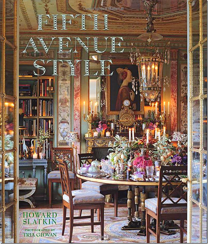
My sister-in-law, Shannon’s parents, lived in a high rise apartment in Houston that we all called Versailles in the Sky because it was filled with antique French furniture, paintings and priceless accessories everywhere you looked. The apartment was definitely not minimalist – but instead had the “cluttered” look, with every corner filled with finery. When Shannon’s father passed away, her mother sold the apartment and downsized. I thought I would never again see another apartment like that. And indeed I haven’t - until I read Howard Slatkin’s new book - and all I can say is – “I have NEVER!!!!!”
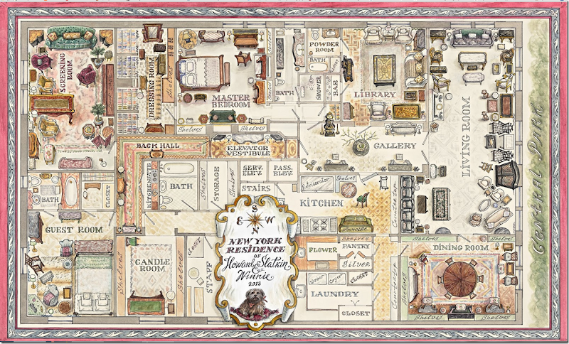
Slatkin’s book came out a few months ago and everyone has already blogged about it. You are probably either familiar with it or have read the book. I’m late to the party because when I first got it – I glanced at it and realized it was my kind of book: a one house book. My favorite design books are those that tell the story of just one house – like Bunny Williams’ “An Affair With A House” or Charlotte Moss’ “Winter House” or John Saladino’s “Villa.” Slatkin’s – “Fifth Avenue Style” - was such a ‘one house’ book. The best part? The very first two pages are the floor plans – a beautiful, large, hand-painted map of the PreWar, 6,000 sq. ft. apartment. Heaven.
When I saw this floor plan, I knew this was going to be a great book and I couldn’t wait to read it, but the problem was I had several other new books to read and I wanted to truly TACKLE Slatkin’s book, to pore over every single picture and written word, and not be rushed while doing so. Thus, I put it aside until I had the time to devote to it, which was only very recently.
Slaktin’s apartment is over the top – a true Versailles in the Sky. It takes the word cluttered décor to new heights. He seems to be obsessive compulsive – and a kind of classy hoarder. Mostly, he is a perfectionist and a bit of a décor snob. Nothing wrong with that – his inspirations are interiors from 18th century castles and the Vatican and rooms in homes owned by Schlumbergers and Rothschilds. In fact, many of the upper crust are his clients – no names mentioned. Honestly, if you could use the Raphael’s Loggia at the Vatican as an inspiration AND pull it off – more cudos to you. Don’t even ask what he thinks about Restoration Hardware. OK?
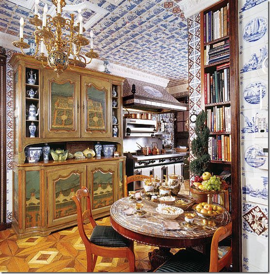
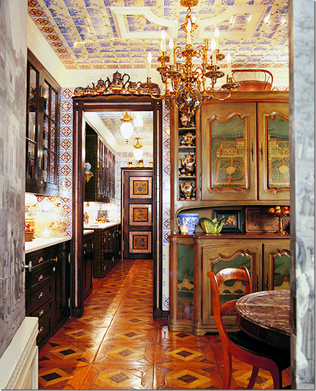
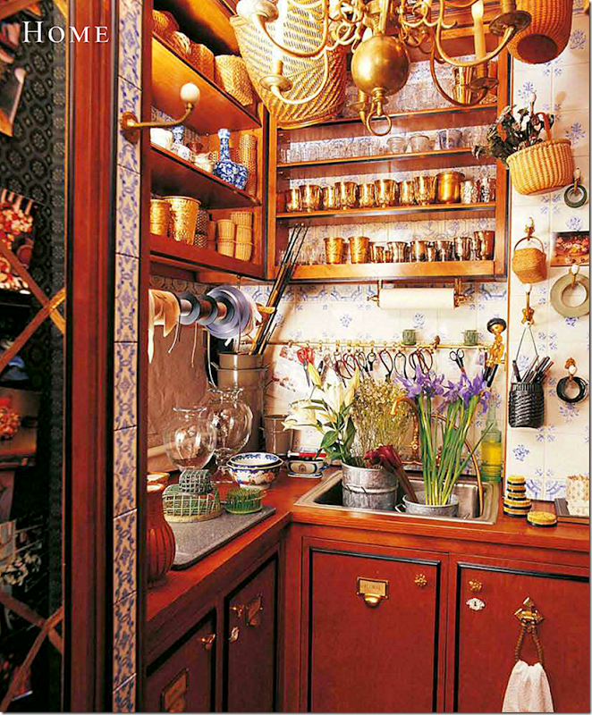
There are parts of the apartment that are a bit too much for me – either too masculine or just too decorated – but that doesn’t mean I don’t appreciate it, every single inch of it. The feminine rooms speak to me more and they are heavenly. Literally. It’s hard to describe the level of detail – you HAVE to read the book to understand that. The craftsmanship is otherworldly. His workmen are extremely valuable; they are every bit as talented as those who worked in the 18th century. Many of the fabrics and trims and hardware were custom made just for Slatkin. Everything, including hangers, is monogrammed – and almost every fabric is hand embroidered. Each décor decision was thought out and planned with no room for error. It took him three years to complete the apartment and honestly, it’s hard to believe it didn’t take longer. For example – the kitchen, the flower room and laundry room are lined in a tile that was custom made for this job: first the tiles had to be designed, then created, then installed - and even the ceilings are tiled. How long did this process take? Every room is like this. Perfection.
And what I really love is that when something didn’t quite work out – Slatkin admits it - he seems to have a cute sense of humor willing to poke fun at himself. For instance, he had special cubicles made for his CD collection. Of course now he doesn’t use CDs, his music is all on his I-Pod – and this intricately designed storage unit was all for naught. And then there is the ironing board installed in his closet – never once used. And there is the Movie System installed in the “Screening Room” – where he never has watched a movie. There are lots of hidden closets and storage areas installed behind jib doors that are empty because he placed furniture in front of the hidden door and it’s too much of a hassle to move it. He lets us know about his mistakes so that we might learn from them, but it really just makes him more human because the apartment looks so perfect it’s hard to believe that he made any mistakes at all.
The apartment was a 30th birthday gift to himself. Slatkin looked for a few years for his perfect apartment – it had to have Central Park views, 11 ft ceilings with lots of rooms, and be ready to be totally renovated. Also, it was important that the construction could continue throughout the year – something that in NYC is rare (construction is usually limited to the summer months only.) Interesting, this apartment isn’t his home base - Slatkin actually only lives in New York City one week out of the month - the other three weeks is spent at his large country house in New Jersey. Seriously, if I owned an apartment this gorgeous – I would NEVER leave!!
In the book, Slatkin describes the inspiration behind many of his décor choices and he shows pictures of these places on the last page of each chapter (each room has its own chapter.) But these pictures are rather small and I was constantly googling the original castle or mansion that had inspired Slatkin. To me – the story behind the design became another story itself. Hopefully you will enjoy looking at the inspiration pictures if you have already read Fifth Avenue Style. If you haven’t read it, please do. It’s an amazing story about an amazing interior designer and his dreams, fulfilled.
So, settle back and enjoy the story of the rooms and the story behind the rooms. I have tried to include what inspired Slatkin’s designs, the inspirations, where he shares it.
THE ELEVATOR VESTIBULE:
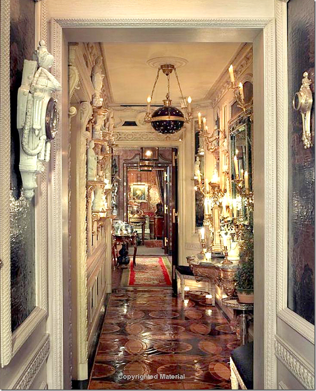
The first room in the apartment is the hallway leading directly off the elevator. This is a long, slender room that is hard to photograph. At the end of this hall you can see the Back Hall and the Screening Room, at the other end is the Gallery, then the Living Room and Dining Room.
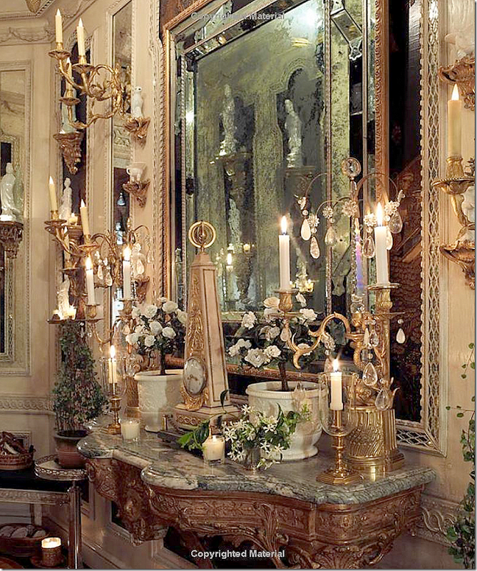
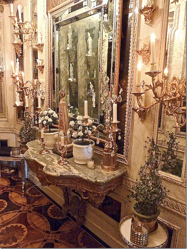
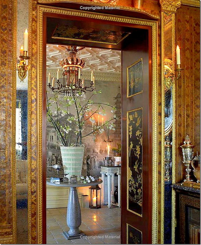
Coming off the elevator, the guest is greeted by this vignette – a console and mirror surrounded by brackets. The console is typically filled with antique bronze accessories and candles.
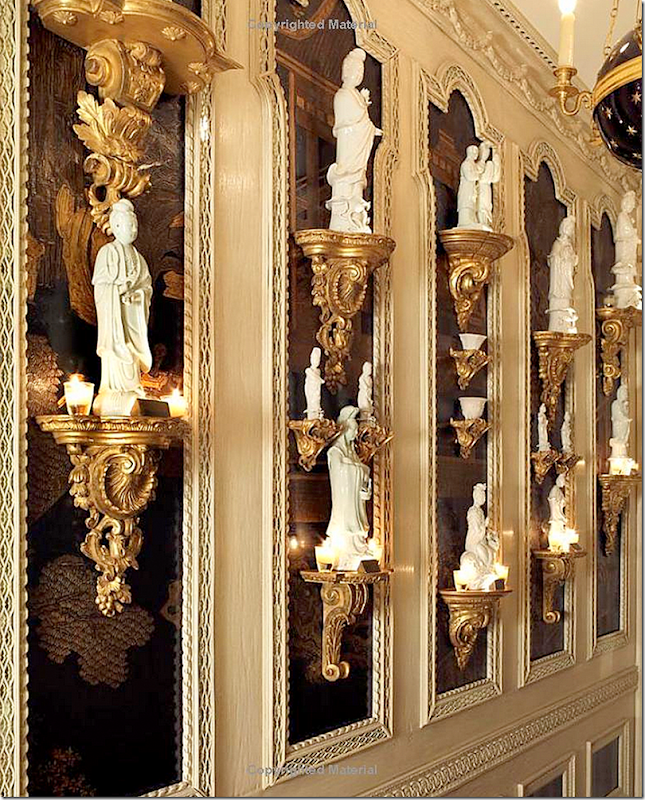
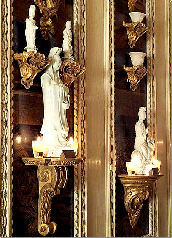
The walls of the Elevator Vestibule are painted cream. Enclosed by moldings with mirror backs are sections of an antique lacquered screen. On each part of the screen are gold brackets that hold a collection of Chinese blanc de chine – or white china figures.
Closeup of the figures. Lighting is very important to Slatkin and he goes into great detail about how he designed the lighting to highlight every ornament, picture and shelf. Here you can see the tiny lights hiding behind a gold cover on the brackets. He also uses masses of votives. It helps that his brother and sister in law are candle makers. Nest is their line of luxe candles. Bamboo is my favorite Nest scent – it’s beyond fabulous and so strong and long lasting!!!
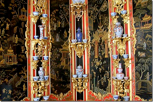
Slatkin’s inspiration for the Elevator Vestibule was this room – the Lacquered Gallery or Chinese Cabinet at Monplaisir the St. Petersburg summer palace of Peter the Great who designed it himself. The room is filled with lacquered panels surround by gold brackets displaying blue and white porcelains. Russian painters spent months studying Chinese lacquer to create this room. Slatkin chose to use Blanc de Chin instead so that the room flows in décor with the Gallery next door.
Close up of the lacquered panels with gold brackets.
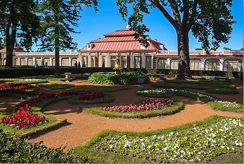
The palace is located on the Gulf of Finland and was finished in 1723 and became Peter the Great’s favorite retreat where he met with close friends. Hard to believe the building is that old – it actually looks like a 20th century country club to me! Others think it looks like a Dutch Colonial building.
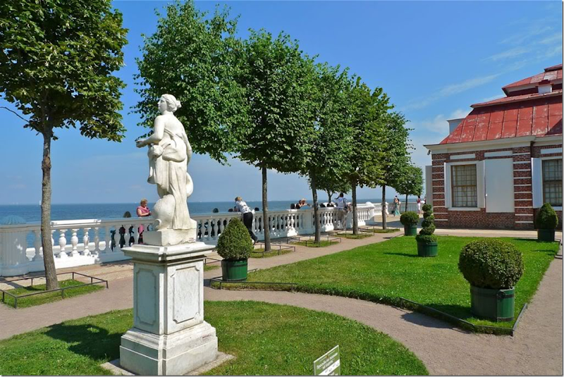
The Gulf of Finland.
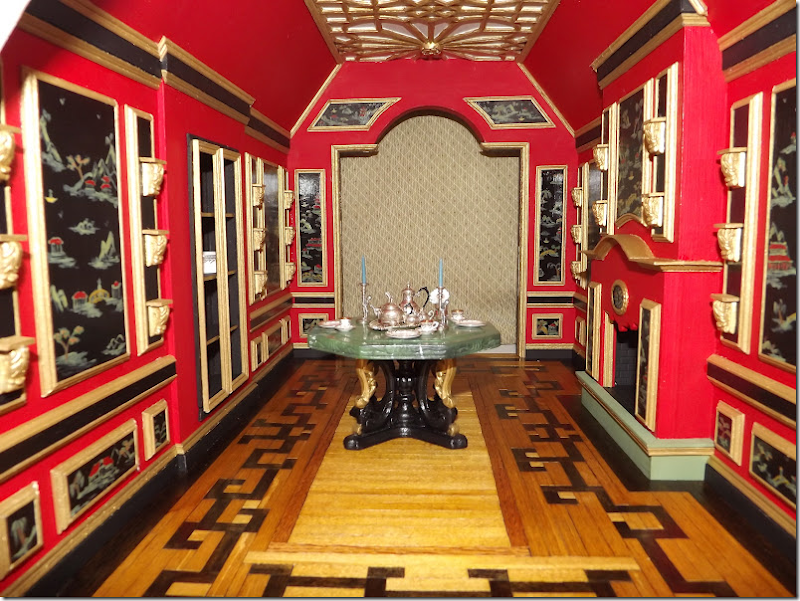
Most interesting, this woman built a dollhouse and used the same room – the Chinese Lacquer room in Monplaisir Palace – as her inspiration when designing the Chinese Tea Room in miniature. Amazing. See more HERE.
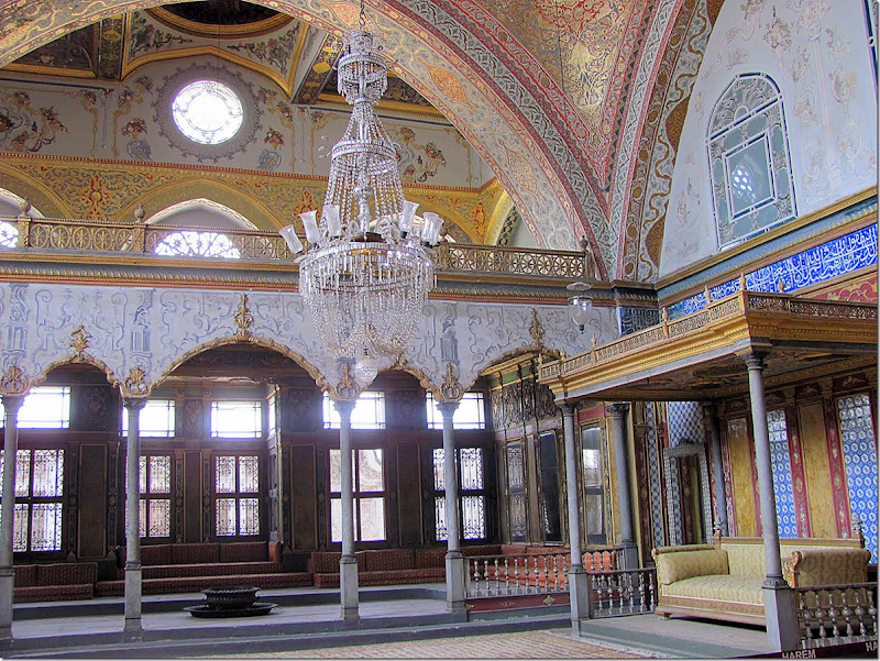
Could this look be imitated on a budget? I think so. You could purchase an inexpensive screen and have it cut to fit in between molding. Of course Slatkin’s molding was based on some he saw at the Topkapi Palace in Istanbul – there are mirrors behind the fretwork. Also, instead of a screen, you could paint the area glossy black. Ebay usually has repro blanc de chine for sale – just mix in white bowls, etc. – and I think you could emulate this look on a budget. I know it wouldn’t be nearly as elegant and the molding couldn’t be copied, but you could get this look in an entryway filled with lovely gold brackets and white blanc de chine. It would be worth a try.
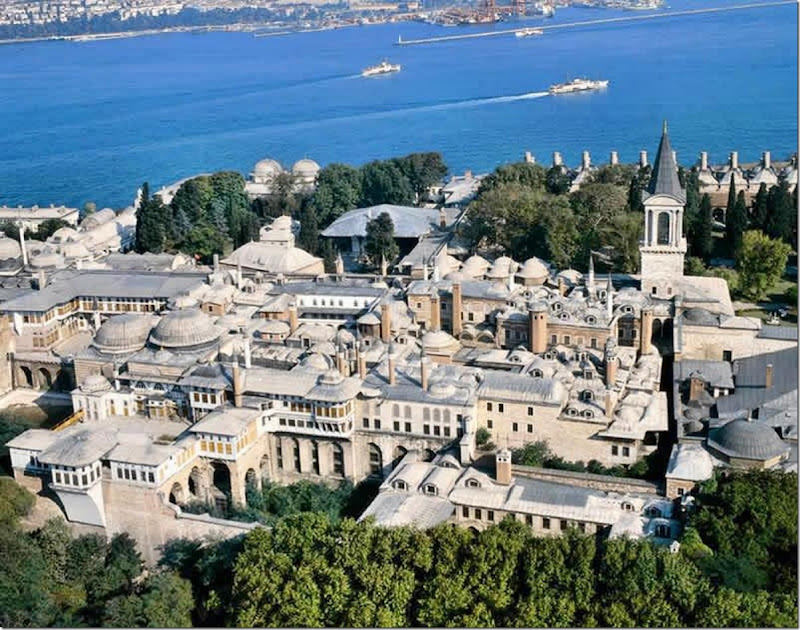
The stunning Topkapi Palace in Istanbul. When visiting, Slatkin spied some fretwork molding with mirrors behind it – which he replicated in his Elevator Vestibule.
The Topkapi Palace is a complex of buildings where the Ottoman Sultans lived for over 400 years from 1465-1856 during their reign that lasted 624 years. It overlooks the Bosphorus Strait.
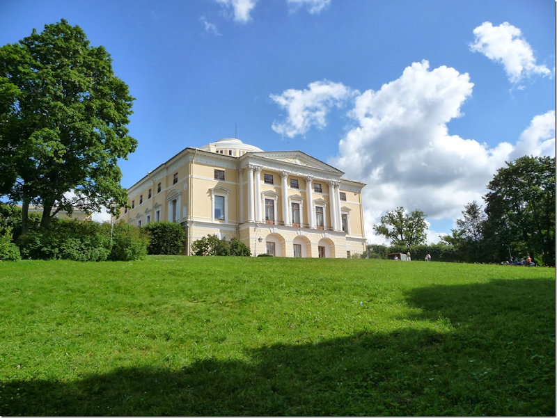
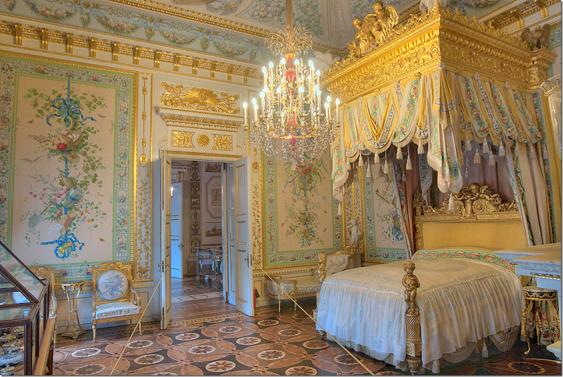
Finally – notice the wood floor. I wish I had a better picture of it. This floor was inspired by the Russian Pavlovsk Palace in St. Petersburg. Whereas you or I would see a picture of a palace and admire a room there – Slatkin has visited all these fine houses and castles and taken notes, to use in a client’s house or his own. Here, he noticed the wood floor in the Royal Bedroom.
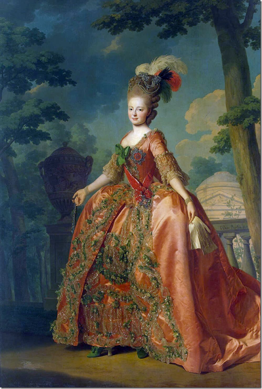
Maria Feodorovna (1759 – 1828) was the second wife of Tsar Paul 1 of Russia. She was the mother of Tsar Alexander I and Tsar Nicholas I of Russia. She lived as a widow in the Pavlovsk Palace in St. Petersburg.
Catherine, the Tsarina, built Pavlovsk Palace for her son and daughter in law. After the death of Paul I, Maria lived here and decorated it.
Here is the floor in Maria Feodorovna’s bedroom. Notice how similar it is to the floor in the Elevator Vestibule.
A second look at the wood floor. Howard details how he treats the wood so that you don’t have to wax it. He puts on multiple layers of satin polyurethene to seal the floors.
For this very small space – a short hall – Slatkin took inspiration from the Topkapi Palace in Istanbul, the Pavlovsk Palace in St. Petersburg, and the Monplaisir, also in St. Petersburg.
THE GALLERY:
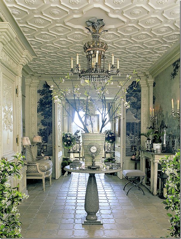
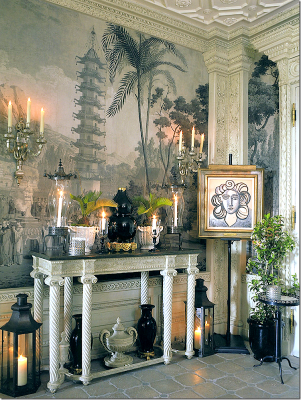
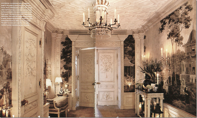
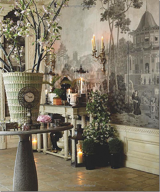
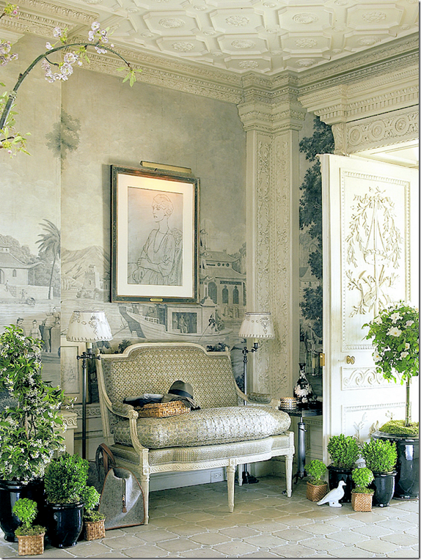
Turn to the right off the elevator to enter the Gallery, or the Entry Hall. At the end of the Gallery is the living room with its Central Park views. This room was inspired by a cache of grisaille hand painted wallpaper that Slatkin found in Paris. He waited 24 hours to buy the wallpaper – a surefire way to know he had to have it. This is one of my favorite rooms in the apartment – I love the wallpaper and the creamy color of the doors and moldings.
This corner shows one of the consoles. I think if this was my apartment I would find a pair of ivory pagodas for this console – ala Mary McDonald – to highlight the pagoda in the wallpaper. Notice the pilasters – the attention to detail is phenomenal. The paper was restored by Gracie. They also added panels where they were needed to fully cover the Gallery walls. Notice how he placed the wainscot so low – this was done in order to not cut down the panels.
A sepia tinted view of the room with the doors to the living room closed.
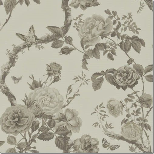
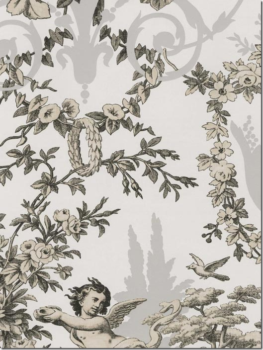
The wallpaper is just gorgeous. How to recreate this room? I found a few wallpapers that are available in gray:
This paper might be a good substitute HERE
Or this one Here
Or you could try painting a design from the Stencil Library. You could also try just painting freehand – even if you aren’t an artist. Tutuorial HERE.
The tiles are limestone from France. Many of the fabrics were custom designed by Slatkin himself and were then woven in France. In the book, he goes into great detail about all the fabrics, especially the ones he designed.
A beautiful tall clock.
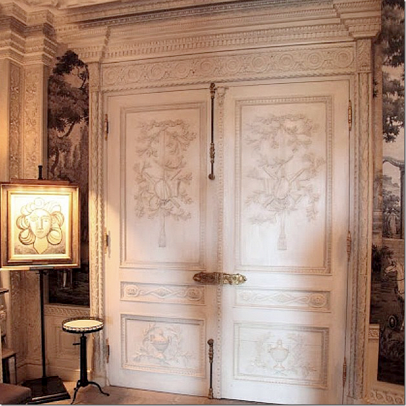
A close up of the beautiful carved doors.
Inspiration for the Gallery came from the antique wallpaper panels. The details were inspired by photographs of moldings and ceilings and stone floors that Slatkin had saved.
THE LIVING ROOM:
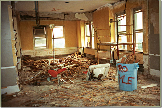
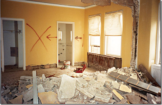
Before – Slatkin calls the living room a bowling alley because it is long and narrow.
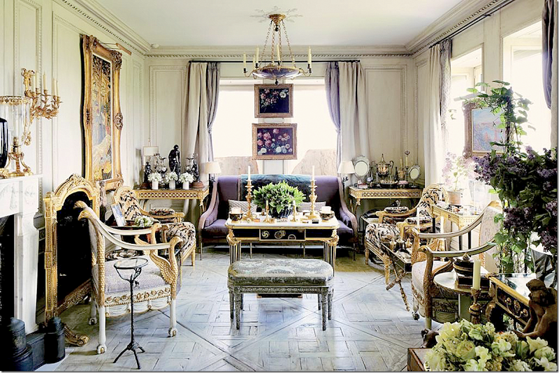
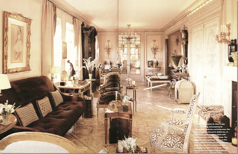
Slatkin wanted this room to be light and airy – and chalky white. The floors are antique in the Versailles pattern that he installed inside out to preserve the original finish. On their backside he created a new chalky finish. The room is filled with antique tables and chairs and a sofa that he designed. The story of the curtain fabric has to be read to be believed!
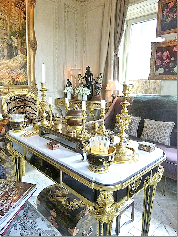
The coffee table – tall, and arranged with antique accessories. I love the chinoiserie tray – so beautiful.
And the other end – the mirrored doors lead into the dining room. To the right is an alcove with another sofa.
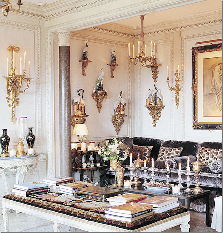
The alcove where brackets were placed around the walls to display his collection of birds. This porcelain collection – displayed on both Regency and Louis XVI wall brackets came to Howard through his grandmother. Notice, each bracket holds a tiny lightbulb so that the birds softly glow.
An inspiration – Jayne Wrightsman seen in her Palm Beach house, surrounded by her own bird collection. Slatkin’s mirrored doors leading into his dining room were a gift from the Wrightsman Palm Beach house. The doors remained in storage for years until the right time came when this apartment was renovated.
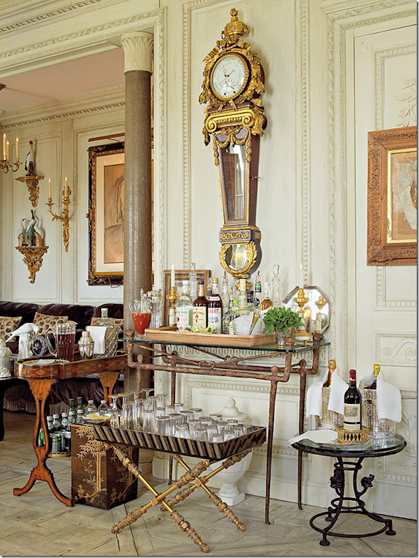
There is a drinks table set up in the living room.
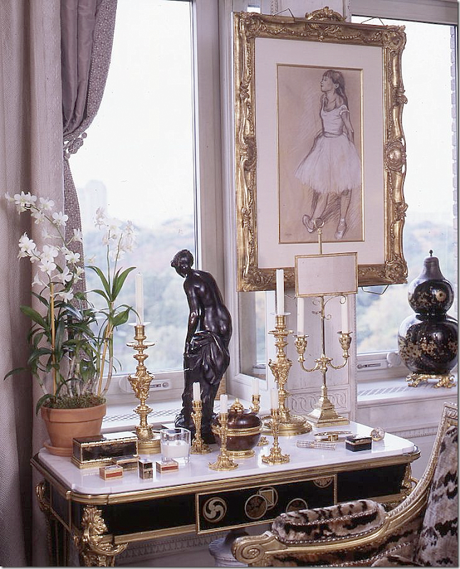
Vignette in front of the windows.
The fireplace in the living room. Slatkin says he rarely uses it as the building remains so warm during the winter.
An earlier view of the living room. At one point the sofa faced the fireplace as seen here, but this was changed when Slatkin realized he rarely lit the fire.
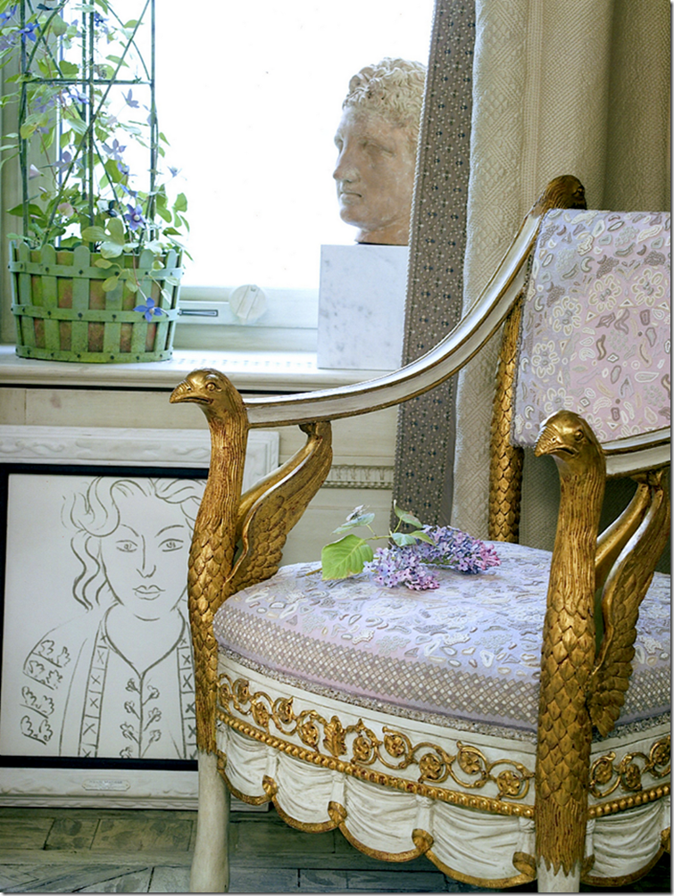
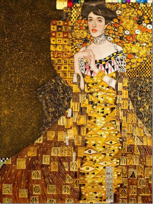
Here you can see the curtains up close – the silk was first dyed to match the walls, then sent to be embroidered. The fabric on this Russian Empire chair was also embroidered by Jean Francois Lesage – inspired by a Klimt drawing.
I searched all the Klimt drawings and paintings and couldn’t find one that absolutely matched the chair fabric, but this one did remind me of it. Kind of! I tried!!!
Or was it inspired by this Klimt?
Through the doors you enter the most magical room in the house – the dining room. The French chair is upholstered in a needlepoint fabric inspired by a Matisse drawing that Slatkin owns.
Trips to Versailles inspired Howard Slatkin when designing the living room. First – the hardwoods were chosen in the famous Versailles pattern. The chalky color of the floor also came from Versailles – years ago a door spied by Slatkin on a visit inspired the stain.
Often the smallest of details is inspired by a trip. A visit to le Meridienne, Mary Antionette’s bedroom inspired the toggle tie backs in the living room.
THE DINING ROOM:
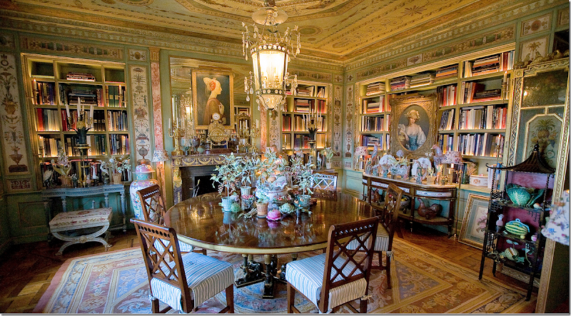
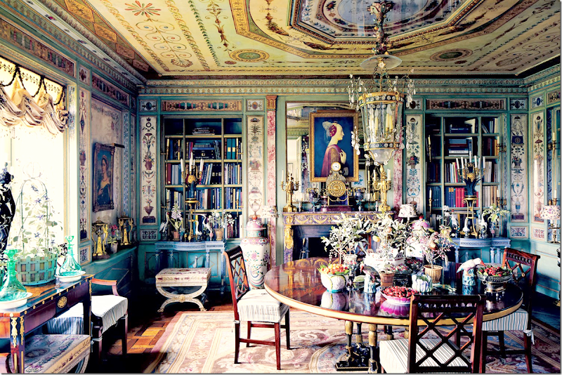
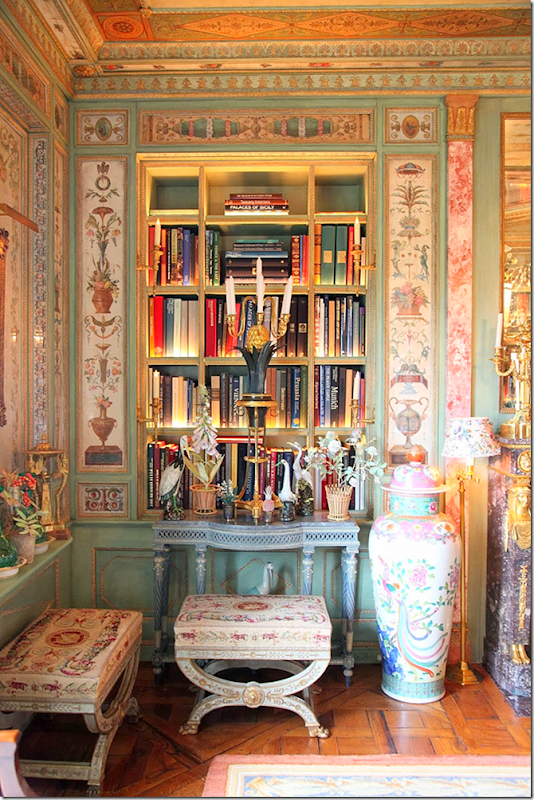
The highlight of the apartment is surely the dining room. Painted green – or Eau de Nil – or the color of the Nile, the room is half a dining room and half a library. The bookshelves are all lighted in a hidden, intricate method which softly highlights the spines of the books. Behind the screen to the right is the door the kitchen and service rooms. There is hidden storage behind the bottom of the bookcases and there is a large empty storage area behind the fireplace – impossible to reach now because of the console tables placed in front. The rug was one of Slatkin’s first purchases, a bit too small – he designed the room to make it fit. The chairs are slipcovered and monogrammed.
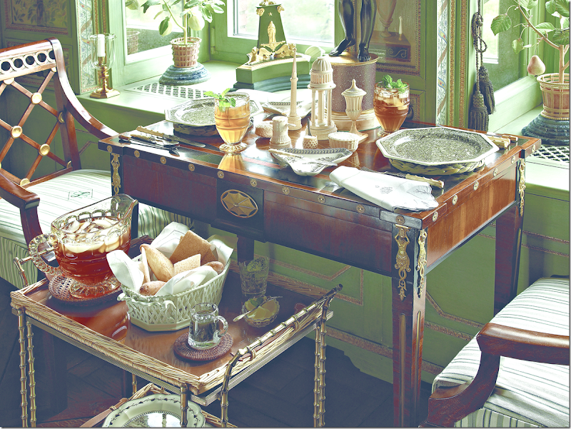
Another view – lunches for two are often taken at the console on the left overlooking Central Park.
A glimpse of the table set for dinner – through the mirrored doors.
A close up of the lit bookshelves.
Looking out at Central Park.
Lunch at the window.
The light fixture is the same as this one found in the Maria Feodorovna’s Pavlovsk Palace. This palace was featured above where the royal bedroom’s parquet floors were copied for the Elevator Vestibule.
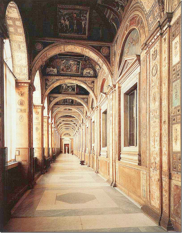
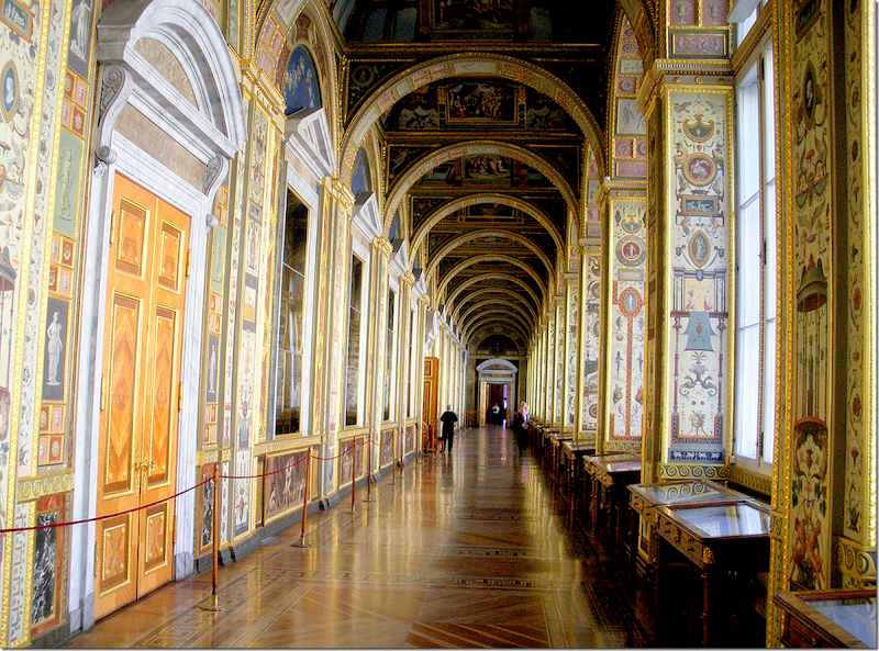
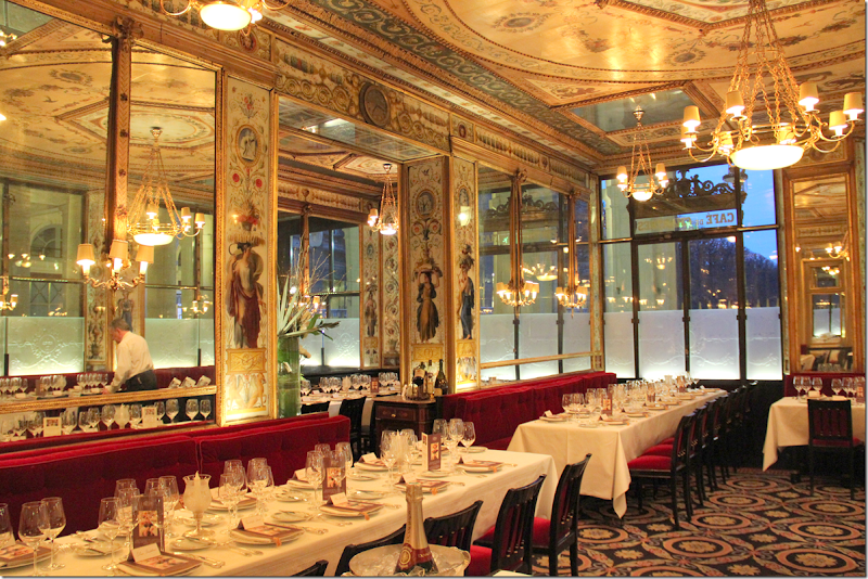
Howard Slatkin had several places that inspired the dining room. First, was Raphael’s Loggia at the Vatican in Rome. Later, this loggia was used as inspiration in Russia’s Hermitage. And finally, a Parisian restaurant also used Raphael’s Loggia as inspiration in its décor, which in turn inspired Slatkin. The restaurant, one of Slatkin’s favorite, is Le Grand Vefour in Paris.
The original inspiration – Raphael’s Loggia in the Vatican.
Another view from the opposite direction of Raphael’s Loggia at the Vatican.
Next, a reproduction of Raphael’s Loggia in the Vatican was created for Catherine II in the 1780’s at the Hermitage in St. Petersburg.
And still, Slatkin’s favorite Parisian restaurant, Le Grand Vefour used Raphael’s Loggia as inspiration for their décor.
All three are wonderful spaces that inspired Slatkin. Amazing, no?
THE LIBRARY:
The Library is a very small room off the Gallery. It was once a bedroom with a bathroom and today it is only used in the evening since it so dark. Ironically, it’s one of the only rooms without any books! The wood floor came from the Schloss Pfaueninsel – and is a basket weave pattern.
BEFORE: The library
Leading from the Gallery into the Library.
In the summer – the furniture is covered in old linen bedding slipcovers.
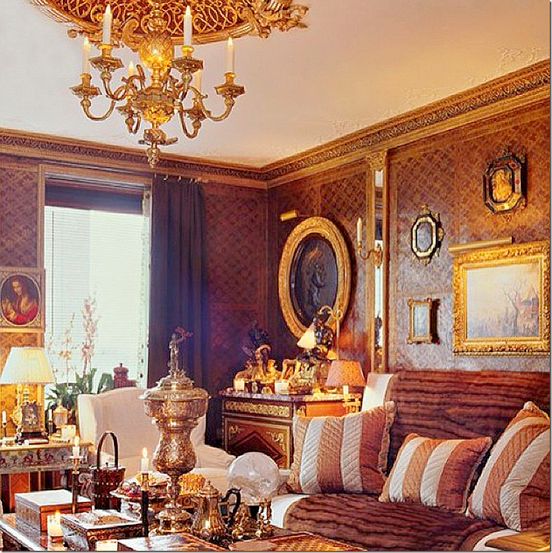
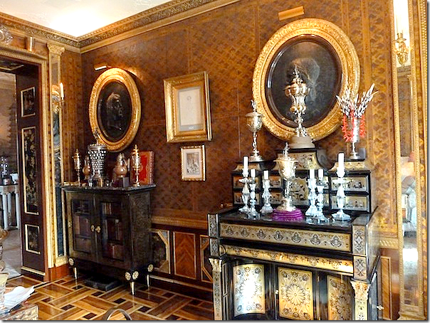
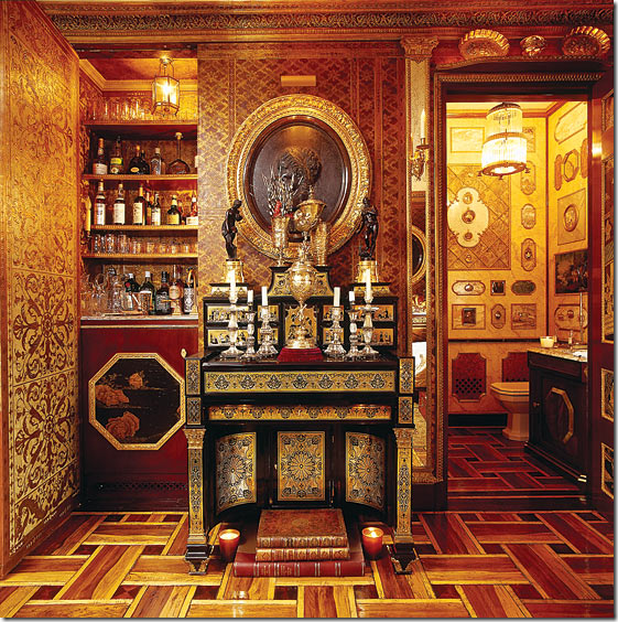
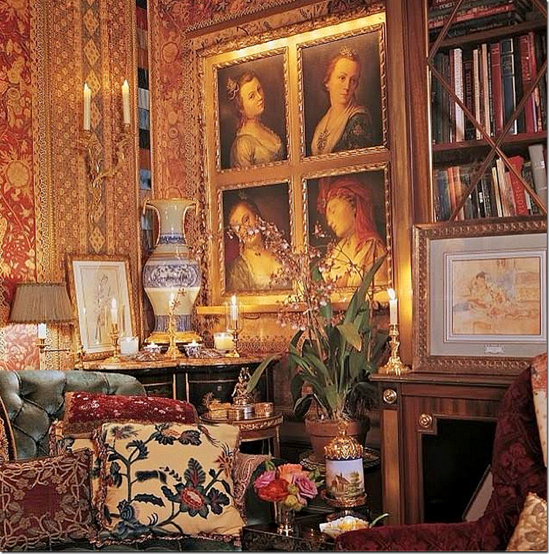
The Library with its leather walls. A set of oval portraits framed in gold circle the room. The wet bar is behind the jib door hidden in the middle of this wall.
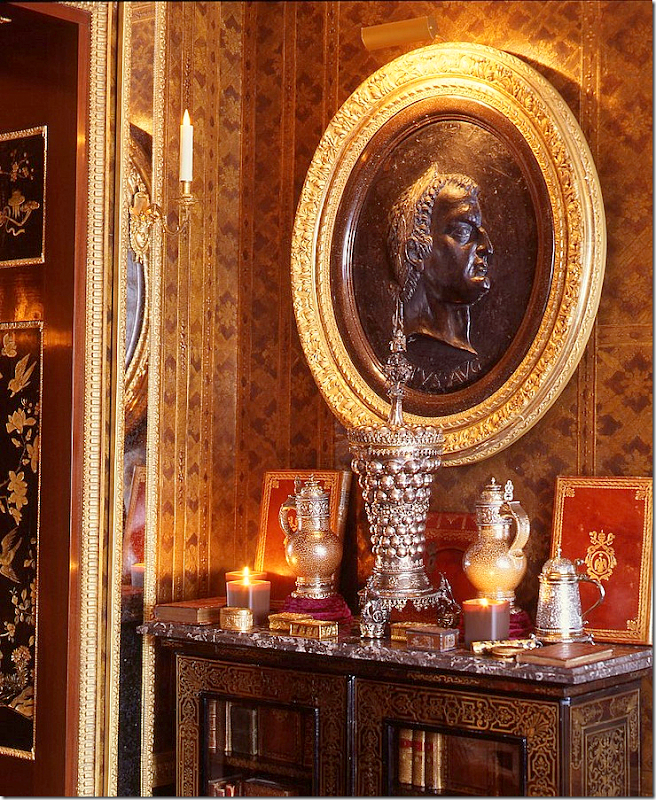
Close of a vignette in the library.
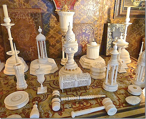
Ivory pieces.
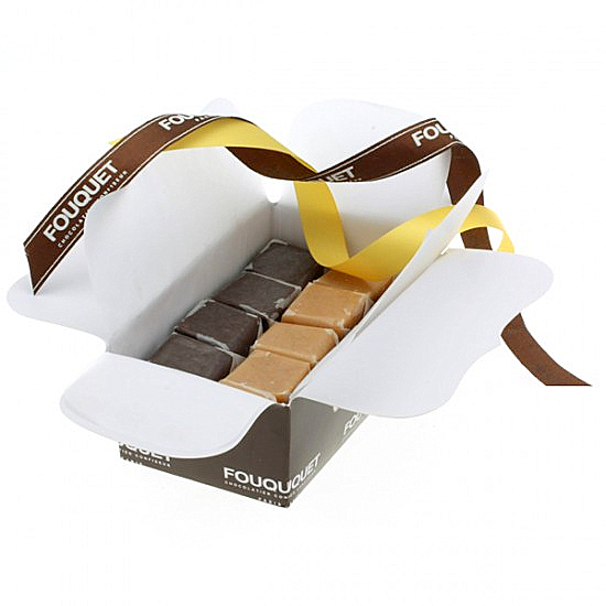
Slatkin said the colors of the Library were inspired by a box caramels from Fouquet.
The powder room is on the right and the wet bar is on the left - usually hidden behind a jib door. This is one of my favorite pieces of furniture in the apartment.
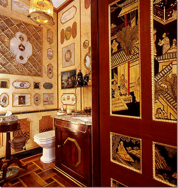
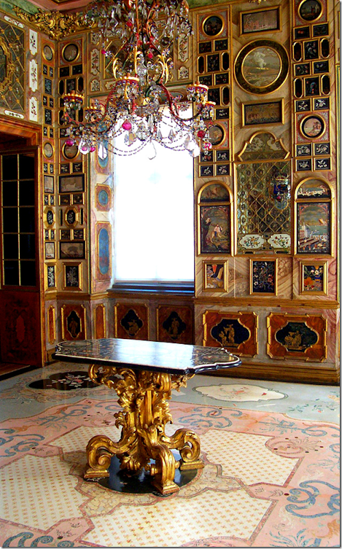
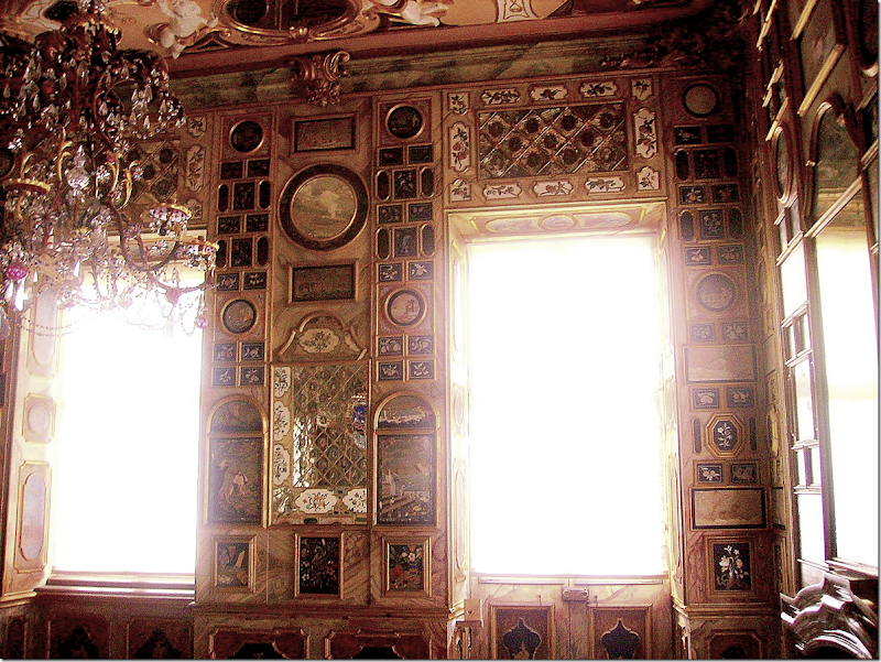
Next to the wet bar is the powder room. The tub is hidden behind a jib door, never used. The powder room was inspired by the fabulous room, the Florentiner Kabinett in Schloss Favorite in Baden Baden Germany. The walls are made of marble with insets where his collection of antique miniatures were installed. In typical Slatkin humor – he tells of his grand plans to add to his collection so that all the spaces are filled with antique miniatures. Alas, he moved on – losing his interest in the collection – and the powder room was never quite finished.
Here’s a close up of the marble lined walls with the miniatures in the powder room.
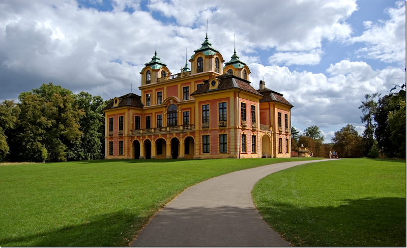
Here is a picture of the inspiration room - The Florentiner Kabinett in Schloss Favorite in Baden Baden Germany. Didn’t he do a fabulous job of recreating this room in such a tiny space? Amazing!
Another photograph of the room.
Schloss Favorite in Baden Baden was completed in 1730. It was a pleasure and hunting palace used only for a few weeks during the summer. It is the oldest of Germany’s “Porcelain Palaces” and the only one to survive intact. It houses a large collection of Chinese porcelain, lacquerwork and Schwartz porcelain.
THE MASTER BEDROOM SUITE:
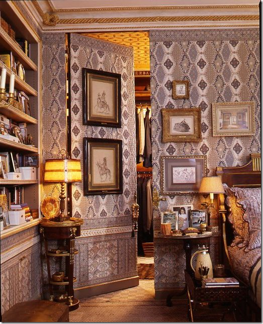
The master bedroom is one of three bedrooms in the 6,000 sq. ft. apartment. There is also a guest room and a small staff room. The walls are upholstered in three different cotton fabrics that were sent to France to be embroidered for added texture.
The closet is behind a jib door.
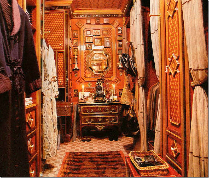
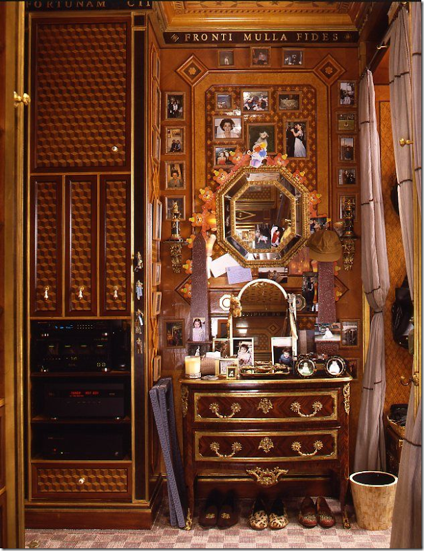
The closet was designed in great detail - down to the monogrammed hangers.
CDs have their own place in the cabinet on the left – yet they have never been touched since the advent of I-Pods.
Just remember – Slatkin only lives here one week out of the month. His main house is located in New Jersey!
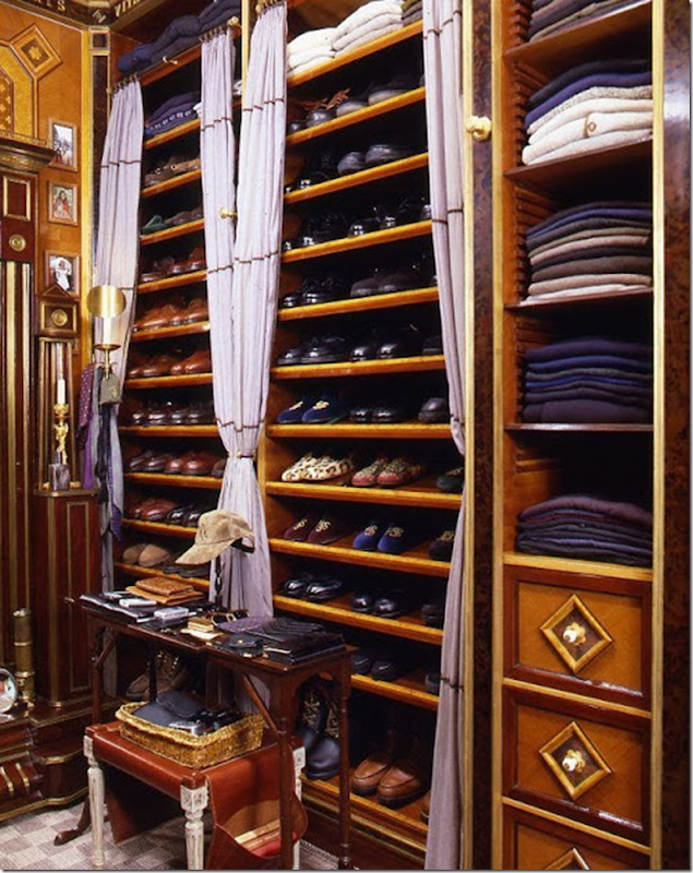
There is a place for each shoe, each shirt, and each sweater.
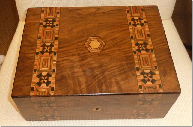
The inspiration for the master closet is the antique English Tunbridgeware box. I shouldn’t say closet – Slatkin uses the proper Dressing Room. And actually – his closet does look more like a men’s shop than someone’s closet.
THE BACK HALL:
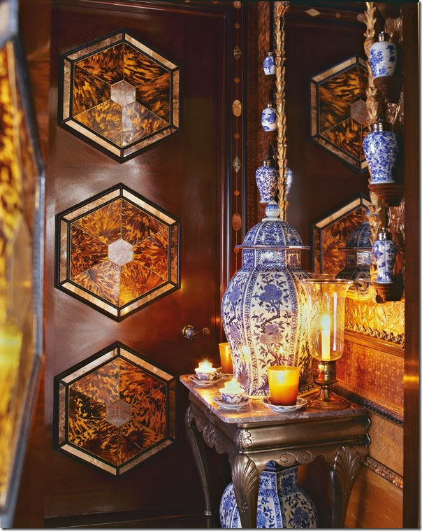
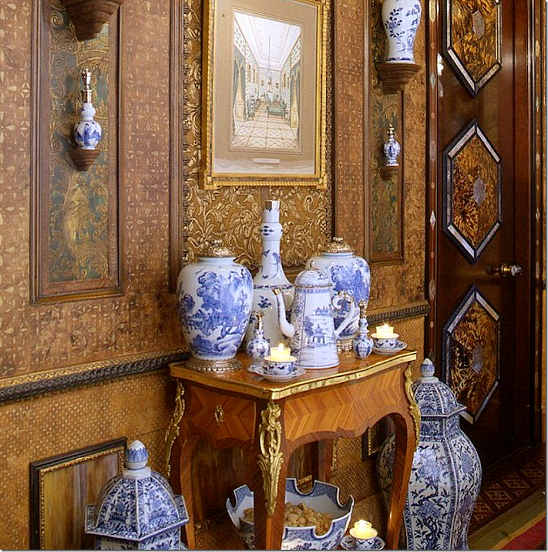
Past the Living Room, the Gallery, and the Elevator Vestibule – you reach the Back Hall. I just named all my halls and landings and the number of rooms in my house exploded! How to decorate a tiny hall? Well, first find a lofty inspiration and then find a sugar daddy! Notice the door with the tortoiseshell hexagons framed in ebony and hardstone found in the Urals. The tortoiseshell is old – found in a box in Paris. Natch. And the door is mahogany. Whew! Could you replicate the door on a budget? Probably. But let’s face it – it would never look this luxe and luxe is what this door is all about.
The Back Hall is all about brackets and blue and white Chinese porcelain. The walls are lined in embossed paper panels and bark.
The attention to detail is, as always, amazing.
And what lofty space inspired Slatkin in the Back Hall?
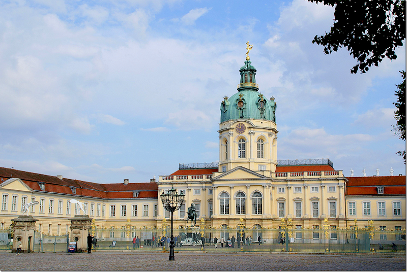
Schloss Charlottenburg in Berlin and it’s famous Porcelain Chamber which he had just visited. This palace was finished in 1706. Due to the availability of Oriental porcelain back then, there was a great interest in collecting it. Nobles and Royals created rooms called “China Cabinets” that were decorated with the ceramics.
A close up of the absolutely amazing room that inspired the décor of the Back Hall.
Shloss Charlottenburg. The outside is almost as pretty as the inside. I love the green dome.
THE SCREENING ROOM:
Slatkin wanted the screening room to be a turquerie – a sort of old Persia, Ottoman empire, Samarkand and Egyptian styled room. This space was designed to be a room where guests would watch movies after dinner, and an elaborate projection and screen was set up – never to be used! Instead, the screening room is a room for after dinner socializing. It’s off the Back Hall and next to the Guest Room.
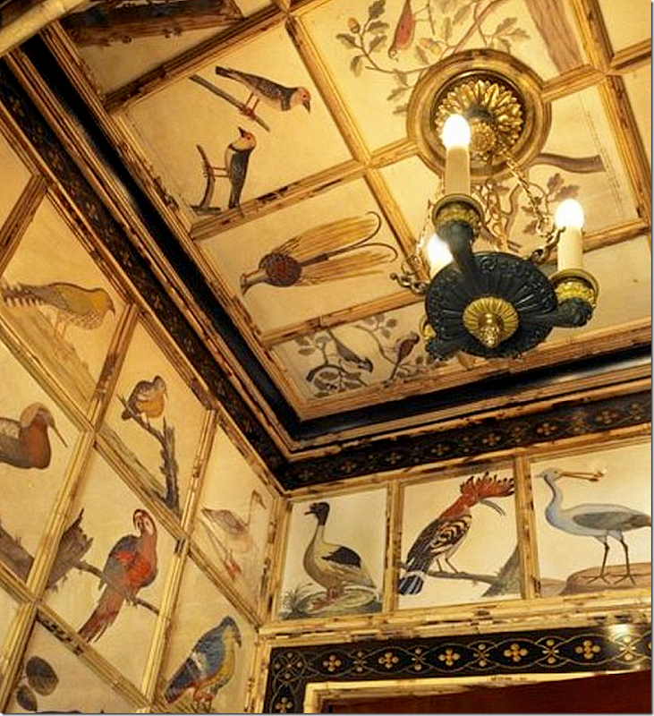
The vestibule leading into the Screening Room – a set of prints lines the small entrance hall. The bird prints are by Eleazar Albin’s book Prints from the Natural History of Birds, 1731 – available HERE. Can you replicate this look on a budget?
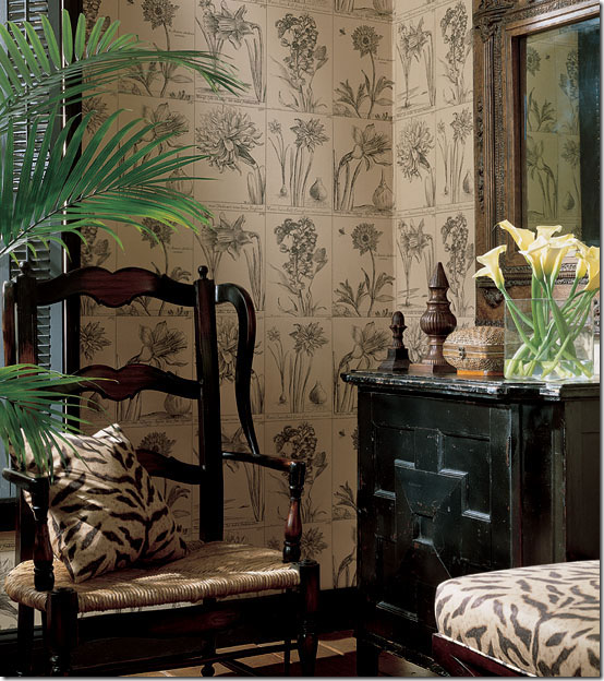
I found this wallpaper – and thought you could wallpaper a hall using this and then using either bamboo or molding outline the row of prints – or leave off the molding. You could also buy a book of prints and cut them out and then paste them on the wall. Labor intensive, but worth the results.
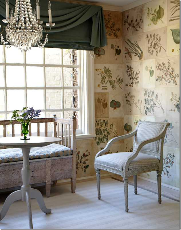
Or you could do what Carol Glasser did – she decorated this room with individual prints that were pasted to the walls. There were black and white copies – which an artist then hand tinted. Notice some are ivory, some are cream and some are tobacco stained to convey age and make them seem authentic.
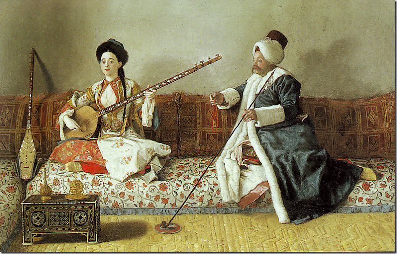
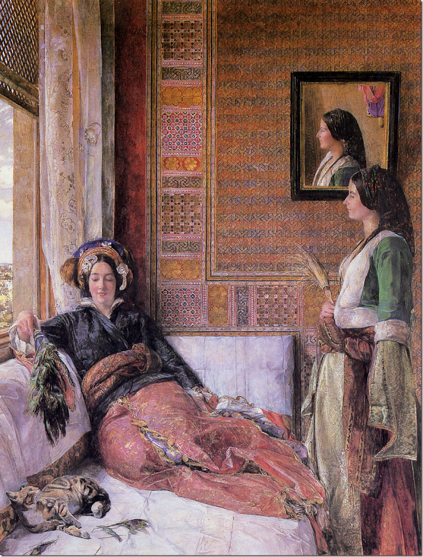
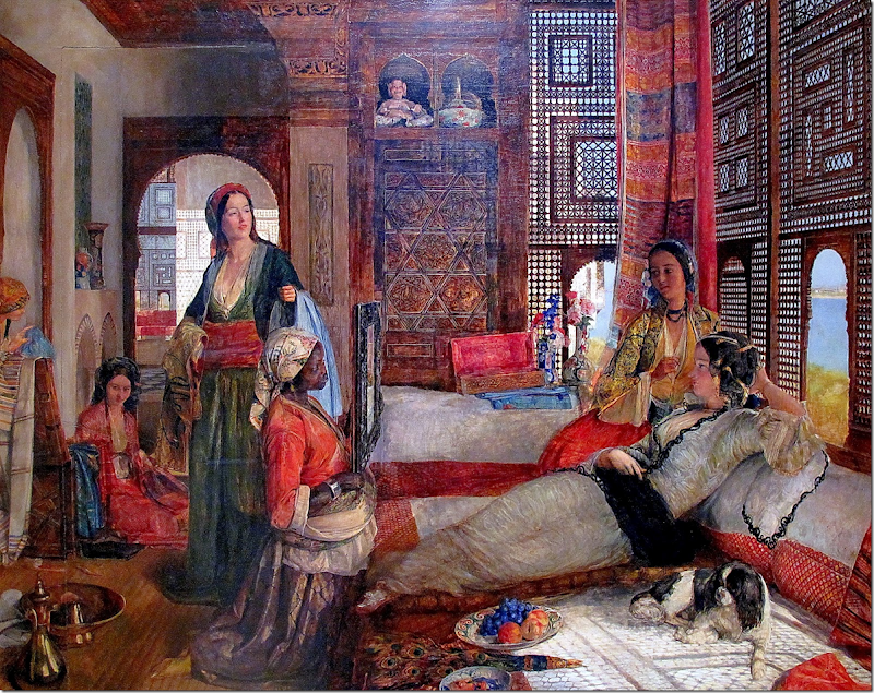
For the screening room – Slatkin was inspired by these two 18th century artists:
Jean-Etienne Liotard
and John Frederick Lewis, “Hhareem Life, Constantinople” 1857
and another John Frederick Lewis from 1851
But, mostly he was inspired by the Renzo Mongiardino room he created for Lee Radziwill when she lived in England.
Slatkin used this room as the inspiration for his screening room.
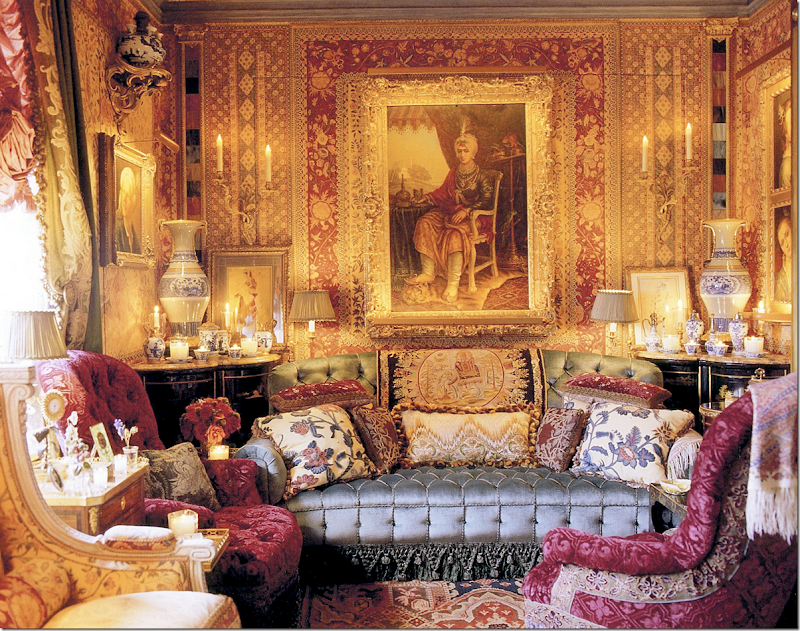
And here is the screening room – while it does resemble Lee Radziwill’s room, Slatkin didn’t use one pattern throughout the room like Renzo did for Radziwill. Instead, Slatkin’s room is a bit more layered and chaotic. Isn’t that back wall with the frame Raja look gorgeous?
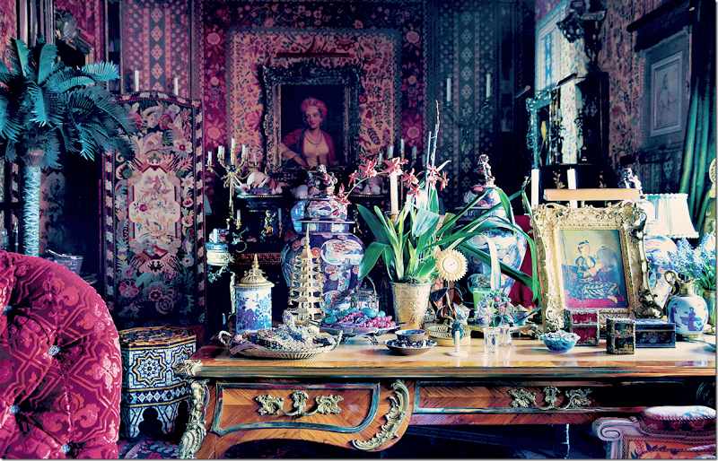
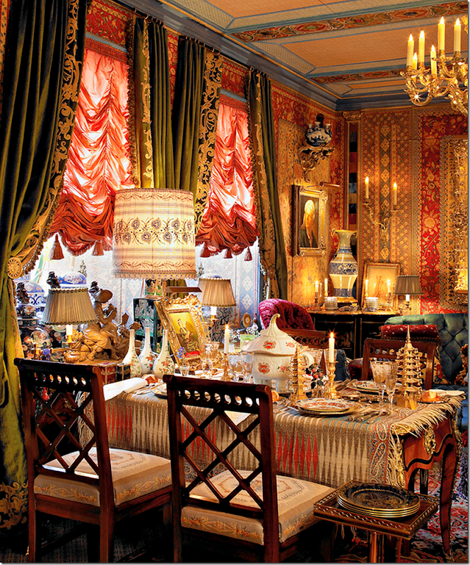
Across from the sofa – this desk is occasionally used for meals.
In this picture you can see the ceiling treatment. This photo was taken at a different time. Many of the plants are no longer here.
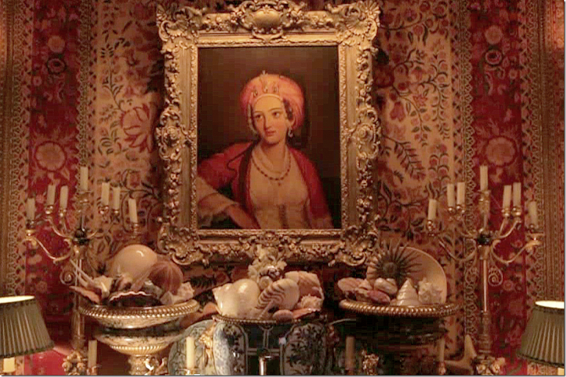
A close up of a beautiful painting and his collection of shells.
The desk at the window – set for a meal.
At the side of the sofa. There is a book cabinet along this wall.
THE GUEST ROOM:
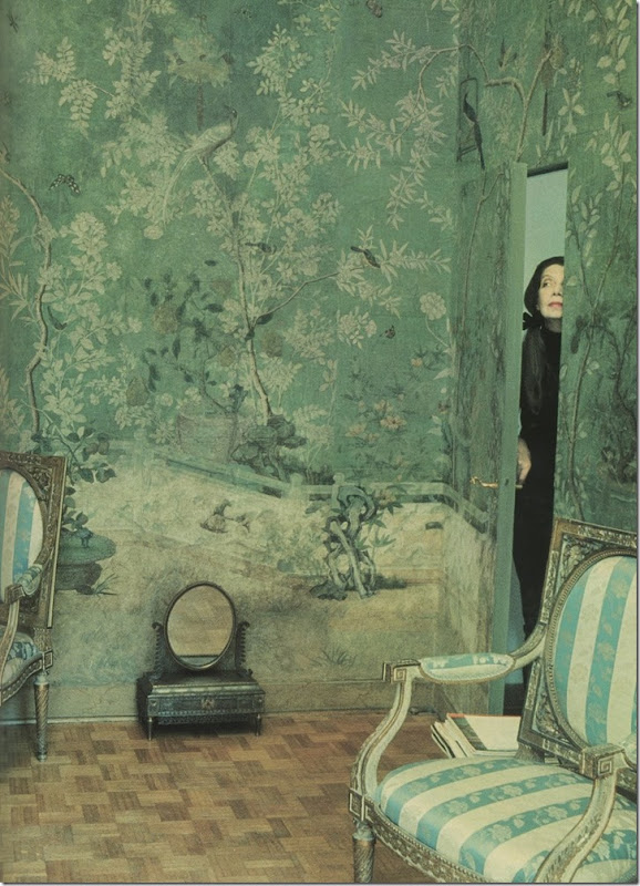
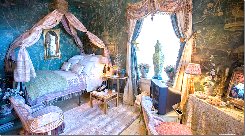
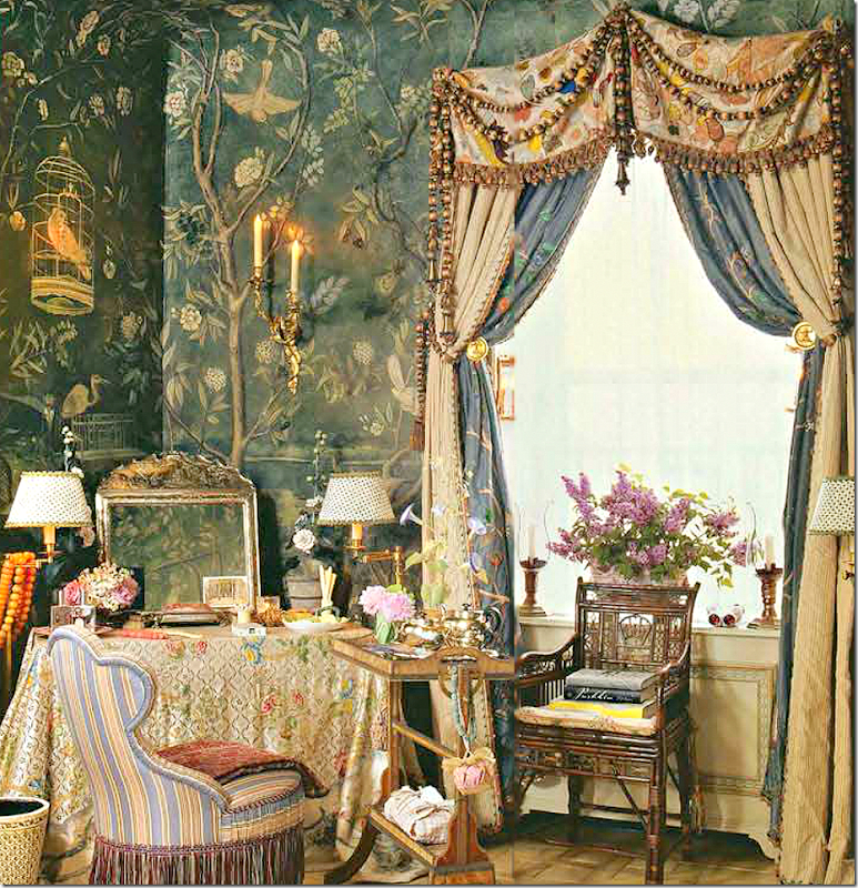
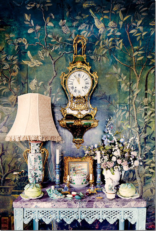
The guest room was not decorated with the rest of the apartment. Slatkin was lacking a starting point. But, once he became the owner of a cache of hand painted wallpaper, he knew it was time to finish the room. The amount of wallpaper, like the other panels found in the Gallery, was not enough to fill up the room, so Slatkin had the missing panels painted by his craftsmen. His inspiration was Pauline Rothschild’s famous bedroom:
This famous bedroom was an inspiration.
The guest room – with the 18th century handpainted wallpaper.
A view of the room – here you can see into the Back Hall – decorated with the blue and white ceramics. The wallpaper panels were too tall for the room – so Slatkin had the ceiling coved to avoid having to cut the paper.
I just love this room. The dressing table is draped with a textile. The closet is filled with clothes in case luggage gets lost. I kid you not.
A beautiful vignette in the room.
THE KITCHEN:
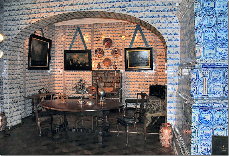
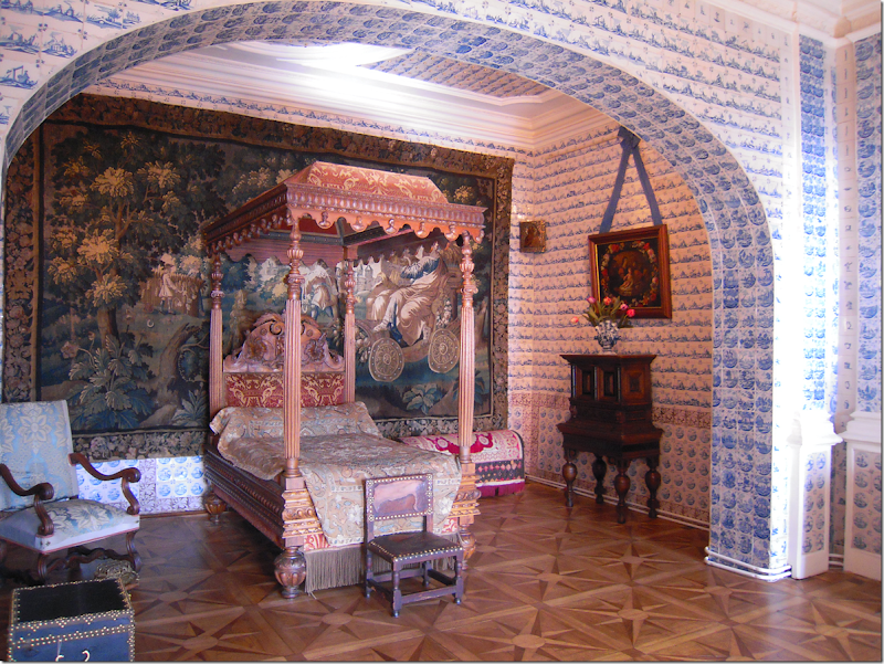
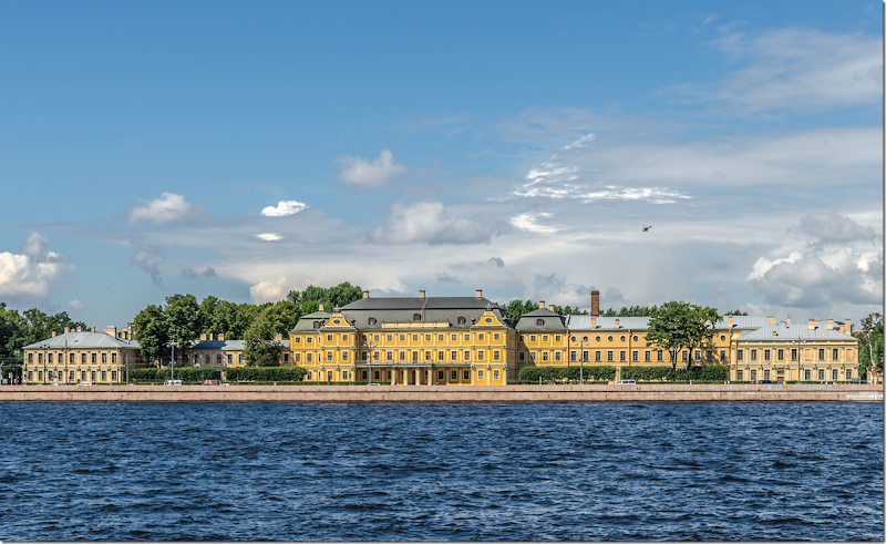
Much of the inspiration in Howard Slatkin’s apartment were ideas he had envisioned for clients, which they dismissed. These décor inspirations then became his own. The inspiration for the kitchen décor was one such idea that a client rejected. The inspiration for the kitchen and service rooms came from the St. Petersburg palace of Alexander Menshikov. Slatkin tells us that Menshikov died bankrupt in Siberia – something he relates to after paying for the endless quantity of custom designed blue and white tiles that lined the walls and ceiling of his service rooms.
The inspiration for the kitchen came from the Menshikov Palace in St. Petersburg.
And another room in the palace. The stoves are so beautiful.
Notice the large tapestry that warms up the tile.
The Menshikov Palace – St. Petersburg, built in 1727 – is now a part of the Hermitage Museum.
Slatkin’s kitchen – tiles cover the walls and the ceiling. He says a white marble kitchen is just not for him – oh really??
There are several service rooms in the back area – the laundry and a place to wash just the glasses.
My favorite is the flower room – what a luxury! Another favorite is the candle room for all his Nest candles.
I tried to hunt down as many of the inspirations for the décor as I could, but it was an almost impossible task. Many sources I couldn’t find, others were only casually mentioned without enough information to track down the inspiration. I showed a small collection of photographs from the book – you will have to read it to truly appreciate the care and time and effort it took to design this apartment. It is an amazing feat.
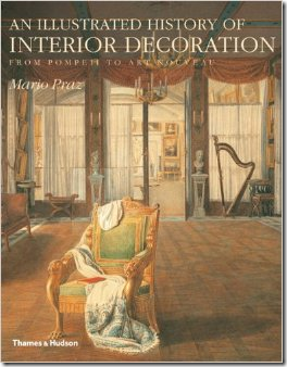
In one interview, Slatkin mentioned two décor books that he reads over and over again – using those for inspiration.
The first book mentioned is this history of interior decoration by Mario Praz. To order from Amazon, click the photograph below:
The second book mentioned is the famous Vogue – Houses, Gardens and People - the first edition by Valentine Lawford. The newer issue is still in print – but this original version is harder to find. Still – you can order it on Amazon, for a pretty penny. Click below:
























0 comments:
Post a Comment