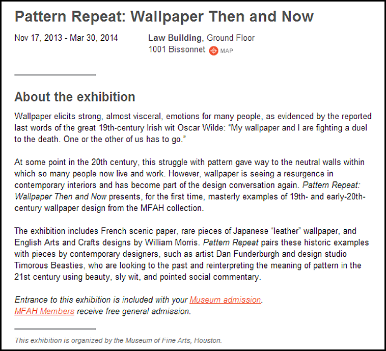
Houston’s Museum of Fine Arts is currently running an exhibition on the history of wallpaper (Pattern Repeat: Wallpaper Then and Now) and the timing isn’t lost on me. A story in the new House Beautiful had me thinking about wallpaper. It seems like wallpaper is everywhere these days – which makes sense - it coincides with the explosion of color the magazines are forcing on us, or me, I probably should say.
I like color, I do. I know sometimes it doesn’t seem that way – but I do. I just don’t care for color for color’s sake. And I don’t like a lot of the décor I see in the magazines these days. Is it just me? Maybe I’m getting too old and I’m clinging to the way things used to be.
I just don’t understand this. A family room in the new House Beautiful.
But, the main feature of this month’s House Beautiful is this new house by Miles Redd. I love Miles – and I especially love the wallpaper he chose for this room. I love the touches of red and the red and white ticking used on the chairs with the green garden seat. And I love the chintz pillows. I did think it was interesting that the same things I questioned about this room – the interviewer did too: the brown sectional? And why is it pushed up against the wall? Of course Miles has answers for both questions. But I still would love to see this room without the brown sectional pushed up against the wall. The brown linen was chosen because it’s a family room and there are kids and dogs. OK. This is why I use slipcovers. So now, brown hides the dirt?
OK…. I just washed my slipcovers last week and my sofa looked so pretty – so clean and fresh, just like a newly laundered pair of white linen jeans.
Still – I love the paper. It’s from Iksel and I keep seeing their papers, which are fabulous. Redd loves wallpaper. He uses it in almost every project he does. But, is wallpaper good for every house? I’ve always felt wallpaper works best where there are rooms that are closed off – like a dining room with doors or through arches. Bathrooms and bedrooms are other good rooms for wallpaper. This particular house shown above is in NYC and is a townhouse – a perfect setting for lots of wall treatments. Hmm – I just noticed this – I used that same lighting fixture from Visual Comfort on a project – sans red shades, which I love!!
This room by Katie Ridder is very similar to Miles. I miss the red accents though. And Katie’s sectional is smaller in scale and reads more like a banquette than a sectional. Did the owners see this picture in Katie’s book and use it as an inspiration?
This room by Miles is in the same NYC townhouse shown in House Beautiful - wrapped in grasscloth.
The master bedroom in the same townhouse by Miles has gold tea paper that takes me back to my youth in the 60s. Those bedside lamps are to die for!
Another Miles house – with another paper by Fromental this time. I love the choice of paper for this beach house.
Mile’s bedrooms are often covered in handpainted wallpaper and I think his use of these papers – featured in so many magazines – have actually made them even more popular.
A more recent bedroom by Miles Redd. This paper is very vivid.
Here Redd used another beautiful handpainted paper based on an early Swedish wallpaper.
Another Fromental paper inspired by the same early Swedish wallpaper – designed by Peter Dunham. These papers that copy the early Swedish paper are some of my very favorites – I love the simplicity of the design.
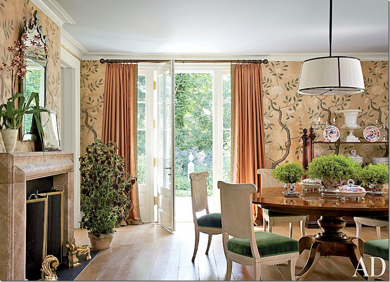
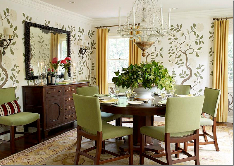
Besides Miles Redd, designer Michael Smith was also instrumental in the rising popularity of hand painted wallpaper. He frequently uses it in his dining rooms.
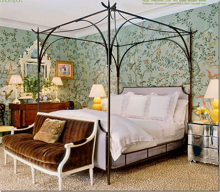
Mary McDonald is another interior designer whose use of handpainted wallpaper furthered their popularity. She recently used a beautiful blue/green based background wallpaper in her own bedroom.
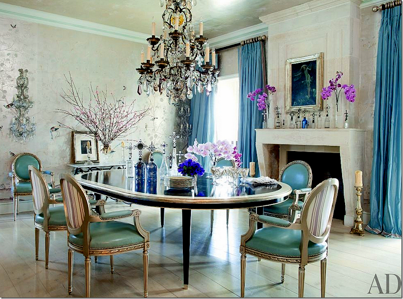
Martyn Lawrence Bullard used this ethereal handpainted paper in Ozzy Osbourne’s dining room – and throughout this house. This house was recently sold to Jessica Simpson who uses interior designer Rachel Ashwell.
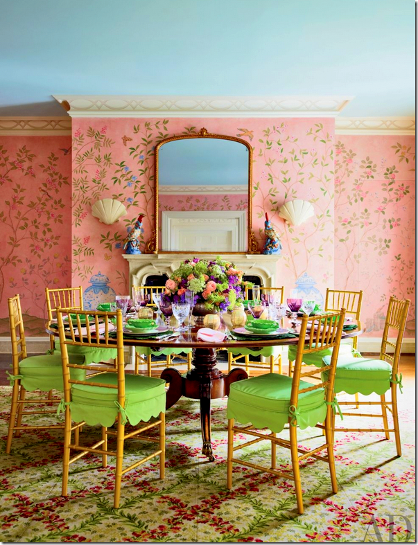
Mario Buatta used pink!!!
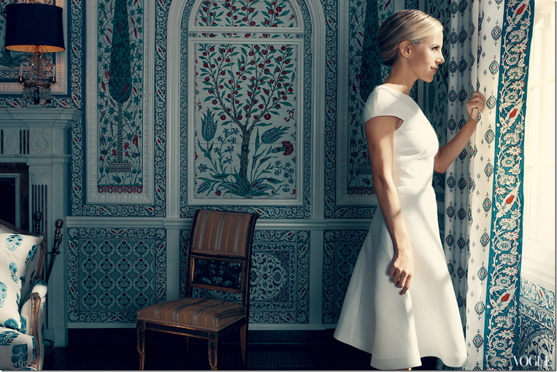
Another gorgeous example by Iksel – Tori Burch’s summer house. This company gained popularity after the owner’s NYC apartment was featured in domino magazine.
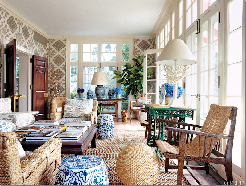
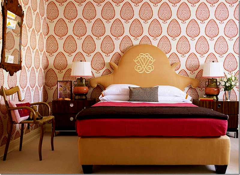
This batik style of paper is very popular today – made even more so by the popularity of the Peter Dunham fabric that it resembles.
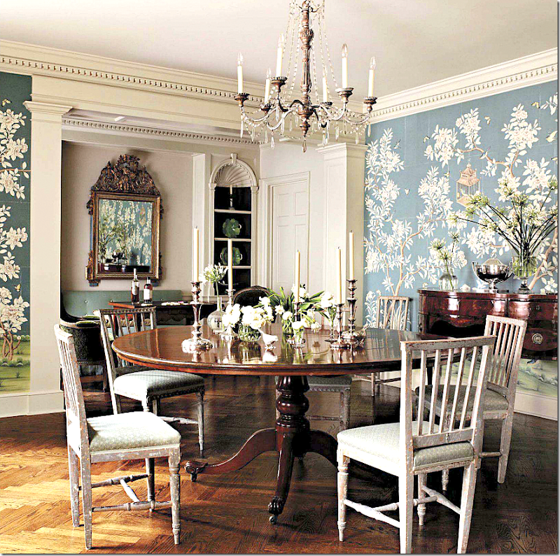
Here, Suzanne Rheinstein used Gracie handpainted wallpaper. So pretty – love the blue!
Interior Designer Mark Sikes dining room has this gorgeous blue/green based wallpaper – featured in several magazines – his house is a favorite among critics.
Close up of Sikes’ console table with blue and white porcelain.
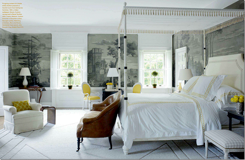
Bunny Williams used Zuber here – to create a soothing background scene in this bedroom. I love the touches of yellow.
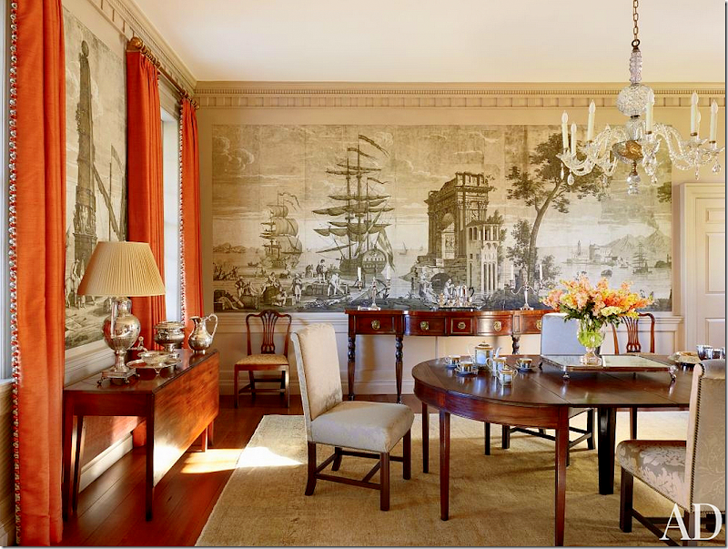
Amelia Handegan designed this dining room with a handpainted paper.
The actress Brooke Shields NYC dining room has this Zuber paper. Love it mixed with the contemporary lamps.
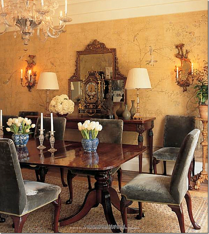
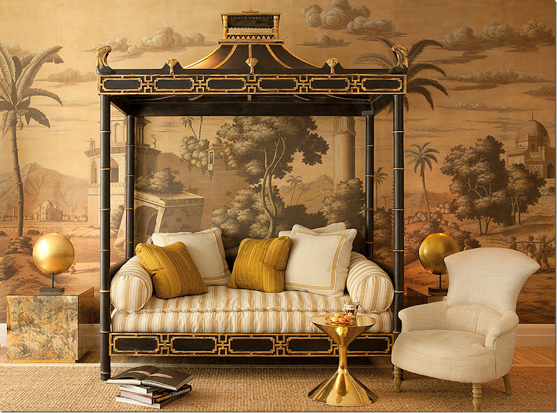
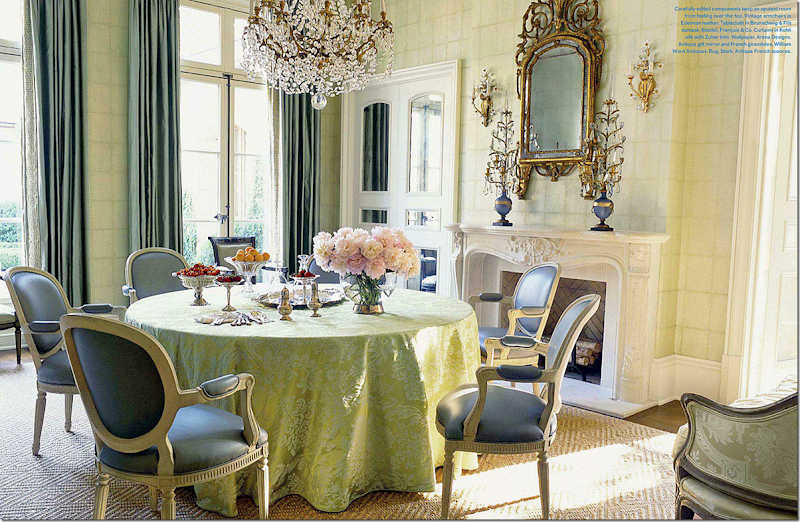
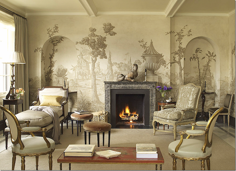
Another wallpaper scene – in golds and grays.
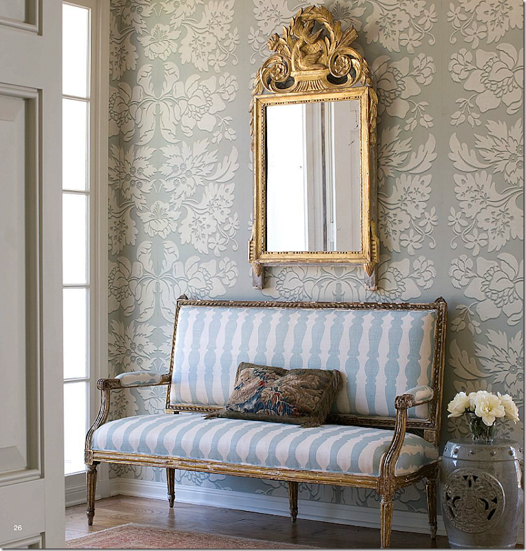
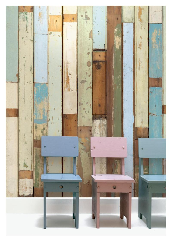
A paper by Arena – resembles stone blocks.
Miles Redd – used this classic wallpaper company – Farrow and Ball - in this bedroom.
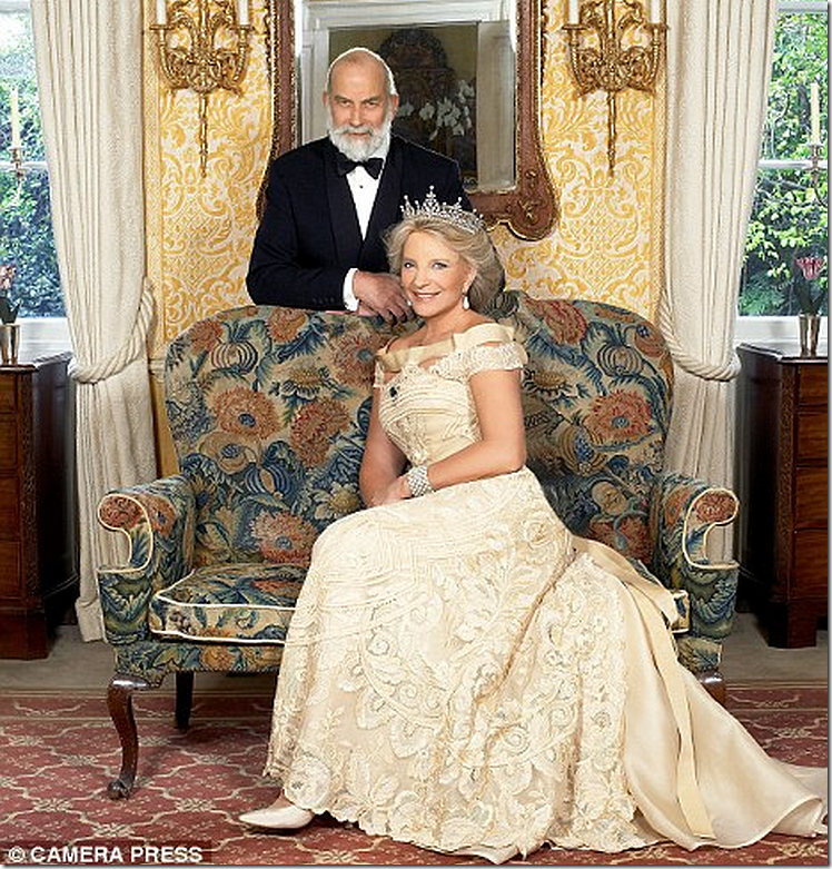
Farrow and Ball in a warm yellow was used in the Kensington Palace apartment of Prince and Princess Michael.
The singer Jessica Simpson hired Rachel Ashwell to style her Beverly Hills house to sell. The dining room was papered in Farrow and Ball.
A large scale traditionally styled paper – used by interior designer Carol Glasser. Such a beautiful color.
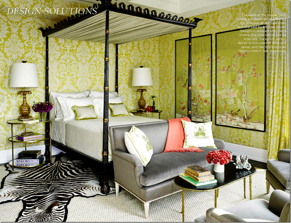
This damask paper in acid green was designed by Allesandra Branca for F. Schumacher. Love!!!
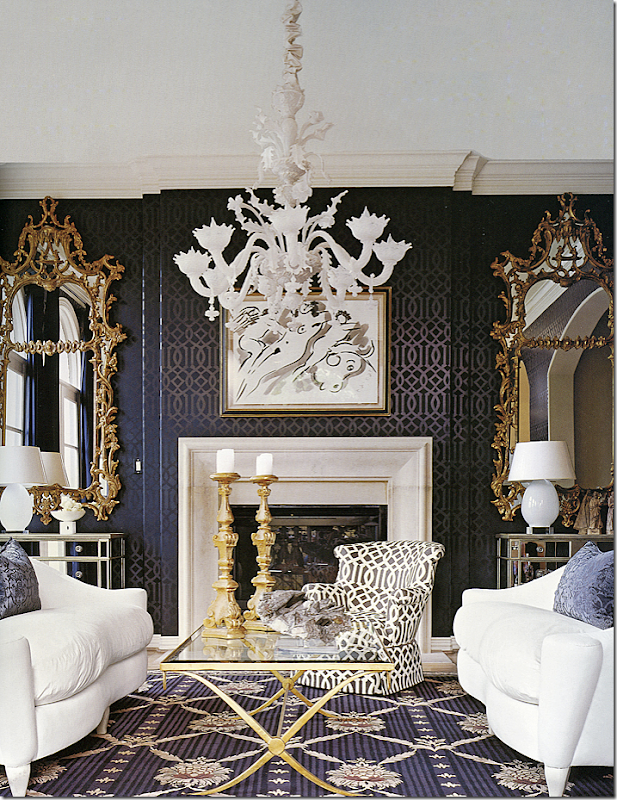
No paper was more instrumental in bringing wallpaper back in favor as F. Schumacher’s Imperial Trellis by Kelly Wearstler. Here it is in black – with the reverse print in fabric on the chair. Fabulous design by Renea Abbott.
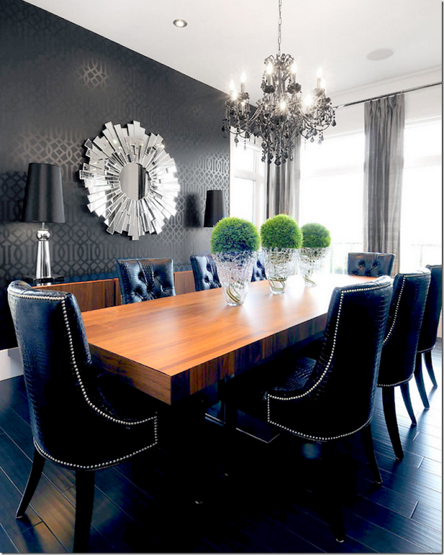
I thought this was interesting – the same wallpaper, but with none of Renea’s fabulous style. Without the contrast of the light and dark rug, the wallpaper just bleeds into the black floor. And notice the white lamps and shades in Renea’s room compared to these lamps. Same goes for Renea’s gorgeous white chandelier. This dark one vanishes. The silver mirror blends in here – whereas Renea’s gold mirrors pop. Perhaps if this designer had used these chairs in the black and white fabric or a lighter fabric, it would have been better. And the curtains? Why bother? These two rooms just shows the difference between a good interior designer and a fabulous one.
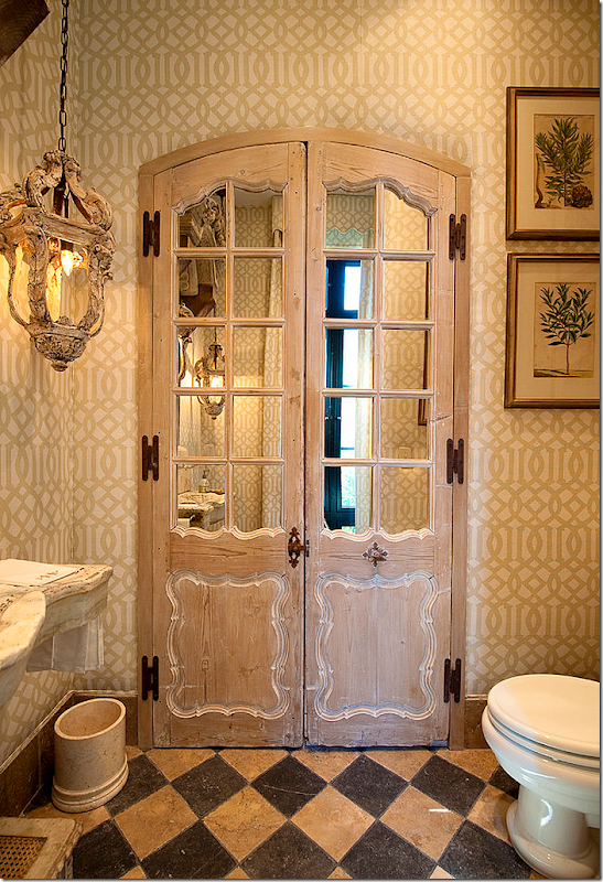
I love the trellis used here mixed with old world design. This juxtaposition just works perfectly.
Wearstler probably went crazy seeing her once edgy paper – Imperial Trellis - go mainstream. To set the wallpaper world on fire – she installed this custom colored Porter Teleo paper in her own house shown here. Naturally she set another trend.
Here, for Bravo’s Million Dollar Decorators – Jeffrey Marks’ partner used the same paper on the ceiling.
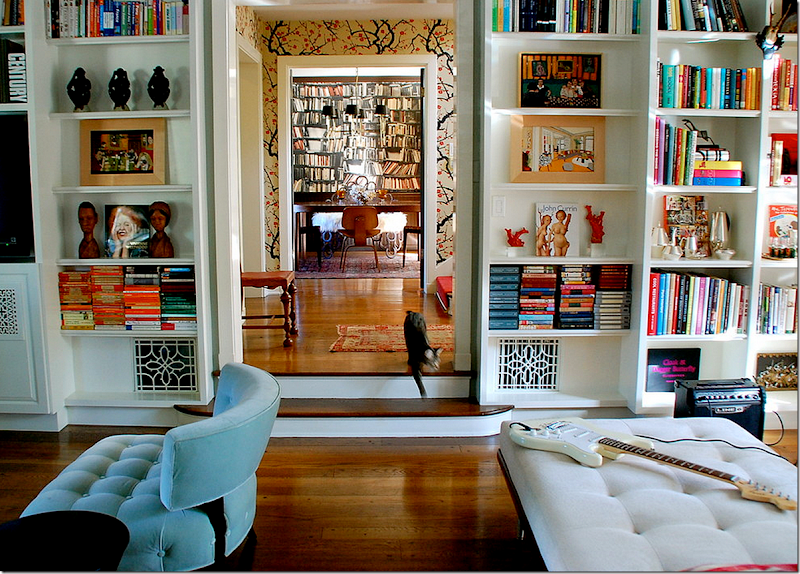
This blogger, A Bloomsbury Life – Lisa Borgnes Giramonti - chose this paper Flowering Quince by Clarence House for her own entry hall and she started an explosion. Clarence House should pay Lisa commission for each roll that is sold. Her house is in Los Feliz – Los Angeles, but you could swear it’s in the Cotswolds.
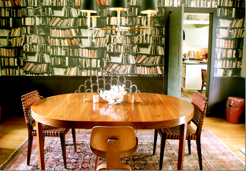
Lisa’s dining room features this fabulous custom wallpaper – faux books.
A rare view from Lisa’s family room through the entry hall to the dining room.
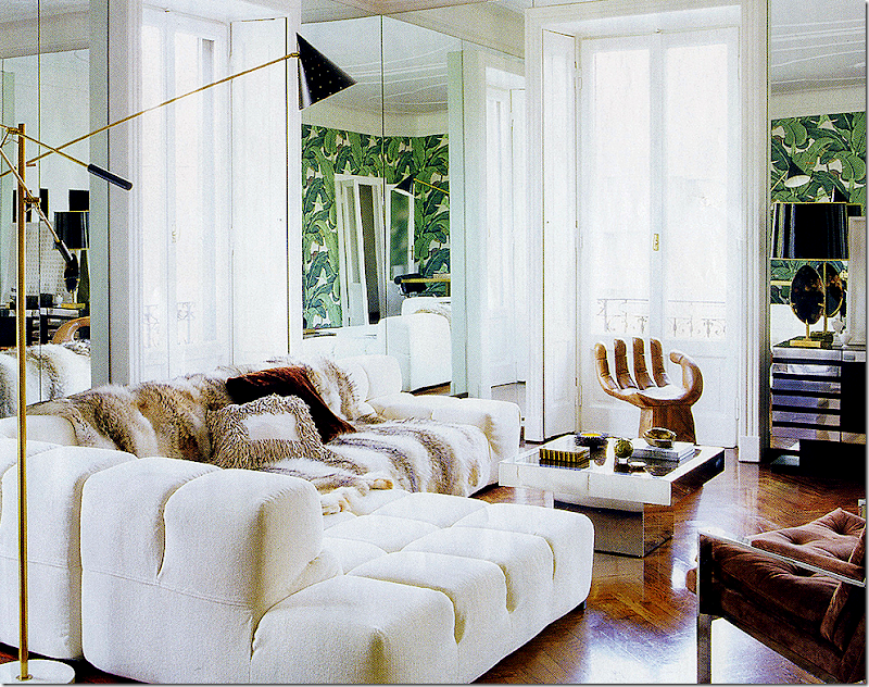
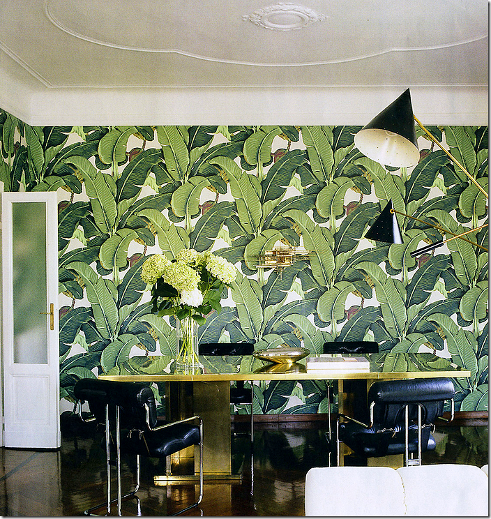
Another person who single handedly started a wallpaper trend is sweet Nate Berkus. He used the original Beverly Hills Hotel banana leaf paper in his apartment. It became so popular, it has almost become too trendy like Imperial Trellis.
The paper was placed along one back wall – enough to make a huge splash.
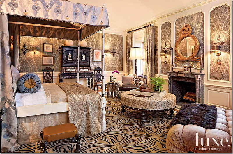
F. Schumacher paper, an oversized paisley by Martyn Lawrence Bullard. Oversized paisleys are another trend today.
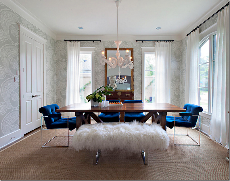
Cole and Son has seen a resurgence with their contemporary oversized paisley. Popular Houston designer Sally Wheat installed the gray version in her own dining room.
Katie Ridder has her own wallpaper company – one of her more popular designs is this oversized leaf.
The English company – Osborne and Little put out this paper which is very popular for more contemporary designs. I like how the owners mixed in the antique wood table with the modern paper.
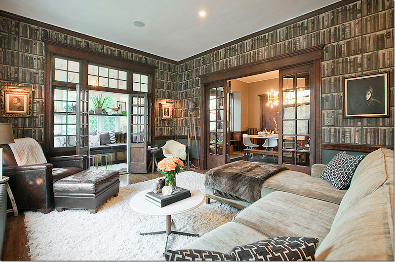
I love this faux library wallpaper. What a great way to warm up a room.
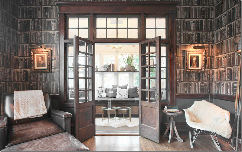
Another view of the same room.
Now – look at this room – with the same paper. Why is it cold looking and certainly not cozy? Well, instead of hanging the paper on all four walls – they left 3 white ones which just defeats the purpose of this paper. In the first room – theyi put a dark gray painted wainscot below the paper which adds to the warmth. These owners could have painted the other walls darker. In the first room, the wood floor and stained doors add more charm and coziness – wall to wall carpet is just boring, which you can see here. A patterned wall to wall carpet would have worked so much better. Or – they could have layered an accent rug over the cream wall to wall to warm it up a bit.
And when all else fails and you can’t find the perfect paper – paint instead. Is anything more beautiful than this handpainted mural in Suzanne Rheinstein’s NYC apartment? After painting the walls, the artist, Bob Christian, then painted the hardwoods.
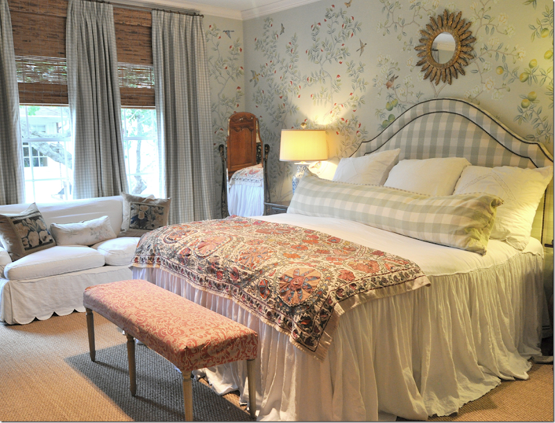
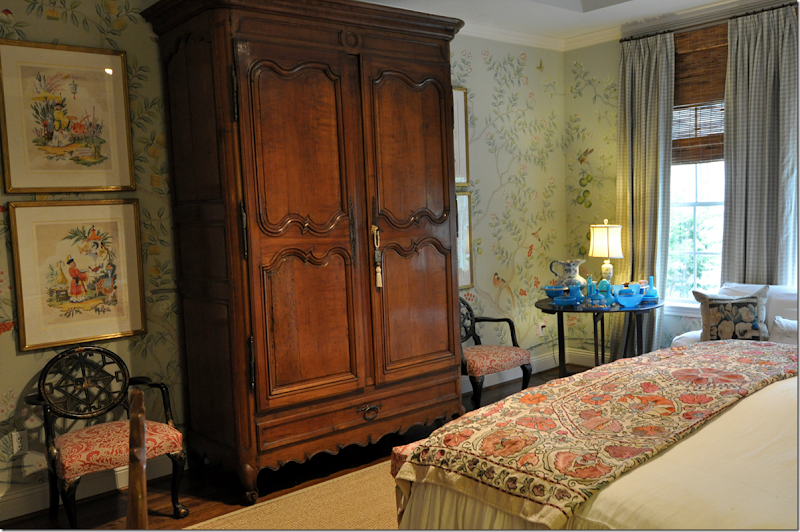
And finally, my bedroom. When we moved into our house about 20 years ago all the bathrooms and a few bedrooms were wallpapered. At that time, I favored a white background with either a stripe or a tiny print, very English, very Jane Churchill. Room by room the papers were removed until only the powder room was left papered with my favorite – Chinese Toile by Colefax and Fowler. A few years ago, Jardins en Fleurs, owner Simon Scott graciously gifted me with a bedroom full of his handpainted wallpaper! Well, I did paid for the labor at least! The change the paper made was phenomenal. It went from a ho-hum room to a wow room! I still can’t believe my good fortune to have a friend like Simon.
I do go through stages were I think I need to change the curtains to a Russian blue tafetta – maybe one day. I did recently get a new Suzani with a deep green background. The four chinoiserie prints on each side of the armoire came from Harrison Howard. I bought those from Harrison before the paper but it was like they were created with just that exact wallpaper as inspiration.
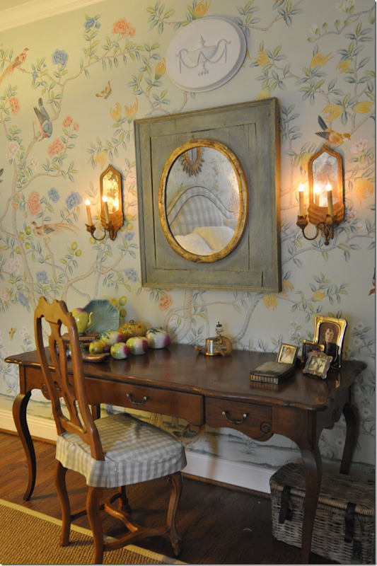
The desk against the left wall. I need to show Ben this picture! He has piled all his junk here despite my pleas to clear it off.
Where do you stand on the topic of wallpaper – yes or no? For me – in rooms with little architectural interest, wallpaper can be fabulous and a lifesaver. Offices, bedrooms, dining rooms and bathrooms are particularly well suited for paper. Even a family room can be papered as Miles Redd showed us this month in House Beautiful.
The room that started it all this week!
Below is information about the wallpaper exhibition at Houston’s Museum of Fine Arts:
Here is all the information for the show -












0 comments:
Post a Comment