Robert Pattinson and Kristen Stewart: On and off again lovers who met while starring in the Twilight movies
If you have been reading this blog for a while, you know that my worst kept secret is I am a Twi-Hard, a Twi-Mom, or a Twi-Freak – whichever you want to call it. I got desperately hooked on the series of books and movies called “Twilight” some years ago. Now that the last film is almost a year old, hopefully this interest is finally waning. Hopefully.
Besides loving the books – Twi-Hards are also obsessed with everything surrounding them, including the lives of the actors who starred in the movies - namely Rob Pattinson and Kristen Stewart – the on and off again real-time lovers. It’s truly embarrassing to admit that someone my age loves a book written for young-adults, but – what can I say - stuff happens!! Over the years, I have written a few Twilight related stories for the blog when there was an interior design element to the story, but the biggest story is this one today and I’ve been working on it for two years now. I recently completed writing a two-part story on this house and published it in a private blog for Twilight fans, to be read by invitation only. This is a condensed version of that story – about the house in Los Feliz owned by Robert Pattinson – which is now for sale.
The 1920s Los Feliz house owned by Rob Pattinson – hidden behind a white stucco wall and dense foliage.
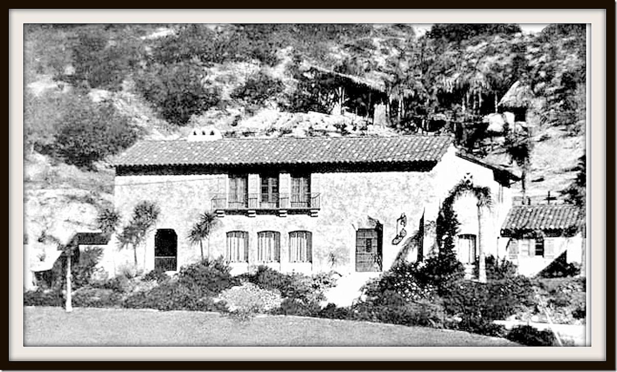
The house has remained almost unchanged for the past 90 years – which makes it all that more interesting to study.
I had hesitated to put that original, privately published story on Cote de Texas because the house is owned by actor Robert Pattinson of Twilight fame. But, since then, this Los Feliz beauty has been put up for sale and a bevy of gorgeous real estate photographs are now available on the internet. Pattinson has since moved out and his connection to the house is on paper only.
Can I say this might be one of my favorite houses ever? And, it truly isn’t my favorite just because the star crossed lovers Rob Pattinson and Kristen Stewart lived here – that is just a bonus. It’s a fabulous house, one with a wonderful history, and one that if I won the lotto tomorrow, I would pick up stakes and move to Los Angeles to live there.
It’s a long story – but well worth reading (I think!) – so get comfortable, grab a coffee, and ENJOY!
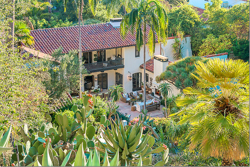
Los Feliz – the back terrace. The house is beautiful, but the grounds are even more fabulous.
Aberdeen Drive in Los Feliz, Los Angeles
As you may know, Twilight is one of the most beloved and biggest money making book series and movie franchise ever. Based on the four books written by first time author Stephenie Meyer - after she woke up from dream one morning – the five movies starred relatively unknown English actor Robert Douglas Thomas Pattinson as the eternally 17 year old vampire Edward Cullen and his lover – the clumsy human Bella Swan, played by the child star Kristen Stewart. Only in Hollywood would these two attractive young people play the parts of ill fated lovers and then actually fall in love in real life. Though the two have never publically announced their romance nor ever given an interview about it, it is common knowledge that Rob and Kristen were hopelessly in love and had dated for the past five years.
The back terrace – with the hill that raises up on the property.
Besides their attractive physical attributes, the two were soul-mates, based on the anti-Hollywood attitude they shared. Rob and Kristen are stars who eschew the plastic surgery phoniness of L.A. and instead dress and act like penniless hobos. Though both are fabulous wealthy, Rob drives a run down SUV he bought used on EBay, while Kristen’s main car is a small blue truck she’s owned forever. And though on the Red Carpet, they dress in couture Gucci and Dior, their everyday clothes are jeans, hoodies, converse, and t-shirts, preferably with holes – and lots of them.
Dressed in Gucci for the Red Carpet, Rob Pattinson – star of many movies, and owner of my favorite house!
Green eyed beauty Kristen Jaymes Stewart, his girlfriend, who lived in the house with him for a year before she bought her own Los Feliz house, after a temporary break-up.
And their everyday attire!
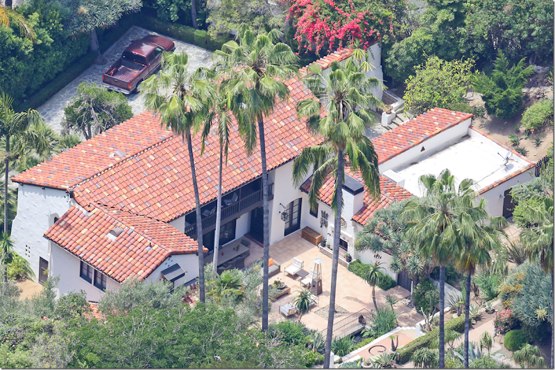
Since Rob and Kristen are so laid back and unmaterialistic, it came as a big surprise when in the summer of 2011, Rob quietly paid over six million dollars to buy a historically significant 1920s house in the trendy Los Feliz area of Los Angeles. The next day, Kristen spent over five million dollars to purchase a contemporary beach house, one row off the beach, in the equally trendy Malibu. The implication of these two purchases was clear – Rob and Kristen would live together in Rob’s Los Feliz house and vacation in Kristen’s Malibu house. Could it be any more perfect? As soon as the tabloids discovered the existence of the houses, I became intrigued with the Spanish styled Los Feliz classic. It was simply stunning. The grounds were even more fantastic. How had an upper middle class lad from England chosen so perfectly? Since the real estate transaction was private and not listed on MLS – there were no pictures of the interiors. Most images of the house came from tabloid photos taken by a paparazzi helicopter. But these photographs of the grounds were just enough to hook me in.
The house on Aberdeen in Los Feliz. Built in 1922, it was one of the first to go up in the Los Feliz area. Today, it is hidden behind lush foliage, white stucco walls and iron gates – perfect for a movie star. Kirstie Alley lives a few doors down, and numerous other stars are neighbors.
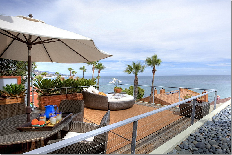
While Rob bought the house in Los Feliz, the next day, Kristen paid over 5 million for this contemporary Malibu beach house. It is being renovated and redecorated at this time.
The beach house has several decks overlooking the Pacific.
The Architect of the Los Feliz House:
The Los Feliz house that Rob bought was designed by the famous and quite prolific L.A. architect Stiles O. Clements. A flamboyant designer, his commercial projects helped shaped how L.A. looks today.
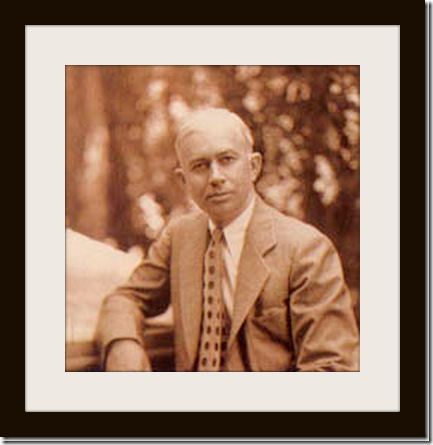
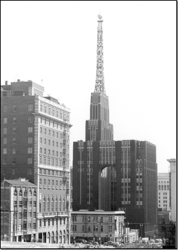
Stiles O. Clements (1883-1966) famed Los Angeles architect. Born in Maryland, Clements studied at the Ecole des Beaux-Arts in Paris. Famous for his art deco designs, he was most known as the architect of the Richfield Tower in Los Angeles.
The Richfield Oil Company – built in 1928 and demolished in 1969.
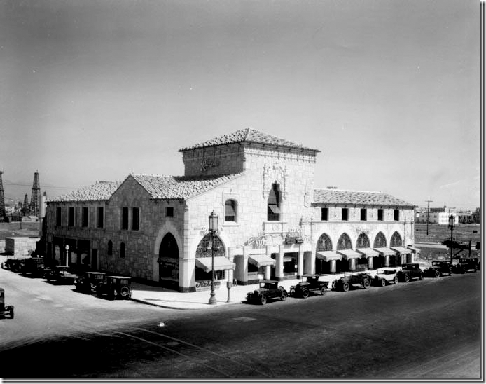
Clements was also the architect of many of the L.A.’s Ralph’s Food Markets. Shown here is the one at 5615 Wilshire Blvd where Rob Pattinson often shops today.
Rob at the Ralphs. Does he realize his own architect designed his favorite supermarket? Should we tell him? And why don’t I run into him at my Randall’s????? The most famous person I ever saw at the grocery store was Barbara Bush, the former First Lady.
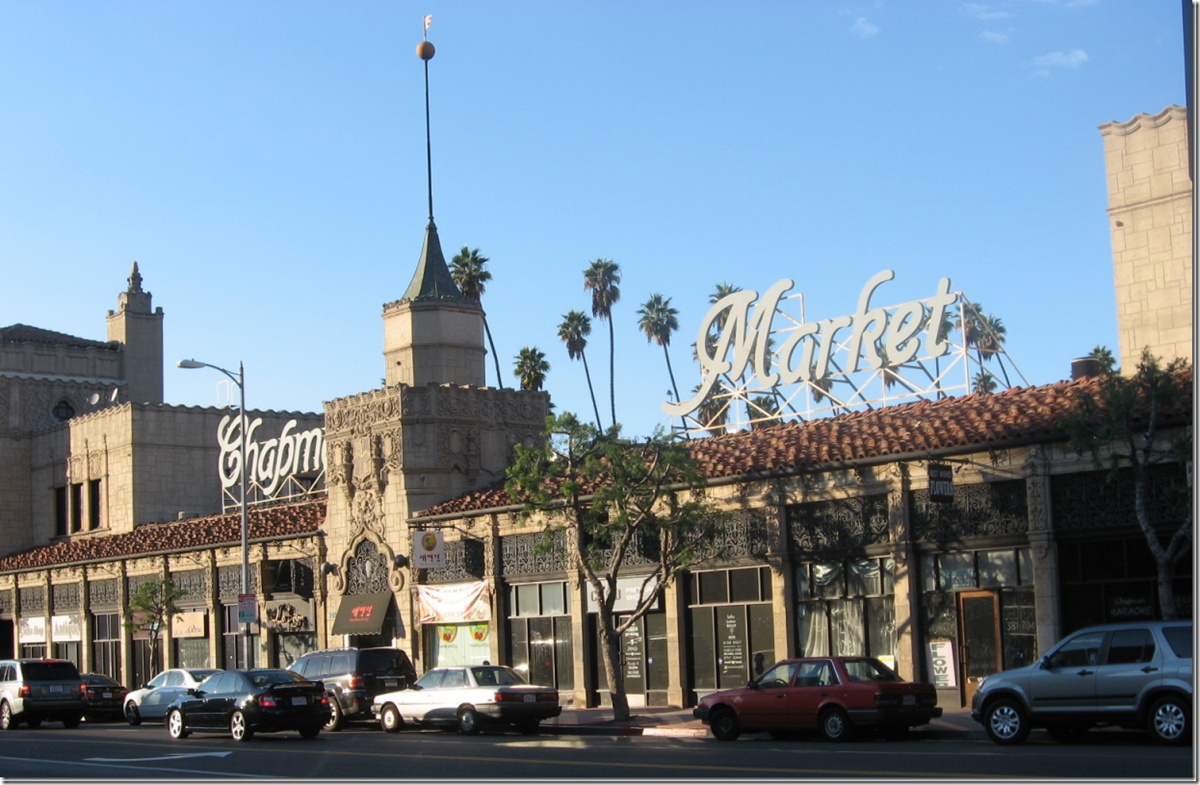
Chapman Market built in the 20s by Clements is considered the first ever shopping mall. Today it is a hip place for Korean youth to hang out at.
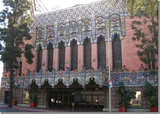
Clements is famous for designing seven movie theaters in all. Most well known are the Mayan and the El Capitan. These themed theaters were fantasies brought to life. Notice the Mayan natives in head dress at the top of the columns.
Adamson House
One of the more famous houses in Malibu was built by Clements. Construction was started in 1929 for this beach cottage owned by Merritt and Rhoda Adamson. It is located right on the beach and is listed in the National Historical Register of Historic Places. Today it is open to the public under the Malibu Historical Society. A vision of Spanish Moorish design – it is a two story house with fountains, a boathouse, greenhouse, courtyards, and extensive gardens. The Adamsons also built the Malibu Pier which their home overlooks. They owned Malibu Potteries who created the tiles that were used throughout the house and yard. In the entry, there is even a rug with fringed ends made entirely out of tiles.
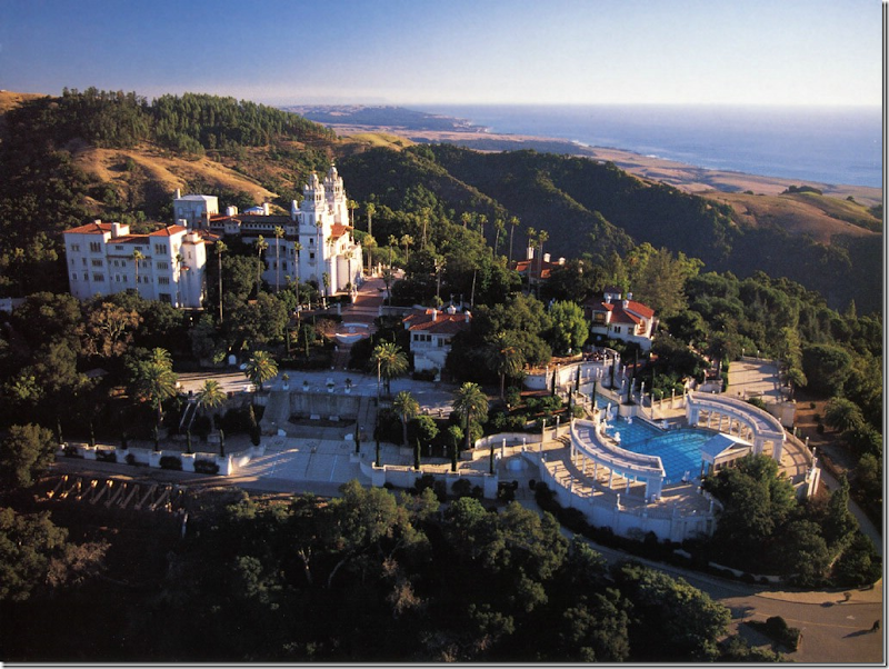
A little known fact is Clements worked with Julia Morgan as one of the architects of Hearst Castle.
The Location of The Los Feliz House
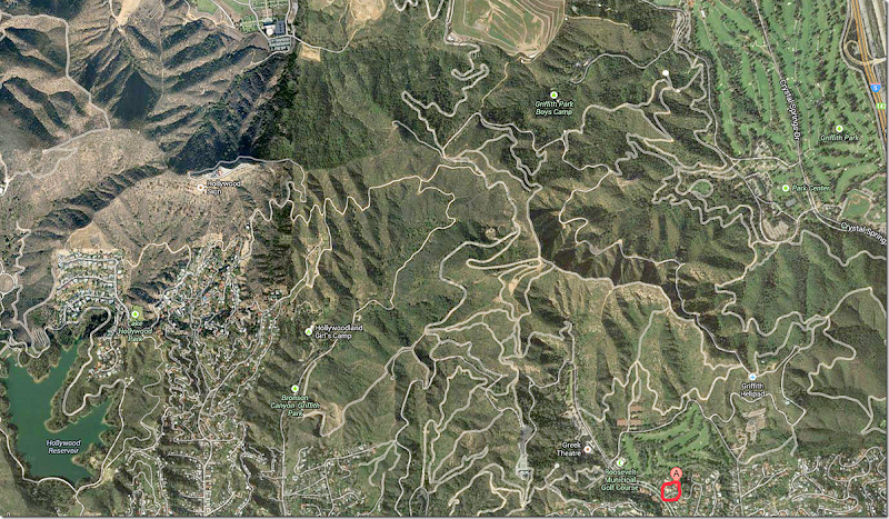
The house is located in Los Feliz, one of the older neighborhoods in Los Angeles. The back yard of the house is Griffith Park, a large sprawling complex where the Observatory, the Zoo & Botanical Gardens, and several golf courses are located. The famous “Hollywood” sign is also in Griffith Park. An interesting factoid is the famous “meadow” scene in the Twilight movie was filmed in Griffith Park – right near the real lovers’ now back yard. Do they realize this? Do they remember this? Should we remind them? Maybe they wouldn’t want to move away then!
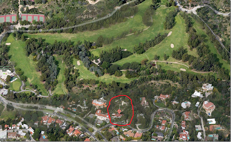
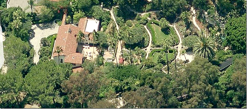
A closer view showing the Pattinson house and its large yard that borders on one of the golf courses in Griffith Park.
The History of the Los Feliz House
When word came out in the summer of 2011 that Rob had purchased a beautiful old Spanish house in Los Feliz, I didn’t think I would be impressed. That quickly changed when a few aerial photos were released. There were no recent real estate pictures because the purchase was a private sale, not listed on MLS. But, for the past two years, as my obsession with this house grew, I discovered vintage photographs from architectural magazines of the 1920s and more recent ones from magazines and books such as Architectural Digest and House and Garden. But, the most clues as to the current interior layout of the house came from Rob and Kristen’s own friends who loved to post their photos on Instagram snapped at the house during pool parties and late night get togethers. The house is now for sale and a professional stylist came in, bringing a truckload or two of furniture and accessories to completely decorate the house. Finally – a dream come true after two long years – there are now beautiful photographs of almost every room and bathroom in the house!
Still, while the new photographs are fabulous, the old photographs remain personal favorites. It is amazing to see how little the house has changed in ninety years and again, it’s a lesson in classic design – trendless decorating will last for decades.
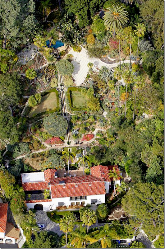
And while I became obsessed with the Spanish styled house, its gardens became an even bigger obsession. The house has the most amazing water feature – a rill – that runs down the high hill in back to the house’s patio.
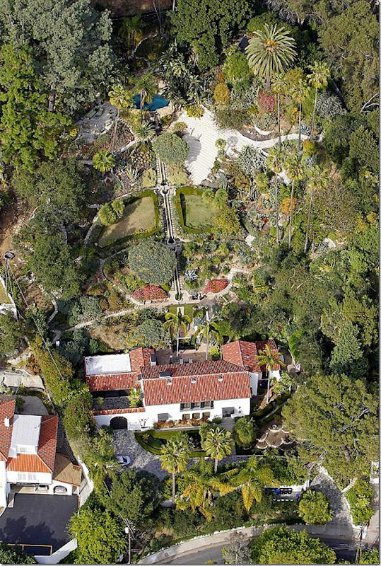
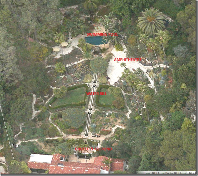
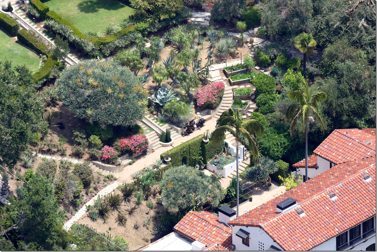
Aerial view of the house on Aberdeen. The house sits at the bottom of a tall hill which rises up from the back yard. The swimming pool sits at the top of the hill and there is a long water fall or rill that starts at the pool and empties down at the house’s back terrace. What looks like a zipper on this photo – is actually the water rill and the steps next to it that lead up the hill to the swimming pool.
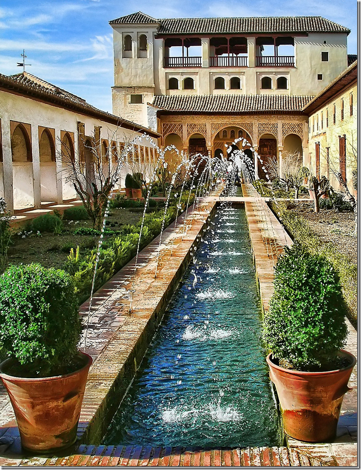
Alhambra, Adulusia
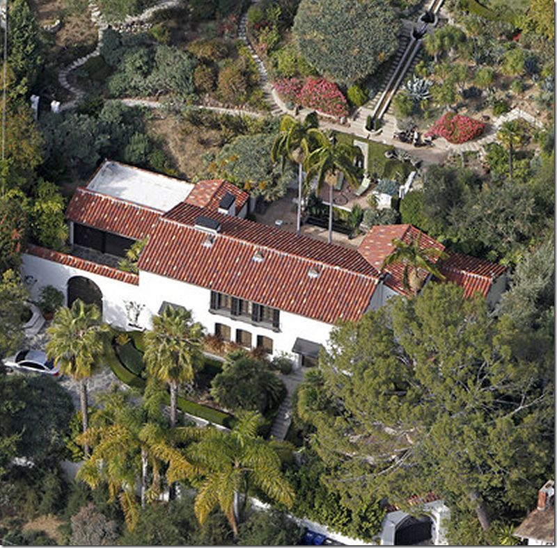
The architect, Stiles O. Clements, used the legendary Alhambra – the famous Moorish palace in Adulusia – as inspiration when designing this house and the water rill. The original owner, Charles Seyler, Jr., was a worldwide traveler who was transfixed by Alhambra’s Spanish gardens. You can see the resemblance between the main U shaped building above with its long lagoon – and the house that Clements designed below in 1922. Towards the very back of the Los Feliz property – at the top of the hill is a solar heated swimming pool with its own beach. The water cascades down the property from the pool in a long lagoon-like or rill structure that empties at the grotto, then pools in a snake shaped gulley into the koi/lily pond which is at the end of the house’s courtyard. While Alhambra’s rill is flat, Los Feliz’s rill falls down from a high point at the back of the property.
The house showing the large back gardens that are reached through a series of stone steps that meander through the garden. In the middle is the long water rill that cascades down from the swimming pool to the terrace. The total property is 1.45 acres. You can see that while the house is not exactly small it isn’t huge either by Hollywood standards, measuring up at just over 4000 sq. ft – with 3 bedrooms and baths.
The house is a U shape that wraps around a back stone patio where there is a large outdoor fireplace. On the front of the house, at the right, is the main front door that leads into the large entry hall and staircase with a black and white stone floor. To the right of the front door is an (unseen) path that leads to the kitchen – the shorter building on the very right side of the house.
The main section of the house is one room deep and one room wide. Downstairs is the living room – flanked by the entry/stairhall and dining room/kitchen on one side and the study/library/garage on the other side. Upstairs above the living room is the master bedroom which has 3 windows that look out at the front yard and three French doors and a balcony that overlooks the back patio and gardens. Above the dining room is the guest room. The third bedroom is on the first floor off the back porch and garage. Notice at the very right is an outbuilding with the large black doors. The real estate brochure mentions a separate staff quarters – is this it? This building stands off the kitchen and the dining room’s private patio. From this view – you can see the path that leads from the front door to the right side of the house.
Actor Tim Curry and the Los Feliz House:
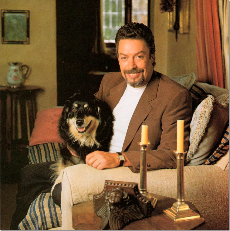
Tim Curry, most famous for his role in the movie The Rocky Horror Picture Show, shown here in the Los Feliz living room, 1998. Curry saved the Los Feliz house from the wrecking ball and totally renovated it inside and out.
While Rob Pattinson is very private and never invited photographers or writers into his home, a former owner, the English actor Tim Curry, was quite the opposite. He had a love affair with the house which he renovated and was very proud of it. He gave many interviews and from those much information was gleaned about the house.
The day that actor Tim Curry first toured the then abandoned house, the city had a permit to tear it down. Curry was with a friend who said it was her favorite house in L.A. Hearing this, he bowed to peer pressure and cried – “Sold” – the minute he saw the house, only to next have a massive panic attack. The once extensive gardens had fallen into total disrepair – weeds had overtaken the beds and wild animals roamed freely. Curry knew the restoration job was going to be enormous and very expensive.
Curry spent six months excavating over 40 tons of debris from the garden, removing the carcass of a deer and numerous live animals. Hidden underneath all the dirt were the original garden paths and beds. Only a few palms, along with original dragon trees, were still thriving in the wasted landscape. He planted over 100 camellias alone to grow around the swimming pool, and, on the walls next to the grotto, he planted climbing roses. Along the rill and near the amphitheater, he put in lavender, irises, and succulents. Curry loves gardening, so restoring the property was second nature to him. He did say that climbing up the hill in the dark with a flashlight wasn’t easy, but the night blooming, heavily scented jasmine made the effort worth it.
Besides the garden, Curry was also infatuated with the interiors as he is quite a lover of good design. His favorite house is the Guinness estate on the River Liffey in Dublin. Curry favors sun faded fabrics and oak furniture – and he likes things to have an aged look. What better place to showcase patina than in a house built in 1922? Most interesting is that when Curry moved into the house he contacted the original owner’s niece who shared pictures of the house taken in the 1920s.
Surprisingly, after all his hard work restoring the estate inside and out – Curry put the Los Feliz house on the market after living there for only seven years. He moved to another house in the area on Nottingham – which he bought from actor David Hyde Pierce and then sold just four years later to another actor, Colin Farrell.
Rob Pattinson’s house on Aberdeen has changed hands often in the past two decades: Curry bought the estate for just $650,000 and then sold it to Kareem Abdul Jabbar for $3,325,000., who sold it to actor Noah Wyle for $2,600,000., who then sold it to the Oscar winning cinematographer Robert Richardson, who next sold it to the Australian director of Legally Blonde, Robert Luketic, for $5,250,000., who sold it to a trust held by Nicholas Frenkel, Pattinson’s manager for $6,275,000. There is some discrepancy in the records about how much Richardson paid for the house and whether Wyle sold it to Jabbar or whether Jabbar sold it to Wyle and whether there was another unknown owner during those years. The house is now on the market for $6,750,000 – a wash for Pattinson since he has spent so much on upkeep and renovation these past two years.
The former owners – Tim Curry, Robert Richardson, and Noah Wyle all went on to live in other architecturally significant houses. Wyle moved to a well known Paul Williams house and then bought Bo Derek’s ranch in Ojai. After selling the Los Feliz house, Richardson totally renovated the house that famous ranch style architect Cliff May lived in until his death.
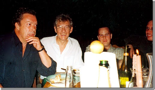
A recent photograph shows actor Tim Curry on the left and at the very right Bill Condon – director of Twilight’s Breaking Dawn I and II movies with his partner Jack Morrissey.
What is interesting to think about is that when Rob Pattinson bought this house, he was working with director Bill Condon, filming the last two Twilight movies “Breaking Dawn” Parts 1 and 2. Bill Condon was also the director of Kinsey, which starred Tim Curry and the two have remained friends. Did Tim Curry tell Bill Condon that his former house in Los Feliz was up for sale again? And did Condon then pass on this information to Rob? Condon has a love of architecture and surely knows about Curry’s love of this house, so was Condon the one who encouraged Rob to buy it, or at least to look at it – knowing personally what an architectural gem it was? And even more fun to think about, did Curry ever come over to visit the house again, once Rob had moved in – with Condon or without? Recently on Twitter, Condon’s partner Jack confirmed to me that Condon actually did play a part in Rob finding Curry’s former house!
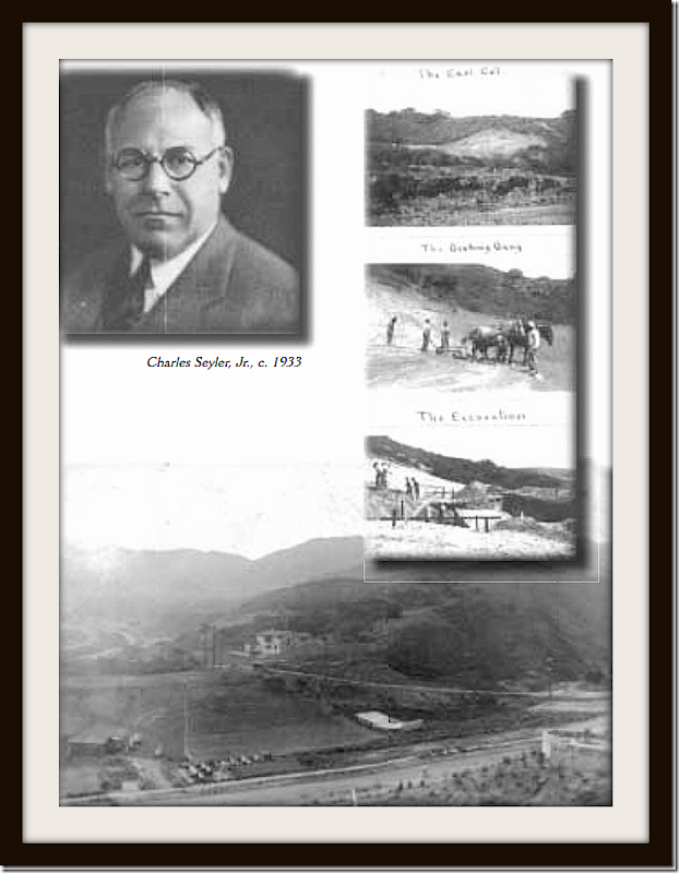
The Original Owner: Charles Seyler, Jr.
1922: These photos are not very clear and are hard to make out – but they show the house being built – using horses to excavate the hill. You can see the hill that rises at the end of the property. Today Griffith Park is located behind that hill. In the last photograph on the left bottom side – you can see the line of tents where the construction workers actually lived. Pictured is the original owner – Charles Seyler, Jr. It was his love of Alhambra from which the garden design was taken.
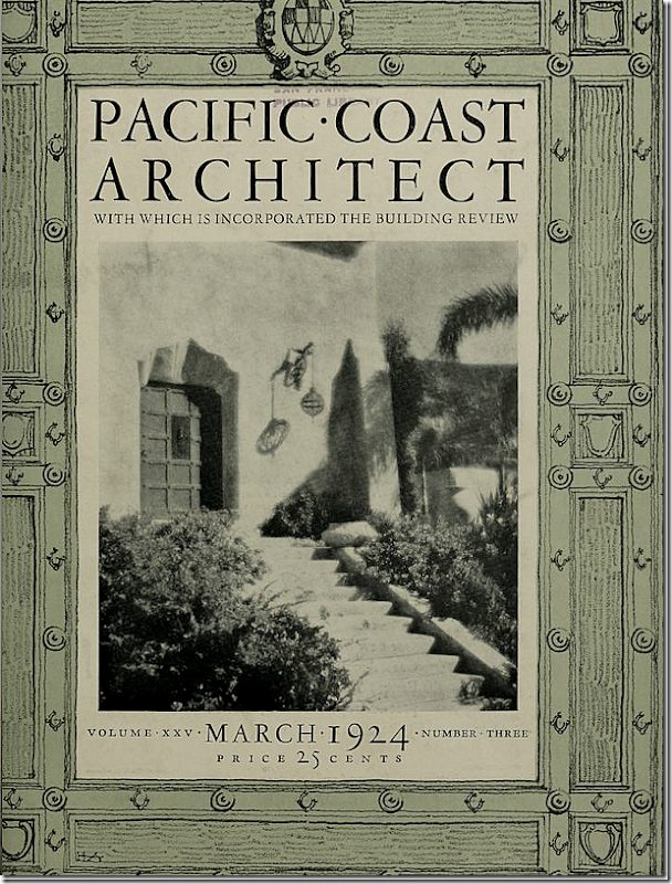
In 1924, the house was featured in Pacific Coast Architect, a highly respected journal of its time. The front cover shows the stone steps that lead to the wooden front door. Also you can clearly see the hanging lantern to the right of the front door. That fixture is still hanging there today!
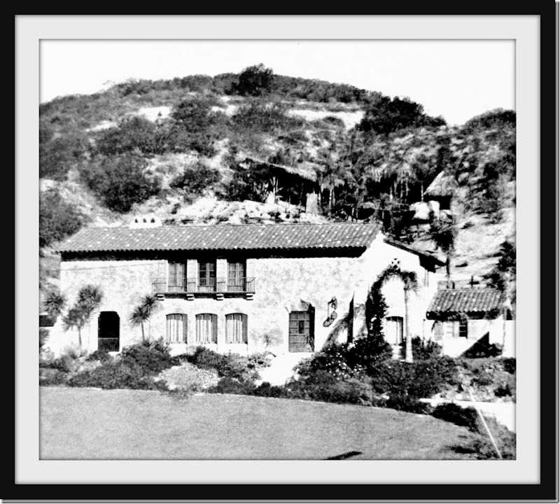
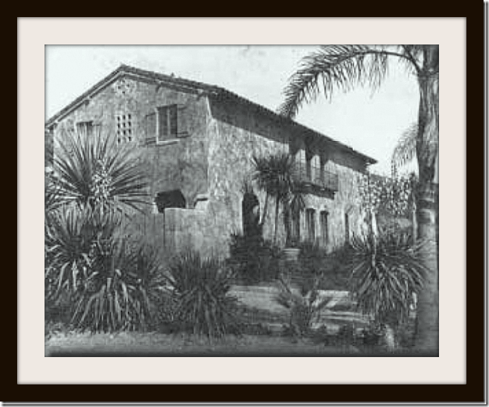
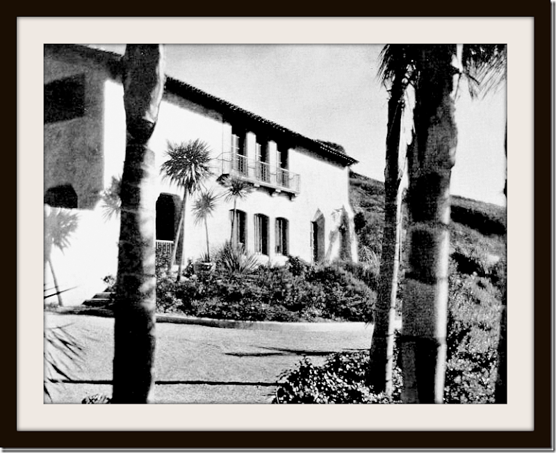
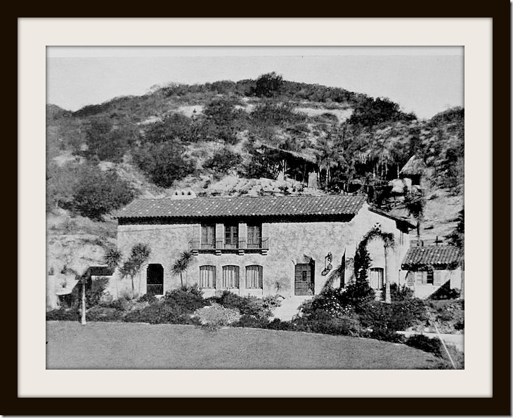
1924: The façade. To the very left of the house is the then open air Loggia. At some later date, the loggia was closed off with a window, becoming another room inside the house. And to the very, very right with the low tiled roof is the kitchen, which back then was actually a maid’s room.
1992: The façade - showing the wood gate that leads to the carport on the left side of the house. The gate was later replaced when the garage was extended to 3 bays. Most of the interior today remains exactly as it was back in 1922 except for the kitchen area which once was 1/2 kitchen and 1/2 maid’s room. The size of the house is the same as it was when it was built; thankfully, the house was never enlarged. Inside, the living room ceiling’s hand carved, stenciled beams remain, as do the iron sconces, the tile and wood floors, the doors, the windows, and the stucco arches. The main changes today are the recently updated kitchen and bathrooms, completed by former owner Robert Luketic. Rob also has done some renovating. Stories of an in-house recording studio made the tabloids – but those have proven to be false.
1924: At the very left, you can see how the loggia was once open to the elements with a short gate blocking the large arched opening. That short iron gate was later replaced with a window, making the loggia a part of the inside of the house.
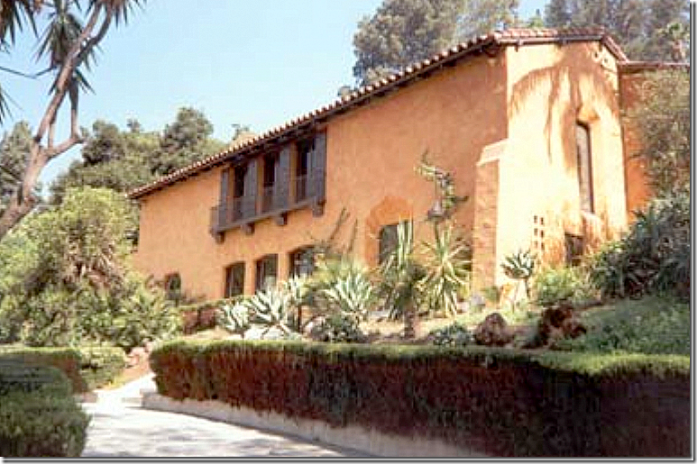
2004: The house shown painted ochre, as it once was before it was recently painted white.
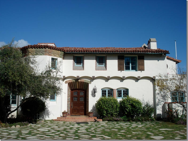
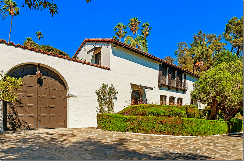
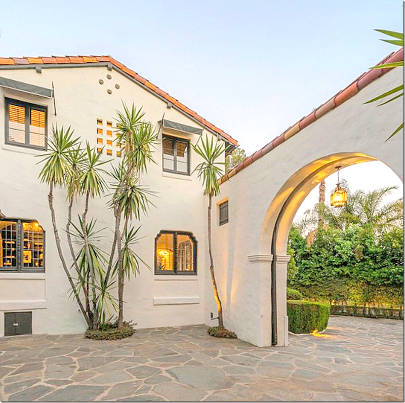
2012: Here, you can see the beautiful original flagstone drive. The main changes in the façade are the wood shutters were removed and black awnings were added. Also, the gate leading to the garage was changed. As you can see, today there is a stucco wall leading to the garage with a tiled roof, just like the house. Also, there are a few new doors: the kitchen now has a door that leads to the back patio, whereas before it didn’t. Additionally, there is a small outbuilding that sits to the right of the house, just outside the kitchen. The biggest change to the façade, though, is the color of the house. In the beginning it looks like it was the color of the stucco. Later, it was tomato red when Tim Curry bought it. He painted the house ochre, which it remained for over 10 years until it was painted a beautiful white – as it always should have been!
With the door leading the garage court closed.
The garage court: Notice the pierced stucco window on the top floor between the two paned windows. There are several of these odd windows in the house that add great charm. And notice the small black door at the very bottom. Does this lead to basement and the hidden wine cellar? Not sure!!!!
THE FRONT GATE:
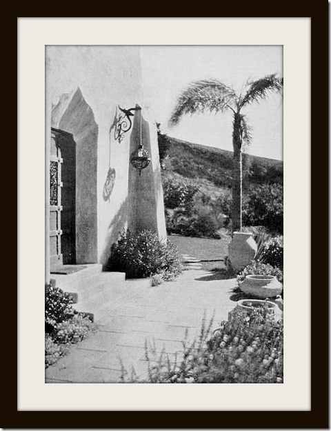
1922: The front gate with the lantern – looks remarkably exactly the same over 90 years later!!
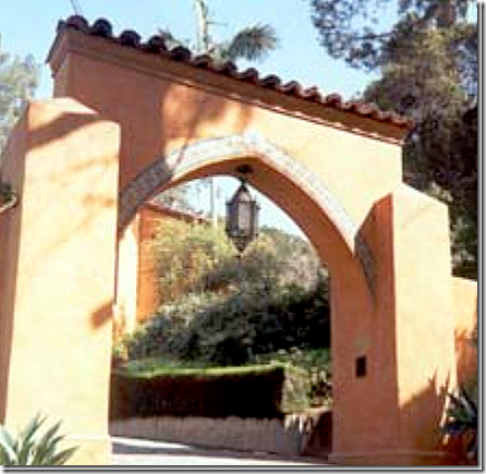
2004: Painted ochre.
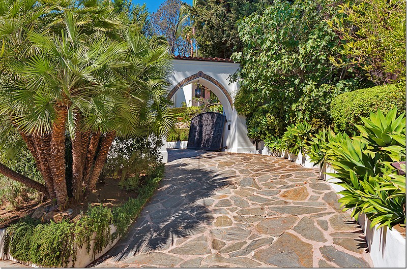
2013: The beautiful gate – notice the iron work on it! Along the arch is a tiled border. The beautiful original lantern hangs from the arch, which has its own tiled roof.
Today – the front entrance with the gate open. One of the main reasons why it is believed that Pattinson is selling the house is because it isn’t in a gated community. The driveway is right off the street and the paparazzi hang around his house waiting for him or Kristen to drive away – and they then follow them around L.A. all day and night. Now that both Rob and Kristen each live in gated communities, there aren’t quite as many photographs of them taken.
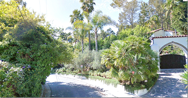
Today: And from the street, Aberdeen. The street is very narrow, barely enough room for two cars to cross at the same time. Here you can the house is no longer visible from the street except for the upper level behind the gate. This lack of privacy from the paparazzi, who waited by Rob’s house in order to follow him around town, is cited as the reason why he is moving from this gorgeous house.
THE BACK TERRACE:
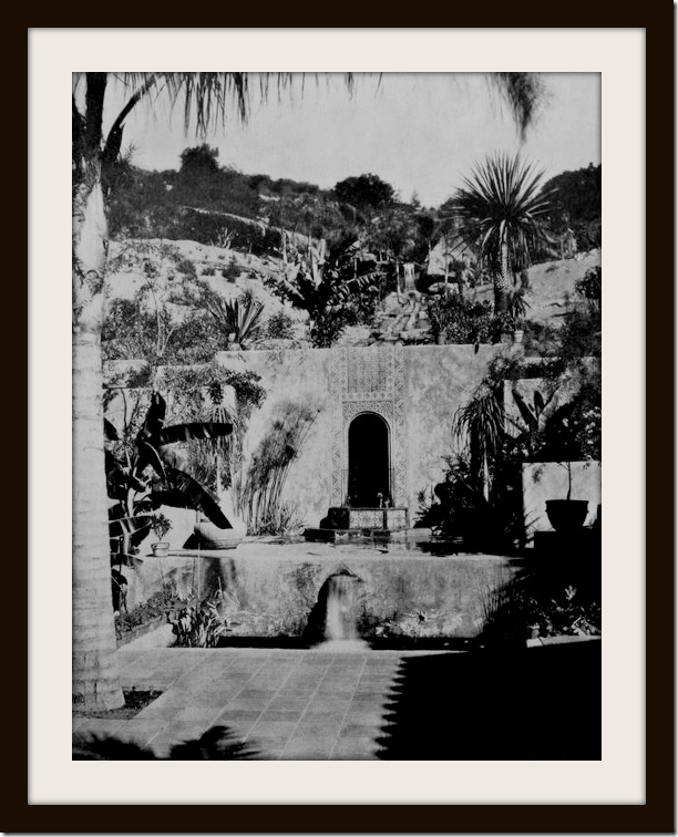
There are many pictures of the house from when it was first built in the early 20s. The house was published in several publications back then, and again, in the 90s when Tim Curry owned it. These photographs, both from the interior and the exterior are wonderful to compare “before and after.”
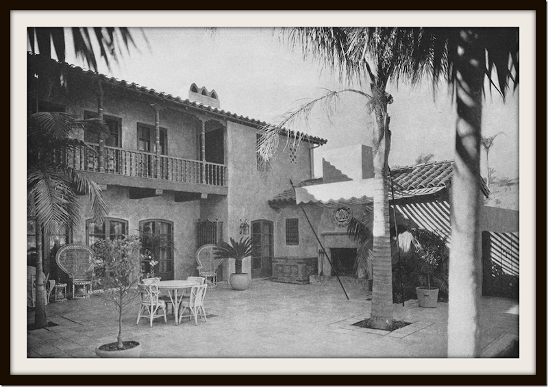
From 1922. The back patio was originally paved with stone. The dining room is on the left wing where the French doors are. Next to the dining room, on the left, is the kitchen, the smaller building with the lean-to roof. Today, there is a French door where the kitchen opens to the patio – but back then, you can see there was no door. That original palm tree remains today.
1924: notice the large awning placed next to the fireplace! That was a total surprise to see. Love the Addams Family type wicker chairs.
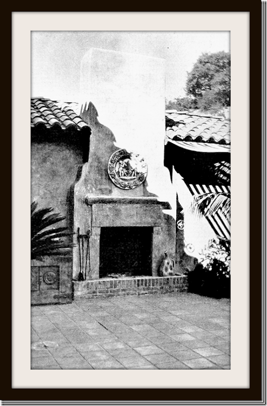
1924: The original outdoor fireplace before the tiles were installed on the hearth.
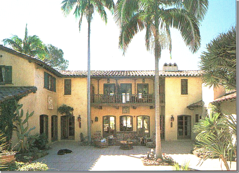
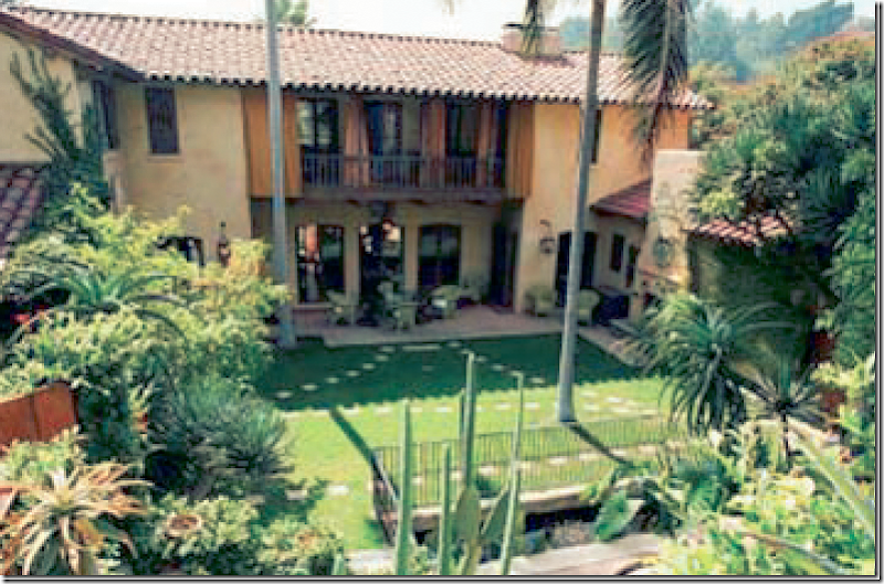
1998a: From Architectural Digest: The back patio. The façade is shown here with a warm Tuscany yellow – it was painted this color by then owner Tim Curry. The house was painted tomato red when he bought it. Amazingly the house has never been enlarged – which is so wonderful. The floor plan remains almost the same except, for the loggia (which was enclosed) and the kitchen (which was remodeled.) Through the center three French doors is the living room. Above it is the main bedroom with its own balcony and three French doors. Both the living room and master bedroom have windows on the front side and the back side of the house to allow for cross breezes to flow throughout, cooling the house naturally. On the left side above the dining room is the second bedroom. The French door at the left corner leads into the entry/stair hall. At the far right is the French door that leads into the study with its hidden speakeasy. Tim Curry said he spent 75% of the year out on this porch.
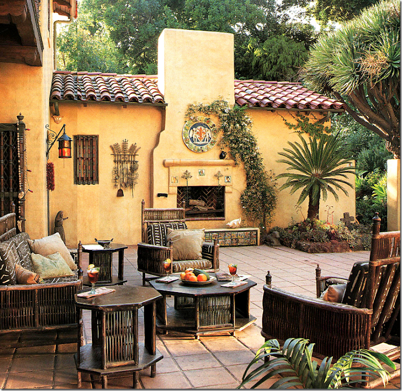
1998: Architectural Digest – this shows the back terrace decorated by Tim Curry. Curry is English and he loves the English Country House aesthetic. You can see how he extends that vibe to the outside. Instead of buying “proper” outdoor furniture – he chose authentic wicker pieces from 1900’s Arts and Crafts Period. Amazing. Notice the beautiful original pavers on the terrace. These were removed by a later owner and replaced with GRASS!!!! Another owner later replaced the grass with tiles – but the tiles are now new – and lack the beautiful patina of these original ones. Shame!
Notice the tiled bench on the fireplace – these tell the story of Don Quixote and was placed there by the original owners. The room behind the fireplace was the chauffeur’s room – which was reached only by a “secret” panel in the study that hid the door. Today this is the guest bedroom.
2004: From Noah Wyle’s real estate brochure. Here you can see the new owners had placed grass over the courtyard! Such a mistake!!!! Thankfully, the stone pavers have since been replaced – but the pavers are new, not the original ones.
Here you can also see the lily pond with a newly installed iron gate around it. The waterfall from the swimming pool cascades down the hill along the rill, all the way down to the grotto and then ends in this koi/lily pond. Notice these owners had placed orange curtains on the outside of the upper balcony.
I suppose that actor Noah Wyle had the grass put down to create a playground for his young children. Lesson: don’t mess with perfection!!! Once the new owners moved in – they replaced the grass with new tiles – making this is a large, paved courtyard again. The problem is – the tiles are brand new and they are missing the patina that they had before. This was a real travesty that was allowed to happen here. Too bad there aren’t restrictions on houses of this age that would have prevented replacing the old tiles with grass.
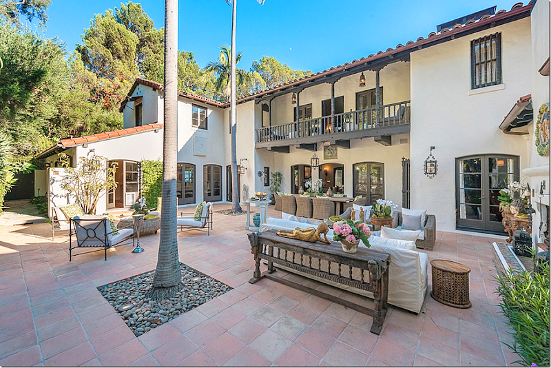
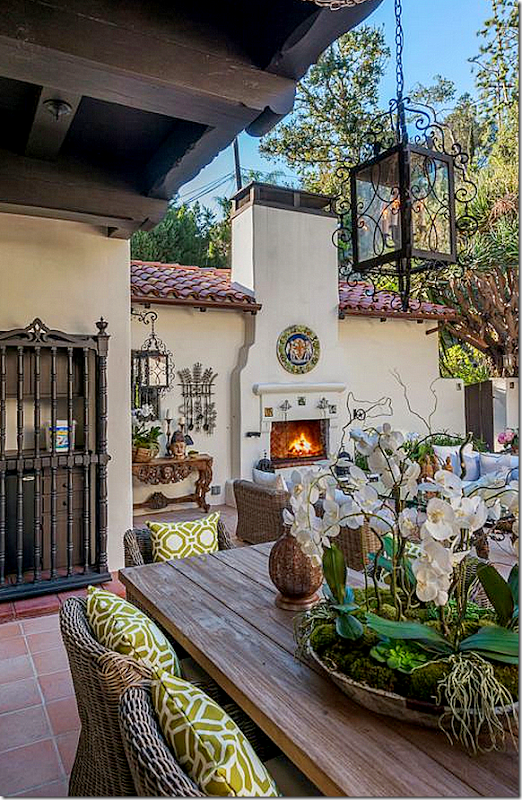
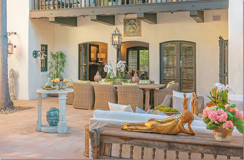
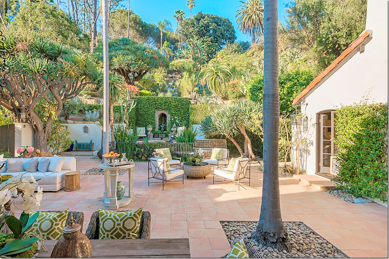
2013: AND today – the back terrace! Now, understand this. When Rob put the house up for sale, he had already been moved out for months. Apparently he is now renting a house in Beverly Hills – in a gated community – and rumors are he has already bought another house that is being renovated. In order to get this house ready for the sale, he hired a stylist who completely decorated the house – which apparently had never been done. Some of the patio furniture here (the Kooboo chairs and the black iron chairs and table) was left here by the former owner – Legally Blonde director Robert Luketic. I suppose Rob is leaving the furniture here for the next owner too.
Isn’t this lovely though – all decorated like an inside room? When Rob lived here, there were countless parties on the terrace with his and Kristen’s friends.
And notice the new tiles that replaced the grass which was put down during actor Noah Wyle’s stay, the new tiles don’t have any of the patina that the original ones would have had. A real shame! Compare the way these tiles look to how they looked during the time that Tim Curry lived here.
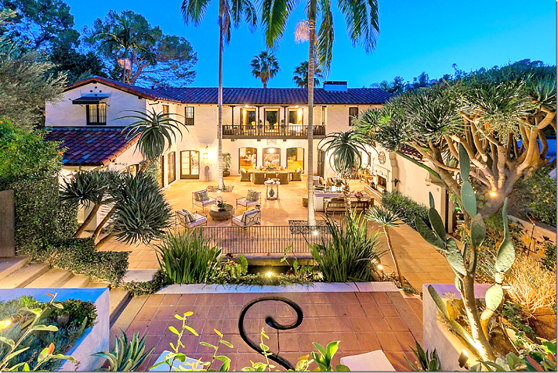
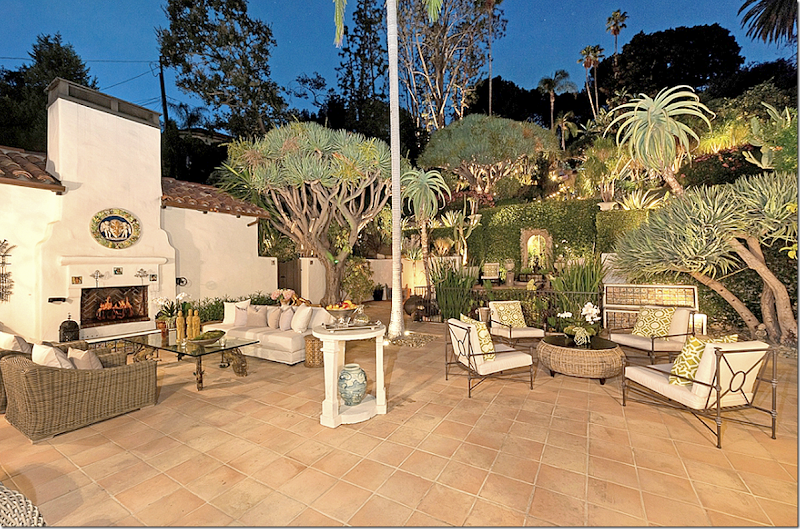
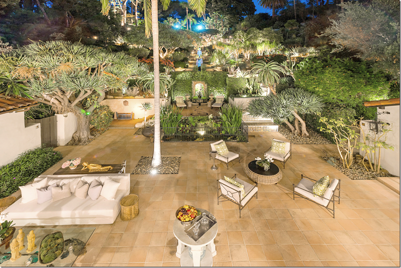
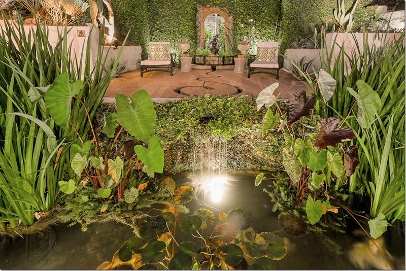
The night view of the back terrace, including the upper terrace with the snake shaped gully and the koi pond.
The kitchen is at the very left with a small hidden garden behind it. Next is the dining room. The entry is in the corner. Above is the guest room and the master bedroom is where the balcony is. To the very right is the study.
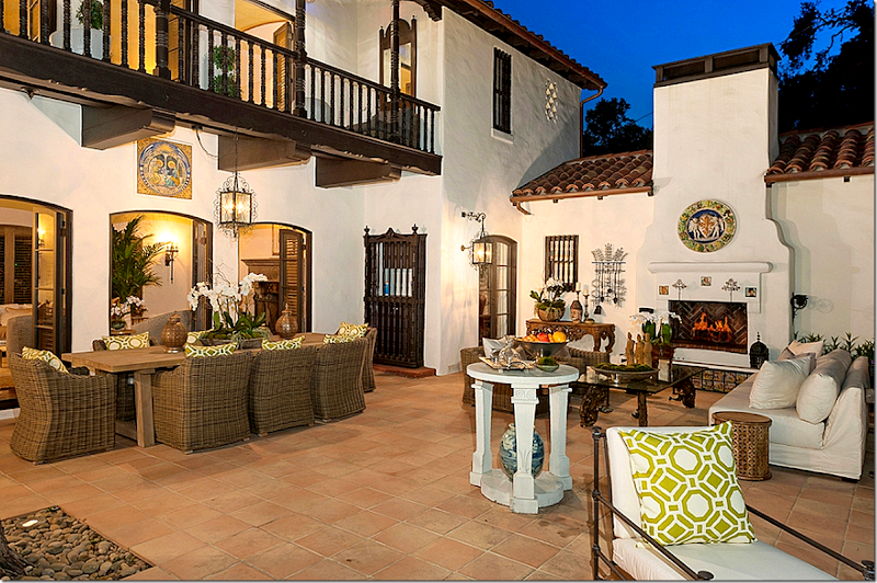
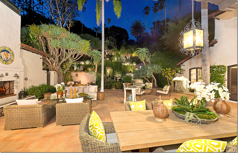
I love the way this outdoor room is decorated – with the sofa and chairs nearby the fire for cold nights. Although the weather in L.A. is wonderful, nights can be chilly year round due to the cold Pacific Ocean acting like a huge air conditioner. Be sure to notice all the hanging lanterns which are original to the 1922 house.
Notice the original bar – behind the carved door.
The large tile above the middle French door is also original to the house.
The terrace at night – this view faces the upper garden. You can see the grotto in the back wall that empties into the koi pond from the swimming pool.
2012: Here is how Rob Pattinson’s terrace was furnished. Not nearly as stylish at all!!
He had a wicker section that was pulled apart – and at some point – someone bought new orange pillows to freshen it all up.
The Koi Pond and The Grotto:
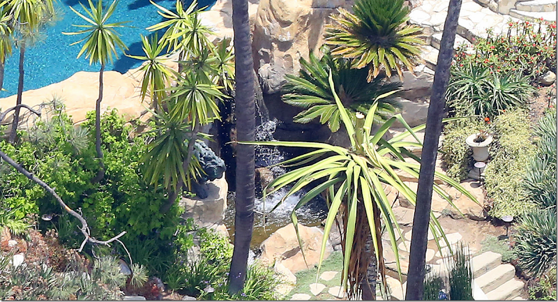
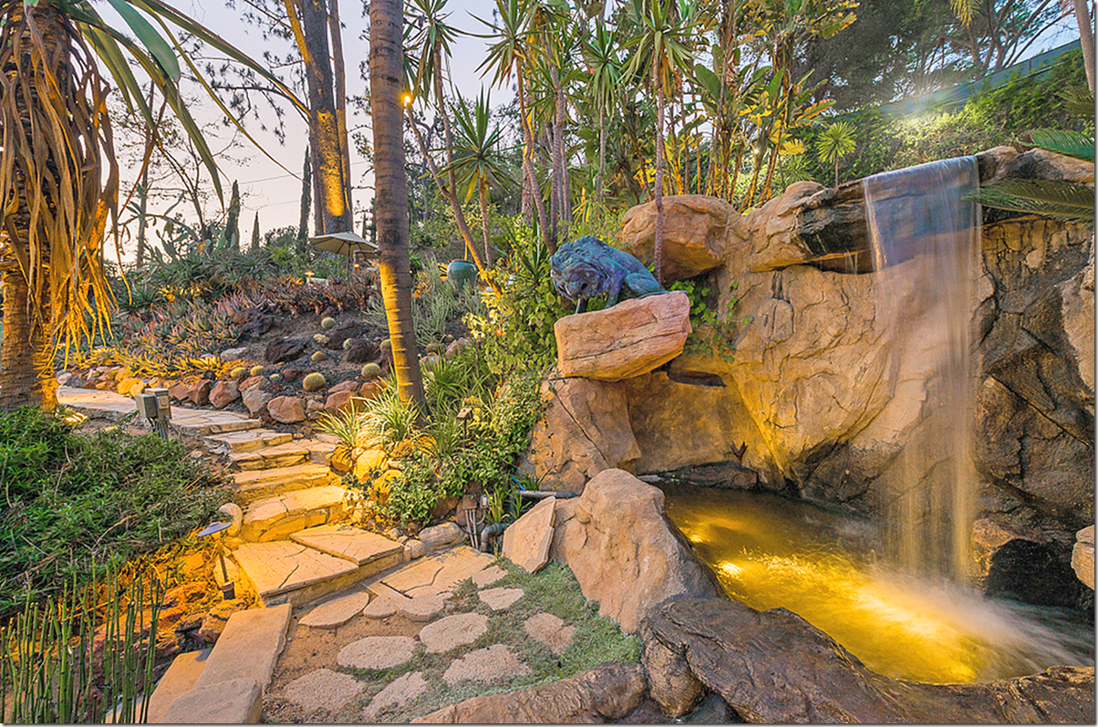
To fully understand the water rill/grotto/koi pond system – in this picture - you can see the swimming pool at the very top of the hill. Now, realize this hill is quite tall – it is quite a hike up the swimming pool. What looks like teeth or a zipper or actually stairs. Starting at the top with the swimming pool is a stone waterfall. From the waterfall, the water cascades down the middle of the steps – along the rill. At the end of the steps – the water falls into a grotto. The grotto is elevated at the back of the terrace. After the water leaves the grotto, it enters a snake shaped gully into another waterfall that pours into the koi/lily pond at the end of the terrace!
TO UNDERSTAND EASIER, LOOK:
The water leaves the swimming pool through a waterfall, flows down the rill, ends at the grotto, pulls into the snake shaped gully and finally pours out of another waterfall into the koi pond.
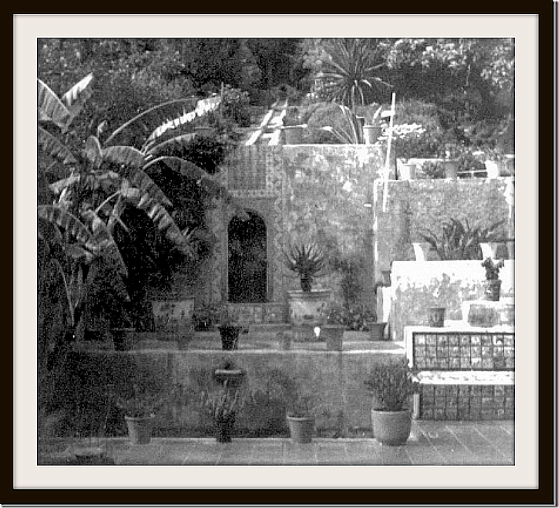
1922: An early photograph showing the rill and the grotto, then the water emptying into the koi pond. There is no iron gate around the pond at this point. Notice the bench made out of tiles at the right of the pond.
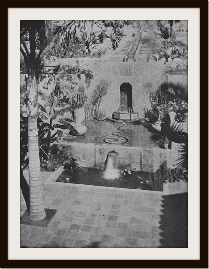
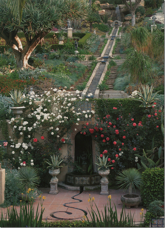
1922: looking down at the waterfall – gushing into the koi pond at the back of the terrace. You can also clearly see the snake shaped gully where the water pools into before entering the koi pond. The grotto is oval shaped and is at the back wall.
1922. And one more early view of the water feature. Today, that back wall is completely covered with ivy and flowers.
The ivy covered grotto at the back wall. In front is the koi pond with the new iron gate around it. Here at the right – is the kitchen door, opened. When built, there was no kitchen door – it was added when it was renovated.
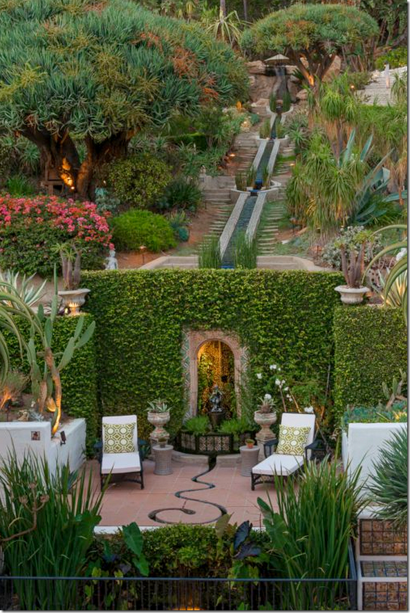
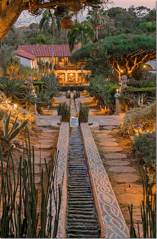
Today – the same night time view of the koi/lily pond with the gate around it. You can see the snake shaped gully, and behind it, the grotto. Above, the rill is lighted. At the very top – the swimming pool area is also lit up. Notice the magnificent original dragon tree at the left.
And one more view of the back of the terrace and the koi pond and grotto.
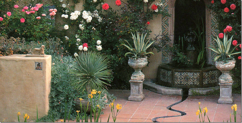
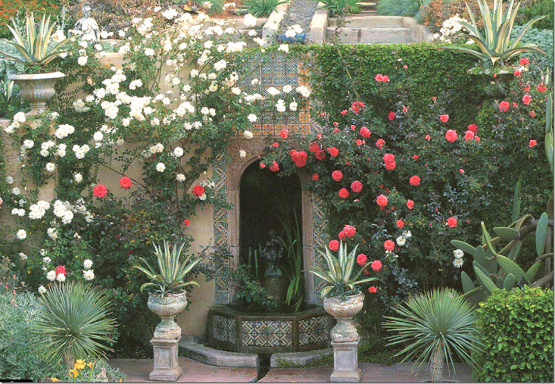
1998: This is a picture of the grotto during Tim Curry’s ownership. He planted the climbing roses on the grotto. Today, there are just a few vines left standing. Can you see the waterfall from the swimming pool at the very top of the rill? Just gorgeous!!!!!!!
Notice – the original dragon tree – planted by the Seylers in the 20s. It remains standing today and is a focal point of the garden.
1998: Close up of the left side of the grotto – showing the stucco wall with the tiny imbedded tile and statute above. All these little details! Notice how deep the gully in the tile is.
1998: Notice the tile mural above the grotto.
Today: View of the grotto, now covered in ivy – the tile mural can’t be seen anymore – the gardener has recently allowed it to be covered by the ivy! Also, most of the roses planted here by Curry in the 90s are gone, which is such a shame.
2012: You can see here, how much higher the upper garden is compared to the terrace. And notice the gorgeous dragon tree – original to the garden. Last year you could still see the tiles above the grotto.
A view of the koi/lily pond with the gushing waterfall. In the grotto above, the water is gushing down took from the rill above it.
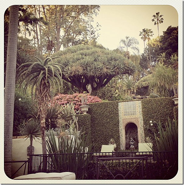
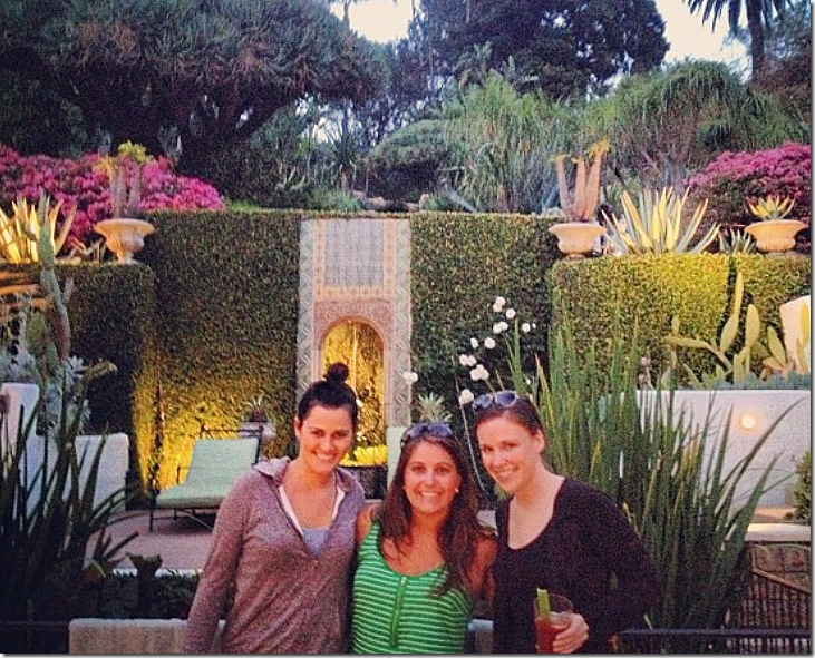
2012: This shows the human scale – three women pose in front of the koi pond. Behind them is the grotto and behind that is the upper garden. You can see from this picture how much higher the upper garden is than the terrace.
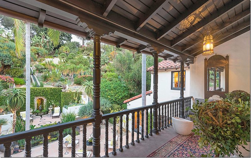
And the view from the upper balcony off the master bedroom – looking towards the garden and back terrace.
THE WATER RILL AND THE UPPER GARDEN:
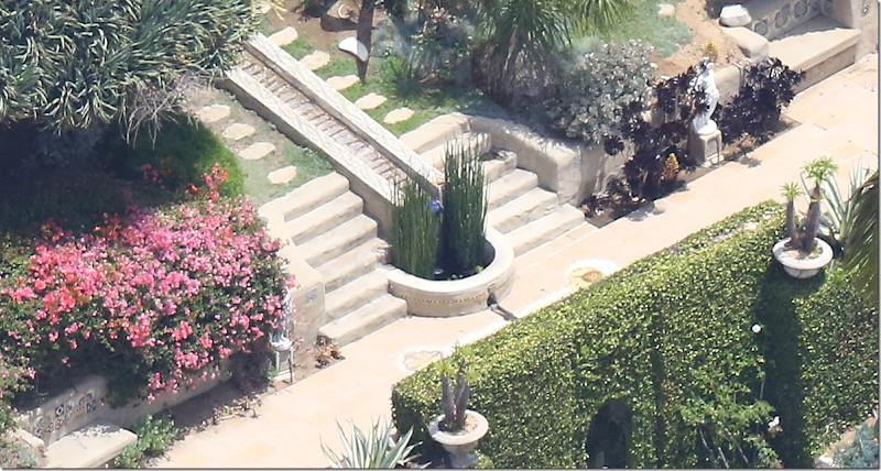
This aerial view of the house on the left shows how the stone steps meander through the garden on the left and right sides – not just the middle. Also, I love how you can see the chairs pulled up to the fireplace.
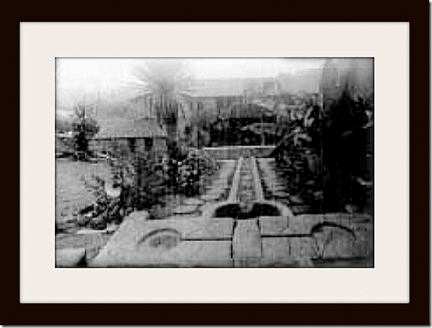
1922: From the hill – looking down the rill, at the halfway point, towards the house. Notice the two circles embedded in the stone on each side of the rill. There are several of these circles at each section of the rill. The water collects in these circles on its journey down the rill.
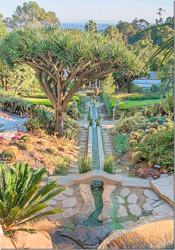
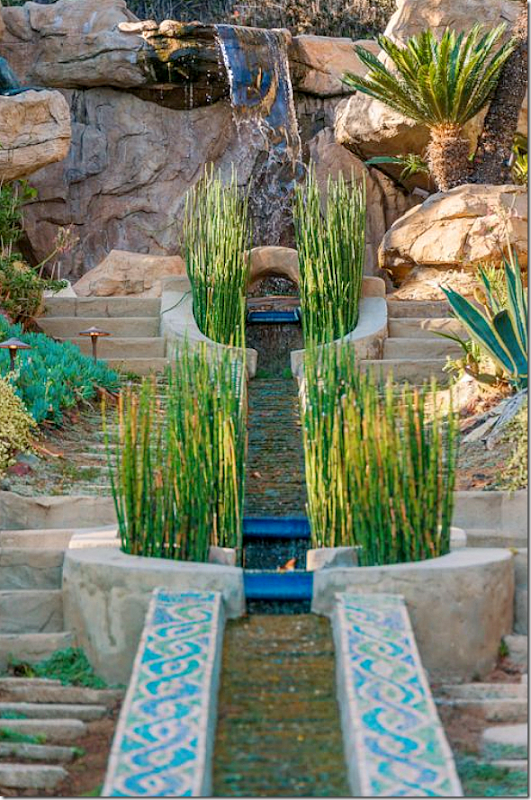
2013: The same exact view, almost 100 years later! The only thing to have changed is the plants have grown older through the years!!! Notice the mosaic tile work on the sides of the rill.
The same view, daytime, starting from the top of the rill looking down past a dragon tree. Notice the city view over the top of the house.
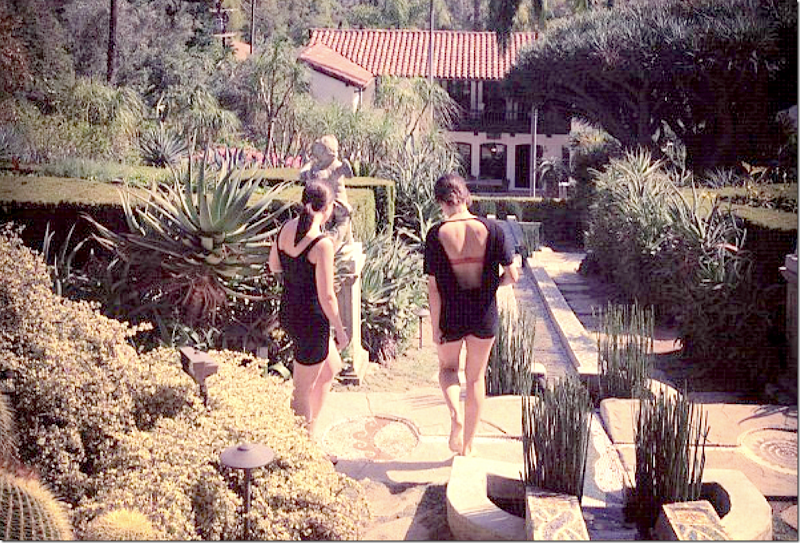
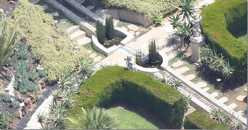
And two friends taking the walk down the rill. They are stopped at the two circles – each with a different carving inside. Also, the oval shaped ponds in the middle of the rill are placed three times down the rill – a decorative way to break up the long water feature.
A view of the rill where it ends before the water enters the grotto.
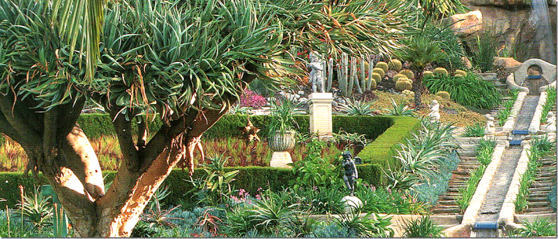
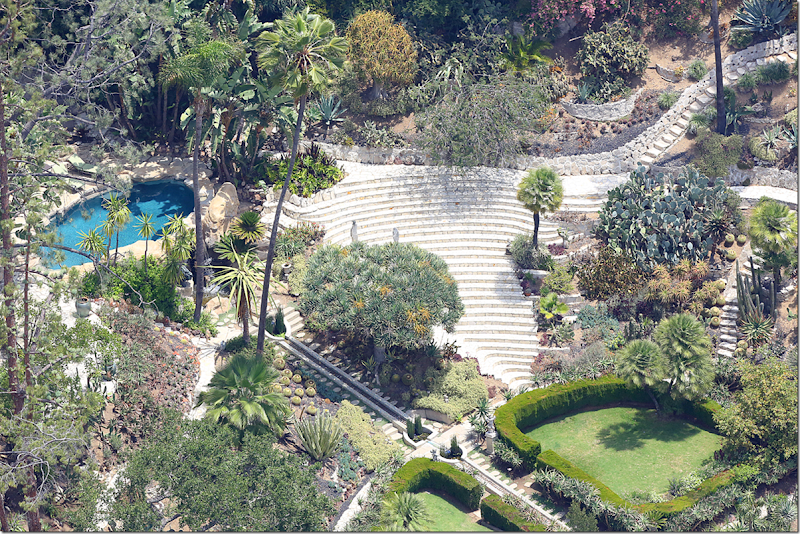
Going up the garden, on the right is the stone amphitheater. Not sure whether this was put in originally or not, but it’s a stunning structure here. Notice how the stone steps meander all over the garden – on the right and the left of the center rill. And see the stone swimming pool, with the waterfall cascading down? Beautiful!
The start of the rill. The garden is laid out very symmetrically. On each side of the steps is a flower bed and then a concrete bench with tiles on their back. These two benches are original to the garden.
Looking up towards the waterfall.
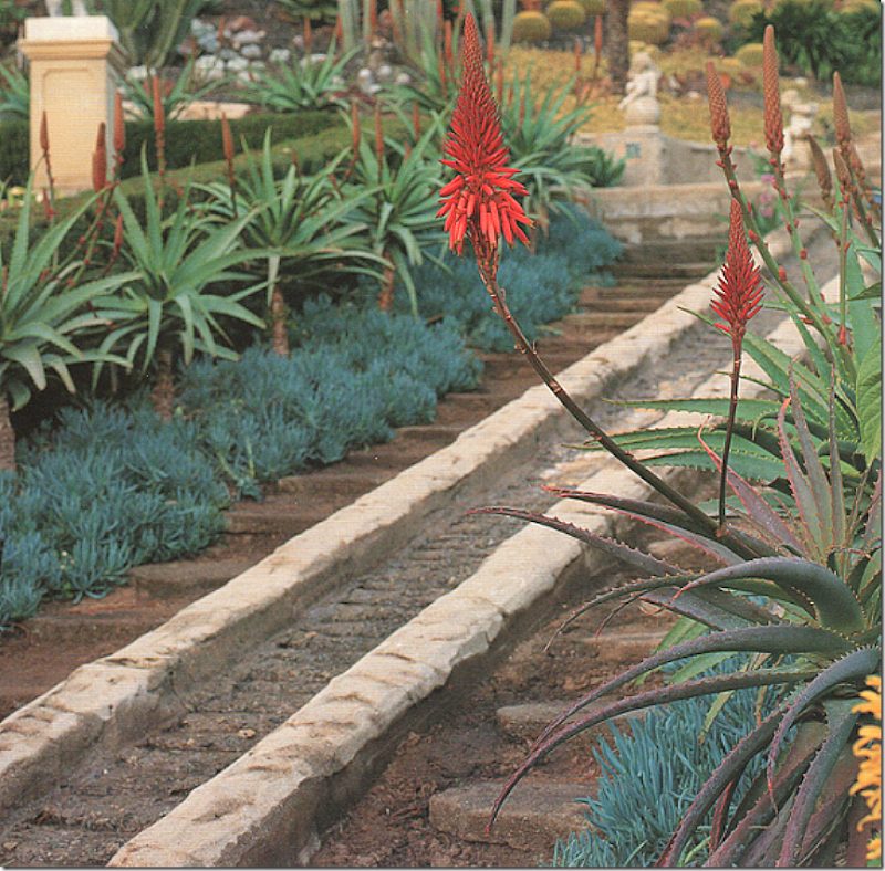
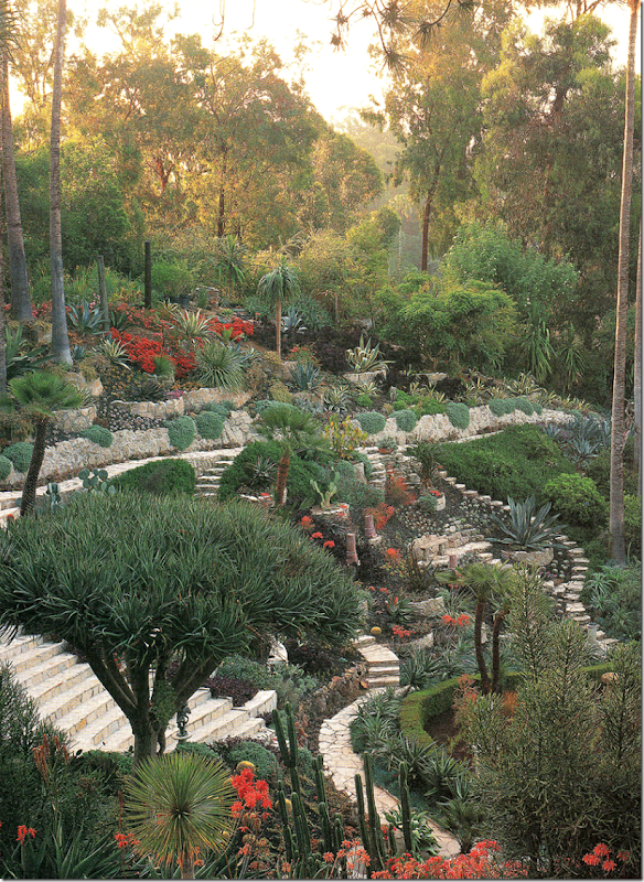
1998: Tim Curry’s time. A close of the water rill with the concrete steps on either side of it. In this photograph, you can see how old and worn the steps truly were. I suppose at some point they were restored. Tim added the succulents along the rill.
1998: A view from Tim Curry’s time: Notice the statues in the garden and also notice all the succulents and aloes that Curry planted along the rill. He used a lot of tall cacti to lift the eye upward and create height.
Further up the rill – the middle section show how the water flows into the horseshoe shaped ponds, over the stone, to the next pond, and then further down the rill. Another pair of concrete putti stand over this part of the rill. Along the way down the rill, there are three center sections with these horseshoe shaped ponds.
And finally – the very top of the rill structure. The water falls from the stone swimming pool into a pond where it then cascades down the stone rill to the bottom of the patio. Ingenious! And quite beautiful. The waterfall is so pretty.
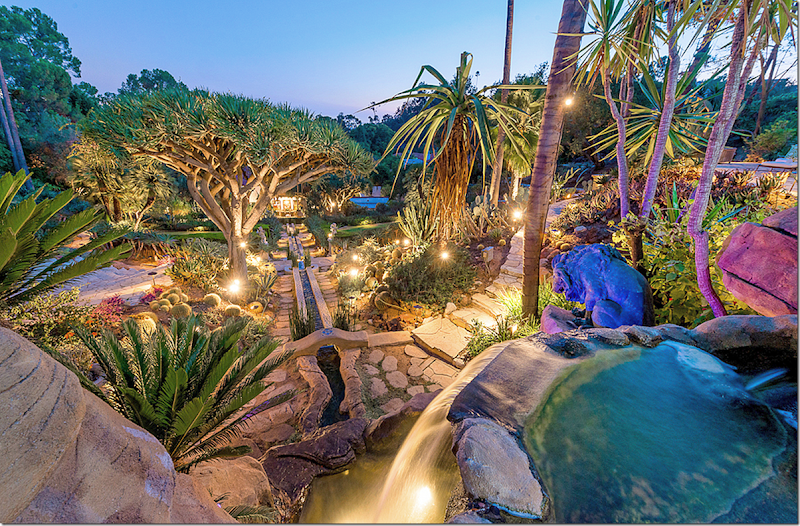
A twilight view of the waterfall leaving the swimming pool and falling down the rill to the house. The dragon tree is lighted as are other strategic points in the garden. The bills to upkeep this garden must be immense. The labor, the lights, the electricity, the gardening – it must be around $10,000 a month to maintain – maybe less, maybe more. I do think that the bills were too much for Tim Curry which is why he left and moved around the corner to a similar house with a much smaller, yet still beautiful garden.
Looking up at the waterfall at the swimming pool.
The Stone Amphitheater:
2013: The stone amphitheater sits to the right of the upper garden. Not sure if Curry installed the theatre or if it was part of the original garden design. Whichever, it is a wonderful addition. I can just imagine having musical friends come over and perform in this outdoor venue at dusk. How romantic it must be!!!
1998:. A view of the stone amphitheater. On the right side of the garden, the stone steps wind along garden paths, circling through the dense foliage. Along the back stone retaining wall, Curry planted lavender which cascades over the fence. It must be beautiful when it blooms. Notice the pops of red Curry used in the garden. Looking at the amphitheater, I wonder if Rob’s friends like Eddie Redmayne have ever come to act out scenes from a Shakespeare play, like Romeo and Juliet.
Notice the plants from this photo from Tim Curry’s time versus the photograph above from 2013. There seems to be a need for more plants today. Curry really had the garden in full bloom, but today, it seems to be a bit neglected. Hopefully the new owners will replant the bare spots and add some colorful flowers like Curry did.
1998: A close up of the retaining wall. Today, all the red plants seem to be gone from the garden. Also today, all the plants along this back retaining wall seem to be a bit bare.
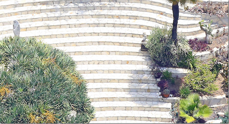
Close up of the amphitheater steps made out of the stone.
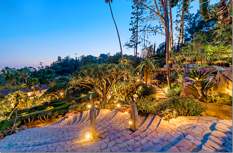
2013: Night time view of the stone steps and another dragon tree.
The night view looking down from the top – quite a steep climb!
THE SWIMMING POOL:
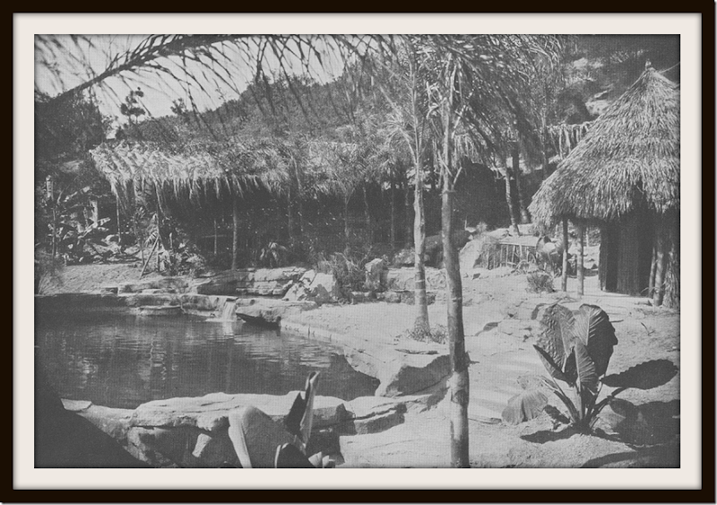
1922: The swimming pool is solar heated. Originally there was a palapa as you can see in this picture. When Tim Curry moved in, the palapa was long gone. He saw this picture of the Seyler’s palapa and began a months long search to find its original location. He finally discovered the holes that held the structure in place and then built another palapa that looked just like the original one. Today, this is unfortunately no longer standing. It also looks like there was another grass topped structure to the left. They owners called this the South Seas pool.
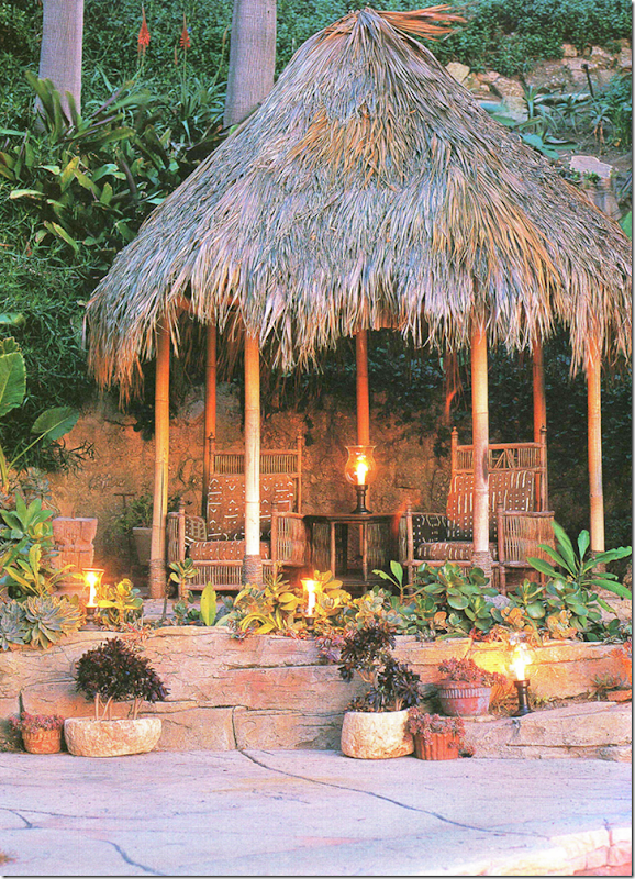
1998: Here is the palapa that Tim Curry installed on the exact place were the original was. He used the same original Arts and Crafts furniture up here at the pool as he did down at the terrace. Unfortunately, the papaya is no longer standing today.
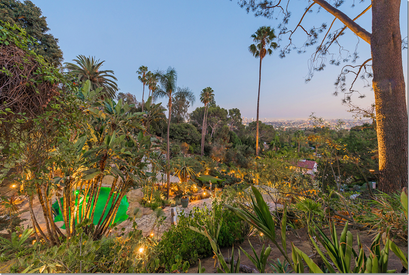
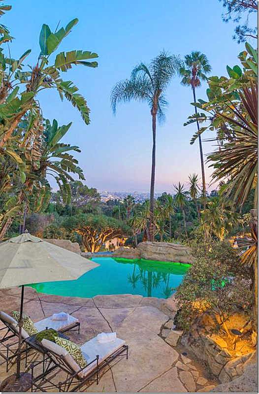
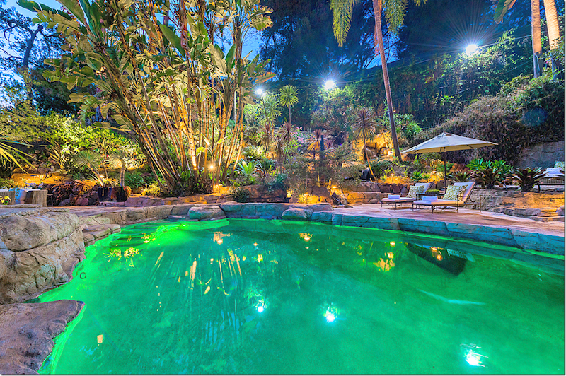
2013: And today – the pool, with green night lights. Here you can see the city views that can be seen here at the top of the hill. And here you can see how high the swimming pool is from house which can be barely seen at the right of this photo.
Swimming pool.
Night lights in the pool.
The break in the rocks were the waterfall starts.
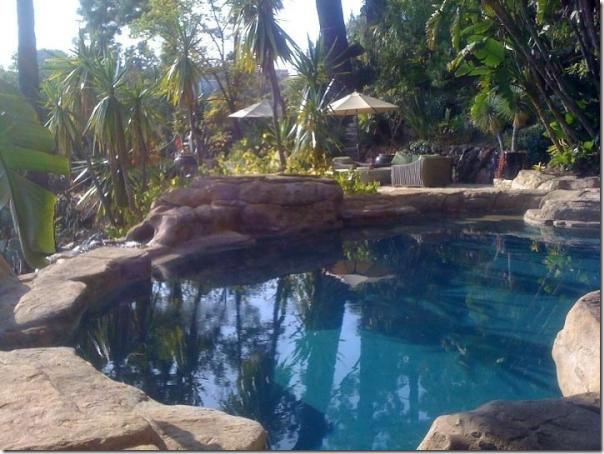
2012: The pool has a beautiful natural turquoise blue color during the day. Much prettier than the night time green.
Ready to see the inside? This might be a good time to take a break and come back to the second part of the story in a bit! Since there are so many pictures, I would love to put this into two parts Interiors & Exteriors – but I thought it would be too confusing.
The House and Its Interiors:
1924: A very early photograph of the house. The front façade shows the open loggia at the very left – which is now closed in and is a part of the house’s interior. On the right is the front door. To the right is the dining room and then where the shorter roof is – the kitchen suite and maids room which is now all kitchen. The maids room was removed in the 50s. The window shown in her room is now a French Door that leads to a front patio off the kitchen and dining room.
Notice how bare the hill was compared to today! Also note that the front fence had not been erected yet.
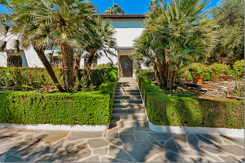
2013: Today. The same flagstone driveway remains as does the front door. The awnings are new additions – installed some time shortly before Pattinson bought the house.
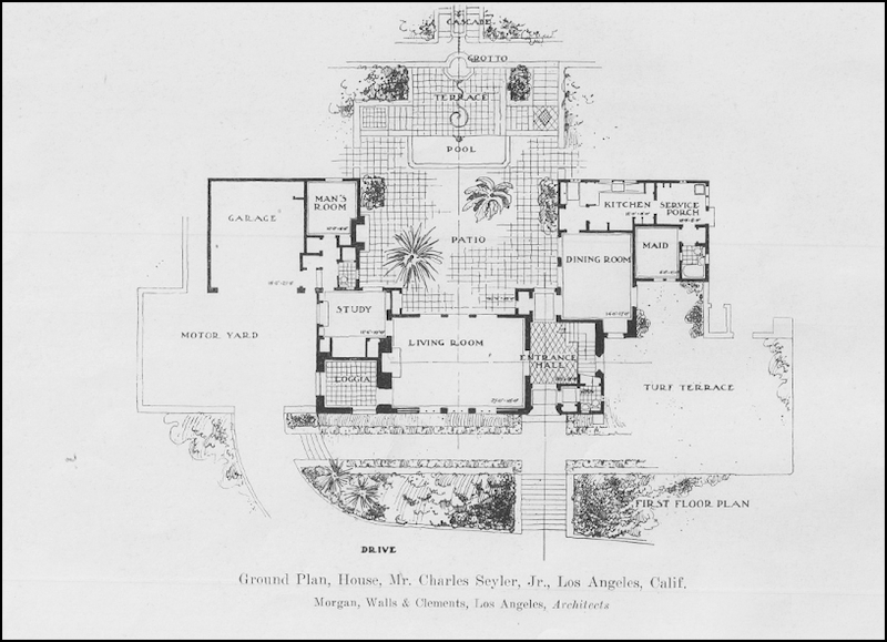
The original floorplan. The most fabulous thing about this house is how little it has changed over the past 90 years. All the decorative elements remain as does the original footprint. The few changes made include the loggia with the tile floor which was originally open to the elements. At some point in time the loggia was enclosed. The tile floor remained but very recently the tiles were removed and hardwoods were put in. Also note the kitchen area. In the 50s the maids room was removed and that area became part of the new, large L shaped kitchen. The laundry room is located in the now enlarged 3 car garage. On the real estate brochure there is apparently a staff bedroom – but where that is remains a mystery. It might be located outside in a small building off the kitchen. Or, perhaps it’s in the basement?
The Entry:
1924: Notice how there were no neighbors. Today – Kirstie Alley’s house is located on that hill. Notice the lantern – that remains today. Love the potted plants. Interesting that in the 20s this was also a decorating tool used.
What is really great is that we have photographs of the interiors from the 1920s, from 1998 when Tim Curry invited Architectural Digest to photograph the house, and from today!
It is interesting and a very rare treat to see the difference in decorative styling through the century – in the same house.

1922: (Sorry for the writing on the picture.) The grand entrance hall with its staircase and checkerboard Terrazzo floors, here, with an oriental rug. The stair treads are wood and the rails are iron. Notice the niche on the landing with a Santos and a tapestry hanging at its left. This room is amazing. Ninety years later and the décor is something you might see today. Classic = timeless.
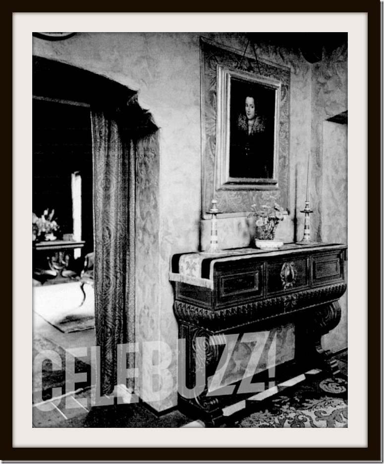
1922: The entry hall – looking towards the living room. Placed here is a Spanish styled console, very fitting for the design of the house, along with an antique portrait. Here you can see portieres that divide the living room from the entry hall. Notice how thick the stucco walls are! Do you like the 1920’s décor in the entry hall?
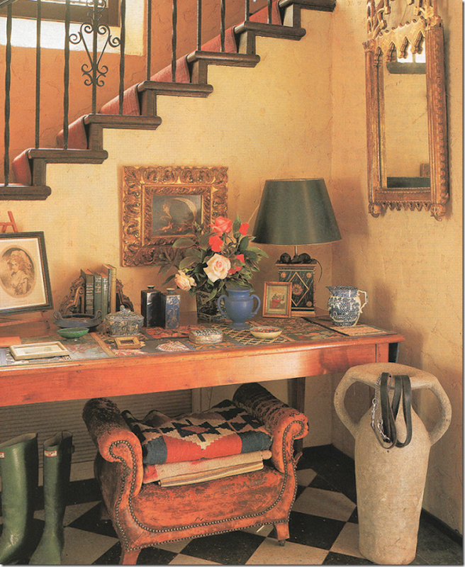
Architectural Digest 1998: 14 years ago – First – let me warn you – I am in LOVE with the way Tim Curry decorated the house. I realize that it was, of course, styled by Architectural Design and the photographs were taken by the fabulous Tim Street-Porter, but – to me the way the house looked under Tim’s ownership is wonderful!!
Curry placed a wood table under the stairs. A lovey vignette of antiques sits atop it. Kilims rest on an antique leather stool and dog leads sit on the urn. Notice the English green wellies! A beautiful gilt antique mirror hangs on the wall. As far as decorative elements, nothing in this room has changed from 1922. The terrazzo floors remain the same, as does the staircase. Curry added a runner on the stairs.
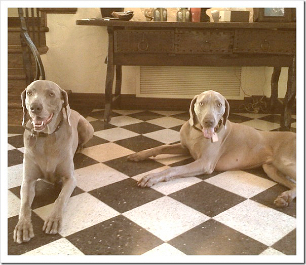
Since Rob Pattinson bought this house privately, there are no real estate photographs from his purchase. Until the new photographs showed up this week – seeing what the house looked like now was a game of searching for photographs on social media places like Facebook and Instagram. I was beyond thrilled when I found this photo of former owner Robert Luketic’s two dogs in the entry hall.
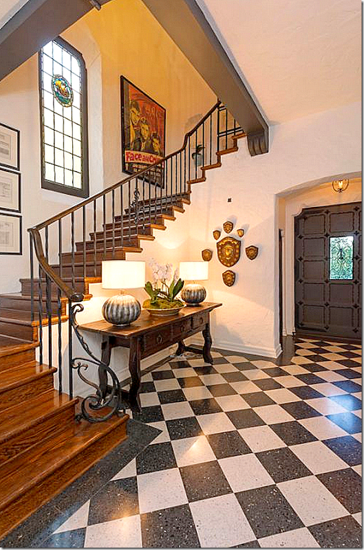
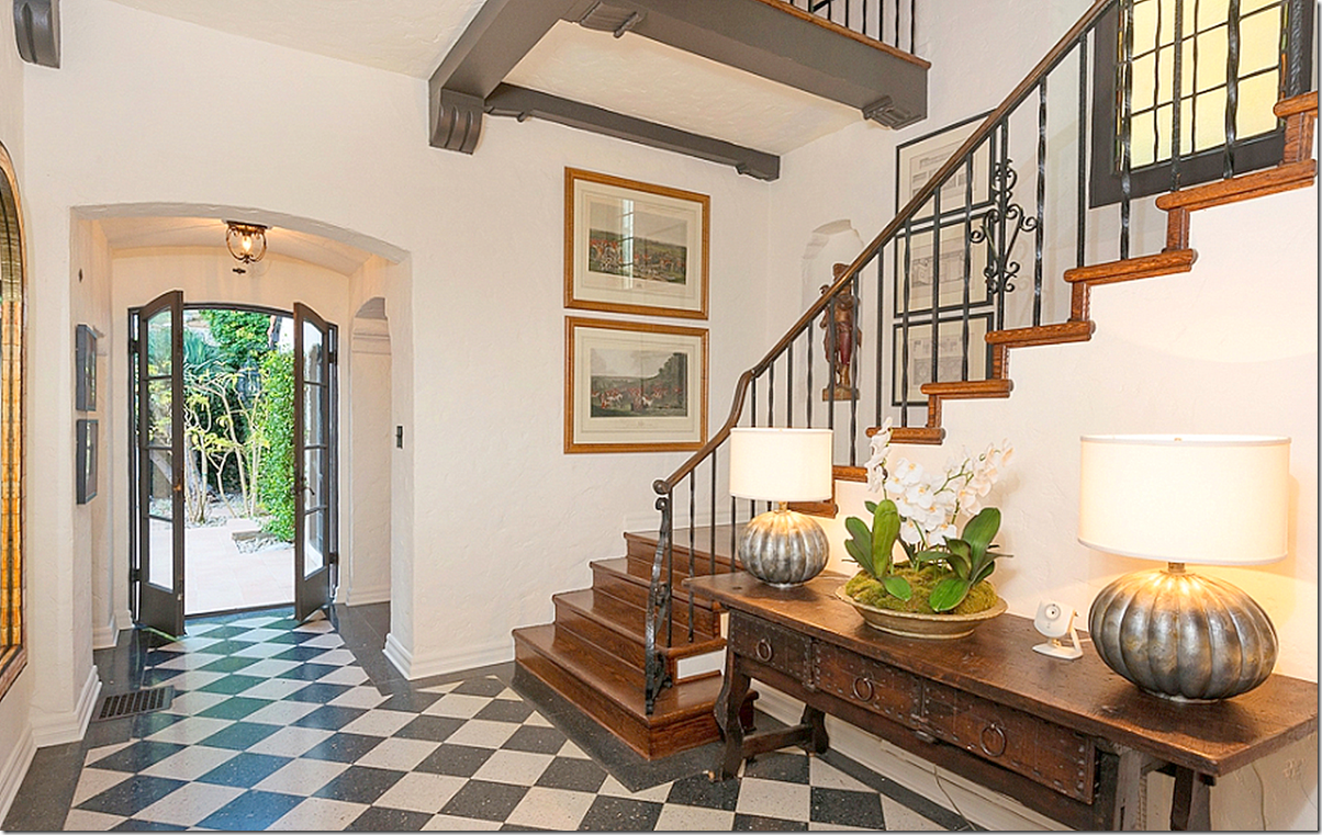
2013: AND today! The entry hall. Now, remember this house was styled professionally. The décor is not my favorite, but at least you can see how the house might look when decorated – something that Rob and Kristen never did. And notice, Rob left this console of Luketic’s at the house when he moved out. Wonder why?
Above, the French door leads to the back terrace. The dining room is through the door to its right. And to the left is the living room.
And the view towards the front door and the powder room to the left of it. Notice the grill covered window in the door – and the stained glassed window above the stairs.
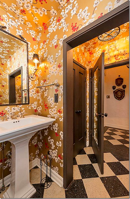
2013: And off the entry is the powder room – newly papered. I can’t imagine a more terrible paper, in my opinion. It takes away from the house itself. I can think of a hundred papers that would look better, but I would have probably left the room plain.
THE LIVING ROOM:
1922. The main living area with French doors and windows that open to the front yard and the back courtyard. Through the portieres (WOW!!!) you can see the staircase/entry hall. Can’t get over the portieres. I would so do that today!! They are still fabulous, 90 years later. I don’t care for diagonally placed furniture but the sofa is interesting. You could recover that and still use it today. Love the French chair to the left. In the right corner, it looks like there is a baby grand piano. And notice the Tiffany styled lamp on the right – maybe it’s original? Notice all the sconces that remain in the house today. Incredible!!!

1922: The fireplace is exactly the same as it is now with the carved mantel and tiles. Love the andirons and antique chair and the tapestry over the mantel. You can see the sun shining through the loggia.
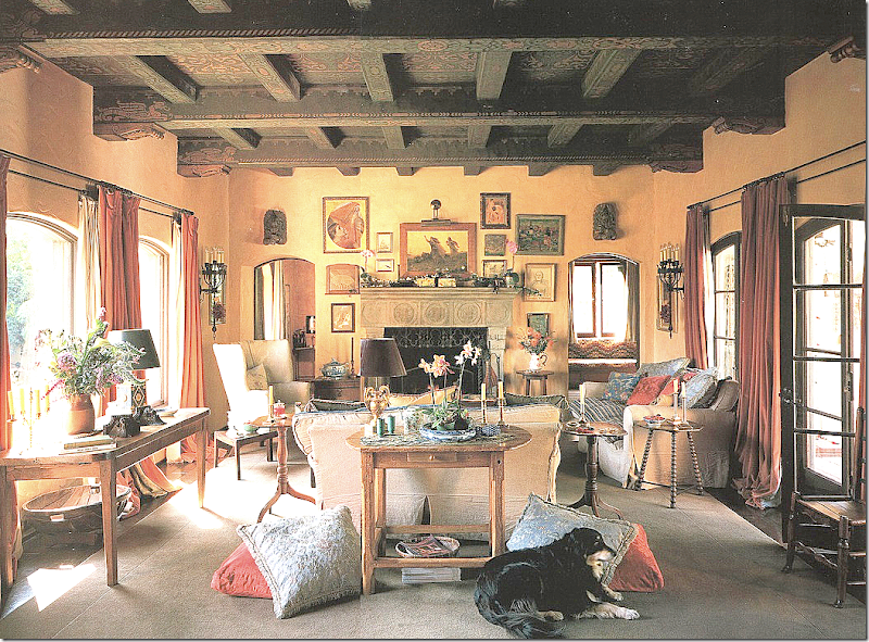
Architectural Digest 1998: Tim Curry: Love the way Tim Curry decorated the house and truly, besides the colors and rug, I wouldn’t change that much today. Linen slips? What’s not to love? That antique wing chair is to die for! All the little tables – gilt lamps, beautiful original stenciled and beamed ceiling – beyond wonderful. The windows on the left face the front drive, while the open doors on the right face the back courtyard. Behind the fireplace on the right is the study and on the left is the once open air loggia with its terra cotta tiled floor.
This beautiful room is a testament to the architect Stiles Clements. I love the proportions of the room – the size, the height – it’s perfection. Curry notes that Clements was known for his exuberant designs but he showed restraint in this house. While there are thick stucco walls, deep recesses, arched doorways and red tiled roofs - the excesses of this style are missing: Juliet balconies and masses of wrought iron. It’s just classic and beautiful.
Again – interior design over 15 years ago and still wonderful.
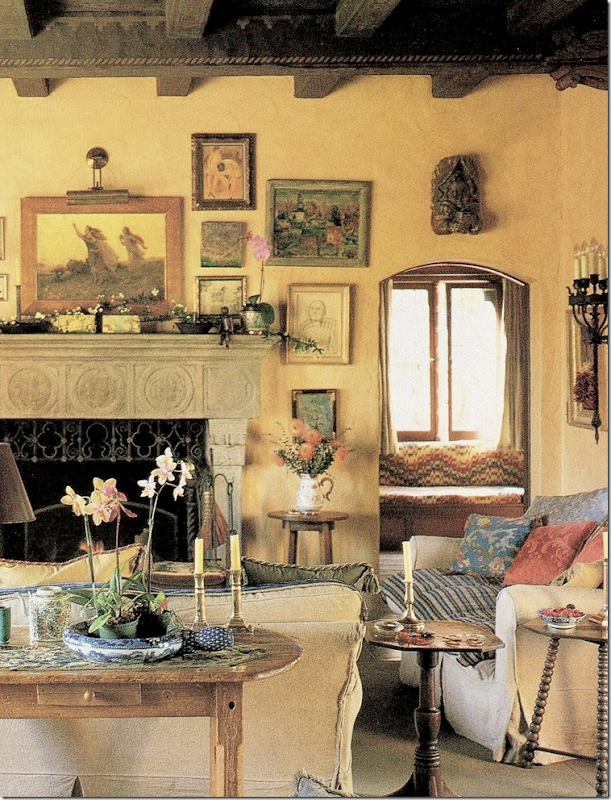
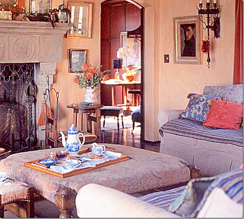
1998: Close up of the right side of the living room – notice the layered striped textile on the slipped sofa, love that. And notice the beautiful tiles on the carved mantel. Curry’s decor is all so English looking – and since he is English – it makes total sense. I especially like how he loves patina. Interesting is how in 15 years small décor elements that have changed: pillow treatments, for example, have really changed. Today, you would have only 2 or 3 pillows, at most, on the sofa. And all the candlesticks – today you would have only one or two lanterns or votives. Also today, you wouldn’t hang so many small paintings – just a few or a gilt mirror instead. Finally, I wouldn’t use this type of area rug, instead I would use a seagrass and layer smaller rugs or a zebra over it.
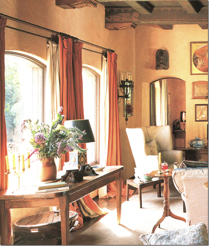
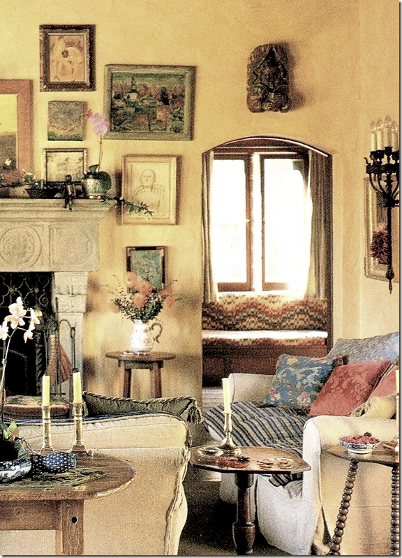
1998: close up of the left side of the living room, showing the loggia to the left of the fireplace. Notice the curtains, how beautiful they are. There are two layers, one a heavy cognac colored fabric, and a second lighter beige fabric.
1998: And looking back towards the entry hall, Curry had two vintage leather armchairs in the corner. Today, Pattinson has a piano placed where these chairs are.
2004: This very small and blurry real estate photo is of the house when Noah Wyle sold it. Here, it shows the living room furnished with white slipcovers and French chairs. This is almost exactly how I would decorate this house!
2010: The owner Robert Luketic who sold the house partially furnished to Robert Pattinson. His furnishings left much to be desired – they really didn’t enhance the style of the house.
2010: But I do love Luketic’s matching leather wing chairs that flanked the fireplace.
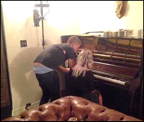
2012: There is only one published photograph of the living room as it was when Pattinson lived there. Here, he is at his rare vintage piano, gifted him on a birthday by Kristen Stewart. Above is a silver covered guitar. And in this Vine Video, you can make out his sofa, a leather Chesterfield. At the time this photograph landed on the internet, it wasn’t known if this was the Los Feliz house or not, but I noticed the original sconces right off, confirming it was his home. And yes, his jeans are falling off without a belt and he has a huge hole in his t-shirt. Can you say Hobo?
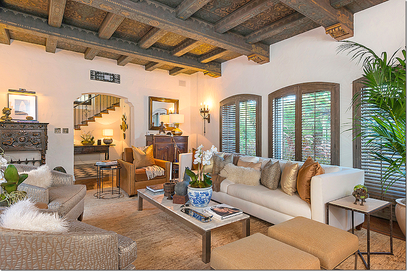
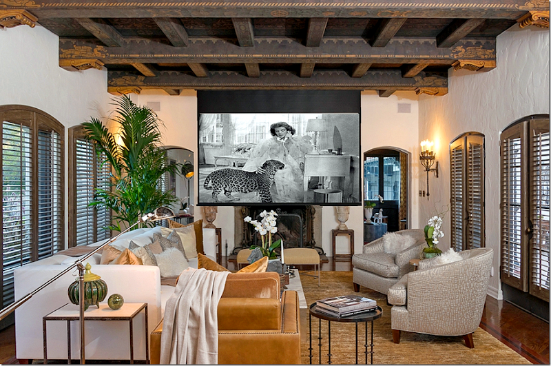
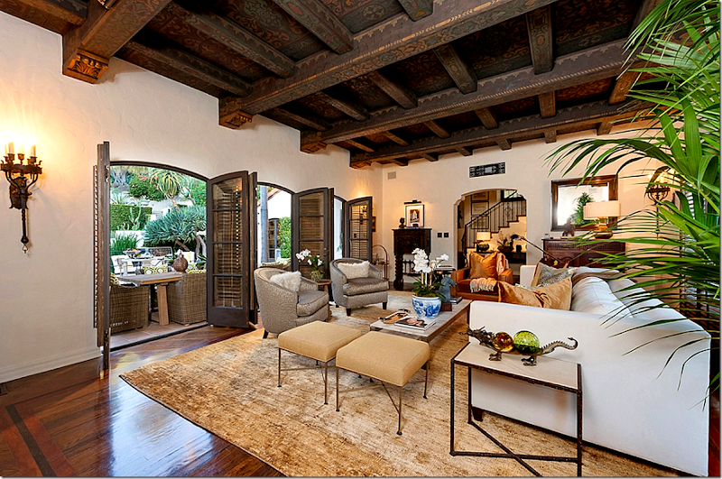
2013: And today – as furnished by the stylists. Pattinson installed the wood shutters throughout. They do look nice, but I would have gone with curtains instead – or at least layered curtains over the windows. Here you can see the gorgeous painted ceiling with carved beams – untouched for the past century. This view is towards the front yard. The furnishings are too contemporary and glitzy for my taste, but the room does look beautiful properly decorated. I do prefer the white painted stucco walls – over the yellow that Tim Curry had them painted. Interestingly – when Curry moved in the interior walls were builders white, which he couldn’t wait to repaint Tuscan yellow.
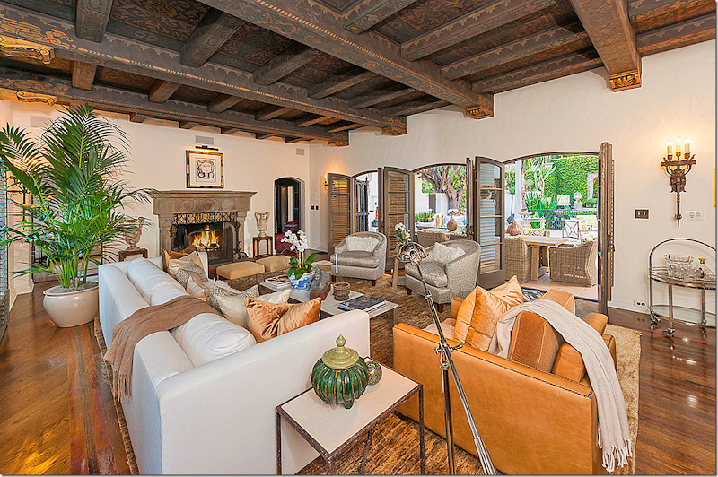
The view towards the back patio – showing the wonderful original fireplace. To the right of the fireplace is the study and the loggia/library is to the left, hidden behind the palm plant. If I lived here – I would keep these doors flung open like this all the time.
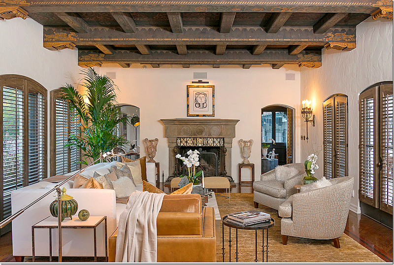
The view towards the fireplace straight on. You can see through to the study out towards the garage court outside. The terrace doors are now shown closed. Since this is main living room/family room – where is the TV?
Apparently this is where the TV is hidden which also makes the living room a screening room. Hmm. I think I would place a flatscreen flanking the door that leads to the entry hall and hide it behind a tapestry or painting. Maybe use this screen for movies only.
I would place a flatscreen where the mirror is – and hide it behind a painting or tapestry.
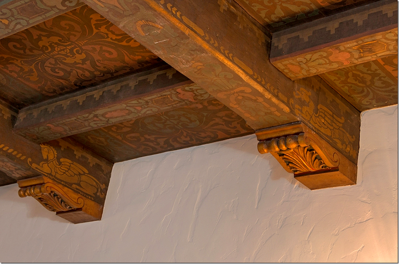
A close of the stenciled and carved beams and ceiling.
The Loggia:
The loggia is off the living room and is on the front side of the house. It’s a small space that was once open to elements, like a covered porch. It was enclosed at some point in time. Tim Curry used it as a library. Back then it retained the original tile floor. But today – it has hardwoods.
1922: The loggia is at the very left of the front. It looks like a black hole, but really there is no window there. You can just see the iron gate that separates it from the outdoors.
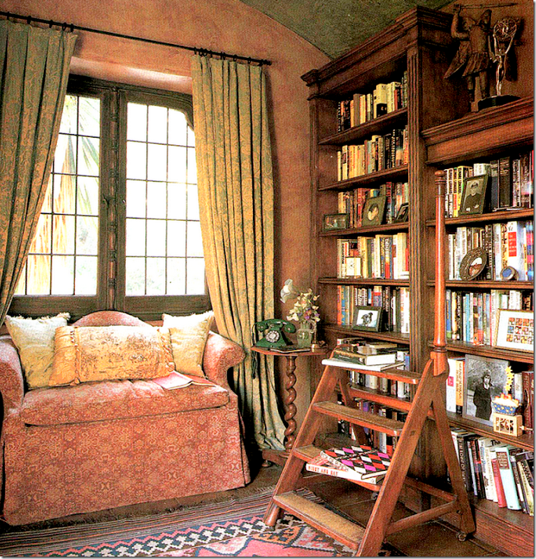
Architectural Digest: 1998. Tim Curry. And here is the charming loggia with its terra cotta tiled floor. Leaded glass windows over look the garage courtyard. The beautiful arched ceiling was painted blue and the walls were chosen to contrast with it. Again, this is such typical English décor by Tim Curry. Love the antique library ladder and the settee under the window. Love the curtains too, and the Kilim. Notice the old fashioned telephone. Curry really has a such a great aesthetic.
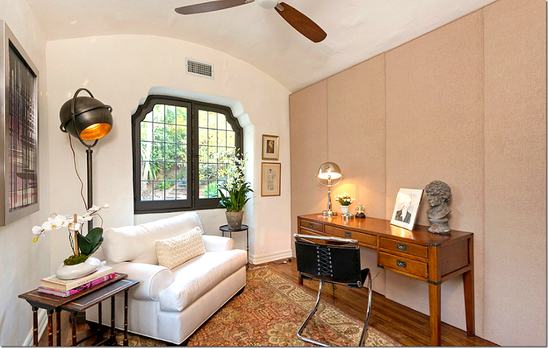
2013: Today – how this room was styled for the sale. Not sure what is going on here – it looks like they are hiding something behind that screen. Not sure what though. (Could it be the stairs leading down to the hidden basement wine cellar?) The ceiling has been painted white! Such a shame! And the decorative wood trim around the window has been painted dark. The tile floor is now gone – and hardwoods are installed. The designers missed a chance to make this a charming library just as Curry had done. Shelves would have concealed whatever is behind that screen - as this room is now, what is it good for except for one person to sit in?
The Study:
The study is by far the most interesting room in the house. It is located off the right side of the fireplace. It leads to both the back terrace, the guest room and bathroom and the back door and garage – so it gets a lot of traffic. But it’s the secrets this room holds that makes it so interesting.
Because the house was built during the prohibition era, the owner had his own speakeasy installed. Apparently this was typical for houses built during this time in Los Feliz and probably all over the U.S. The study is fully paneled and by pressing a hidden button on the built in desk, a portion of the paneled wall moves to reveal a steel vault with a false floor that leads down to an air-conditioned controlled wine cellar in the basement! On the other side of this desk, another panel opens to reveal a hidden bar whose walls were originally lined with menus from ocean liners and hotels. And, on the opposite wall, a third panel opens which leads to the hidden chauffeur’s quarters – now the guest suite, which is located next to the garage.
Unfortunately, there are very few pictures of the study as it was. Even the original floor plans give NO hint to the three hidden panels – and what is behind them – they are only drawn as closets.
Architectural Digest 1998: Here’s a view into study – showing the paneled wall where the hidden door to the chauffeur's suite is. This is block paneling with a decidedly orange stain.
This view shows the study’s with the banquette in a flame stitch upholstery that Tim Curry used.
2004: A tiny, blurry real estate picture shows the study when Noah Wyle sold the house. Here you can see the paneling with the portrait – this is apparently where a hidden steel vault room reveals stairs that lead down the basement’s temperature controlled wine cellar. And somewhere by the built in desk a third wall moves to reveal a speakeasy bar that was once decorated with menus from various famous ocean liners.
When the house went up for sale this week – I was ecstatic to finally see the hidden bar and wine cellar! But – imagine how disappointing it is to not be shown this, nor is any mention even made of this in the brochure! The last time the house was sold, the bar and wine cellar and hidden doors were extensively discussed. I’m not sure what has changed since then, unless perhaps the wine cellar might have been turned in to a security panic room? Or – were the stairs moved to open to the Loggia instead, where that odd screen was placed?
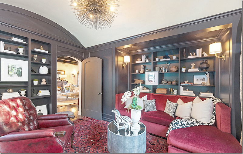
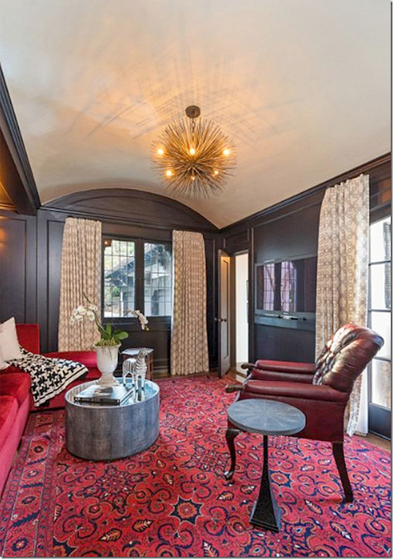
Today: I have no idea who the stylist is but this is just not my taste at ALL - nor is it right for the house. First, the paneling has been painted or stained, which is fine – the orange color was not great, but this is much too contemporary a stain. The once painted and barreled ceiling is now plain white. And notice, the block paneling has been removed. The built in desk was also removed. Not sure if Rob Pattinson removed it – or did the previous owner Robert Luketic. Or – did the stylists have it removed? Where are the hidden stairs to the wine cellar? Where is the hidden bar? And what happened to hidden door to the chauffeur's room. I do wonder if that vintage red leather chair was left here by either Pattinson or Luketic and that is where this horrid red décor came from? And the light fixture? In this house? With all the original sconces and fixtures? Why? Sorry to be so negative!
And looking towards the other direction. Whew. Well….. This room could be a knock out, instead, the décor is just bad. The window overlooks the garage, while the door leads to the guest quarters – nothing hidden about it now! This is where the hidden panel led to the guest room. All gone now. Such a shame. The window on the far right overlooks the back patio. Still, this is a wonderfully sized room for the owners to watch TV in at night – instead of the larger living room, which would be nice to use during the day.
The Guest Suite:
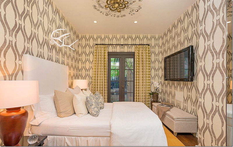
This tiny guest room which was actually the chauffeur's room is next to the garage and the back door. The French door overlooks the yard, hidden behind the outdoor fireplace. Oh, the wallpaper and light fixture. Again, why? I wish I could have decorated this house!! The wallpaper is all wrong, again, for the style of the house and the light fixture? Still the bed is nice, and very pretty, and I do like the idea of curtains.
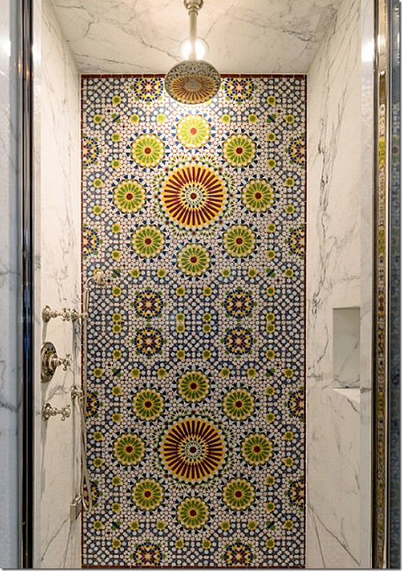
The guest bath is a total surprise. Rob had recently said he was having plumbing work done at his house and maybe he meant he was updating this bathroom. The white marble and fixtures are gorgeous and I must say I do rather like the mosaics for this tiny guest bath. Wish we could see more of it! LOVE!
THE DINING ROOM:
To reach the dining room, you walk back through the living room into the stair hall and take a left. Or you could just walk across the courtyard!
The dining room is off the entry hall, just past the stairs.
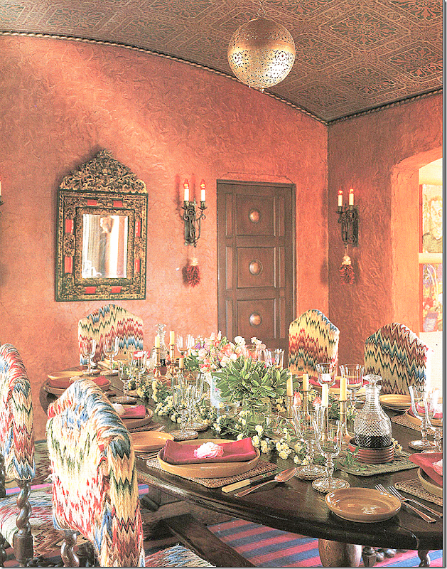
Architectural Digest 1998: The dining room designed by Tim Curry. Here he decorated the room with a striped dhurri and flame stitched antique chairs. Notice the curved arched ceiling – it’s stenciled again – and it is just beautiful. The iron sconces on all the walls are original to the house and remain there today. The carved wood butler’s door opens to the kitchen and is original to the house. This is the door that the butlers used during dinner parties to enter the kitchen. At the right is the then-newly opened arch that leads to the kitchen/breakfast area. Before the kitchen was enlarged, there was no opening here – and that part of the kitchen was the maid’s room. Today – this arch has since been closed back up.
2004: Another poor Noah Wyle real estate photograph showing the dining room from another angle.
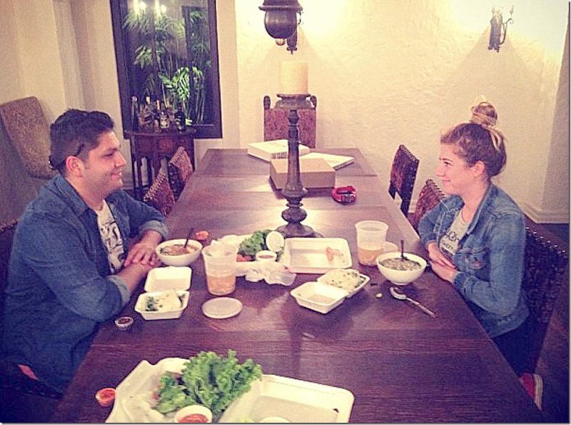
2012: This photo is a rare picture of the dining room when Rob and Kristen lived here. Their friends posted this on their Instagram while eating take out. I recognized it was the house from the bottom half of the sconce. Actually Rob chose right for the furniture here. Great table and chairs.
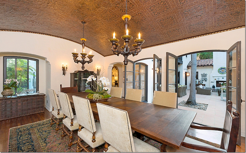
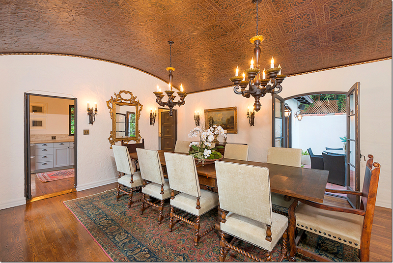
2013: Here is the dining room today – with two chandeliers. The ceiling is stenciled and painted – again original to the house. Just beautiful! It looks like this is Rob’s table left here, but with new chairs.
The door opens to the kitchen and there is also the original wood butler’s door. Through the French door is the outdoor patio that connects to the large L shaped kitchen. It would be a great place during a party to set up a second bar area.
THE KITCHEN:
The large L shaped kitchen was once three rooms – a room with an eat-in banquette and kitchen, a service porch and a maid’s room with a bathroom. At some point, the maid’s room and bath were demolished and the space became all one room.
2004: The kitchen was further remodeled at one point with limestone counters and backsplash.
New professional appliances were installed and a quatrefoil window was installed over the range. The roof was painted gray with dark beams.
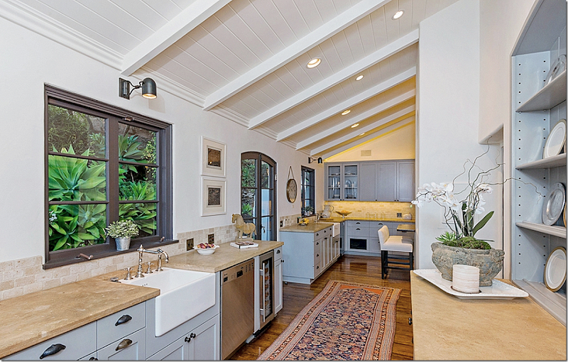
When Robert Luketic moved in, he painted the cabinets a trendy gray and the ceiling and beams were painted white and he installed new light fixtures. He also refinished the hardware.
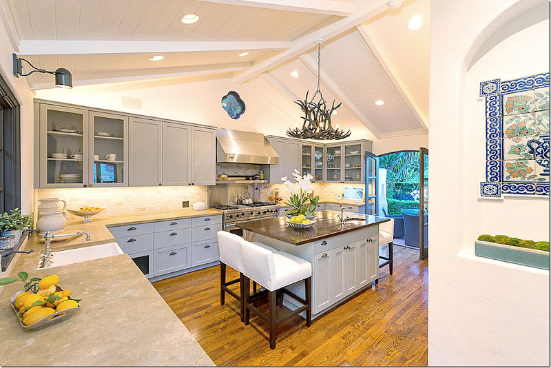
2013: And today. The L side of the kitchen. There are two sinks and two dishwashers. This area acts as a butler’s pantry with the built-in shelves to the right. The French doors here lead to a secret garden behind the kitchen. When Rob and Kristen lived here – there was a flatscreen on the wall above the second sink.
Here you can see the outside patio off the dining room and kitchen. Under one cabinet is a window that looks out to this patio. The stylists added the new horn chandelier which is a great choice. I love the kitchen and think it’s a great space. Love the runner.
And looking at the wide part of the kitchen Notice the tile mural in the arched niche at the far right. Kristen is known for her culinary expertise and she often cooks large Italian meals on the weekends for family and friends. Her new house’s kitchen isn’t nearly as pretty or spacious as this one, which is a shame.
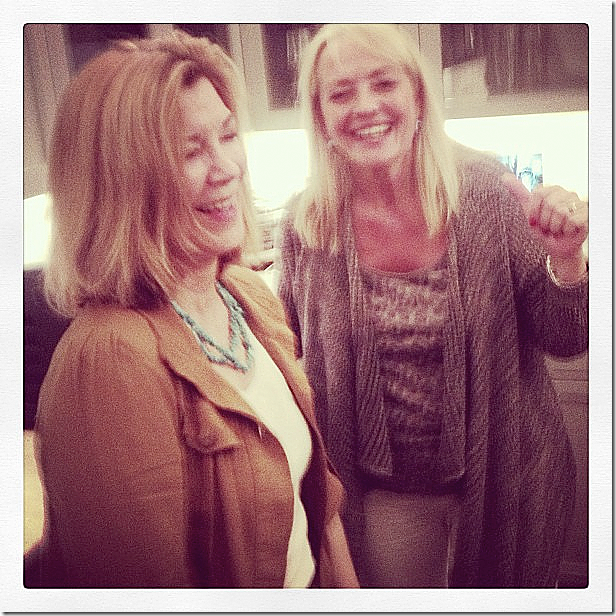
2013: A real surprise was this photograph taken in the kitchen that popped up on the internet showing Elvis Presley’s sister in law on the left visiting with Rob’s mother, Claire Pattinson, from England. No one knew the two families even knew each other, much less were close.
And many photographs of Rob and Kristen’s friends hanging out in the kitchen were found on Instagram. This one showed Kristen’s childhood friend Suzie in the kitchen. At the time I was thrilled to see that Rob and I shared a Shaw’s farm sink! You can see the flatscreen that is now gone.
UPSTAIRS:
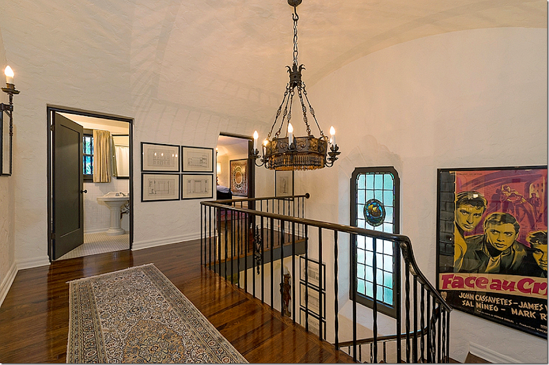
The landing leads to the two bedrooms upstairs, along with the bathroom with its original tiles and sink.
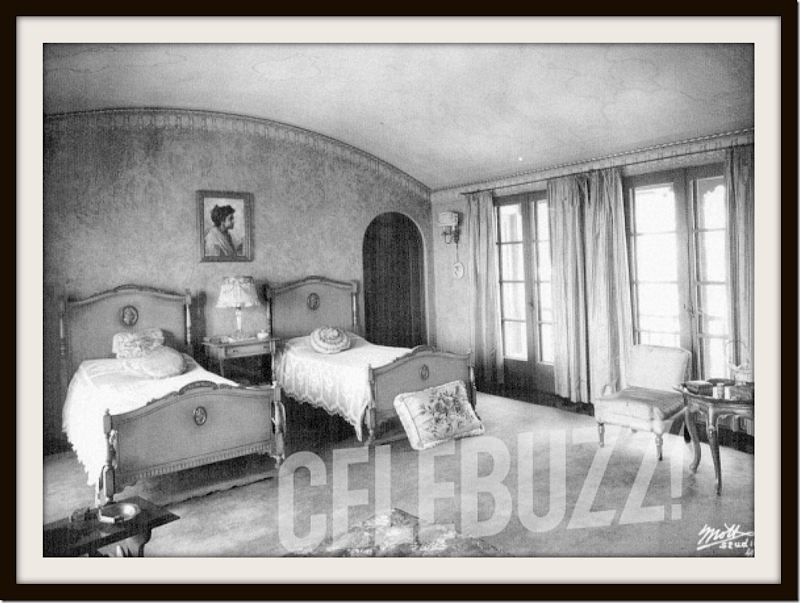
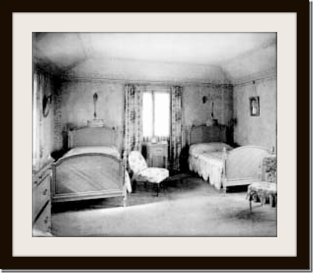
1922: The Seyler’s master bedroom with another curving ceiling that matches the ceilings in the loggia, the study, and the dining room. Twin beds – even before the Hollywood censorship! Still, such a pretty 1920s bedroom. The arched doors on both sides of the beds open to the bathroom and closet. Beautiful French table and chair! And I love the chintz pillow on the floor.
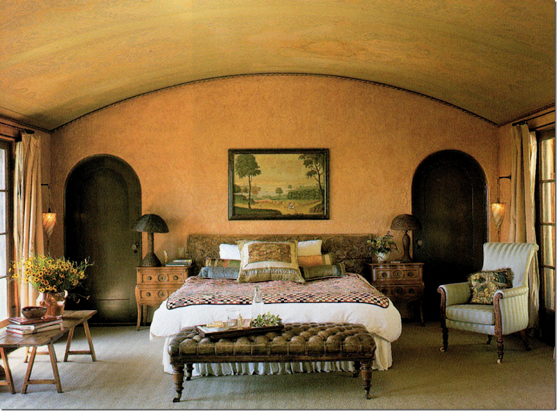
Architectural Digest 1998: Tim Curry’s Master bedroom. Beautiful! Dreamy!!! And so romantic. This room sits above the living room and has the same set of French doors on each side – at the front of the house and and at the back overlooking the courtyard. Again, with the cold Pacific Ocean acting as an air conditioner, the placement of these French doors allows for cross ventilation. Love the Fortuny hanging sconces. Love the arched wood doors – and the painting above the bed. The floors are hardwood, but Curry has placed a large textured rug over most of the planks. He used an old carving as his headboard. Beautiful antique tufted leather bench in front of the bed. Just gorgeous!!!!!!!!!!!! 1998 – but still good for today!!
2004: Noah Wyle used a beautiful four poster bed and an antique chest.
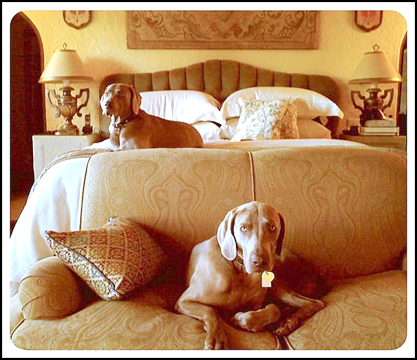
2012: Robert Luketic showed the bedroom on his Instagram. I do love this – with the paisley sofa and matching lamps – with a tapestry above the bed. The walls were painted gold here.
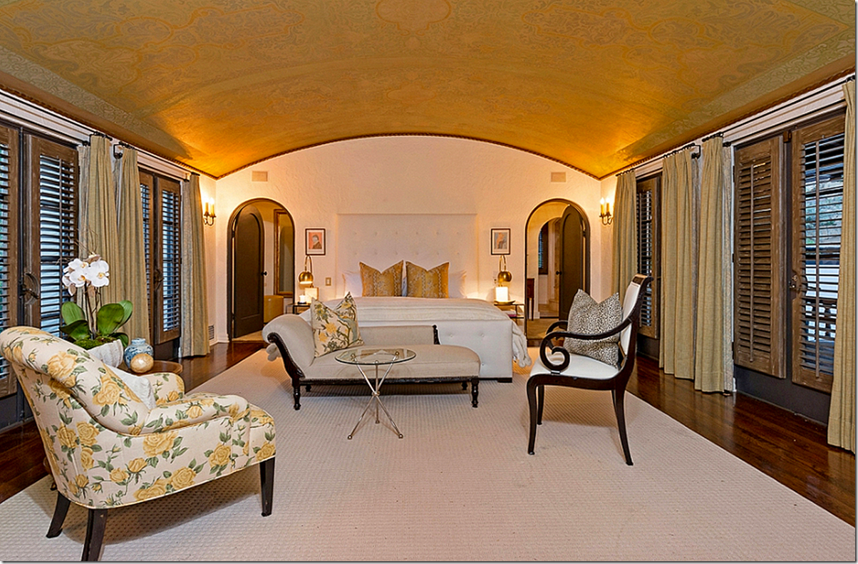
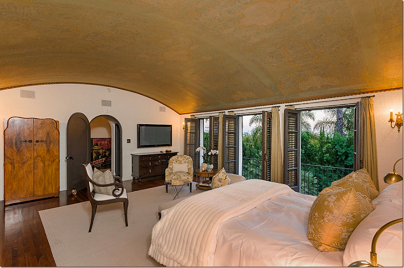
2013: Shows the bedroom as decorated by the stylists. The ceiling is so beautiful with its original subtle paint job and the room is so romantic and dreamy. Must be wonderful sleeping with the doors open or having coffee on the balcony. I love the double arched doors. The closet is through the doors and then another set of double doors lead to the bathroom.
The view towards the front yard and the landing. Was the vintage armoire Pattinson or Luketic’s?
The balcony off the master bedroom overlooks the terrace and the water rill. The lighted window on the right is the guest room.
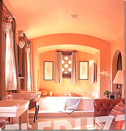
1998: This is the master bathroom when Tim Curry lived there. The walls were stucco, painted Tuscan gold and he added a vintage chesterfield sofa. Love the curtains and the wonderful light fixtures.
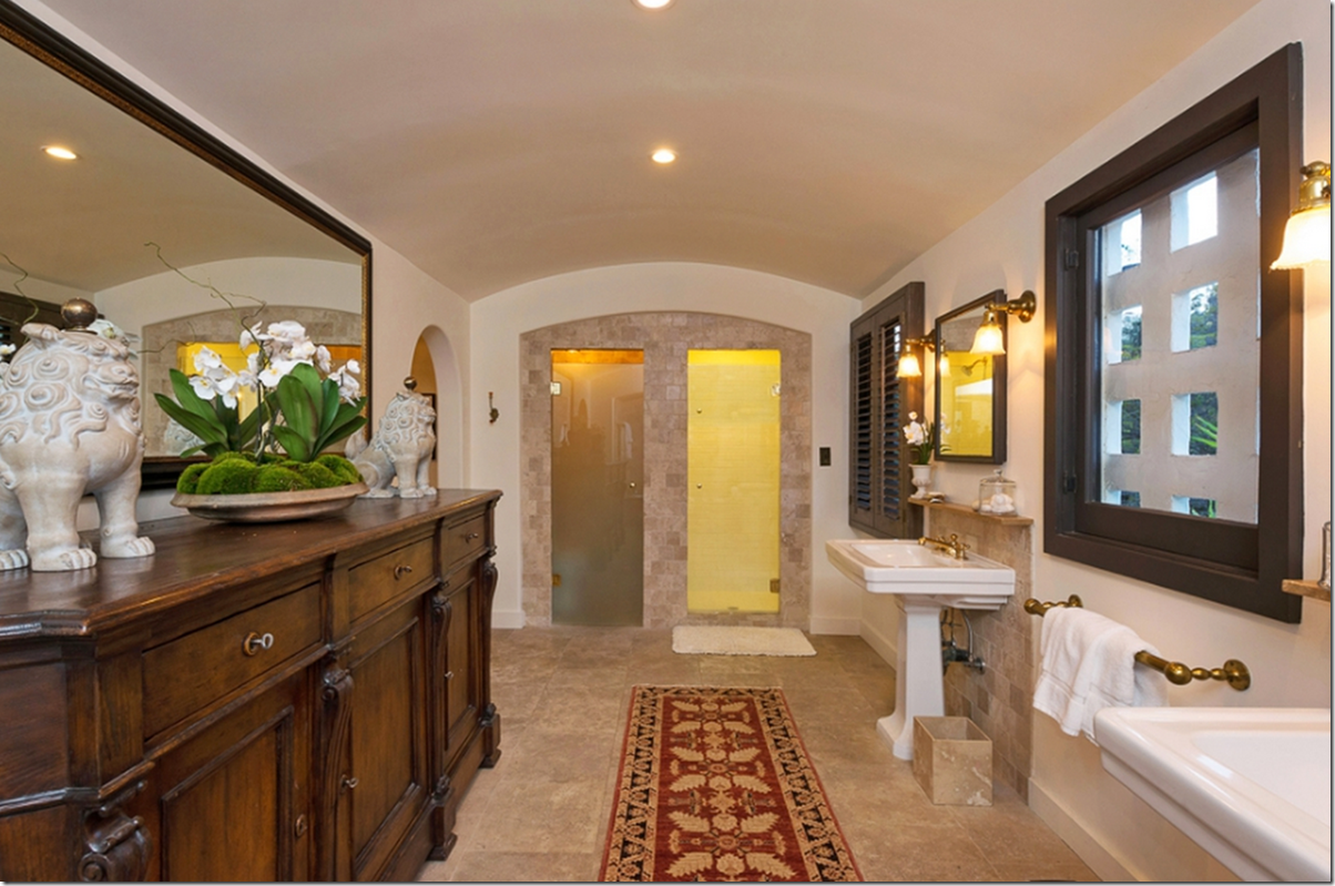
2013: Luketic remodeled the bathroom – adding limestone floors and tiled walls – which matched the limestone in the newly remodeled kitchen. Again, the ceiling is barreled.
And looking the other direction at the large walk in shower. I don’t care for the new light fixtures as much as Curry’s though. Love the stucco windows. Aren’t they fabulous? There are several like these throughout the house – you can see it in the outside pictures.
THE GUEST ROOM:
1922: Guest room – with hanging sconces and French wood bed frames. Love the chintz curtains and slipper chair!! The guest room is located over the dining room.
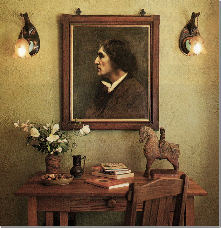
Architectural Digest 1998: Tim Curry painted the guest room a warm green. The portrait is Sir Henry Irving, the first actor that was ever knighted. Not sure if the French art nouveau sconces are original to the house or not. I don’t think they are, judging from the looks of the other iron sconces found throughout. Curry stated the walls were painted realtor’s white when he bought the house – which he hated! So he repainted them all in shades of ochre and moss, great colors no doubt, but I love the white walls as they are painted now.
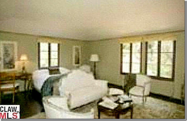
2004: Noah Wyle continued the all white décor with French chairs and settee and bedroom with green walls, perhaps left over from Curry.
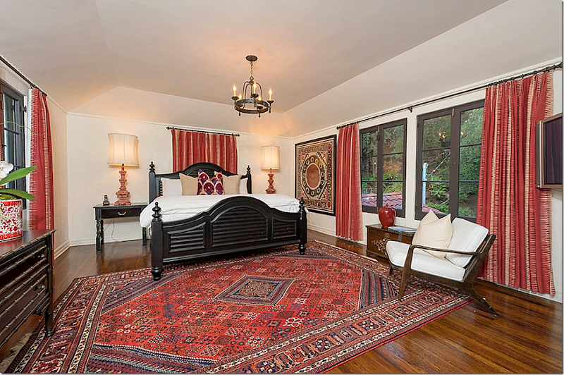
2013: The guest room done in the reds. The drapes would be nice, but they are way too short. And the suzani is too big for that wall space, but still, the room looks nice.
These are all the rooms photographed for the sale of Rob Pattinson’s house. Missing is the extra bedroom and the wine cellar and speakeasy bar. Still, the real estate brochure is thorough and quite beautiful.
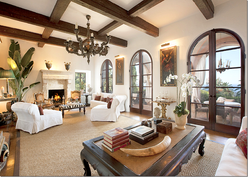
After being obsessed with this Los Feliz estate for almost two years now and scouring real estate and web sites for any pictures of it, these real estate photographs were a huge excitement for me! I can’t tell you how long I poured over them. Still, the stylist’s decorating left me cold and unsatisfied. How would this house look best? I keep coming back to Diandra Douglas’ Santa Barbara estate, thinking this is exactly how Rob Pattinson’s Los Feliz house should have been decorated:
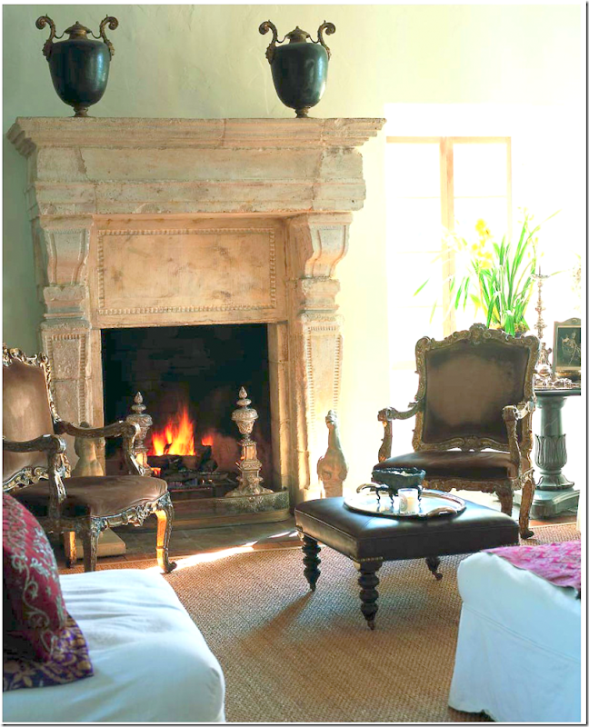
Dianda Douglas’ Santa Barbara estate is filled with priceless antiques and white slipcovered furniture with velvet pillows. A touch of zebra pops the room.
Diandra’s house looks so much like Rob’s house. I love the way she decorated hers.
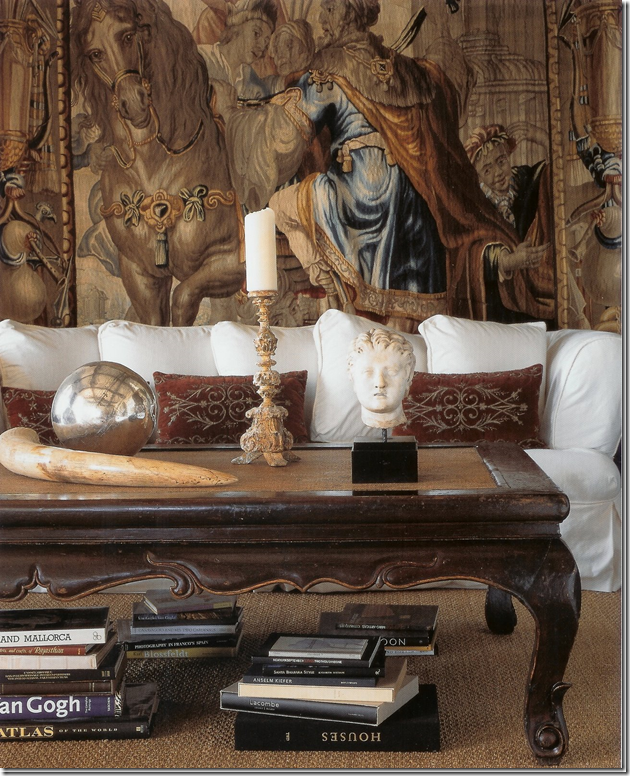
A gorgeous antique tapestry and a selection of oversized accessories are exactly how I would decorate Rob’s Los Feliz house. No glitz, no trendy gimmicks – just wonderful antiques and plain fabrics which when combined, let the house shine.
How would you decorate it – given the chance?
I don’t know why I fell so hard for this house. Sure, the Twilight connection was a draw – but honestly, it’s only the reason why I became aware of the estate to begin with. In the end, it was the house itself that spoke to me. What makes it so wonderful? For one, the size is perfect – not too large – and certainly not small. It has a very human scale to it. It is elegant, yet cozy, warm and inviting – everything a house should be. It has the quirky hidden wine cellar and bar, and most remarkably, its footprint has never been changed, except for a reconfiguration of the kitchen. The layout is totally unique. I love the beautiful and spacious entry hall and the inside/outside feel of the rooms. The painted and barreled ceilings are all so special, as are the original sconces still intact. I love the scale of the rooms especially the living room and the master suite above it. The house is just special.
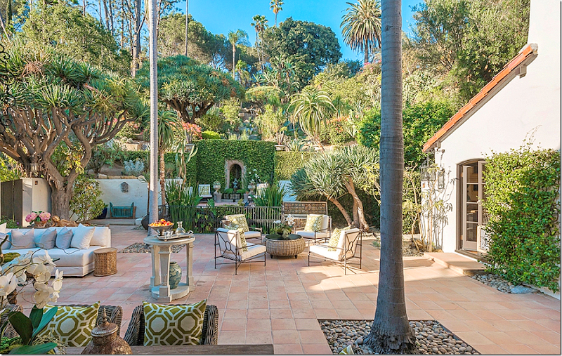
And then there are the gardens. It would be hard to think of another house, that isn’t a mansion on some grand estate, with gardens like these. The fabulous water feature - the tiled rill that cascades down from the high hill where the rock lined swimming pool turns into a waterfall, which then pours into the grotto and finally gushes through to the koi pond at the edge of the patio. There is the stone amphitheater that invites nighttime musical and acting performances. There are the climbing roses, the lavender, the succulents and boxwoods that make up much of the landscape – along with the original dragon and palm trees that have survived over 90 years now. The patio is a room itself, with a fireplace and lots of cushy seating, it’s a perfect place to relax alone or to entertain.
The grounds with the meandering paths are romantic and musical with the waterfalls and birds chirping. Add to this, the city views that are seen from the back property, when at night L.A. becomes a twinkling array of lights.
Recently after a night time party given at the house, a guest tweeted “is there another garden as beautiful as Robert’s?” – probably not!
Epilogue:
And finally what happened to Rob Pattison and Kristen Stewart in the end? Last year, the couple split up after Kristen was secretly photographed in the arms of her very married director which led to her public plea for forgiveness from the “person I love and respect the most, Rob. I love him, I love him. I’m so sorry.” This apology was the only time the privacy-loving couple had ever admitted they even dated.
The split lasted just a few weeks and Rob and Kristen quietly reconciled. During their time apart though, Kristen had purchased her own house in Los Feliz - a newer, more contemporary home, where she still lives today. Although it is reported in the tabloids that they are yet again broken up which is why the house is now for sale – there are whispers that they are secretly, yet again, back together and have bought another house in the canyons, which they are now renovating. Since neither gives press conferences or interviews about their personal life – the truth will probably never be fully known.
To view the real estate brochure, go HERE.
Home
»
»Unlabelled
» Los Feliz: A History of A House
Subscribe to:
Post Comments (Atom)



















![[image_thumb159.png]](https://blogger.googleusercontent.com/img/b/R29vZ2xl/AVvXsEhZqu0XAnhrYwB7a_fjKu_uVcZBXZjDspPx-nclU4v-C3ELlXvjd1NLE4PvYJhW10aN-McFz1iyxF5_vtCHGltBfPyKWsEl4k3aV67Hmph6FVu3vU4iCp_sUppan3ZxWjiR4iTEaHcfzbQV/s1600/image_thumb159.png)



![[image_thumb6119.png]](https://blogger.googleusercontent.com/img/b/R29vZ2xl/AVvXsEjEosx6T2f30ozpyvkljG_s_CEVMcQTVzpOxYVR5a24NFLv_0Xqn9paMEaRKOmpkrH4pXtdp36hBOjrWS0B1xT_0HEylDrg5XoqE7XbA6B-Mzdi4BVDXCuW7vlzJ7EHoFyLlKhFrxIHbt7f/s1600/image_thumb6119.png)





0 comments:
Post a Comment