A few months ago I got a call from interior designer Ginger Barber asking if I wanted to show pictures of a country house she had recently completed – located about an hour 1/2 from Houston. Of course, there’s no need to even ask! I am always thrilled to show a house decorated by Ginger.
As you know, Ginger Barber is one of my favorite designers – I have long loved her easy, casual aesthetic and I never fail to learn something new from her different projects. Unfortunately, this house was being published in the summer issue of Luxe Magazine, so we had to wait a few months before we could show these gorgeous photographs taken by Nick Johnson. The best part of waiting is that while the magazine spread was indeed lovely, I am able to show so many more photographs here – which is the beauty of the internet blogging!
Enjoy!
The house was designed by Curtis & Windham Architects and built by RB Ratliff Builders. Landscape by Sarah Newberry. The house is over 16,000 sq. ft. and has 9 bedrooms and 11 bathrooms.
Let’s first look at the property:
The couple came to Ginger looking for a country home near Houston. They needed a place for their large extended family to enjoy holidays at, but, it also needed to be just right for much smaller gatherings. The perfect property was a 100 acre horse farm – full of aged oak trees and rolling hills. This is not the first house Ginger has decorated for the family. There is also a vacation house on the east coast that was published in a national magazine a few years ago and, there is their home in Houston.
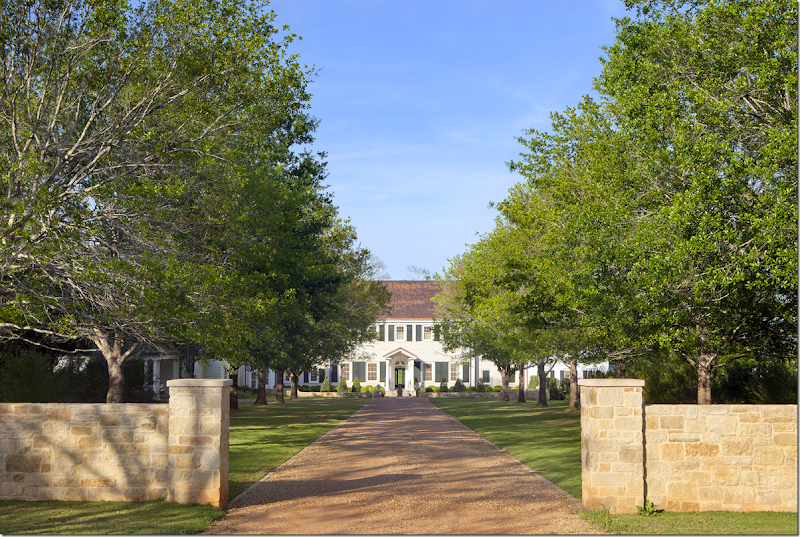
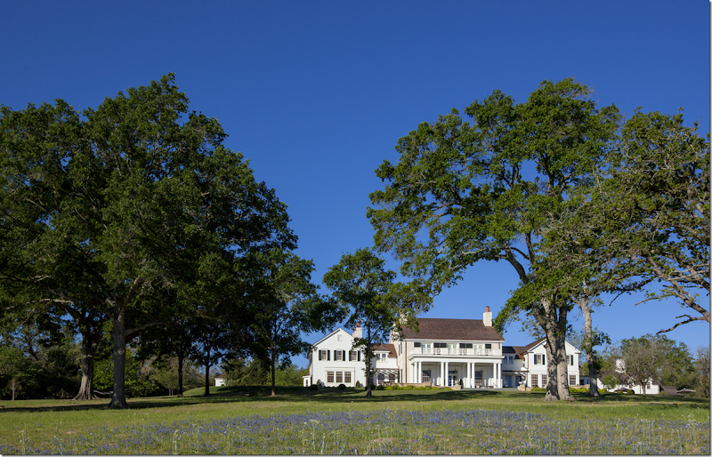
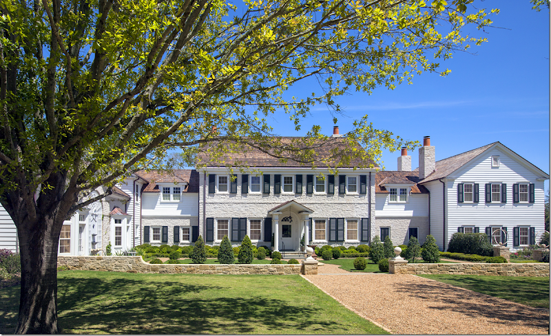
When designing the house, Curtis & Windham sited it on the highest point in order to maximize the views. There is a stream on the farm, which was fed into a newly created lake. The house is set back from the road – so that the approach to it takes a bit of time as the driveway winds through the trees. Finally, the gravel road reaches a stone fence that encloses a grass lawn with an allee of shade trees that leads to the stone farmhouse.
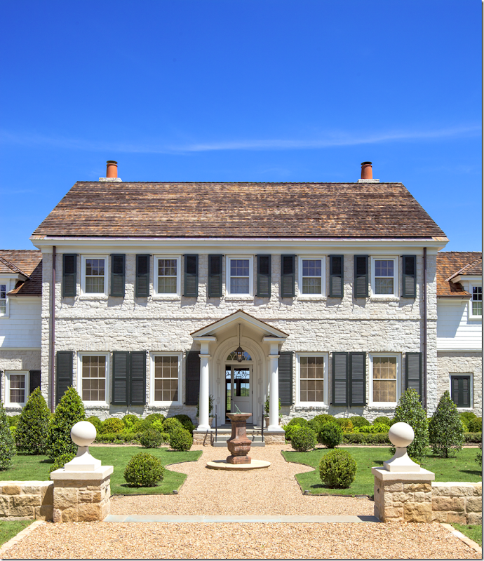
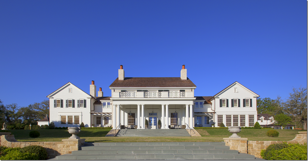
The center portion of the house is symmetrically designed, but there is a long wing on the left side that is not repeated on the right.
Surprisingly, the house is made mostly of stone, which makes it so much more substantial. The main living area is in the center section of the house and faces the back property. To the right, on the first floor, is the master bedroom suite. To the left and in the left wing is the kitchen and family room which overlook the swimming pool.
Once inside the low enclosed stone wall with its gravel paths – there is an antique sundial. What I love most about this house is that it is American. It’s not pretending to be some Italian villa or a Provencal farmhouse either. It’s not some faux Belgian estate, nor a Swedish one. It is just American, which makes it seem so much more honest.
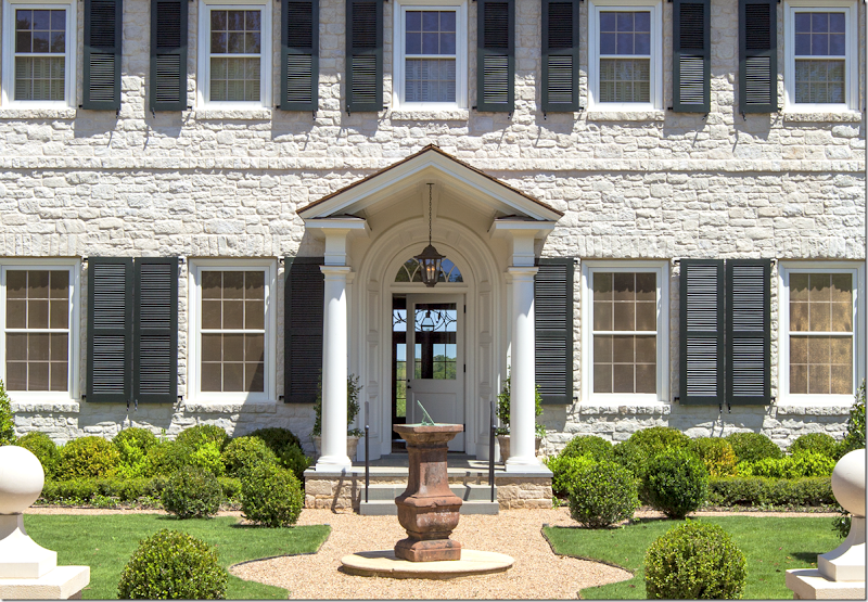
A close up look of the front door that opens to a small entry. The spiral staircase is to the right in a room of its own. Through the glass window in the door you can see out to the back property.
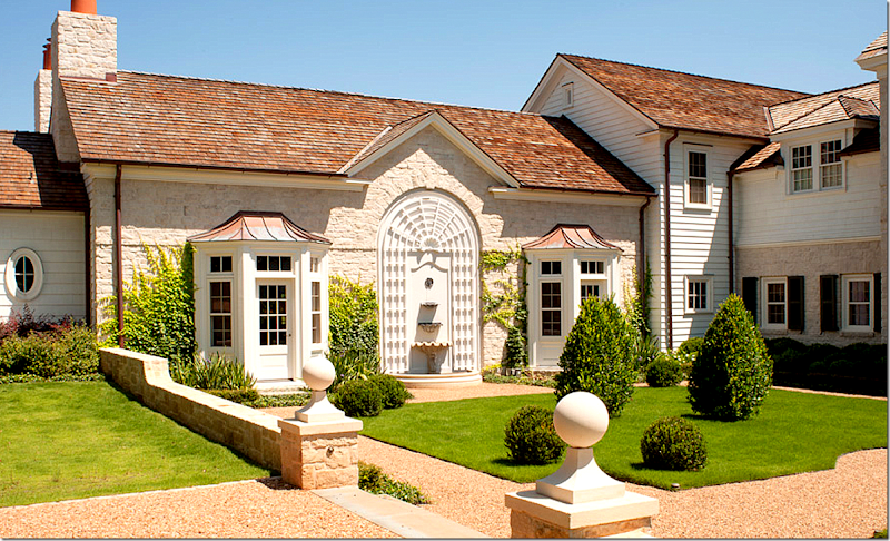
The left wing. Along this wing, there are two bay windows found in the family room – with a hanging wall fountain (seen above) between them.
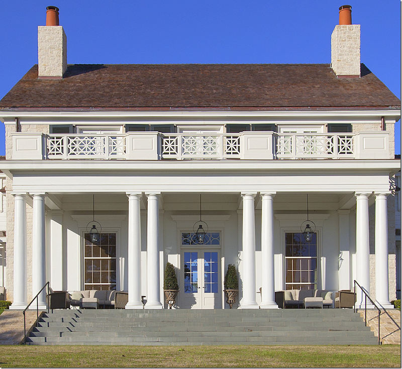
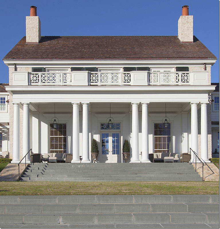
The back side of the house: the center portion is the large living/dining room. To the left is the master bedroom suite and to the right is a paneled sitting room. In between the living room and the sitting room is the wet bar. Notice how the property terraces down with slate steps. And notice the beautiful railing above the first floor. At the very right of the property is the pool and pool house – you can barely see the pool area since it is lower than the house.
A close up of the back porch that leads off the formal living/dining room.
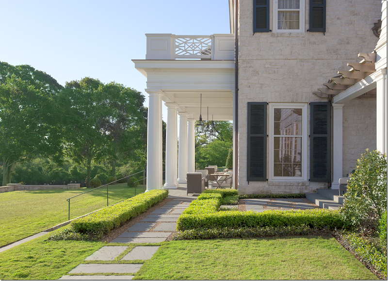
A side view of the back porch. I love the railing on the second floor terrace.
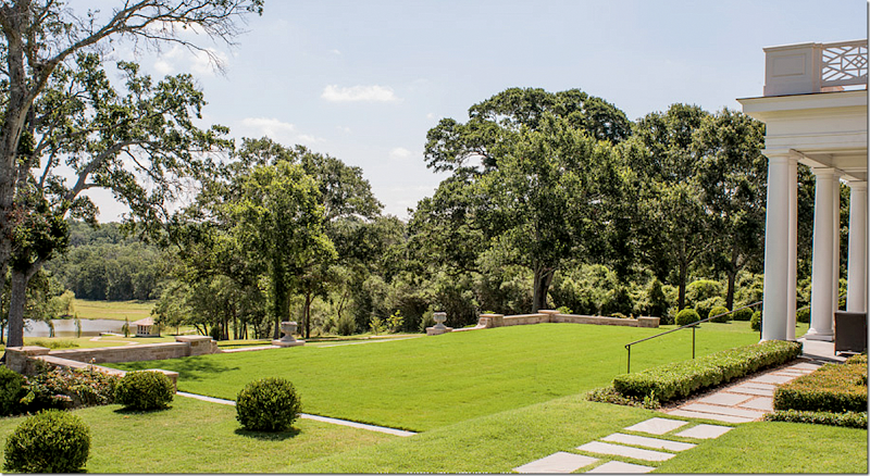
Here you can see the back lawn that terraces down to the lake.
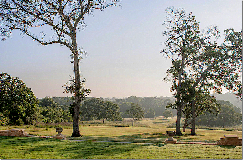
A mist filled view of the property as seen from the back of the house. Beautiful!
A view of the back from afar showing how the house was sited on the highest part of the property – affording great views.
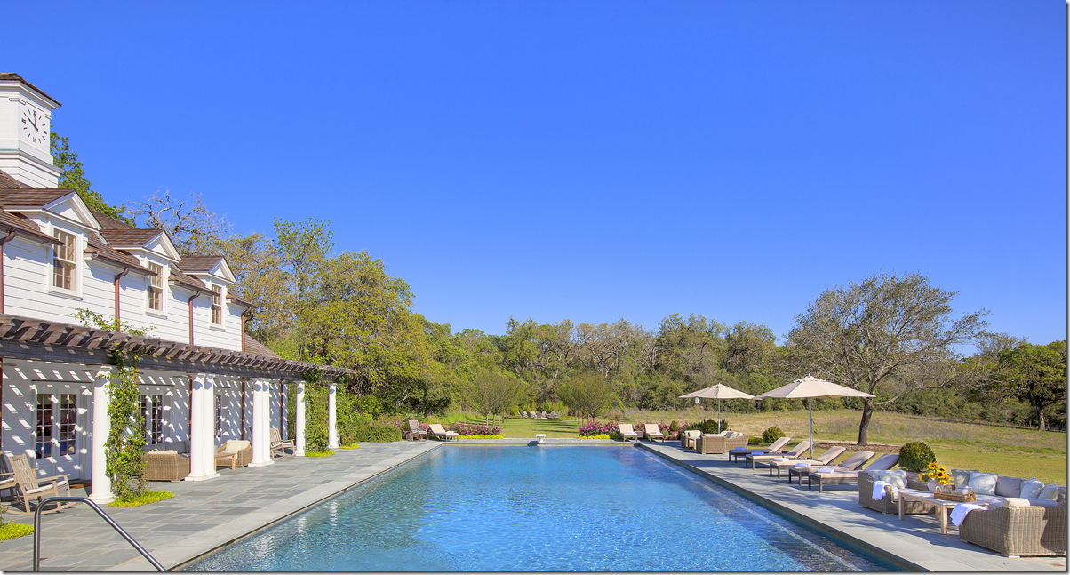
Here is the large swimming pool of course! This is Texas! It sits off the wing on the left side of the house.
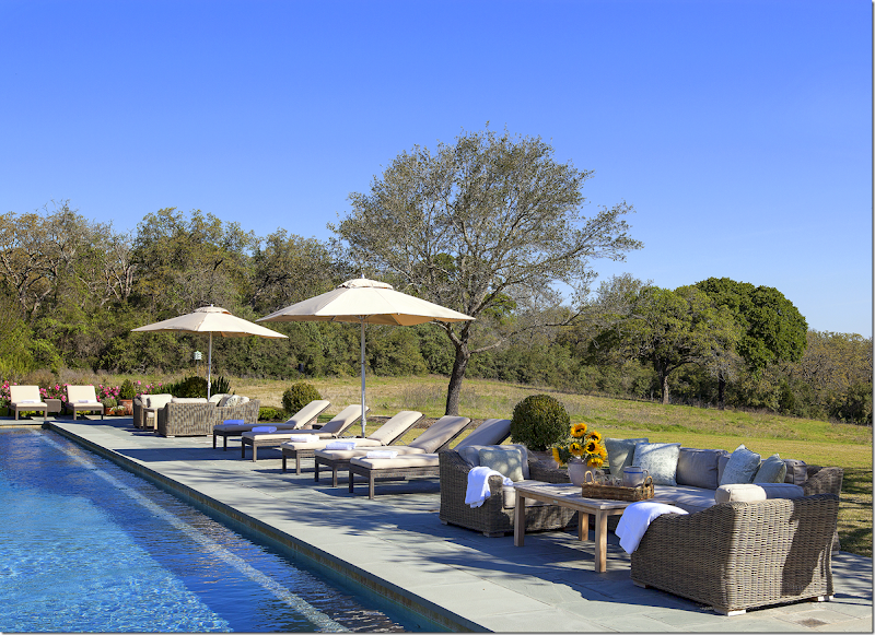
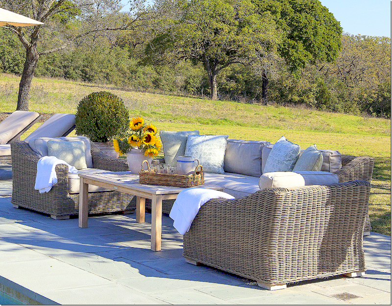
Ginger used an assortment of teak and wicker furniture around the pool.
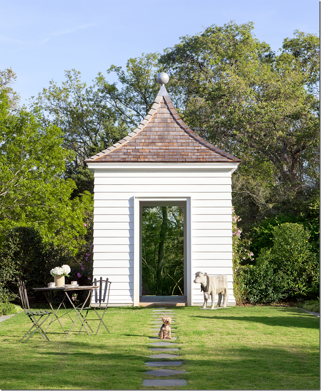
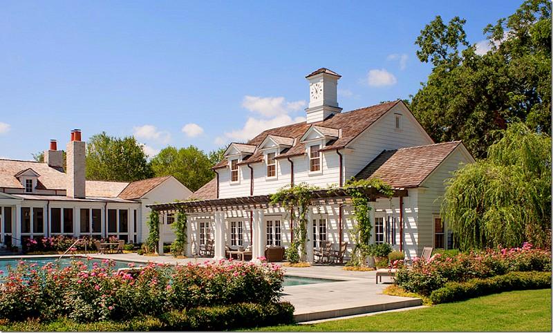
The pool house. Notice the clock tower! I love that!
Ginger decorated the pool area as an extension of the house. The printed fabrics are muted Rose Tarlow.
The wing with its long screened in porch overlooking the swimming pool and pool house. The kitchen and family room open onto the screened in porch.
A modern day folly.
The stream located on the property was fed into this man made lake. I love the screened in house – perfect to guard against mosquitos while hanging out at the lake.
A beautiful view of the lake which shows how high the house was sited to get the best views of the property.
Ready to go inside?
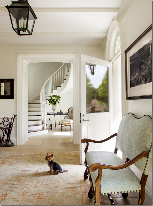
You enter the house here, with the staircase on the right through the opening. The entry and stair hall have stone floor while the rest of the house has dark hardwoods.
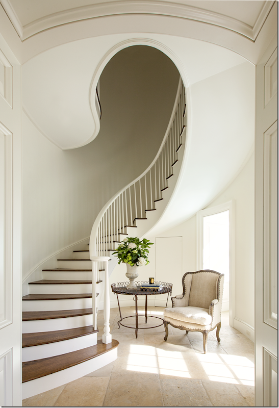
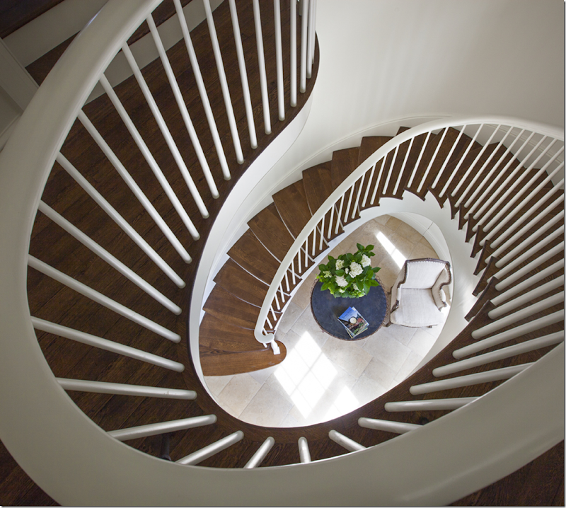
The staircase is quite beautiful in its simplicity. I love how the landing curves forming a perfect half circle.
Isn’t this a gorgeous photograph by Nick Johnson?
The formal living/dining room is past the entry – and runs the width of the main section of the house. The room is behind these two windows and double doors.
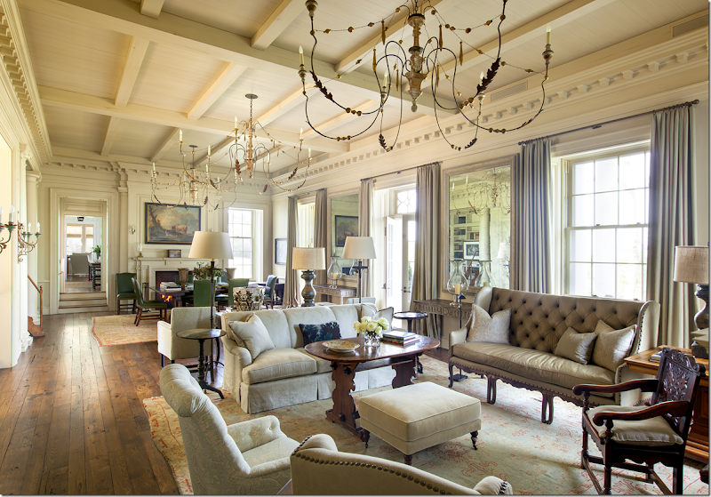
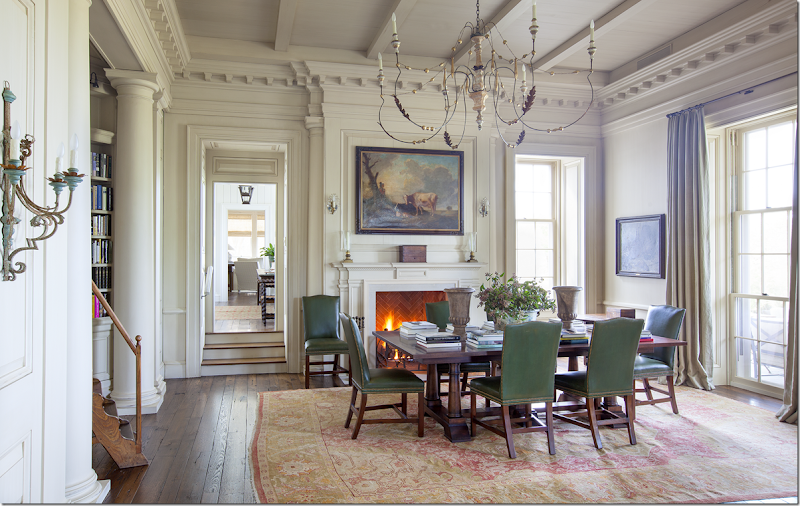
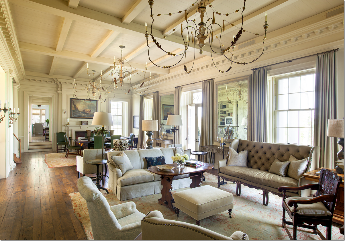
And here is the living/dining room. The ceiling is 15’ ft tall. Notice the beautiful mill work. The room is half dining room and half living room with a matching fireplace at each end. Notice how Ginger placed matching mirrors and consoles between the two windows and the center door. AND, notice the three large chandeliers – love them!!!!! On the wall opposite the windows, there are two book shelf bays. While the room is filled with fine furniture and antiques, it is still welcoming and doesn’t give off that don’t-touch vibe. I also love the chic sophistication found here and am thrilled Ginger avoided a typical Texas farmhouse look. Instead of Texana, this room could be found anywhere on the east coast, or even in England.
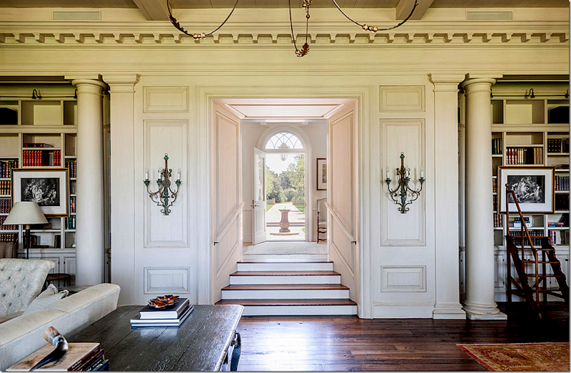
Looking back towards the entry hall and out the front door.
At the dining end, Ginger used green leather on the English styled chairs. Notice the bay at the left behind the tall columns. And through the door way, up the steps is the bar and paneled sitting room.
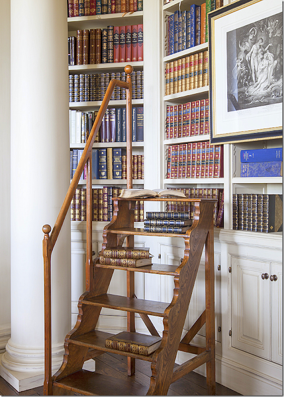
One of the two book shelf bays. Beautiful library steps. I love the way the library is incorporated into this great room.
Wonderful green leather – such an unexpected touch. Ginger piled the table high with books – making it double as a reading area.
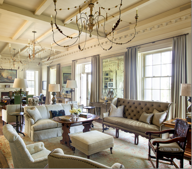
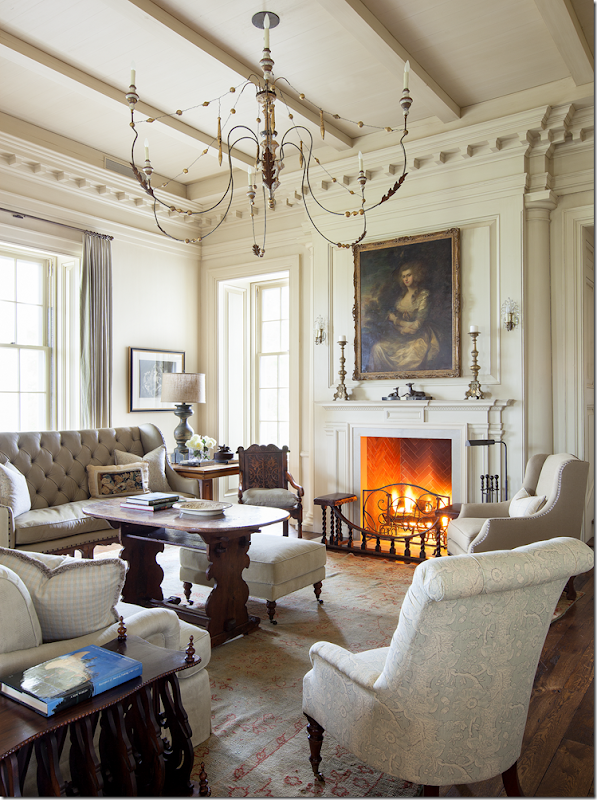
The seating area of the large room. The leather sofa is an antique. The two rugs are not matching – but they are complimentary. In Luxe Magazine, Ginger said all sofas are 96” – the perfect length for napping. See? You always learn something new from her!
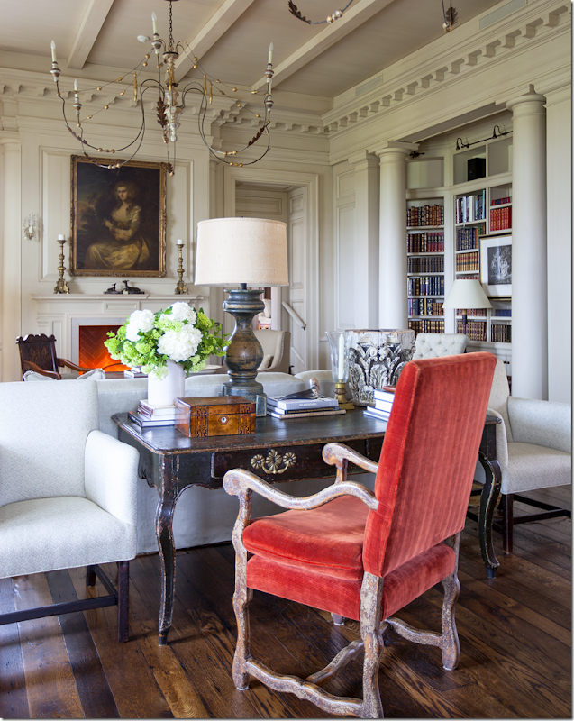
Here you can see the second book shelf bay that is across from the seating area. The orange velvet picks up the same accent color found in both rugs. To the right of the fireplace is the doorway that leads to the master bedroom suite and sitting room.
In this close up, you can see the subtle patterns – a toile and a check – that Ginger chose for this room. The painting over the fireplace is gorgeous!
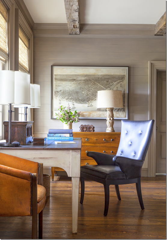
Off the living room is the master bedroom suite – with this sitting room. Notice the shiplap walls and the antique beams. Again, Ginger used a mixed of antiques and plush upholstered pieces covered in subtle colors and patterns – like this tiny check. Isn’t that a great fabric? Notice the art work behind the sofa, love!
And across from the sofa – looking out at the back acreage - is this desk with antique map. I love the antique leather chairs.
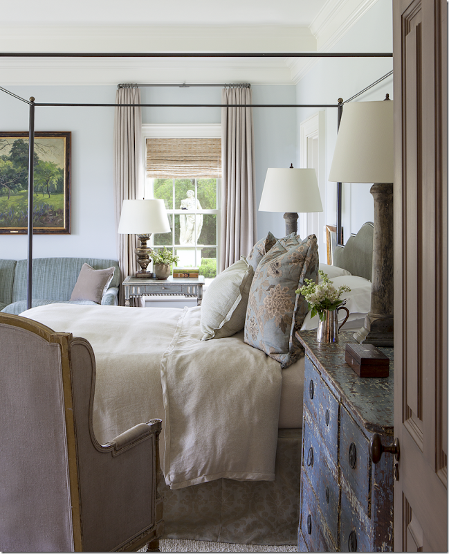
The master bedroom overlooks both the back yard and the side yard. Ginger filled up the large room with enough furniture so that it doesn’t look empty – something that many designers unfortunately neglect to do. There is nothing worse than a large room without enough furniture – it looks so empty and cavernous and unfinished! Love the Bennison fabric used on the bed pillows. And love the long console at the window.
The statue placed at the side yard is seen from both the bedroom and bathroom. Beautiful painted chest!
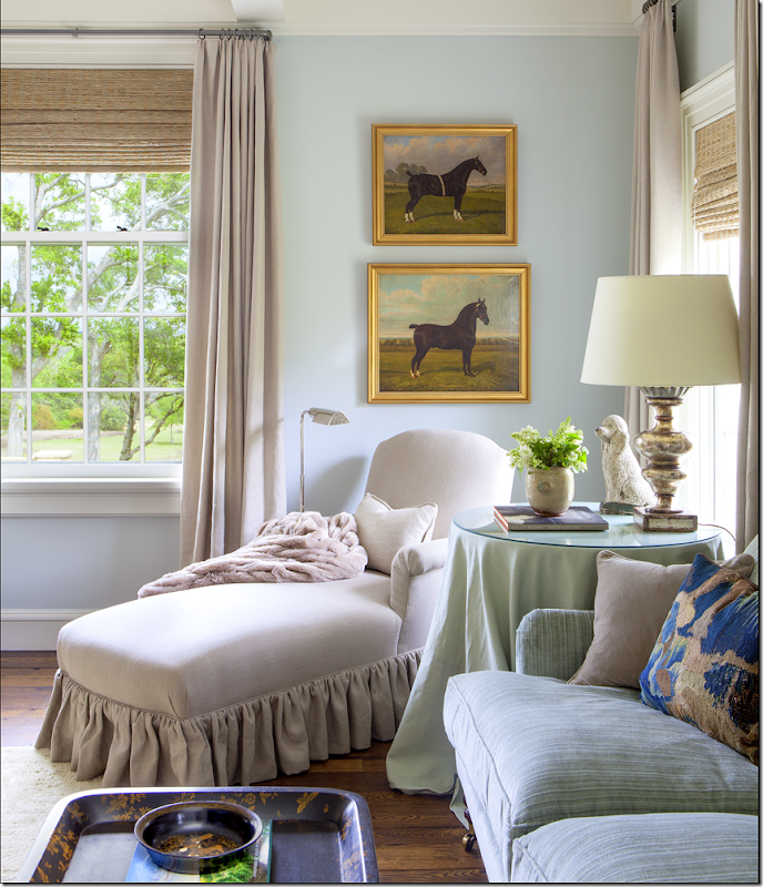
Beautifully tailored chaise longue.
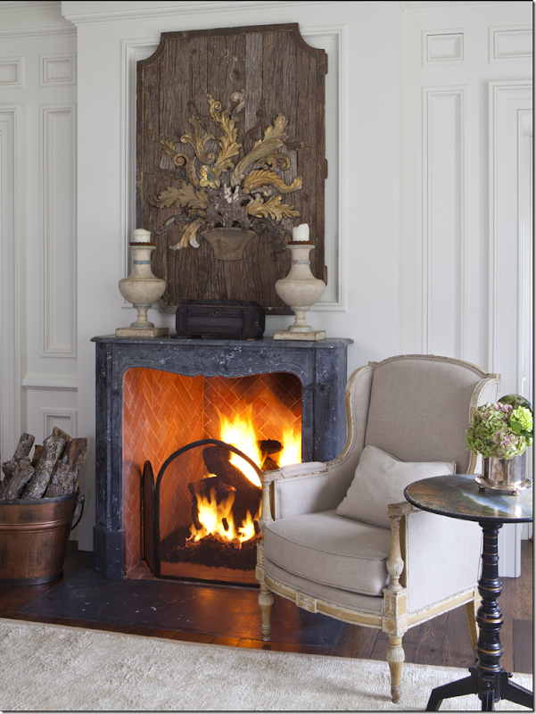
And beautiful trumeau over the fireplace. Such a pretty fireplace. Does it hide a flatscreen? Probably.
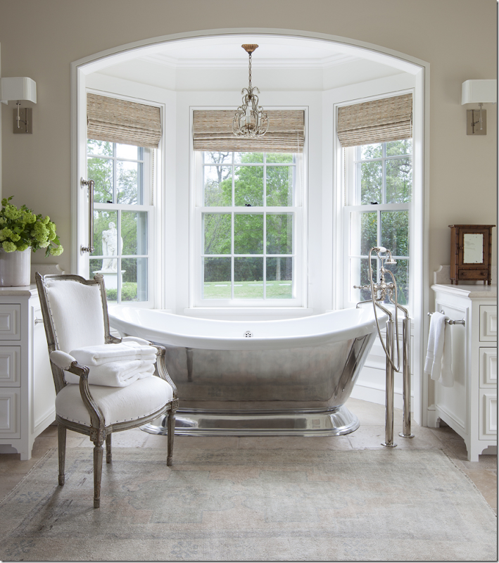
And the master bathroom. I love how Ginger used muted antique rugs throughout the house – even in the bathroom.
Back in the living room – we’ll go to the left side of the house now, up the steps, just past the dining area.
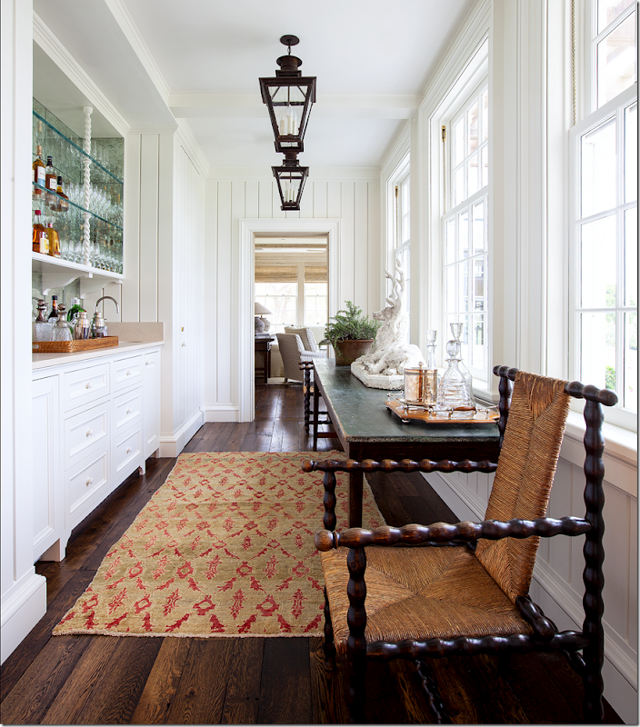
There is a wet bar that leads to a smaller sitting room.
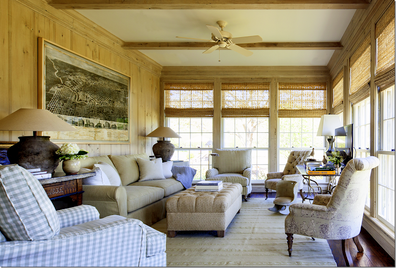
The wet bar connects with this sitting room which overlooks the back yard. Here Ginger brought in a some light blues and lilacs in subtle toiles and checks mixed with khaki. Beautiful paneling. And notice another antique map – this time of Houston, Texas, a sentimental choice.
This room leads to the kitchen and family room in the left wing.
Looking at the front façade, the left wing holds the large family room which overlooks the screened in porch and swimming pool.
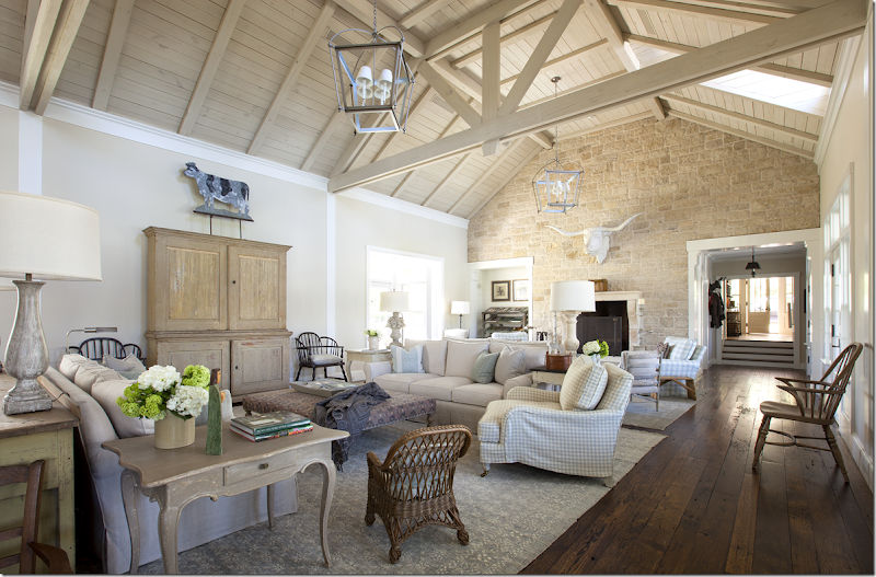
The left side of the house with the long wing houses the kitchen and this large family room – with its barn like roof. This room was divided into several seating areas with the middle portion centering around a large armoire that hides the flatscreen. While this room is as large as the living/dining room – the feeling in this room is much more casual, but no less beautiful. Notice the large cow sign that adds a touch of whimsy.
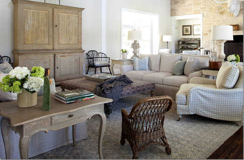
Here’s a close up of the seating area with its muted blue checks and rug. I love the black chairs flanking the Swedish armoire. Notice on this side, Ginger used a small check while……
on this side, she used a larger check mixed with a subtle stripe. The checks in soft blues mixed with the khaki linens add a unifying design factor to the large house – another lesson learned here. By using the same basic colors and patterns throughout – the rambling house seems connected and cohesive. Another design lesson from Ginger.
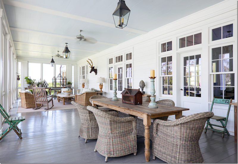
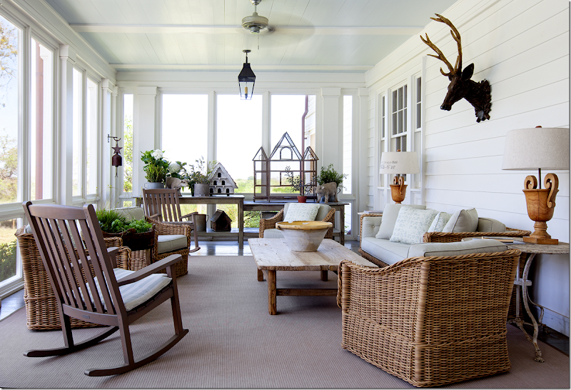
Off the family room is this screened in porch with an eating area and two sitting areas.
A close up of one of the sitting areas with its assortment of birdhouses.
Here you can see the swimming pool on the left that the screened in porch overlooks. What a porch!
And, finally, here is the kitchen. This kitchen looks at home in the upscale farm house - it’s not an over the top design that plagues many large kitchens these days. The kitchen overlooks the screened in porch.
And here is the wing with the screened in porch, the pool and the pool house on the right.
A HUGE thank you to Ginger Barber for allowing me to show this beautiful house! I hope you enjoyed seeing how a classic American farm house can be right at home in the heart of Texas!
AND….please remember:
Coming up soon is the fundraiser for Ginger’s passion – Habitat for Horses.
The event takes place this November 7th at AREA. For more information, go HERE!
If you can’t attend, please consider a small donation for this worthwhile charity.
HERE.
Home
»
»Unlabelled
» A True American Farmhouse–In Texas!
Subscribe to:
Post Comments (Atom)













![[image%255B3%255D.png]](http://lh4.ggpht.com/-w4Q9c6mJpLk/Uklg_XnFQTI/AAAAAAACCLo/Gj1tQcS78LQ/s1600/image%25255B3%25255D.png)
0 comments:
Post a Comment