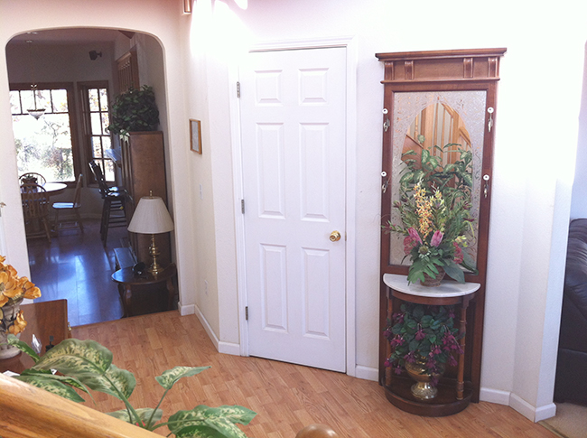
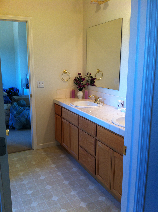
At this point we've been able to narrow down some parameters as we have a better handle on what's out there. As for location—we want to live below the snow line and Brad wants a short commute to work, so unfortunately a lot of our original neighborhoods have been eliminated.
This coupled with the fact that there's super low inventory (barely one new house per week that meets our basic criteria), I've had to lower my standards a bit. And we've been looking above our original budget.
With that said, here's what we found recently...
House #1
This house was in a highly desirable neighborhood with a pretty breathtaking view. It also looked like it hadn't been touched since it was built decades ago.
Foyer from the front door:
Old school dining room to your left:
And this faux finished room to your right:
The dollar signs were multiplying with every new outdated room I walked into...
Faux finished textured walls in so many rooms. I hate textured walls... unfortunately many houses have that here.
But this living room was my favorite—it had a lot of potential.
It also had a great view across from the fireplace (not that you'd know it from these overexposed iPhone photos)
The master bedroom was just off the living room and also had a great view overlooking the deck. More faux paint and textures.
Interesting window shapes in the master bath. And yes, I believe that is carpet on the side of the bathtub.
A hallway leading to some more rooms...

Like the emerald bathroom...

Downstairs there was giant basement with a bunch of rooms. It was huge and empty down there.
It was very 70's.
There were also tons of storage areas like this... it was like a maze of scaffolded rooms you could get lost in. Strange.
But the outside was great.
You'd have to cut back a lot of the trees to fully take in the view, but trust me, it was beautiful.
The deck wrapped around the whole house and there were lots of pergolas.
The Verdict: Way too much work for way too much money. This house was over budget, and too big in my opinion. The location was great but that's about it. It was a definite no for both of us.
House #2
This was also in a (different) highly desirable neighborhood.
I loved the front entrance:
The foyer was.... interesting.
Great potential though.
View from the front door onto the living room....
Living room again. It had screen doors that opened onto the deck.
To the left of the front door is the kitchen/seating area... by far my favorite spot in the house.
It was the wood beams that won me over.

I loved how cozy and open it was. There was even this bonus pantry/storage room.
Next to the kitchen there was a bathroom and dining area (not shown)

Master bath (this photo, I know)
Large walk in:
Across from the master was another bedroom:
And a third:
And another bathroom:

Downstairs there was a basement...
And another bathroom:
Here's the back of the house from the yard:
And the view of the yard from the deck:
Just behind the yard was a river/creek (which was quite loud and a nice feature), and just behind the trees is a lake, though you'd have to cut down some trees to maximize the view.
A nice pergola area.
Wraparound deck and more seating
The Verdict: Brad thought the bedrooms and bathrooms were too small. That didn't really bother me, but I wasn't really wow'ed by anything other than the kitchen/fireplace area. I didn't like how the living room was closed off from everything else though. It was also above our budget and we would have wanted to make a lot of changes, so we had to cross it off the list.
House #3
I was so excited to see this place. Seriously, look how adorable:
Oh yeah, and it sat on top of a mountain. Before we go inside, I just have to share this view:
I mean... my jaw dropped when we pulled up. Let me paint the picture...
You could see all the way to Yosemite. It was breathtaking.
I just sat on the front porch and stared. I almost didn't even go in.
View from the entrance:
Living room to the right:
And there's the view again from the large picture windows.
Dining room just to the left of the living room:
Standard sized kitchen, needed updating:
Just off the kitchen was a nice gathering area with a fireplace:
Back to the foyer area (there's a small bathroom behind the door)
Going upstairs...
There's a bedroom,
And another bedroom,
And a Jack & Jill bathroom between them:
Then there's the master bedroom.... I mean, hello:
Can you imagine waking up to this everyday? It's like living in a tree house.
There's also a small balcony off the room:
Master bath:
And finally, here's the back patio:
The Verdict: It pains me to say this... but the house is just too small. There's no space for my office or Brad's man cave. If only there was a basement or guest house it would be perfect. It was also a short sale and needed a new well (which can cost up to 30k). Bummer, because no view will ever come anywhere near this house. Sigh...
House #4
This one is in a great location and private (on almost 4 acres):
It had a large open concept living/dining/kitchen with lots of windows...
The whole house was custom built around 20 years ago and they did a great job. The cabinets look original but they are super modern and clean.
Outside is a huge deck that wraps around the entire house.
The view isn't bad:
There's also a garden area set up in the yard:
Back upstairs off the kitchen is a bedroom...
With a bathroom:
And a laundry room (excuse the funky coloring)
And the master bedroom, which we loved. Sidenote: the whole house had these nice plantation shutters.
A large walk in closet:
And large (but outdated) bathroom:
Just off the master bathroom is a door to a patio area with a built in hot tub:
Downstairs is a large bonus room:
And a guest suite with its own bathroom:
There was also this room which would have to be converted into my office:
And a covered patio on the lower level:
The Verdict: Our favorite so far. Brad wants to make an offer but I'm hesitant because it's over our budget. My only issue (other than the price) is that it's lacking the rustic/farmhouse character I'm looking for (where's my wood beam ceilings and brick walls, dangit?!). I could add all of this but I'd rather invest money into a cheaper house than one that's already at the top of our budget. So now we're just (impatiently) waiting to see if something better comes along...
Keep your fingers crossed for us—we're hoping for a breakthrough soon but it's tough when you live in such a sparsely populated area. In the meantime I'll be touring as many houses as I can in hopes that something will catch our eye, and of course I'll report back with my findings.
Also, for those of you who have requested another free monthly planner, good news: the 2014 edition is almost done! I'll be sharing the link to download that next week.
Have a happy and chocolate filled Halloween :)


0 comments:
Post a Comment