I was thrilled when I was contacted by a representative from Veranda asking me if I would like to show pictures from the new issue of Veranda. Of course I would! Who can pass up real photographs – not scans from the magazine? Trust me I like to do my part for Pinterest.
Seriously though, I was honored to be asked and I do love putting these beautiful images on the internet where they will be enjoyed forever.
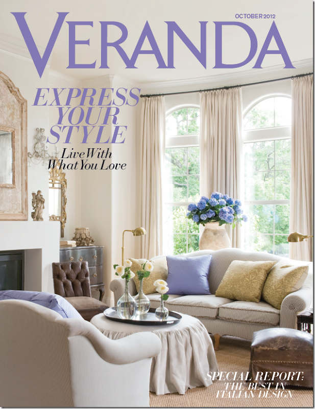
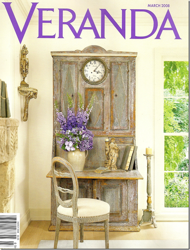
The gorgeous cover! I love the touches of lavender. All photographs shown today are by the great Peter Vitale.
This month Veranda magazine honors Houston interior designer Jane Moore with a cover story. Is this her third cover for Veranda? I believe so. I know her work has been published in the magazine at least 4 or 5 times. Additionally, her work was included in the new The Houses of Veranda book by former Veranda editor Lisa Newsom. Jane and Veranda are related – in laws of a sort. You probably know the connection, but if not, Jane’s daughter Shannon is married to Lisa’s son Andrew. Lisa started Veranda magazine over 25 years ago and just recently handed over the editorship to Dara Caponigro. Andrew and Shannon Newsom own the fabulous Wisteria catalogue and Jane has helped out all these years – providing her great eye and picking out antiques to be reproduced by the company.
Jane Moore was a long standing designer and antiques importer when she became known to Houstonians in the late 90s after opening a shop near River Oaks with fellow designer Joe Shaffer. Called Moore & Shaffer, it was filled with decorative items and antiques – mostly small accessories. I know all this because I used to haunt the shop. I remember getting a $500 check from my parents for my anniversary and heading right over there to buy a set of large antique books that I still have today. The next year, with the same anniversary check, I splurged on a tiny red tole tray. It was a real extravagance for me then. Actually it still would be today!
When that shop closed, Jane moved to her own space in a darling shingled house that looked more like Nantucket than Houston. Several features in Veranda and Southern Accents helped make Jane a very popular figure in the antiques and design business. It was around this time, after a trip to Sweden, that her aesthetic changed dramatically. She became one of the first in Houston to show these gorgeous Swedish and French painted pieces. Along with Babs Watkins, Donna Gray, and Margaret Naeve – these ladies – all with impeccable taste – introduced lighter woods to Houston - creating what I now call the Houston Look.
The Nantucket styled shop has recently closed and Jane’s moved on to a new home, a nearby townhouse which Veranda shows this month. The townhouse is a total departure from her last house which was shown in Veranda in 2000. It’s amazing how much design in Houston has changed in the past ten to twenty years. Where once Jane’s house was English inspired, filled with dark woods and fashionably cluttered, today her townhouse is bright and airy with mostly limed and painted antiques. Jane says she was ready to completely edit her look when she moved. The new townhouse is filled with only what she wants in it – no one else. And she loves it – she looks forward to coming home each day to a place that is filled with pieces she carefully selected from a lifetime of collecting.
Today, I will show photographs of both her townhouse today and also her house in the 90s so that you can see how her style has evolved over years.
Enjoy!
VERANDA: 2012
The living room in Jane Moore’s new townhouse is filled with antique furniture and accessories. The Louis XVI period gilt console on the left is a prized piece from her former home, as is the set of vintage upholstered furniture. She added Fortuny pillows along with pops of lavender. Notice the two worn 19th century leather chairs – these also came from her previous house. My favorite? The gilt console. The slipped ottoman. I just love that! And the macaroni beaded sconces and the olive jar filled with hydrangeas.
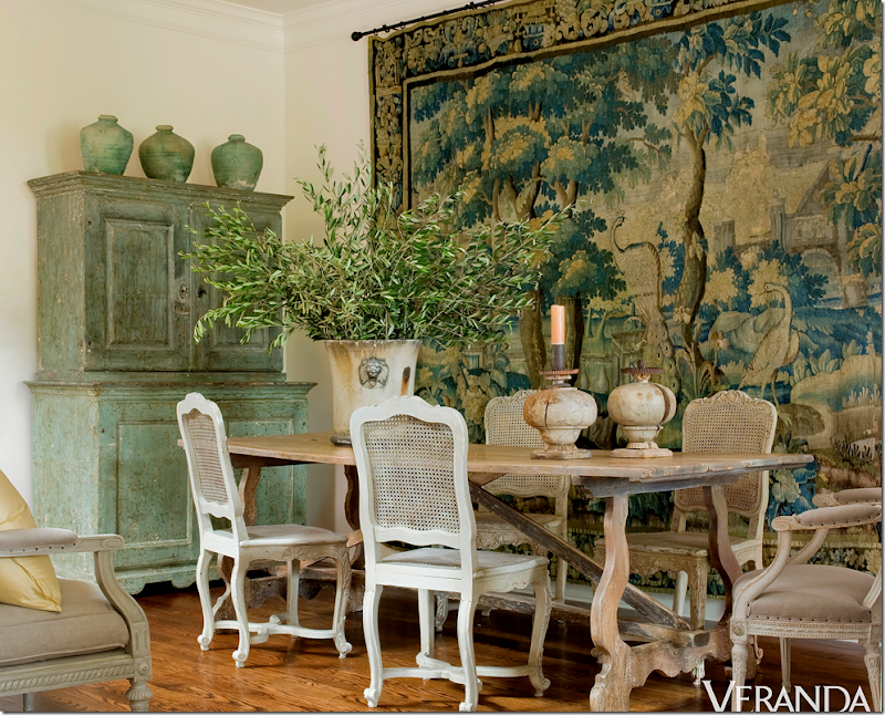
Here a gorgeous 18th century tapestry hangs on the dining room wall, another piece that came from her former house. The cane chairs are vintage while the fabulous dining table is 18th century French. Be sure to notice the beautiful 18th century Swedish cupboard. I love the way the tapestry is the main focal point and how it makes the room comes alive. It is so large – what a find this was! And I love how the green paint of the cupboard picks up the greens in the tapestry.
Jane’s kitchen is remarkable. She completely stripped out all the cabinets and put in a combination of tables and chests to make up her antique styled kitchen. I don’t think I would be brave enough to do this – but I LOVE the way it looks! Donna Gray is another Houston antique dealer who did something similar in her townhouse kitchen. Notice the farm sink is in the limed cabinet which is actually an old French architect’s desk, and the dishwasher is in a marble topped built-in. Above it all is a delicate 18th century gilt mirror and sconces. Pots and pans are stored in the laundry baskets beneath the cabinet. Notice how she pairs the antique table with industrial styled chairs.
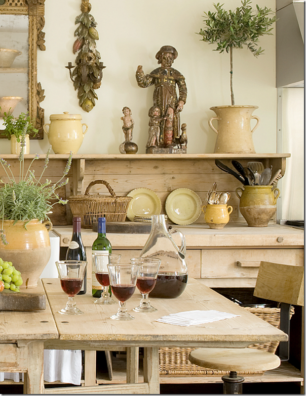
Here’s a close up of the styling I love all her French yellow ware and confit pots. The pots hold her kitchen utensils. Dishes and glasses are stored in the Swedish cupboard in the dining room. The table is an antique gate leg which doubles as a working island.
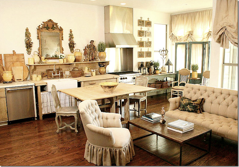
Now don’t kill me Veranda, but this photograph came from a different magazine – Antique Shops & Designers. It shows a little more of the kitchen that I wanted you see. Notice the oven is off to the right of the sink. And to the right is a sitting area with a large tufted sofa. What a cozy room! Since this picture was taken, there have been changes in this room as you will below. You can tell that the photographer pulled out the sofa to get it in the same shot as the kitchen, but in reality – the sofa is in its own room. Also, the industrial styled chairs weren’t being used back then – I think they are really a great addition. Wonder where the refrigerator is hiding?
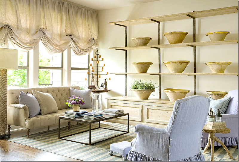
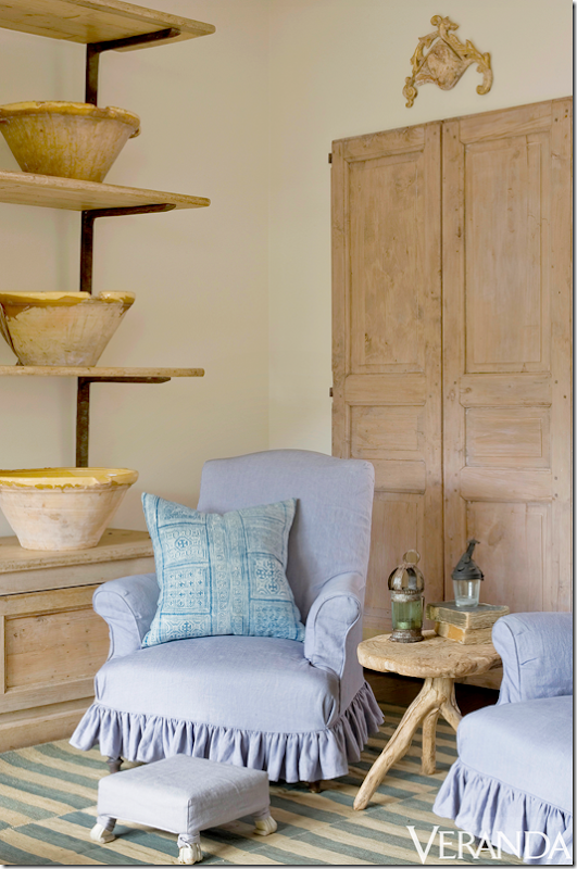
Here is what the family area looks like today – the chairs have been slipped in a lavender linen which matches the pillows in the living room. A blue and white striped dhurrie is from Carol Piper Rugs, who has a great collection of flat striped rugs at her shop. Along the wall Jane has added a 19th century étagère which is filled with her collection of French bowls. The repeated bowls are so eye catching – this simple, utilitarian object becomes the focal point of the room. The tufted sofa is also 19th century. Notice the billowing linen shades which softens the room. I love the modern, industrial touches – here the Belgian brick layer coffee table – mixeddddr with all the antique upholstered chairs and sofa creating an updated, fresh look.
Across from the sofa is a pair of old doors from Chateau Domingue.
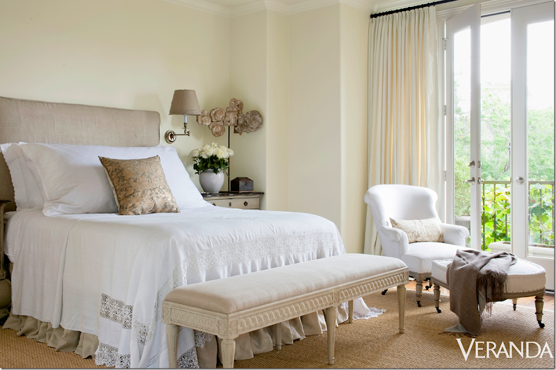
In her bedroom, Jane continues the use of bleached, painted woods – shown here in the bench which came from the Wisteria catalogue. The chair is antique – I love all antique upholstered chairs and sofas!!! The headboard is slipcovered in linen. Her bed is made with an assortment of white cottons and linens – but she adds a feminine touch of lace and a Fortuny pillow. At the side of the bed is a painted Swedish chest. What a pretty view of the treetops outside the balcony!!
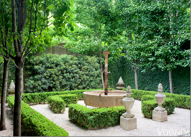
This might be my favorite part of her townhouse – the Belgian inspired garden. All green with just box and ivy and bushes. The pear trees are planted in rows to give an architectural feel to the space. Doesn’t it look like an outside room within a room? I love the old fountain and the two urns that stand at the “door” to the room. And the white gravel…fabulous!!! At the back – two obelisks stand at the corners of the garden. Landscape design by Glauser McNair.
VERANDA 2000:
In the new Veranda article Jane says how happy she was to edit all her old possessions and take just what she, and she alone, wanted. What a dream that must be!!!
Before she moved to the townhouse, she lived in a Georgian styled home – which was decorated in the English country style – clutters of books and accessories and lots of red and yellow walls with black accents. As I said earlier, it’s so fascinating to see how different design is today compared to 10 and 20 years ago when Jane first decorated her house. This article originally was shown in Veranda in
Photography is again by Peter Vitale. And notice who produced this? Carol Glasser! I do miss these old days of Veranda. Almost every month – or every other issue – there would be a fabulous Houston house. If there wasn’t a Houston house, there would be a Texas one. Glasser produced articles as did other designers. Now, Veranda is more of an international magazine which is why it is so exciting that a Houston house is again on its cover!
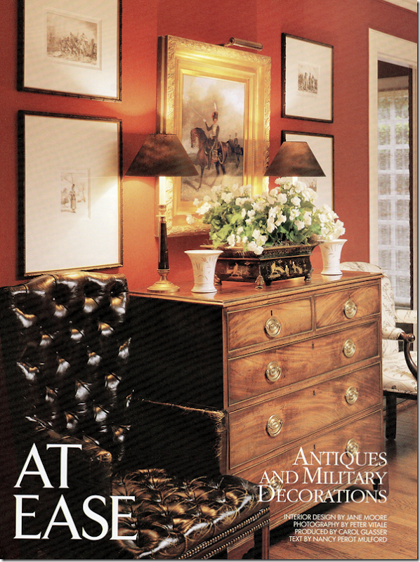
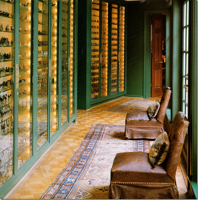
Here, the entry hall into the Moore’s house. You can feel the English vibe – right away! Moore’s husband at the time collected antique toy soldiers – a hobby that Jane indulged him in. Together they collected historical antiques – like this painting of a soldier on horseback. Don’t think he has just a few toy soldiers – his collection was over 6,700 when this article was written and is considered the largest one in the country!
Notice the gorgeous French gilt console? It’s in Jane’s townhouse, in the living room! The console is period Louis XVI with its original marble top. The walls are yellow striped wallpaper. On the console is a statue of the Duke of Wellington mixed in with beautiful tortoise shell boxes. The bow was tied to resemble a soldier’s epaulet.
The seagrass covered living room holds a collection of vintage furniture. Notice this is the same collection that Jane is using in her living room today. Another bust of the Duke of Wellington stands in the corner. Red walls and black and white ticking fabrics. These colors black and white were taken from military uniforms worn, while red came from national flags. The colors were chosen to blend better with all the military memorabilia around the house. Notice the gorgeous shades!!! I remember back when this was my ideal decorating. I tried to recreate this look in my own house until I got bit by the all white bug. The house also reminds me of Carol Glasser’s former house before she redecorated it. Ginger Barber’s houses from this time also were more colorful than they are today. It was around this time that Renea Abbott opened up her Shabby Slips – making it easy for everyone to get white slipcovers. Babs Watkin’s store was another huge influence on this switch from dark to light – just as Margaret Naeve’s is. Another influential antique store was Skelton St. John. The switch from English to Swedish and Belgian and French designs really made a huge difference in the way our houses looked.
Houston designers of this era used seagrass – before many had even heard of it in the states. Creative Flooring is rumored to sell more seagrass than anyone else in the country.
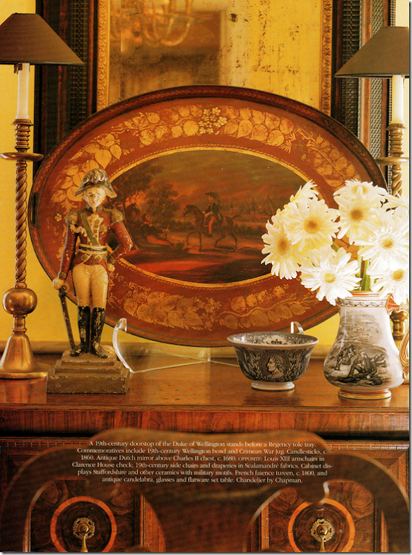
Another Duke of Wellington (Jane was really very patient!) and a beautiful red tole tray mixes with transferware. All must-haves in an English styled house.
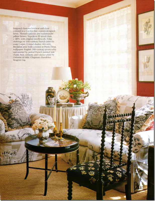
The red sunporch had a skirted table – who didn’t have 2, 3, and 4 skirted tables in a house. I covet that Napoleon 3rd period spool chair. I wonder where that went to? And a tole tray coffee table, another must-have as was the English tea tin.
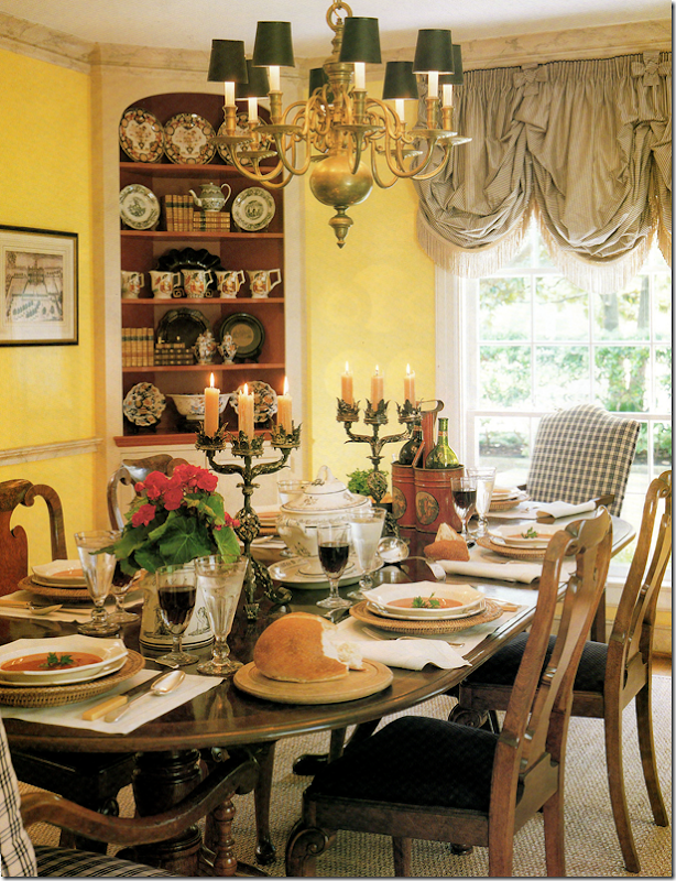
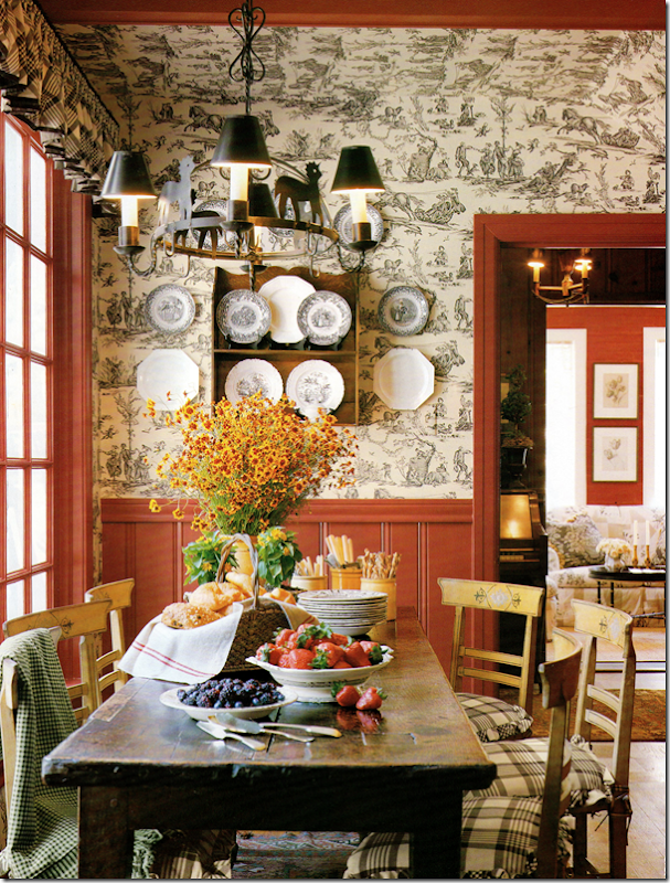
The breakfast room has a charming black and white toile mixed with red paneling. Rustic table, more transferware mixed with creamware.
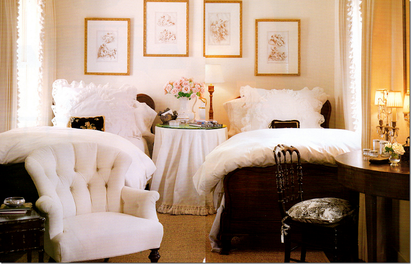
Sorry for the bad scans – but the magazine is over 12 years old! I remember at the time that I just loved this bedroom. I thought it was so beautiful - probably because it was white!! Another skirted table. I used to have one skirted table in each room too. I‘ll bet Jane still have this antique upholstered chair somewhere in her new house!
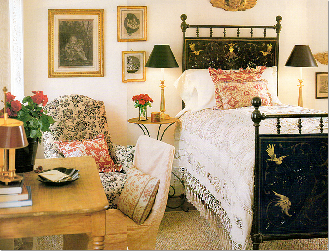
And another darling bedroom with an antique tole bed, painted. Pine desk.
The highlight of the house was the family room which was added on to the back. The connecting hall was built to hold the largest collection of toy soldiers in the country! Notice the two 19th century leather chairs. These are in Jane’s living room today.
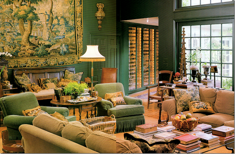
And the fabulous family room! It was filled with comfortable chenille covered furniture. Remember how popular chenille used to be. No longer. Whatever happened to it? I thought this room was stunning – and it truly is. You think you are in a country house in England, not Houston Texas! Notice the tapestry – Jane uses this in her new dining room.
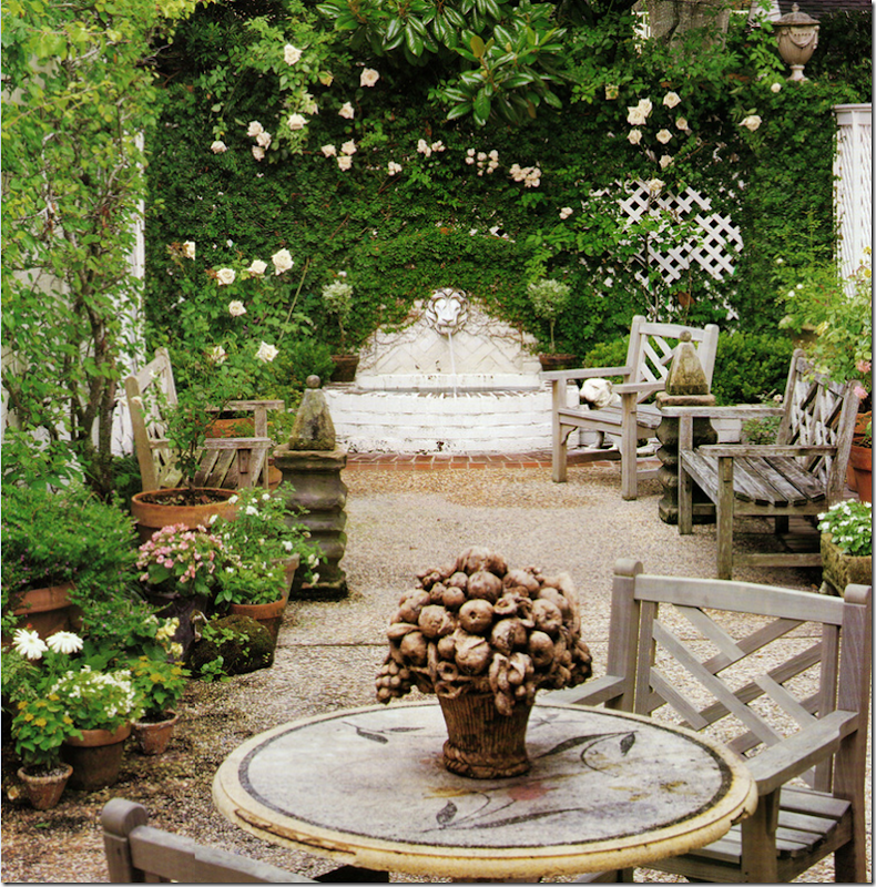
Her patio back then is similar to hers today – but while that garden is Belgian inspired, this is all English with the roses and fountain and teak furniture.
Four years later, Jane had another house in Veranda – in the foyer was a burlap covered settee – showing the new direction that Jane was going in. It took a trip to Sweden to change her aesthetic – and change it did. Unfortunately I had torn out that article for my collection of tearsheets and I can’t find it to show!!! If anyone has this magazine – email me!!!
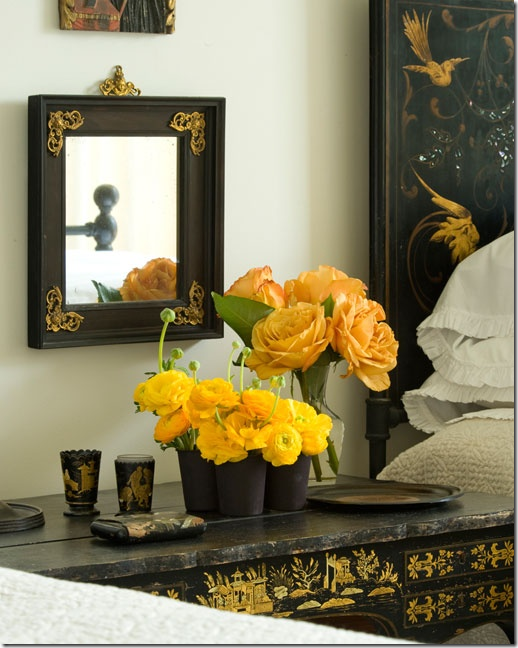
This photograph is on the Veranda web site – I wonder if this is a guest room in the townhouse? It is the iron bed from her former house, but it looks like there are two now? Notice the beautiful chinoiserie table and black mirror. Mystery solved?
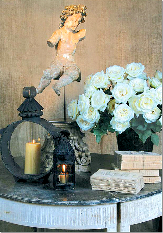
Here are a collection of ads that Jane created to run in Antique Shops & Designers. This one shows a gorgeous Swedish demilune with tied books and a santos.
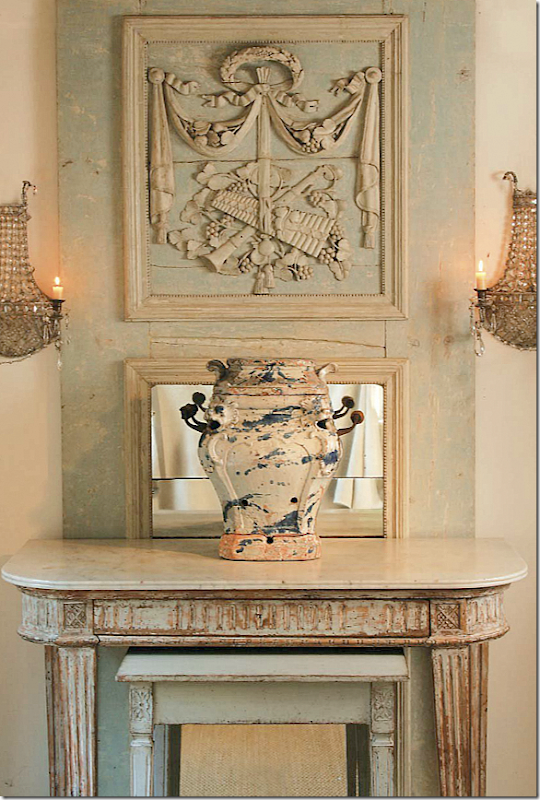
A gorgeous, tall trumeaue sits behind a painted console. That mirror!!
Another gorgeous mirror mixed with a painted chest. Can you see what a difference a real antique is compared to a faux antique. I love those candlesticks and that capital.
And this Swedish armoire and settee. You can really see the difference in Jane’s aesthetic from her English inspired house to her Swedish inspired townhouse. Her store’s ads reflect that change.
If there was any doubt of Jane’s changing aesthetic, this article was all the proof. It was one of Veranda’s most popular houses – evidence of this is it is included in The Houses of Veranda book. The house is owned Jane’s daughter and Veranda’s Lisa Newsom’s son. Shannon had also become a huge fan of Swedish furniture and when they purchased this new house, Jane filled it with antiques that are priceless today.
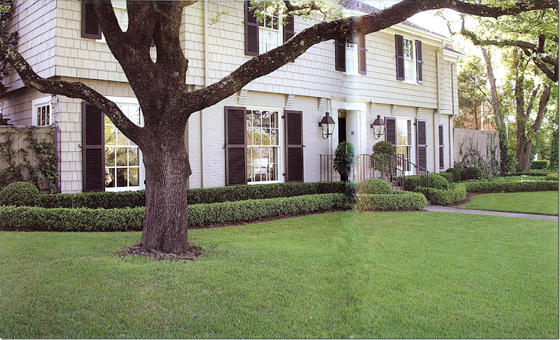
Here’s how the Shannon and Andrew’s house looks on the outside. Box and more box. Not a hint that the inside is pure Swedish!
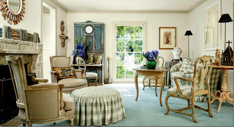
I adore this house and have shown it a million times, but I had to add it here in this story of Veranda and Jane Moore. The story would not be complete without showing this wonderful Swedish inspired house. French chairs mix with Swedish chairs and tables. I love the checked ottoman. Underneath, Jane put a flat dhurrie with no pattern but a light shade of blue.
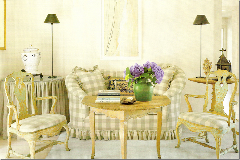
The sofa in the living room and the Swedish chairs and table. Notice how Jane mixed in contemporary lamps!
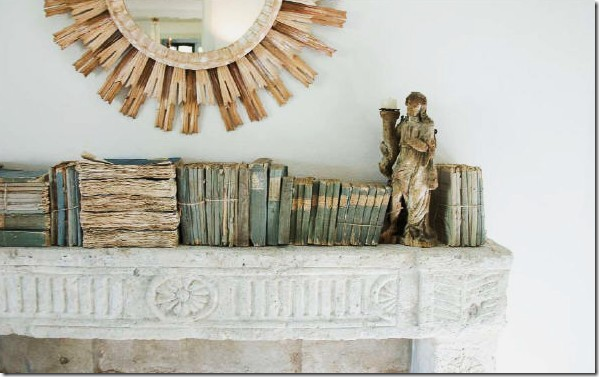
Was this the first time we saw these kind of books used as decoration? Probably. Wisteria produced a faux book box that resembled this collection. And the reproduced that mirror.
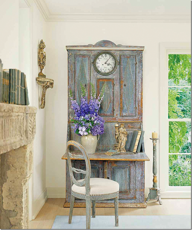
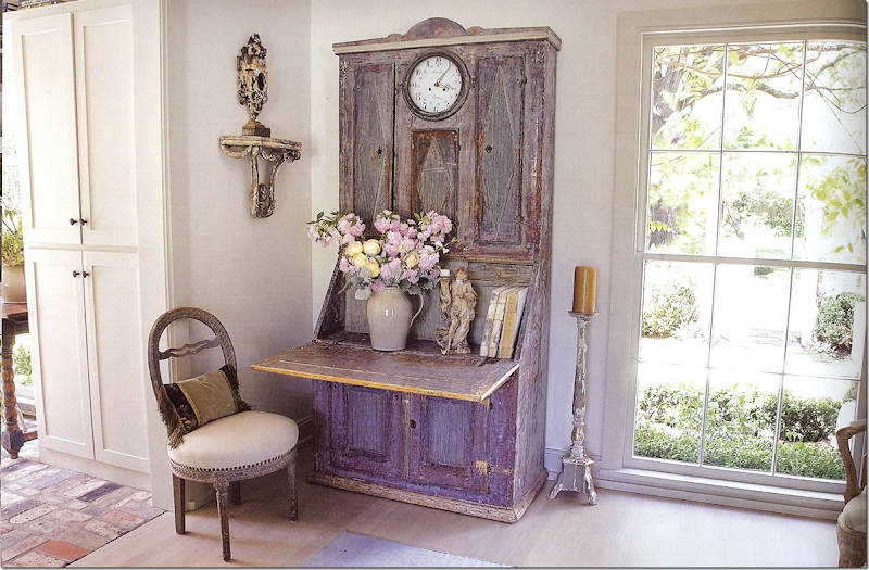
And in another corner, notice the Swedish desk with the built in clock!!! No wonder this picture made the cover – it’s stunning. I love the lone candlestick standing next to the desk.
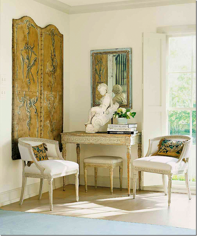
Another gorgeous corner in the living room. Swedish chairs and console and bench. A leather screen and a statue finishes it out. This is such a beautiful vignette. Is there anyone that doesn’t like this? No!!! I don’t believe you!!!!
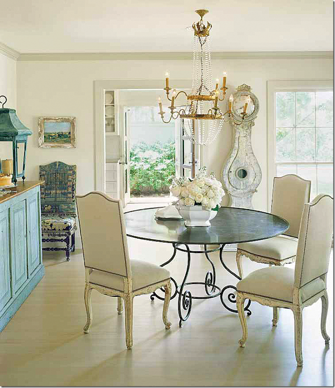
This might be my favorite all time dining room. It inspired me – that’s for sure. I bought a similar table and a similar chandelier after seeing this picture!!! And I had to have a Mora clock. Thanks Jane!!! I love the lanterns on the cabinet. This started me on my love of lanterns too. So many things in this picture really influenced me. I didn’t realize how many things inspired me from it until just now.
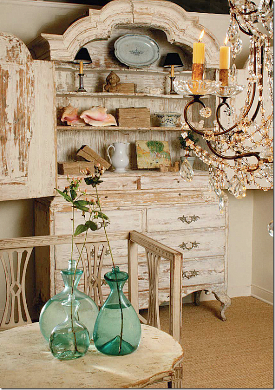
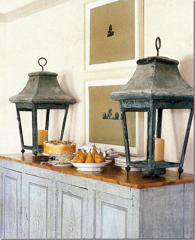
Antique lanterns on the Swedish painted cabinet. Later, Wisteria reproduced these for a while, but no longer. Why not?
Off the living room is the brick floored sunroom, on the left.
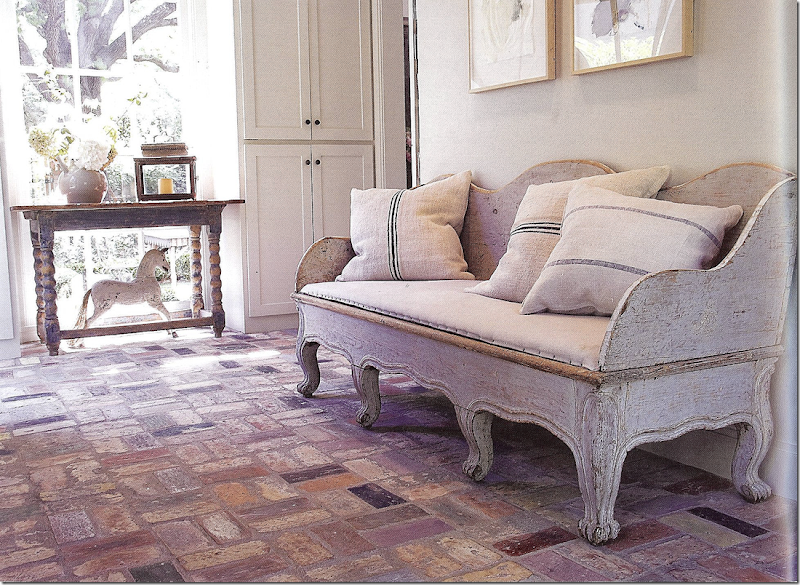
Here is an antique Swedish sofa with feedbag pillows –years before we all had to have those! And notice the horse – a must-have in a Swedish house.
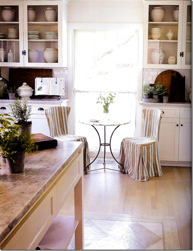
Off the dining room is the kitchen with white marble and subway tile and a collection of white confit pots.
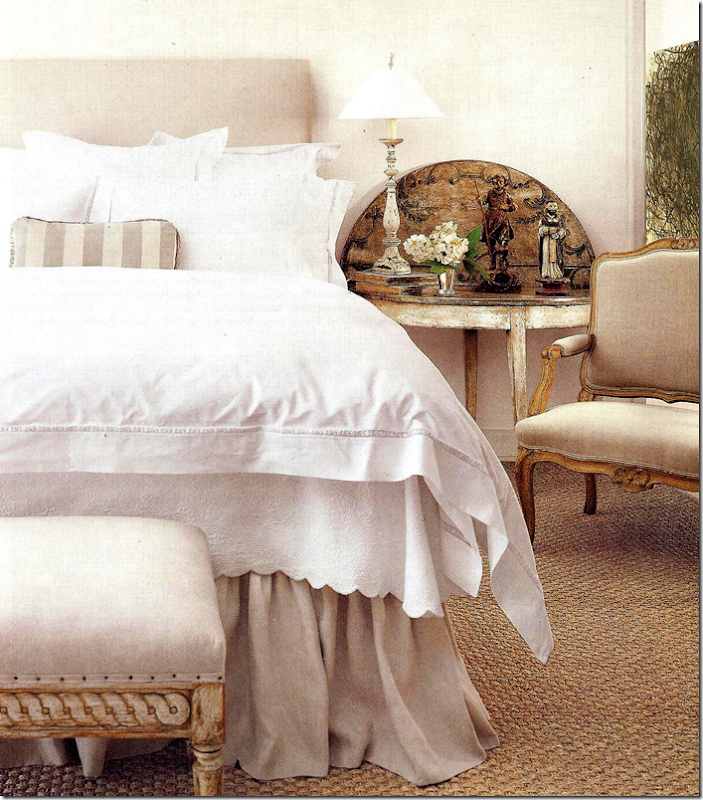
Their seagrass bedroom has the prettiest flip top table!!!! White cotton and linens on the bed – just like mom’s bedroom. And a bench with tiny nails that sits at the end.
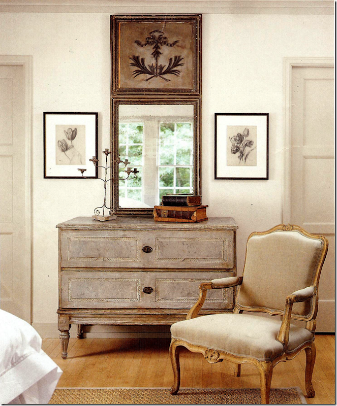
A trumeau and a Swedish antique chest sit next to a French chair.
Their gorgeous marble bathroom. Notice the way the marble is carved behind the sinks.
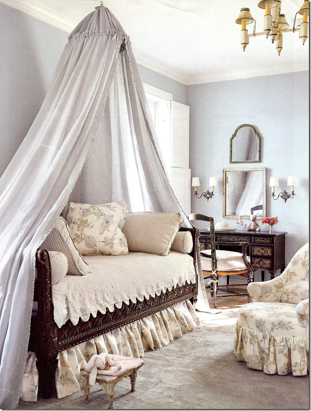
The prettiest little girl’s room ever. Bennison fabric and scalloped ticking bedspread. Who could ask for anything more?
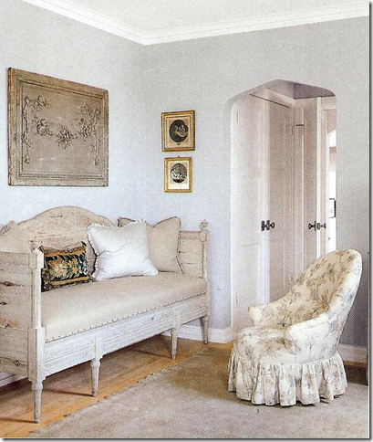
Well, you could ask for an antique Swedish sofa!!! To die for!
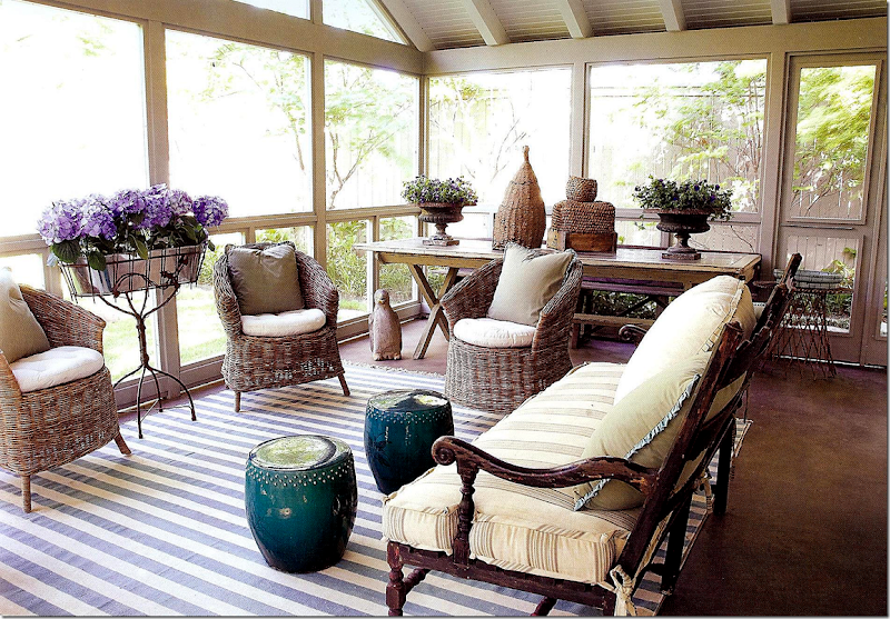
Out back is the Newsom’s charming screened in porch – filled with Kooboo chairs before we knew what they were! Blue and white striped rug, just like moms. I love this porch – I would be here all the time.
And if you love the Wisteria catalogue, Paper City announced their new flea market located behind their store and warehouse in Dallas. Go HERE for info on times and address. I wish I lived in Dallas!!!! I would be here all the time. Notice the horse – reproduced by Wisteria – inspired by their own horse.
Pictures of the Newsom’s house are located in both these books below. If you would like to order them, just click on the picture.
When Jane Moore recently moved out of her Nantucket inspired shop, Suzanne Duin moved right in. Duin owns Maison Maison where she sells French and European antiques. 2922 Virginia Street. More information HERE.
For a charming story about Jane Moore and the Newsom’s house, go HERE to The Indulge Décor blog.
And here is an interview with the Newsoms on Shabbynest’s blog HERE.
And many years ago, I wrote a story of how to copy a Swedish room (from the Newsom house) on a budget – unfortunately many of the sources aren’t available anymore!! But some still are. HERE.
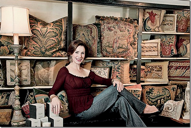
To contact Jane Moore for interior design work and antiques, email her: jmooreinte@aol.com
A huge thank you to Veranda for the gorgeous pictures!!!
I hope you enjoyed this look at Jane Moore’s work.
Home
»
»Unlabelled
» Houstonian Great Jane Moore
Subscribe to:
Post Comments (Atom)







0 comments:
Post a Comment