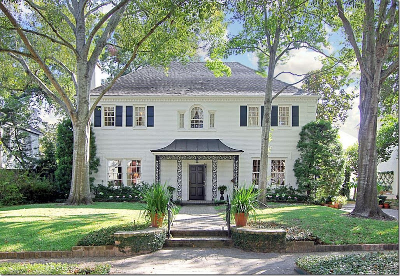
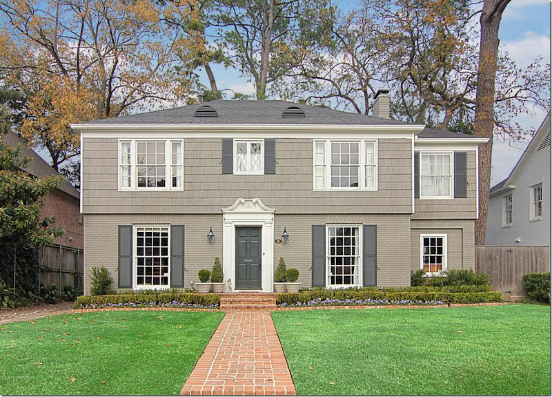
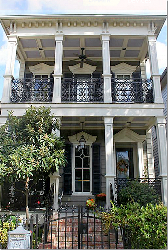
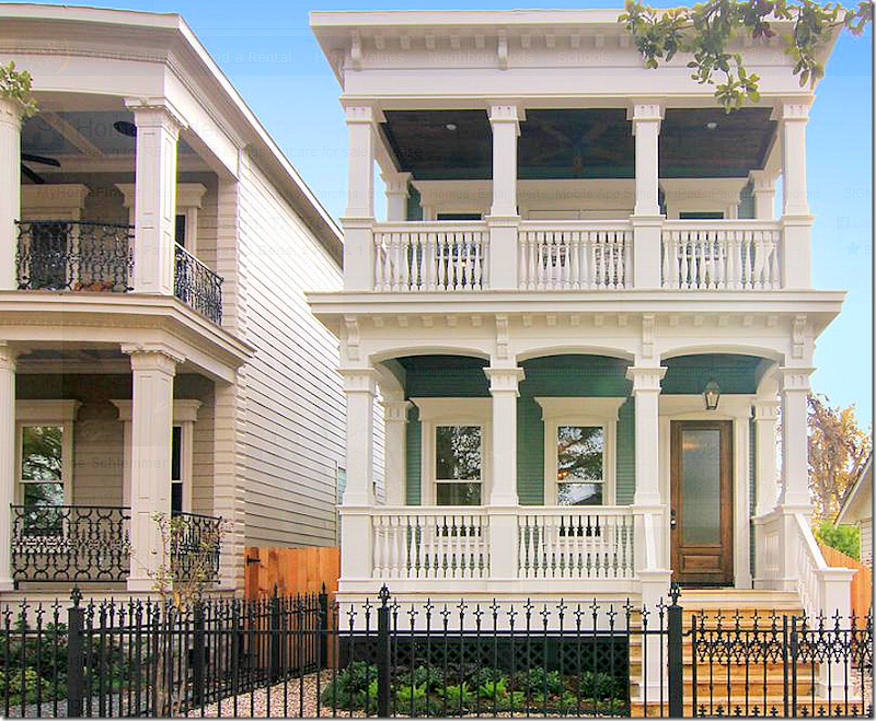
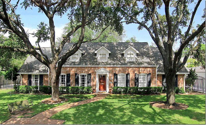
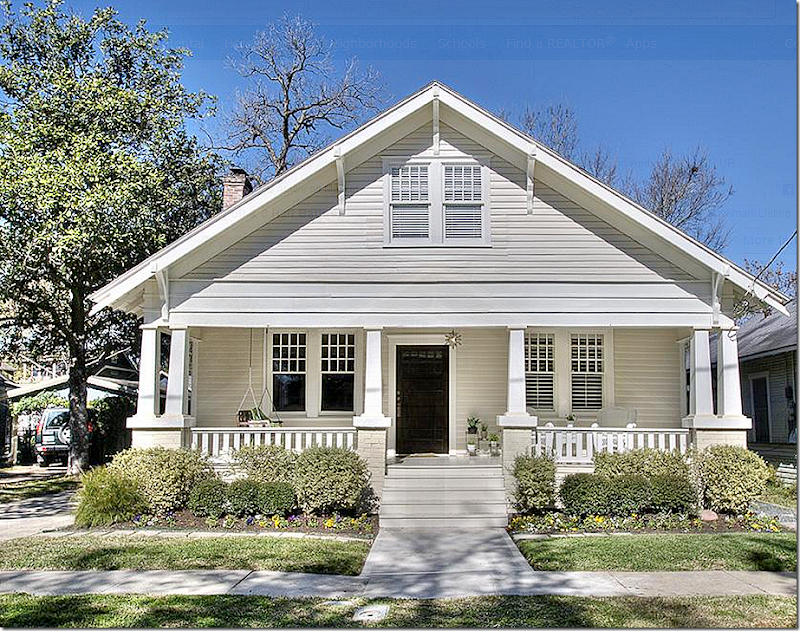
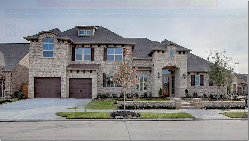
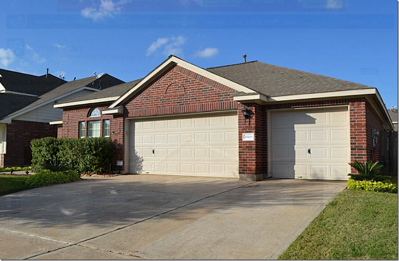
And, today, we have another question from a reader:Dear Miss Cote de Texas: thought I would reach out to you and perhaps inspire a post or even a series of posts, which selfishly might help me out :).My family and I are going to be relocating to a new city. Yes it can be stressful but at the same time extremely exciting to think about the possibilities that await in a new home.We are currently home owners, so it won't be our first time at the rodeo, but as an avid CdeT reader over the past few years I would love to get your thoughts on what to look for in a home. When we bought our current house a few years ago, I was pregnant with my first child and we were in a bit of a hurry to get settled. After looking at what felt like a million houses, we ended up buying a house that was right for the moment but one that we have grown out of as our family has gotten bigger and our children have gotten older. While I love this house for the many memories it has given us during the past few years, I have always felt ambiguous about it. Like I have never really been in love.I am absolutely hoping to avoid that this time around and would love your advice on how to look and wh3t to look for. We constantly hear about the need for "great bones" and I know their are many cosmetic things that can be turn-offs or turn-ons. So what is really important? Once we get past the big things like neighborhood and mechanicals, where should we put our energy?I thought this might be a question a lot of people could be interested in. What makes a house have “good bones?”First – what you like in a house or why a house appeals to you is something very personal. So, it’s hard for me to say – “buy this house” or “look for this in a house” – when it’s my taste and not yours. Still, there are some things that I think are worth contemplating before buying a house.Do you want a new house or an old house? I love older houses built in the 30s and 40s. I love the smaller room sizes and that older houses aren’t open concept. I love the kitchen not being in the middle of the family room. I love a separate dining room and a nice entry hall. And I love the mature landscaping that comes with an older house. Yet, everything I described is exactly opposite of what I live with!If you want to buy a new house, I think there are some features that you should be careful to avoid if possible, which I will outline in detail. And there are drawbacks to buying an older house – especially if you prefer the open concept living which most older houses don’t have. With an older house – unless it has been extensively renovated – you will have more maintenance issues than you would with a brand new house. So, there are give and takes with each option.You seem to know about neighborhoods and schools, which are two of the more important factors when buying a house, although, as far as schools are concerned, there is always carpooling. We never lived anywhere near where my daughter went school, and I carpooled her for years until she got her drivers license. So, schools can be a flexible situation when buying a house. But location or neighborhood is not flexible. The wise man says, always buy the least expensive house in the most expensive neighborhood as opposed to buying the most expensive house in the not-so-ideal neighborhood. For investment purposes, this is probably a good adage to follow.Once you find a neighborhood you like, the choice of a new house versus an older one will be made for you, unless you plan to buy a tear down and rebuild. I looked around at houses for sale in Houston to find some that would appeal to me – from the outside, at least.Look for a house with clean, simple lines and classic windows and doors. I always am drawn to Georgians because they are so symmetrical looking. Like this:You can’t beat a house like this – with beautiful, classic proportions. The windows are nicely placed and aren’t overwhelming. Great front porch and mature landscaping. A brick house is almost maintenance free, which is another thing to think about. Here, the brick has been painted white – which is so pretty. An older home is hard to beat from the outside.Another classic house with pretty windows. It’s very symmetrical with an asymmetrical wing on the right that only adds to the charm. Half wood shingles, half brick – the upkeep would be more labor intensive than an all brick house. Pretty landscaping.Gorgeous classic house, with beautiful wood windows. It’s mostly brick, but there is some wood siding that would need painting every so often. A house that looks like this is really hard to top.This house is brand new but it is built to look old. The proportions are excellent, the placement of the windows is perfect – and – unusual in a new home, no front loading garage!Another brand new house that truly looks old. Try to buy a house that an architect designed. I would choose a house like this one above any day over a typical new one in the suburbs with much more square footage. In so many of those new houses in the suburbs, they look like an architect never touched the plans. Windows and doors are placed everywhere and anywhere with no sense of design. The builders throw every element in the house, rather it’s appropriate to the design or not. And, the houses end up a mess. Worse, there’s no thought given to furniture placement. This house above is never going to “go out of style” or look like the decade in which it was built. It will always look like a house in New Orleans.Ranchburgers from the 50s and 60s can be wonderful. Notice how symmetrical this design is. Since it’s older, there is great curb appeal. Such a pretty house!While the door is a little off center (it makes me wonder if this was actually once a duplex and the other front door was removed) – this authentic bungalow has great appeal. Isn’t this charming? All wood, it would require maintenance, but I wouldn’t let that stop me from having a wonderful house like this.Well. This is a perfect example of a new suburban house built without much thought given to classic design principles. There are some pretty things about this house, like the stone and brick, but there is just too much going on here. It’s so off balanced looking – even the garages looks a little strange. There’s a tin roof and a shingle roof and the window over the garage also seems off balance. Instead of the front door being the focal point, the garage is. This looks like two houses smushed together. And it’s such a shame because this really could have been a beautiful house – if only it were more symmetrically designed and less lopsided looking. Try to avoid turrets, especially those that make no design sense.Many new houses have front loading garages. So does my house. I would give anything to not have it, but it is what it is. This house is all garage. If you have a front loading garage, try to make it more attractive and less a focal point. Is there even a front door here?
 Look at the non descript façade of the canal house that Brooke and Steve of Velvet and Linen bought. The front loading garage was the focal point of the house. But with a little ingenuity – the house was dramatically changed:
 Yes, it’s the same house. Pea gravel replaced the concrete driveway and carriage style garage doors replaced the plain, boring one. Old shutters lead to the front door on the right. New stone lined flowerbeds add to the curb appeal. Just beautiful! I showed this to Ben, hint-hint.Now that we’ve looked at the outside of houses – what constitutes “good bones” inside?I like symmetry inside with a nice entry and a center hall, separate dining room and living room or library with a wood tread staircase to the second floor. Ceiling height should be at least 9’ or 10’ or up to 12’ in a large house. Any higher and you lose that intimate human scale that makes a house cozy and welcoming. Surfaces can be changed – but if you don’t want to remodel or update a house, look for wood floors or a very neutral stone. Tile floors can really date a house and wood is the most classic choice. Try to find a house with one floor covering that runs throughout the main level. If you choose a house with a classic façade, most likely the inside will be classic too – with lots of wall space and not a lot of superfluous windows everywhere.With kids, it’s great to have the master down and the children upstairs. The most ideal set-up is a little study by the downstairs master that can first be used as a nursery if you are still in the baby stage. A library or office is nice for children to have a place to do their homework in and keep the rest of house neater. A laundry room is a must, as is a mud room where the children can keep all their coats and boots in one place when they come in from school. A bathroom for each bedroom is a plus and will add to the value of your house. Teenagers require their own space, so a playroom for little ones one day will give teens needed privacy.
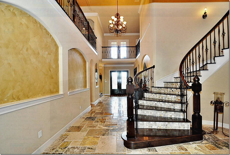
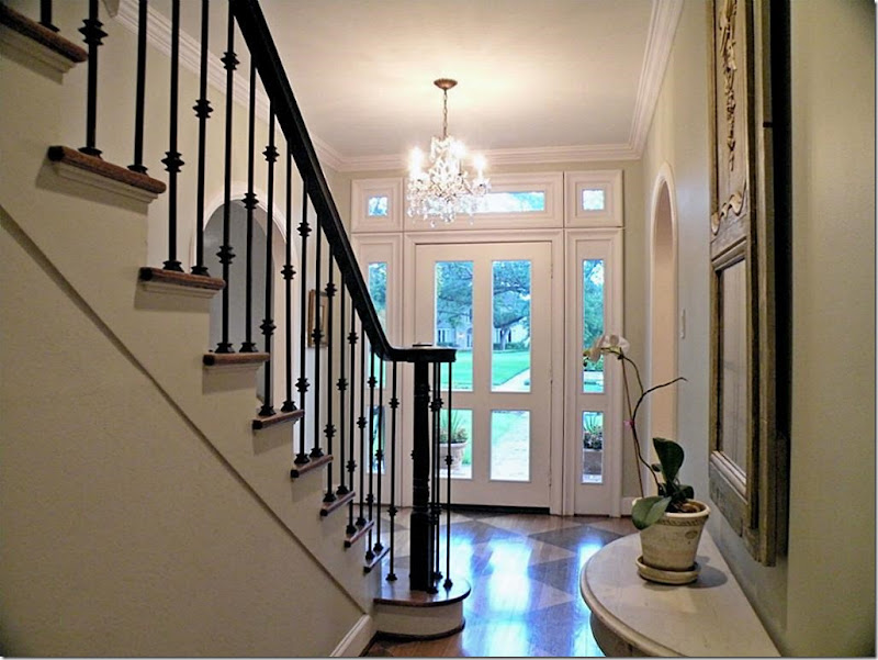
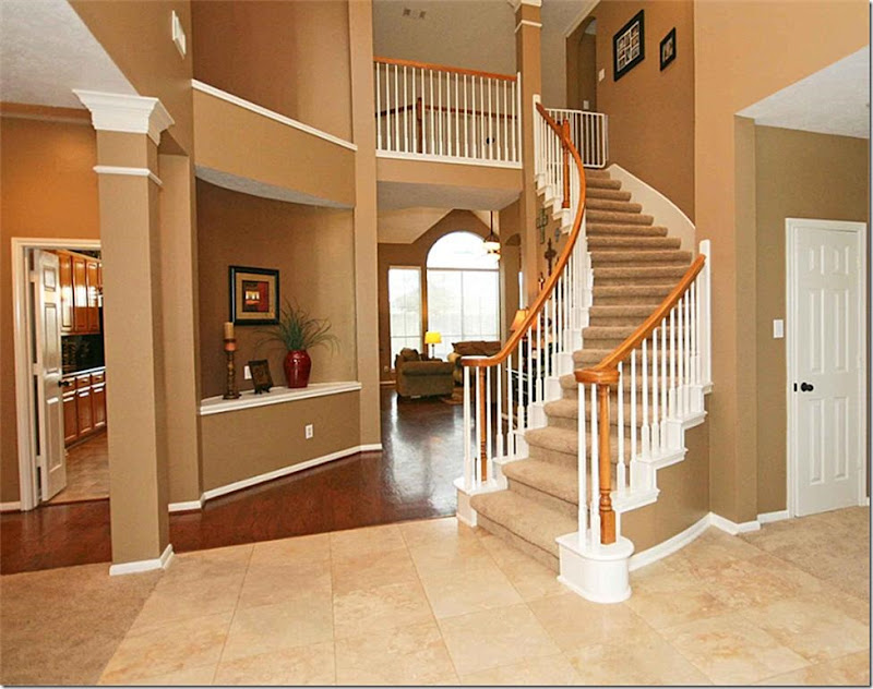 Here are some things to watch out for and avoid: I would nix this above house for several reasons. First, look how many different floor coverings there are in just this one area – carpet, stone and hardwood and tile! Four!!! Unless you plan to totally remodel, avoid this kind of situation. Even if you did rip it all out it would cost a pretty penny to fix this if the slab isn’t flat underneath all these different floor coverings. Try to find a house with just one floor covering throughout the downstairs. Look how jarring the stone looks against the wood – it cuts off the large entry, making it appear smaller. This house would look so much better if it was just all wood. Additionally, the stairs are carpeted. With kids, this carpet would have to cleaned or replaced often, otherwise it would look terrible after a few years. Look for stairs with wood treads. AND, even if you take the carpet off, you still don’t have wood under this. It would cost a fortune to redo these stairs, since the treads are plywood. With small kids, it just best to find a house with wood treads. Finally, notice the large niche above the built in. Avoid houses with these kind of niches. They are just dust collectors and serve no purpose at all.I would avoid a house like this – first, the tile is way too trendy looking. In a few years, you would probably get tired of it. Look for quieter finishes – like wood or stone floors. And notice the stairs. Instead of leaving the risers wood, they installed a busy tile that fights the floor tile. Another thing to avoid, those niches on the walls. The only thing you would do with these niches is to place a series of paintings or prints there. Avoid houses that dictate your interior design! And finally, the open balcony over the entry – this would become an loud echo chamber. ALWAYS avoid open balconies this large, especially with noisy children.A pretty, classic entry. Timeless. Pretty front door. Hardwood floors and stairs. Simple iron railing. Classic molding. This is a room where nothing would need to be changed before you moved in.Look for – simple iron or wood railings. Wood stairs and painted wood floors. This entry is so much prettier with all the simple choices – instead of different flooring materials and busy looking stair rails. Beautiful!
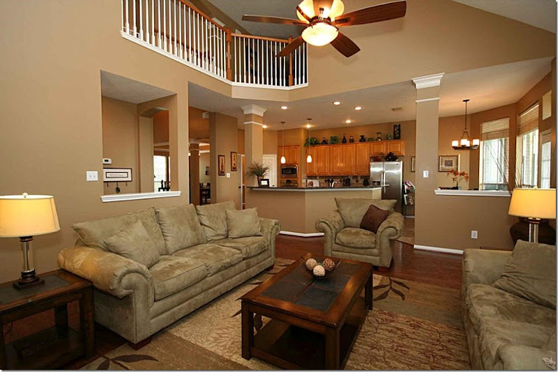 This is something I would avoid at all costs: the upstairs overlooking the downstairs family room as shown here. If the ceiling was just high or pitched, it would be nice – but with the open balcony like this, it is a disaster with active children or music loving teenagers. The house will be an echo chamber. I had a client with this situation and we had to go back in and close off the balcony at great expense to quiet the noise - and they only had two children. They didn’t realize the issue with the noise until the night they moved into their beautiful new custom designed house. The husband started looking at new houses one week later!!! It was awful. But, once we walled off the upstairs balcony, the sound level was tolerable. Avoid a open balcony with a double height ceiling at all cost. Don’t ask for this trouble if you can avoid it!!!!And here we have the window issue – how would you hang curtains here? Again, in a house with “good bones” you wouldn’t have this problem with the windows. A house with good bones has pretty windows that were designed with thought. I can only assume this homeowner was clueless how to hang curtains since there aren’t any. I really wouldn’t know how to hang them either. This is very important: before buying a house – look at ALL the windows and ask yourself if you would know how to cover them. If you can’t figure out what to do with the windows, walk away or bring your designer in to give an professional opinion. I can’t tell you how many emails I get with pictures of windows like this – saying what do I do????
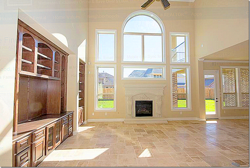 Another house with bad windows. Terrible windows actually. What is that horizontal window over the fireplace for? And windows over a fireplace? Where’s the chimney? Again, before buying a new house – look at all the windows. And look at the walls. Be sure there is enough room along a wall for your bed or sofa. And if you have a lot of art work, make sure there is enough wall space to hang your pictures.
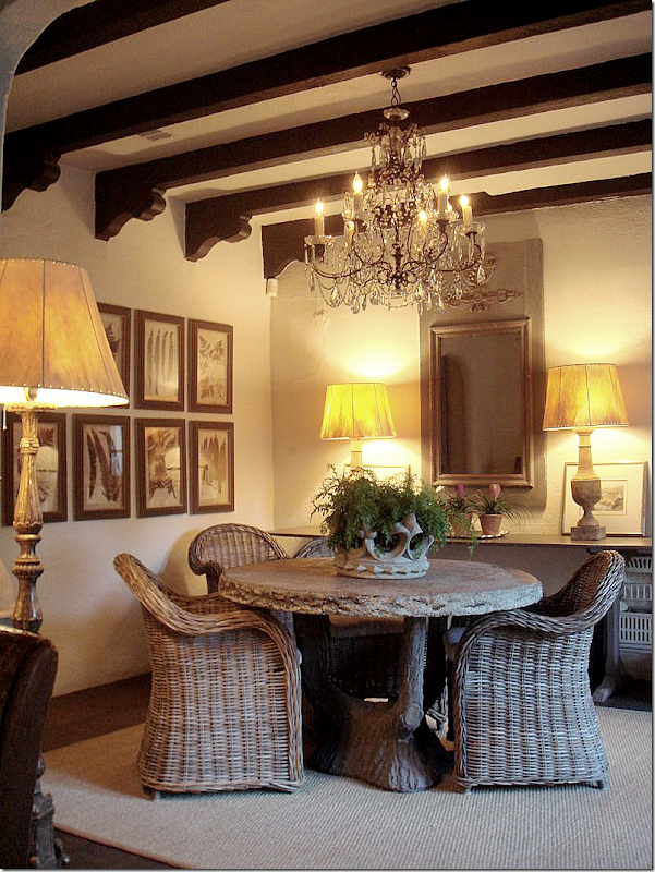
 Classic wood windows and French doors are so much prettier than walls of plate glass windows. Here, the raised ceiling isn’t too high and the beams help the room remain human scaled. Compare this high ceiling with the high ceiling in the house before. Which room looks friendlier, warmer, cozier? This house is the epitome of a house with “good bones.” From Classic Casual Home.
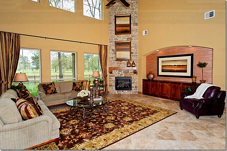
 Here, again, the open balcony. Imagine you have friends over and the kids are upstairs running up and down the hall with their friends. Disaster. This balcony is pretty, but avoid this unless you are a empty nester. Again, this ceiling is so high, the room seems cold no matter how warm the decorator tries to make it. It would be hard to feel cozy in this room. Another thing to think about is the flatscreen. Be sure you aren’t limited to putting your flatscreen only above the fireplace.
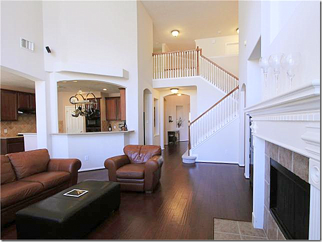 Human scale. This is a pretty house – with nice white walls and nice, dark hardwoods. Yet, the ceiling is so high in this room, I can only imagine the echo in here. Double height ceilinged rooms can be so hard to feel comfortable in. There’s no sense of warmth or coziness in a room like this. And, again, you have the open balcony that will carry all the upstairs noise right down into your family room and kitchen. A classic house will have ceilings that relate to the human size.
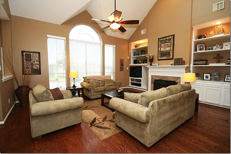
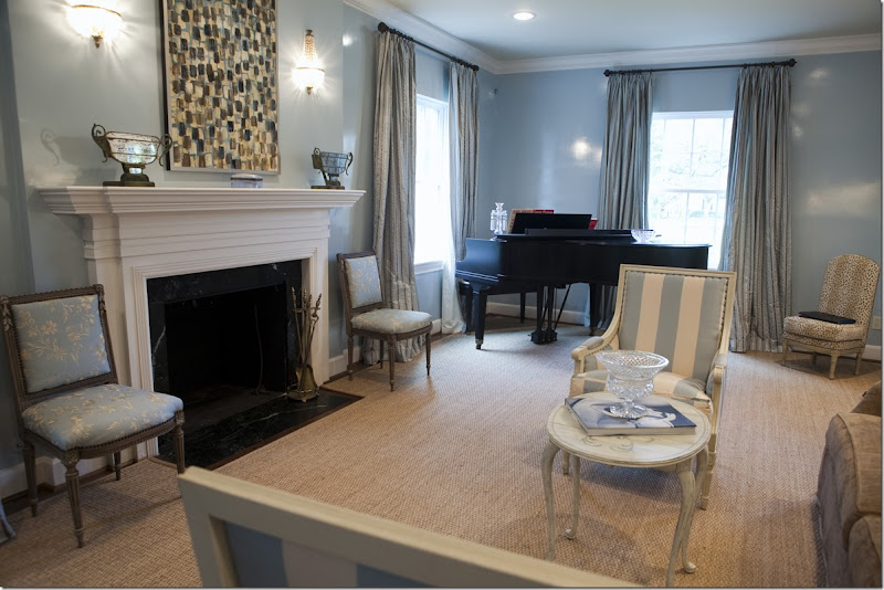
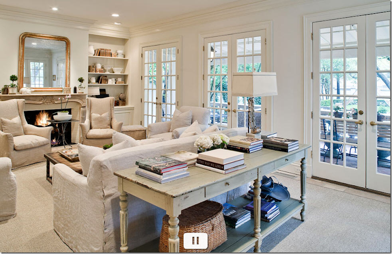
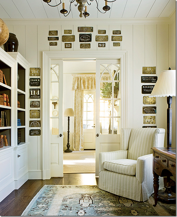
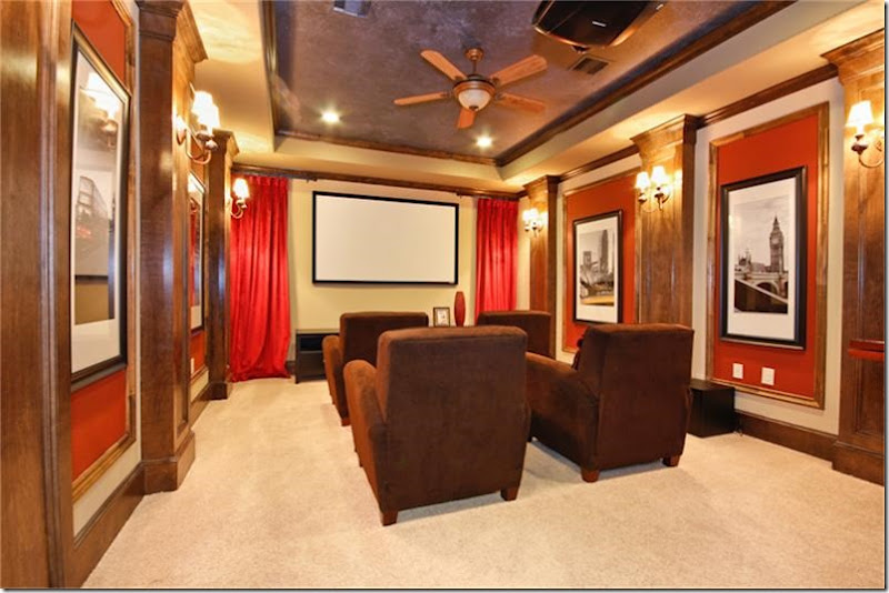
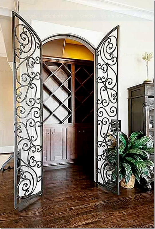
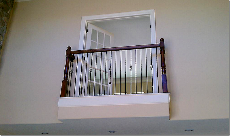
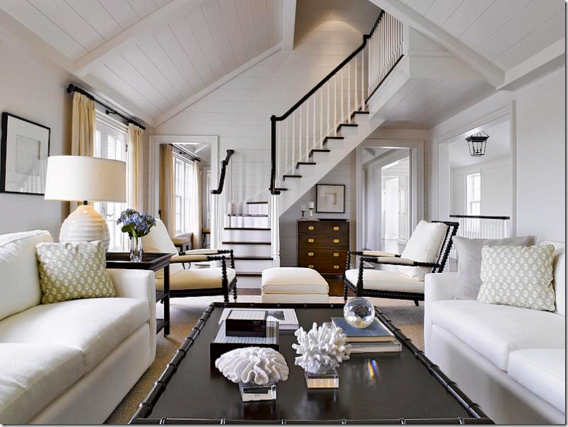 Not all high ceilings are bad. Compare this room with the one before it. Notice how the planks on the ceiling warm up the space and make it seem cozier. Simple wood railings and treads – so pretty. Also, there isn’t a large balcony overlooking the room, creating an echo chamber. Instead, there is only a small section of landing.When looking for a house, look for a more traditional fireplace mantel. This would be expensive to remove and it’s a real eyesore. Avoid gimmicks like this built in niche. The simpler, the better.A pretty wood mantel with marble surround is classic and tasteful. Avoid the gimmicky looking mantels pretending to be either antique or from a ranch.Pretty windows are things that make a house have good bones. And French doors are hard to beat. Also, the ceiling in this family room is probably 9’ – instead of a two story ceiling. The room is warm and inviting. High ceiling rooms can be hard to furnish and they tend to make people feel more uncomfortable. Cozy rooms are great for families to sit around, watch tv and cuddle.Cozy family rooms with bookshelves, curtains, French doors, and normal ceiling heights. Much more desirable than a large, cavernous room with high ceilings and balconies overlooking the space. Pretty doors and windows.Make a library out of any room by flanking a sofa with built in bookcases. Again, warm and inviting and cozy. Pretty windows and woodwork. Rooms don’t have to be huge. Smaller scaled rooms invite a closeness that is missing in the massive rooms found today in many newer houses. Think human scale.The wood on the walls and ceilings is so warm and cozy looking. These ceilings are tall – maybe 12’ – but the beams and wood planks keep it in scale with the human form. Gorgeous doors.Instead of regular doors – interior French doors are a charming and classic looking touch. And instead of a home theater, chose a library where the children could work on their computers and study.Such pretty doors and nice wood paneling.When looking at new houses, beware of the gimmicks thrown in to entice you. Home theaters are great, if you have plenty of extra square footage. But with young children – this space would be better suited as a study or a playroom. Try not to be swayed by gimmicky rooms in new homes, like wine cellars or home theaters. Look for studies and libraries and laundry rooms and mudrooms. Rooms that you know you will use!Unless you are a true wine connoisseur, don’t fall for the wine cellar or wine tasting rooms. It’s a waste of space. Think of the built in bars from the 50s and 60s that no one ever uses anymore. You would use a wine cellar even less.Juliet balconies. Avoid. I love how the builder designed this. Kidding. Just awful.
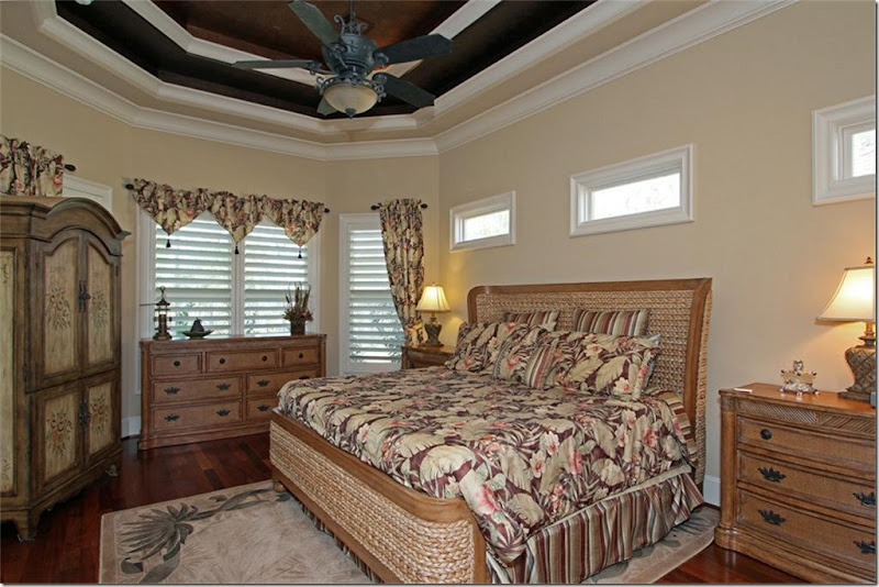 The dreaded tray ceiling. I’m not sure when these got so popular, but so many of the new houses have these. I have one in my master bedroom. Try to limit your tray ceiling to just one tray, instead of two or three. And if you have all of these trays, don’t draw your eye to them. Paint them the same color as the walls, not a dark accent color. That’s all you notice in this bedroom – the ceiling!!! And again, the windows. How in the world would you cover those 3 windows over the bed and what is the purpose of them? Think about waking up each morning to the sun blaring down on your head. And windows like these are low enough to interfere with your headboard choice. Again, don’t limit your decorating choices before you even move in. Take a good look at ALL the windows in the house before you buy a new house. A classic house, with good bones, wouldn't have those windows, nor that ceiling.
Pretty windows are the basis of “good bones” in a house. These windows are perfect for the space. They are well thought out and covering them with curtains is an easy task.
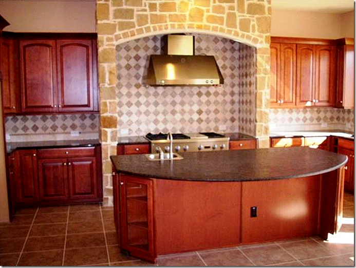
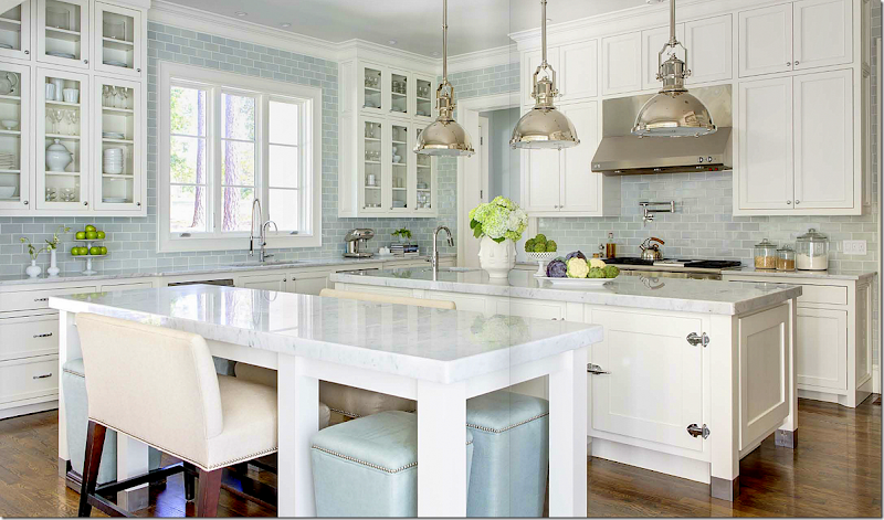
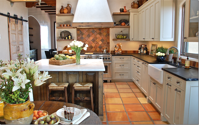
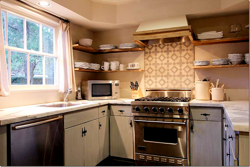
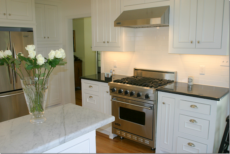
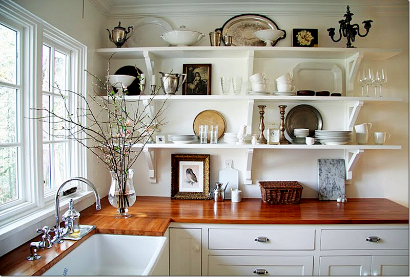
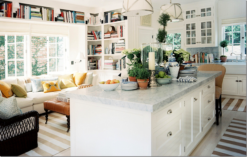
Disguise less than perfect windows with shades and curtains – like I did in my bedroom. This is one long, but short window here. Terrible. By adding four drapery panels and one textured shade, I made it seem like there are three pretty windows here.Go for simple in the kitchen. You’d get so tired of this stone and tile after a few years.Choose a quiet granite and backsplash over one with so much movement. Keep the backsplash simple otherwise you’ll tire of it quickly. No need to get fancy with backsplash designs. A nice subway tile is classic.A white kitchen with white marble and hardwood floors is so classic and soothing and beautiful. You’d never get tired of this kitchen and hopefully, it’s timeless enough to last.This classic, old fashioned looking kitchen would look good forever. Notice how both these kitchens took the backsplash up to the ceiling. Don’t skimp on a pretty backsplash. This beautiful subway tile makes the kitchen so luxurious as opposed to just a few rows of tiles.If you don’t like all white – go for black countertops. This Santa Fe kitchen is so beautiful. There is a simple backsplash that doesn’t overpower the space but ties in the tiled floor. The owner could have gone for a kitschy Santa Fe kitchen, instead she went for classic but with a southwestern vibe. Love!A kitchen doesn’t have to be huge to be functional. Again, just a bit of design in the backsplash limited to behind the stove. If your backsplash is busy looking, limit it to a small area.This was a reader’s kitchen she sent in. Black granite, white marble and subway tile – so classic and pretty. You would never tire of this look.Butcher block countertops and open shelving. Timeless and ageless.By adding a sitting area near the kitchen, this space is so inviting for children to do homework while mom cooks.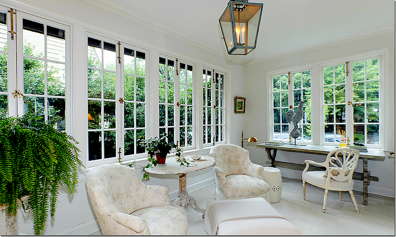 Older homes often have enclosed sun porches which make good studies or play areas. When the kids are teens, a space like this is perfect for offering them privacy with a friend or date.
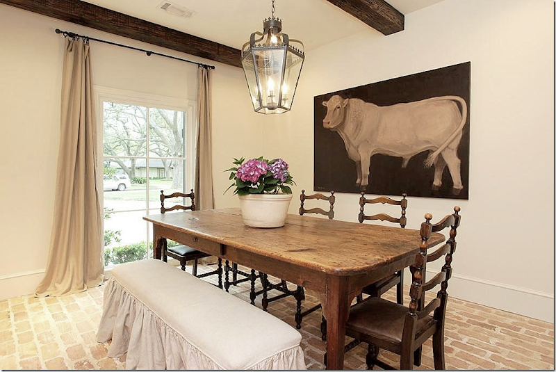 Instead of stone floors – think brick for warmth and a classic look. And beams add so much warmth.
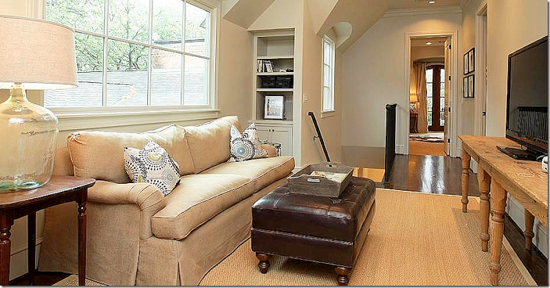
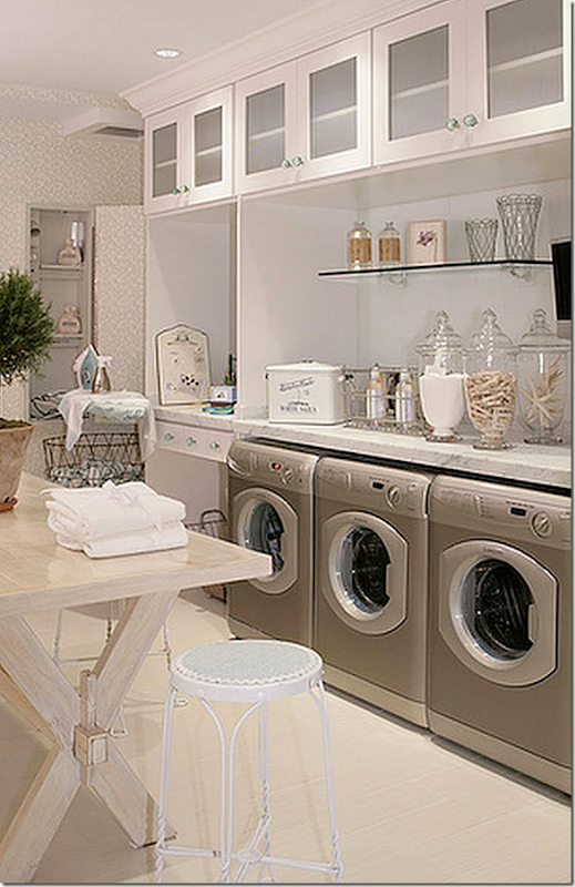
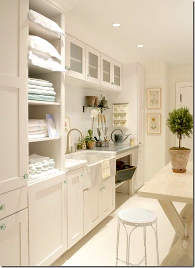
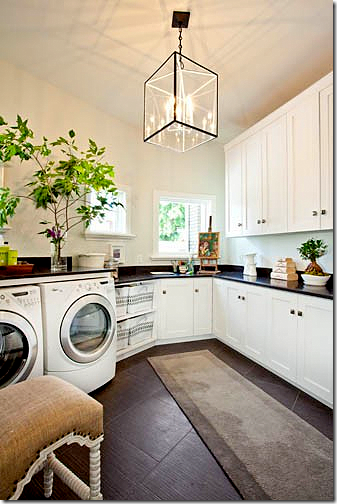
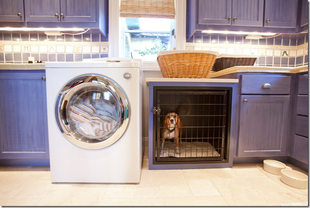
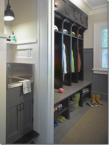
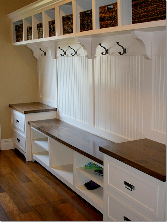
This landing was turned into a study/tv room. Again, perfect for teens who need a more private space away from parents.Instead of that wine cellar – make sure you have a dedicated laundry room. The bigger the better as far as I am concerned. What a dream room!! You’ll have better luck finding a big laundry room in a new house rather than an older one. Just make sure the house has one. Some new houses put the laundry on the second floor – you should figure out if that is something you would like when searching for your new house. I’m more inclined to think a laundry room should be on the first floor, with a door to the outside. Then, you can incorporate the mud room in with the the laundry room if need be. You can also make the laundry room a pet center, a place to put the dog beds, bathe the pets in a big farm sink, keep their dog food there, etc. And the laundry room, if on the ground floor, could double as a place to pot flowers and wash off after working in the yard, or for the kids – playing outside.And on the other side of the laundry above shows its large sink, a must in my opinion. A big farm sink would be great for washing pets if you have them. The table is for folding clothes and towels.Nice. I would do anything for a big laundry room! If you put in extra cabinetry, it could double as a butler’s pantry if you need one. Put in an extra refrigerator to hold soft drinks for the kids.The laundry room can double as a potting shed. Isn’t the vintage sink wonderful with the brass faucet with its patina??Built in crate for the puppies is a good idea in the laundry room. Though I don’t recommend crates! Poor baby!!!!!!If you have the room, add a separate mud room for the kids’ coats and shoes. I like the idea of a sink in the mud room – to wash up before they come inside with dirty hands. It looks like there is a built in step to the sink for the little ones.These individual doors instead of open cubbies keep the mudroom clean looking. This mom is really organized. It looks like there’s a bulletin board of each locker for notes.Each child gets his own space, hook, shelf, drawer, and basket. Use individual lockers if you don’t want a cluttered look in your mudroom. This is a great idea. You could also buy a row of old school lockers to do the same thing.
 Here instead of that home theater – create a room for your kids to study in. Velvet and Linen turned a home office into a special place just for their children. And again, a space like this could do double duty for a play space for friends when the kids are younger and teen aged.
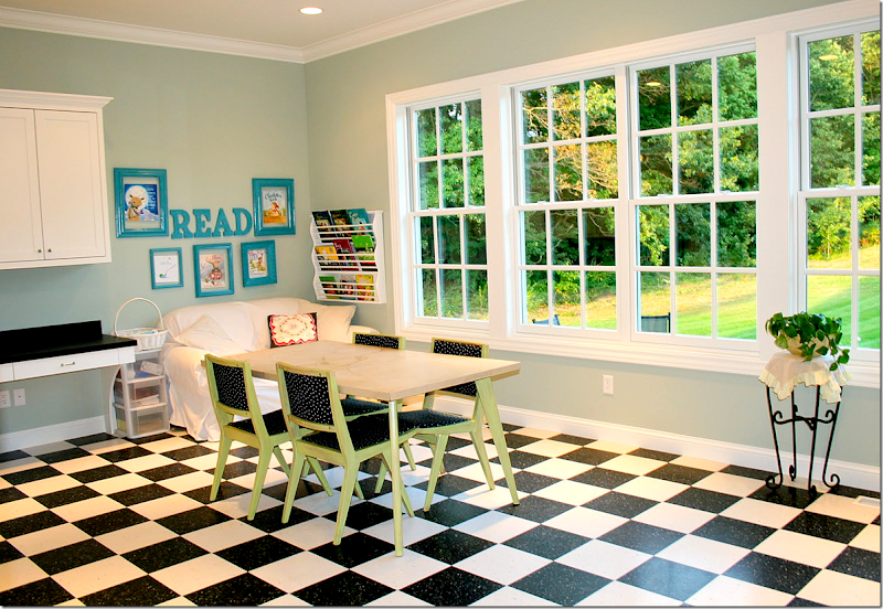
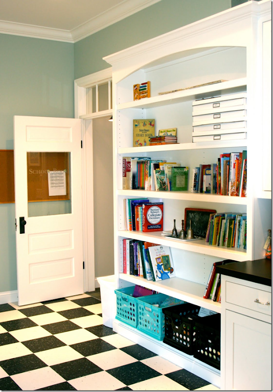
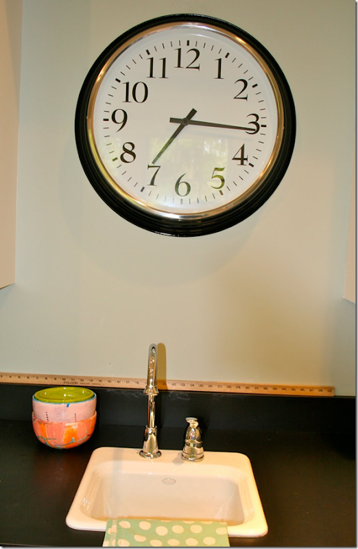
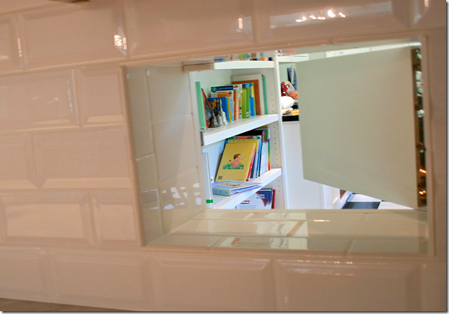
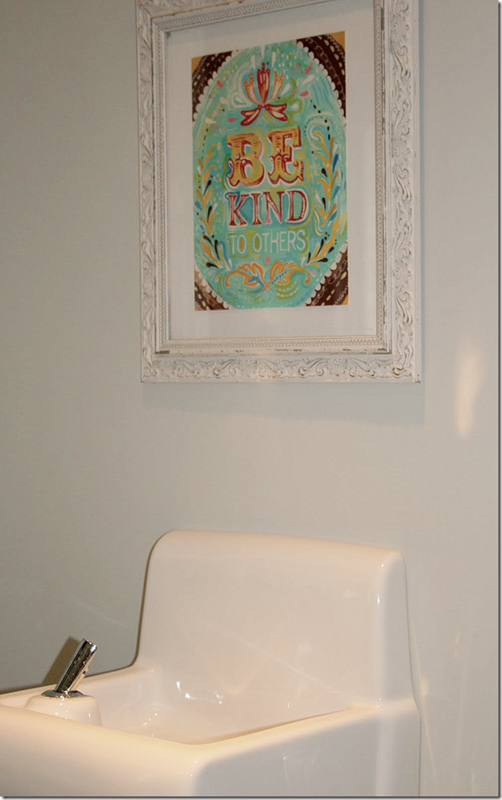
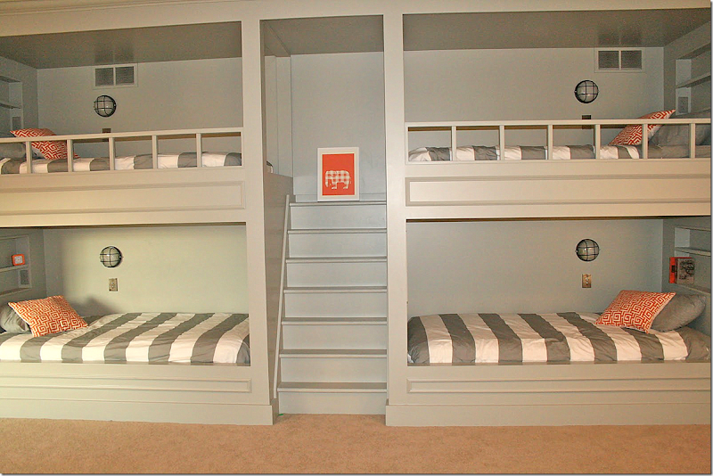
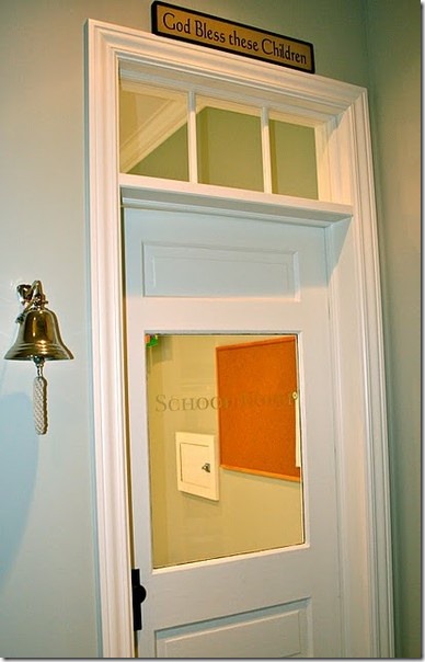 It sounds like you have a lot of children, so I thought I would add pictures from a favorite blogger who homeschools. She has the coolest “school” in her house that I’ve ever seen. Her blog is August Fields here and I featured her kitchen a few years ago. She has six children – 4 boys and 2 girls – and she is a real inspiration. Here is the door to the homeschool. It’s an old one that she cleaned up – love the bell and the lettering on the door.And, here is the main room! Isn’t this adorable!?!! She started homeschooling with her eldest child, who is now 11. Even if you didn’t homeschool, isn’t a room like this so much more valuable than a home theater? It would make a wonderful playroom too. Great ideas to think about when house hunting - vinyl floor for easy upkeep and cleaning, lots of storage space and shelves. And notice the beautiful windows. What a difference they make.Next to the front door is a wall of built-ins to hold all the school books.There’s a sink for easy clean-ups. Great idea for home school rooms and playrooms.Another great idea. There’s a secret pass through in the kitchen backsplash that allows mom to peek into the school room. Good idea for a playroom too.AND - this is the most amazing thing – a water fountain for the kids!! Mom says the kids love it and drink from it all day long, especially during the hot summer months.And finally, here’s one last idea from August Fields. Her kids all share rooms – a girls room and a boys bunk room. Here is the boys room with four bunk beds. Each bed has its own light and shelf for books and toys. These striped duvets are from West Elm, and Target carries them too.The bunkrooms are something to think about. I have no idea how many children you have, but bunking them together according to sex is a good way to save on space. Instead of six bedrooms for all her kids, this mom uses just two bedrooms.
I hope I’ve given you some food for thought when you go house hunting! Send us some pictures when you get settled into your dream house!!
Submit questions to Dear Miss Cote de Texas at mrballbox329@aol.com 

The next Urban Market Houston is fast approaching!! Be sure to attend Houston’s best antique fair: 
February 9, 2013 - 3pm-6pm
February 10, 2013 - 9am-4pm
February 10, 2013 - 9am-4pm

The NEW Location: 9401 Knight Road, Houston, Tx 77045
Bayou City Event Center *www.bayoucityeventcenter.com
Bayou City Event Center *www.bayoucityeventcenter.com
Just South of 610/Reliant Stadium
For information on
The Urban Market Houston Antique Show,
please contact Jackie Sharbrough, owner
The Urban Market Houston Antique Show,
please contact Jackie Sharbrough, owner













0 comments:
Post a Comment