It’s been awhile since I’ve had a Readers Kitchen Series, so I reached into the files to pull a few out.
Before I show these, just a few comments about the Readers Kitchen & House Series:
If you have already submitted pictures – I will most likely get to yours at some point soon. AND, I am still looking for new kitchen and house pictures. My back stock is dwindling down. I would love to keep the Readers Kitchen and House Series going – but I do need pictures to do so. If you plan on submitting your kitchen or house I ask two things only:
1) Submit the LARGE size pictures only. Please do not send those teeny phone pictures or the smallest ones from your camera. The bigger, the better!!!! The best way to email me the large files is by downloading http://zoomfoot.com/ This way you can email as many large files as you want at one time. Now, if you don’t want to send the pictures via Zoomfoot, you can always send a few large pictures 3 or 4 at a time via email. Either way, I don’t care – just as long as you send the LARGE pictures!!! No one wants to look at small pictures when they call see all the details in a bigger image.
2) Take the pictures during the day! I never realized what an issue this was until today! Quite a few submissions were taken at night and it is just not the best way to show off your kitchen or house. Also, turn on the lights. I know that in magazines the lights are usually off, but those photographers have lit the room up already! So – lights on and daytime pictures!!!
READER’S KITCHEN #1
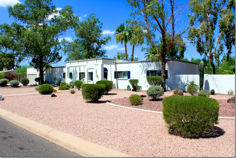
The first kitchen is located in Scottsdale Arizona – a first for us! The husband and wife are both in real estate and the wife also does interior design. Their house is located in an equestrian neighborhood – where horses are ridden on the streets – on their way to the nearby stables. The couple renovated this house planning to sell it – but instead they fell in the love with the area and are going to stay put for awhile. I thought the exterior was interesting – first, the xeriscaping, all gravel and a few evergreen bushes, along with cactus and eucalyptus trees. So different than what you would see in the north! And, the architecture is interesting – the flat ranch that looks remarkably contemporary.
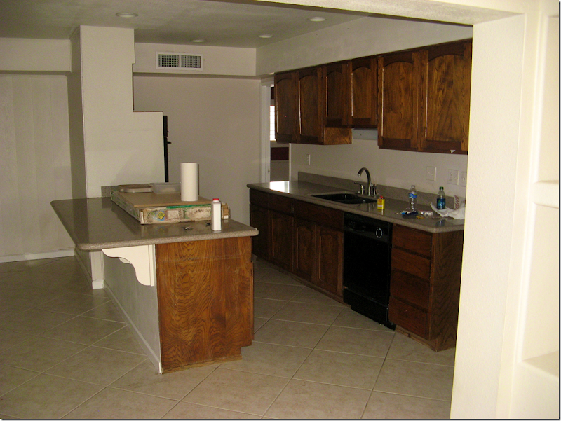
BEFORE: not so bad actually!
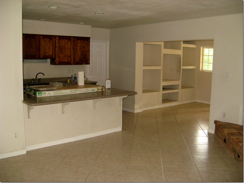
And again – the before picture. In the corner was a fireplace which the couple had wanted to salvage, but it obstructed the beautiful views outside the windows, so it was removed. And they also thought they would save the tile, but instead went with a light travertine.
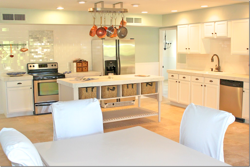
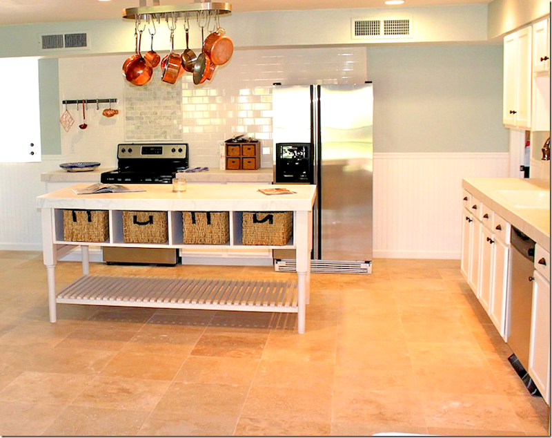
AFTER: The entire kitchen area was gutted – it’s hard to tell where the old kitchen even fit in here! I love the way the walls are painted a soft aqua mixed in with all the white. The backsplash is white subway tile – and notice that the area behind the range – the tile is slightly darker to emphasize that space. The paint is a custom color – the formula came from a friend nice enough to share.
The island was built on site. Notice the beadboard that is on the bottom half of the walls. I love beadboard and I think it warms up a space and makes it so welcoming!
Notice the island is also made of beadboard. And the top of it – is porcelain tile. A savings over white marble. Cute breakfast area with white slipped chairs.
Ideas to take from this kitchen:
1) Use a darker toned subway tile behind the range to highlight that area.
2) Beadboard is an inexpensive material that looks so great and really warms up a space.
3) Consider white porcelain tiles in place of pricey white marble.
KITCHEN #2:
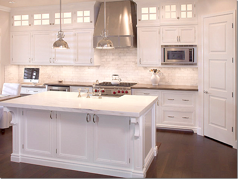
This kitchen is also in Arizona – this time in Tempe. Again, it’s a total redo, but unfortunately there are no “before” pictures! What a beauty!!! The owner is an Ob-Gyn doctor with her own practice. She tells me that she redid the kitchen after studying the internet blogs, looking for inspiration. At the time of the reno, she was also pregnant with her first child!! So many pretty elements – the white marble, the dark countertops, the dark floors, and notice the transom look over the cabinets – those aren’t windows, but when lit – they do look like windows! What a great idea. AND, notice the ceiling treatment – wood was placed there to create interest and give it the look of a beamed ceiling, but it is actually almost completely flat.
The sink is in the island so that she has a view when washing up. She used beautiful polished nickel hardware and faucets. Here you can see the back countertops look like black granite. And she has a gorgeous, dramatic stove hood in stainless, which matches the appliances. The pendants look like Restoration Hardware. Those pendants are the best buy from RH right now. They are so great looking and are so reasonable (especially for RH!)
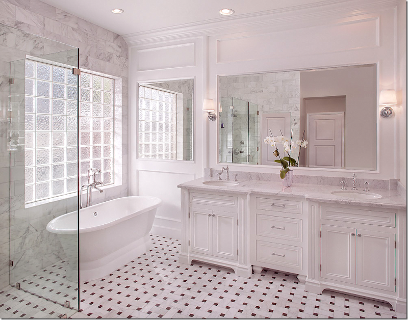
The homeowner also sent in this picture of her new bathroom – which flows with the look of the kitchen. Instead of wood floors, she used a ribbon pattern black and white marble tile. White marble on the counters and a gorgeous tub! Hardware is again polished nickel. Notice how instead of a blank wall, the mirror was extended to the area by the tub. Pretty molding!!
Ideas to take from this kitchen:
1. Dark hardwoods look so rich when mixed with white cabinetry and countertops.
2. Consider mixing white marble with black granite (usually matte finish) in the same kitchen. This creates interest instead of having an all white look.
3. Use paneling to create a faux beamed ceiling.
4. Use lighted glass cabinets in a dark kitchen to fool the eye into thinking there are transom windows where there aren’t any.
Kitchen #3
BEFORE: This shy owner was somewhat reluctant to share her house on the internet, but eventually decided to when she sent me pictures of her house. This kitchen was added onto the house in 1930!!! As you will see, it was a total renovation.
Wow!!! What a huge difference!!!! The owners kept the original four walls and were limited to where appliances could go, but it seems like they are all in a perfect place! They also wanted to retain the vintage feel of their older house, but have all the modcons. She wanted a old timey looking range, but they were too pricey. Instead, she searched and found this range Fratelli Onofri Royal Chiantishire with a vintage appeal.
They chose the lantern tile backsplash because it was different than subway. The owner says she wanted white marble countertops but everyone talked her out of it. I hear you! So many people get talked out of it!!! Instead she used Coast Green granite – and mixed it with walnut on the island. Again, the mix of the dark and light is so nice. And they chose a farm sink with a bridge faucet - again for that vintage look. The stove hood is painted white wood.
Notice how she also has that transom look over her cabinets. Not sure if hers are lighted though. Pretty glass pendants hang over the island. The owner does say that the wood requires oiling and lots of maintenance – probably more than the white marble would have. Maybe. I love her shaker style cabinets. Notice the dishwasher is hiding behind a cabinet door to make it disappear. I think these homeowner achieved their goal – creating a brand new kitchen with a vintage feel for an older home.
Ideas to Take from this Kitchen:
1. Use wood countertops for a vintage feel.
2. Glass panes in the cabinets look like transoms and add to that older look, as does shaker style cabinetry.
3. Nothing beats a farmhouse sink and bridge faucet when looking for a vintage styled kitchen!
A HUGE thank you to our three homeowners – who all used white kitchens but mixed in other décor elements to create visual interest.
Remember – send in your kitchen and house pictures AND send in your Ask Miss Cote de Texas questions.
We have a great giveaway coming up next week. AND, I am working on a top secret contest that if it works out will be the biggest and most interesting of ALL giveaways!!
Home
»
»Unlabelled
» READERS KITCHEN SERIES
Subscribe to:
Post Comments (Atom)




0 comments:
Post a Comment