It’s been a while since I showed a house from the Aidan Gray contest – so I thought now was the time. This house, located in Houston, made the semi-finals, and I really thought for sure it would make the finals!!! The house has an interesting design history. It was built by a popular real estate agent who is friends with Ruth Gay, owner of Chateau Domingue. Ruth helped the owner with the décor, adding some of her fabulous architectural pieces here and there like antique mantels and doors and aged terracotta floors. The original owner then put the house up for sale. Luckily I was able to find the original real estate photographs – showing the pretty décor, filled with antiques.
The next couple to own the house was not into antiques and furnished the house in chrome and contemporary furniture. Unfortunately, I also have those real estate photographs! Which brings us to the present day. The contemporary loving couple sold it to the current owners who have worked hard to turn the house back to its original French roots – with the help of the uber-talented interior designer Nicole Zarr of Triangle Interiors, Inc. The results are fabulous – the house is beautifully decorated, so warm and inviting in soothing shades of yellows, blues, grays and creams. I hope you like it as much as I do!!
Enjoy!
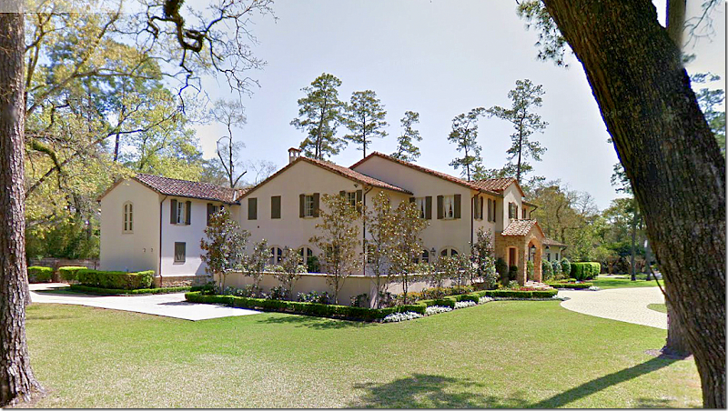
The house is stucco and stone with a tiled roof. The study is to the right of the front door and the dining room is to the left. At the right wing – is the master bedroom. On the very left of the house is the kitchen and, then the garage.
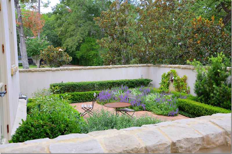
At the side is a walled courtyard that the dining room and breakfast room/kitchen overlook.
The courtyard with lavender and box.
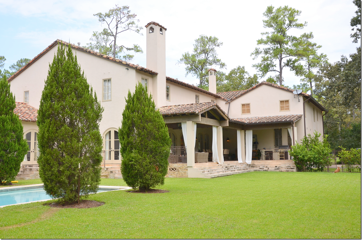
The back yard shows a large covered patio with a fireplace and kitchen. The family room and living room have French doors that open onto the patio. To the very left is the master bedroom wing. Upstairs are the numerous bedrooms, a game room, an exercise room and a media room.
For each room – I will show the real estate pictures from the two previous owners to compare to today’s décor.
The Entry:
There is no picture of the entry from the original owners, but here from the second owners – with the contemporary aesthetic –is the view looking towards the front door. The contemporary couple kept the original antique lantern.
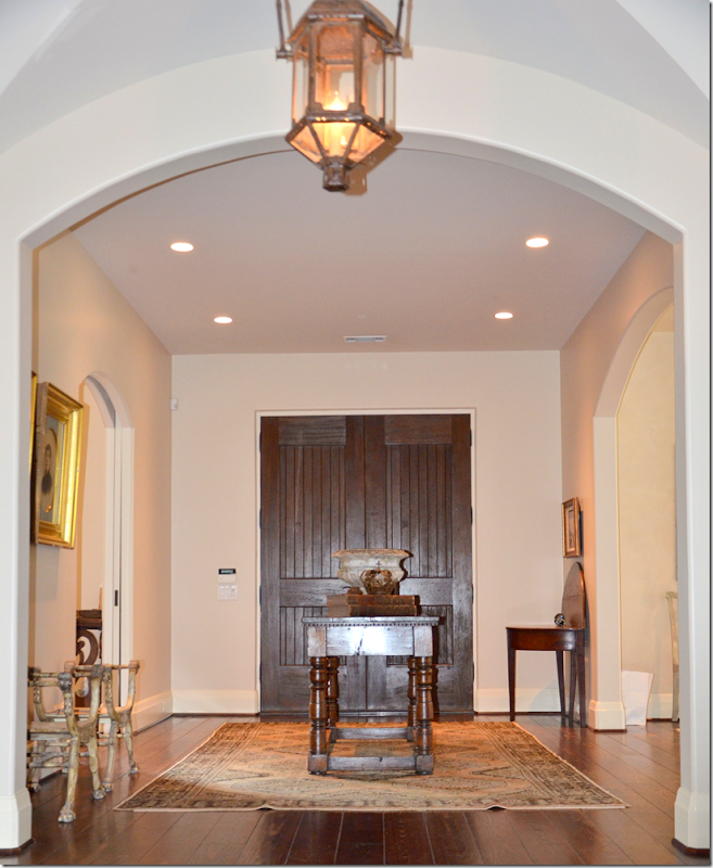
Here is the same view today – the current owner placed an antique table in the middle of the entry, on top of a rug. To the left is the library and to the right is the dining room.
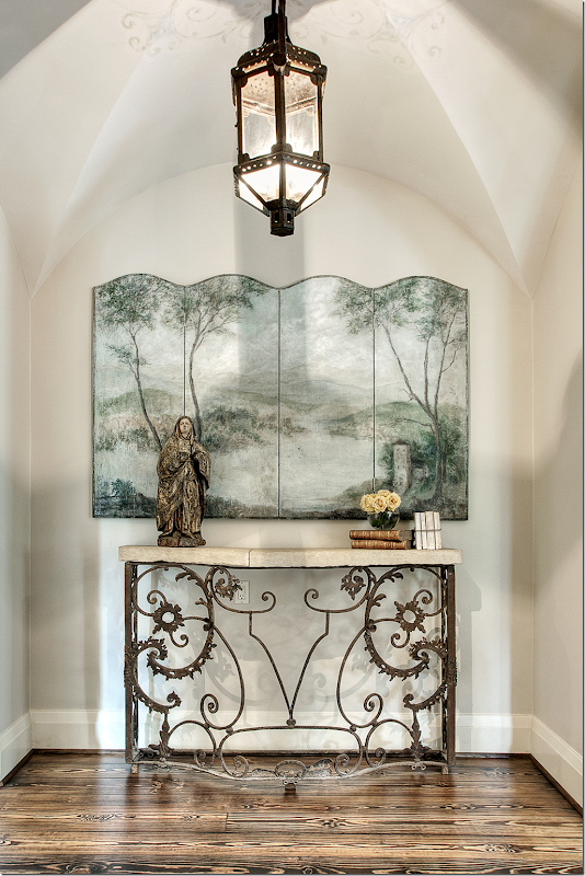
Past the front entry hall is a small vestibule with a groin ceiling. Leslie of Segreto Finishes painted a subtle pattern around the original antique lantern. Beautifully styled by Nicole Zarr, a screen sits atop a console – with antique books and a santos. Sooooo pretty!!
The Study:
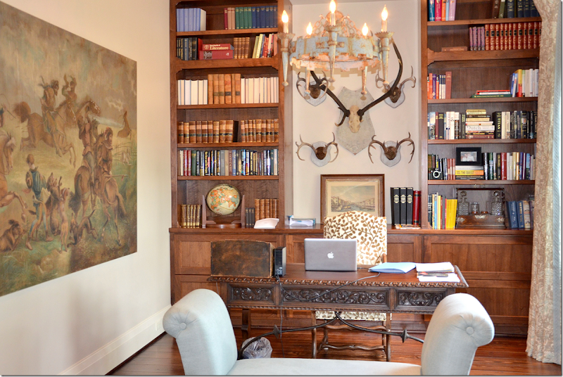
Inside the office at the front of the entry hall, is an antique desk with a wonderful painting. A beautiful painted iron chandelier hangs over a bench.
The Dining Room:
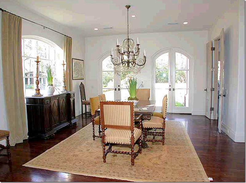
Across the entry hall from the study – is the dining room. Here we can see the original owners décor – this owner built the house and decorated it with the help of Ruth Gay from Chateau Dominque. The French doors open onto the side courtyard. The double doors lead to the kitchen. I love the décor – with the antique table and chairs and an iron and crystal chandelier. Sorry the real estate pictures are such poor quality!
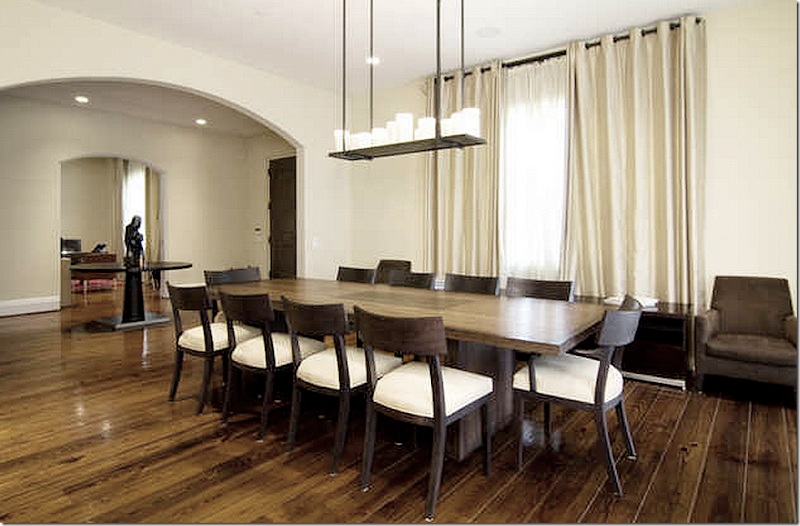
The second owners dining room – hard to believe it’s even the same house! The curtains cover up the pretty front window. The crystal chandelier was replaced with a faux candelabra. What can you say?
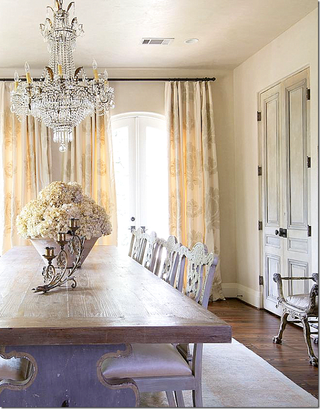
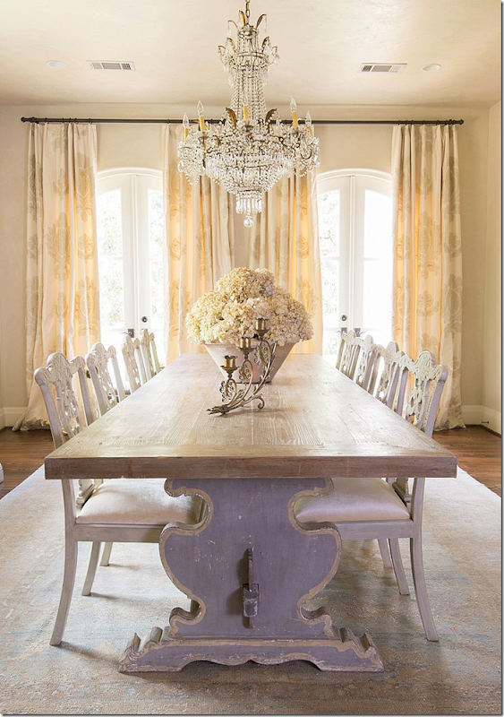
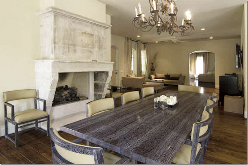
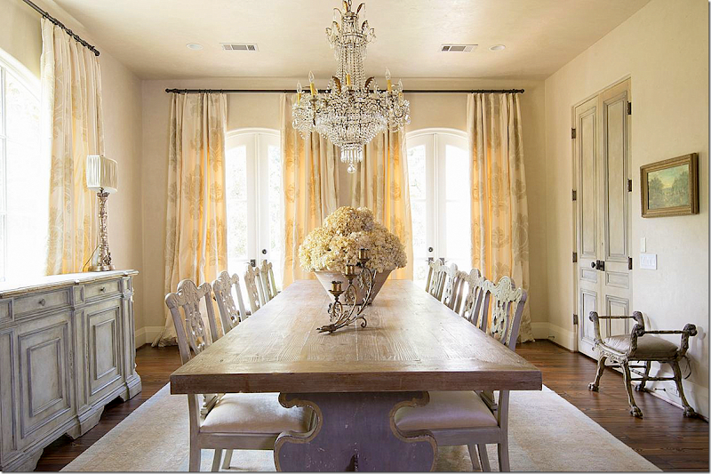
And the dining room today – decorated by Nicole Zarr. Stunning! I love this room so much. First, the charming dining room table with its carved wood base and painted chairs is fabulous. Second, the chandelier is a show stopper. It’s just gorgeous! To the left is a painted console that fits right under the window.
A close up of the chandelier – love its macaroni beading. Notice the beautiful antique pair of doors that lead to the kitchen. Again, adding doors like this to a house makes such a difference! You don’t have to have antique French doors – try going to architectural salvage houses where you can find old doors that have plenty of patina, for much less.
Here you can see the table base, painted. So charming!!! Also notice the curtains. I love the way Nicole designs her curtains. Most have a subtle pattern that makes them all the more interesting. And I love the pot of hydrangeas. Also notice the muted rug – in light blues and yellows.
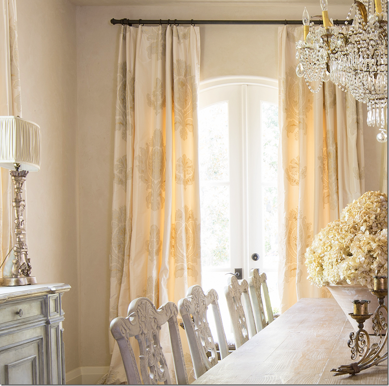
Here you can see the pattern in the curtains – so pretty!
The Living Room:
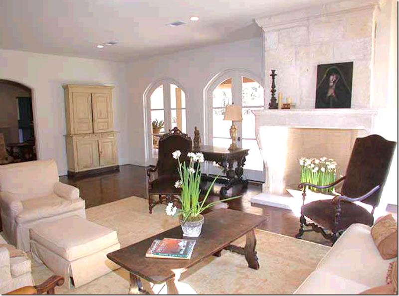
The original owners decorated the living room with Spanish styled tables and French chairs, using taupes and brown velvets. Ruth Gay placed the 18th century stone mantel, found in France. In the back, a cream painted armoire. Lovely!!
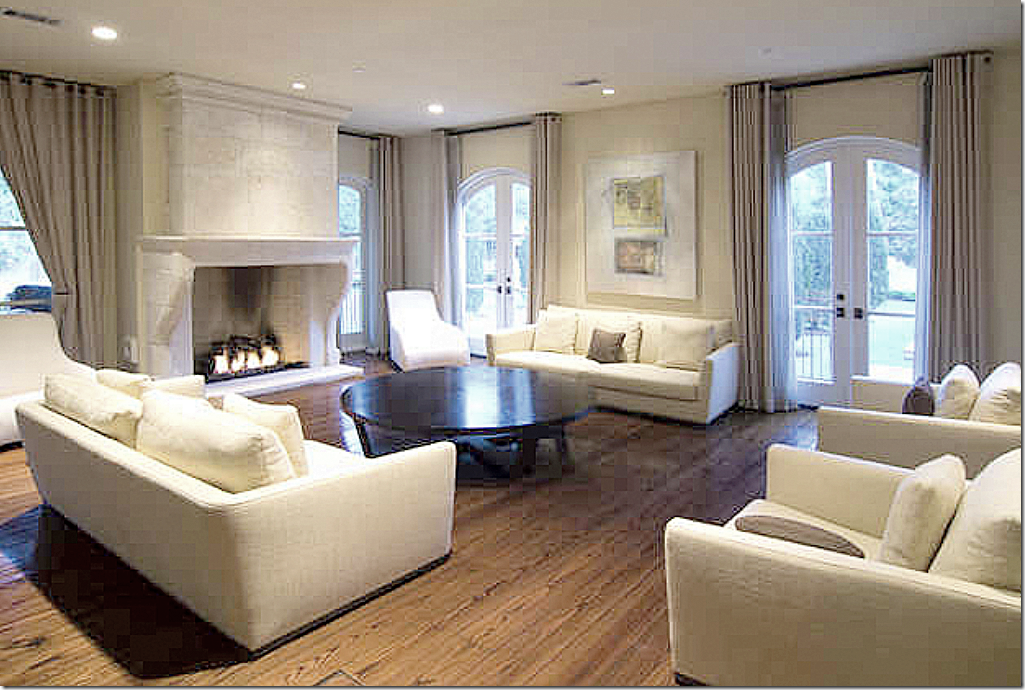
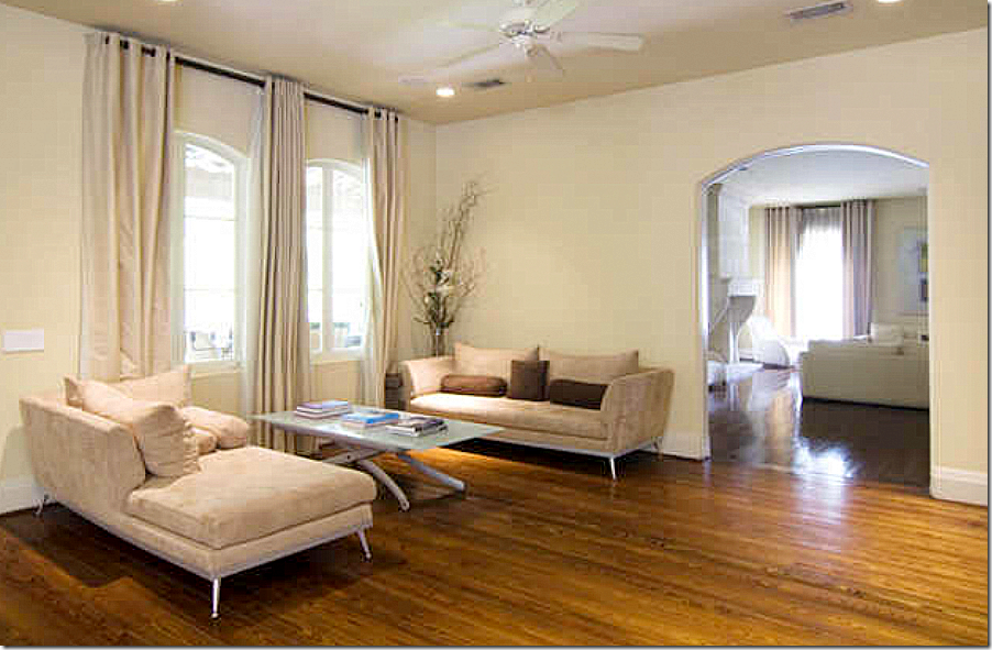
The second owners furnished the room in boring contemporary sofas and chairs. At least they kept the fireplace!!! The curtains couldn’t be any more uninspired.
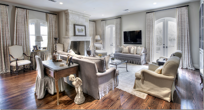
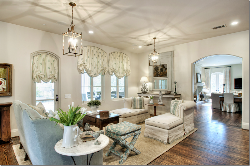
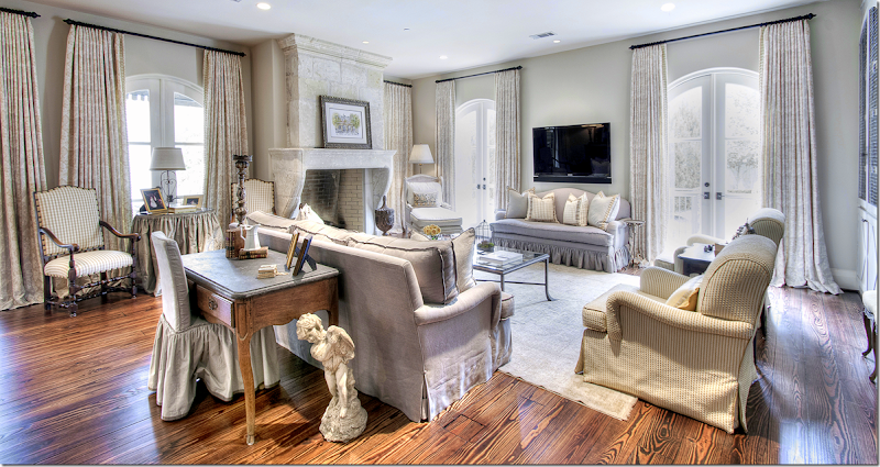
And here is how it looks today – decorated by Nicole Zarr. She used linen to cover the sofas. A small check is on the two chairs. She used an area rug, again, very muted. The curtains have a subtle toild pattern. Along the back wall are two built in cabinets.
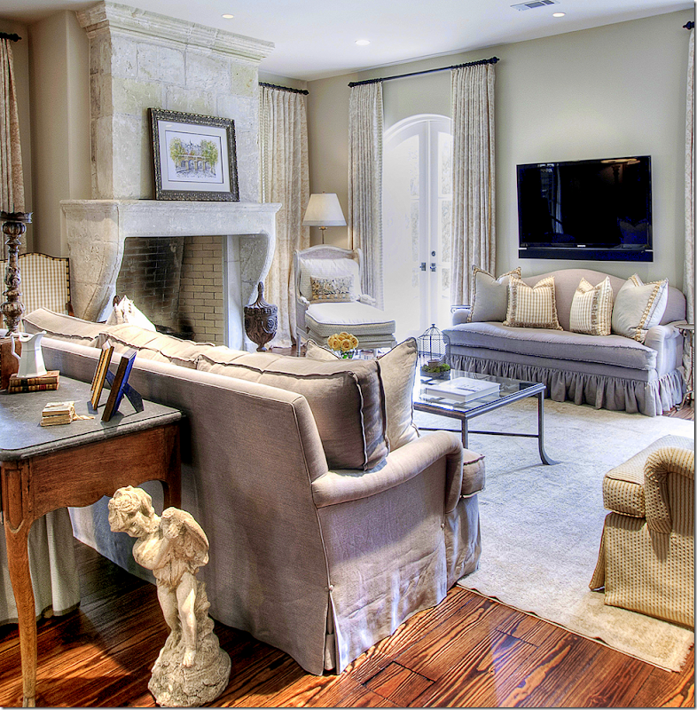
A close up of the seating groups around the fireplace.
I love the curtains – with trim on the leading edge. The mantel is gorgeous too. Incredible. The antique mantels are just so much better looking than the repros, but unfortunately, they are way too expensive for most of us!!! The owners were so lucky the house came with all these architectural elements. Pretty chaise in the corner.
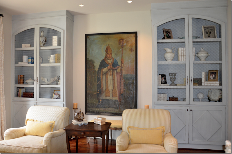
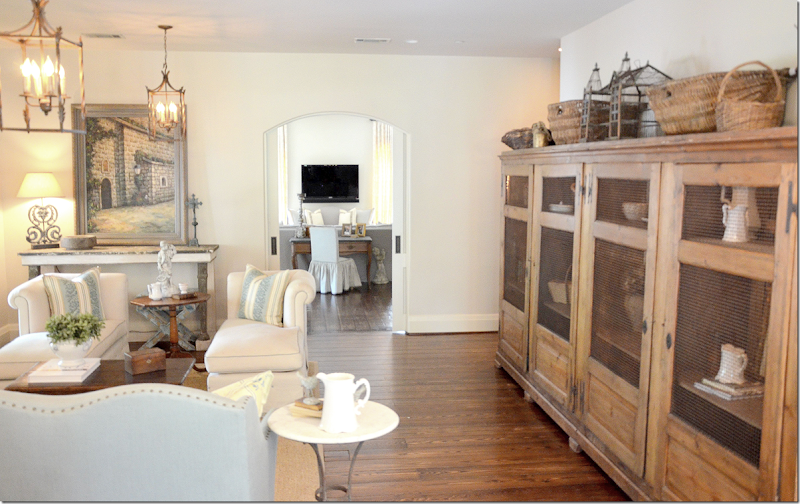
Along the back wall – two cabinets were added – they have a Swedish feel with their carved doors and chicken wire.
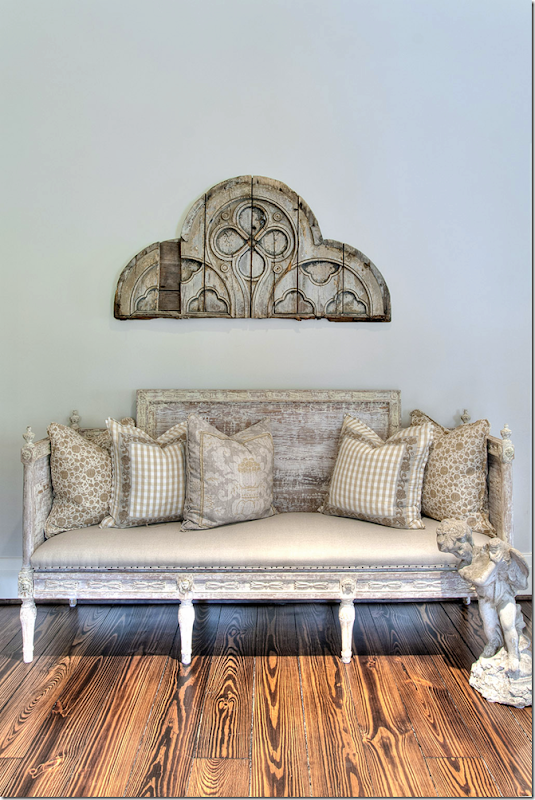
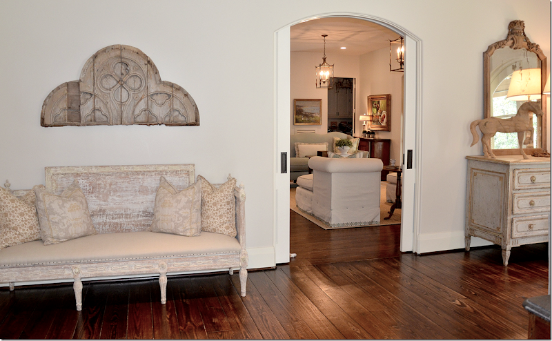
And along the side wall the leads to the family room is a Swedish sofa with a mix of pillows.
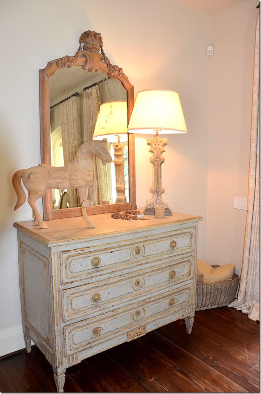
And on the other side of the doorway is this antique chest and mirror
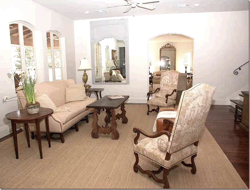
Through the double doors is the family room.
The Family Room:
The original owners decorated the family room with French styled chairs and sofa. Love the two tall chairs with toile fabric. The stairs led to the upstairs bedrooms. Through the windows is the covered porch with its outside fireplace and kitchen. Through the doorway is the living room. Love the way they decorated this room.
The next owners furnished the family room with more contemporary furniture. Again, it’s hard to believe it’s the same room. I wonder why they even bought this French styled house? It just doesn’t go with their aesthetic at all!
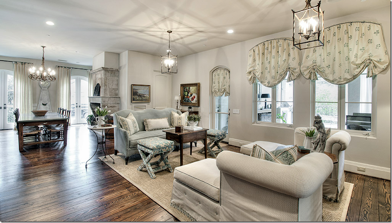
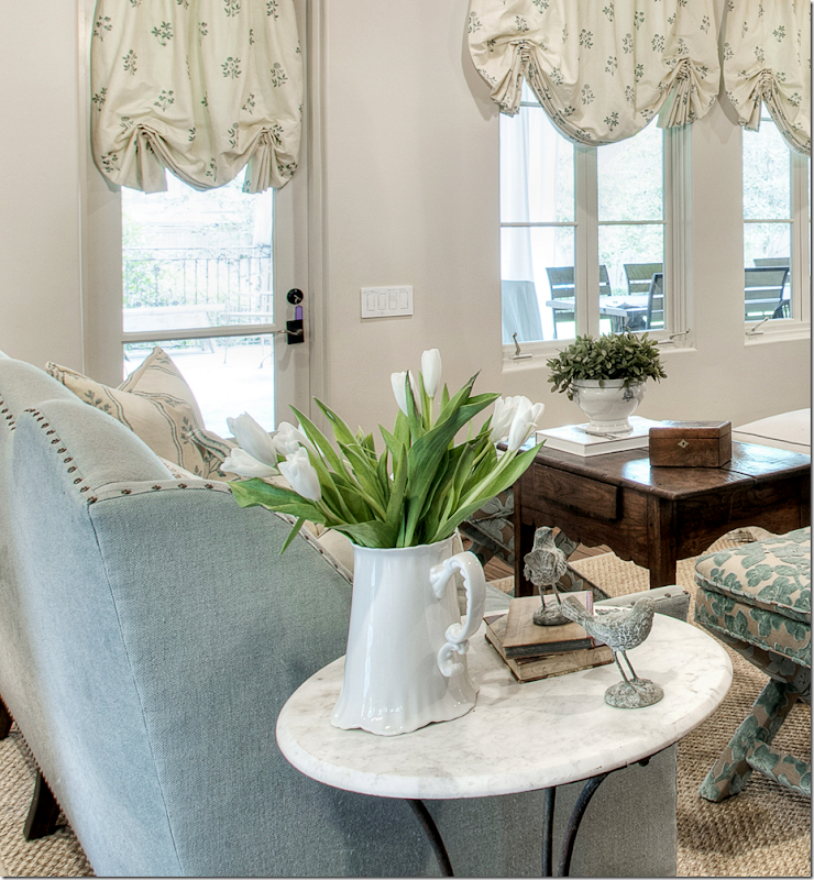
And today! The room was decorated by Nicole using creams and light blues. I love the window treatments. There are chaises instead of chairs which are great for watching TV. Love the highback sofa in light blue velvet. And I love the tall table used for a coffee table. So fresh and pretty! Through the arched opening is the living room.
A close up of the trumeau – so pretty. Notice the trim on the chaise. Love the decorating!
And looking the other direction. The breakfast room and kitchen connect to the family room. The covered terrace is outside the windows of the family room.
Close up of the fabrics used.
Across from the family room- is a large French bookshelf. You can really tell the difference between the pictures that the homeowner submitted herself and the ones her decorator had professional taken! These were also taken much earlier – you can see the trumeau is a new piece – there was once a painting there.
Pretty light blue velvet with nailheads.
The Kitchen and Breakfast Room:
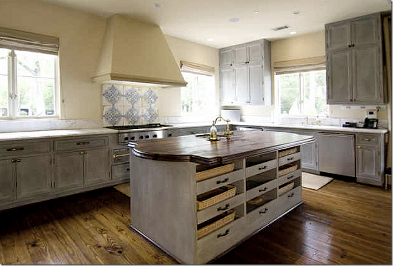
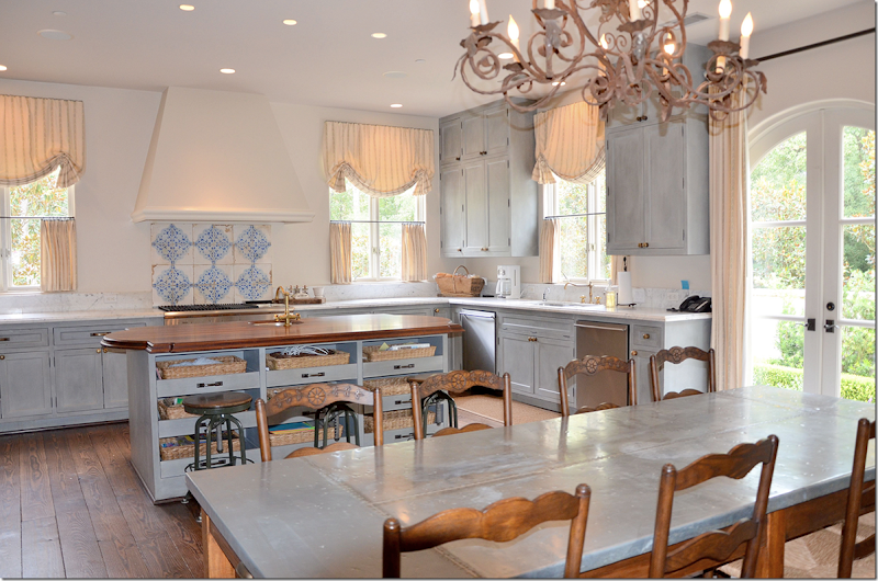
The kitchen has remained almost the same through the three owners. Tiles on the backsplash and pretty painted cabinets.
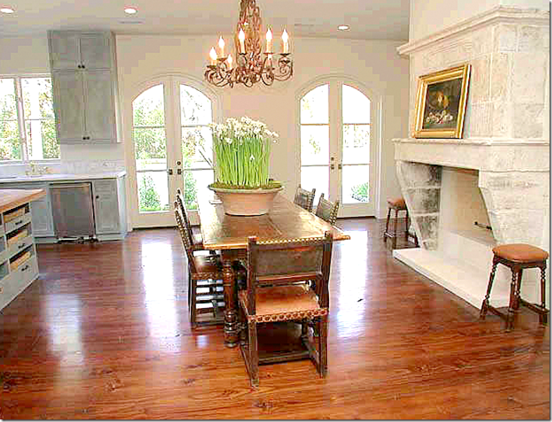
The first owner – with another stunning antique Chateau Dominque fireplace. This light fixture also stayed through all three owners. Through these French doors is the side courtyard.
The second owners added plain khaki shades.
And they added another contemporary table and chairs - just so boring.
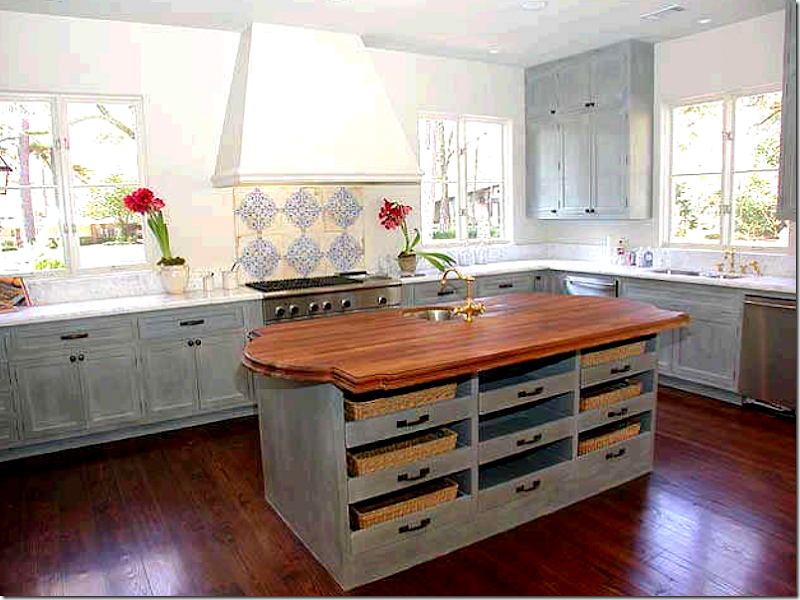
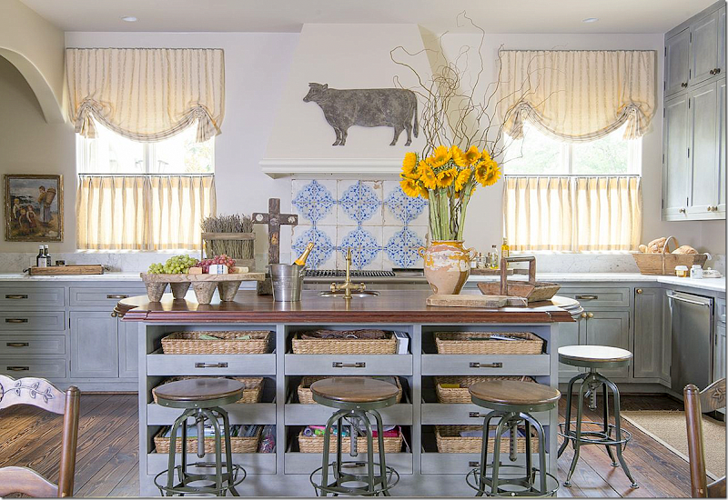
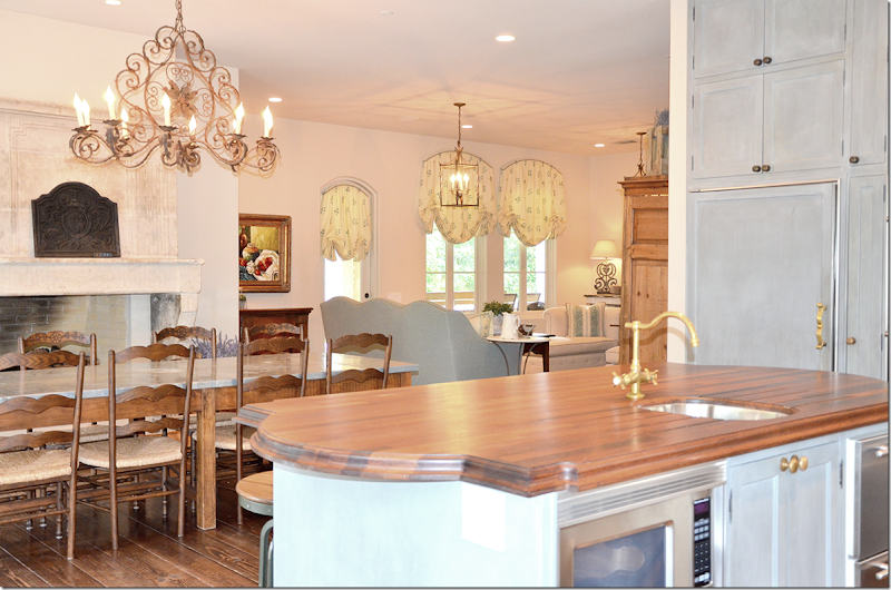
And today – industrial stools were added for around the island. Cute window treatments in yellow stripes were added along with French styled accessories. I love the painted cabinets and tiled backsplash mixed with the white marble.
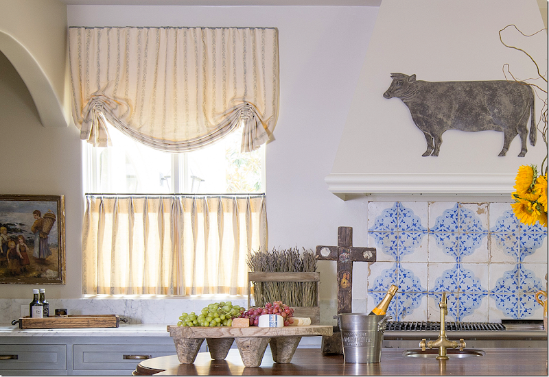
In this closeup you can see the marble countertops and the walnut on the island. I love the antique tile backsplash. Using tiles like this is a great way to add patina in your house without a huge expense – unlike an antique mantel. Love the way Nicole did these curtains!
And a shot of the breakfast area, overlooking the kitchen.
Looking back from the kitchen to the family room.
Another view of the breakfast room with the beautiful antique mantel.
The Master Bedroom:
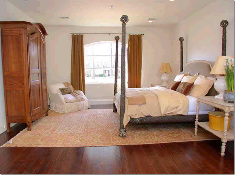
The original owners used a four poster bed and a French armoire.
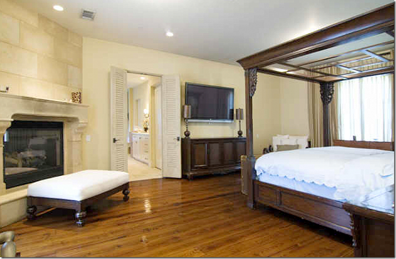
The second owners – here you can see that there is another fireplace in the bedroom.
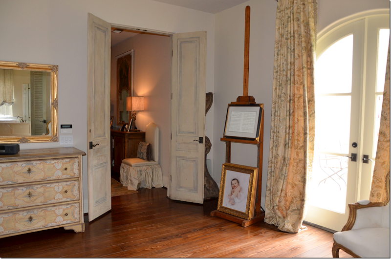
And today, the present owners have hung subtle patterned curtains in yellow. Notice the pair of antique doors that lead into the master bedroom.
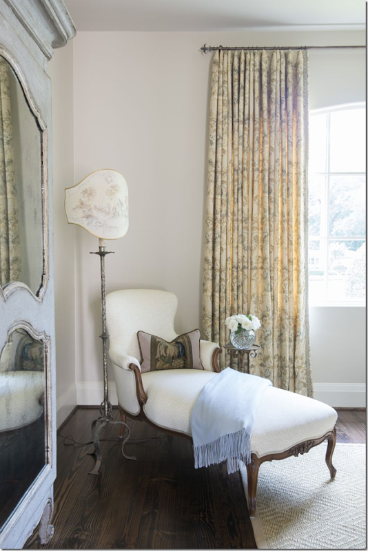
And, across from the bed, there is a blue painted armoire and French chaise. Love the lamp!!! Such a pretty a vignette. I wish there was a picture of the bed!
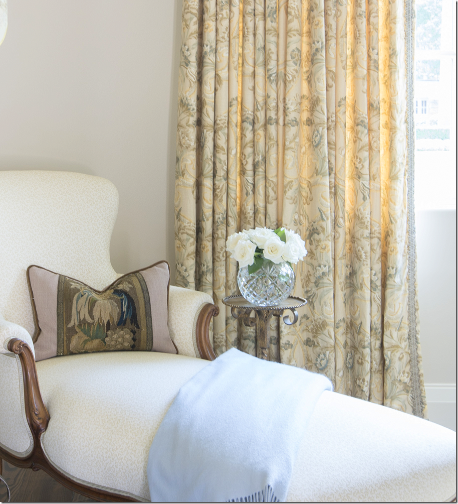
Here you can see the pattern in the curtains and the subtle pattern in the chaise fabric. Notice the trim on the leading edge of the curtains.

This really interested me – the original owners and their beautiful master bath. Love the marble shower and I especially love the antique terracotta floor from Chateau Dominque. Gorgeous!
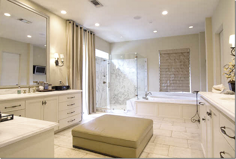
The second owners – with the contemporary aesthetic – TOOK OUT THE TILED FLOOR!!!!!! Wow! That’s sad! And of course they hung up more boring curtains and I have no clue what that leather ottoman is doing in the bathroom!
At least the owners chose an antique stone tile to replace the terra cotta. It’s still very pretty – I just wish they would have left the terracotta down!
In the pool bath – the original terra cotta floors remained. Nicole Zarr put up a new wallpaper and added an antique mirror.
I love this house – the layout and the décor – and I thought it was so interesting to see how three owners decorated it – from French to Contemporary and back to French décor. It amazes me that the second couple even bought the house – with its 18th century mantels and antique terra cotta floors, the old iron chandeliers and sconces – and then they added a houseful of contemporary furniture! Why not buy a modern house instead?
I talked to the present owner – and she said she was glad that the house was furnished with the contemporary furniture when they looked at it – because it kept a lot of potential buyers away!!
I especially love the way Nicole Zarr decorated it – with a continuity of colors – creams and blues and pale yellows. I love her use of patterned curtains and antique rugs in soothing colors. And I love how she uses trims to highlight edges on furniture and fabric.
I especially love the dining room – with its painted furniture and gorgeous chandelier! What a beauty it is and what a beautiful room!!
I asked the designer Nicole if I could show a few more examples of her work – and she graciously sent some pictures. Here are few of my favorites:
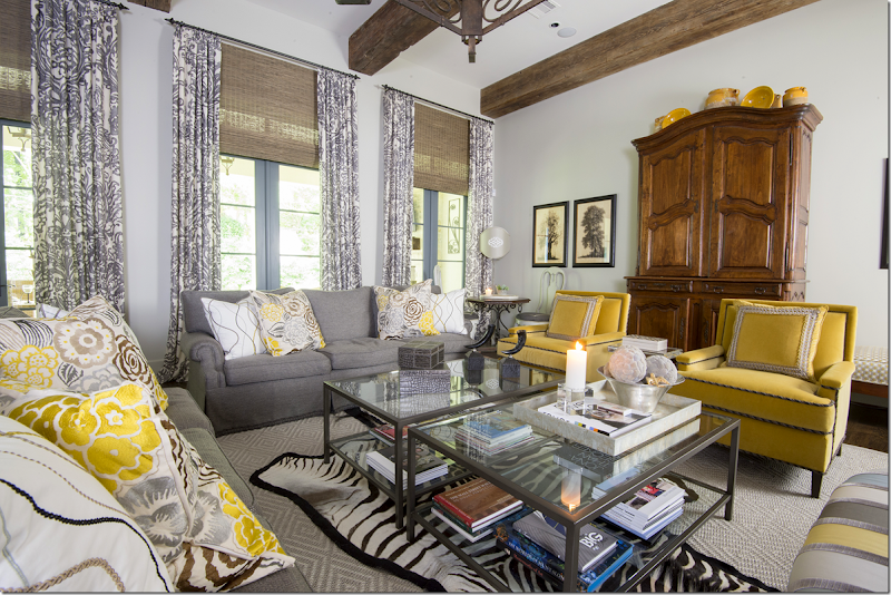
This family room is chic in bright yellows and grays. The patterns are much more bold here than in the previous house, and the effect is more trendy. I love how she mixed in antiques with the contemporary pieces.
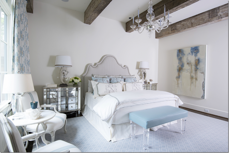
This bedroom is all soft blues and whites. Again it’s a mixed of the more traditional with new looks such as lucite and mirrors.
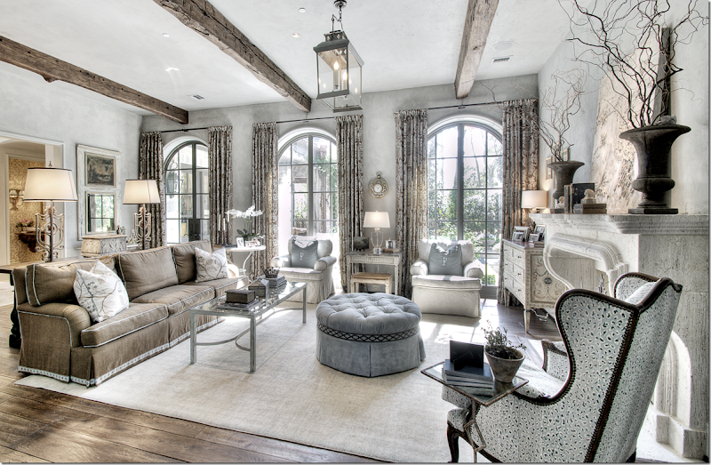
In this house, Nicole mixed browns and blues and creams. Love the curtains – and love the colors. Notice the trim on the brown sofa and ottoman. I also really like the furniture arrangement with the two chairs against the windows.
Here’s a closeup – Nicole used such pretty painted pieces in this room. The side table and the chest are just beautiful.
Leslie of Segreto Finishes painted this room and added the detailing at the ceiling and the two pictures flanking the French doors. On the stone floor, Nicole added a very subtle rug. So pretty!
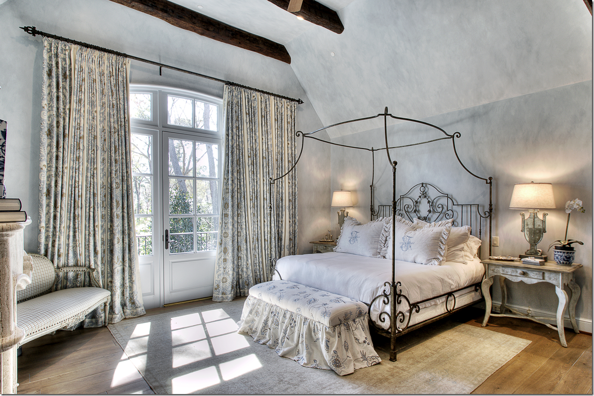
For the master suite – I like how she took a large room and filled it up so it becomes cozy instead of cavernous. The canopy bed is a great idea to lower the ceiling to human proportions.
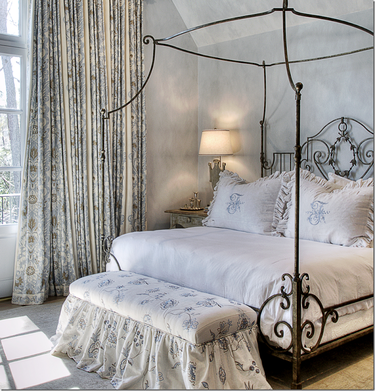
A close up of the beautiful fabrics she used. What a pretty bed!
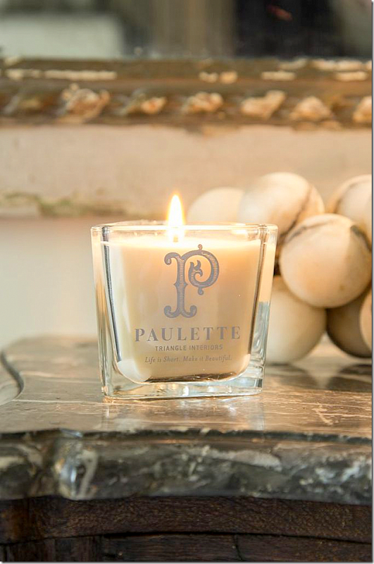
Nicole Zarr took over her mother’s interior design firm, Triangle Interiors, Inc. after she got sick and passed away. Today Nicole helps raise money for cancer research and has created a candle in her mother’s, Paulette Domercq, memory – with the saying “Life is Short. Make it Beautiful.” So true!
A huge thank you to Nicole for the beautiful pictures.
To contact the designer:
Nicole D. Zarr – email her at:
Nicole@triangleinteriors.com or phone: 713-973-6040










0 comments:
Post a Comment