OK OK – I guess I’m through with the series on the British Royals! Enough of your complaints caused me to scrap the last installment. Originally, I had planned to do just one or two stories of royal houses and I thought I could fit it all in, but that turned out to be unrealistic. I might still do the last story I had planned at some later time – we’ll see. Recently, I got a book on Clarence House with great old images that I would also love to show you and only wish I had had it for that blog post. But, in the meantime, back to design in the United States!
First, I had a huge laugh at this month’s Traditional Home magazine. Have you seen it yet?
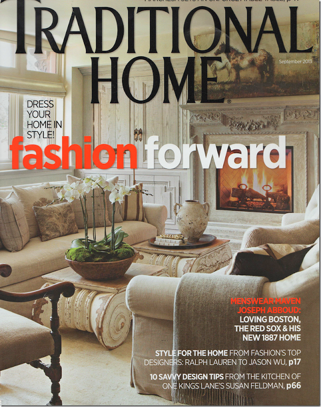
This month’s cover of Traditional Home.
Recognize the coffee tables? Yes – there they are – two capital coffee tables from Restoration Hardware.
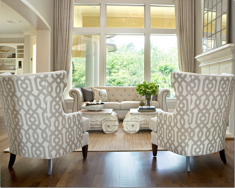
Remember this house in Houston, decorated by Amanda Carol99 , that featured the same two capital coffee tables? If you read the comment section from that story, you will remember that these two tables from Restoration Hardware caused quite a stir. Some people loved them – like me – but some felt that “no designer of note would ever use those tables.” So, I did a search in design magazines and found quite a few noted designers that do indeed use Restoration Hardware – and those tables in particular.
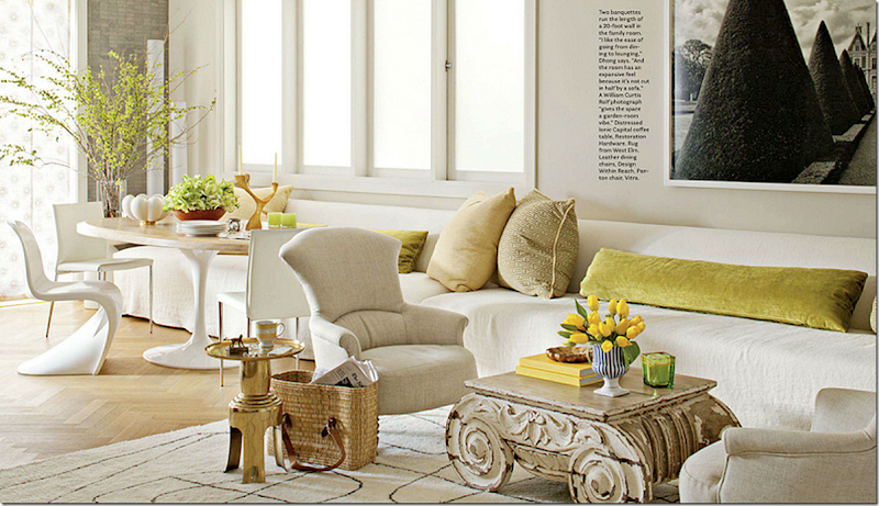
I found this house designed by Benjamin Dhong who used one of the capital coffee tables from Restoration Hardware. Dhong is a highly respected and admired designer from San Francisco. He used a few pieces from Restoration Hardware in this particular house but he mixed them with serious antiques and some expensive reproductions – to great effect.
![[image7.png]](https://blogger.googleusercontent.com/img/b/R29vZ2xl/AVvXsEiXH_gXCR4yO2K_3QgrHvPEtnGoN-FJNPZndISOpY6vKUntGMAlKpNQ366K45X1d6DuKhTc_Vt6xCbHxoiSKqHCv911N4_qskrGkJRex9WtsCATP_AJIP_m_BSEre6wHJ5xuoOBvclBsMso/s1600/image7.png)
Here in the guest room, he mixed a Restoration Hardware chair with a beautiful bed from Michelle Nussbaum’s Ceylon et Cie and he then wrapped the room in gorgeous handpainted wallpaper by DeGournay. Dhong proved that you can mix furniture from places like RH and Pottery Barn with expensive antiques and create a wonderful look. The operative word here is “mix.”
The question is should houses use only furniture from places like Restoration Hardware or Pottery Barn? Do they look as good as one with a mixture of pieces – such a Duong’s?
In this month’s Traditional Home, it validates many of the negative commenters who were so against using a lot Restoration Hardware in one design setting. No! The negative commenters have a valid point? Well, yes, they do.
In the cover story, another highly respected designer, this time of menswear - Joseph Abboud - furnished his entire apartment almost completely in Restoration Hardware. And, I’m sorry to say, it couldn’t be more boring if it tried. So disappointing.
First, let me say, that this was a business collaboration between Abboud and RH, so I don’t think he would have used their products so extensively otherwise. Abboud is from Boston and has always wanted to get a place back home, away from New York City where he lives. When he found an architecturally wonderful space, he bought it and filled it up completely with Restoration Hardware – even using their designers on the project.
The moral of the cover story shows how important it is to mix old furniture with new pieces from stores like Restoration Hardware or Pottery Barn, rather than just using only new pieces. Just by mixing in an old beat up side table from a yard sale would look so much better than a house filled with only Restoration Hardware. The two rooms shown above by Benjamin Duong, where he mixed high and low – old and new Restoration Hardware - shows how beautifully this mixture can be done. As Houston designer Amanda Carol did with her client – mixing in a few pieces of RH with pieces the owner previously had, such as the two chairs with the patterned fabric on the back, Amanda created an interesting design, perfect for the young family that lives there. As the years go on, the couple will add more pieces as they collect them.
First, let’s look at Abboud’s new apartment:
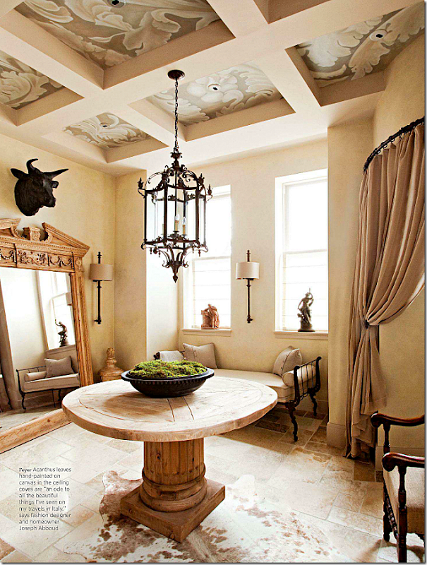
Here in Joseph Abboud’s new Boston house’s entry way, you will recognize all the pieces from RH that fill the room – from the table and lantern to the mirror and sconces. This room could be stunning – instead it looks like a advertisement for Restoration Hardware, which I suppose it really is. Everything just blends in together. It’s so monotone, there is hardly any contrast at all. All I can think of is how beautiful this space would look with an antique dark wood Spanish table and a collection of antique chairs, mixed with a gilt wood console and a gilded mirror – flanked by crystal beaded chandeliers. Instead, it’s just so humdrum.
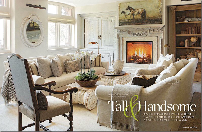
The living room fares better and looks much less like a RH showroom than the entry hall. Of course, I love the two capital tables and the sofas are hard to distinguish from custom or RH. The room itself is quite pretty with the fireplace and paneling. But can someone tell me why there is a RH picture light over the RH mirror?
The dining room is filled again with RH furniture, all in a neutral palette except for the oddly yellow rug. Again, it leaves me wanting color or pattern. Its an overload of beige that just seems boring and uninspired. Even the sconces get lost in all the beige.
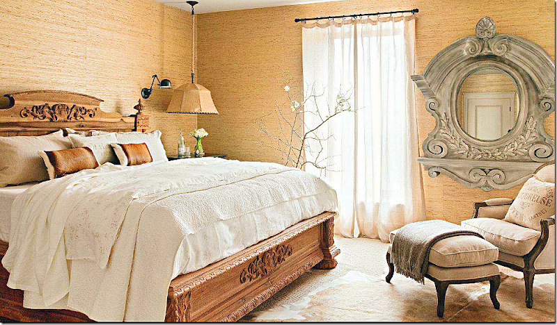
The bedroom is my least favorite – again – a sea of beige. But it’s the oversized faux French window mirror that truly ruins it. It seems so out of scale and looks almost comical. You can just imagine the RH decorators saying – “where can we stick this mirror? Just put it in the bedroom.” Even one of their full length mirrors would have looked better here.
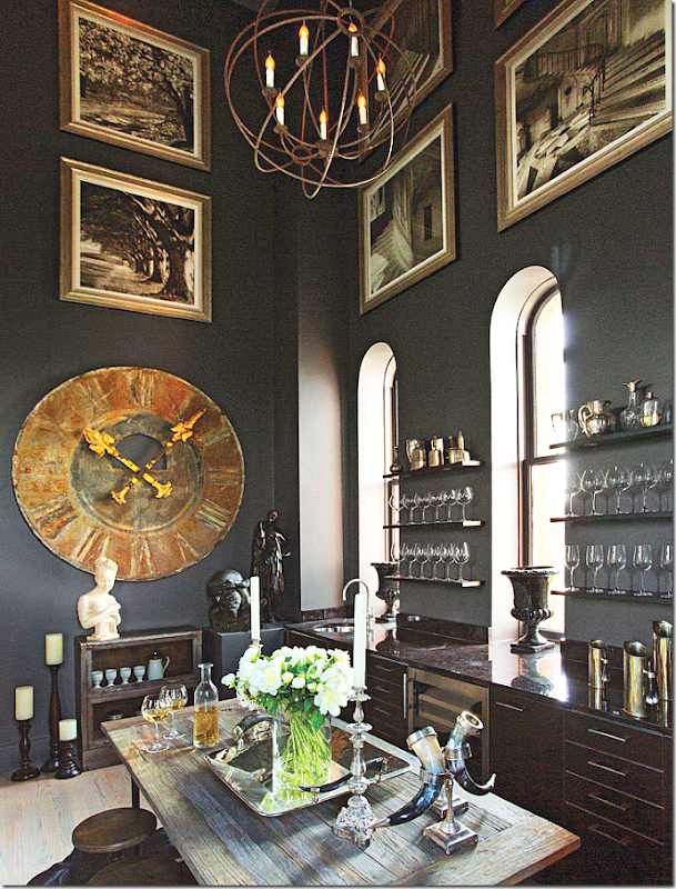
The wine room – located at the top of the tower Abboud’s 19th century building – is the one exception to the entire spread. With its wonderful dark walls and cabinetry, the room is moody and exotic and looks like the perfect place to spend a cold and rainy Saturday afternoon, tasting wines. But, it’s the odd assortment of accessories from RH that are placed around the room without any real purpose that ruins it for me.
Thanks Traditional Home – you’ve ruined Restoration Hardware for me for the next few months, if not forever!! If you want to use RH or Pottery Barn – do so, by all means, but use their goods sparingly and always try to mix in some old pieces here and there for patina and contrast.
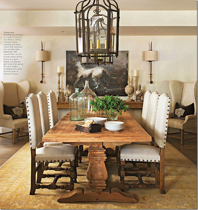
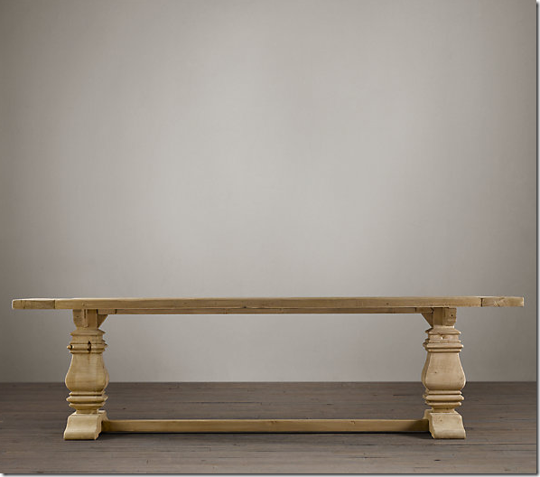
Looking back at the cover story, I thought of the dining room table. This table from Restoration Hardware is so popular today – it seems like it’s everywhere. It’s based on a Belgian design and there are copies of the RH table at every price point.
If you look at the picture of the dining room again -
You will notice, that while the chairs are pretty and the table is wonderful – all from Restoration Hardware - everything tends to blend together – nothing stands out, there isn’t any contrast, no focal point – except for the painting - which is also basically neutral. If the host chairs were in a darker linen, they could have made much more of a statement. If the rug wasn’t yellow – and if the chairs were stained dark – if the console was painted a light cream or a dark gray – there would be contrast and the room would be so much more exciting.
Looking at this room – as many times as I’ve seen this table used, what is the best way to decorate with it? Is a sea of unstained or limed wood the way to go – or is there way to spruce it up, make it more alive and exciting? And then, what is the best way to decorate a dining room today, especially if you are on a tight budget?
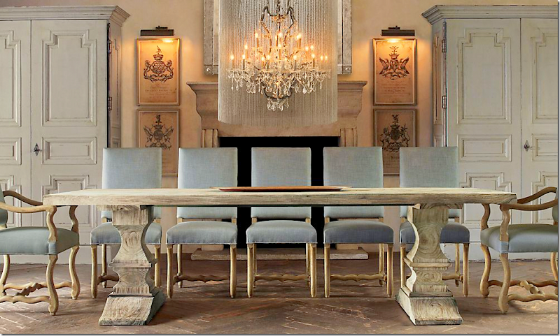
In this ad for Restoration Hardware – they used a pale blue which does add a bit more color, but everything still looks very monotone. Maybe if the walls were painted in the same blue, just a bit deeper – this room would really come alive.
Remember paint is the cheapest way to achieve the biggest change.
Here is the same table using the same host chairs with a little more contrast coming from the side chairs. The aqua walls add a bit of contrast.
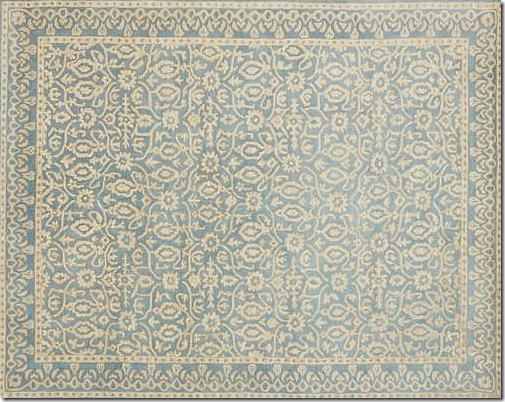
I would add a rug for even more color and texture. This rug came from Pottery Barn and is a great budget conscious price. Sometimes hardwoods need a rug to break up all the brown wood.
Here the unfinished wood table blends into the chairs and other furniture – even the painting and the floor. Isn’t this room just crying out for something to land your eye on? Some focal point? The easiest way to pop the room would be white slipcovers or a patterned fabric.
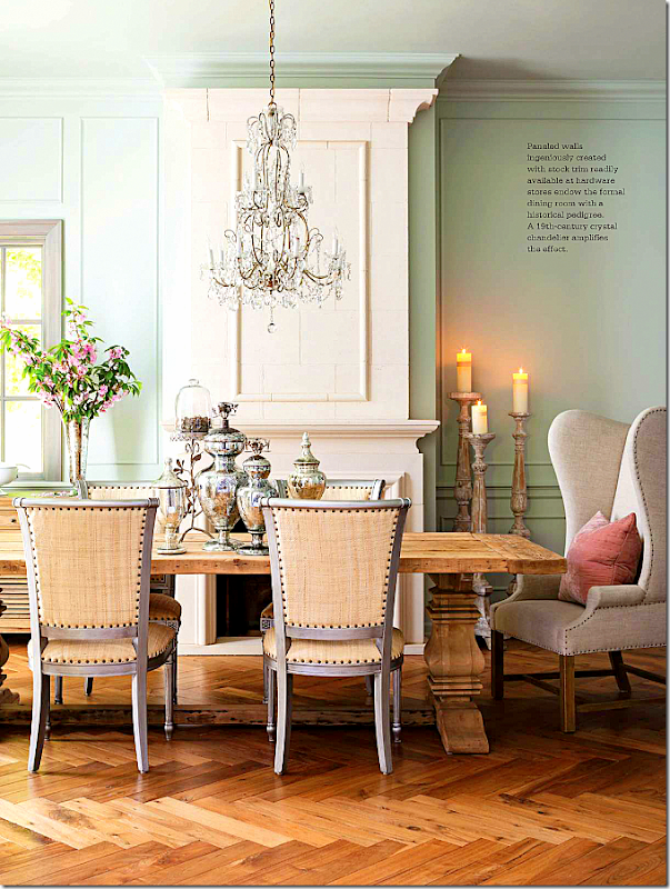
Here, again, the same basic RH table – but by using the much lighter chairs - there is more of a contrast and it’s not so boring looking. Plus, the sunlight from the windows makes it bright and airy. This room shows you that you can see use a neutral palette in a room and not have it all just blend together.
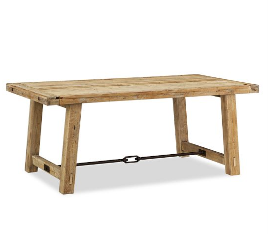
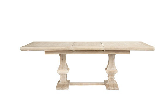
If you’ve wanted to use the popular Restoration Hardware table, but don’t to spend that much money – there are several good alternatives:
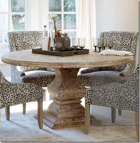
The original table from Restoration Hardware , which comes in different finishes is quite pricey at $2400-$3900.
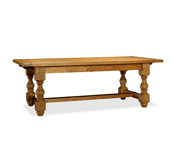
Pottery Barn has a similar table in two finishes for $1200.
Or this Pottery Barn unfinished stain table for $1200.
This Ballard Designs table seats 10 at starts at just $800.
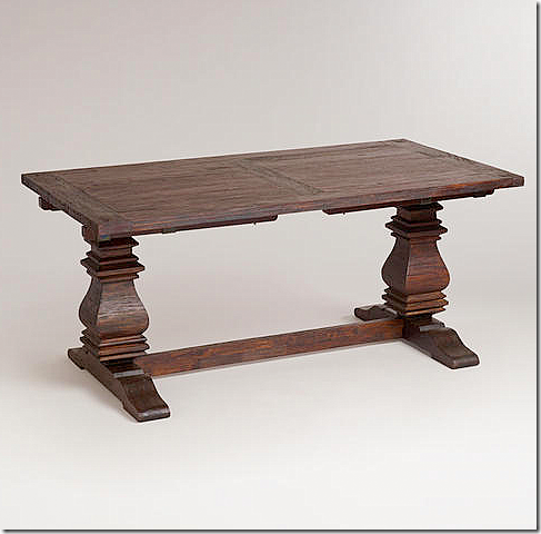
On a tight budget, but you want a similar table? Cost Plus World Market sells this one for just $699.
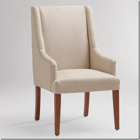
And their chair – sells for only $180!!
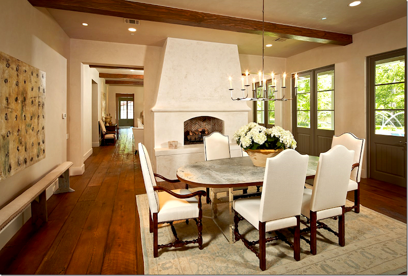
Here a metal top table with unfinished wood legs is made more exciting with the almost white upholstery on the chairs and the contrasting dark stained legs.
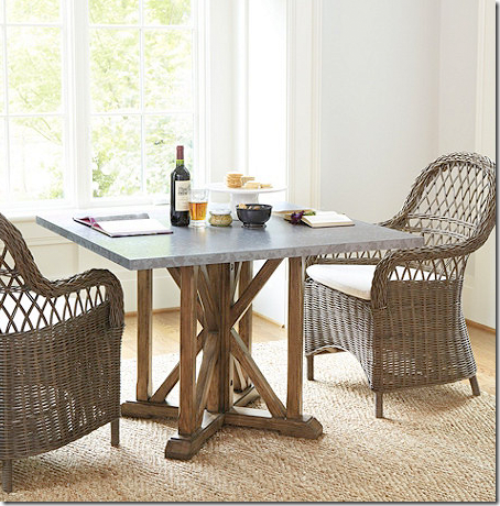
Ballard Designs sells this zinc top table for just $700. And the best news, they now have these wonderful Kooboo chairs in stock – the only place I know that has them, even my wholesale sources are out! Only $279.
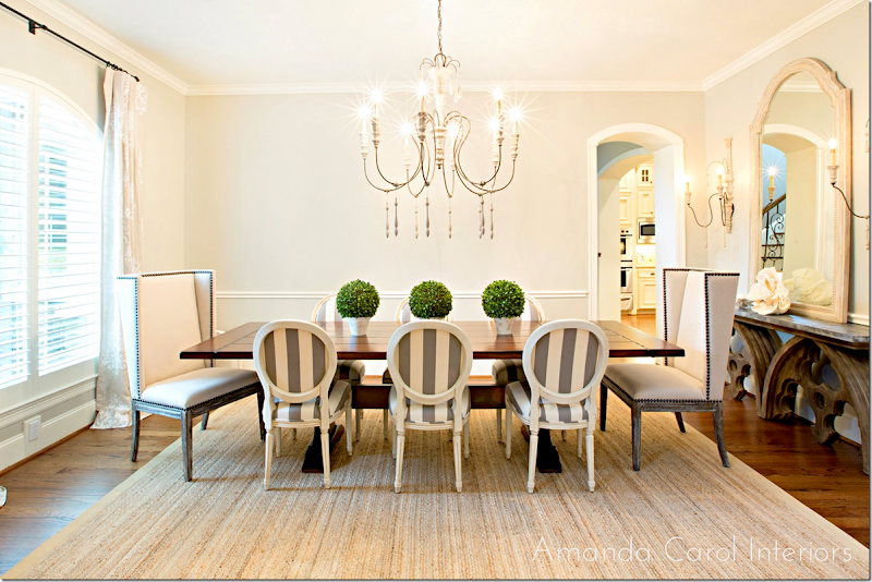
And while this table is darker, just the addition of a stripe on the chairs adds so much to the room! Even the texture and color of the rug adds a lot of contrast.
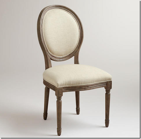
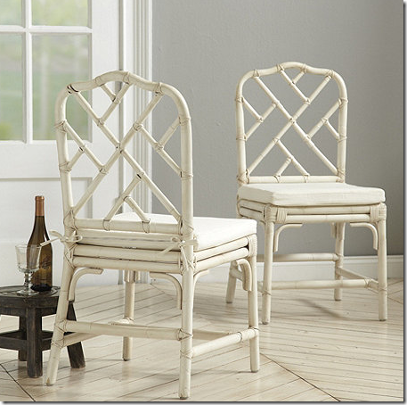
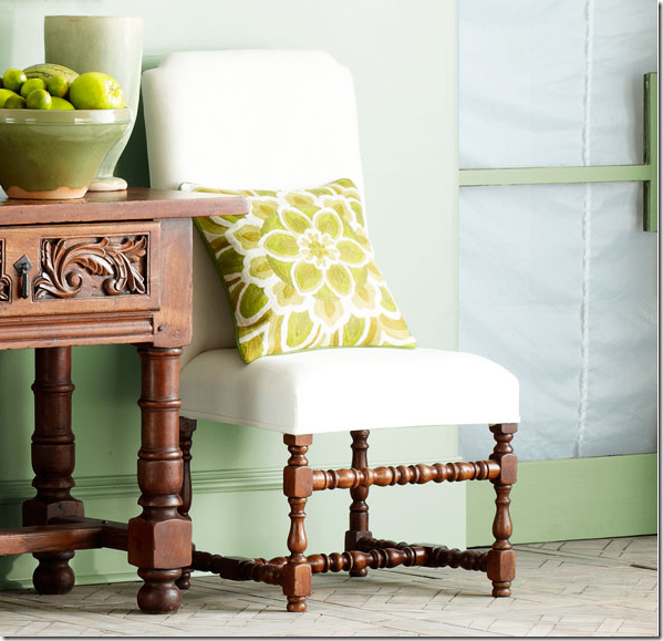
Need a French Chair – at around $175 each – you can mix this with a unstained table, or paint it white – and then reupholster. Choose a wide stripe fabric like Amanda did to get a really great look.
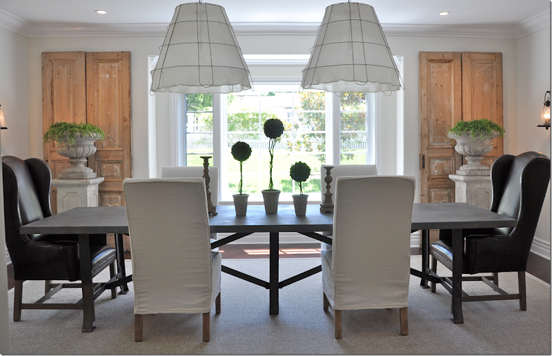
In this dining room by Brooke Giannetti – by using the two chairs by Restoration Hardware in a deep brown leather, there is more of a contrast with the whiter chairs. The pine doors contrast with the dark chairs and the somewhat darker table.
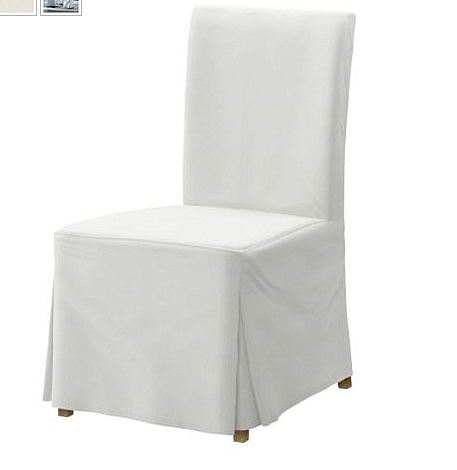
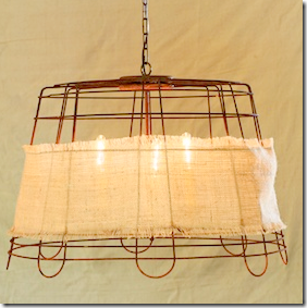
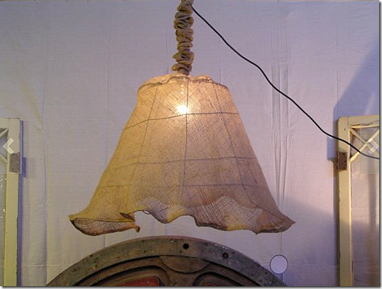
To get this look – try this Ikea chair for $89 – and shorten the slip half way up the leg. Look for pine shutters to flank a window. Visit a garden store – for inexpensive concrete pedestals and urns. And for the lights – these basket chandeliers are such a focal point – I’m crazy about them. Try making them on your own – or:
Try these custom lights HERE.
Add fabric to this fixture – just $59.00 HERE.
And this basket chandelier kit is just $185. HERE.
This room is all cream, but what keeps it from being boring? The antiques. The mix and match of the furniture from different time periods give it enough interest to keep it from plain. If this room was furnished all in RH or Pottery Barn, the beautiful architecture would go unnoticed.
A round table from Ballard Designs for $1200.
Try this pretty French table for just $995 HERE.
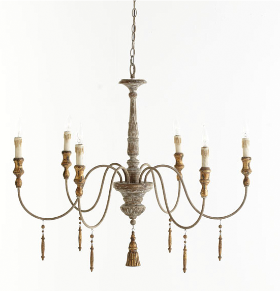
Try this light – from Wisteria for $799.
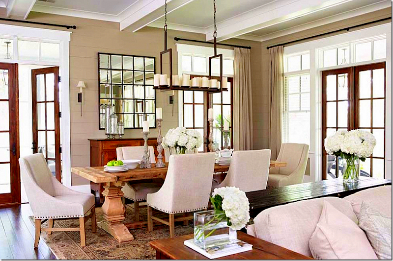
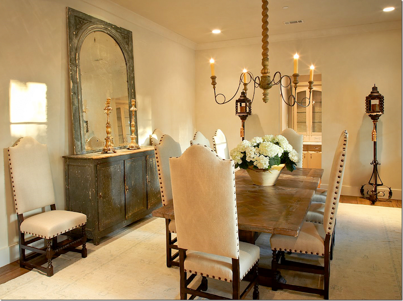
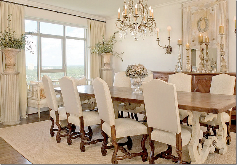
A light wood table is mixed with cream upholstery and darker wood legs. The antique console in a deep gray adds more interest. I love the standing lanterns – so fabulous!!
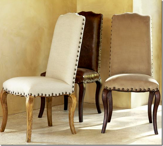
Pottery Barn chairs $349 – give you the look with nailheads.
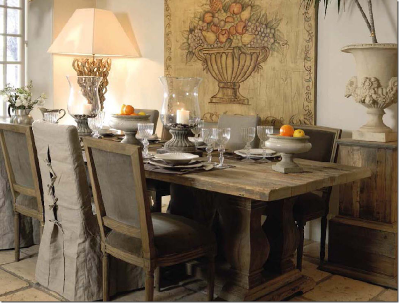
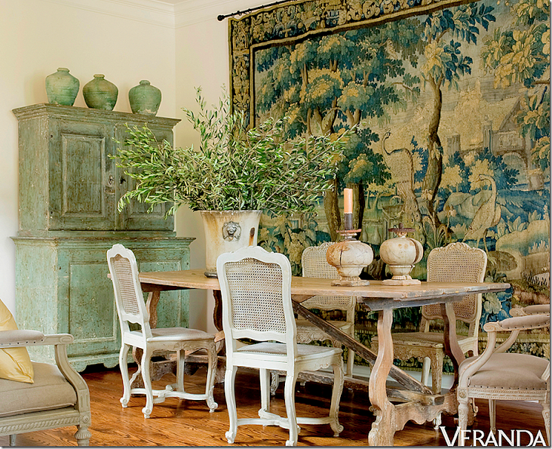
A Spanish styled unstained wood table could be boring but mixed with French white chairs – it is anything but. The beautiful tapestry and painted chest also add so much to feast the eyes. Just beautiful.
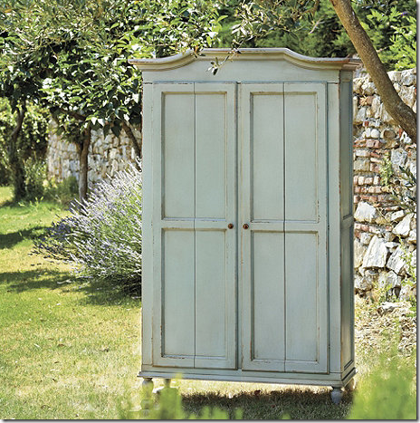
This dining room would be hard to copy on a budget – because of the tapestry and the armoire. This armoire from Ballard is a nice choice, but it’s not cheap. You would be better to find an old one at a second hand store and paint it green or aqua. Though at just under $2,000 – it’s still cheaper than an antique. The tapestry is something I have no great source on tapestries.
But – there are reproduction tapestries that are reasonable – and this one is pretty. Put it outside in the sun for a month and maybe it will look antique? HERE.
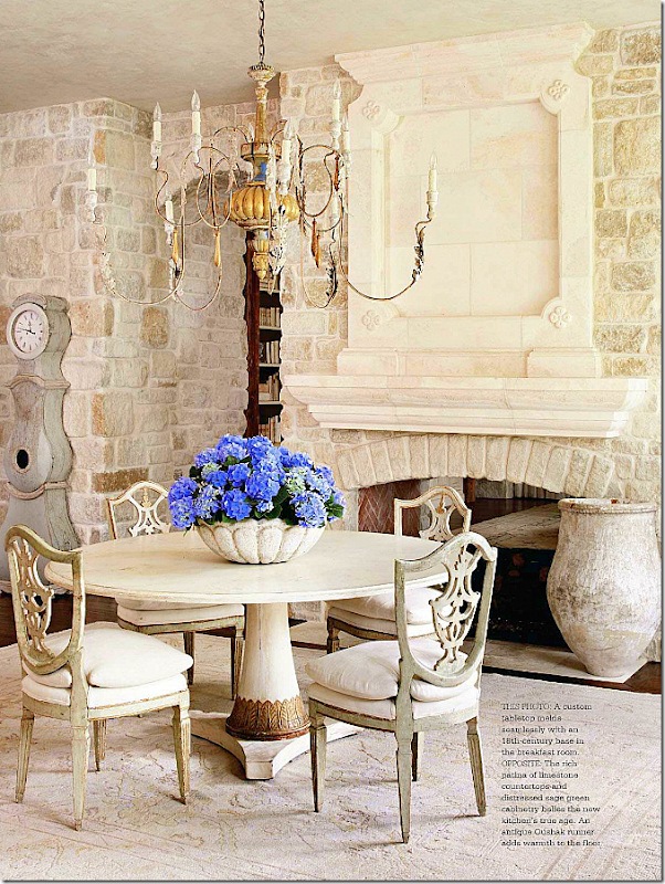
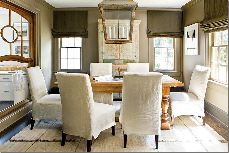
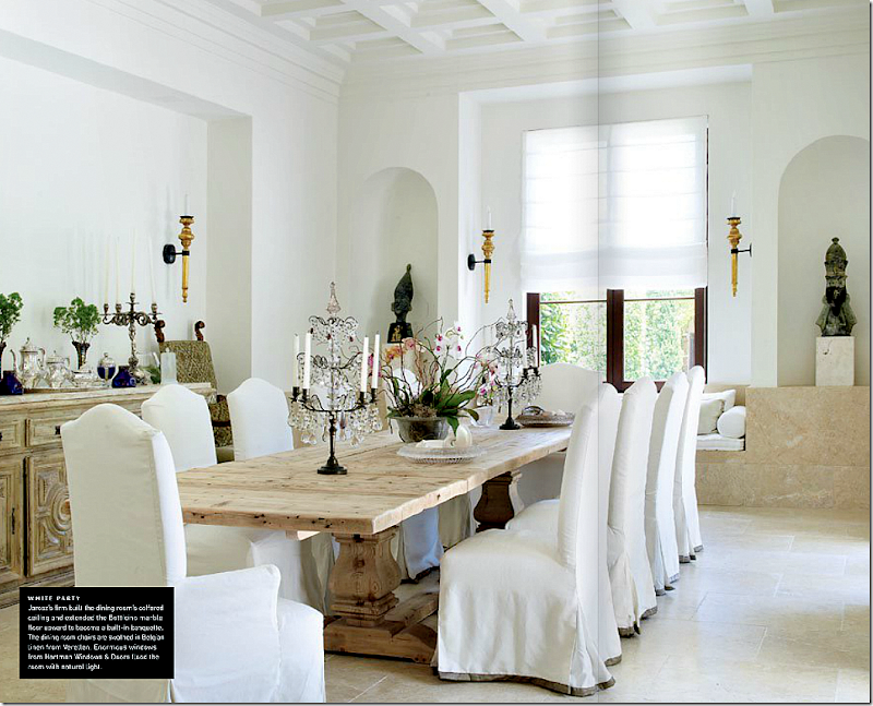
A light stained table mixed with slipcovered chairs with darker legs and creamy fabrics makes for a neutral but certainly not boring palette. The overscaled antique lantern matches the scale of the scale of the table and chairs. This would a great room to copy – you could find similar chairs and table at a retail store – and have short slips made like this. Simple dark shades and dark woodwork – add punch. Add a large outside lantern and you would have a great look without having to spend a fortune.
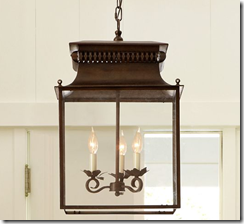
Pottery Barn $399. Oversized, this lantern has a nice look to it.
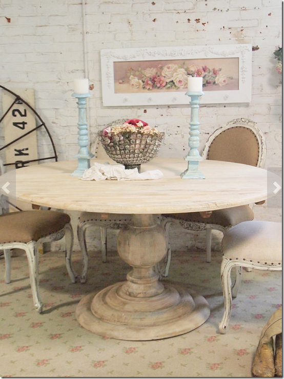
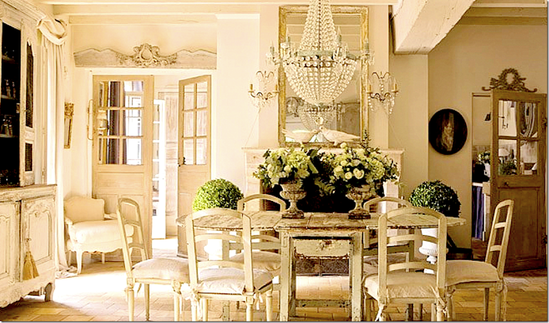
Another totally neutral room – completely monotone, but boring? No. The rough patina of the table becomes the focal point as do the antique doors and armoires. Even a new chandelier would still work in this room. But all new pieces would make the look boring. To get this look on a budget – hunt for an old beat up table at a thrift store or yard sale, then paint it light. Do the same for the chairs. The mix of styles and use of old pieces will keep the room from looking stale.
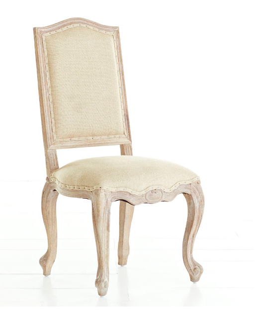
This Wisteria chair is nice copy of an antique. $339. For antique crystal chandeliers – try EBay. They usually have a good selection. And if you have a little more of a budget – 1st Dibs. I’ve had great luck on 1st Dibs. Especially when the dealers are willing to work with you on the price! It never hurts to ask for a price reduction. All they can say is no.
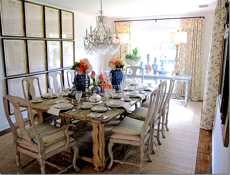
Here an antique table mixed with repro Swedish chairs looks interesting, not boring because of the art work. A set of frameD documents on the wall really adds a great focal point. To copy – look for old sheet music to fit inside ready made frames. The more frames the better. And pattern curtains add just enough pattern to make the room look alive.
For antiques and reproduction Swedish antiques – always check with The Lone Ranger!!!
The Lone Ranger Antiques – Swedish vintage and antique furniture.
His prices are great and so is his merchandise. I’ve bought so much from him – though the things I have bought aren’t antiques, they still look great. HERE.
The unstained table that is so popular today – to make this work, get slipped chairs from Ikea or Pottery Barn, then add a colored trim to make them look custom. Splurge on antique accessories to add interest and richness.
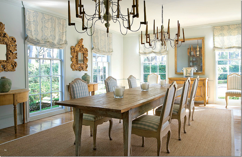
This room is made interesting with fabric – a toile in the windows and a check on the chairs. Try two chandeliers instead of one if your table is overly long.
For this chair – use the Wisteria one shown above and cover in a linen check. Contact the Lone Rangers to see his Swedish demi lune tables.
Reproduction chairs are mixed with a table with painted legs. This is a great idea for a sprucing up an old table – paint the legs cream and keep the top darker.
Ballard Designs – set of 2 for $450.00
Wisteria – $356. These chairs come in almost every color!
The Lone Ranger – use a pair of these in a dining room filled with one set of china or all white plates.
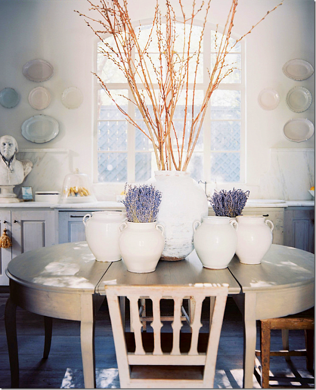
A dining room set up in a kitchen. The interest here comes from the accessories on top – a set of light jars. Again, the more, the better.
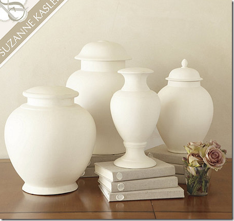
I used this collection of white bisque accessories in some bookshelves recently and they really make a statement. They start at $69 from Ballard Designs.
By just using a white tablecloth, a look of the table is changed so much. Instead of a dark look, the table looks light and fresh. Love this dining room!
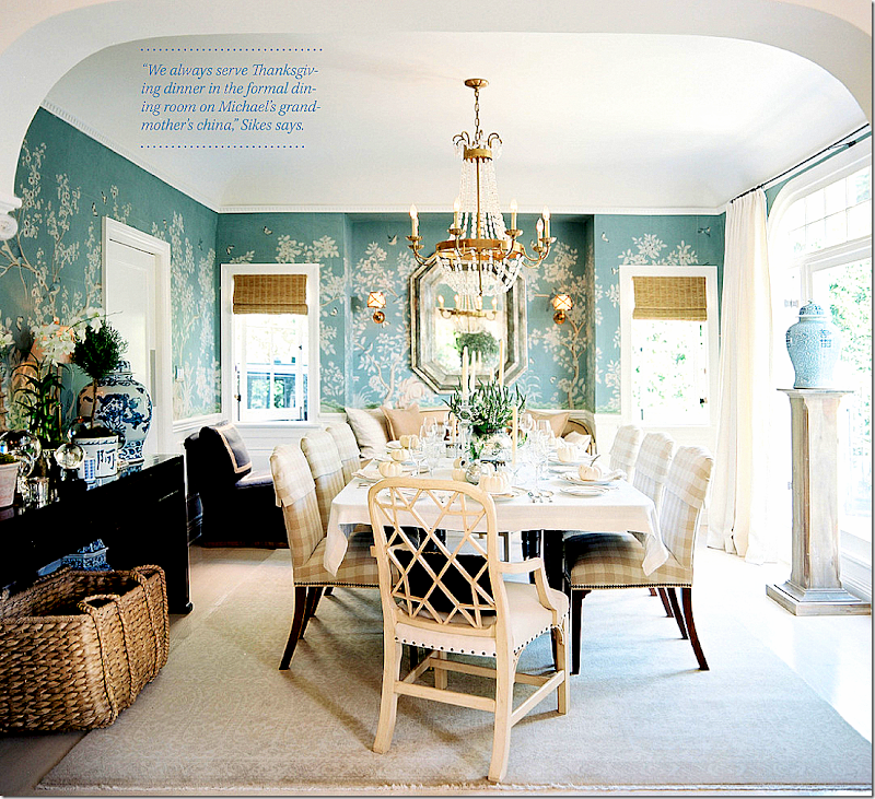
The wallpaper makes this dining room – and it would be hard to source on a budget, but….contact Scott Simon from Jardins en Fleur. I used his handpainted wallpaper in my bedroom and it turned out beautifully. It’s much cheaper than De Gournay and if you are serious about it – give him a call – for sure!!! HERE.
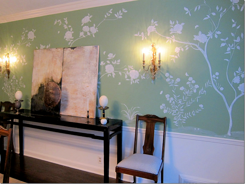
If you are handy with a paint brush, you could always try stenciling out a design like this – and if it doesn’t work – paint over it!!!
Patricia aka Mrs. Blandings who is not an artist – painted this herself in her own dining room. I think it’s amazing! She gives a tutorial HERE if you want to try it. Isn’t this incredible?
Also, in the room, the chandelier is new – from Circa Lighting. Wisteria has great blue and white pieces for the house.
But, it’s all about the wallpaper here.
With a really tight budget – get a large round table from an office supply place and sew a skirt for it in a vibrant color. Get a set of reproduction French chairs from any retail store (see the French chairs cited above) then reupholster them in a contrasting color. Green and blue together are so fresh looking.
When sewing a skirted table – be sure to line it. I use blackout lining. It’s thick and it makes the skirt drape so pretty. And be sure to puddle it 1 or 2 inches.
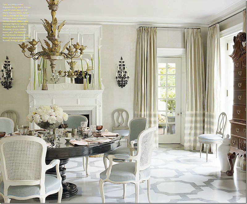
Instead of going light on an old table, go black, then mix it with white painted chairs. If you are really handy, paint a stencil in matching colors on the hardwood. The painted floors add the punch here, something that almost anybody could do on their own. Here are two tutorials to painting your own floors: HERE and HERE.
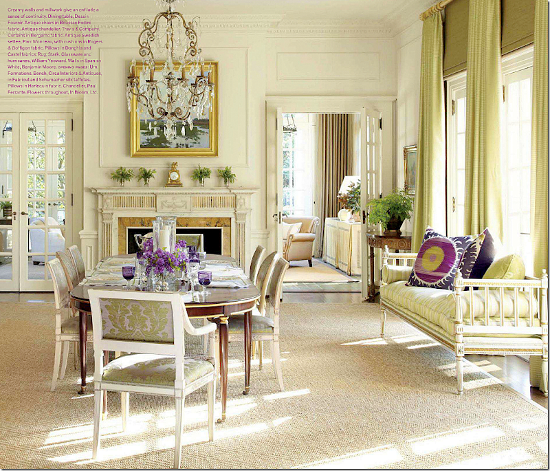
What I love about this room – a dressy dark table mixed with lighter chairs. Dark, matching chairs would have been so boring and predictable. And the Swedish day bed that makes this room.
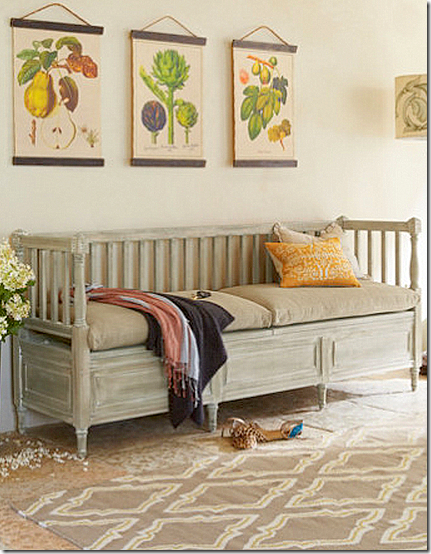
Soft Surrounding has this great Swedish repro! Add it to the dining room for a great focal point.
And the Lone Ranger has a lot of Swedish settees that could be placed in front of or between windows in your dining room.
Ginger Barber designed this dining room which I love. The white leg on the table catches the eye. And again, I love the Swedish sofa used in the window. Another great idea – wood pedestals with urns on top. That is certainly a look you can get on a budget. Can’t spend the money on a chairs like these? Try these from Wisteria.
Wisteria has these for $400. For a true chair like above – I would check out all the antique stores and flea markets for an old set. Try EBay and 1st Dibs. But, they can be pricey.
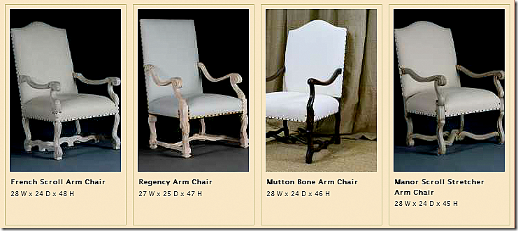
When I need a set, I call Hien Lam and buy them there. The price is reasonable, certainly cheaper than retail. But – they are a splurge. HERE.
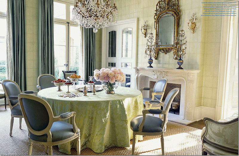
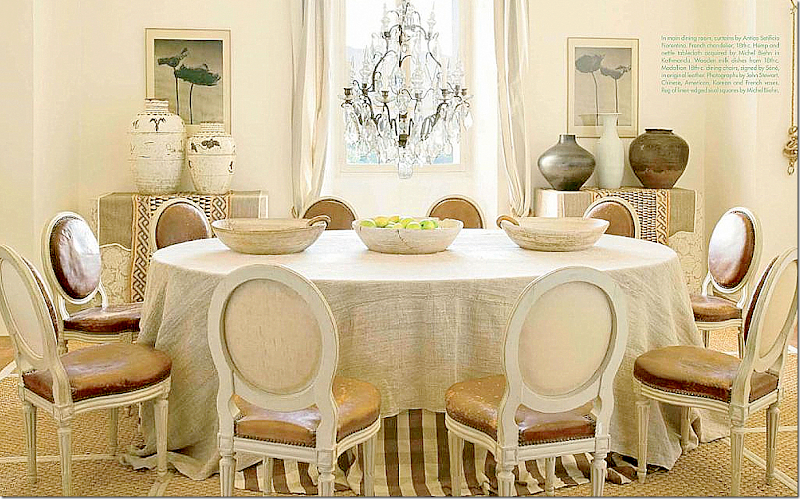
And finally – I just love this dining room. It’s so cozy and inviting. This would be easy to copy on a budget – using a round table instead of an oval. I love the double skirt with the rough linen overlay.
Getting a set of gorgeous French chairs with aged leather would be hard. But think about buying a set of cheaper French chairs and covering them in a distressed pleather from Pindler and Pindler just on the inside. No leather? Try suede or velvet for a similar effect. Leave the back neutral for contrast and interest. To flank the window, skirt two rectangular tables or file cabinets and top with a collection of blue and whites or white vases. Add a crystal chandelier from EBay and a seagrass rug from Pottery Barn.
I hope I have given you a lot of ideas to think about in your dining rooms – mostly using the trendy Belgian styled dining table - and how to avoid a boring showroom look with all matching light stains.
I think the Belgian styled table is here to stay for awhile longer, but the all monotone palette is looking a little tired. By using printed fabrics and curtains and vases –you can add some color without it being blinding bright. And by mixing in antiques or vintage pieces, you give the room patina and interest.

0 comments:
Post a Comment