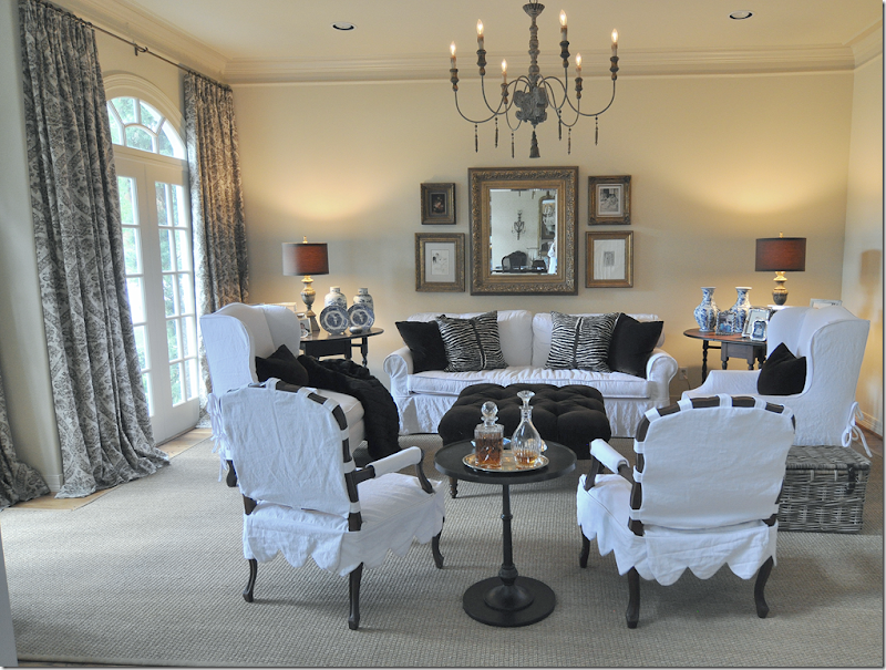
Late last year I showed this living room that I had redecorated for a client. Basically, we used what she had and just recovered it all in white slipcovers. We did buy the two new arm chairs and lamps – but mostly everything was already hers, which really helped keep costs down. The damask linen curtains were added to soften the room and add just a bit of pattern. Originally, the room was wallpapered in a red stripe and the fabrics were a mix of gold chenilles and Bennison florals. It had been almost decade since anything had been done to update the house, so we started with this room.
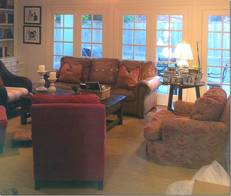
BEFORE: Next we tackled the back part of the house with the family room, breakfast room and kitchen. The family room was also done in reds and golds. The TV was over the fireplace with the leather sofa facing it. To get ready for the remodeling, we moved the TV to a side wall and moved the sofa in front of the windows. Again, we used much that was already existing except we did buy a new sofa and chair and a few tables.
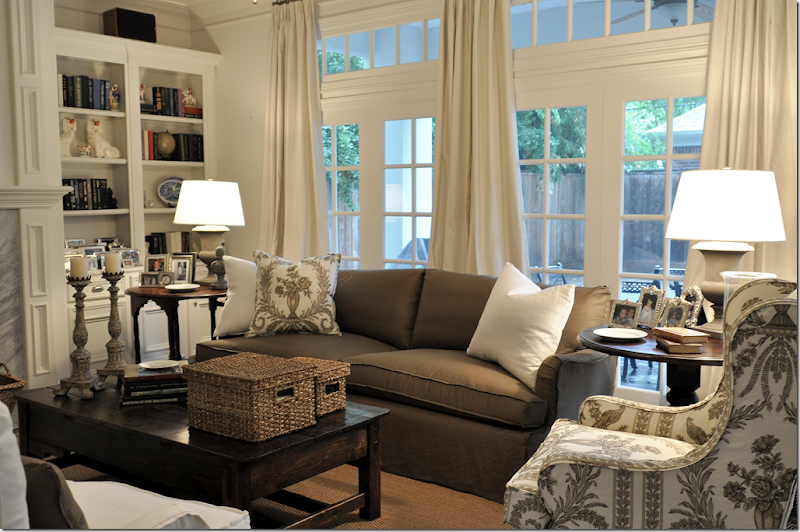
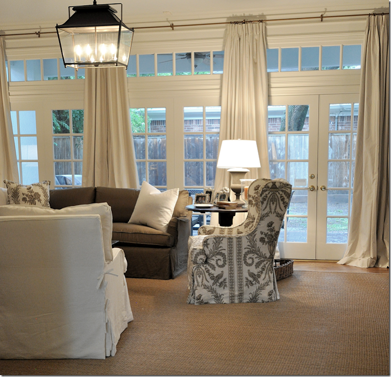
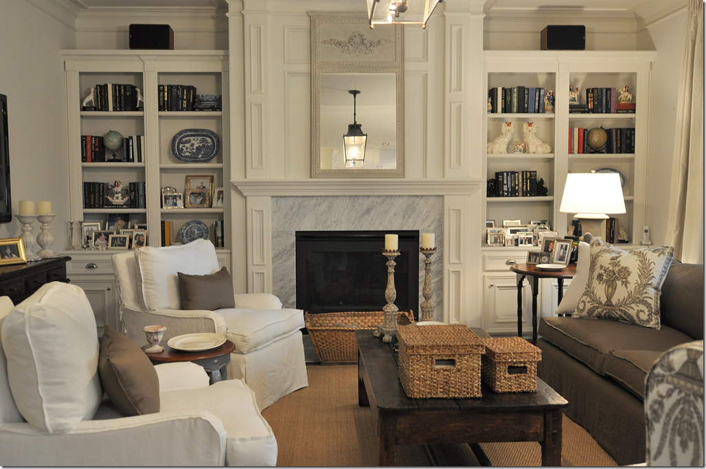
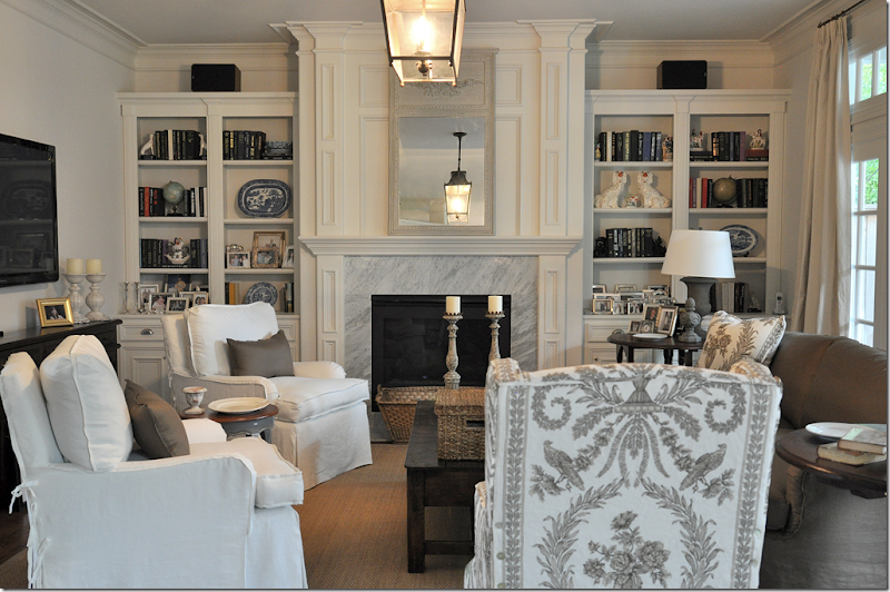
AFTER: First, we painted the walls in all three rooms a very light and soft gray. The colors in the room were chosen to blend with the living room – whites and browns. The sofa was slipcovered in a brown linen with white linen pillows. The arm chair was covered in a Vervain brown and white linen toile. The client had fallen in love with this toile and it was used as the starting point.
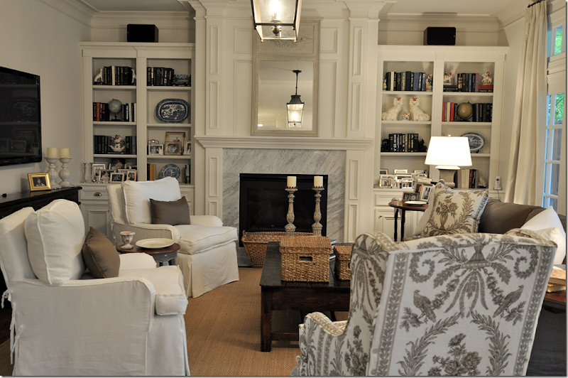
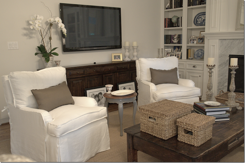
The TV was moved from above the fireplace to the left wall – where we added a long console under it to hide the cords and equipment. The two existing chairs were slipcovered in white linen and we added swivels underneath for easy TV watching.
We bought two lanterns from Pottery Barn and hung one here and one in the adjoining breakfast room. The curtains are a striped linen and were installed both here and in the breakfast room. The large arm chair and sofa came from Hien Lam Home on W. Alabama. The two urn lamp came from Ballard Designs. All furniture is slipcovered for easy cleaning. The white slips will be washed and the brown and toile linens will be dry cleaned.
The dated looking and drab brownish granite was removed from the fireplace and the kitchen counters. We used white marble here on the fireplace and changed the brass grill to a black matte one. The mirror came from Indulge.
Two lamps ordered for the console from Aidan Gray hadn’t arrived yet, but hopefully they will fit. The console is very shallow so our choices were quite limited. Baskets on the coffee table hide a myriad of TV clickers and magazines.
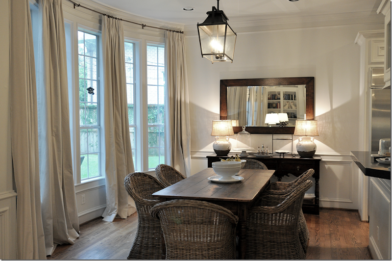
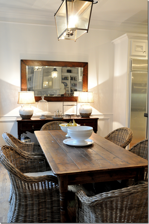
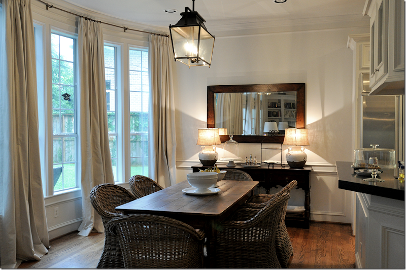
In the breakfast room, we added the curtains – four panels to fit in the long bay window with its six windows. The table was the client’s, but we changed out her country French chairs for Kooboos from World Market.
We moved out a washed pine armoire in exchange for a wood console and mirror. The lamps came from Pottery Barn. NOTE: the client hung the mirror horizontally – without me, which drives me insane. She won’t turn it vertically so I just pretend it’s not hanging the way it is. I’ve begged her to rehang it until I’m blue in the face, but she likes it this way. Grrr!!! Maybe she’ll change it now, but she doesn’t read the blog.
BTW – I went to World Market and they said they still get these Kooboo chairs in, but they sell so fast they don’t advertise them. You can put your name on a waiting list for them – or, so they said at the store in Houston on Richmond. Not sure about the validity of that – but it’s worth a try if you want to get these. Otherwise, it’s wholesale only for these chairs now.
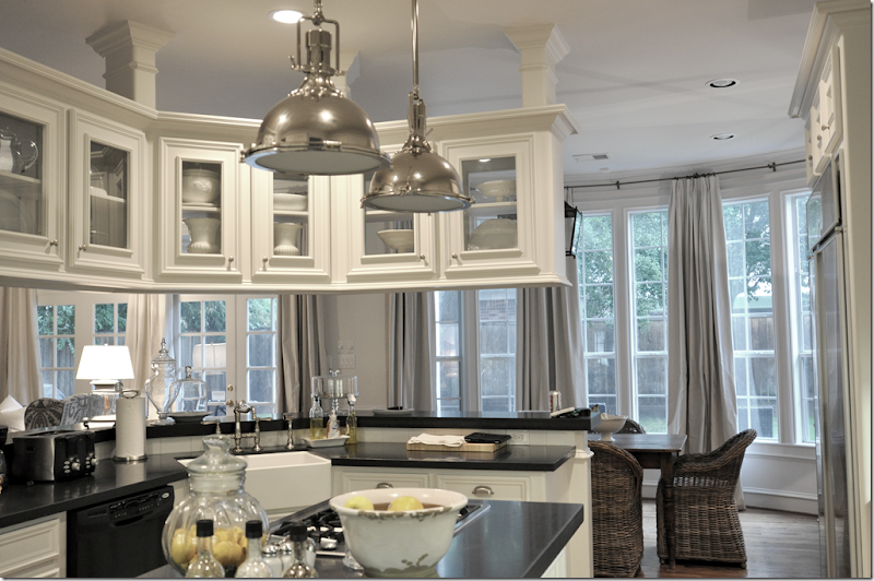
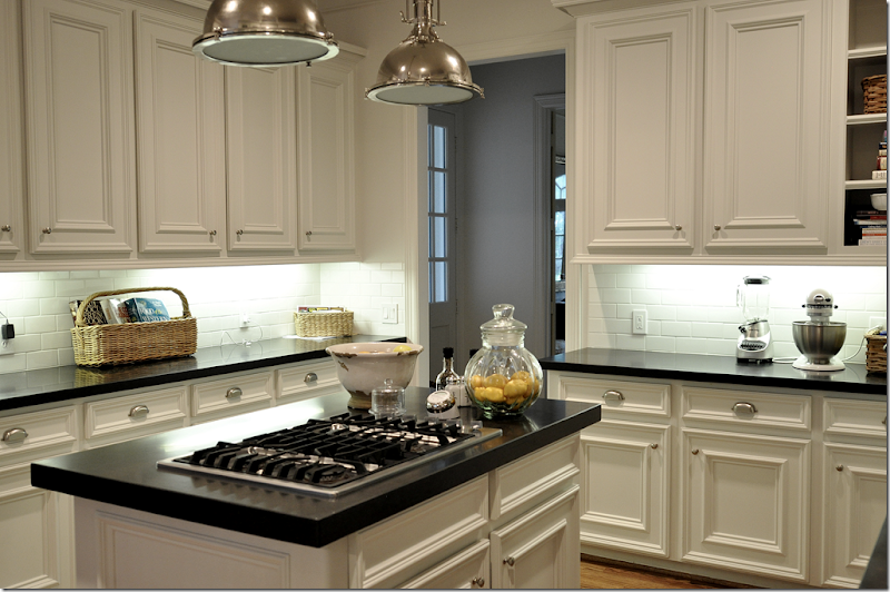
In the kitchen we changed out the dated brownish granite for a matte black granite, which I love! It’s so smooth – it feels like velvet. We added a creamy white subway tile and the two pendant lights from Restoration Hardware which are a steal (the only items there that ARE a steal!) – they are such a great look and the quality is fabulous for the price, especially. These are the medium sized pendants and they are really quitei large. We added a farm sink and new hardware and bin pulls. She still has to replace her dishwasher, but that’s next on the list.
The new subway tiles brighten up the kitchen so much – before it was the dark granite slab on the backsplash. New cabinet doors replaced the old ones that had been pretty beaten up. To keep costs down – no appliances were moved, everything stayed in the same place.
Finally, now that the living room, family room, kitchen and breakfast room are redone – she only needs to redo the dining room! I know that is not what the homeowner wants to hear, but it’s like dominos….once they start falling….
Coming up next time: I visited a townhouse decorated by Houston great Ginger Barber! Pretty???? Let’s just say, I wanted to burn my house down when I got home. Yes, it’s wonderful!
0 comments:
Post a Comment