Over the past five years that I have written the blog, I’ve talked about many of the Houston interior designers that I have long admired. There is a group of these designers who are somewhat close in age and each has been significant in developing what I call the Houston Look. Each has her own style and aesthetic, but all have remarkable taste and talent. They have created some of the most beautiful interiors here and in other cities around the country. There isn’t a house that they have had published which I haven’t studied in minute detail, trying to learn from them, emulate them, and just enjoy the beauty they create. One of these designers is, of course, Ginger Barber. I am always thrilled to show a house she’s designed – and last week I got an even bigger thrill when I toured one of her houses – with her!
You may recall that a few months ago there was a home tour in Southampton - a classic Houston neighborhood. After the tour I received numerous emails from readers “Did you go to the tour? Did you see the Ginger Barber house? OMG! Will you show it on the blog? I want to look at the pictures of it!” After about the 10th email, I realized that I was going to have to get pictures of this house!! And that’s what happened. Both the homeowner and Ginger were gracious enough to welcome me into the house to take photographs. I had been inside the house before Ginger decorated it – and when I returned, my jaw was on the floor – I couldn’t get over how different it looked – how beautiful and serene and pleasing it all was. It was that classic combination, elusive to so many: casual, yet elegant; inviting and warm; bright and airy.
I came home and tweeted “I’m going to burn my house down” because that is how I felt!!! I also wanted to retire, never again to take on another client. If you can’t compete with greatness, why try? Yet, something else happened during my photo tour of the townhouse – Ginger was so nice and so giving and I learned so much from listening to her and observing her work up close. While I thought I was there to just take pictures, I came away with credit for a college course in decorating.
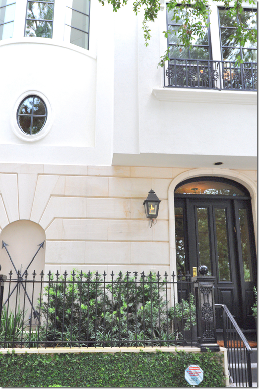
The house is located on a beautiful, tree lined street, a few blocks away from the city’s museums. It’s a four story townhouse in a development that more resembles Georgetown than Houston. The white stucco townhouse reveals itself slowly. You enter through the front door into the foyer with a black and white marble floor. A curving staircase which winds up through the four floors takes you to the main one – on the second level. There, the living room and dining room are open on the right, while up a few steps on the left is the family room and kitchen.
There’s a lot to see and I’ve tried not to let any details go unnoted. So, grab a cup of coffee, sit back and enjoy!!!
We start the tour on the second floor – just off the staircase – where the living room and dining room greets us:
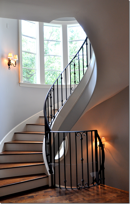
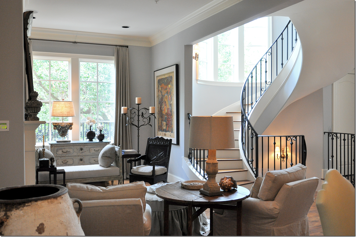
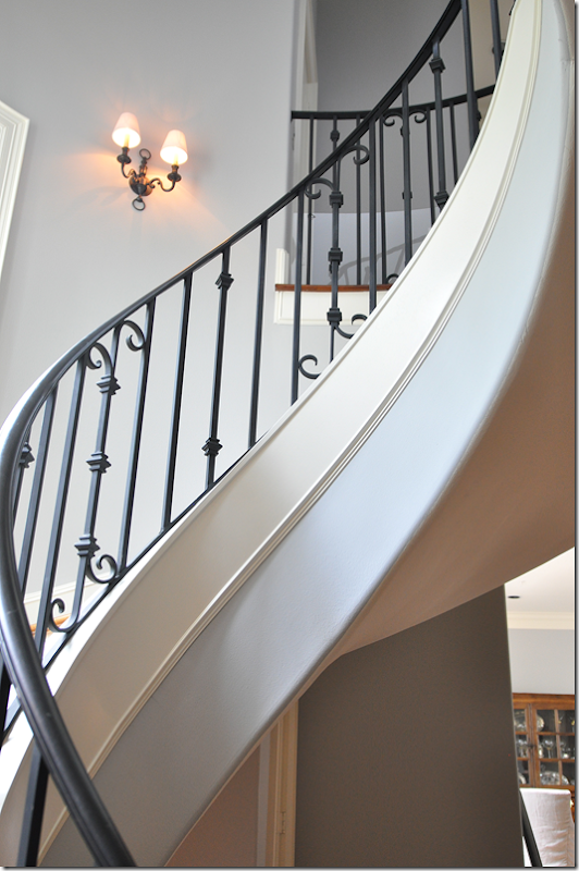
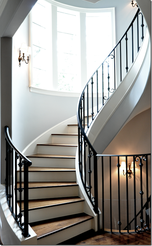
The floating stairs are the central element of the house – they are found in the front, middle section and run from the ground floor up to the fourth floor. The railings are elegantly simple, sconces light the way, as does the large bay window. Next to the stairs is an elevator which comes in handy when there is heavy luggage!
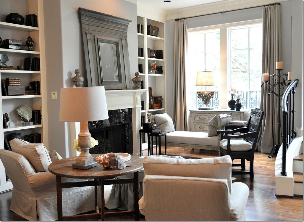
Directly to the right of the stairs on the second floor is the living room – with the dining room directly behind it. The walls throughout this level are a pale bluish gray. The fabrics are linens, the only muted patterns are found mostly in the pillows.
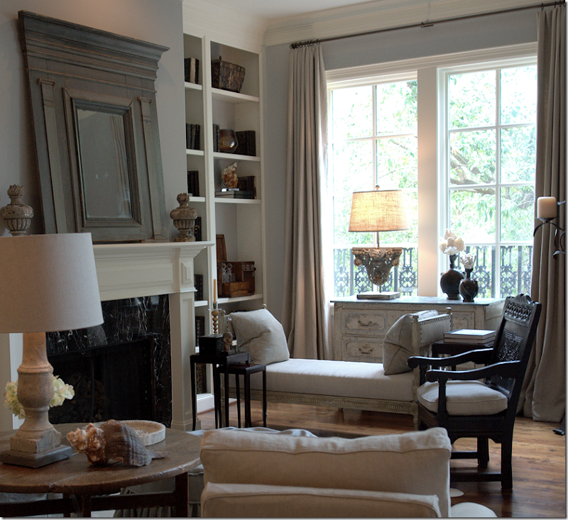
Since this is the living room – it was decided they really didn’t need a traditional sofa – instead there is an antique Swedish daybed on one side of the fireplace and two slipped club chairs and ottoman on the other side. An antique Spanish chair sits in between, acting as an accent. One of the most beautiful objects found throughout are the lamps, some of which Ginger creates herself from relics. Many are antique balustrades that are converted into lamps, while others are architectural fragments that serve as the base of the lamp.
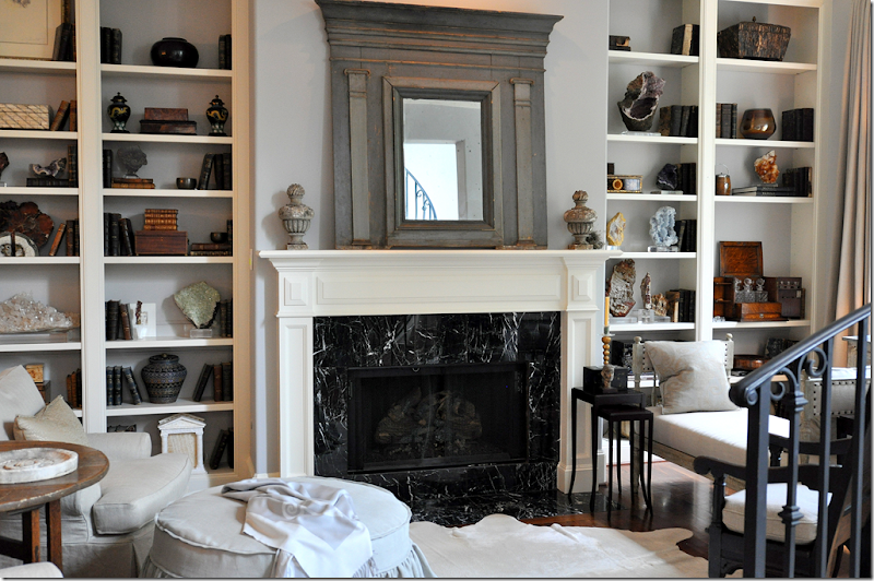
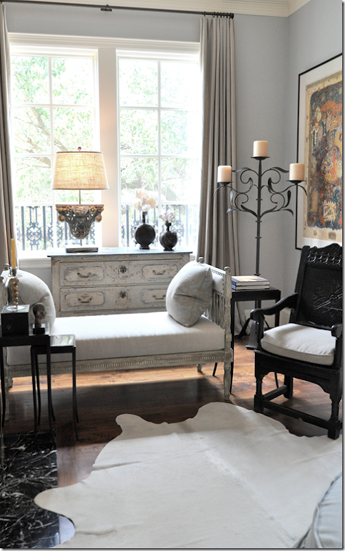
A closer look at the living room’s back wall with its fireplace, flanked by book shelves. To the right is the antique daybed, to the left are the two club chairs and an ottoman. A pure white skin reaches across the hardwood floors. Atop the fireplace, the antique trumeau becomes the focal point. Painted in shades of deep gray, it reflects the stairway.
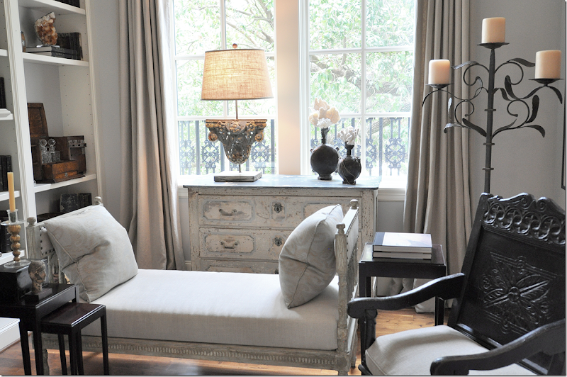
Across from the two club chairs is the Swedish day bed. The dark chair pops against all the light painted woods.
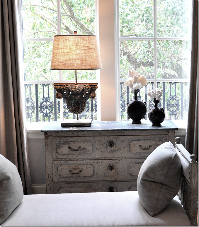
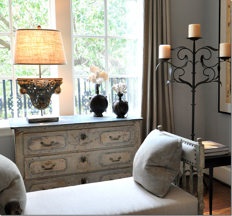
At the front window sits a painted antique chest, with another beautiful lamp atop it.
What is so beautiful throughout the house are the antiques. Each piece was hand chosen by Ginger and the homeowner from a myriad of Houston stores. Here, a beautiful Swedish daybed sits next to an antique Spanish chair which sits in front of a French chest. You eye goes from piece to piece and back again – trying to take it all end, but it’s futile. It’s just all too pretty to pick one thing you like best.
The chest has a hint of blue paint. It’s creates a subtle effect along with the painted daybed.
In the corner is a wrought iron candelabra that lends height. I really love the lamp on this chest – it is striking looking.
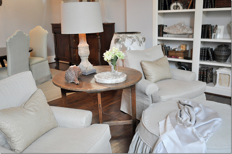
Across the room are the two slipped chairs with a round slipped ottoman. Two pillows made of Fortuny provide subtle pattern. An antique French wine table sits between the chairs. I was struck by how exquisite the upholstery was. The chairs were perfect, as were the slips. Everything was top quality – and it shows. Of course Ginger doesn’t do frou-frou, so mostly all is tailored. Welts are teeny-tiny, flanges are 1/4 or 1/2”. Accessories are over scaled but sparse. The look isn’t cluttered, but it’s not minimalistic at all.
Here, behind the chairs – you can see into the dining room.
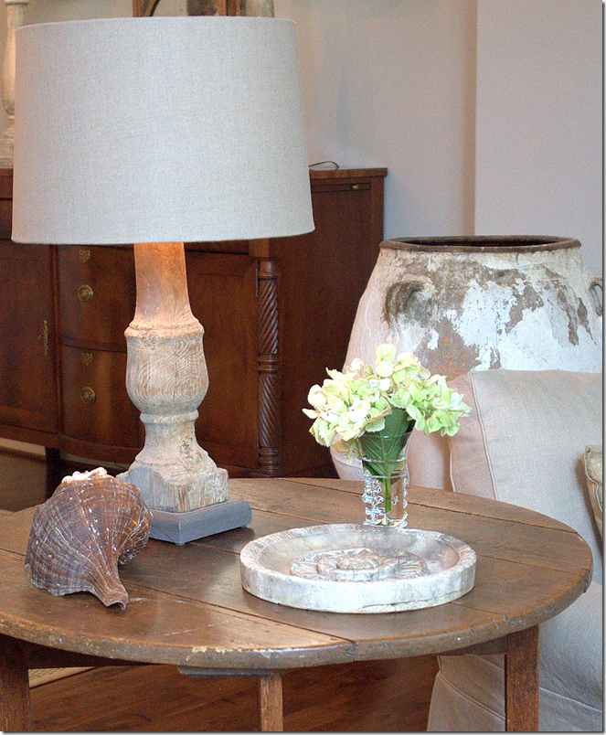
Notice the perfectly executed linen shade – so beautiful! On the table, just a stone relic and a shell. The little details, like the lampshade, was what really caught my eye. No detail was too small to overlook.
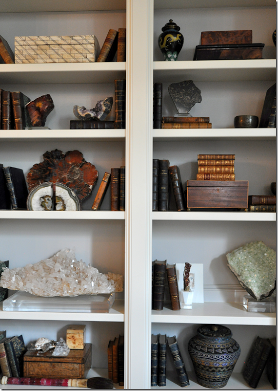
The shelves hold the owners’ collection of minerals and old books.
Sources Living Room: Swedish daybed: 2620; Spanish Chair: Watkins Culver; Chest: MNaeve; Trumeau: Skelton St. John; Balustrade lamp: Neal & Co.
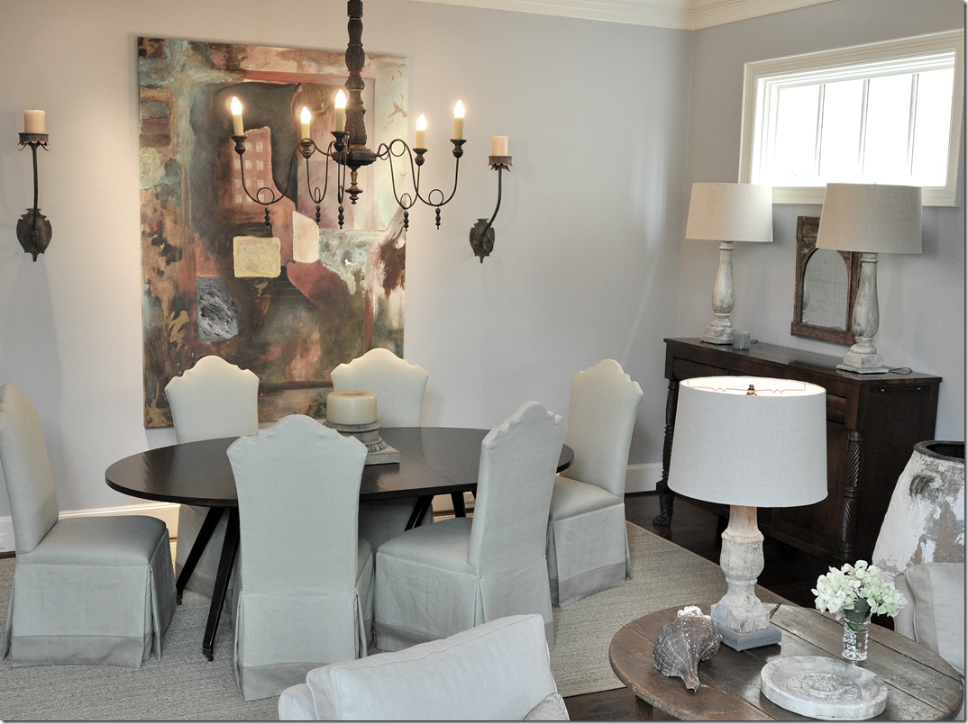
The dining area opens off the living room. An dark wooden oval table sits underneath a chandelier from BROWN. The homeowner’s artwork was incorporated into this room. Against the side wall, a tall buffet is accented by two matching balustrade lamps. A small antique mirror sits between them.
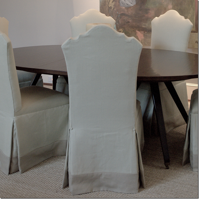
I’ve cropped this picture so you can see the chairs up close. I think these truly represent Ginger’s attention to detail. Notice the beautiful shape, first – the top is a simple arch – yet, a few extra curves make is so much more special. Now, notice the upholstery. It’s a beautiful linen – probably from Belgium. To slightly highlight the fabric, she adds a band to the hem. The band is in a slightly different colorway, just a tiny bit darker so that you notice it. And, notice how wide the band is – probably four or five inches. Now, at the pleat – notice the tiny buttons – just a tiny button that doesn’t scream out EXCESS TRIM! Instead it adds just a touch of luxe and quietly says “custom.” These chairs and the way they are upholstered are gorgeous. I found that most all the upholstered furniture was just this way. There’s a little detail here and there that makes it special without being ostentatious. A HUGE lesson here to be learned from Barber. Who was the upholsterer? Neal & Co., Houston (to the trade, only.)
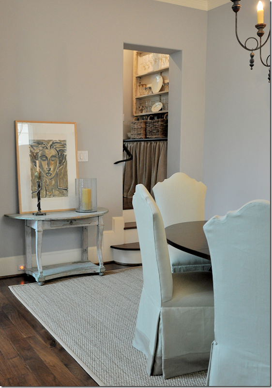
Against this wall in the dining room, a smaller, painted console holds a print and a few candles. To the right – up a few steps is the butler’s pantry/bar and kitchen.
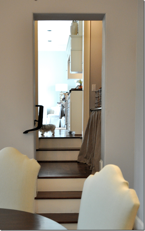
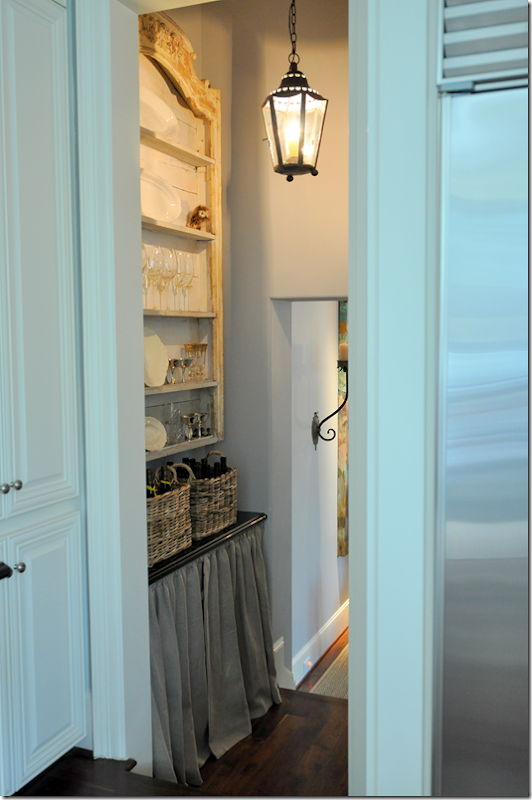
Here is another look at the butler’s pantry leading to the kitchen and then the family room. I love how there are steps with railings that lead from area to area. It adds a touch of romance to the townhouse.
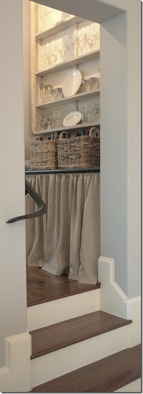
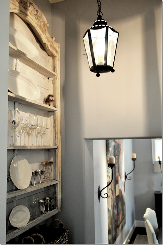
The butler’s pantry was just a small, boring space – the homeowner loved skirts so Ginger added one, replacing the cabinet doors that were once here. Kooboo baskets hold wine bottles, and above is a beautiful painted shelf that holds all the bar glasses. Suddenly, this tiny room becomes very special. From this space is the kitchen and family room – but let’s walk around back to the front to properly enter the family room!
Sources Dining Room: Table: Shabby Slips; Chairs: Neal & Co.; Painted table: MNaeve; Chandelier: BROWN
Ready to see the family room and kitchen?!!
Let’s walk back through the dining room and living room to the stairway.
If you turn left off the stairway, up a few more steps is the family room and then the kitchen.
Walking up the few steps to the family room – you are greeted by a small seating area to the left – set in front of a large, curved window which overlooks the front of the townhouse. The tall French chest was one of the first pieces bought by Ginger for the house.
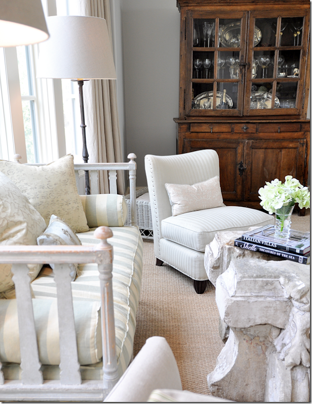
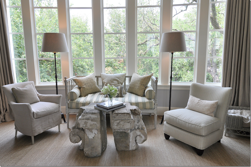
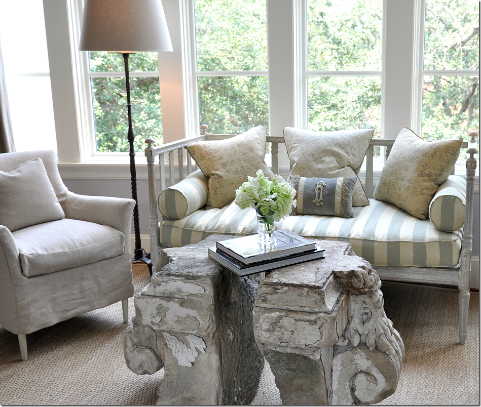
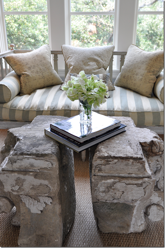
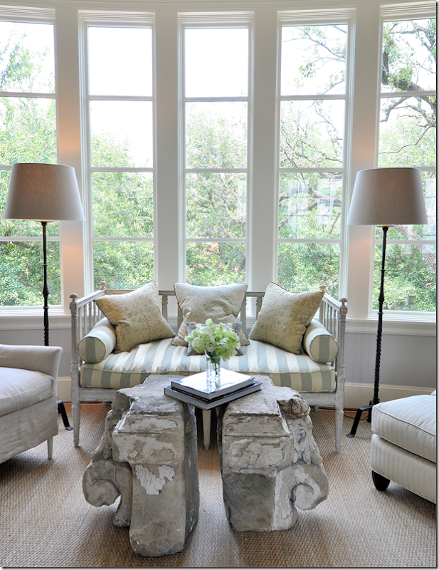
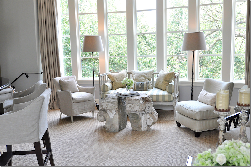
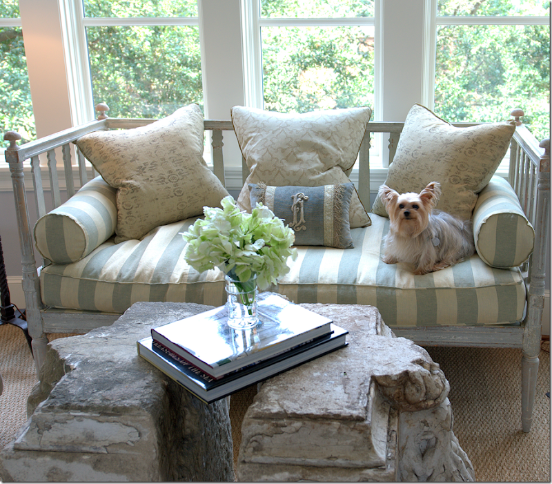
Overlooking the large, curved windows with a view of the treetops – is this gorgeous seating area. An antique Swedish sofa is covered in one of the rare patterns found in the house – a French blue and cream silk stripe. Two chairs flank the sofa, one is slipped in linen, the other is upholstered in a muted stripe. As gorgeous as the Swedish sofa is, the coffee table is a stunner. Made of two large architectural capital relics – Ginger chose not to have a glass piece put on top – the two pieces stand just slightly apart from each other. Two simple iron lamps flank the grouping. And yes, this vignette is this gorgeous in person!
A trio of muted pillows along with a BViz velvet pillow sit on the striped cushions. I can’t tell you how pretty this setting is! I was literally speechless when I walked in this room. The “coffee table” is just breathtaking.
Since there isn’t a glass top, Ginger placed a few books that bridge the two capitals.
Since the house’s layout is a “piano nobile” – where the second level is the main floor – the view outside the large bay window makes it seem like you are living in a tree house – it’s so green and leafy on the street, which is lined with decades old Live Oaks.
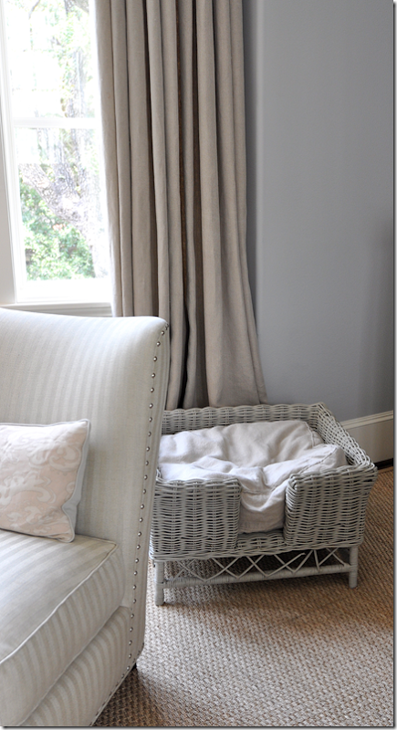
Behind this chair tucked away is the dog bed. A darling wicker piece – that Ginger has painted gray. Again, just a little detail that makes all the difference. Ginger sells these at The Sitting Room, but she says they are out of them now – if you want one, get on a waiting list! Also – notice the nail heads on this chair – small and silver.
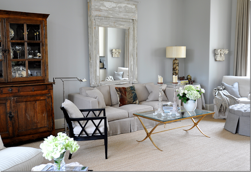
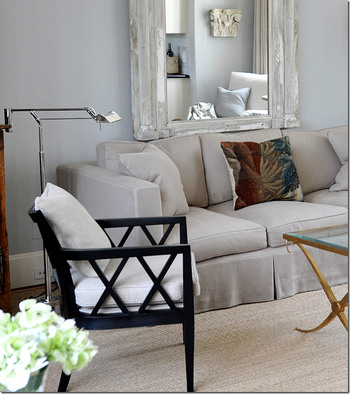
Past the seating area under the large front window is the expansive family room. A custom cut seagrass covers the hardwood floor. A large antique mirror acts as the focal point over the linen covered sofa. To the right, two club chairs and a tufted ottoman sit in front of another large window.
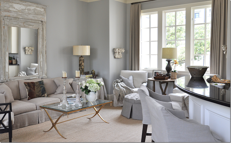
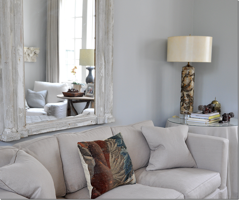
A large curved bar divides the kitchen from the family room. At the bar are stools, slipcovered in linen. The brass coffee table was the homeowners. To the right of the sofa is a skirted table also in linen. On the sofa, there are two linen pillows with another made from an antique tapestry. The walls, again, are a soft bluish gray which set off the linen so nicely. The two club chairs sit in an alcove with an architectural relic hanging on each side of the alcove.
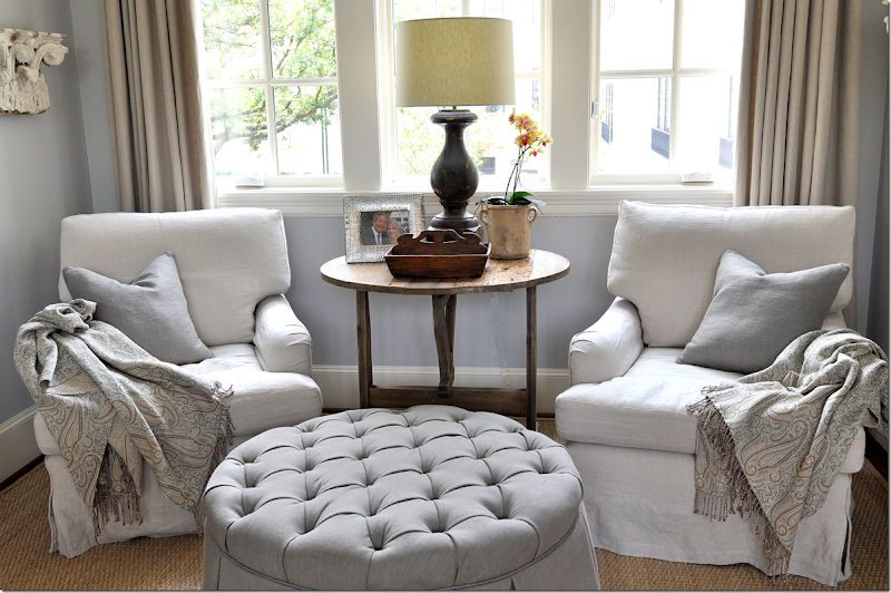
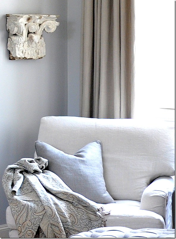
In the alcove, the two chairs are slipcovered in linen. The round ottoman is tufted in a slightly darker linen. On the chairs – the two pillows are a light gray blue which pulls out the color of the walls. The curtains are yet another shade of linen. Notice how in this one setting – four different shades of linen are used – which creates the interest and texture. An antique wine table sits between them with a balustrade lamp.
More about the fabric choices. What I really loved about this space – was the texture that the different linen fabrics create. While at first glance it may all look like linen – on closer look, the linens are different shades. For instance, these pillows are linen – but the texture of the linen is much thicker and heavier than that found on the chair and sofa. Plus, it’s a slightly blue shade – which plays up the wall color. Notice how the linen curtains are also a slightly darker shade which pops against the blue/gray walls. It’s all very masterfully done – the fabric choice is not something that happens in a meeting or two, but it is a thoughtful process that takes a well seasoned and talented interior designer to pull off so beautifully. Even the throws pick out the taupes and linens and blues so perfectly. Again, the fabric choices, their colors and textures were another lesson to be learned – and trust me, I was taking voluminous notes in my head! It’s not everyday I can tour a house designed by a great like Ginger Barber. I really looked at it as if I was taking a master class. I asked questions and she explained things to me; she was very open about her choices and reasoning. I wish you all could have been there to take notes along with me!!
Here, I love the way the alcove is reflected in the trumeau.
Another lesson was the asymmetry found in this room. On this side of the sofa, there is no end table because of the placement of the adjoining tall chest – instead there is a floor lamp, and a contemporary one, at that. And instead of only matching pairs of chairs – I noticed that there were many single chairs – like this one - accent chairs without a match. Remember, in the living room, there was the lone antique Spanish chair. I really liked the idea of the accent chair – instead of everything being so symmetrical. These chairs kept your eye alive, unsuspecting the usual.
And looking back from the alcove – towards the front window and the secondary seating arrangement. You can see on the very left the hand rail that leads the few steps down towards the stair hall and the living room. Notice in this arrangement – at first glance it looks symmetrical – but the chairs are different, not a matching pair. Something to strive for, especially if you rely heavily on symmetrical designs.
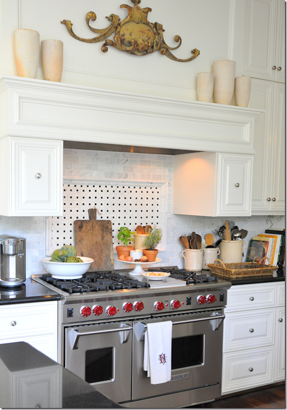
In the kitchen, Ginger explained that typically she would have removed the granite counters and put in concrete ones and some kind of antique tiles for the backsplash – something she would find at Chateau Domingue. Here though, she said the kitchen was pretty with its black granite and she and the homeowners chose to leave it as is. It has beautiful appliances, like this large range, so Ginger just added her touches – accessorizing the space with confit pots and ironstone, and an architectural element atop the range.
And past the range – leading full circle – we are back at the butler’s pantry which leads a few steps down into the dining room.
The space is narrow, so it’s hard to get a full picture full of the antique shelf. Ginger filled it with bar glasses and ironstone platters. The wicker baskets and the linen skirt add that unexpected texture and uniqueness to the small space – creating eye candy in what is basically just a pass-through.
Sources: Family Room and Butler’s Pantry: Swedish sofa and mirror: The Gray Door; Club chairs: Shabby Slips; Tall cabinet: Skelton St. John; Bar Shelf: Joyce Horn Antiques
Ready to go up to the third floor?
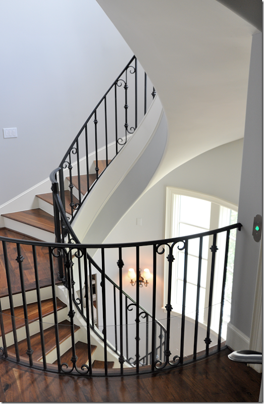
The stairs lead from the first floor to the top floor – one continuous spiral which is at the heart of the townhouse. The large bay window overlooks the front tree-lined street.
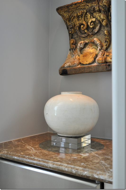
Off the stairs, you turn left to the master suite, but before you enter, there was a small breakfast bar with a refrigerator and shelves above. Ginger took out the shelves and added an architectural relic and a vase, making this utilitarian space more like an art filled niche rather than a coffee bar.
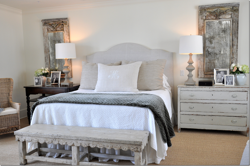
The master bedroom is a serene space – with large windows on each side. One side overlooks the front street and the other side overlooks the interior courtyard. The space is wall to wall seagrass. One side of the bed is a wooden buffet while the other side has a Swedish chest – both antiques, of course. A set of balustrade lamps with white shades add just a touch of symmetry. Above each side is a matching pair of antique painted mirrors. There is a wicker chair on one side of the bed and a pair of chairs on the other.
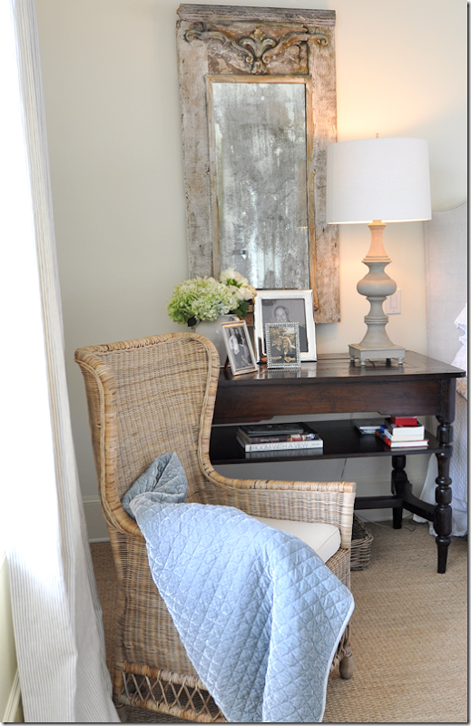
The left side of the bed – with the dark table and the lighter wicker chair. The curtains are a linen ticking stripe.
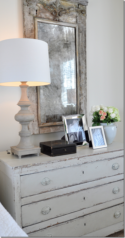
The right side of the bed – with an antique box, a few pictures and a white ironstone jar. Everything is so pretty and pale and then, the dark antique box pops the setting, making it come alive.
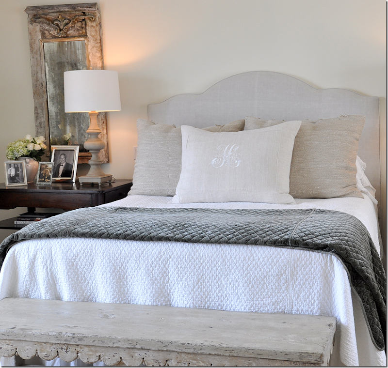
At the end of the bed is this wonderful antique scalloped bench! It’s fabulous. I love that she left it bare – without a cushion covering it up. All the pieces in this bedroom are wonderful – from the set of mirrors, to the night tables, to this bench, to the Swedish armoire (that I didn’t get a picture of – I was probably hyperventilating!!) I talked with Ginger about her sources and it was amazing how she goes from store to store to store looking for pieces. Mostly everything was found in Houston – not 1st Dibs – which says something for our antique stores here, they really are great! It used to be that years ago, you would have to go to Dallas, New Orleans, Atlanta or New York to find special pieces – but now, Houston has so many great shopping venues, you don’t need to travel anymore. Ginger told me she loves to support all the stores – they are good to her and she likes to reciprocate by buying from them and by giving them the credit for finding the pieces in Europe to begin with. She was very open with her sources and wanted to be sure everything was credited. I think in the end, almost every antique shop in Houston is mentioned in the sources!
And more that I learned from listening to her. It’s obvious how hard Ginger works – furnishing a house this size with all antiques – from the accessories to the mirrors to the fabric choices to the furniture, is quite a job. Yet, she does it and makes it all look effortless. I know better though. Still, this was a huge lesson learned. Keep shopping until you find just the right piece for your client. Don’t settle - it’s out there somewhere. If your city doesn’t have good shops, plan a shopping trip or visit online shops like 1st Dibs. And even more important – make sure each room has some special antique to create a focal point. In the bedroom, for instance, this bench and the armoire created the interest – as did the two matching mirrors. In the family room – the beautiful Swedish sofa created the focal point – as the did large mirror over the sofa. In the living room, the Swedish daybed and Spanish chair added so much to the design. If your client can’t afford an antique in each room – plan long term for one in the future and try to save up for it. You don’t have to furnish a room overnight. Antiques take time to source – use that time to save up for one – or put it on your wish list for a few years down the road. I’m not sure Ginger would approve of this – but I say if antiques are out of your price range, find a reproduction with good lines and a pretty finish. I know we can’t all afford a house filled with antiques – so look for a vintage piece that has the right lines and a bit of patina instead. Or find a newer piece at a garage sale – and paint the dark wood, light. Take a class in faux painting for furniture and create your own antiques.
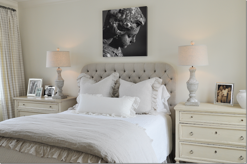
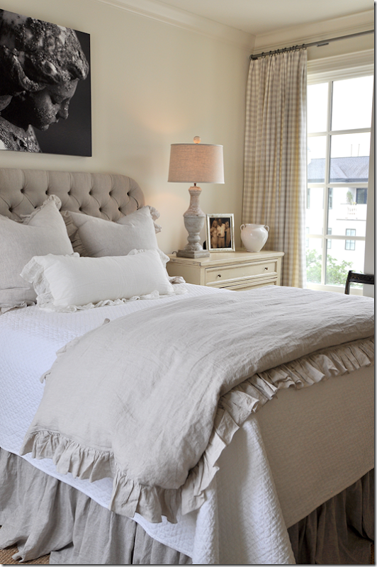
The bedding is a mix of white cotton and linens. Notice the beautifully arched headboard that is reminiscent of the arch of the dining room chairs. Two darker heavier linen pillows add a thick texture that pops, while a special monogrammed linen pillow is in front.
The homeowner has a choice of a white duvet or a peacock blue coverlet – mostly used in the winter. Aren’t the pillows beautiful? I loved the sizes – and how there are three, with one being the accent.
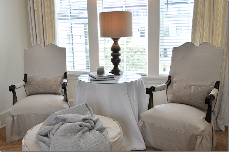
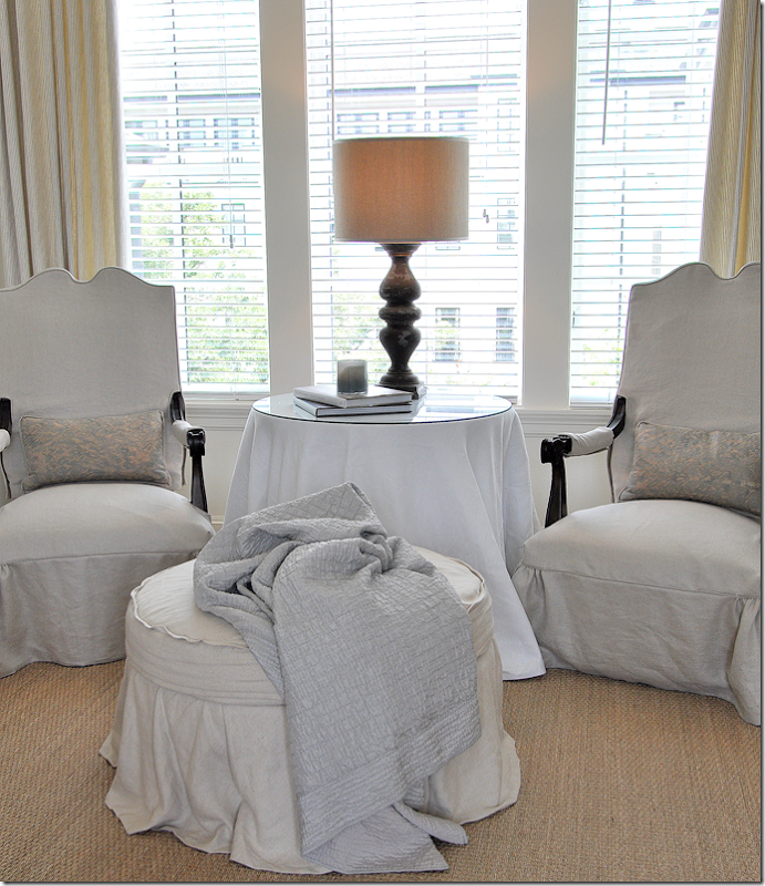
Against the side wall of windows overlooking the courtyard, Ginger used the homeowners chairs and slipped them in linen – along with creating a round slipcovered ottoman. She added a white linen skirted table with another fabulous balustrade lamp – this time with a darker shade. Fortuny pillows add just a hint of pattern.
The chairs are arched – like the headboard. In front is a darling slipcovered ottoman.
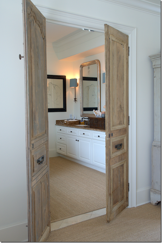
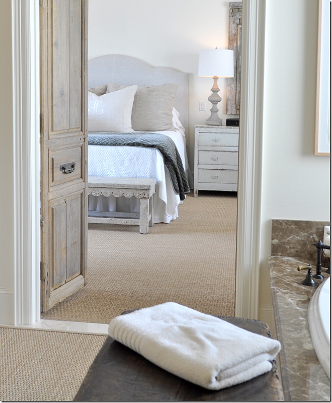
Across from the bed and next to the Swedish armoire are a set of antique doors that lead into the master bath. The doors give a touch of architectural interest to the room – again, they are unexpected and add such a visual treat! No wonder I forgot about the armoire!!
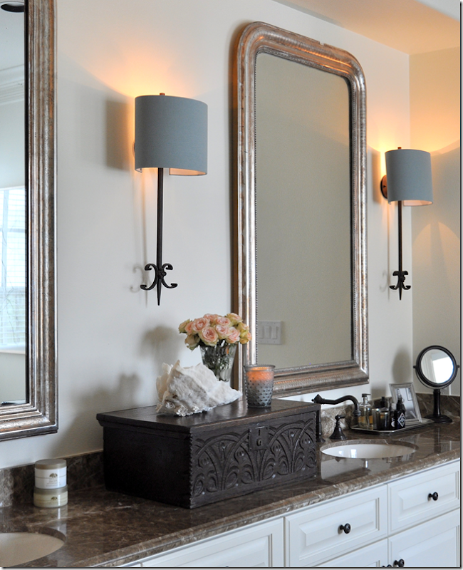
Again, as in the kitchen, Ginger told me they decided not to remodel the bathroom, but instead make decorative changes such as add two antique Louis Philippe mirrors and a set of European sconces. She added this beautiful antique bible box – because she told me she doesn’t like wide expanses of countertop. Another lesson learned! What a beautiful idea!
She added a custom cut seagrass rug to the bathroom to provide a warm texture against all the shiny marble and tile and placed this beautiful, small antique table to hold towels! Gorgeous!!
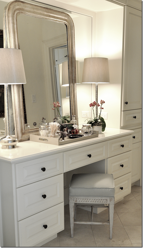
For the lady’s dressing area – she added a leaning Louis Philippe mirror against the mirror, along with contemporary lamps and an antique bench. Again – another great idea to take home – you don’t have to pull out a mirror – just layer an antique one against it.
Or find a pair of interesting doors – to make a space feel more special.
Sources: Master Suite: Scalloped Bench, 18th century Spanish table, and Bible Box: Skelton St. John; Coffee bar Relic: MAI – The Two Lucy’s
Leaving the master bedroom suite on the second floor – we go to the Lady’s study – located on the other side of the staircase.
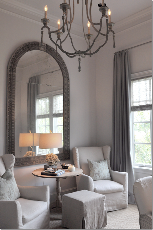
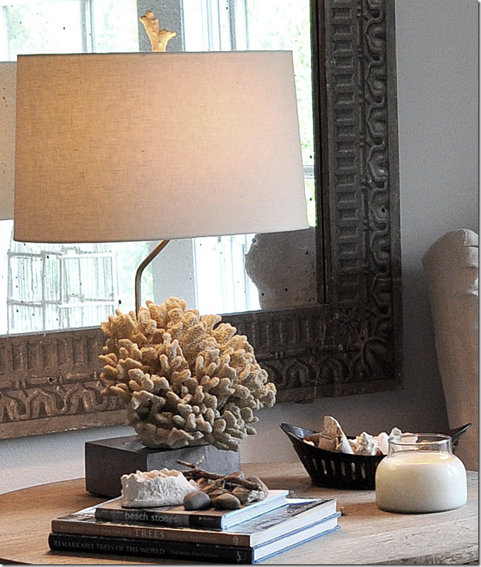
The lady’s study has a large arched mirror that sits in front of a pair of slipped wing chairs and a square ottoman. Between, is a limed table with a wonderful lamp.
The lamp is made of a piece of coral – notice the finial. Another lesson to learn – lamps. Many of Ginger’s lamps were created by her – using old balustrades or architectural relics. They are all so beautiful and add such a luxurious touch. They aren’t dressy, most are very casual, but the workmanship is beautiful. The lampshades are just as special. As I said earlier – nothing is left to chance. Every detail is important and thought out.
The owner’s desk is antique Spanish – Ginger created the large idea board for all her clippings.
Sources: Lady’s Study: Mirror: Vieux Interiors; Chairs: Mecox Gardens
And, up to the top level – the fourth floor:
Leaving the third floor with the master suite and lady’s study, we go up to the fourth level. To the right, you can see the button to the elevator – which comes in handy for lugging up heavy items. On the 4th level is the guest room (or grown daughter’s bedroom), the man’s study, and the outdoor terrace.
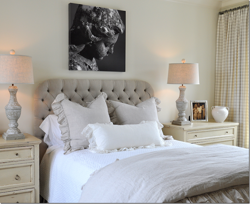
Here, the guest room has a pair of painted chests with matching balustrade lamps with linen shades. The art work is a photograph by Pulitzer Prize winner, Skeeter Hagler. (More information about him, follows!)
On both sides of the room, large windows overlook the front street and the interior courtyard. Notice how wonderful those lamps are – and how pretty the headboard is!!!
The headboard is tufted linen and the bedding is white cotton and ruffled linen. The pattern comes from the Chelsea Editions check used for the draperies. As in the master bedroom, this room is soothing and restful.
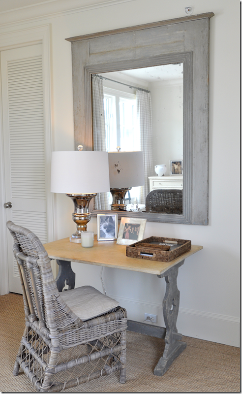
Across from the bed is this darling desk and Kooboo wicker chair, along with an antique trumeau. Isn’t that desk adorable? I love this whole vignette with the mirror, desk and wicker chair.
Sources: Guest Bedroom: Bedding: Indulge; Photograph: Skeeter Hagler Photography; Chests: Joyce Horn’
Leaving the guest room, walking past the central staircase, is the man’s study and the terrace.
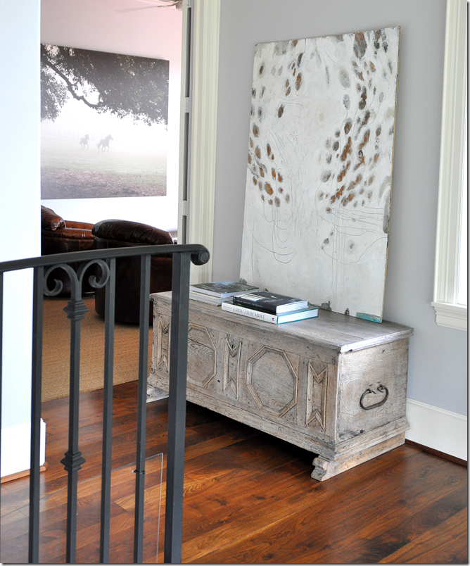
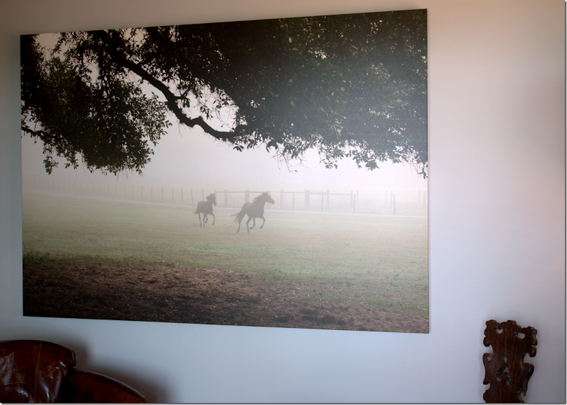
A painted trunk stands in the hallway – which looks into the man’s study/TV room. Inside the study, hanging on the wall is another photograph by Skeeter Hagler – this one of galloping horses in a misty field.
Ginger didn’t decorate this study/TV room – so I’m not going to show it – but she did place the art work here – the Skeeter Hagler photograph. Another great idea to learn from: instead of buying oils – think about photographs! This piece – of horses in a field - has a masculine vibe to it – so it is appropriate for the owner’s man cave. It adds so much atmosphere to the room – and I love how it is oversized.
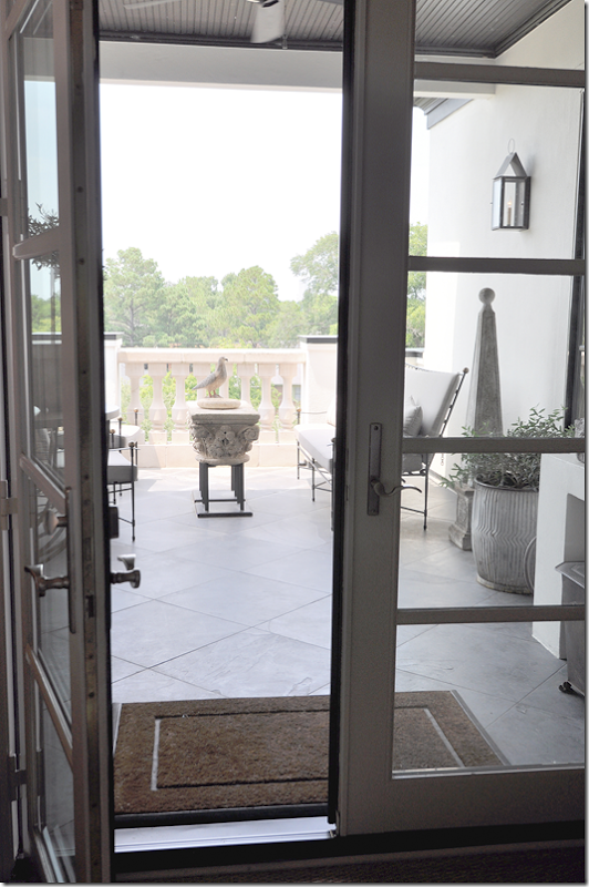
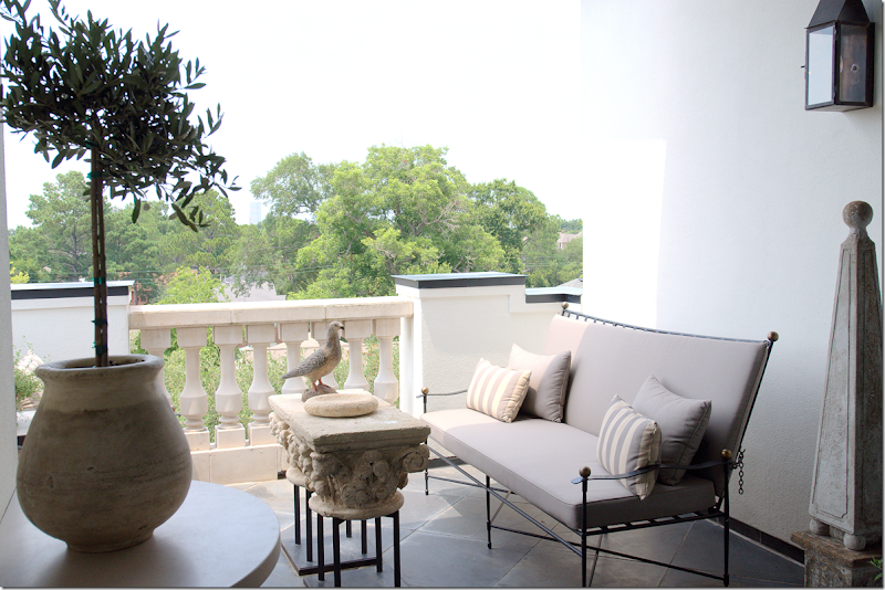
Off the man’s study is the large terrace that overlooks the trees – and downtown. Up four flights, the view is amazing. There’s a place to cook outdoors here and a place to sit down, thanks to the Janus et Cie furniture, Amalfi Collection, that Ginger placed here.
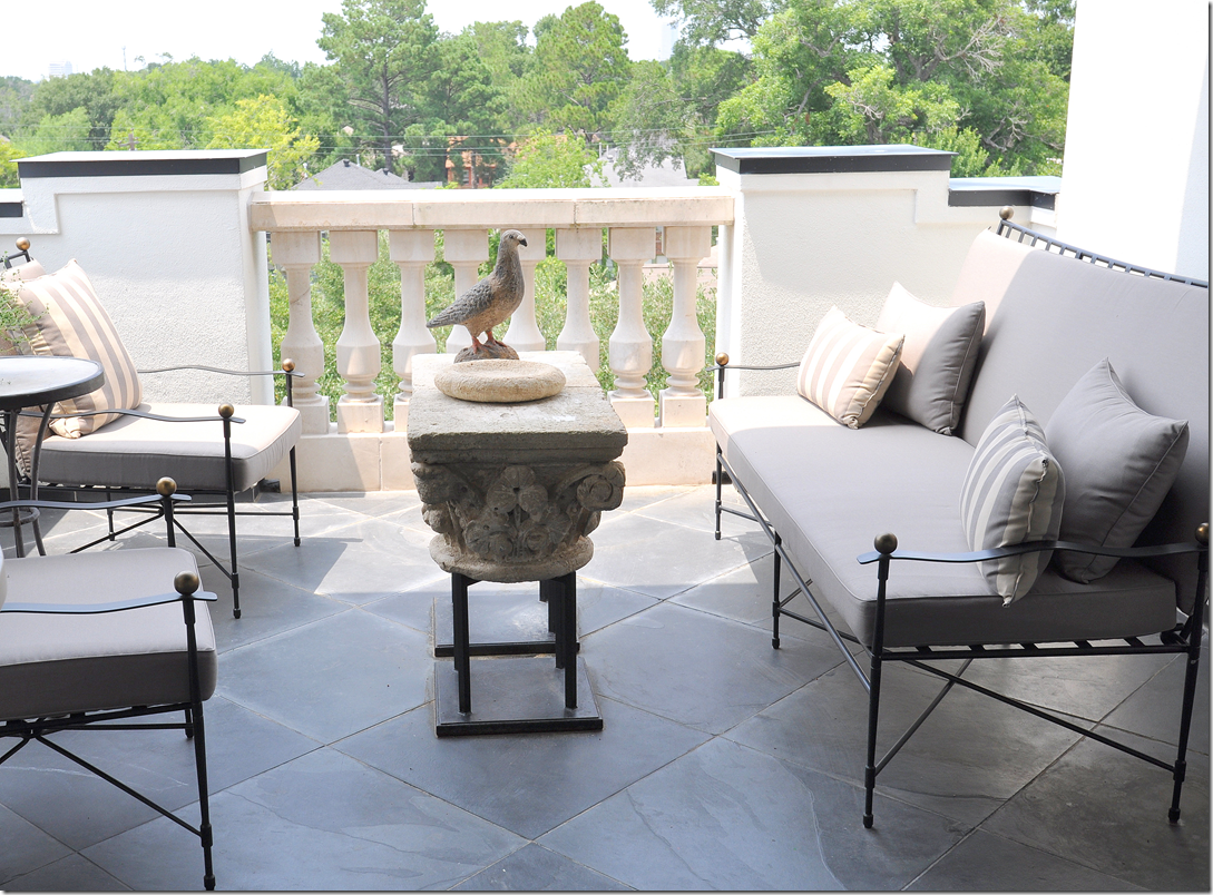
She added stripped pillows and linen colored outdoor fabrics, along with wonderful accessories like the pot and plant on the left and the obelisk and lantern on the right. The coffee table is another wonderful piece – made of architectural capitals put together on an iron frame – sort of like those found downstairs. I love how the décor outside has the same aesthetic as inside – it all flows together.
Love the bird! I’d be out here 24/7 if I lived here.
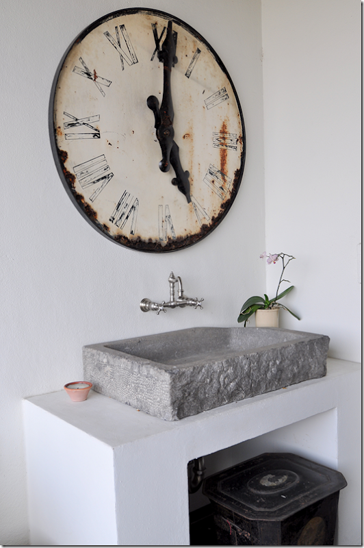
Across from the grill is this wonderful stone sink and station clock. A large tin below acts as garbage bin. Notice the darling wall hanging faucet. Like I said – Ginger doesn’t let one detail go by without careful thought and deliberation. Although this is outside on the terrace, I can’t help think this setting would make a perfect powder room inside!
Sources: Terrace: Furniture: Janus et Cie; Sink: Chateau Domingue; Clock: The Gray Door.
And now, we come to the end of the tour! The owners’ sweet dog wanted to say Hi – and of course he is sitting on my favorite corner in the townhouse!!! So I get to show it one more time!!
I want to take this time to thank the homeowners for letting me photograph their beautiful house and to write about on the blog.
AND I want to give a huge thank you to Ginger Barber for the tour – giving me her precious time meant the world to me. Little did she know how much I was learning from her – things that I will never forget – and ideas that I will try to incorporate into my own designs. Just her work ethic alone was inspiring. Things she shared with me stuck in my head throughout the time we spent together. “That’s why her designs are so great” kept ringing in my ears. “That’s the difference!” I found myself repeating to myself over and over. She doesn’t cut any corners and it shows. Everything was perfect. Perfect. There wasn’t one thing I would change. The house was casual, not dressy by any means, it was comfortable and inviting, cozy and warm – the best kind of interiors there are. Yet – for all its welcoming vibe - it is exquisite and beautifully executed. Nothing was out of place, nothing was wrong. All the proportions were right, all the furniture fit exactly like it should – it was the work of a pure professional and I came away really inspired to kick it up a notch myself. Ginger has always been a huge inspiration and a role model and now, I realize WHY even more.
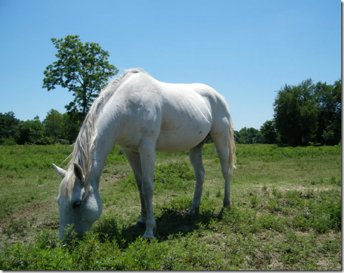
Finally, while I was photographing the house - Ginger told me a story about how a few years ago she rescued a starving and abused Belgian (of course it was Belgian!) horse out in a field near Galveston. What do you do when you rescue an emaciated horse? As Ginger quickly learned from the police – you call Habitat for Horses, a humane not-for-profit organization that rescues abused horses and those horses on their way to the slaughterhouse. After the horses are made healthy, Habitat for Horses then places them for adoption, or if unadoptable, they provide them with life time safety and shelter and feed. Since 1997 when they were founded, Habitat for Horses has saved 5,178 abused and neglected horses. They have adopted out 4,660 of these horses. Yet, there’s still a lot of work to do: in 2011 alone, over 134,000 horses from the US were slaughtered in Mexico and Canada!!!!!
With this one rescue, Ginger discovered a new calling – something that she has devoted much of her free time to – by volunteering, raising funds, and just spreading the word about Habitat for Horses. Right now, Habitat for Horses is located on a 27 acre farm near Galveston which was donated to their cause. But, space is limited and they are in desperate need of more land. A massive campaign is underway to raise the funds to purchase additional land for the rescued horses. In a few months, Ginger, along with Jill Brown from BROWN, will be hosting a fund raiser for Habitat for Horses. I’ll let you know the details as the time comes closer. In the meantime, be sure to visit the Habitat for Horses web site to learn more about this organization – and if you are so inclined, how you can help – by volunteering, adopting, or donating. I talked to Ginger tonight and she told me she was going out to the ranch tomorrow to feed the horses and help out in the stables. It’s not glamorous work, but it’s hugely rewarding for her. Hugely. She said it’s the most important thing she has ever done and her face radiates with excitement when she talks about the rescued horses.
One interesting note is that for the fund raiser, the photographer Skeeter Hagler whose work was shown in this townhome, has agreed to auction his photographs for Habitat for Horses.
To visit the web site of Habitat for Horses, please go HERE.
To peruse Skeeter’s web site – go HERE.
And to visit Ginger Barber’s web site – go HERE.
And finally, I hope everyone had a wonderful Fourth of July!!!!!
Home
»
»Unlabelled
» A Ginger Barber Designed Townhouse
Subscribe to:
Post Comments (Atom)






0 comments:
Post a Comment