Is chintz hot again? They’ve been saying “Chintz is Back” for a few years now. Take it with a grain of salt - but, I did find this new, gorgeous, gorgeous chintz that F. Schumacher just came out with:
Loving this chintz by Schumacher. Love, love love!
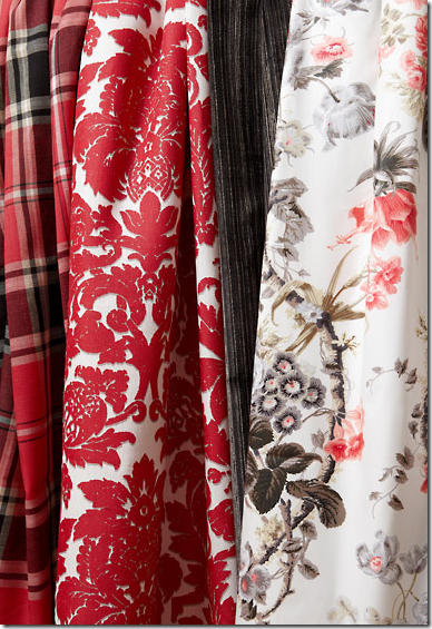
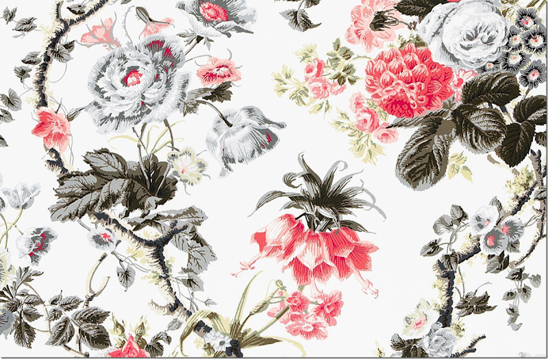
It’s the colorway – gray and white with red – that makes this fabric so new and wonderful. Whose design is it? Who else but Alessandra Branca, of course. Born in Rome and now living in Chicago, Branca loves the classics – with a twist. For example – in her red and black chintz, there’s just a hint of acid green in the leaves – another favorite color of hers. The white background mixed with all the grays just screams “now.”
Branca has a definite color palette. If she isn’t doing red and black with yellow, she’s doing acid green. And if she isn’t doing those colors – she’s doing navy. That’s it.
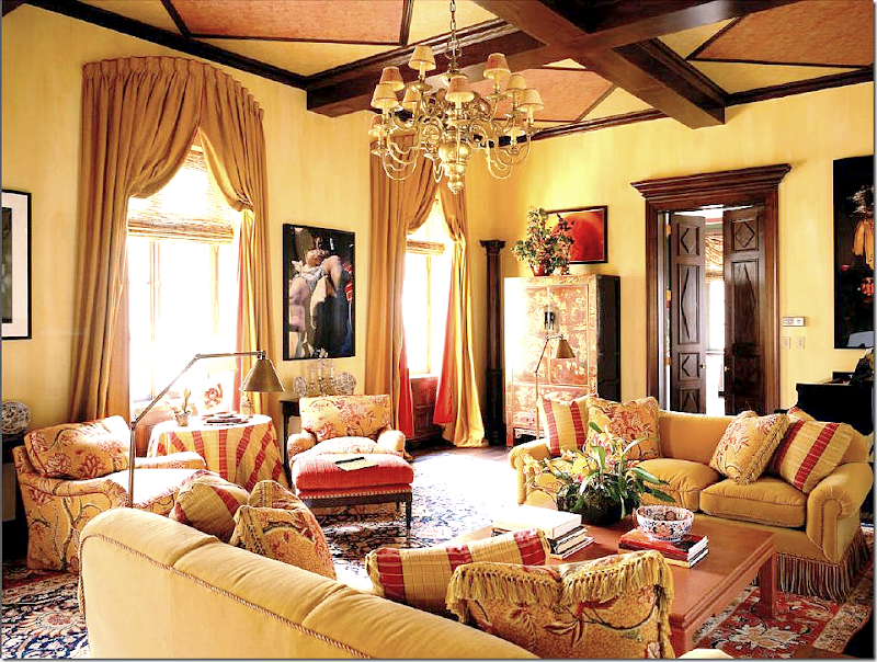
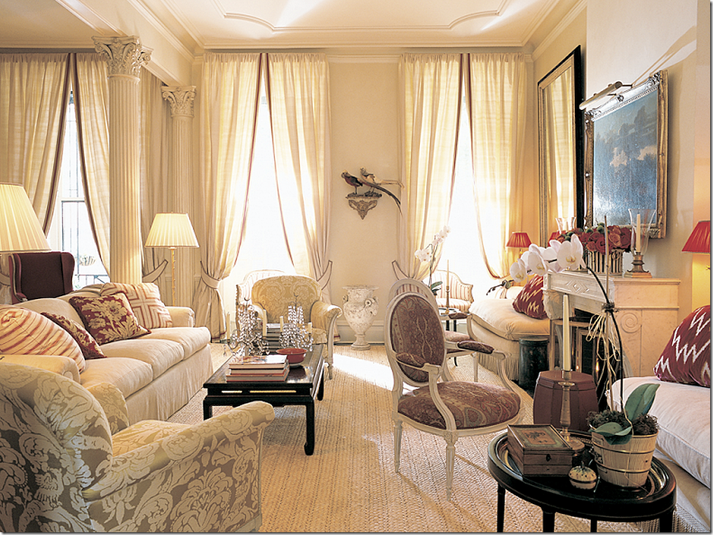
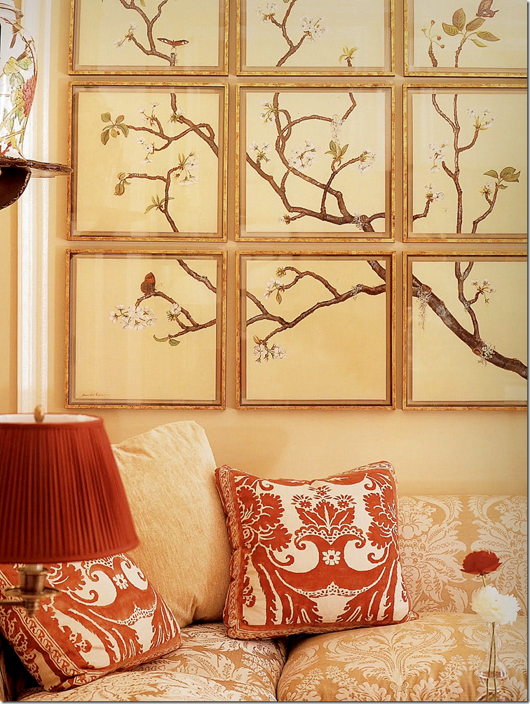
Yellows and reds with black accents. Classic Branca. An apartment like this never goes out of style.
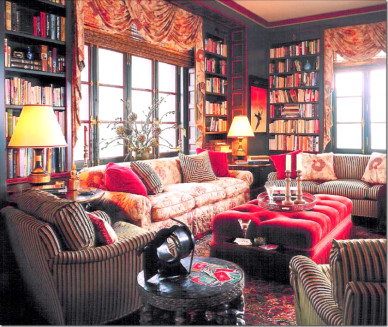
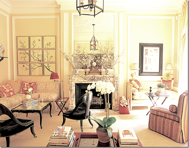
Another apartment with Branca’s colors mixed with floral and striped fabrics.
It’s interesting how certain designers have limited palettes. Branca is known for her red and black interiors. But what if a client likes her aesthetic, but wants light pink and green interiors? Well, Branca has done bright pink and lime green before. But do you hire Branca if you want pastels?
Think about Rachel Ashwell with her light pink and green and turquoise palette. What if you want Rachel and a red and black interior? Do you have to hire Alessandra instead?
I wonder if designers with such rigid palettes lose clients? Are you better off without a specific palette if you want a huge career?
Glad that’s not my problem!!
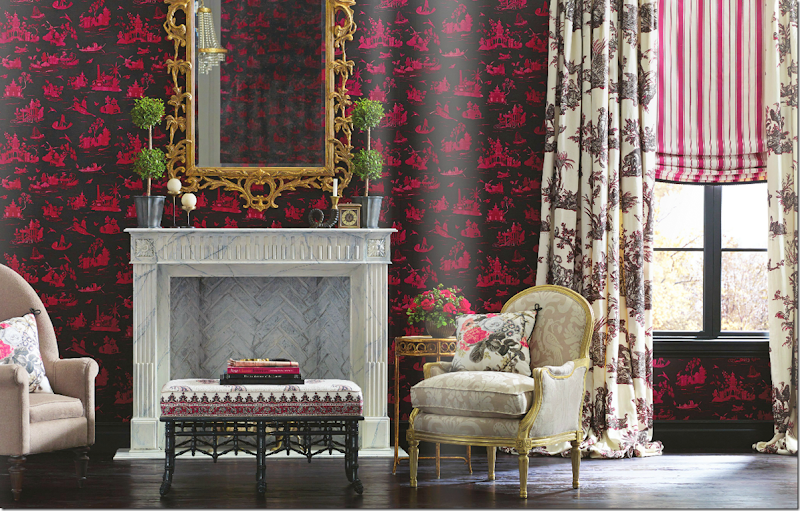
Here is the Branca chintz – with complimentary fabrics from her new collection.
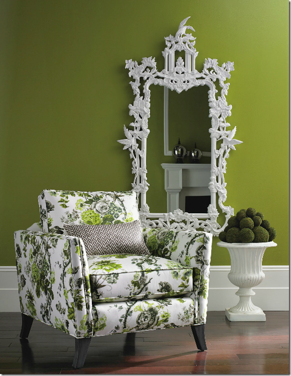
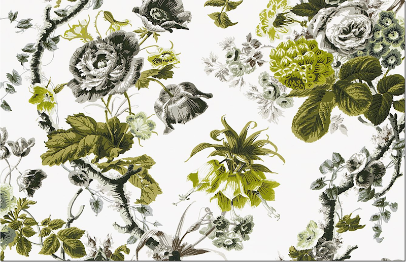
Here it is in another colorway – with the acid green and gray and black flowers on a white background. Another smashing fabric.
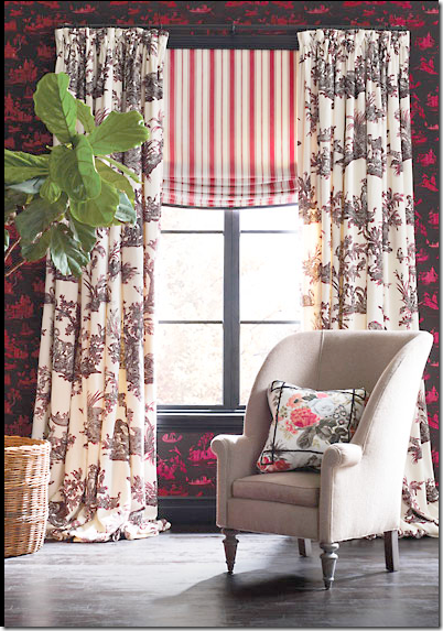
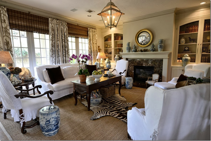
Since Branca is known for red and black, she also designed a toile fabric/wallpaper with a black background. Shown here is another pretty toile fabric used as curtains – but it’s her striped fabrics that are a real knockout in this collection. The striped fabric is heavy, crisp, and GORGEOUS in vivid colors. One of the best stripes ever. And again, here the chintz is shown as pillows. I would love to see this chintz in a room with all white slipped furniture with curtains made out of that chintz.
Shown large…
This would be so pretty mixed with navy blue or with hot pink.
Another vignette of Branca’s new fabrics for Schumacher.
I have to say – Schumacher is really hitting it out of the ballpark these days with their newest designer collections. Mary McDonald and Martyn Lawrence Bullard both came out with smashing fabrics.
And then, there is the Wearstler Collection – think how much money Kelly Wearstler made for Schumacher on just this one fabric and wallpaper, which started its own huge trend? After her very successful association with F. Schumacher, Wearstler left to join forces with Lee Jofa. Why? I could never figure that one out!
Schumacher picked a winner in Branca. She is well known and extremely talented and will attract as many customers as McDonald and Bullard did. When designing the new line, Branca used her own designs as the springboard – as seen in her own Chicago townhouse.
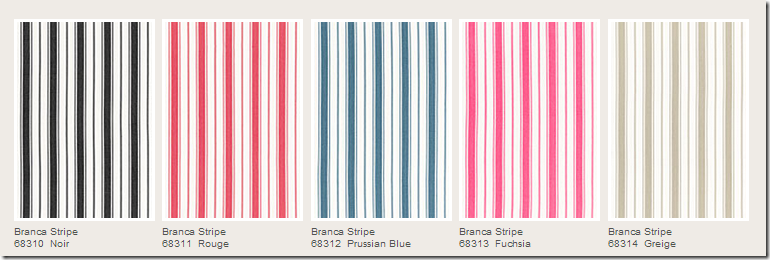
For instance, her love of stripes – is seen in the collection:
The Schumacher stripes are fabulous – they are printed on heavy, thick fabric. The stripes are clear and bright. Just beautiful in person.
Schumacher relied on Branca’s aesthetic for the collection: her love of stripes, plaids, toiles and chintz – all done in her bright, clear colorways.
AND, Branca loves to use damasks and Fortunys – as seen in here in her NYC apartment.
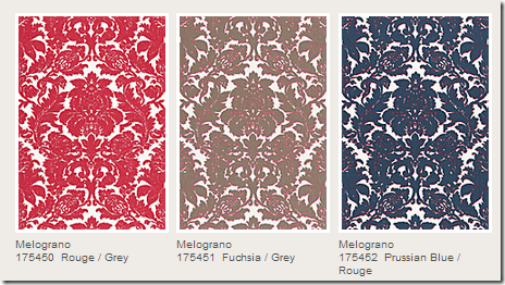
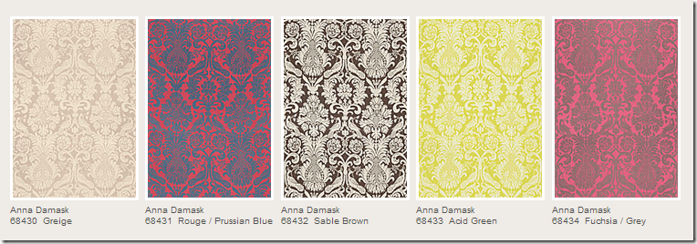
She recreated her own line of damasks and Fortuny like fabrics – here with the Melograno and Anna damasks.
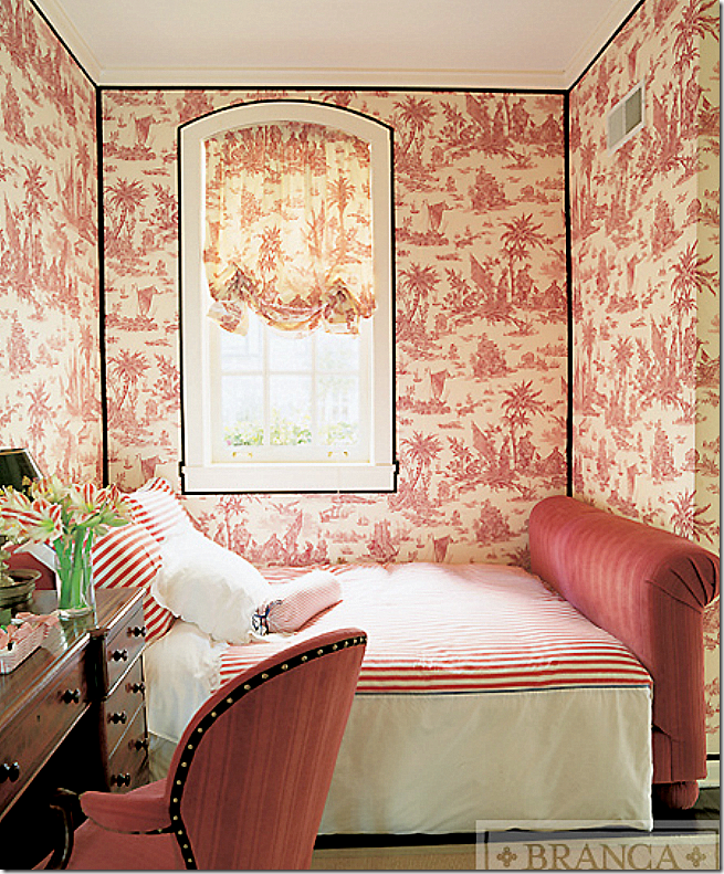
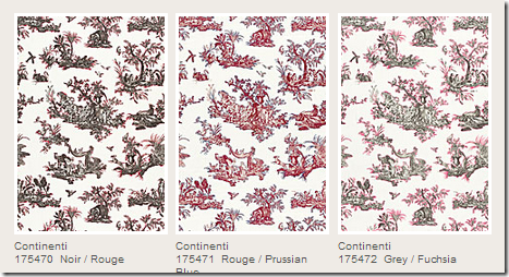
And Branca is famous for her use of toiles – as seen in her own Chicago townhouse. Schumacher recreates toiles in her line – in reds and blacks and blues.
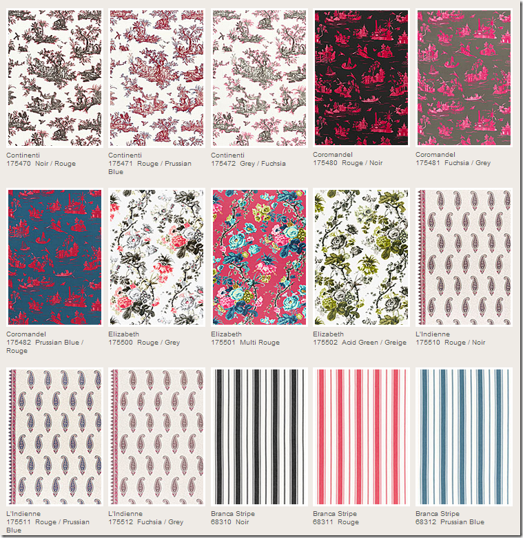
Here is one of the new toiles – the Continenti is available in three colorways.
But – for me – the best is the Elizabeth chintz – in either the red/gray or acid green colorway. I am dying to use it somewhere!!
It seems like pretty rooms are making a comeback – especially those with beautiful fabrics. These are the rooms that keep catching my eye – making me rethink the quiet, neutral palettes that I’ve loved for so long.
This room especially made me question solids only designing.
It was this room that made me realize that I’m just loving pattern lately. This classic chintz from Colefax and Fowler helped make Tory Burch’s living room timeless. The persimmon silk curtains – though plain – didn’t exactly hurt the design either. This is English decorating from the 60s updated for today.
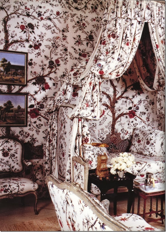
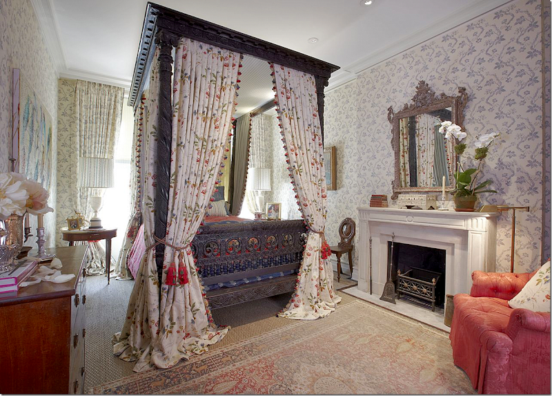
Tree of Life fabrics – wow. The fabric made me fall in love with this bedroom. Totally. I’m a sucker for a pretty Tree of Life fabric. Michael Smith has a few in his collection. But, there is something about this particular fabric – on the cream background – that is just gorgeous.
Here, the same fabric by BRAQUENIÉ as seen in Givency’s French country estate. GORGEOUS! Pierre Frey sells this fabric and others like it HERE.
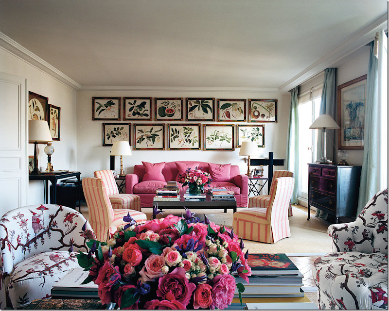
In Lee Radziwell’s Paris apartment – she used a gorgeous toile fabric and placed it on an assortment of chairs and sofa –unifying them.
And across the sitting room – the hot pink picks up the deep pink in the toile. The toile is just gorgeous.
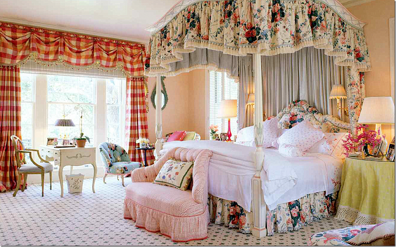
This living room in Houston by Mario Buatta – a personal favorite. Dated? I don’t think so – although it was designed years ago. I love it – still. This house was recently totally redone when the owners moved out – and this classic house is now contemporary. It’s scary how awful the new design is. How to update the Buatta design for today without going contemporary – the walls could be white or cream instead of buttah yellow? Maybe a different rug – apple matting perhaps, maybe less fabric choices?
The bedroom in the same house- pattern upon pattern. To update it for today – use less pattern, add a seagrass or textured rug. But still, this is gorgeous – can’t it just stay the same?
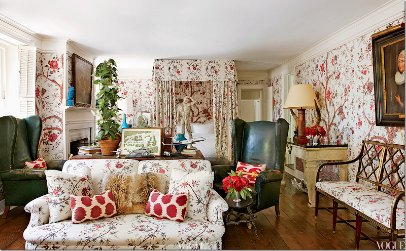
In England, Nicholas Haslam’s country house once owned by John Fowler.
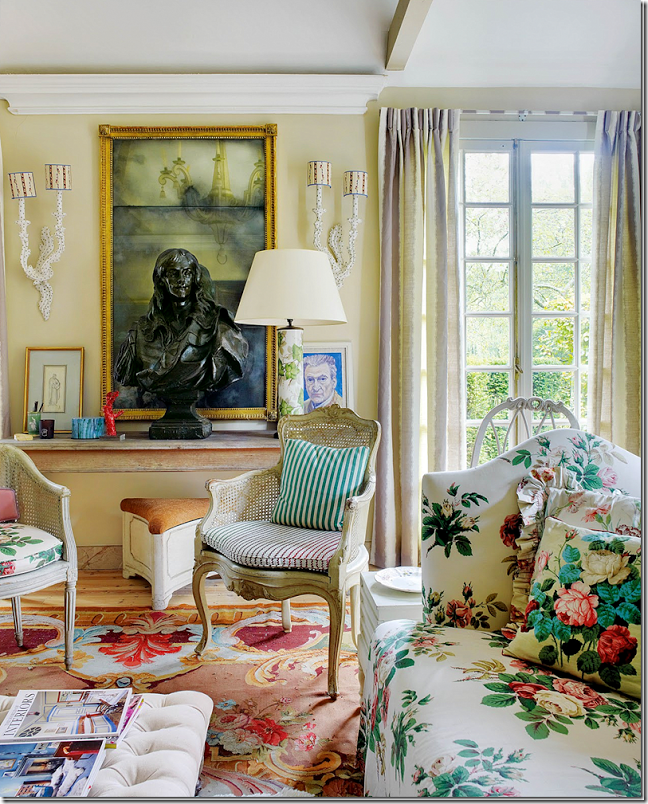
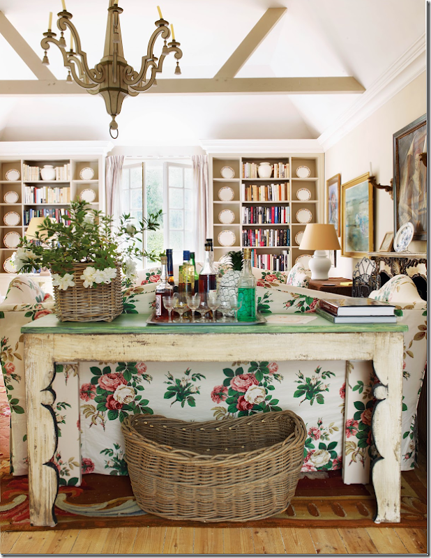
The country house garden room - with this fabulous chintz. I wanted to redo my family room in this chintz for about a month. I obsessed over it for weeks.
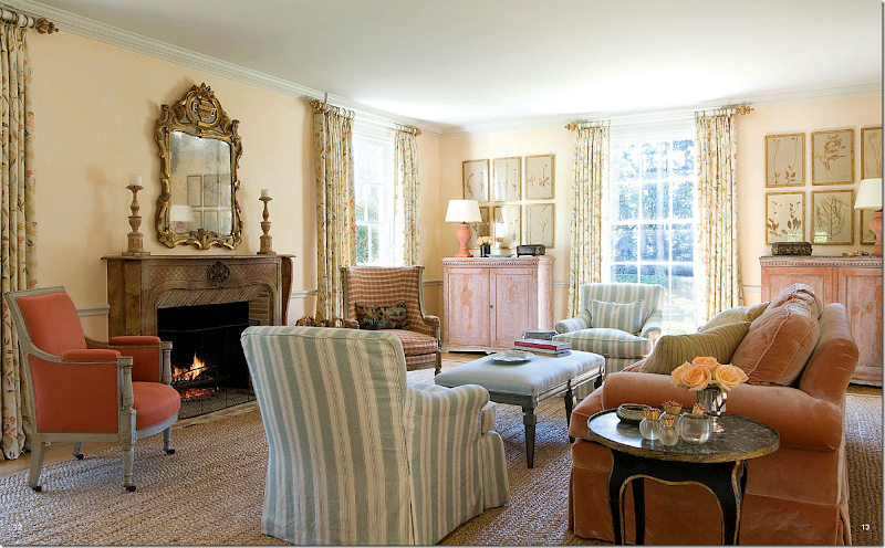
Using patterned fabrics for today – love the chintz fabric for the curtains. This room is so perfect – the colors, the fabrics (velvets and linens mixed together,) the antiques – everything is fabulous: Carol Glasser. The peach velvet is especially wonderful. Wouldn’t change a thing – not even an ashtray!
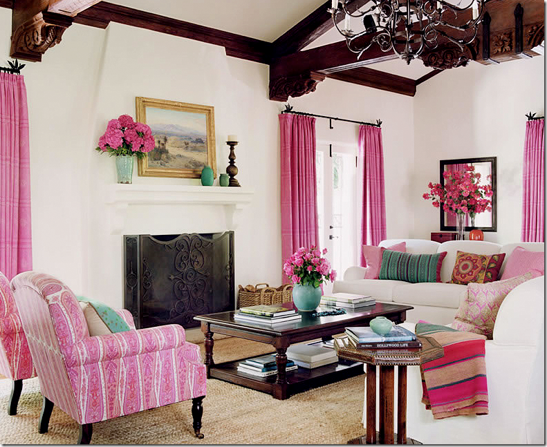
Schuyler Samperton mixes prints and textiles with solid fabrics – wow!!! This is a huge departure for Samperton, choosing this colorway - but it works. Love this house! Samperton created a classic design but updated the colors to make it current. Amazing.
Kathryn Ireland used two patterns in this bedroom – then mixed them with textiles. LOVE! This room looks exactly like it might have looked in the 30s or 40s in the English countryside or the Near East. Fabulous – and love that rug!!!
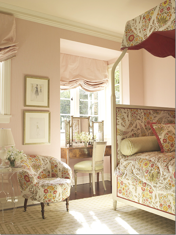
Quieter, Suzanne Rheinstein, uses one print, mixed with a solid blush silk in this bedroom. Her designs are so timeless. Her fabric choices are always impeccable.
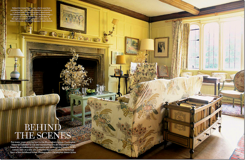
Love this! The sofa actually came with the house from the previous owners. Only in England would that happen. So fabulous, timeless, classic.
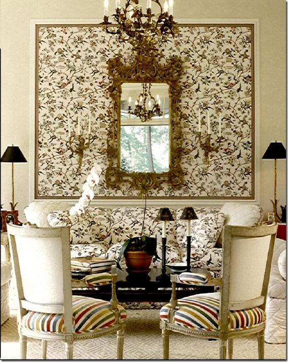
Before she established her red and black and yellow palette – Alessandra Branca designed this rather quiet living room – using one busy print mixed with a colorful stripe. Another example – of good design showing no age at all. I would move in here today!
Are you also loving patterned fabrics lately? Or are you scared to take the plunge?
I wanted pattern. I wanted the flowery chintz in the Haslam garden room. But instead I chose a pattern that would work with everything I already had. Another option would have been pillows instead of curtains. Just be sure the pillows are large enough if you bring the pattern in that way – 22 or 24 inch.
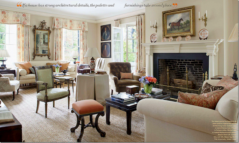
Not convinced about patterned fabric? Here, a muted gorgeous Robert Kime linen sets the tone and the mood. Apple Matting again! It really looks great. This room makes me fall in love with design all over again. Amelia Handegan. She’s good. Very, very good.
To see the new F. Schumacher, Alessandra Branca line of fabrics,
go HERE.
Home
»
»Unlabelled
» Pretty Rooms & Pretty Fabrics
Subscribe to:
Post Comments (Atom)







0 comments:
Post a Comment