During the last story I showed a bright family room designed by Schuyler Samperton – a well known decorator in Los Angeles. You might already be very familiar with Samperton, but for those who aren’t, I wanted to share images from her beautiful portfolio. For years Samperton’s web site was a stagnant place, but that all changed just a few years ago when she debuted her new internet site. It’s been a real thrill to see her updated work, most of which had never been seen before. Her portfolio has grown with her and her work is fabulous – it’s fresh and new, but it’s steeped in the classics. Her rooms are warm and welcoming at the same time – everything that a house should feel like.
To review – it was Samperton’s own apartment that garnered her initial burst of popularity. She started out working for the mega star Michael Smith, along with another designer. Both left and started their own firm. Today, Samperton is now solo. Her stint with Smith clearly made a lasting impression on her work and you can see his influence in her designs – which is definitely a great thing.
Let’s look at her own apartment first – which garnered so much attention.
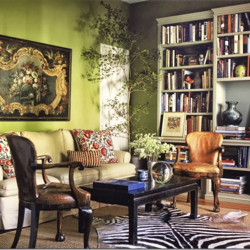
Located in West Hollywood, this is a 900 sq. ft. apartment – with five rooms. It is small, but so rich in layers and colors, you don’t notice where the rooms start or end. In the main room, she added a large bookcase which immediately creates architectural interest. The room is amazing. It’s the basis of her aesthetic and much of her work has these same elements: warm colors, textiles, worn leathers, layers, and patterns.
Another look at the bookcase – and a glimpse of the large window where she added Bennison curtains, a very luxurious choice. Underneath it all is a zebra rug adding more pattern. The room is timeless – it could have been installed this year or twenty years ago. The coffee table is an antique Oriental lacquer piece and the two chairs are painted an unexpected red. It’s all so warm and inviting and welcoming. You want to put your feet up and read a book and never leave.
A close up of the Bennison fabric against the green walls. The antiques aren’t fine or out of reach, which makes it all the better. Michael Smith’s influence is seen immediately – in the wall colors, in the choice of fabrics, in the use of textiles and antiques.
This shows a recent update to the space – a daybed placed in front of the windows instead of the two red chinoiserie inspired chairs.
A vignette with a bright turquoise lamp in front of an oil painting.
A screen is used in the dining room along with an antique gilt wood chandelier.
Another more recent view of the brightly painted yellow dining room with its skirted table and the newly placed lantern.
In the master bedroom, a 19th century French antique settee sits next to the bed.
A Suzani is used as a bedspread, while a screen is used as a headboard. Again, the Michael Smith influence is strong here – with the suzani, the screen, the blue and white lamp and the English antique furniture. Samperton took the best of Smith and made it her own.
Westside Provencal
The next house that Schuyler designed which was published is owned by the model Carolyn Murphy. It was shown in Vogue magazine and its publication coincided with her new web site/blog. Here in the living room – the walls are creamy white with a gray velvet tufted sofa and antiques. The house is wonderful – filled with architectural charm – a bit of France near the L.A. beach.
The house was built in the 1920s. It’s small, but so charming, the size makes it all the more cozy. Here Samperton added her trademark beautiful curtains in a muted pattern.
The dining room is truly fabulous! The Restoration Hardware fixture hangs over the beautiful wood table – with two chairs that are almost falling apart !!! Love this so much!
The kitchen is charming – look at the sink. Love the tile floor and the casement windows in the adjacent pantry.
Samperton said she searched the internet for all these different textiles – and together they do make a colorful statement. Again, it’s all so casual and simple, yet it is so warm and inviting. I just love her aesthetic. Notice the original door knob.
A nook upstairs – love the rug. Again, a pile of patterns, nothing matching, but that is the charm. Samperton has a gift of being to assemble mismatched fabrics and make them relate to each other in an unexpected way.
Tiles and a marble sink – tiny casement window with stucco walls and an old shelf. Perfection!
Carolyn had the headboard and the curtains – so they were reused. Love the metal lamp. Love the table. The only pattern is a pillow with the found fabric.
WOW!!! The master bathroom is beyond fabulous! I would live outside in that adjacent garden! Why don’t they still make houses like this?
A close up of the marble vanity. Love the mirrors and the twin sinks. Perfection.
The garage was turned into an artist’s studio and an entertaining space.
It’s Belgian Rough Luxe meets industrial chic.
Notice the corner fireplace. Love the furniture Samperton assembled for this space.
The back yard – when can I move in? Love the gravel and the lavender planted around the pool. Notice how the four trees become a natural pergola – what a great idea!
Hancock Park:
In this house, the décor is a little more dressy, but it still has that warm mix of antiques, Oriental vibe, and luxe fabrics and textiles. Again, Samperton chose a patterned fabric for the curtains – and mixes it with plain upholstery.
A vignette in the living room.
Love the dining room where there is turquoise hand painted wallpaper mixed with gold fabrics. Notice the rug!
Love this use of fabrics, rug, and textiles in the family room.
The paneled walls are great – they add so much character to the house.
Love the quiet chintz at the window and on the bed.
Beverly Hills:
This house is a real departure in the color palette for Samperton. But, it still has the same warm feel – inviting and comfortable and cozy. Dying to know who lives here! A single female? Or a married couple?
Notice here how she tones down the bright fabrics with art work and an antique wood console.
As always – a mix of textiles on the pillows.
The dining room is blue and white – notice the blue and white tiled walls – a la Michael Smith. He copied that age-old idea and other designers then copied him.
Palisades Traditional:
This is another new addition to the portfolio. Again, it’s traditional with an English colonial feel to it. Striped fabrics are mixed with patterned textiles.
The kitchen and breakfast room are an interesting mix of white marble and red walls. Notice the pendant lights over the island.
Love this printed fabric and the blue denim in the family room.
English styling in the powder room with its leaded glass windows.
The children’s room – a mix of blue and white stripes with worn leather and plaid. The lamps and their shades are fabulous!
The master suite is my favorite – the English styled canopy bed dressed with embroidered fabrics, the striped settee, the old rug and the walls are wallpapered, adding another layer – wonderful! The layers that Samperton puts in each room add much to the feel – the rooms don’t feel empty, no matter how large they are – they feel properly furnished. So many designers don’t add enough furniture to larger rooms, making them seem cavernous. Samperton avoids that misstep.
The owner’s study – love this!!!!!! This is a working office but – Samperton still made it feminine and pretty. Love the chandelier and the pink fabric mixed with the ticking stripe.
Swedish furniture – notice the hand printed wallpaper that Samperton lined the walls with. I love all her rug choices – they add another quiet layer of pattern to the rooms.
In the master bathroom, she added wood furniture – an unexpected choice.
The English styled chair with striped fabric works with the rugs and cabinets. Such a pretty space.
I hope you enjoyed seeing some of Schuyler Samperton’s portfolio today – there’s lot more on her web site – so be sure to visit there and check it out. When she debuted her new web site, she started a blog which was very interesting and promising! But, I’m afraid she is too busy with clients to keep it up – so it’s rarely updated these days, which is a real shame. Still, read the older entries when you visit.
I hope you got some new ideas for decorating today – ideas for adding warmth and coziness in a room, ideas on how to fill out a room so it doesn’t look either empty nor cluttered, and ideas on how to mix and match textiles and fabrics in ways that aren’t too obvious.
Visit her web site HERE.
And if you are inspired by Samperton’s style – be sure to visit Michael Smith’s web site. He’s got some beautiful photographs of his portfolio – some old favorites and some new designs – HERE.