Today, we have a new letter sent into the Dear Miss Cote de Texas series:
The Issue:
Dear Joni, I have tried to decorate the way you have suggested over the years and now I am stumped with a few problem areas! First of all the TV is awful. I don't know how to improve this area and the lighting is all wrong. The room gets very dark in the middle of the day even though we have the French doors. There is not enough seating for the shape of the room and I know there is a better way. Please help a forever friend of your blog! The walls are painted Linen White with the ceiling painted 1/2 strength
Any suggestion for anything will be sooooo helpful!Here are the pictures of my living area. We had a small family room that ended where the wing back chairs are and a kitchen nook. We felt so closed in especially when we had guests over so we pushed out the back of the house and added a screen porch
Now I need help with the arrangement of the furniture....TV....and lighting in my new space. Help!!
Here are the pictures of the space:
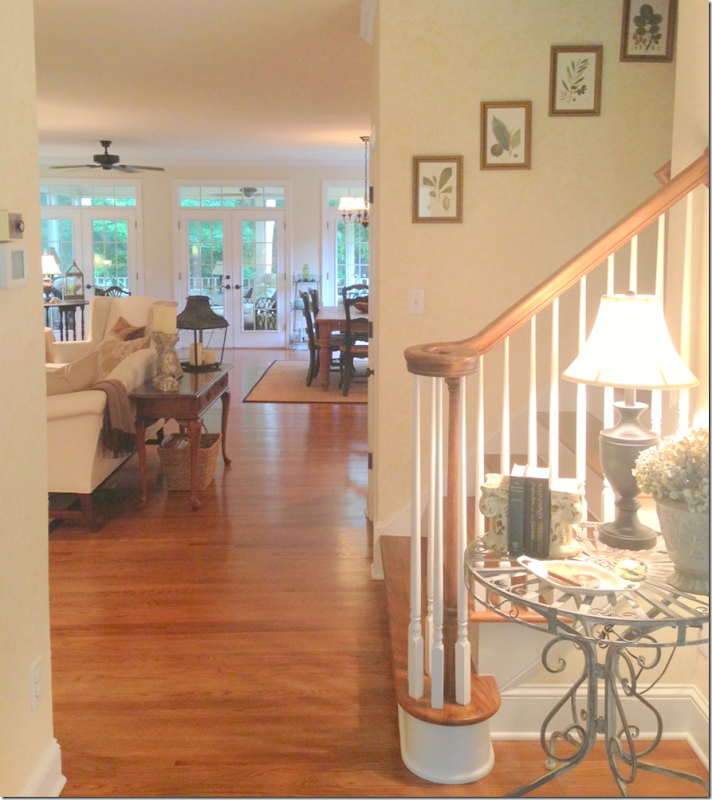
When you walk in the front door, the living room is on the left and the dining room is on the right. Then, past the staircase, the family room and kitchen is at the back of the house.
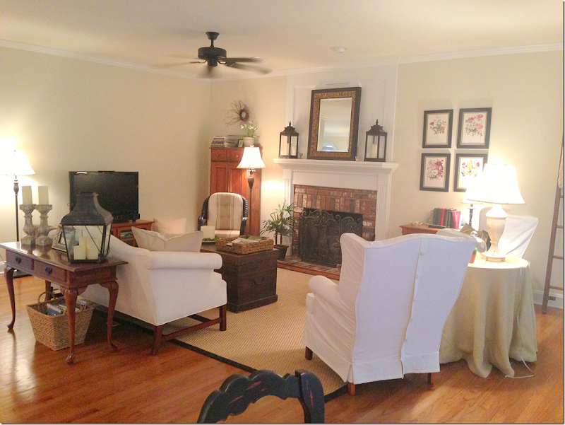
The family room is arranged with a sofa that faces the fireplace and two wing chairs that divide the space from the breakfast area.
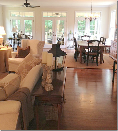
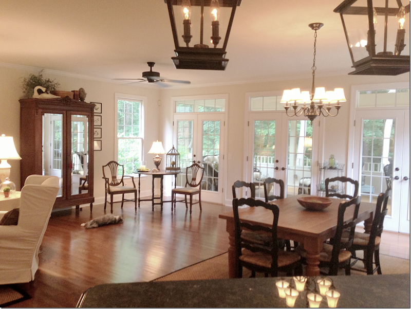
Here you can see the breakfast room area that was added on past the family room. It’s now all one big space. The kitchen is to the right.
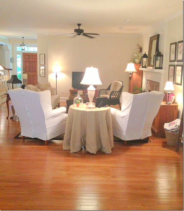
Looking from the breakfast room area to the family room.
Here you can see the area that was added on – a large breakfast room, along with a screen porch.
The kitchen’s bar is angled out into the breakfast room area.
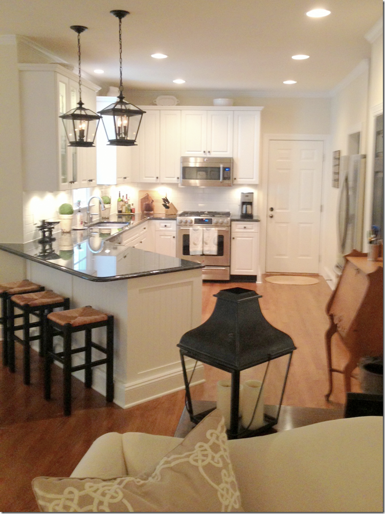
The kitchen behind the family room.
The Solution:
First, I would like to thank you so much for submitting this design question. I’m going to address this as if you were a client. No holds barred!
I think you have a great look going, love the slipcovers and all your accessories. Love the lanterns too! It just needs some tweaking!
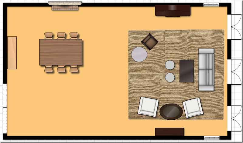
The first thing I would address is the floorplan. What struck me immediately is how unbalanced the room seems – everything is weighted towards the living area – while the dining area looks so empty. Additionally, the living area seems cramped and with the sofa floating in the room – it makes that area look even smaller.
Probably the best solution would be to flip the rooms – put the dining room table in front of the fireplace (which an be lovely in the winter) and use the back room as the living area. Have you thought of this before?
I would move the furniture around like this:
I would float the sofa in front of the French door and use the armoire as the place to house the flatscreen. The white chairs would sit across from the armoire. You could always add two Kooboo chairs for more seating, instead of just your one wicker chair and, then add a few round ottomans. If the armoire isn’t a solution, you could put the flatscreen on the console and just move the white chairs across the room to flank the armoire. I would get two matching chandeliers for both the dining and living areas. This layout would solve the lighting issue – as you would be sitting near the windows. You could then add wall sconces on either side of the dresser in the dining area, along with a second pair that would flank the fireplace. Additionally you would have the chandelier for even more lighting.
While I know this is somewhat drastic, this might be something you want to play around with one weekend – move the furniture to get a feel for the layout. Try to live with it this way for at least 48 hours – that’s the minimum you should live with something new in order for your eyes to get used to the change!
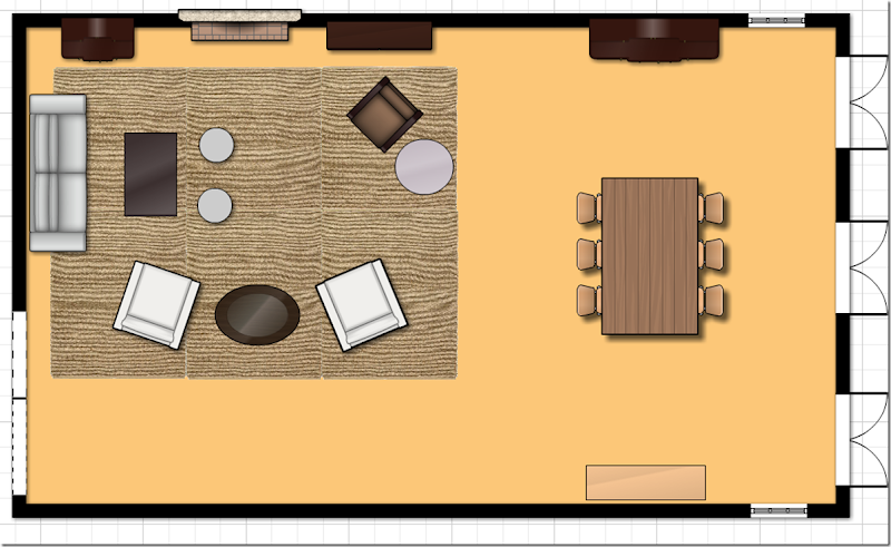
Now, if that layout is too drastic, I came up with a second solution below:
1. The dining table should face the other way and be centered in front of the French doors.
2. Have an electrician come out and move your hanging fixture over the table. This really doesn’t cost a lot at all and you can easily patch up the area where the chandelier is moved from.
3. By moving the table, you fill out the back area and it won’t look unbalanced and empty. You can leave the buffet and armoire where they are, just flank the extra chairs around one of those two pieces.
4. Next move the sofa to the back wall. Then move the two armchairs where the sofa was, using the gateleg table, now in the back area, between them.
5. Move the accent chair to flank the fireplace.
6. Move the console table to the right of the fireplace and put your TV there.
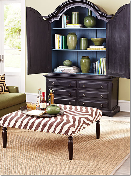
7. I like your trunk as a coffee table – but to gain more seating, you could always add an ottoman that doubles as a coffee table. If not, then add two small ottomans in front of the trunk to get a little bit more seating. I’m just not seeing any other way to get a lot more seating in here with the size of the space.

Restoration Hardware has a nice coffee table/ottoman.
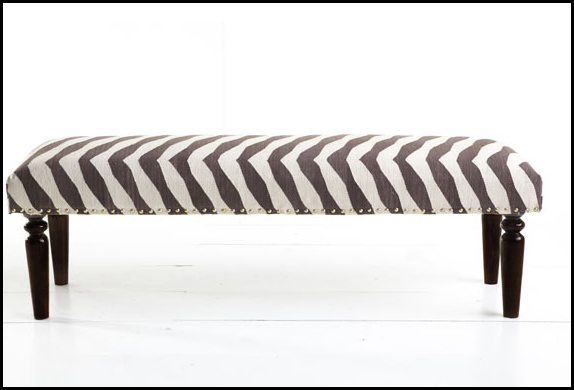
From Wisteria – I love this one because it adds a pop to the room like a zebra rug.
From Wisteria – this one is smaller.
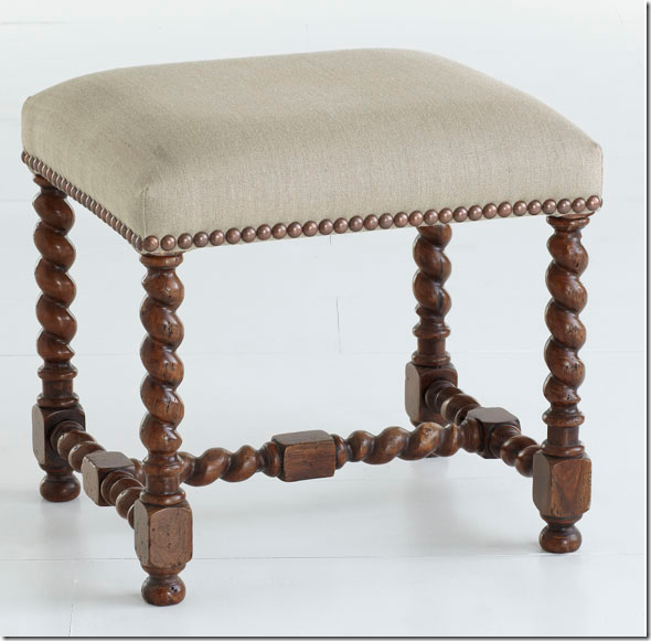
From Aidan Gray – you could use two of these in front of your trunk for extra seating and also as a footstool for your white chairs.
From Wisteria – you could place these around your trunk easily – plus they add texture.
From Wisteria – these are great looking for extra seating or footstools.
I would probably not use the skirted table, it looks a little dated – a small garden stool would be a nice alternative. Then, the lamp now on the skirted table could be moved to the gate leg table between the two white chairs.
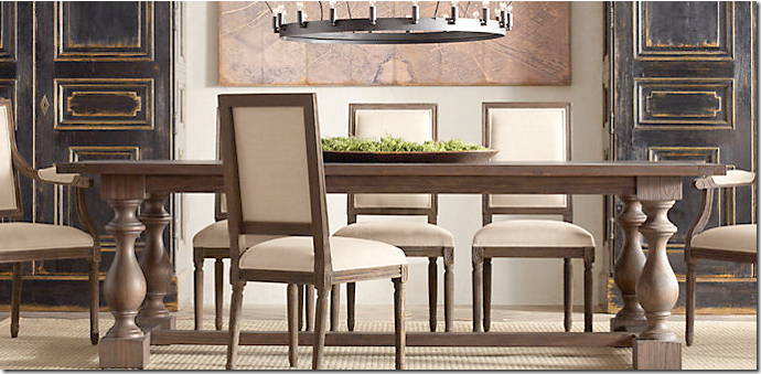
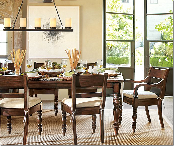
One point - in the dining area, if your table is not long enough, I would consider saving up and buying a very long one that would fill out the space. There really is a lot of wasted space now and a nice, long table could make a huge statement. I’m not sure if your table is long enough or not without seeing it in person – but if you could use a longer table, I would try it out.
I found this extra long table at Restoration Hardware on sale at a great price.
And this one at Pottery Barn.
As for décor – I would highly suggest getting curtains in a printed linen fabric. You would place the rod above the transom and stretched out past the window so the curtains cover the walls, not the windows, therefore not affecting the light. Then I would make two 22” inch pillows out of the curtain fabric for your sofa and two lumbar pillows for your chairs. Additionally, I would make chair slips out of a check or striped fabric that coordinates with the curtain fabric.
All this fabric will add so much to the décor of your room and make it look more thought out and designed.
Here are a few fabric ideas from our sponsor Lewis & Sheron HERE.
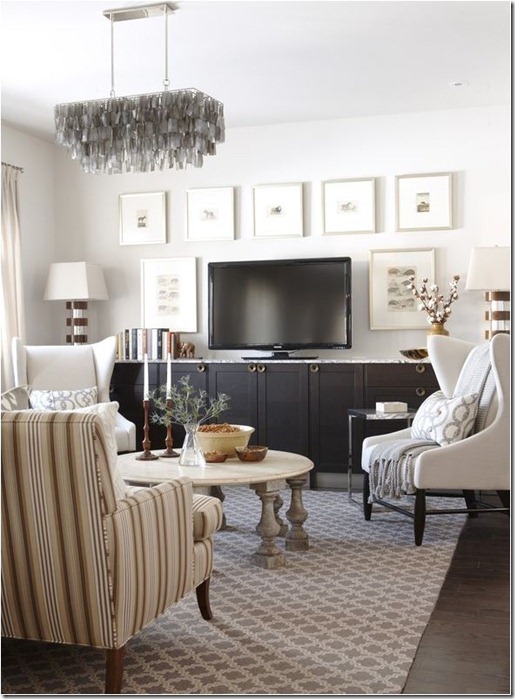
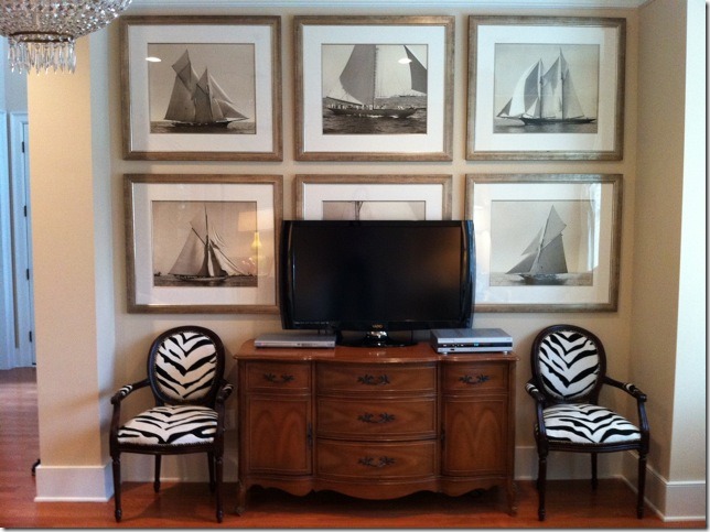
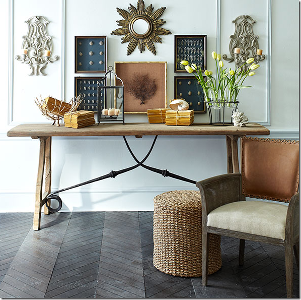
As for the TV – the best way to disguise a flatscreen is to surround it with art, prints or photographs. I tried hard to find the perfect picture to show you, but couldn’t.
The arrangement is perfect – and one I would emulate with the two pictures on each side and the ones above the TV – BUT, if these had dark frames and dark mats – the flatscreen would be more disguised. Instead, go for dark when surrounding the flatscreen. But – remember this arrangement, the proportions are wonderful.
These prints COULD have been great – they are darker – BUT – the flatscreen has to BECOME a piece of the artwork, not be used to stand in front of the art work!! These prints are too big for the space. With smaller prints they could have FRAMED the flatscreen properly – but instead, it just doesn’t look good. The flatscreen should have replaced the print behind it and the other prints would have been centered around the flatscreen, but there isn’t enough room. AVOID.
Now, imagine the seafan is the flatscreen – see how these prints surround the seafan on both sides evenly? And notice the dark mats – these would blend in with the flatscreen and make it disappear. Also – you could use a small mirror like this above the flatscreen for interest.
If you use your longer console for the flatscreen – you could also flank two lamps on it – adding more light.
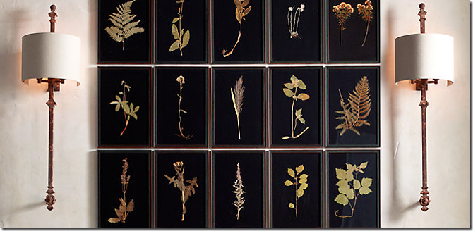
This series of botanicals from Restoration Hardware would be fabulous to hang around a flatscreen. Two on each side and five on top. The flatscreen would totally disappear.
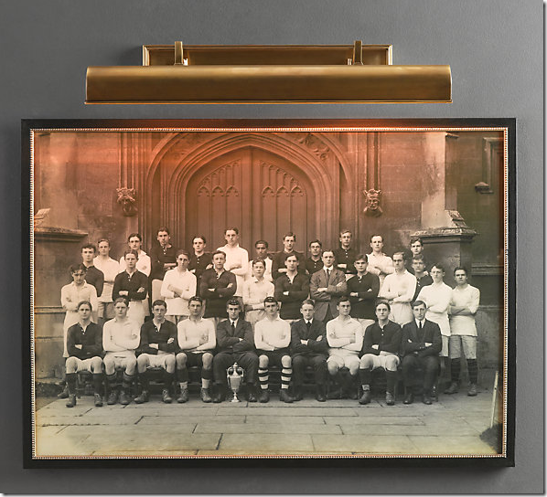
Lastly, I know you said more light is the issue – but without adding a window, I’m not sure how you can brighten the space without adding a chandelier over the space. If you do move your sofa, you could add a picture light over a painting on the back wall in addition to the two standing lamps.
Restoration Hardware
You could always add four recessed lights in a square about the living area to get more light. It looks like you already have two there.
Or, you could get a ceiling fan with a light kit.
I’m not a huge fan of really well lit rooms and only use low watt bulbs in my lamps and chandeliers. In my chandeliers and lanterns, I only use 7 watts! But that’s personal, I suppose! I keep all my sconces and chandeliers and lamps lit during the day – and then at night, as the room gets darker, it gets more romantic. Brightly lit rooms are such a personal choice. To me – your room looks light enough.
Still, you can get more light by adding two lamps to the console table against the wall and by moving the lamp from the skirted table to the gateleg table, you may gain enough light.
If you do consider adding a chandelier over this area – I would probably get two that match – one for over the dining table and one for the living area.
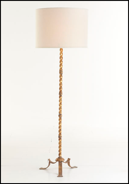
For your floor lamps that flank the sofa, I would be sure to get two matching ones that make a statement. These are from Wisteria.
And from Ballard Designs.
I hope I have given you some things to think about and help you out.
If anyone has any suggestions – please leave a comment!!
And don’t forget – the French antique giveaway ends this Saturday night at 11:59 pm!
Go HERE for all the details.



0 comments:
Post a Comment