As I’ve written before, my favorite design books are those that are written about one house:
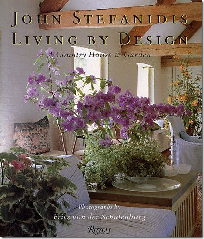
Like John Stefanidis’ English country house in “Living By Design.”
Bunny Williams’ very popular “An Affair With A House” chronicles her country house and gardens and how they grew and evolved through the years.
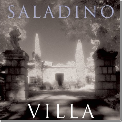
John Saladino’s “Villa” is a real favorite – the story of the stone wreck that he turned into a gorgeous Santa Barbara vacation house, which he promptly put up for sale after working on it for years.
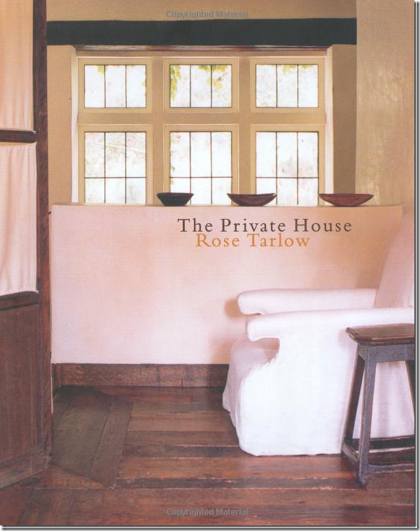
“The Private House” by Rose Tarlow – while not just about one house – it does spend considerable pages on the Los Angeles house she built.
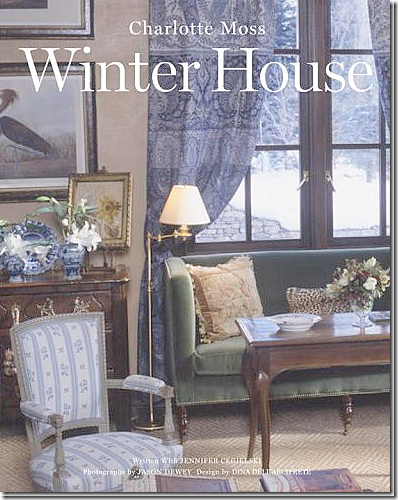
“The Winter House” by Charlotte Moss is about her former house in Aspen, which was sold soon after the book came out.
And one of my old favorites – “The Shabby Chic Home” by Rachel Ashwell where she wrote about the extensive remodeling of her Malibu house – one of many she’s lived in over the years.
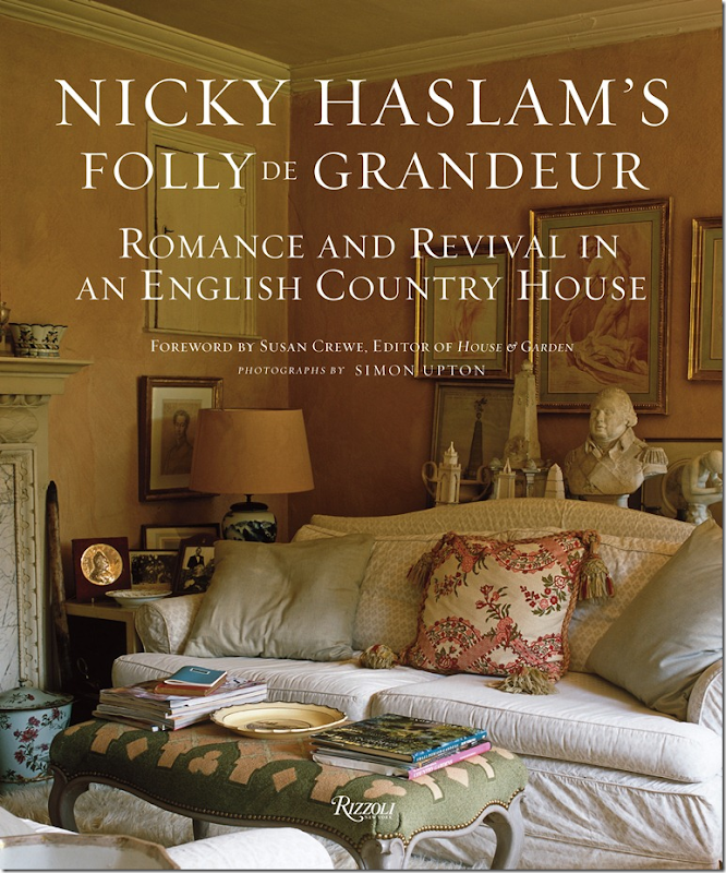
The newest addition to my list of favorite “one house” books is by Nicholas Haslam called “Folly de Grandeur – Romance and Revival in an English Country House.” Even the title is so enchanting! The internationally acclaimed interior designer released this book to celebrate his fabulous weekend house in the English countryside. The book came out a few months ago but I waited to read it until I had a few days to enjoy it without interruption. I finally found the time last weekend and like a good movie that you think about for days afterwards, this book is much the same. It stays with you. Reading it, you feel like you are a guest in the house, enjoying a warm summer eve at dusk, with a cocktail in your hands before dinner – listening to stories from your host while the birds chirp and the fountain gurgles. It’s just that type of book. Weekend Two and I’m still immersed in it.
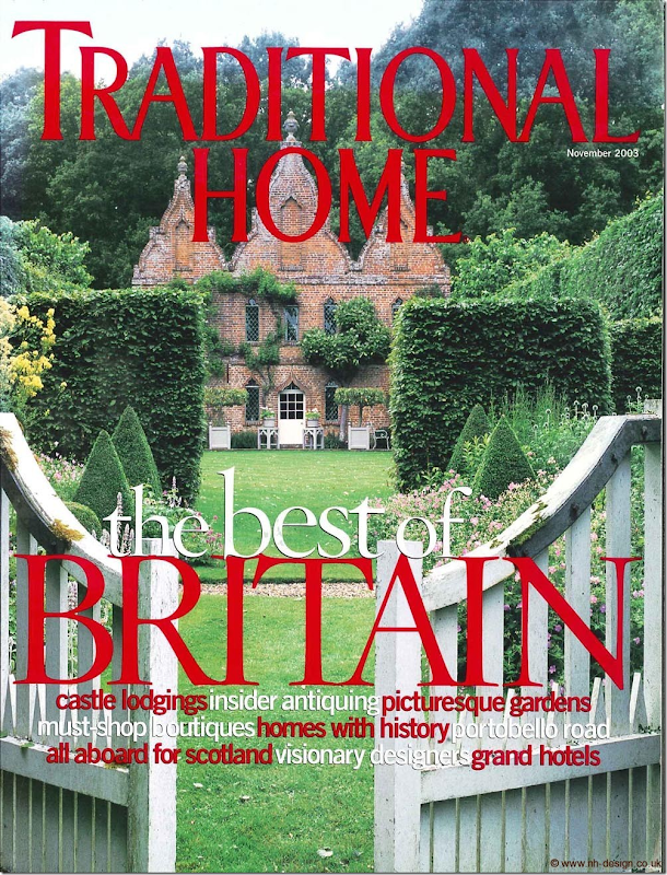
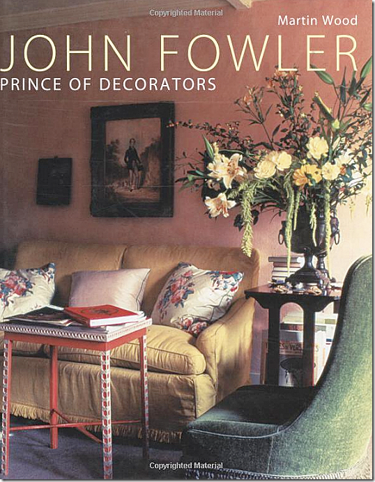
I’ve been waiting for this book to come out for a long time. I still remember the story about the house in Traditional Home – over 10 years ago. You probably do too. Nicky has lived here for almost 40 years now, and before him, the owner was the legendary decorator John Fowler. The house was a chapter in the 2007 Fowler biography by Martin Wood, which is a great addendum to Nicky’s own. Simply called “the prettiest small house in the world” – Nicky’s devotion to his house is evident on each page. And if you are a lover of the history of interior design – you will appreciate the faithfulness to Fowler’s original decorations, which in some rooms remain almost unchanged.
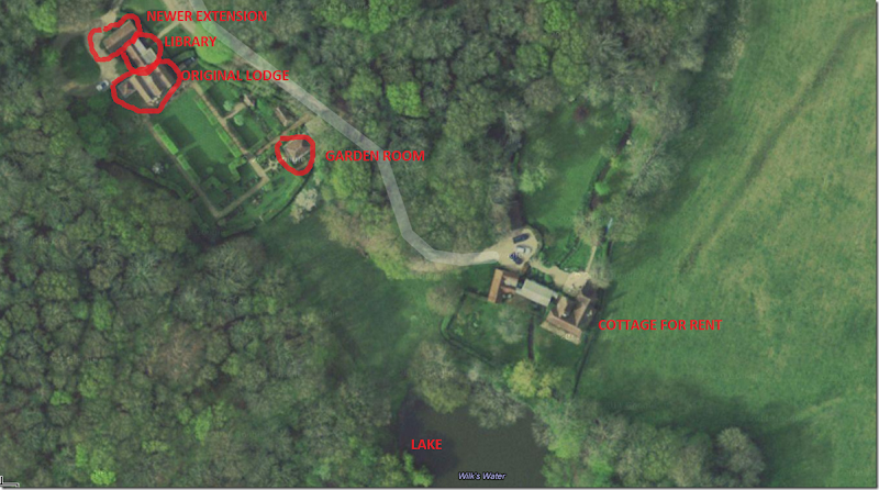
The Hunting Lodge, as it is called, was bought by John Fowler in 1946 – for just 1,500 pounds. Fowler used his inheritance from his mother to fund the endeavor. The house was a total wreck – the bottom floors were used to house animals and Fowler shoveled out several inches of chicken manure just to start the renovations. Over the years he added on to the original three rooms, first a kitchen, then another one, a barn became the library, and a shed out back was turned into a two story guest apartment. He later added a foyer to help keep the chill out of the main rooms and he installed electricity and plumbing – both of which the house lacked when he bought it. He designed the garden as a series of rooms in an homage to Dutch styled landscaping and he added two pagodas for al fresco meals – one in the sun and one in the shade. Towards the end of his life he built a garden room, far from the main building, where he ended up spending much of time. He remained at the Hunting Lodge until his death at 71 in 1977.
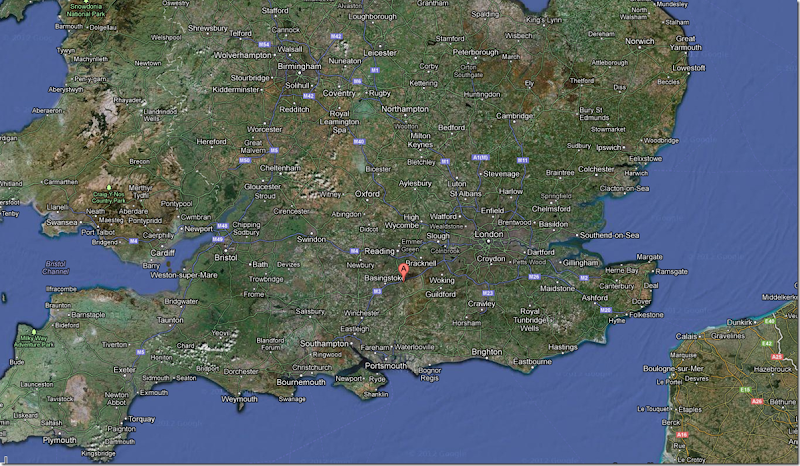
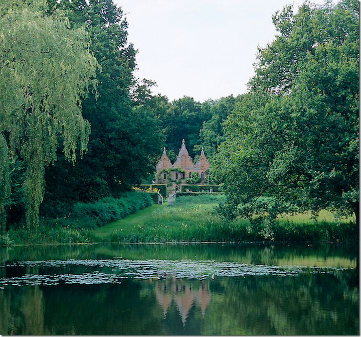
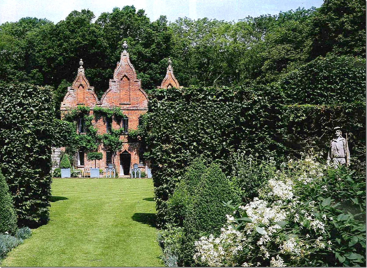
The house is 40 miles from London near Odiham in Hampshire. Royalty once frolicked here – Queen Catherine of Aragon first met the Prince of Wales at the lodge, though she later married his brother King Henry VIII. Back then, the Tudor building was just three rooms that still stand today and was used by royalty while out on the hunt. Around 1720, the distinctive pink brick Jacobean Revival façade was added to the lodge. At that time it became part of a series of follies that were on a large estate. Through the ensuing centuries, the lodge became decrepit until Fowler bought it. In his will he bequeathed the house to the National Trust – and without even going inside, Nicky signed up to rent it from the Trust. He doesn’t actually own it.
The lodge stands approximately 4o miles from London making it an easy weekend commute for Nicky.
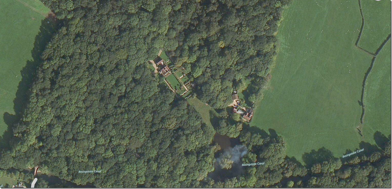
View of the estate in a old forest where the Tudor royal family hunted.
View of the original lodge, the library (former horse barn) and the new extension & dining room. Fowler renovated two cottages making them into one for his friends the acting Redgraves.
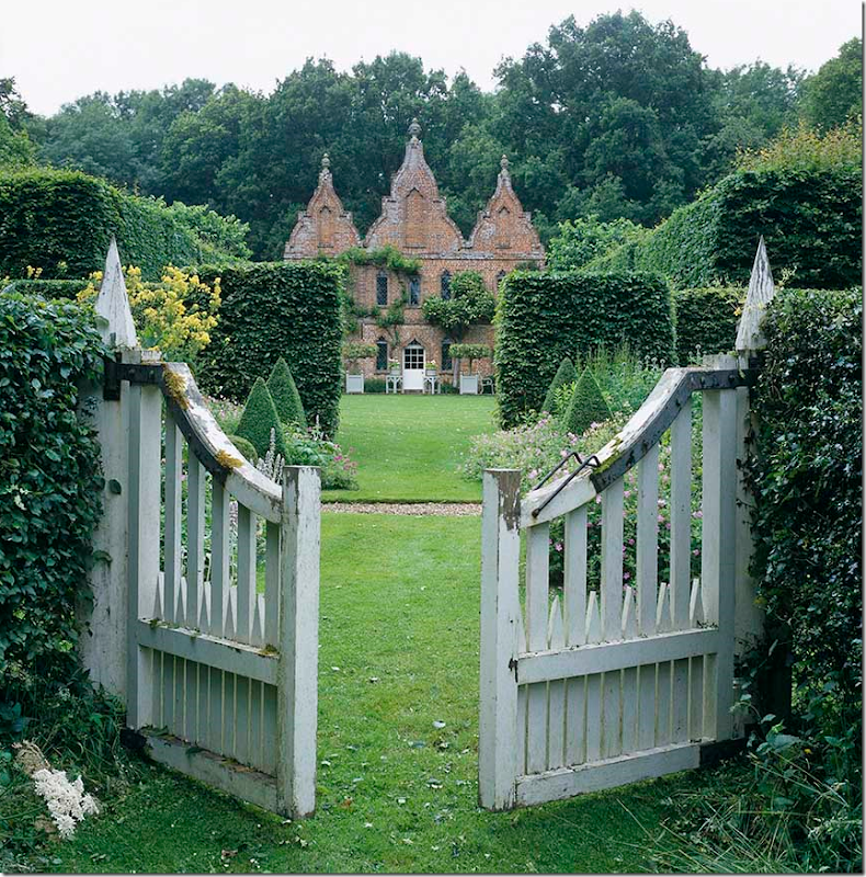
The view of the façade – as seen through the gates that lead to the lake.
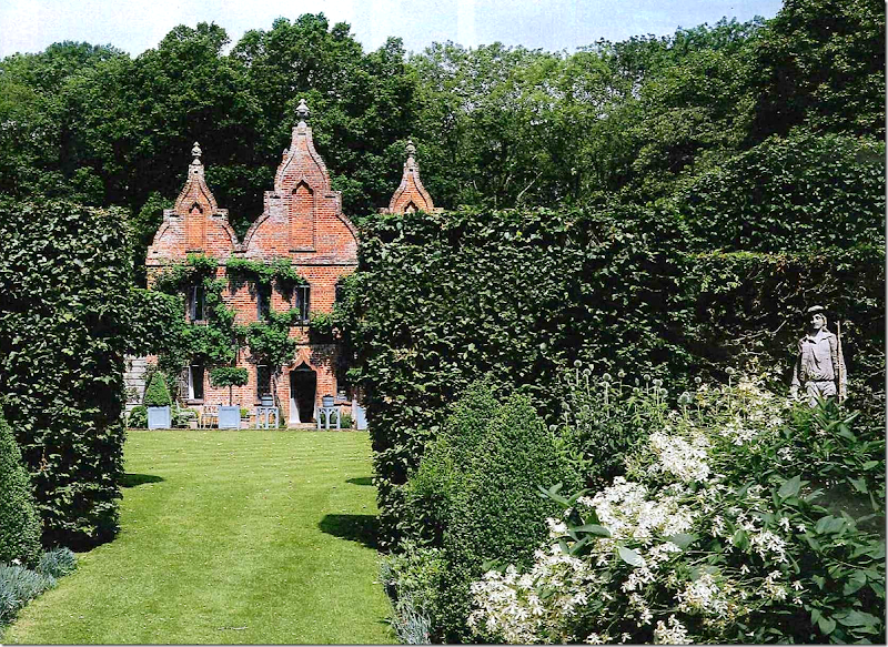
Along the façade is the “garden” door that leads to the sitting room. The front door is at the side of the house where the curved driveway is.
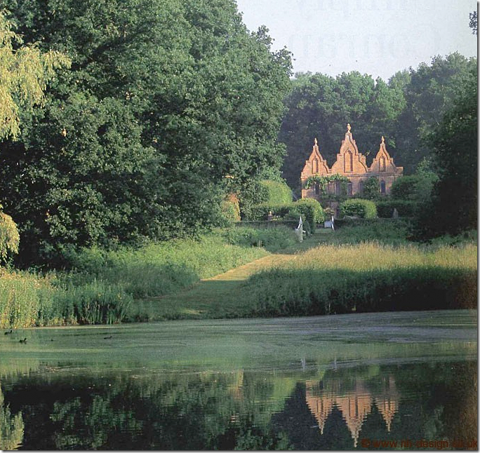
The view of the house reflected in the lake – with the sun shining on the pink brick façade.
And another view of the lake. Across from the lake are two small cottages that were combined into one by Fowler for his friends the Redgraves.
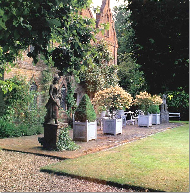
Along the façade is the brick terrace with statutes on each side.
THE ENTRANCE HALL:
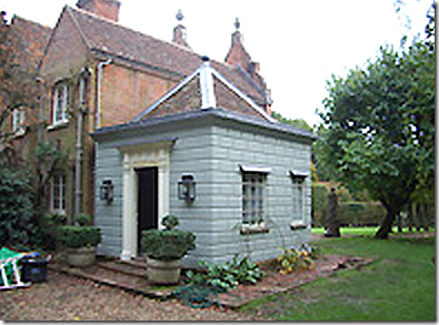
The wood pavilion that Fowler added on to the house to be the new foyer. The wood is made to look like stone blocks. Sorry – bad photo!
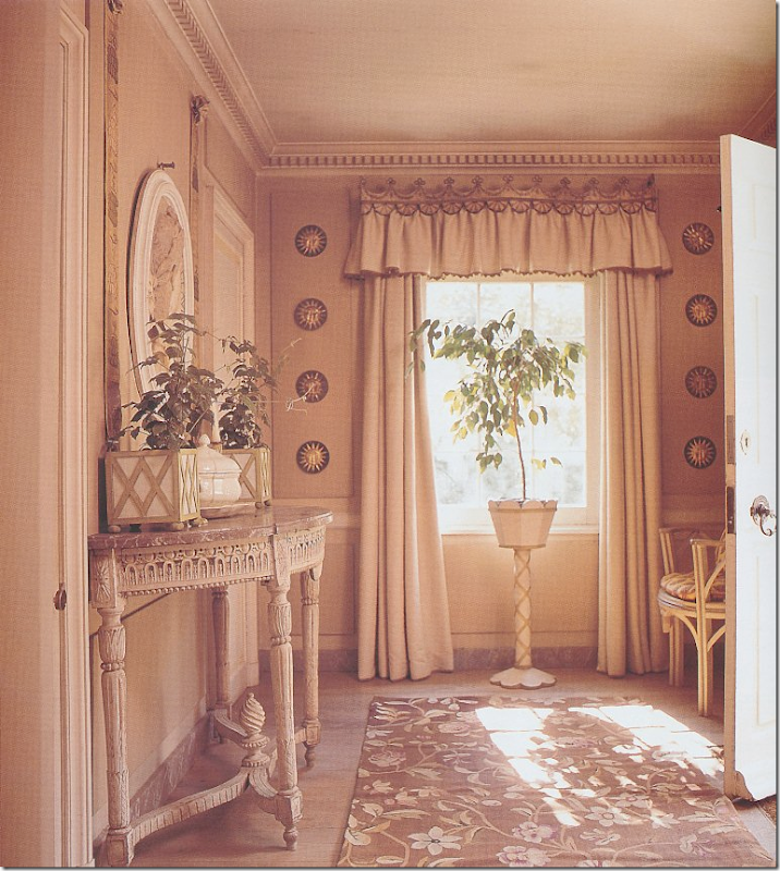
The new addition built by Fowler acts as the foyer with a powder and cloak room. Fowler added the dentil molding and the walls are painted to resemble molding. This is an older picture, today the chair fabric has been changed.
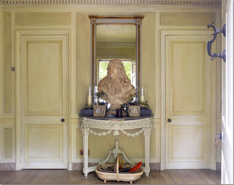
This is one of the prettiest rooms in the house – I love the faux painted paneling. The pelmet was designed by Fowler. Many of the decorating choices in wall and window treatments by Fowler remain today. The new chair fabric matches the curtains in the next room.
The view from the front door – with the cloak room and powder room doors. The lanterns are actually electrified because of drafts.
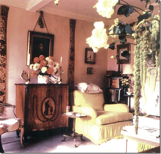
Here is a photograph from John Fowler’s days. He also used a similar French console, and put round frames flanking the window. The curtain rod looks the same as the one used today, except upside down.
THE OLD HALL:
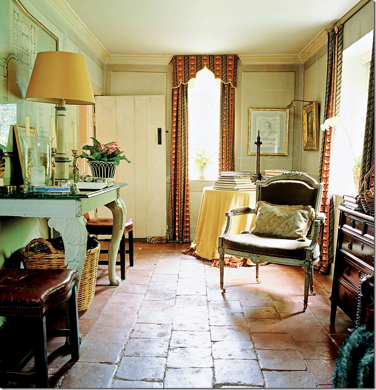
The new entrance hall leads into the old hall. This used to be used as a dining room before Nicky created a new one in the back extension. Instead, now it’s used as place to sit by the fire when coming in from the cold. Love the original tiles – which are waxed once a week. Fowler designed the pelmets to follow the shape of the windows. Nicky uses the same shape today. In the corner is the skirted table which used to be for dining, now it holds books. Notice the rustic original plank door!
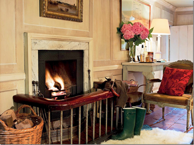
A table which holds the framed plans for a palace for the Duke of Wellington that was never built. His guest book rests here.
The old leather and brass fender. The walls have faux molding in this room too. Across from the fire is a sofa. The rooms in the house are all very small – none is wider than 12 feet!
THE SITTING ROOM:
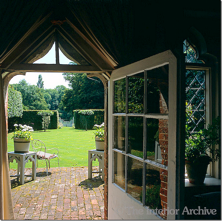
Past the Old Hall is the Sitting Room. This looks out on the lawn that reaches down to the lake. Outside the door is the terrace that is under the brick façade.
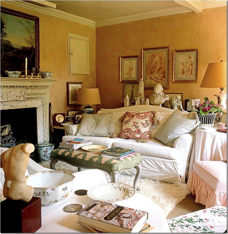
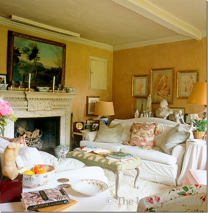
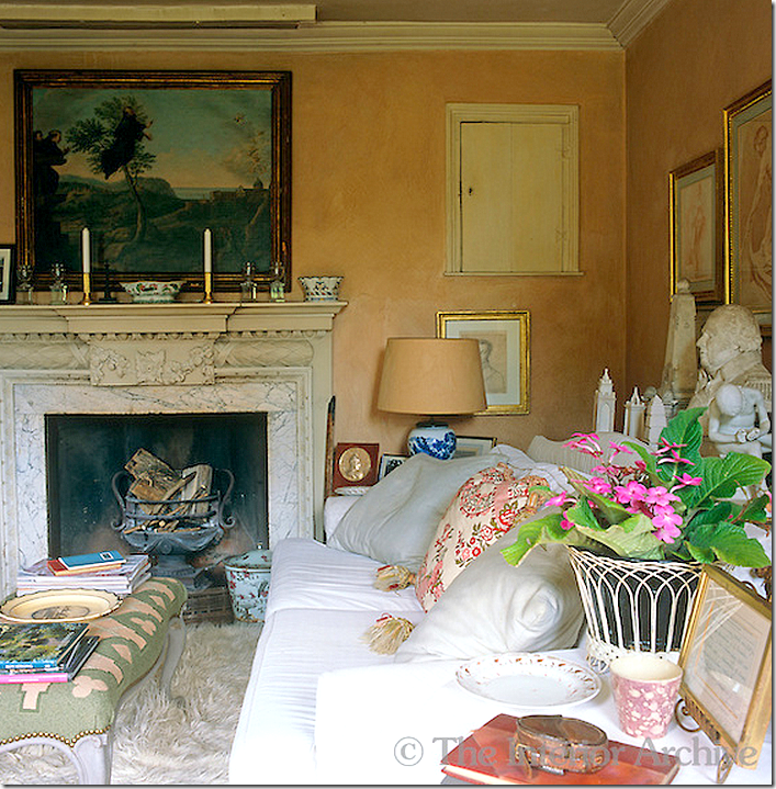
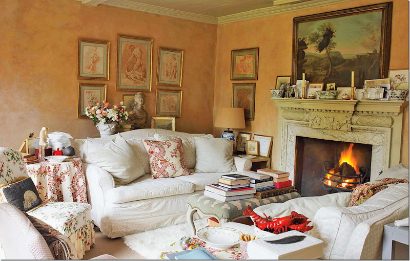
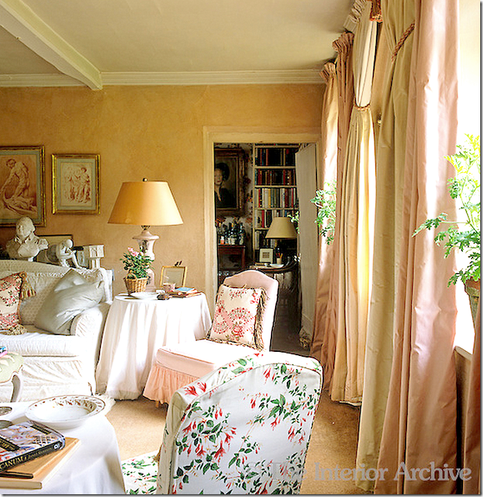
The Sitting Room, where Fowler cleaned out all the chicken mess, is used as the main lounging area. Twin sofas flank the fireplace – they are slipcovered in a John Stefanidis print that is over 30 years old. Nicky insists it looks just as good as new!
The walls are from John Fowler’s time – they were created using bull’s blood – eek! The color is pink-brown, or a perfect match to band-aids. Nicky collected all the prints that match the walls and had them framed alike.
Nicky loves Flokati rugs from Greece and he layers them over carpets. They aren’t expensive so when they get soiled, he just replaces them. I love the painting over the fireplace and I love the little cupboard door in the wall.
The view from the other side. The room is a square – 12 x 12’. More of the framed prints on this wall. In the book Nicky describes every accessory and every memento in detail.
It took Nicky many years to decide on fabrics for the front window. Through the door is the Staircase Hall.
The cover of John Fowler’s biography shows the same sitting room – as decorated by him. The walls are the same pink.
And the view across from the sofa.
THE STAIRCASE HALL:
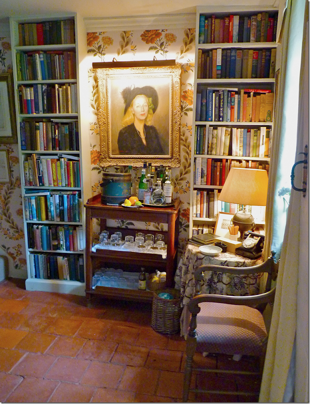
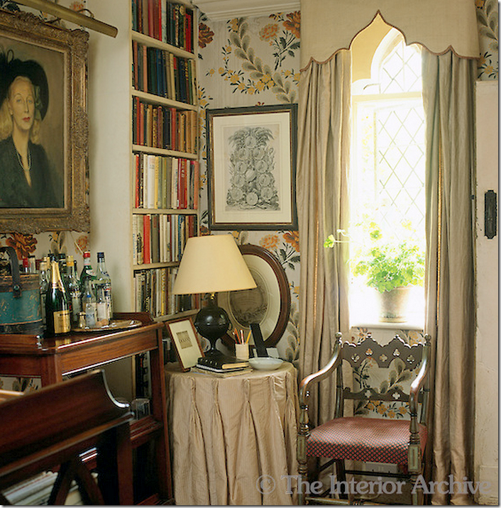
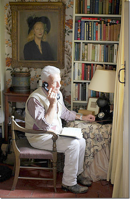
The staircase hall has the same old terra cotta tiles that are so fabulous. The portrait is of Nicky’s mother, which sits atop the drinks trolley – or bar. The room is used as a study and for the stairs and as a large telephone booth. This is where the only land line phone is kept.
An earlier photo showing a different skirted table. Many of the chairs have Gothic motifs – even though the façade is not Gothic, but Jacobean. Notice the pelmet with the red trim and how it follows the shape of the window.
Nicholas Halsam using the famous telephone!
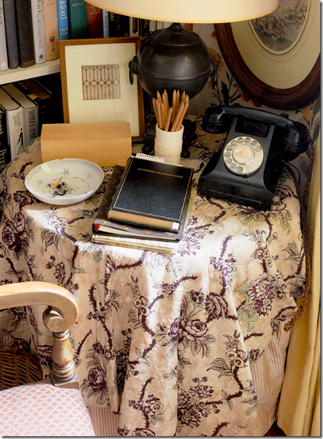
The telephone just looks old – its actually a reproduction.
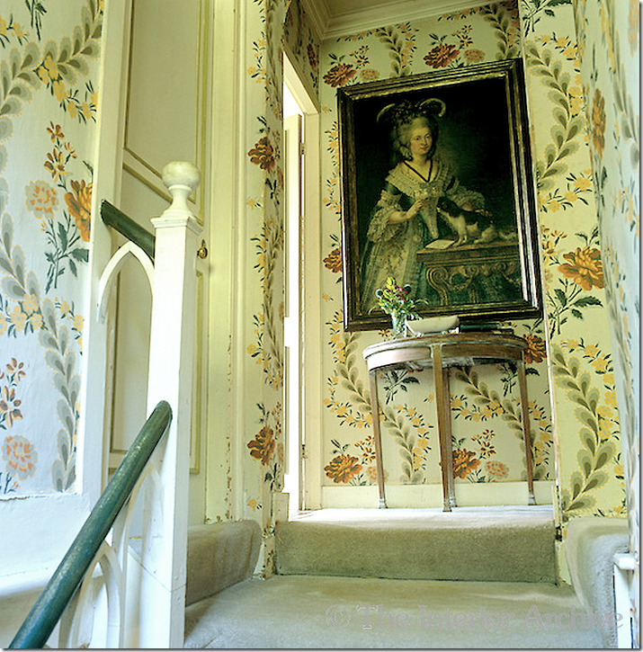
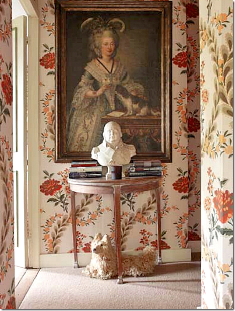
An older photograph showing the stair landing on the second floor. Fowler installed an oversized Mauny wallpaper in the hall, staircase and second floor landing. Eventually it became so old and fragile, that Nicky asked Mauny to remake the discontinued print just for him – which they did.
The second floor landing – as it is today with the toy dog under the demi lune.
The stairs with the its lantern and frames. Apparently the stairs are teeny-tiny, barely wide enough for one person to climb. Fowler and Nicky both believe that an overscaled print in a small space makes the room look bigger.
THE KITCHEN:
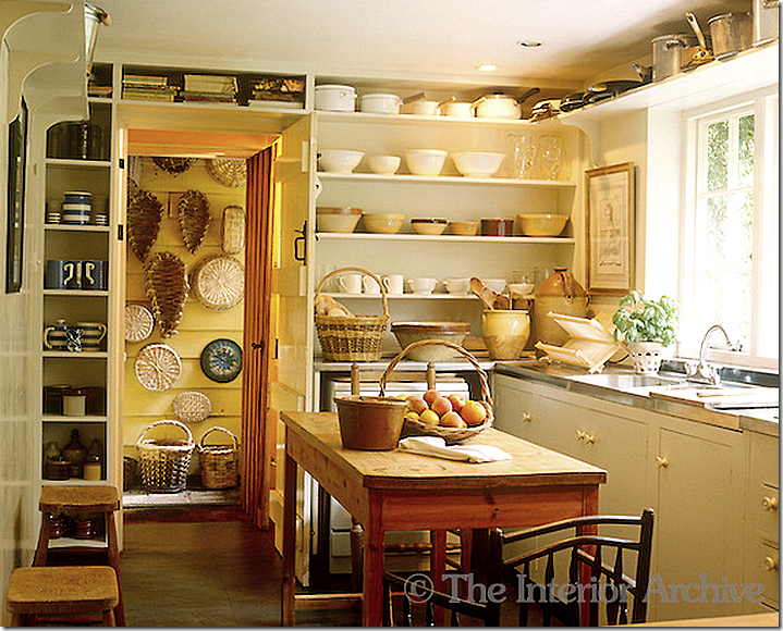
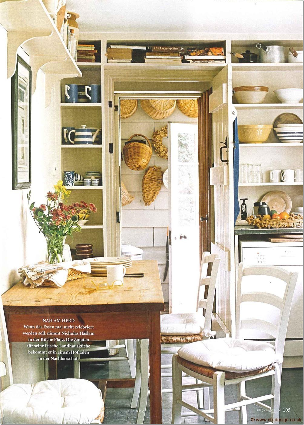
Past the stairhall is the kitchen – which was the second one added on by Fowler. The first one, behind the sitting room is now used as a pantry.
The problem with the kitchen is that this is the only way to get from the front part of the house to the library and the new extension when the guest bedrooms and dining room is. Therefore, dinner guests have to pass through the messy kitchen in order to reach the dinner party. Nicky had pieces of wood made to cover the sinks so the kitchen wouldn’t look like such a mess to the dinner guests. I spent a few hours looking at the floor plans trying to figure out a better way to move traffic through the house. Call me Nicky!!!
Past the kitchen is the back door hall where baskets line the walls. This leads to the both the Flower Room and the Library, which leads to the new extension where the dining room and guest bedrooms are.
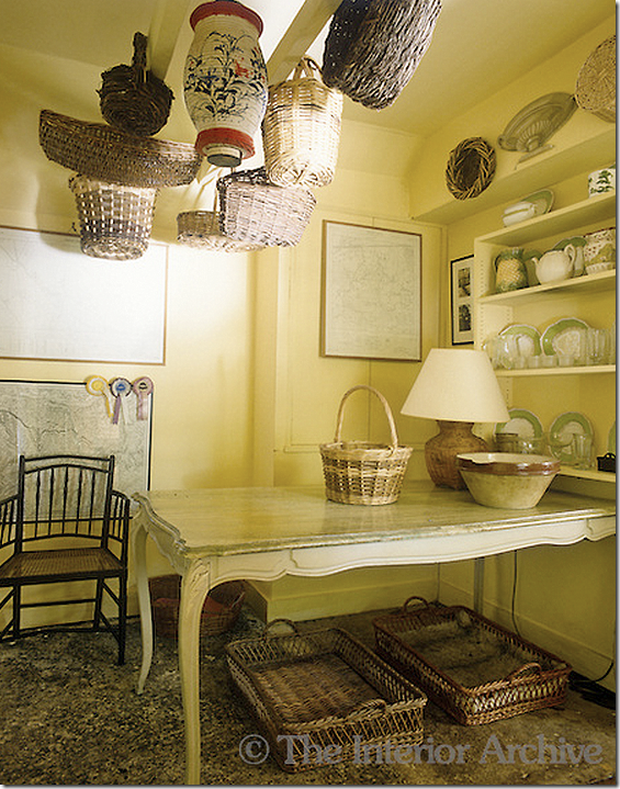
The utility room off the Flower Room. Love the cabinet doors and that old sink!!
And the Flower Room – which at one time held the dining room table. Today, there is a desk here instead – and this table was moved into the new dining room. This is where the flowers are all arranged and put in vases.
THE LIBRARY:
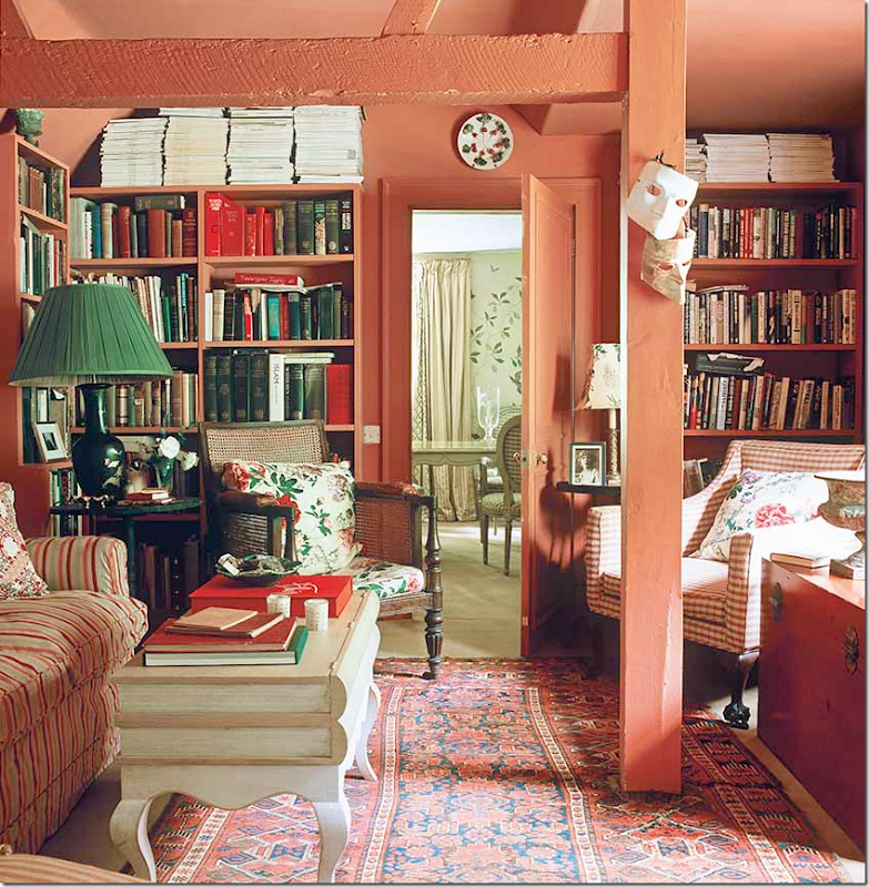
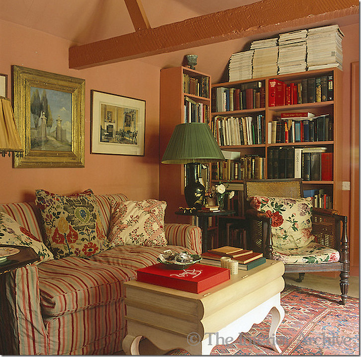
The red library was once the horse stables. The library connects the old hunting lodge with the newer back extension that Fowler created out of outbuildings into much needed guest quarters. Through the door you can see into the new dining room which Nicky created in the extension.
The coffee table is made of two false books on top of a table. As it is all over the house – the library is filled with books.
THE DINING ROOM:
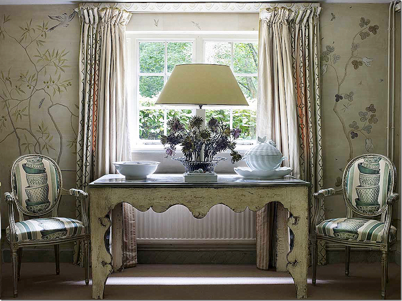
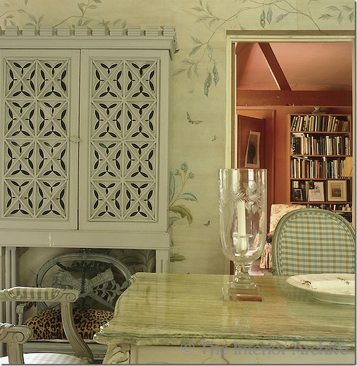
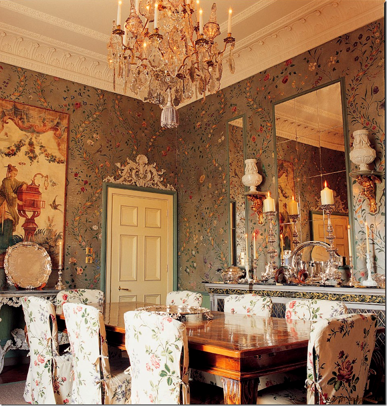
Nicky’s new dining room was recently created out of two smaller rooms in the extension at the back of the lodge. While the walls look like hand painted wallpaper – they are actually hand painted. The table at the window was cut in half – the other half in is the Garden Room. The chairs wear a new fabric – before they were covered in green checks which Nicky felt was too Swedish looking. The lamp is incredible – it is metal flowers and Nicky says it’s impossible to move.
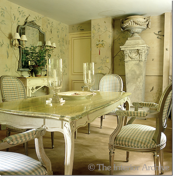
The table which was once in the Flower Room. Notice the large column and urn – Nicky designed the column. And here is my main issue with the house – the carpet!!! I don’t understand the carpet!! Why not put wood down or seagrass instead or more of that wonderful terra cotta tile? I hate to say this but there is carpet in the bathrooms too! OK – this is a more English thing than an American thing, I know. This is an older picture and the carpet has since been replaced with a flat weave grayish carpet – but still….
The walls were painted to look like paper – including seams and even “torn” areas. Here you can see the “seam.” Also you can see the new carpet here. I do prefer the old check fabric, but I’m a sucker for checks. The dining room is one of my favorites in the house - I love the way the walls were painted.
And looking back through to the library. Unfortunately, in the book, Nicky doesn’t show the rest of the new extension with its study and two guest bedrooms on the second floor.
UPSTAIRS IN THE ORIGINAL HUNTING LODGE:
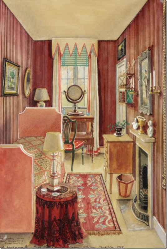
There are three bedrooms in the main house. Two are tiny and one is the master bedroom. Fowler actually slept in one of the tiny bedrooms instead of the main one. The two smaller bedrooms share a bath. Nicky says that when he has only one guest – he gives them both bedrooms – one to sleep in and one with the luggage to dress in. Above is the tiny red bedroom with its striped walls. Again, Nicky believes that bold, large patterns are better for small rooms and that they actually make a room feel bigger. I am beginning to agree with this.
Here is a painting of the same room – as it was decorated under Fowler. He used red stripes too.
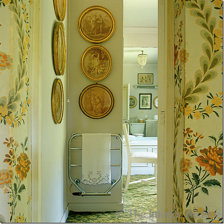
The upstairs bathroom – showing the Mauny wallpaper off the hall. You can see the green and white carpet that is in the bathrooms. One thing that Nicky collects are frames. He has framed prints on every wall in the lodge. I love these round ones!
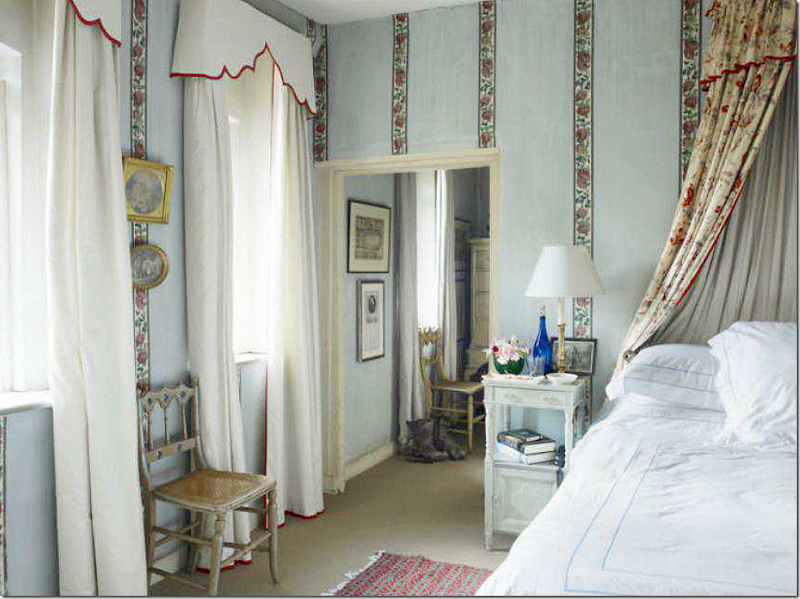
An older picture of the master bedroom and dressing room. The walls are as Fowler decorated them using a soft aqua wash with Mauny wallpaper stripes. The carpet has been changed since this picture was taken, but I love it!
As the main bedroom looks today – with the curtains showing the red trim and the familiar shaped pelmets.
THE GARDENS:
In front of the house is a large lawn, which Nicky has mowed in a checkerboard pattern. The lawn is surrounded by clipped hornbeam – which makes it seem like a room. Past this area are flower beds.
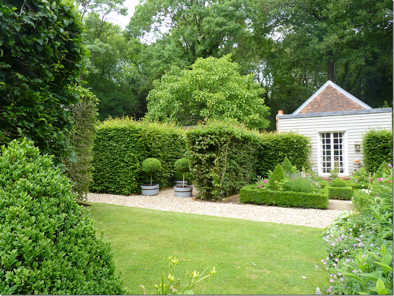
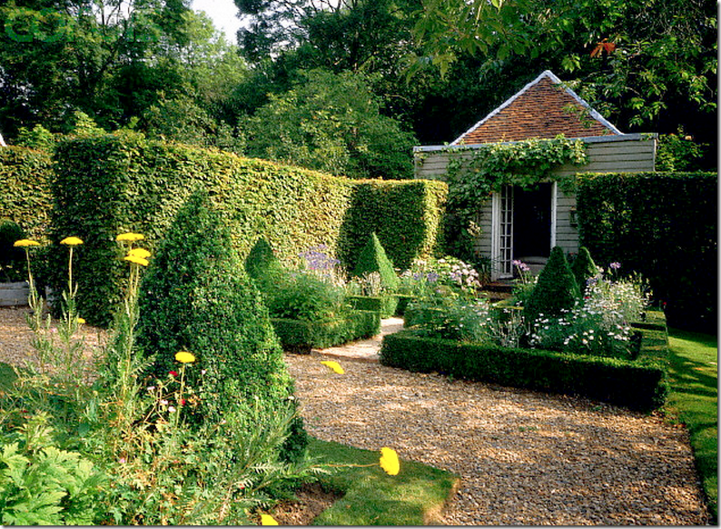
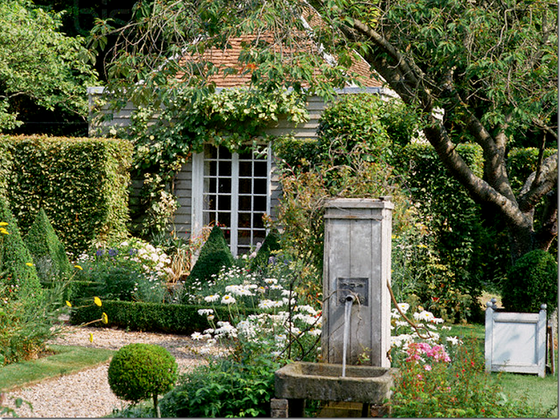
Clipped box and flowers outside the Garden Room.
Past the front lawn and two pavilions is the Garden Room, which Fowler built in his later years. Attached to this room is a conservatory which is used for dinner parties.
Another view of the Garden Room and gravel paths.
The fountain outside the Garden Room.
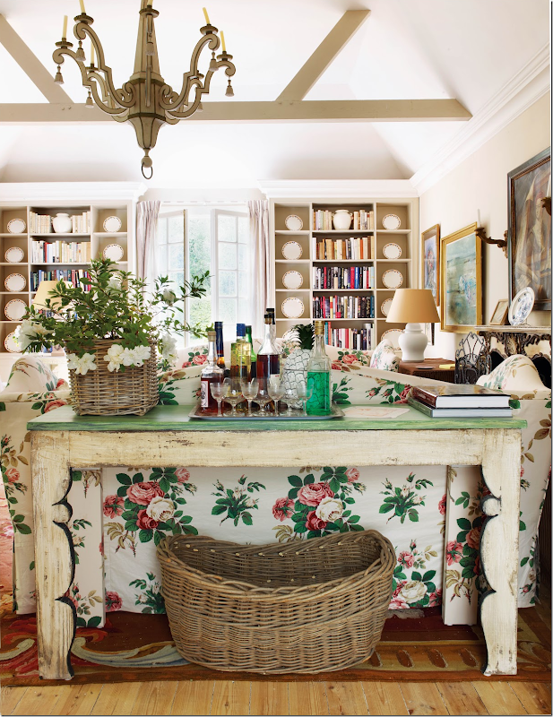
The Garden Room. Nicky added a fireplace to this room which causes him to use it even more now. Fowler also used this room a lot – almost forgetting about the hunting lodge. I think I might live back here too! The console shown here is the second piece of the one in the dining room that Nicky divided in half. Notice the back legs are covered in the chintz on the sofa so the rustic legs will blend in.
The sofas and chairs are slipped in the chintz Georgina by Nicholas Herbert. Underneath is hardwoods and a antique rug.
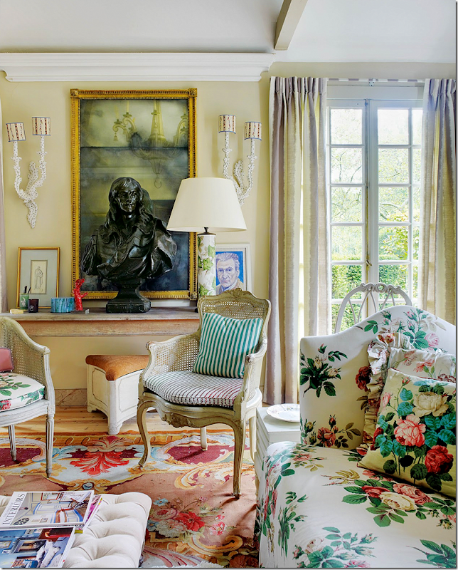
The two sofas facing each other along with two different painted French caned chairs. I love the plates in the shelves.
And looking towards the conservatory where dinner is served. I am obsessed with this room!! I think it’s gorgeous – the high ceiling with beams, the wonderful chintz slipcovers, the fireplace, the chest, the hardwood floors, the French doors, and the painted French caned chairs. I can’t stop thinking about this room and wondering, do I want chintz again???? Thinking maybe I should slip two chairs in my family room with this chintz. Totally obsessing!! This room just hit me a way that few have. Oh well…
MORE DESIGNS BY NICHOLAS HASLAM USING CHINTZ:
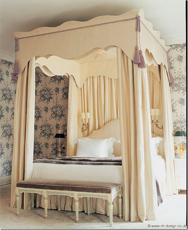
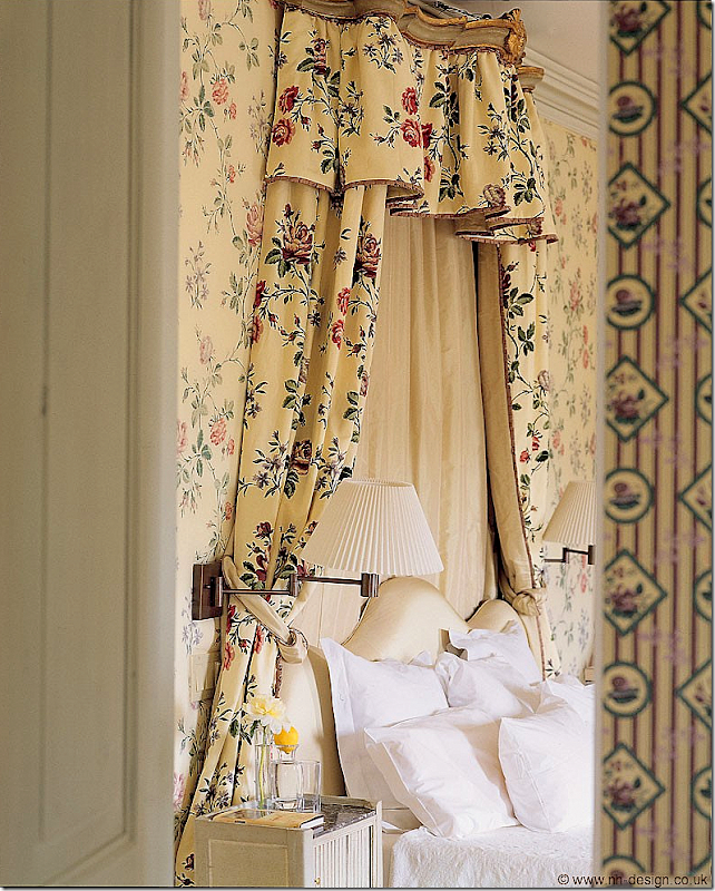
Obsessing over the chintz in the Garden Room made me want to see more rooms Nicky designed using chintz. I didn’t have to look hard – he obviously loves chintz. This bedroom is gorgeous. The chintz is so pretty – used everywhere in the room. It’s a smaller print than the one in Nicky’s Garden Room. I think I like the bigger print best.
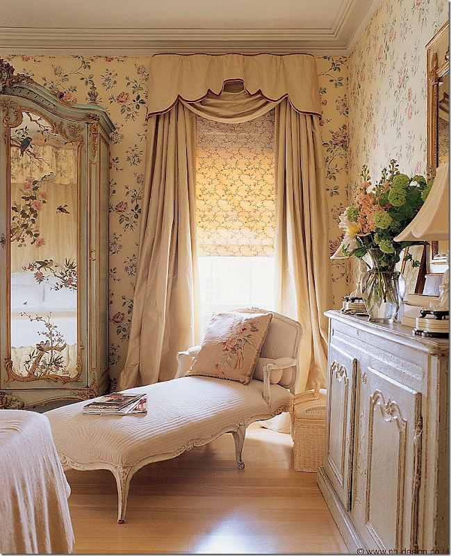
This bedroom has a chintz on the walls that Nicky designed himself.
I love this bedroom - with the chintz Bowood that John Fowler designed after finding a relic of it at Bowood House. Remember Tory Burch used this same fabric in her gorgeous living room? I love the furniture and the door and the curtains. So pretty!!
In this bedroom in New Orleans, Nicky used a chintz by Georges La Manch.
And the other side of the beautiful bedroom in New Orleans.
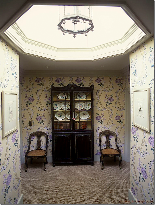
On this landing he used the same Mauny print again – this time in a purple colorway.
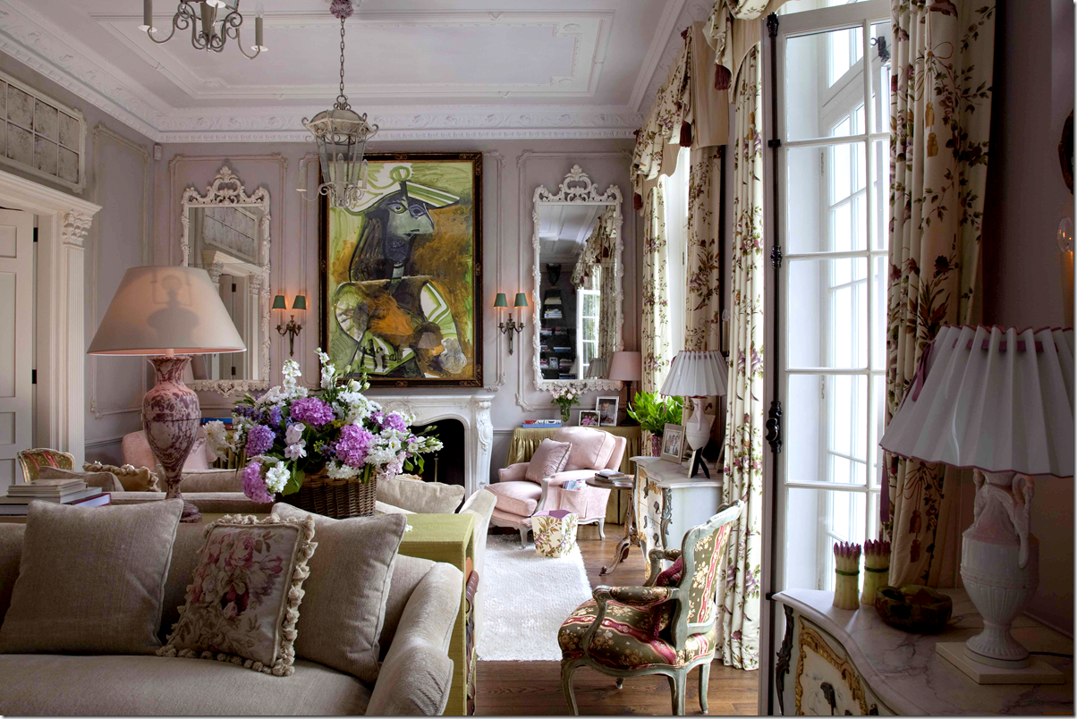
This living room is gorgeous – notice the Picasso (how can you miss it!!!) Love the chintz at the windows. It looks so fresh to me to have chintz at the windows.
In this New Orleans living room he used a chintz with a blue background. I prefer the white or cream backgrounds. Those two chandeliers!!! The wallpaper!!!
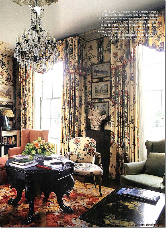
This room uses an 18th century Claremont chintz, Les Raisins.
To die for!!! Chintz slips on the chairs.
This small English country house reminds me of Nicky’s. Chintz on the chairs. I LOVE this room!!
The entry hall of the same house – again Nicky used the Mauny chintz. Love the silk curtains with the blue lining.
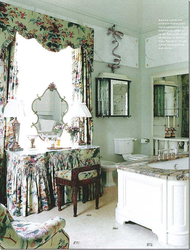
And even in the bathroom – a chintz with a yellow background!
Sooo, chintz?
Yes or no????
What do you think?
To order Nicky Haslam’s book on this country house, click below:
To order the biography of John Fowler, click below:
AND – look!! Mario Buatta has a design book coming out – FINALLY!! By Emily Evans Eerdmans and Paige Rense. Due out in October.
Pre order by clicking below:


![5176_843a4d7fb5b1641b0bb8e3c2b2e7523[2] 5176_843a4d7fb5b1641b0bb8e3c2b2e7523[2]](http://lh6.ggpht.com/-trbGCg4o3FE/UZFlBX-jhxI/AAAAAAAB0iw/2PN_JrrGzsc/5176_843a4d7fb5b1641b0bb8e3c2b2e7523%25255B2%25255D_thumb.jpg?imgmax=800)



![image_thumb131[1] image_thumb131[1]](http://lh5.ggpht.com/-KYQbSgVJ7VQ/UZFnL2xsuVI/AAAAAAAB0qg/tFvOyvwEkww/image_thumb131%25255B1%25255D_thumb.png?imgmax=800)










0 comments:
Post a Comment