This three story, stone house is located near mine – right on the route to my hairdresser’s, so you know I’ve driven by it a million and one times. I watched it being built about five years ago and have been anxious to see the inside of it ever since.
Imagine how ecstatic I was when the owner submitted the house for the Aidan Gray catalogue contest! Finally, I got to get a glimpse at the interiors and they were even prettier than I imagined.
I truly thought this house was a shoe-in for the prize, but while it made the semi-finals, it didn’t make the finals. Still don’t understand why not!!!! But then again, most of the houses submitted were pretty enough to be a winner.
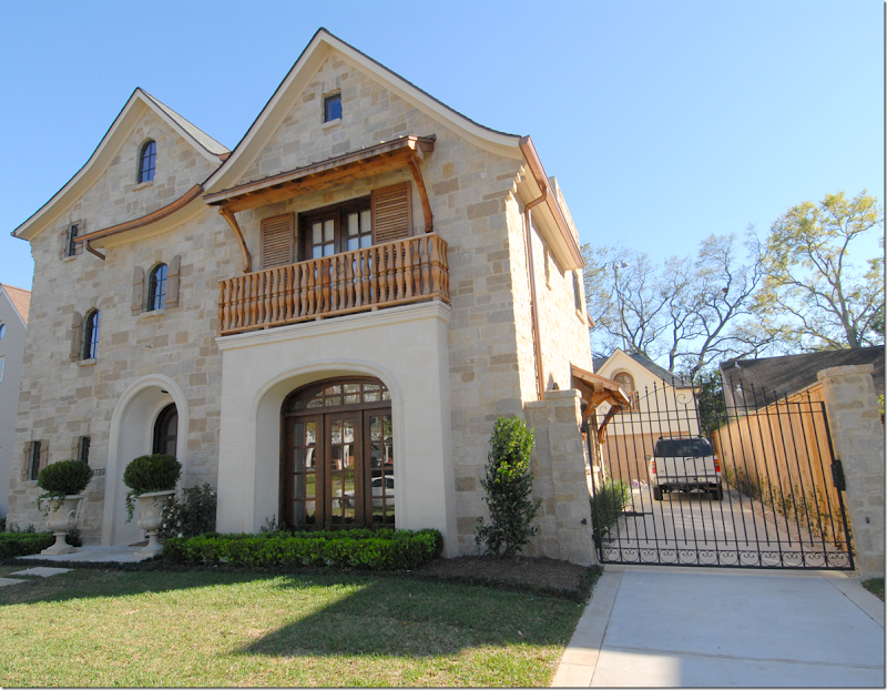
Notice in this picture the cute wood awning on the right side of the house. And notice the pretty iron detailing on the driveway gate.
Enjoy!!!
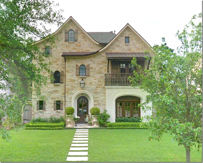
Three stories of stone and stucco, wonderful shutters, arches and balconies. I love the way they used pavers instead of a concrete sidewalk – and I love the clipped box shaped into big rectangles. Notice the charming gate at the left of the house.
At the right of the center hall is the dining room where the large front window is, and at the left is the grand winding staircase that reaches up three floors. The living room is at the left of the hall and the family room and kitchen are along the back of the house.
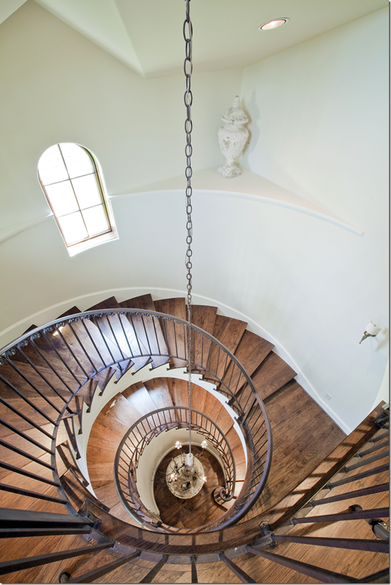
Reaching up three stories, the winding staircase has iron railings and wood treads. At the ceiling of the highest floor a large Italian styled chandelier hangs down. Lighting the way are sconces that are placed along the curved walls. I really like the railings – simple, yet pretty, with just a tiny bit of curved detail at the top. Perfect!
And looking down from the top level. See that niche? I like the way she accessorized it with just a single crusty urn. No silk flower arrangement, no “wow look at me” lighted spotlight – just an elegant urn. Again, just perfect! It looks like there is a round skirted table in the entry – but no picture of that!!!!
In West University, usually when there is a third floor, it is just a room or two - a media room, a guest suite, a playroom. There aren’t any pictures from the top floor so I’m assuming it’s probably one of those choices. I wish we had one!
Having that third floor is such a bonus!
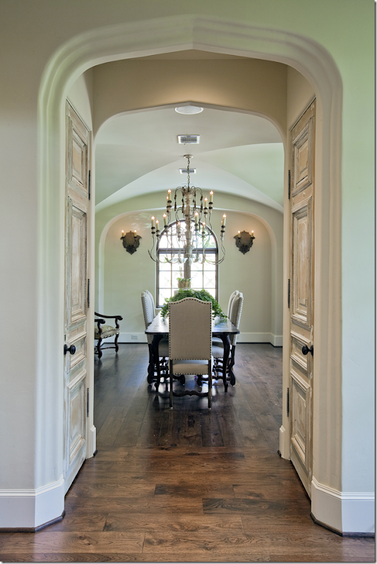
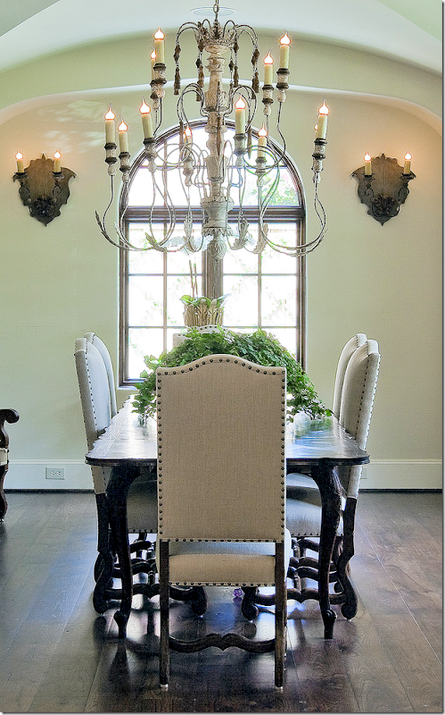
Off to the right of the front door is the dining room. Notice the two doors – are they old or faux painted? Either way I love them! The more special you can make your doors, the more special it makes your house. Along with the large window that faces the front of the house, there is an arched window to the side with adds a visual destination for the eye when looking into this room. Notice the elegant groined ceiling and notice the way there is an arch around the window wall, making an alcove of sorts. Great architectural features.
Here’s a close of the room – the chandelier is incredible! I love its size. Pretty Os de Mouton leg chairs with nailheads and trim. And I love those sconces!!!
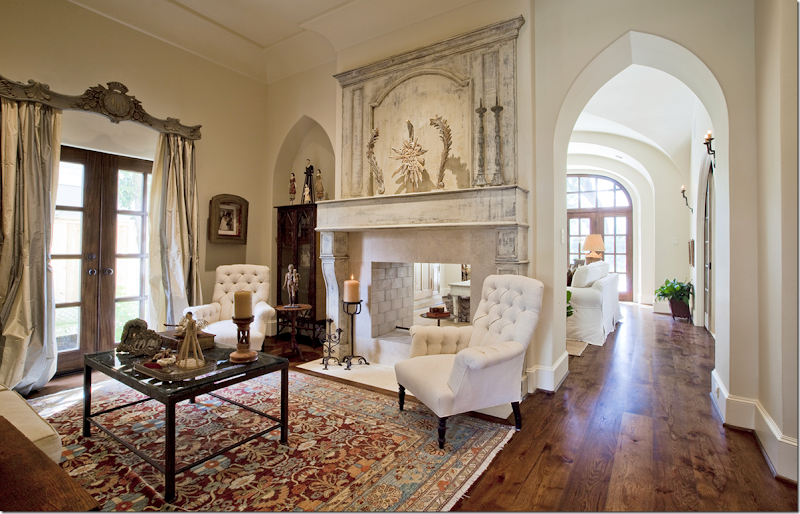
To the left of the front door is the living room. The large fireplace opens to the family room behind it. Beautiful striped silk curtains – constructed perfectly! And the antique cornice piece – to die for!!!!! More features – the pointed arches over the doorway and the shelves. And notice how thick the wall is. Also notice the beautiful crown molding – simple, yet so gorgeous. I like her collection of Santos spread around the room.
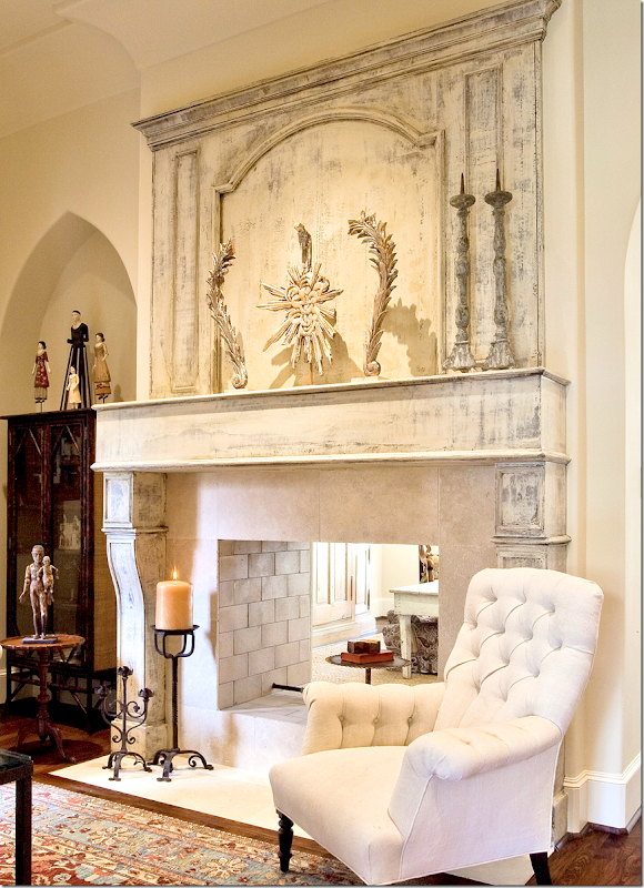
The showstopper of the room is the fireplace and its beautiful, painted wood mantel. Again, not sure if it is old or not – but who cares??? It’s beyond FABULOUS!!!!!!!!! There’s a large trumeau above the mantel which is decorated with a few water gilded pieces. Limestone surround and beautiful stone bricks inside. This is really, really beautiful. Makes the whole room!!!
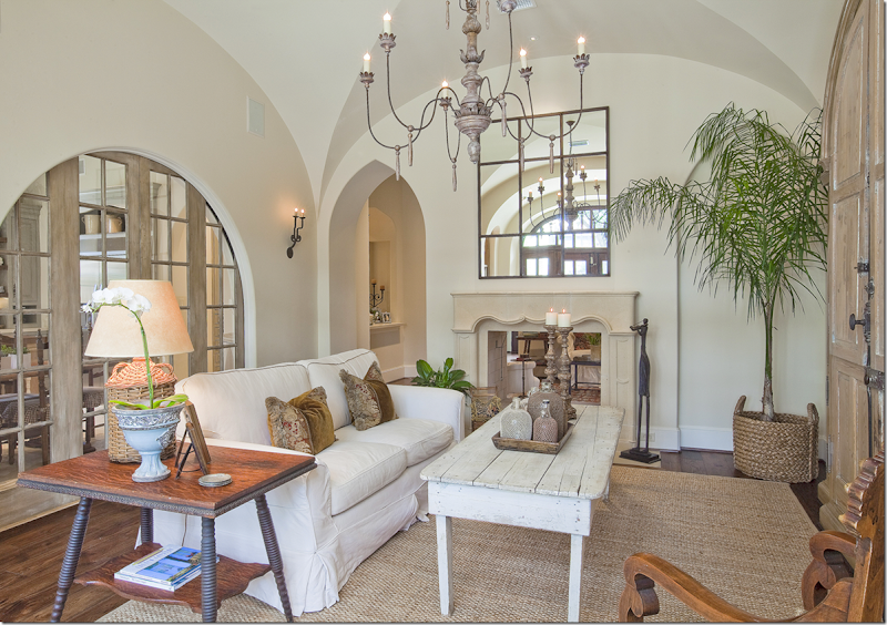
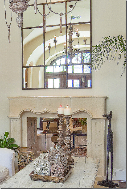
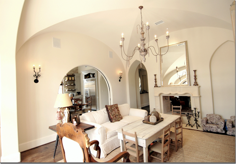
On the other side of the living room is the comfy family room. This fireplace is a French inspired stone mantel – not quite as grand as the living room, but just as pretty. Above is a paned mirror that mimics the arched doors between the family room and the kitchen. Again, those doors are architecturally beautiful. And there is another elegant groined ceiling in this room. I’m dying to know who the architect was!!!!!! The wicker bottle lamp is repeated with a collection of bottles on the coffee table. And through the arched doorway – you can see the wet bar on the left.
A close up of the mantel and the accessories on the coffee table – an assortment of mesh covered bottles!! Love!
Here is what it looks like with the doors open to the kitchen. Notice the iron sconces. And the chandelier is wonderful here too!!! This is an earlier picture – the mirror is different here and so is the pillow. You can tell it’s a happy, family home – love the little chairs for the kids pulled up to the coffee table.
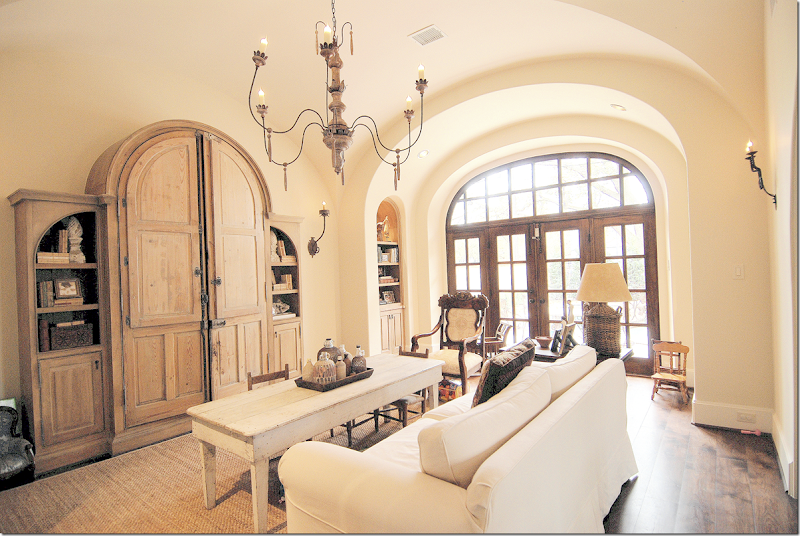
Looking towards the back yard, you can see the arch around the French doors – just like in the dining room. Arched bookcases are on each side of the alcove. And, the pine bookcase with its own arches is the perfect shape for this house. More sconces on this wall – this time with one tall arm.
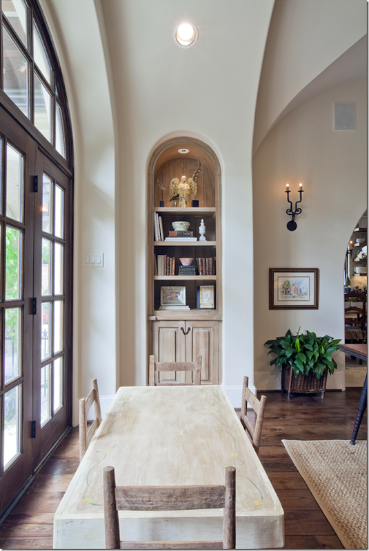
In the arched alcove near the window – you can see the bookcases with their wonderful paint treatment. Love the kids table here – great for art projects!!!!
Ready for the kitchen??????
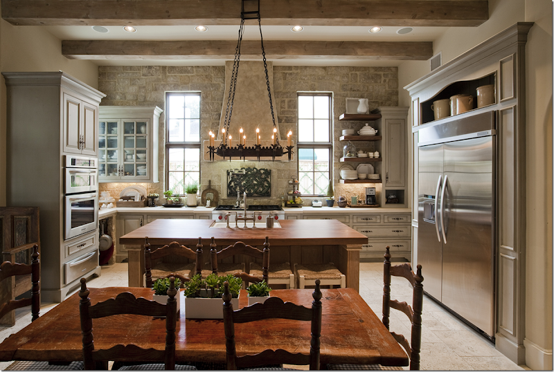
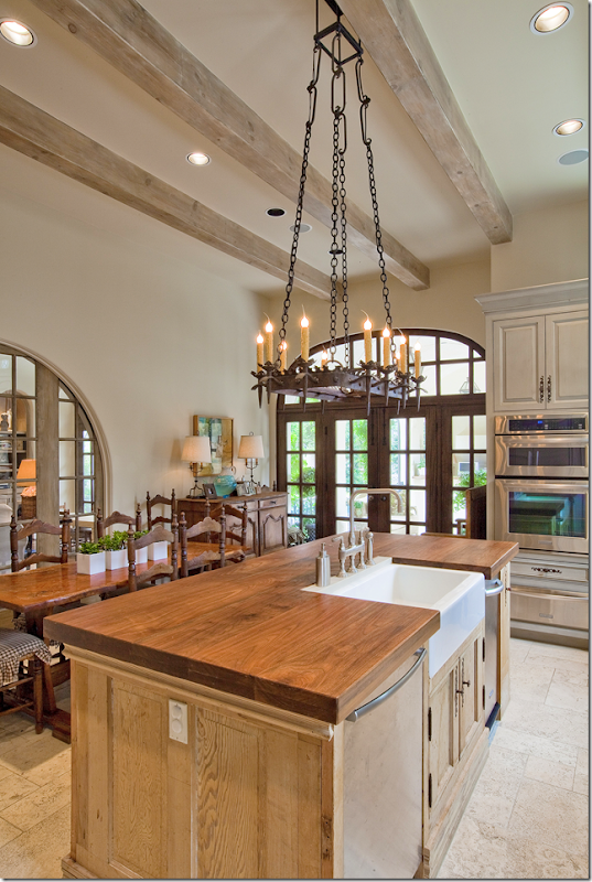
Beamed ceiling, with a back wall of stone – the kitchen is warm and friendly, yet sophisticated. The range sits along the back wall while the sink is in the island. In front sits a French table with chairs. Notice the wood surround around the refrigerator – and I love that open shelf filled with yellow ware!!! The floor in the kitchen and adjoining butler’s pantry/wet bar is limestone.
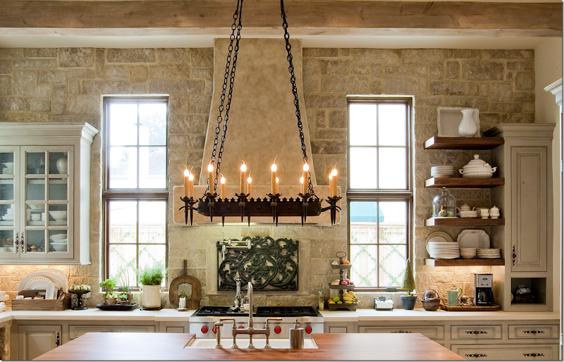
Here’s a closeup of the cooktop with its stone hood and stone wall. I love the stone!!! The countertops are limestone (I think!) – and the island is wood. Pretty open shelves on the right side. Love the subtle paint treatment on the cabinetry. And notice the iron chandelier over the island. There’s another iron piece that is imbedded in the stone wall, over the cooktop. This really shows you that kitchens don’t have to be all white or dark – you can use beige as a base color and get this look!!! But, then again, you’ll need a stone wall and beautiful windows, beams, cabinets, and on and on!!!
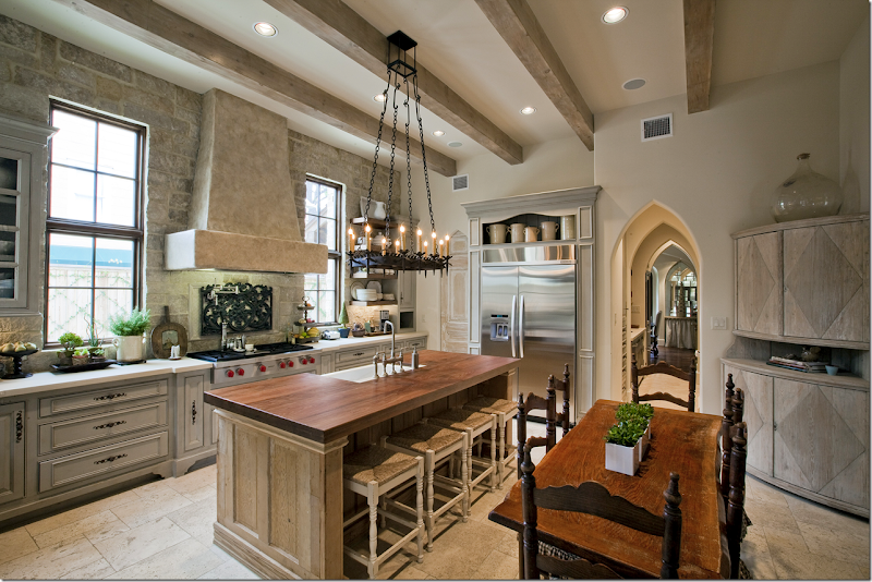
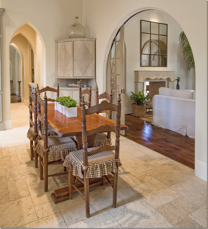
Another view. In the right corner is a wonderful antique Swedish cabinet! Love the large demijohn above that makes the piece seem taller. Through the doorway is the butlers pantry/wet bar – that leads to the dining room. Look at those series of pointed arches!!! SOOO pretty. Notice to the left of the refrigerator – the pantry door is arched and fauxed.
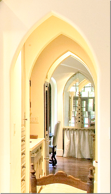
Closeup view from the kitchen into the dining room. It looks like there is a skirted console in the dining room in a mirrored arched alcove – wish I had a bigger picture of that! I wonder if there are two of those – one on each side of the front window?
Looking towards the backyard through the French doors.
Along the back wall is an antique French buffet. Pretty faucet and farm sink.
And the view into the family room and the butler’s pantry/wet bar. I’m in love with those sliding doors that separate the kitchen and the family room. Actually that is a perfect idea. If you have an open living concept and ever have a fancy dinner party – you know that having help in the kitchen can kill the mood of the party. The caterers or cleaners are banging and clanging the pots and pans, plus there is all that heat from the kitchen – with doors like this, you just close off the kitchen from the entertaining areas!! Perfect solution!!!
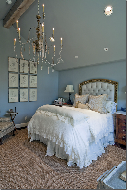
The master bedroom has pretty French blue walls and another killer chandelier. The ceiling is vaulted and beamed – but the dark wall color, also on the ceiling, along with the large chandelier, tends to make the room seem cozy, even those it’s vaulted. Also, notice how low the sides of the vault are – maybe just 7’. Another great way to cozy up a high ceiling room. Who is the architect?????
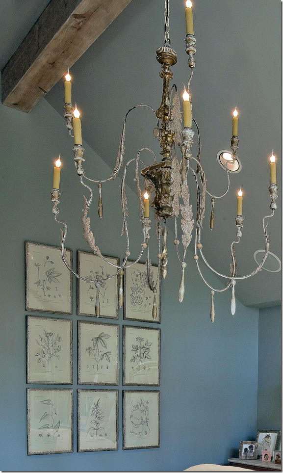
Closeup of the beautiful chandelier and the set of framed prints – love!
And another close up of the headboard – which is so beautiful. It looks like a gilded picture frame, while the inside is a tufted blue linen. Such a pretty room!!!! Dying to know where that headboard came from?!!!
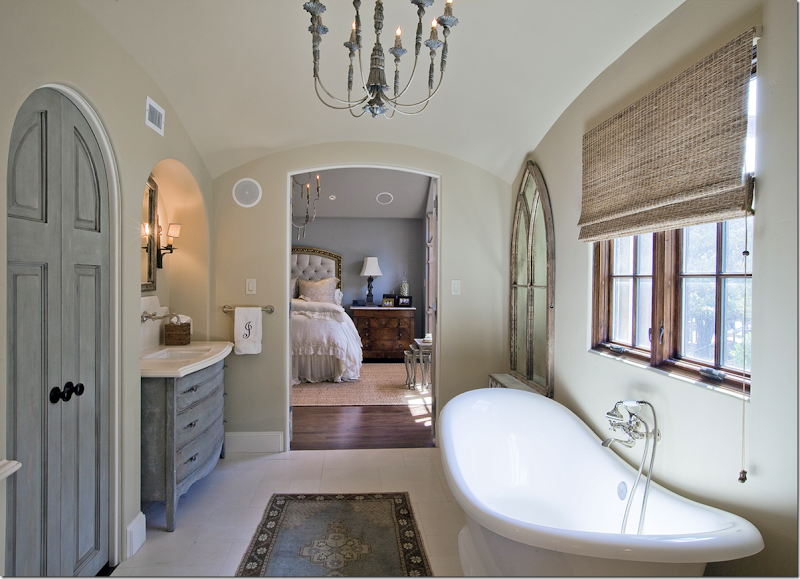
And the pretty master bathroom. The sink cabinets are painted blue – and so is the closet door. Notice how pretty that arched door is – it really becomes an focal point!!! Notice the limestone backsplash over the sink – and how the faucet is installed there. Love that look. The bath is also beautiful, right under the wood windows. Arched mirrors flank the tub. Love the bathroom rug – instead of a bathmat. And of course, there is a pretty chandelier, this time painted a soft blue.
And finally – the back yard has a covered porch, with more arches. This leads off the kitchen and the other window is off the family room. There’s a stone fireplace on the porch!! So nice. Hey, I have that same concrete table! Love all the lanterns and well, I just love this house!!!!
A huge thank you to the homeowner who shared this beauty with us today. I’m in love, that’s for sure.




0 comments:
Post a Comment