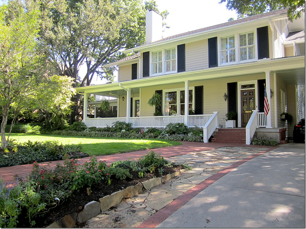
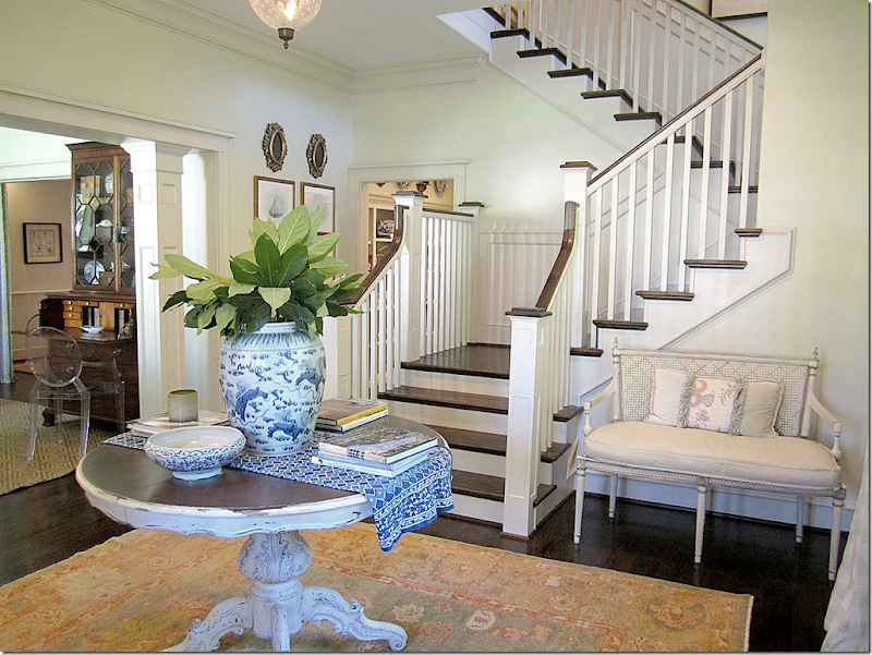
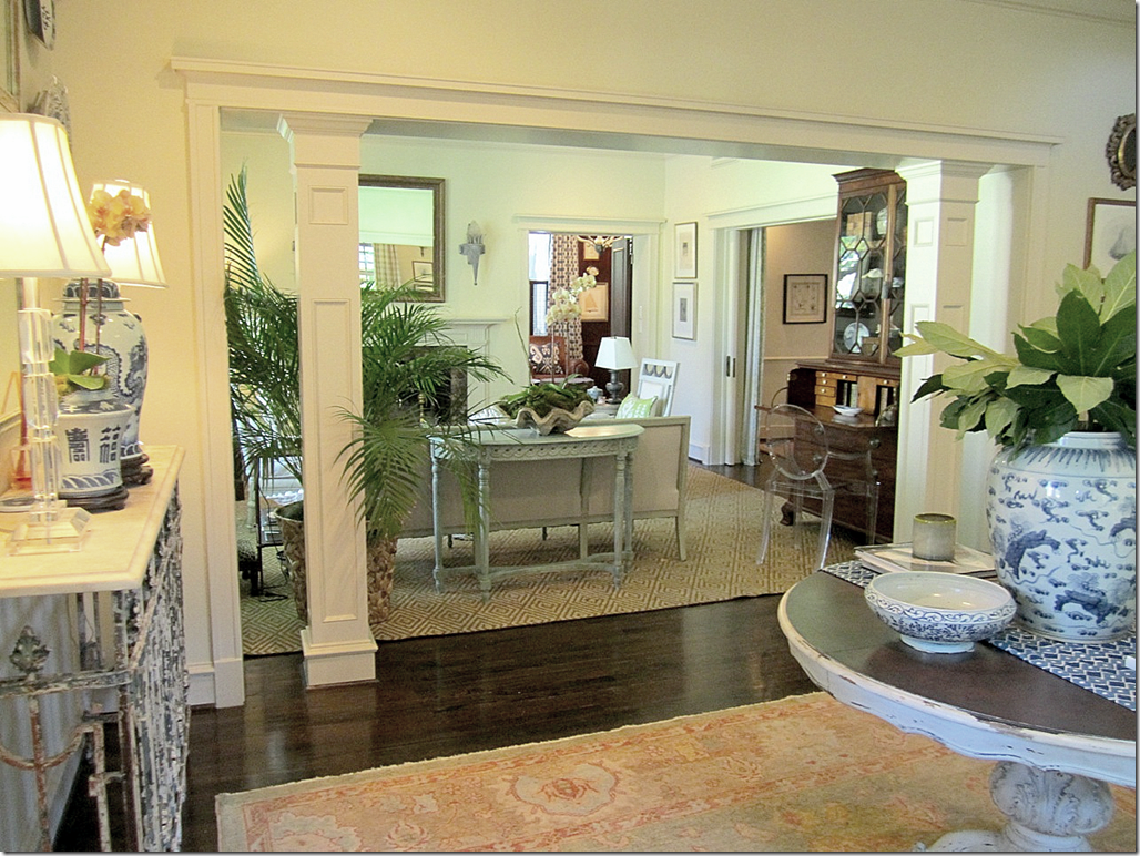
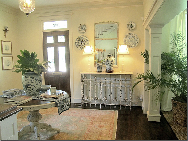
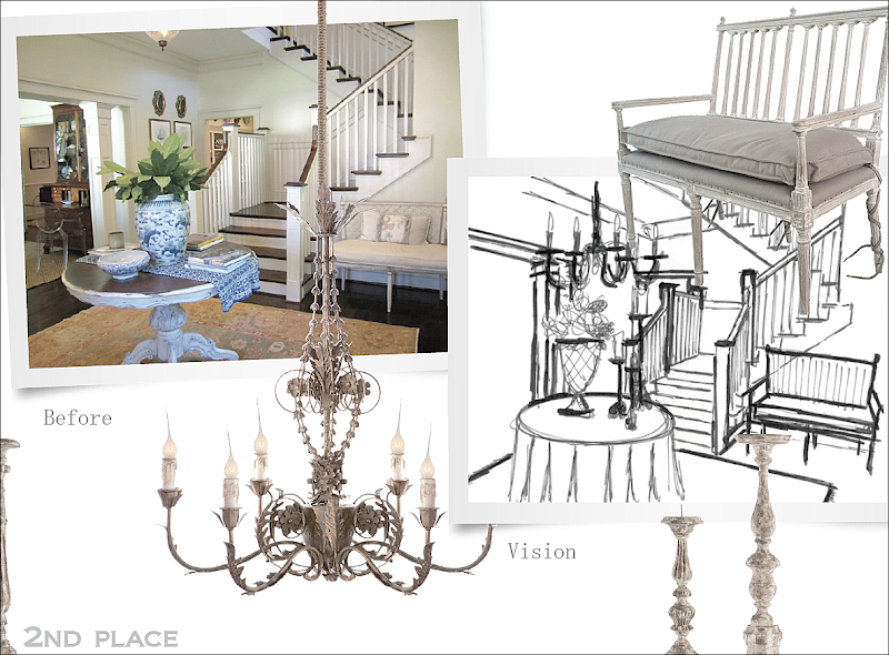
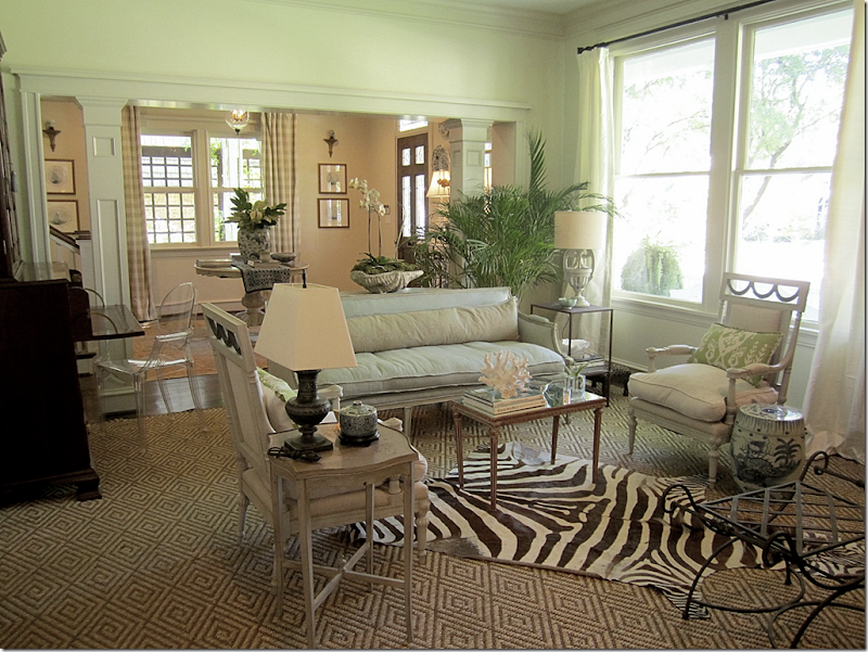
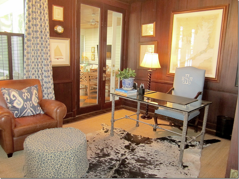
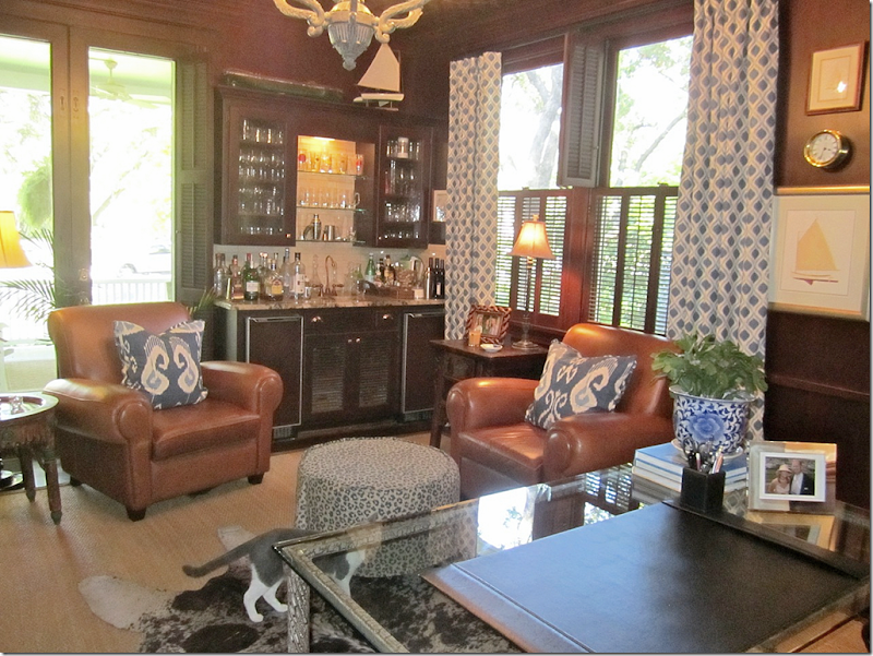
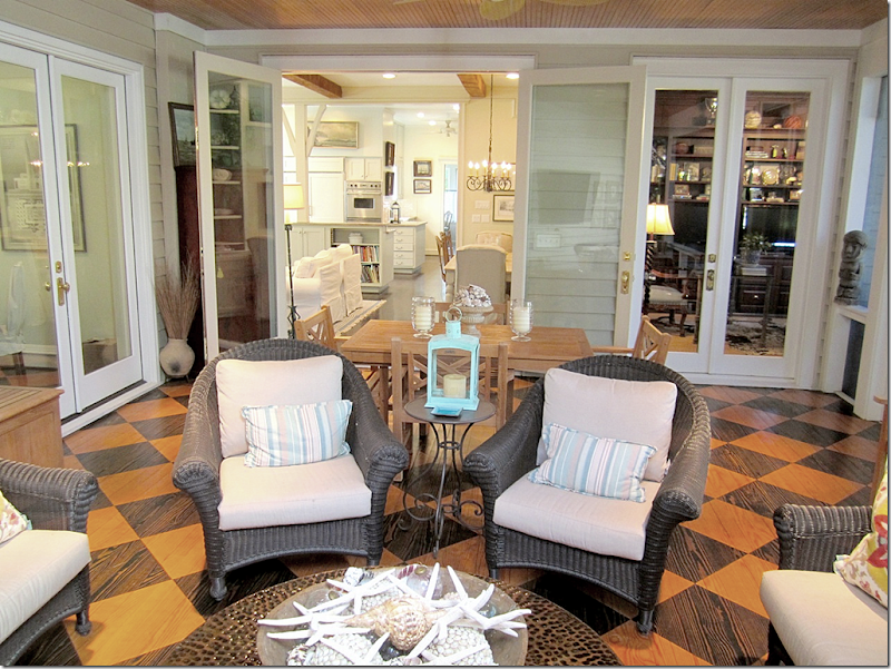
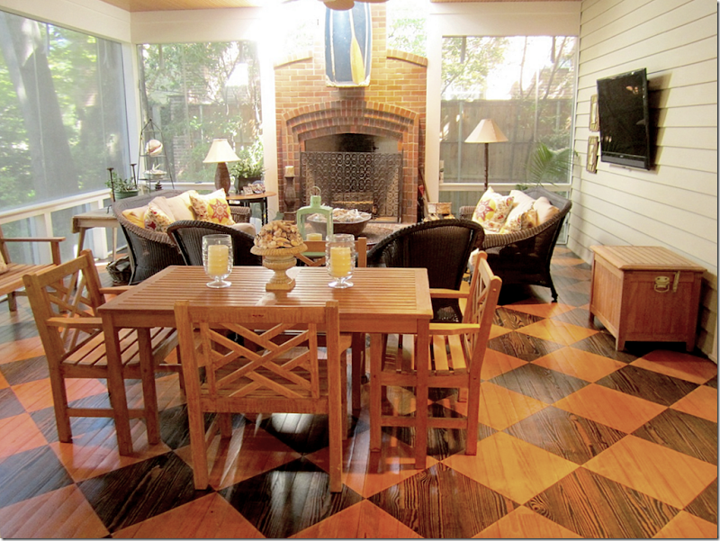
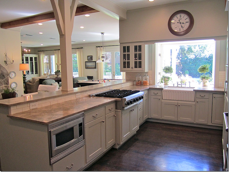
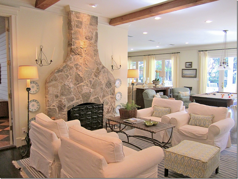
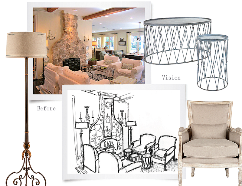
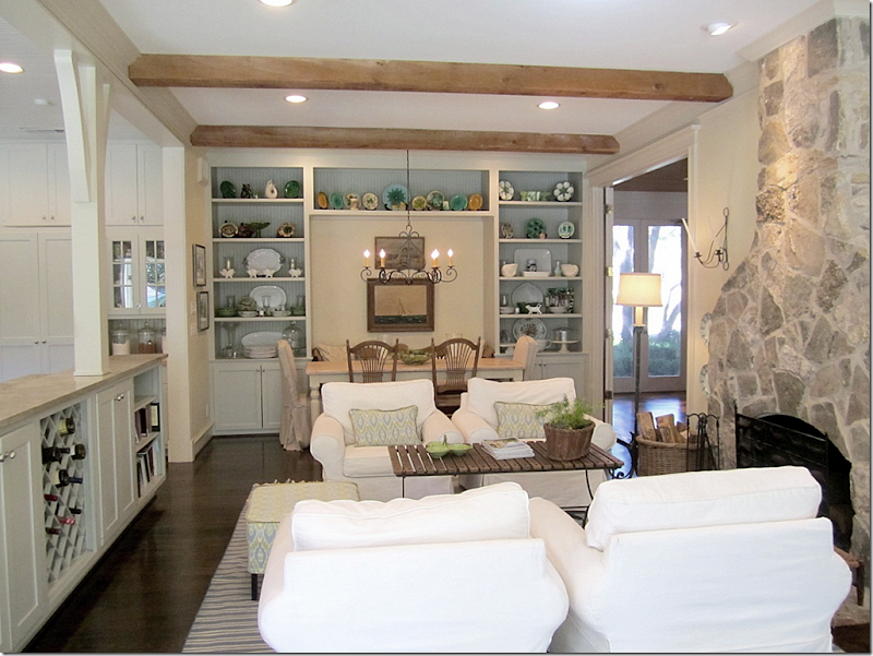
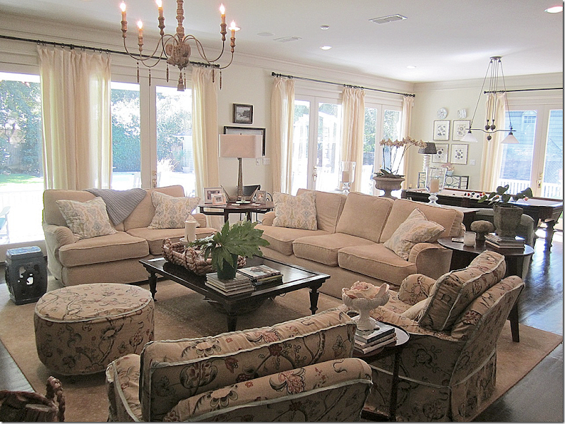
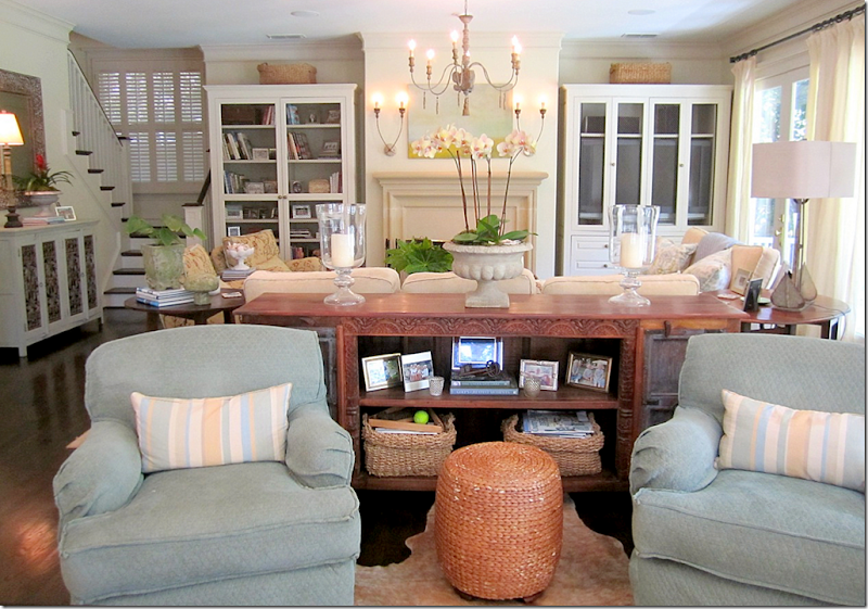
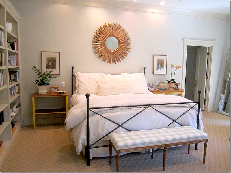
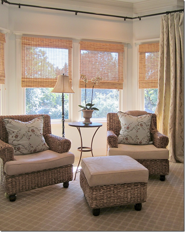
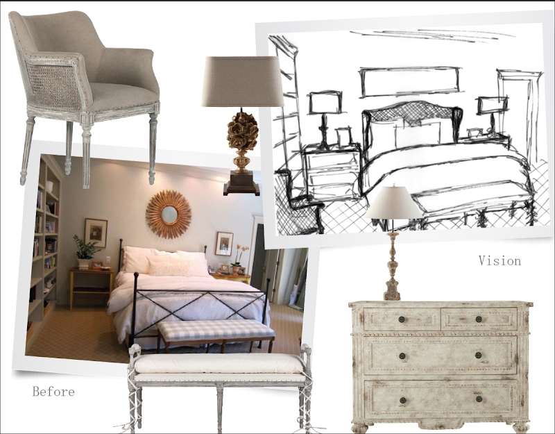
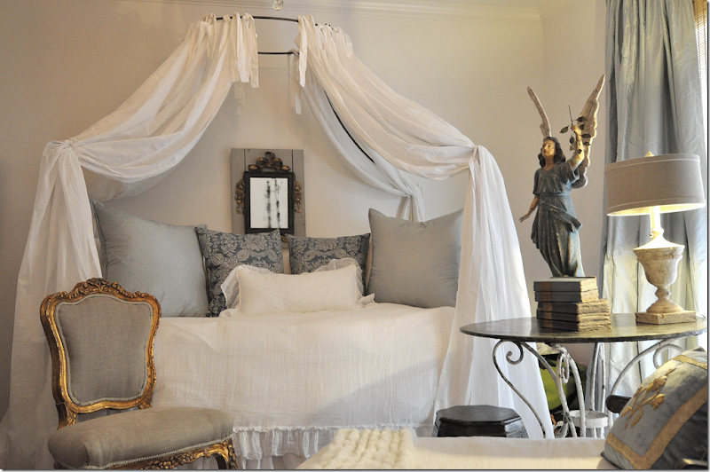
This large, older house located in Texas, is the 2nd place winner in the Aidan Gray Catalogue contest!!They don’t build houses like this anymore – with large foyers that are the size of a room!! What would you do to have a foyer like this??? The owner placed a center table right in the middle and topped it with blue and white items. There’s a lovely antique bench, but the focal point is definitely the staircase! This room is what caught Randal Week’s eye when choosing a winner.Through columns, to the left, is the living room, and you can see further back into the library.And looking the other direction, next to the front door with its beautiful transom with the address (love that detail!) – is an antique iron console with more blue and white porcelains. The room is so lovely – what a wonderful introduction to a house!And here is what Randal hopes to photograph in the entry – he wants a skirted table topped with Aidan Gray candlesticks and wire baskets. He’ll add their own chandelier (and wow – I love this chandy!!) along with their own bench. It will be interesting to see if the final photograph really looks like this drawing!The living room has a sisal carpet with a zebra, mixed with a French sofa and arm chairs. The colors found here are found throughout the house – light blues mixed with creams.And looking the other direction – love the fireplace and the clam shell filled with orchids! The sofa is especially beautiful too. Next – is the library, seen through the door.The paneled library continues with the light blue colors – here, mixed with leathers. Love the curtains and ikat pillows and the monogrammed chair!! And those maps! Through the door is the screened in porch that sits at the front of the house, on the left side.Another view of the library, showing the fabulous bar. What a great house for entertaining. The door opens to the front porch. There are large porches on almost each side of the house. Not showing is the wall of shelves on the left side of the room.At the side of the house is the large screened in porch. It leads into the library and the breakfast room and kitchen through the open doors and to the family room at the left.And looking at the other direction – there is a fireplace and a TV out here! What a great space! I think I would live out here if this was my home!!!The screened in porch leads into the breakfast room and keeping room all the way past the kitchen and here – the butler’s pantry. Great space for storing dishes and for entertaining. There’s even a farm sink in the pantry. Past the pantry is a small office. The door to the left leads back to the entry at the front of the house.The kitchen over looks the back yard with the large swimming pool. Along the back of the house is the family room with a pool table. The keeping room and breakfast room are to the left of the kitchen.Love this! And so did Randal! This room – the keeping room – caught Randal’s eye. Great fireplace with its Texas limestone mantel. Great fabric and love the blue and white rug so much. Love this!!!And here is what Randal envisions for this space. He’ll bring in four of his own French chairs, his own sconces and lamps, along with a few of his wire tables. I love those tables.And looking towards the other direction at the breakfast room. A banquette serves the table along one side, while a mix of chairs are used on the other sides. Beautiful light fixture. The kitchen is to the left and the screened in porch is to the right.The family room overlooks the large backyard with the swimming pool and pool house. Again, the décor is all cream with a touch of blue mixed in.I wonder if Randal was drawn to the house because they have an Aidan Gray chandelier and sconces??? Just kidding, but I’m beginning to think there aren’t many houses without something from Aidan Gray. Many of the people who submitted their houses for the contest had something from Randal’s company!! This is my favorite chandelier of his – the price is reasonable and I’ve used it many times before, including in my own guest room.A sofa table divides the space between the sitting area and the pool table. Towards the back is another staircase.On the landing upstairs is a small sitting area with slipcovered furniture in creams and blues. I love all the fabrics the homeowner chose – the muted patterns in blues and creams found throughout the house. This house is really beautiful – and beautifully furnished.And finally, the master bedroom in whites, creams, and blues, caught Randal’s eye! Love that bench in blue checks!Across from the bed is a sitting area that overlooks the back yard!And here – is Randal’s vision for the master bedroom. He’ll bring in Aidan Gray’s caned bed, night stands (are those new?!!! Love those!!! I need two of those for a client Randal!!!) lamps, and benches, along with a caned chair with upholstery nails that is to die for! I can’t wait to see this room done up in Aidan Gray furniture.What a wonderful home!! It is almost like a dream movie home – rambling, with all these wonderful nooks and crannies to read in, and sit around and talk, eat, and just enjoy being together with your spouse and children. I love that about old homes – large rooms mixed with small rooms, large entry halls, big butler’s pantries, bay windows, front and back and side porches, outdoor fireplaces!! What a lucky family to have such a beautiful, friendly, warm and cozy house to raise their children in. Congratulations on being chosen!!To visit Aidan Gray’s web site, go HERE.NEXT:A few years ago when I redecorated Elisabeth’s bedroom, I got so many comments about where to buy the angel in her room.I had bought mine at Olivine, but mine was the last statue they had. Recently, Helen, who owns the wonderful shop Olivine, told me she had just gotten some new angels in. They are not as large as mine, but that might be better for most people – because mine is HUGE!!!Helen sent me this picture of the new size. You can see it looks exactly the same, just a bit smaller. If you are interested in the angel, contact Helen below.
AND FINALLY – BIG, BIG NEWS IN THE PUBLISHING WORLD:
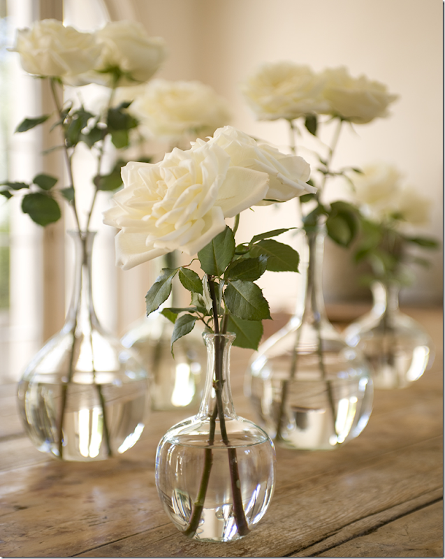
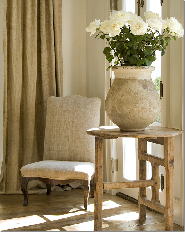
There’s a new magazine coming out – Milieu. It’s an interior design magazine being published in Houston, by a rather popular and ultra talented interior designer. Though the designer is from Houston, the magazine is definitely NOT local. It will be international - with houses, gardens, and stories from all over the United States and Europe, as well. Distribution will be throughout the United States. There will be more information in the near future about where and how to get the magazine when it is published.I’m so excited, I can’t stand the wait! I’ve known about this for a while and had promised to keep my lips sealed, but the introductory “mini mag” will be coming out this January. That gray font alone is enough to make me drool. Care to guess who is behind the new magazine?Fresh white flowers, limed wood. Guesses?Thistle and olive jars. Oh, this is too easy!!!Come on, who is the only designer who can mixed it up THIS good????(all photographs above by Peter Vitale)Give up?I know you know!!Yes, the fabulously talented Pamela Pierce is behind Milieu. Look for more information to be coming out soon! CAN NOT WAIT!!!!!Next time: my new library, finally!









0 comments:
Post a Comment