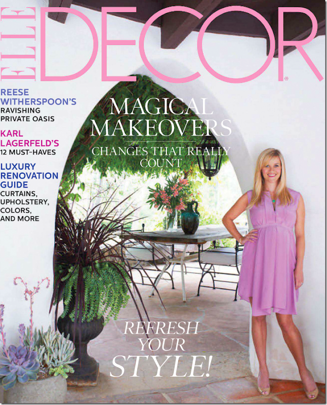
It’s déjà vu all over again. Just a few weeks ago, Reese Witherspoon splashed her historic Libbey Ranch in Ojai on the pages of Elle Décor. Declaring it a "work of art” that she is just a caretaker of, the ranch is surprisingly now for sale for a cool $10,000,000. That’s quite a gain from the $5.8 million she paid Kathryn Ireland for it in 2008. Though Kathryn lived there, restored it and wrote a book about the ranch, rumors are that she never actually owned it. Reese bought the ranch furnished, but she was quick to hire L.A. decorator to the stars, Kristen Buckingham, to rid the interiors of anything that looked like Kathryn, or so it was said. The photos from Elle Décor showed a completely different looking estate from when Kathryn lived there – it was now sophisticated and cool in neutral tones – long gone were Ireland’s vibrant and colorful fabrics (or so it seemed in Elle Decor.) Antiques and mid century pieces mixed together to make it all very hip, very today. While I absolutely loved what Buckingham did, readers of Cote de Texas mostly disagreed with me and in the comments section, Ireland won the contest, hands down.
So why is Reese selling? In the Elle Décor article, Reese states that she wanted the ranch in order to give her children the same experience she had growing up in Tennessee. She wanted her children to get “muddy” and play outdoors with all the animals. Towards that purpose, she brought in horses, ponies, donkeys, pigs, chickens, goats and four dogs – all for the benefit of her two children and her baby, soon to be born. Reese told Elle Décor she felt relaxed the moment she drove through the gates – where the phones don’t ring and there is no access to email (maybe that is why she is selling, no email would drive me insane!) Within an hour of arriving, she would be sleeping on the big couch. Doesn’t sound like someone who is close to selling, does it?
The same sell off happened to Kathryn Ireland. In a snarky way, I reported on the event on the blog - after appearing in two major magazines and writing a book, Ireland put the estate up for sale. Were we, the readers, now expected to be targeted customers in a high stakes real estate war? Was there anything wrong with magazines pimping out their readers as potential clients? Did it matter?
That whole magazine/book episode with Ireland seemed highly manipulative to me at the time, but I’ve since noticed it seems to be a trend. Many times an interior designer or actor will show off their home in a magazine as a prelude to putting it on the market. Reese doing it shouldn’t be so surprising, but she did sound rather sincere in the interview stating how much at home she felt at the ranch. Maybe the decision to sell had nothing to do with the timing of the magazine spread. Perhaps Reese agreed to the magazine spread just to show off the work of Buckingham – and it does deserve to be seen. Still, does it make a difference if the article was only to show the interior design or to show off the estate to perspective buyers? Is it a bait and switch? Is the article really saying – come inside my house, it’s beautiful – look at the way I live my life, and oh, by the way, this TOO can be YOURS, all for a cool $10 million.
And then there is the subject of the bait and switch furniture. Seeing the rooms in the real estate brochure, you will see that Reese’s house looks little like it appears in Elle Décor. The difference between the two is quite shocking. The magazine shows you rooms that really don’t exist. The more I looked and studied the differences, the more manipulated I felt. I’m curious if you will feel the same way. When you look at a magazine, do you expect the house to look something like the pictures? Or does that not matter to you? I must say, that I think it does matter to me. I don’t mind the stylist adding flowers and pillows, but when they totally redo an entire room just for the magazine shoot, it goes a little beyond the pale. Just admit it – be honest about it. The readers of magazines that cost over $5 deserve as much.
Another thing that hit me while looking at the photographs from the real estate brochure, is how talented the photographers who work for the magazines truly are. Under their eye and the careful work of the stylists, they can make a shack look like the Palace of Versailles. The photographs in magazines are works of art and nothing will drive home that point more than a real estate brochure with their photographs taken without the help of a trendy stylist. And it’s not just the stylist that is important – so is the sun. Landscaping looks so much more appealing when the sun is out brightly shining or is dappled through the shade of a large tree. And even inside a house, the interiors show off so much better when natural light is streaming through the windows. Who would think one house for sale would create so much to ponder?
And then there is the real estate brochure itself. Suddenly, there are pictures of rooms and rooms that have never been seen before! I honestly thought I would never write about the Libbey Ranch again. But, seeing all these new photographs of rooms never shown before piqued my interest and hopefully will interest you too. People must still be interested in this ranch – Kathryn Ireland’s book is now out of stock at Amazon!
One more point in driving the desire to write about it again is there is a lesson here to compare the magazine photographs with the real estate photographs to learn how to take better photographs. I know I’ve picked up a few tips myself. The appearance of a room in Elle Décor compared to how it really looks is startling, begging to answer, what is true – what is real? So, indulge me one more time with this look at the Ojai Ranch – until the new owners decide to open their doors to House Beautiful or World of Interiors.
Enjoy!
William Waldron took the photographs for Elle Décor. I have no idea who the photographer for the real estate agent was.
The listing agent is up for a guess. The property seems to be listed with several agents. My advice is just to google it to find a realtor if you are interested.
The house is described as Spanish, built in 1923, in excellent condition with views of the mountains. There are 9 bedrooms! Five full and 2 1/2 bathrooms. I can only count 7 bedrooms, so 2 must be hiding somewhere.
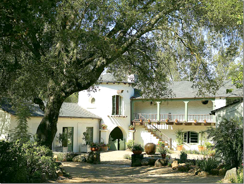
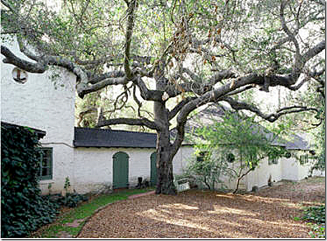
The Libbey Ranch as photographed for Kathryn Ireland’s book. Notice how charming it looks with the gates, windows and French doors all open – as if welcoming you inside. The sun is bright, yet the tree provides dappled shade. The house looks romantic and beautiful.
Now, notice in this real estate photograph taken for Kathryn Ireland, the charm is somewhat diminished. The gates and windows are now closed. The large tree is mostly cut of out of the photo. The angle of the photograph is not as appealing as the one above, taken for the book.
And here, without the bright sun, the courtyard looks almost dismal. This really shows how important the sun is when taking pictures of exteriors.
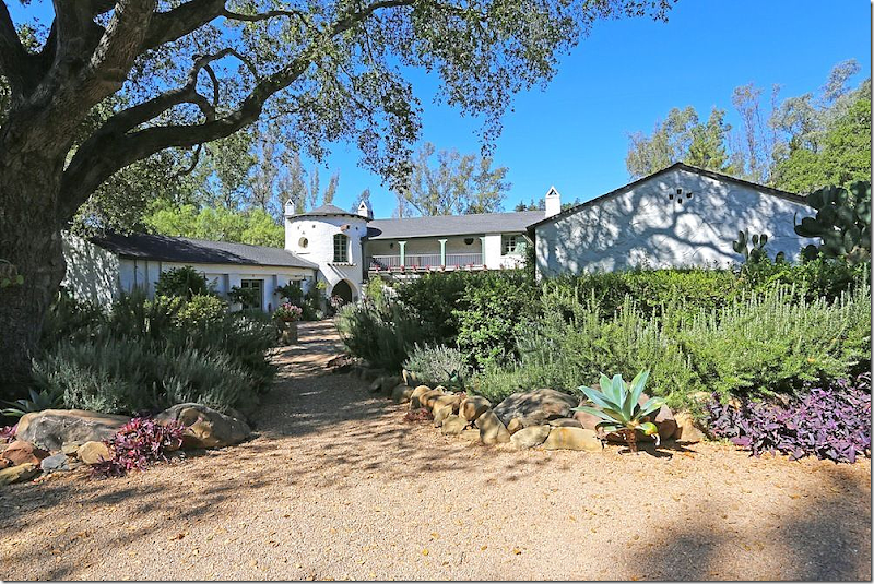
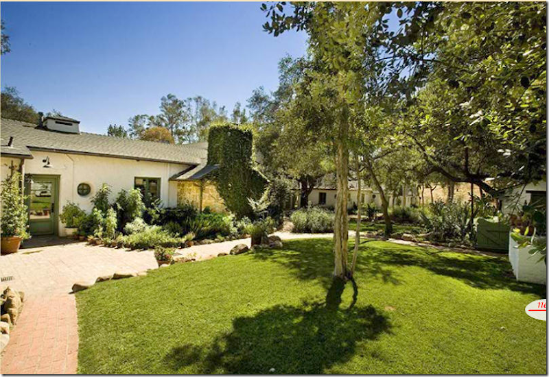
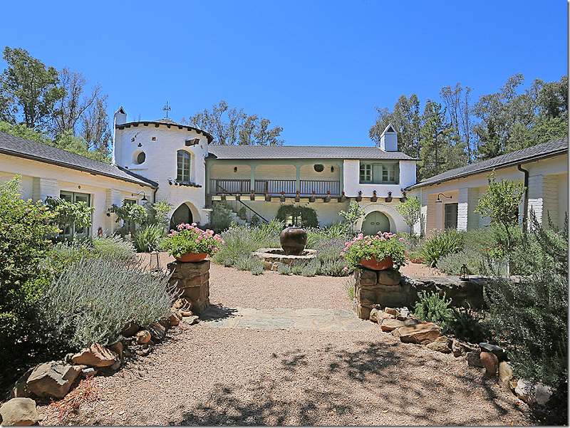
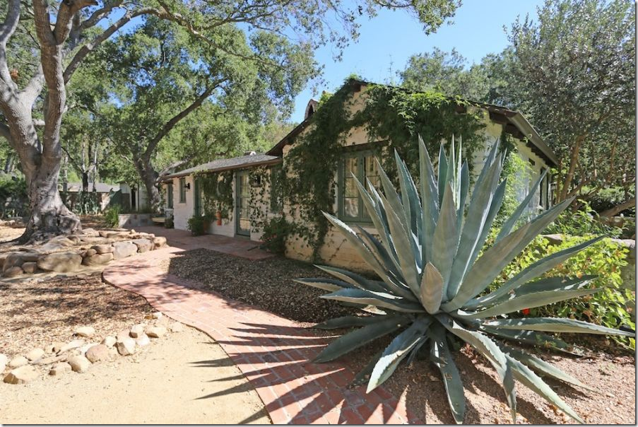
By comparison, the real estate brochure for Reese shows the importance of the landscape – now overgrown and much more lush than when Kathryn planted it. Again, the sun makes it all look bright and cheerful. But where is that atmospheric tree? This less skillful photographer didn’t include it in the photo.
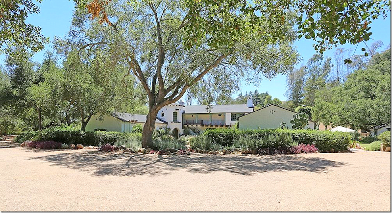
Ah, here it is. Reese’s real estate photographer pulled further away and now shows the tree.
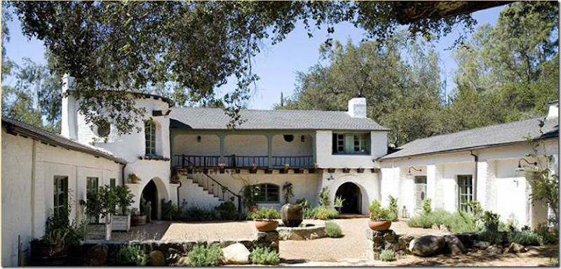
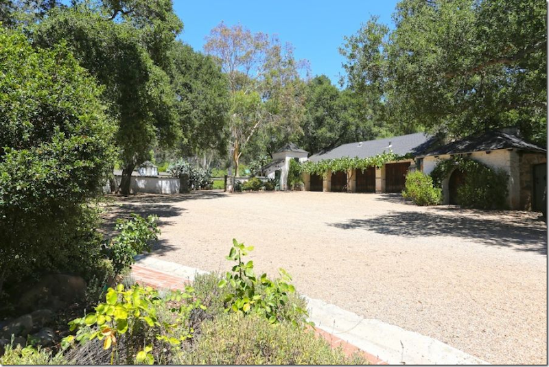
And even further away – the first photograph of the house where you can see the front side of both wings at the same time. Beautiful gravel driveway.
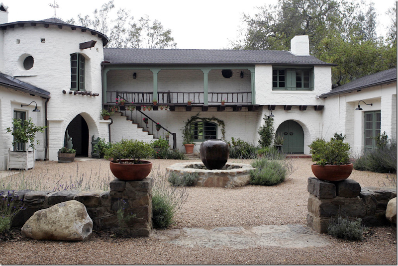
When Kathryn listed the ranch, this photograph showed off the courtyard.
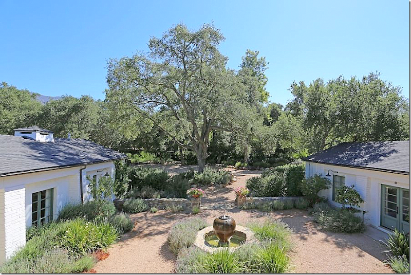
Reese’s brochure shows the courtyard from the balcony, a slightly better and much more interesting view.
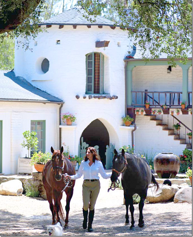
For her book, the photographer caught the courtyard teeming with life – two horses, and a running dog – it all looks inviting and lovely. He also captures the flower pots on the stairs and the curtains blowing in the wind. (Remember those plaid curtains, they show up later.)
For Elle Décor, an equally nice photograph, but notice the sun is not shining – and it makes everything not quite as welcoming. Had there been some dappled sun behind them, it would seem so much more atmospheric. Great styling
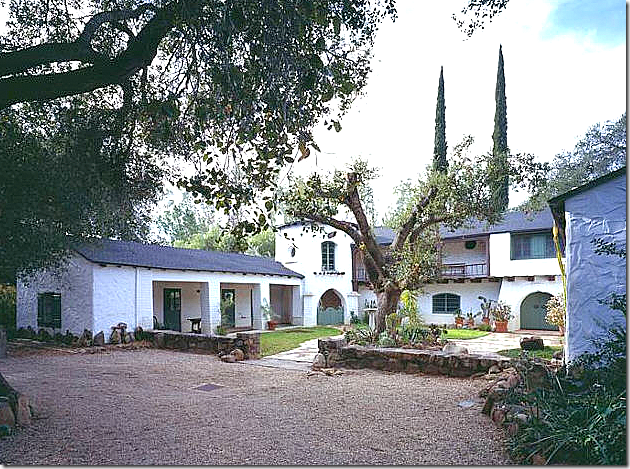
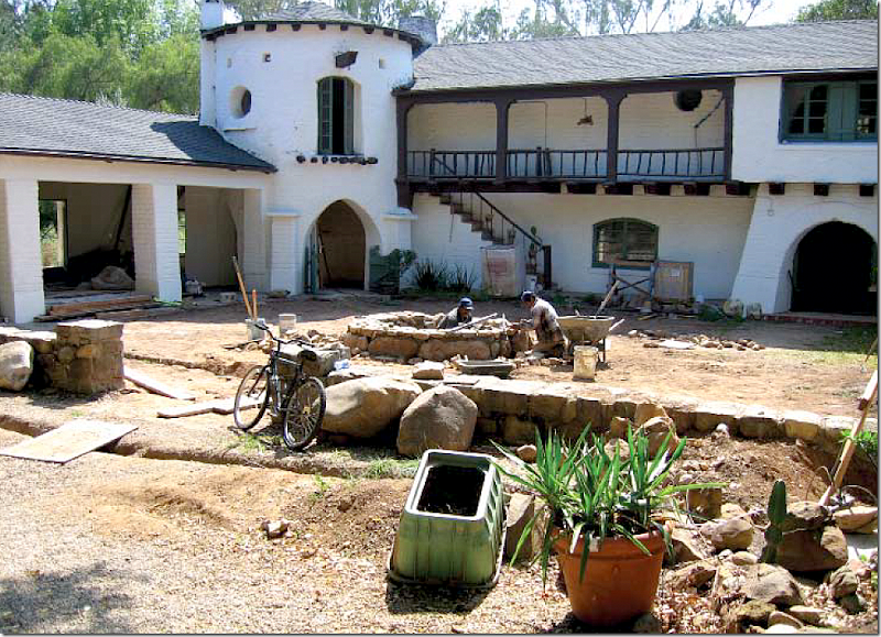
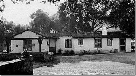
In this rare photo, you can see how the courtyard looked before Kathryn bought the ranch. There was a dead tree in the middle of the courtyard – and two tall cypress on the back side that were all removed. Inside, the courtyard was flagstone and grass – all removed by Kathryn. Instead of a fountain, there was a birdbath in the middle of the courtyard. The entire wing on the left had to be renovated – and it was turned into one luxurious guest suite. The Harold Ramis’ lived here at this time. Without the beautiful landscaping, the courtyard doesn’t look nearly as lush or manicured – the curb appeal is lacking.
And another view of the real estate brochure that shows how the ranch looked when Kathryn bought it. Notice the walkway and grass where there is now a fountain and gravel. Kathryn replaced all the flags and grass with French styled gravel. In France, the gravel keeps owners alerted to robbers – whose footsteps loudly crunch in the stones. I can attest this is true! I can always hear the gardener before I see him – his noisy, crunching steps give him away.
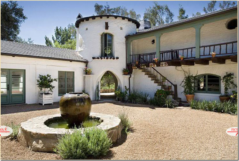
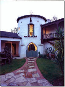
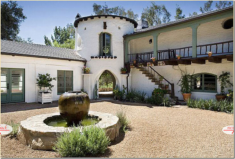
And here is how Kathryn’s real estate brochure captured the tower and fountain. Nice enough…
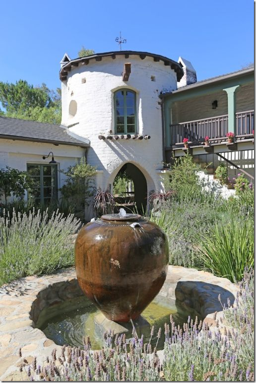
But Reese’s photograph is the best – the tower and fountain are tightly cropped – the photographer shows the water in the pond and the lavender surrounding it. The shot looks good enough to be in a magazine. It is definitely a more pleasing shot than Kathryn’s. Good real estate photographs are especially important in the internet age. If the photographs aren’t appealing, you can lose hundreds of potential buyers.
Kathryn’s real estate pix of her front door shows off lots of chipped paint.
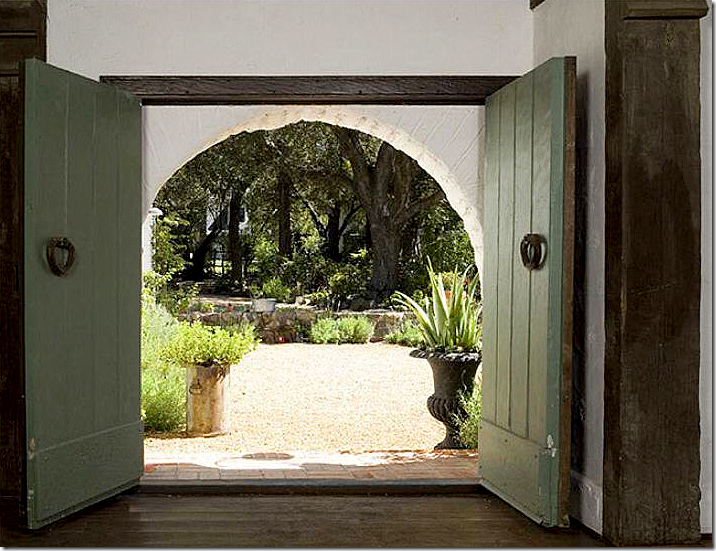
Reese’s more tightly cropped shot shows the doors looking much more fitting for a $10 million ranch. And the view of the courtyard is gorgeous!
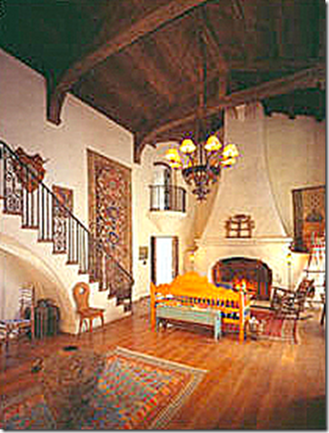
Inside the main room: A rare look at how it all began. The large medallion shape on the tall mantel was copied by Kristen Buckingham for Reese. There appears to be a large area rug, and not much furniture except for a couch on the right wall and a few chairs. A dinner table is set under the stairs. Notice the chandelier is here – and remains at the estate today. Technically, Reese could claim the chandelier as her property and not sell it with the ranch. I do wonder if she will sell the property furnished.
And these two rare pictures, above and below, show the real estate brochure from before Kathryn Ireland’s time when the Ramis lived here. Notice the same light fixture. Also, the house looks like it was decorated in Mexican chic with lots of serapes, which is actually fitting for the ranch. It seems very similar to Kathryn’s vibrant interiors.
And here, facing the fireplace with a Spanish bench instead of a sofa.
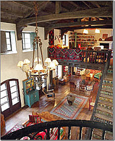
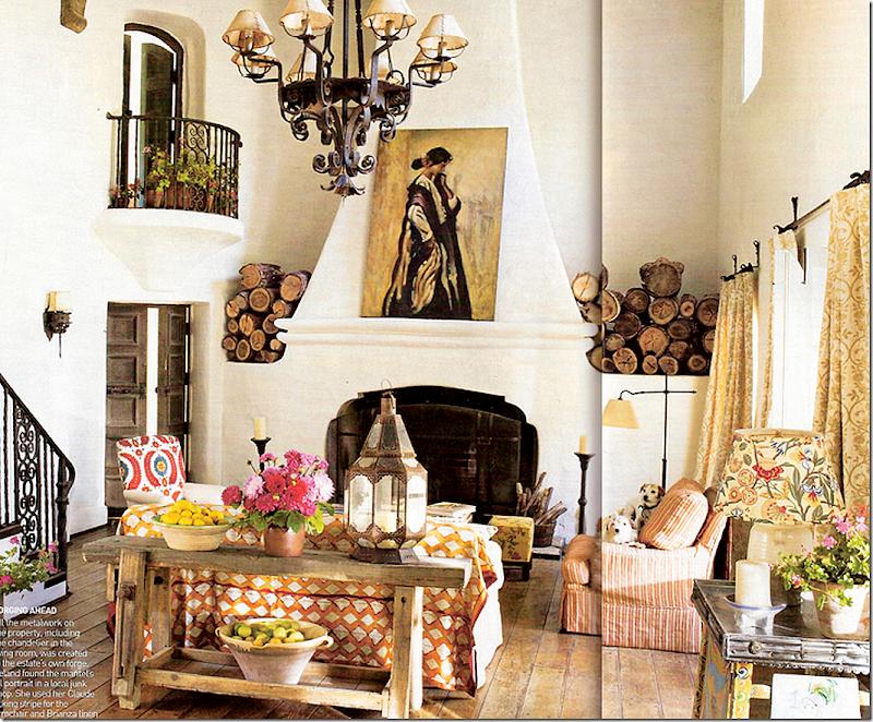
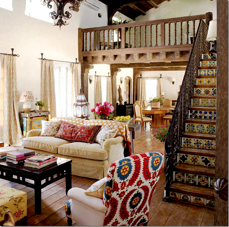
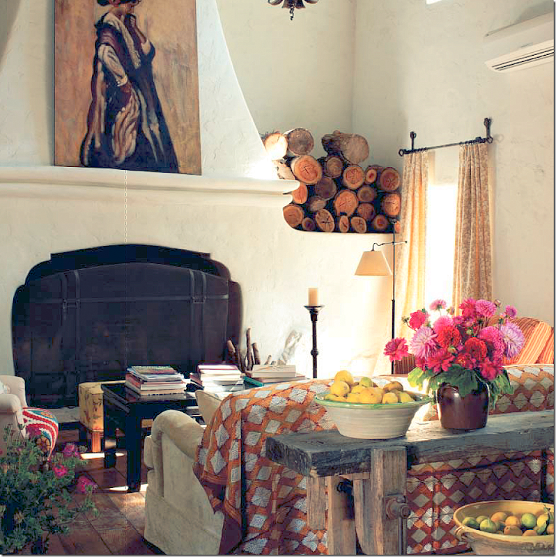
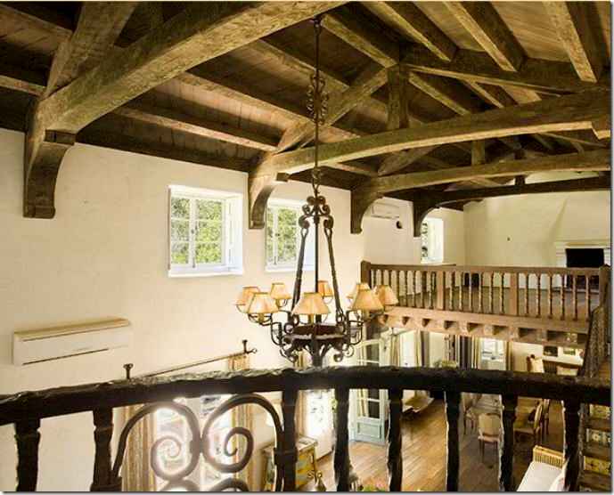
Kathryn’s living room was styled several different times for magazines and her book. But always, her room was bright and cheery and ethic looking. Here, the stylist added flower pots to the rotunda room’s balcony. There was always stacked wood on each side of the fireplace. Fabrics were from her own new line and from Robert Kime, whose fabrics she once sold in her showroom.
A slightly different view, from the loft room. Here she added an antique chair, a rug and different styling on the console.
And here, looking towards the dining area where her more formal meals were eaten – across from the front door.
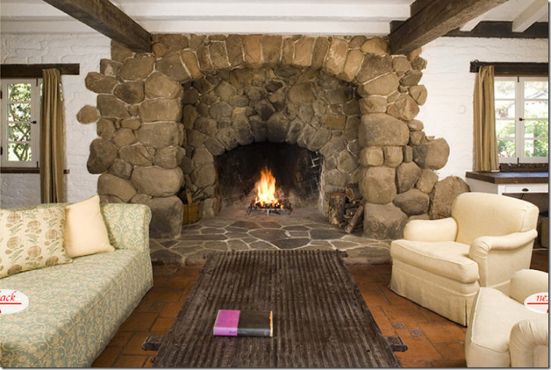
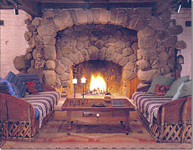
A closer view showing the large fireplace with its old screen. Not sure why they didn’t light the fire?! Fireplaces do look prettier when they are lit.
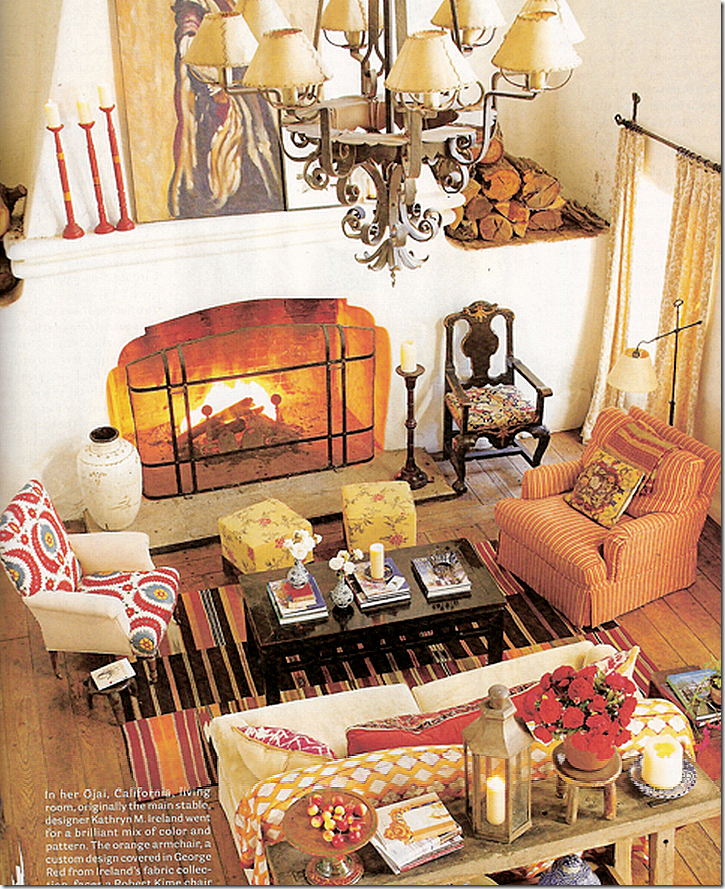
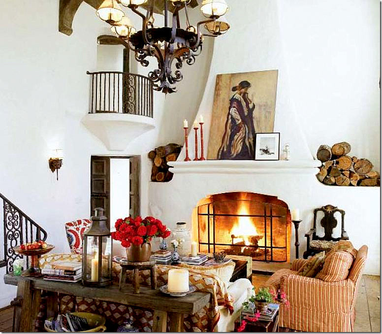
For the book, it was styled with red flowers and red candlesticks – on the cover of the book, the large painting was removed in order to leave room for the book’s title. Missing are the plants on the balcony. Can you spot other styling differences between the photos?
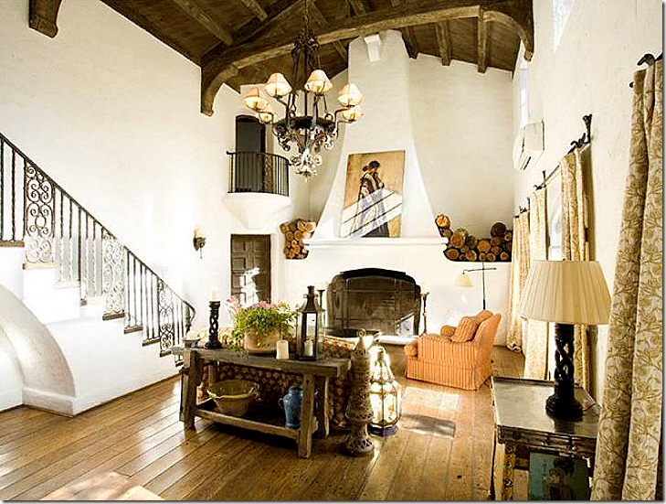
Now – look at this photograph for the real estate brochure. Is it even the same room? Yes, it is – and actually most of the furniture is still here, but the quality of the photograph is so bad compared to the book photographs – it looks like it’s been stripped bare. There’s no welcoming fire, the plant is not in full bloom and the photo is taken from so far away – it’s hard to see details. What a terrible photograph. Why do the agents take such bad shots? They should try to sell the house, not deter buyers!
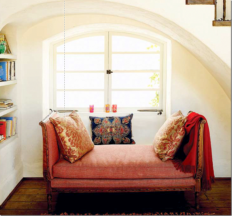
The book’s photo of the area under the living room’s stair shows a French bench with Fortuny pillows and a throw. There’s also a blue pillow, along with colorful glasses on the sill – and an area rug is barely seen. Simple styling additions can make a huge difference.
For the real estate brochure – all the pillows and throws, rug, and glasses are long gone. Were they returned to the shop? Why? Look how empty the space looks without the benefit of the stylist’s extras. Now, some real estate agents will edit a room to make it less personal, and therefore more inviting for a prospective home owner. They want the buyer to be able to imagine themselves in the space. But, when a house doesn’t really need editing or cleaning up – why change it, like they did in this photo? It’s possible that this is how Kathryn really lived in this space – without all the extra accessories that were brought in for the photoshoot. I think that is probably the real truth here.
For Kathryn’s book, she filled up the upstairs loft with furniture and art and then lit the fire. The rugs and pillows and exotic accessories add depth and texture to the room. But this was all for show. The furniture probably all went back to the shops the next day.
For her real estate brochure – all that furniture in the loft is now long gone. Again, returned to the shop? When your house is placed on the market, you don’t know how long it will take to sell, so why remove all the furniture, unless it wasn’t there to begin with. Bait and switch. Now, let’s see how Reese’s living room fared under the lens of the real estate photographer:
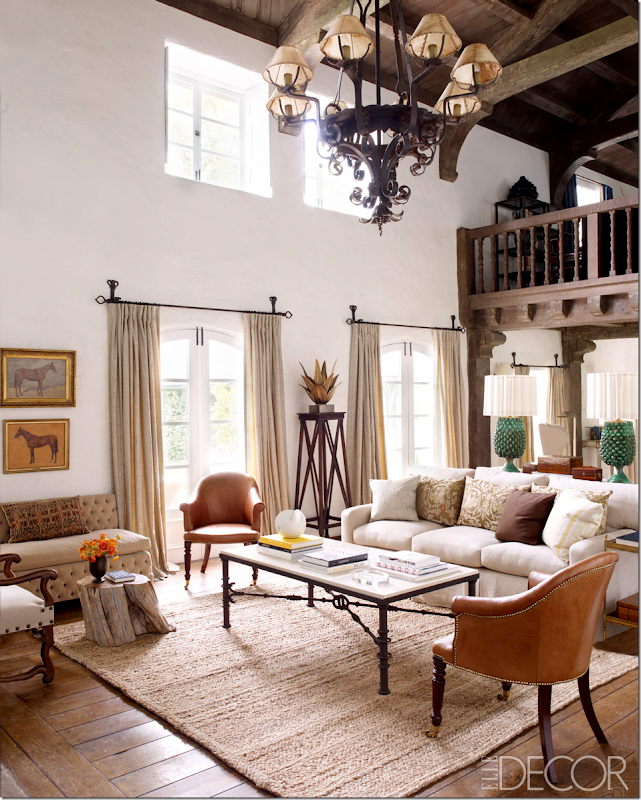
Here is Elle Décor’s photograph of Kristen Buckingham’s beautiful interior design. Looking at this room again – I am struck by how truly beautiful it all looks. I love it. A textured rug anchors the room – as does the back to back sofas with the two green lamps. The lamps are so stunning- they become the focal point of the room. I wasn’t crazy about these lamps at first, but on second look – I really like them now. A tufted banquette sits by the curtains and a large coffee table anchors the setting. I especially love the pedestal with the metal sculpture. Ready????
And here is the same room in the real estate brochure. The rug and lamps and pillows remain, as do the two leather chairs. But the coffee table is gone – back to the store? And the pedestal and sculpture are also gone. And it’s a wonder no one ever tripped on that exposed lamp cord and killed themselves. How could such a beautiful room now look so….ordinary?
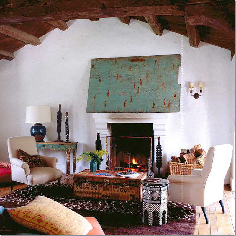
The gorgeous photograph as seen in Elle Décor – with the round bust on the fireplace and the much maligned plant at the right of the fireplace. There’s a handsome chest – and notice the beautiful trestle desk between the two sofas. One thing lacking in the Elle Décor pictures is the sun. It must have been overcast that day. A bit more sun streaming through the windows would have been so beautiful. But, still, this photograph is gorgeous (even with that stupid plant!) Ready?
Ouch! Really. No medallion here – that is long gone, along with the coffee table. The desk remains, thank God! The tall French chair remains but this room looks nothing like it did in the magazine. Photographer or Stylist? What is missing? And notice, in real life, Reese uses Kathryn’s firescreen, but in the Elle Décor pictures – there is no screen. I guess they didn’t like it as much as I did.
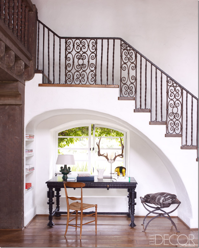
In Elle Décor, under the stairs, there is a beautiful desk with a lamp and accessories. The photograph is perfectly cropped - showing just the arch of the stairs.
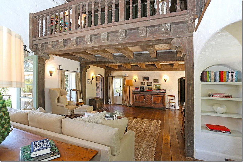
And here in the real estate picture you can see – the desk is gone, but the stool remains along with the two new urns. Also, here you can see that the chest and the tufted banquette remain next to the fireplace, but the plant is long gone. This view also shows the second sofa and arm chair with the large ottoman that you couldn’t see in the Elle Décor pictures. This real estate photograph looks better than the others, probably because there are features that are closely cropped – like the beams and the wing chair.
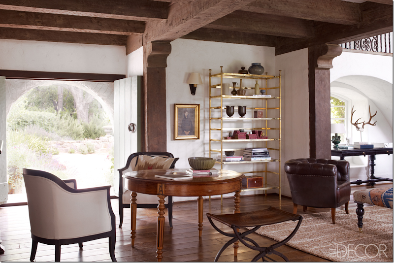
And in this beautiful photograph in Elle Décor, you can see the center table with two chairs, the controversial brass étagère and the leather club chair. The black desk under the stairs is also visible. This is such a pretty photograph. Notice how the space where is étagère really needs a tall piece there. Rather you like the brass or not, the proportions are perfect. Ready?
And in this real estate photograph, you can see the center table and beautiful chairs are long gone, as is the leather club chair. And if you look very closely – you can actually see the black desk is there in the same space where the brass étagère was!!!! You can just barely see it’s leg. So, for the Elle Décor photoshoot the stylist or Buckingham – moved the black desk to make room for the brass étagère that Reese maybe owned or maybe didn’t. This was a good decision because that area does need height in that corner. You can also see how much the center table and chairs added to this room. Without them, the space in front of the door looks empty. Again, the talent of the Elle Décor photographer (William Wendon) is really evident when you compare his photos with these real estate photos.
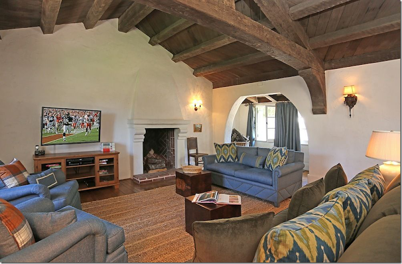
And in the real estate brochure, we now have a chance to look at Reese’s room above the living room, which was missing from the Elle Décor layout. Ikat pillows in blues and line greens mix with a moss green velvet sofa and blue sofa and club chairs. Below is a textured rug. At the window are blue curtains. A great room for watching football games – right? Just like what is on the TV! And that’s a great tip for flatscreens. Instead of having a big black empty box, turn the TV onto to something pretty, if possible. Or photoshop a painting onto the screen.
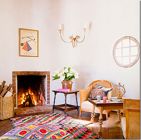
Now, this is where the questions begin. This is the small rotunda room that overlooks the living room with its Juliet balcony. Here is how Kathryn Ireland furnished it, with cane chairs and sconces and an ethnic rug.
And here is how it looks in Reese’s real estate photographs. No way that Kristen Buckingham touched this room. It has the same cane chairs and sconce that Kathryn used. And the curtains – you can see these same plaid curtains in the window in the photograph where Kathryn is with her horses. Even the same basket remains! So what’s the problem? I was under the impression that Reese had gotten rid of all Kathryn’s furniture – immediately. But as this room show, and others will too, this isn’t the case at all. UNLESS – certain rooms were photographed before Buckingham had finished decorating? But why would that be done? Also, I was under the impression that this room had been turned into a library by Reese. Nope. And notice that ceiling fixture – no wonder Kathryn didn’t ever photograph it!! It’s scary!! So, now begins the game of finding things that Kathryn left behind that Reese kept. Want to play?
On to the right wing – where the kitchen and family room are:
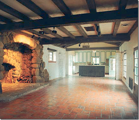
The kitchen, as Kathryn found it. She removed the upper cabinets and added the large refrigerator and a desk to the left of the side door. The island was made out of old doors, but wasn’t sturdy enough to house the range, so it was replaced. I like the old island. She also painted many of the beams white to make it brighter. This wing used to be the old carriage house. The fireplace was added when the wing was converted to the kitchen/family room.
For the book and magazines, Kathryn styled the kitchen and breakfast area to look like a very colorful and lively place. The sun outside was bright, as were the interiors inside. She draped textiles over chairs and placed colorful dishes and pottery around. Above is a classic iron fixture, probably antique. Notice the original tiled floor. Kathryn had to add new tiles in the kitchen area that didn’t match, but meshed instead. This is a perfect photograph – inviting and fun! You want to join in a grab a glass of juice or sit down at the laptop.
Now, here is what the kitchen really looked like – when it wasn’t styled! Wow. So different! Isn’t it amazing what a good photographer and stylist can do to a space!??!! It looks like a different kitchen. And here you can see the tiles that Kathryn laid in the kitchen. Should she have removed the old tiles to match the new ones? Or put wood down here instead of trying to match old vs. new tiles? I would have put wide planked, aged wood down, but no one asked me.
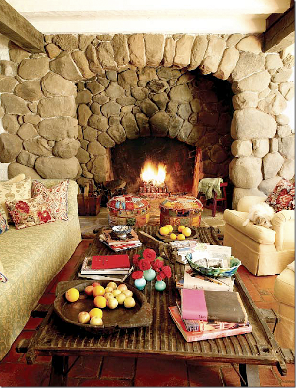
And here is how Kathryn styled the family room at the other side of the kitchen. Long sofas with slips, club chairs, and an ethnic door made into a coffee table. Lots of pillows wearing her fabrics were added, as were colorful accessories like the two stools on the hearth. Again, a perfect photograph – one where you would love to join in.
And, the same space on the real estate brochure- without the attractive accessories or pillows or throws or rugs. At least the fire is going. I wonder if this how it really looked day by day – or not? It looks positively depressing compared to the other photograph.
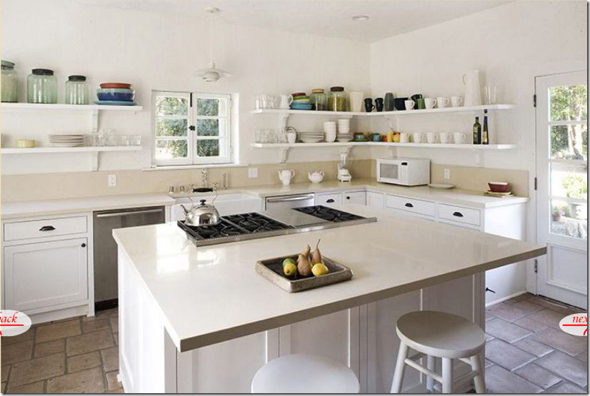
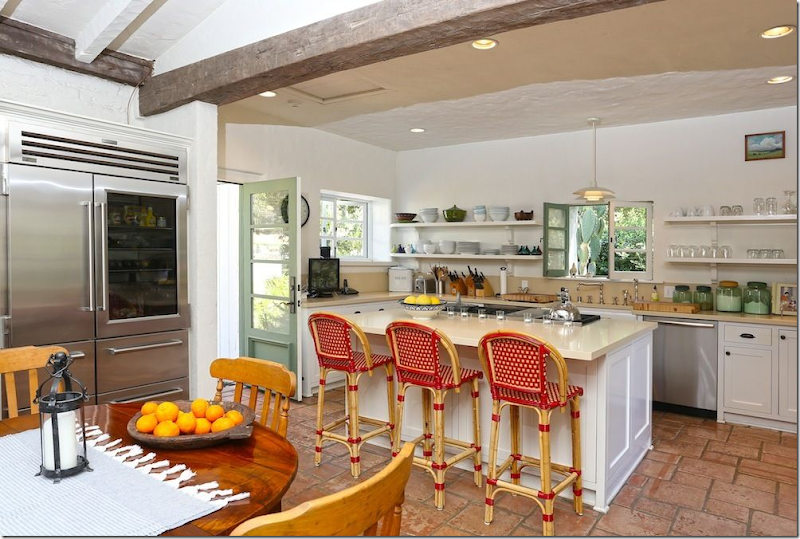
Now, here is what the kitchen looks like in Reese’s real estate brochure. It does seem much more colorful and lively than Kathryn’s real estate kitchen. But that may be due to the red stools. At least they opened the windows and doors to look more welcoming. Now, get ready:
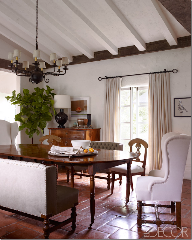
Remember this gorgeous photograph of the dining room from Elle Décor? It featured two custom banquettes and an assortment of Swedish chairs and wing chairs – all antique. The Swedish chairs were period antique. I remarked this was the prettiest room – and it is, in this photograph at least. And notice the lighting in this picture. Not too bright – instead it’s rather moody with just a bit of sun streaming through the window. You can’t really tell the color of the banquettes – or they green or gray or khaki? The curtains look soft and full in this light. Just perfection. Now get ready for a huge, huge disappointment…
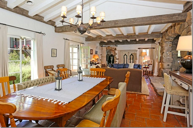
The same room!!! OK – it’s the same dining room table (I guess) and the same banquettes, but the period Swedish chairs – gone. The gorgeous wing chairs? Gone. Probably the chest is gone too. Instead she is using Kathryn’s old tacky breakfast room chairs with some ugly schmatte on the table. Even the curtains look limp and boring. I could CRY!!!!!!!!! See what I mean about a talented photographer making a shack look like the Palace of Versailles? No, I’m not saying this is a shack, but it certainly looks nothing like the photograph in Elle Décor. Besides the bait and switch furniture, there is the lighting of the room that is so important. I had no idea! Notice how gorgeous the room is lit in the Elle Décor picture. Oh, seriously, I could cry looking at this mess compared to that gorgeous Elle Décor photograph. I’ll bet it took them hours to take that one picture. Hours. You know who else cries when she see this? Buckingham. Honey, I’m right there with you.
I barely want to continue on. Well, this is cute. Cute striped ottoman. I like the chairs and the brown sofa. I like this. Of course they didn’t photograph this. And those red bar stools in the kitchen? They don’t go with anything. At all. Why are they there?
Well, it could look like this – this is how it looked when the Ramis lived here – Mexican sofas – actually this is cute. My sister-in-law Shannon would love this!!
And here, in Kathryn’s real estate brochure – you can see the back of the kitchen wing. The large fireplace is covered in ivy. To the right is the bedroom wing. Let’s see how they really lived on the outside terrace:
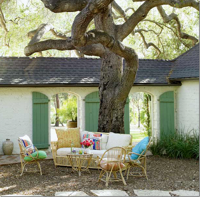
On the terrace outside the living room Kathryn Ireland styled this photograph for the book – how darling is this? I love how she adds all the pillows and lanterns and textiles to her photographs. Of course, I shouldn’t be fooled that she actually live this way.
Here is how the terrace really looked when Kathryn live there. Quite different.
I should have known it was all fake. She schlepped the same arrangement all over the ranch – including here, out by the bedroom wing. I even spied this sofa in the living room in one of the real estate photos! See if you can spot it there too. OY! This is worse than the moving flower arrangement. That happens when there is only one vase of flowers and the stylist will move it from room to room for a photoshoot. It’s called Spot the Vase of Flowers. Here, Kathryn plays the same game with furniture. By the way, this sofa is for sale on her web site. Don’t even ask how much. AND, this gorgeous tree? It’s gone now. Looks healthy to me, but it must have died.
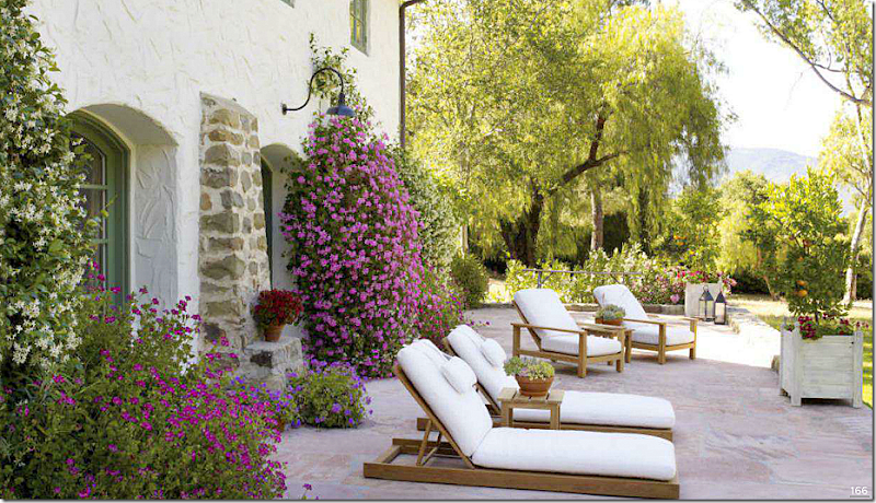
Don’t think Reese didn’t fake us out with her terrace. Remember this to-die-for photo from Elle Décor. Those white covered teak lounges against the hot pink and purple flowers = gorgeous! At least the photographer got some sun for this photo. Absolutely breathtaking!!! GORGEOUS.
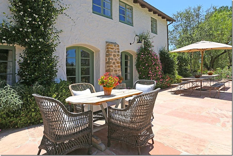
And here is reality via Reese’s real estate photos. Now, I’m not going to argue against Kooboo chairs, and this looks pretty cute, but it can’t compare to the styled photograph. Even the flowers look dull compared to the Elle Décor photo.
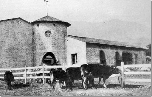
Before it was a second home, the ranch was really a barn for animals. Here is the back side of the rotunda – where later Kathryn would add an outdoor eating area.
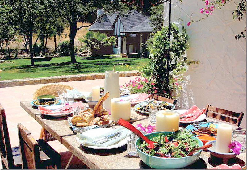
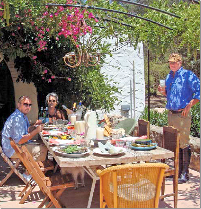
And here is how she styled that area for the book. Again, a perfect photograph. Bright and cheery and most certainly an invitation to join in the meal. Across the back terrace, you can see her master bedroom house.
And another view – you can see the arch of the rotunda. She added the iron pergola to shade the table. There is no photo to show how this really looked, when the photographers weren’t there.
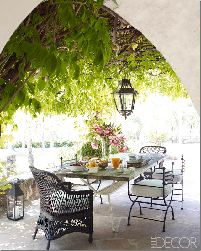
And how it looks under Reese’s ownership – she kept Kathryn’s table and added new chairs. Again, a beautiful photograph. Well, she added the wicker chairs. Those metal chairs? They are for sale on Buckingham’s web site. Price wasn’t listed, but I can only imagine how precious they are.
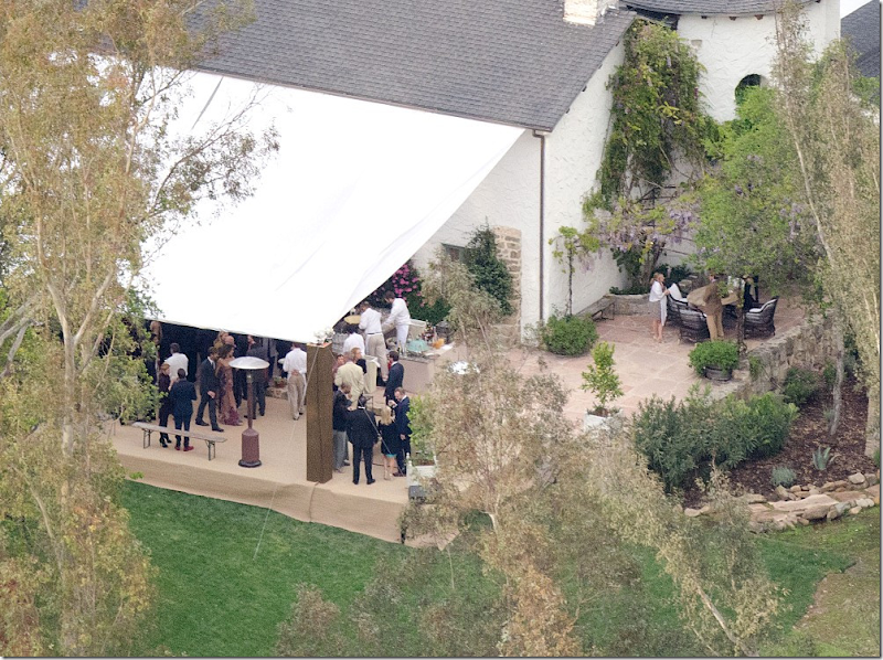
In reality – here is how that space looks – taken at Reese’s wedding. It looks like the table and chairs that are shown on the terrace are actually used here – with the wicker chairs. The pergola isn’t quite nearly as full and lush, but it is still a pretty spot for an outdoor meal.
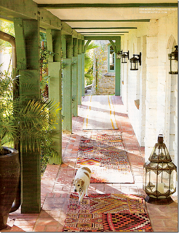
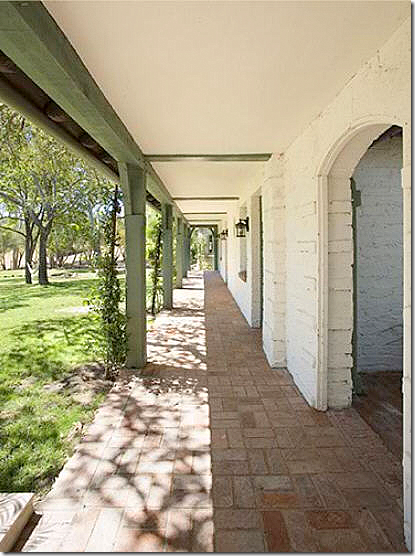
Here’s how Kathryn decorated the walkway outside the bedroom wing – lots of antique rugs and lanterns and even a cute dog!!! Yeah, right. Still, a beautiful photo even though it is nothing like the reality.
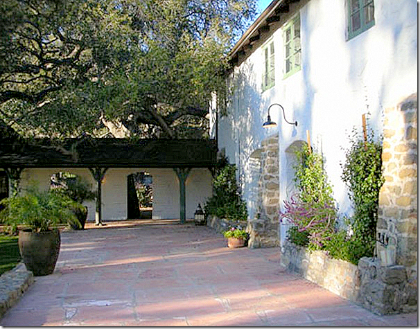
Of course, this is how Kathryn really lived – with the bare necessities. All the stylist’s tricks are gone, returned to their real home, in the shops. You can see here how Kathryn planted vines around the columns – below you will see how full those vines are now.
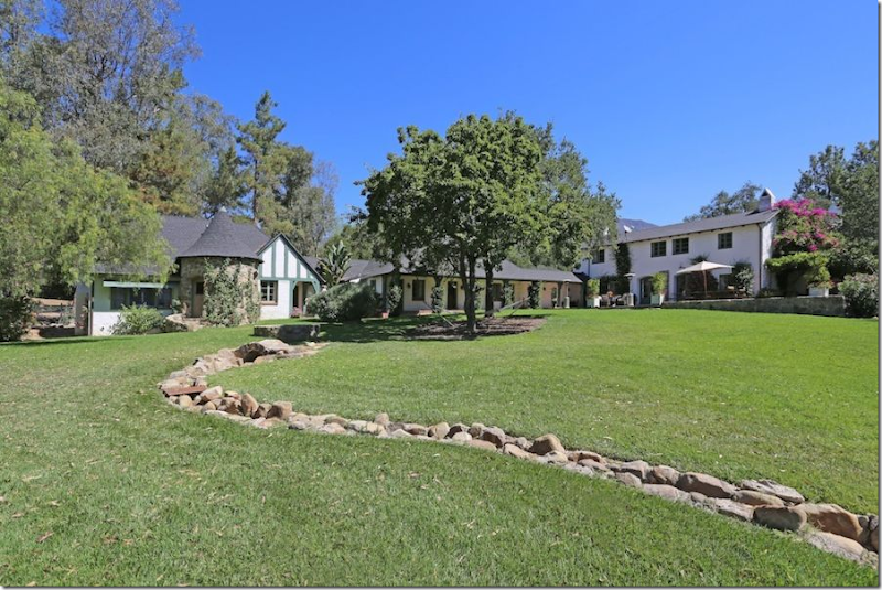
Reese’s real estate brochure captured the main house, the back terrace and the bedroom wing where the children’s rooms are. Reese’s and Kathryn’s bedroom is in the house on the left. Notice the vines around the columns – so full. And there are now vines crawling up the rock turret too.
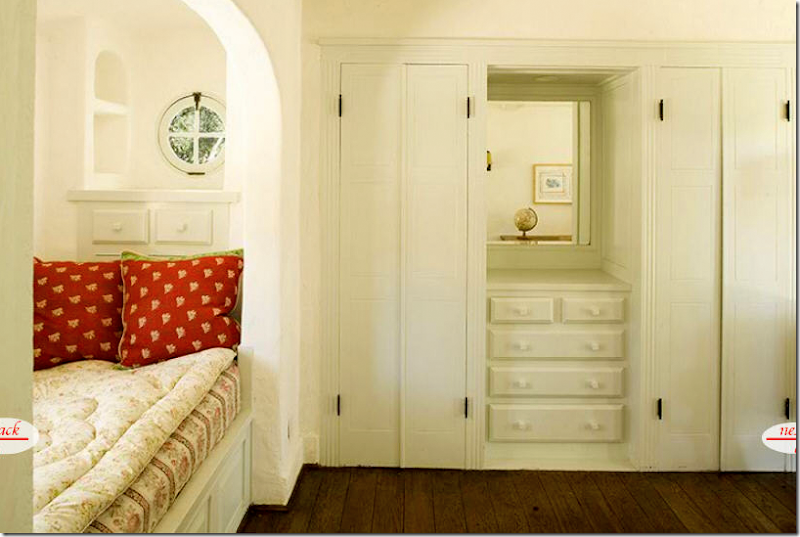
The two children’s rooms in the bedroom wing behind the back terrace – were decorated for Kathryn’s three boys. Here is one bedroom – with a trestle desk, a green chair and a cute mattress with red pillows – all dressed up in Kathryn’s fabrics. Of course, this photograph taken for the book is highly appealing – bright and welcoming.
And here is how it really looked – on Kathryn’s real estate brochure. While the bedding is the same, it just lacks that perfect styling. You can even see the same globe in the mirror! The photographer chose the worst angle from which to take his photograph. So dreary. Why would anyone want to sleep here? Why would anyone want to buy this? And the lighting – see how important it is in a photograph? This room looks hospital drab instead of bright white.
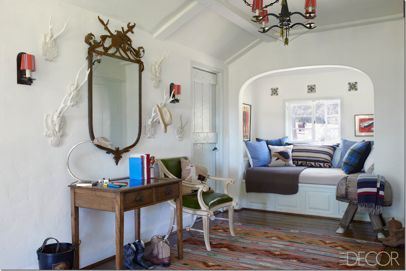
The very same room – decorated for Reese’s son. People remarked on that chair – from Bunny Williams’ line – saying how expensive it was to be in a kid’s room. Reese obviously agreed with you. Such a wonderfully decorated room for a boy. The colors are great – browns and blues with a hint of green. The light fixture and sconces are darling, along with the saddle chair and cowboy boots. What a lucky boy! Too bad he never got to claim this as his own. BTW, notice how the horse just happens to standing outside the window. Hmm. That must have been one really lucky photographer! haha Ready to see the truth?
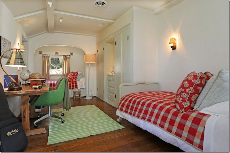
Here is how the room REALLY looks like - in the real estate brochure. Reese kept the bedding left by Ireland and even used the same desk and green chair and rug and curtains and globe!!! In the Elle Décor shoot – there isn’t one thing that is in this room – including the Bunny Williams chair. They must have spent days styling this room for the photoshoot. They even put up new lampshades on the sconces and a light fixture. Well, they did a great job – the Elle Décor room is certainly cuter than the real one – thanks to Buckingham. Notice too, again, how important lighting is. Compare the lighting in this photograph with the Elle Décor one. It makes a huge difference. Again, the Elle Décor photographs are like works of art.
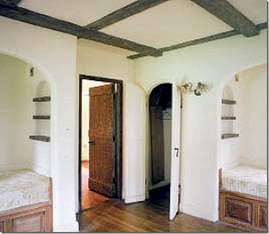
In the second bedroom – this is how Kathryn found the room, with dark beams and dark wood on the bunks and doors.
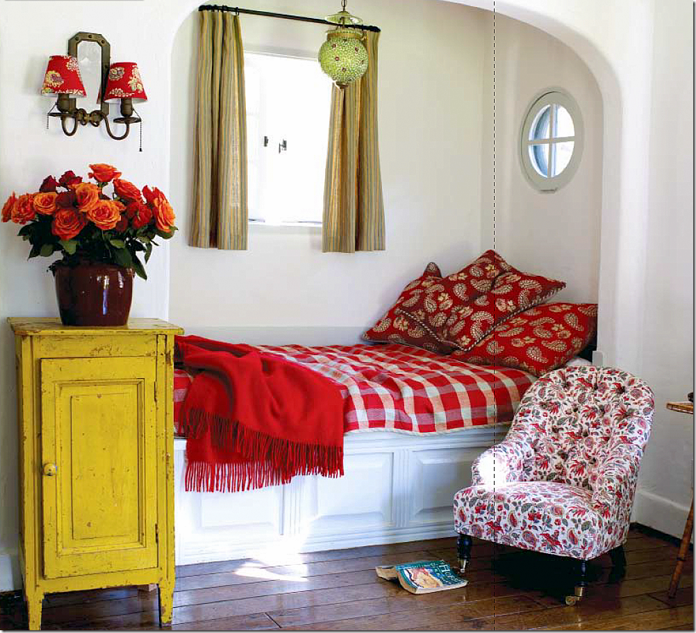
And here is how she decorated it for the book – more reds and plaids and yellows. And notice that chair. It shows up again and again.
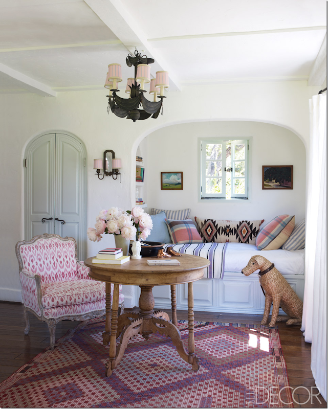
And here is the same room – decorated for Reese’s daughter. Well, this is how it looked in Elle Décor, decorated by Kristen Buckingham. So cute – we all agreed. In fact, many of you felt this was the cutest room in the house! The bedding, the chairs – the fabrics! That light fixture, the rug – that table --- soooo darling and soooo fake! Even the wicker dog is fake.
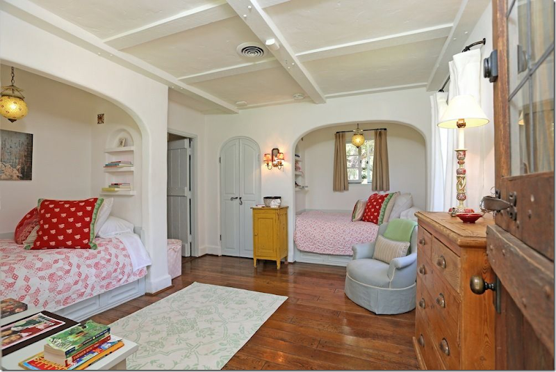
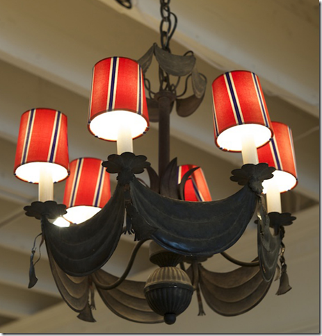
And here is how it REALLY looks – poor Reese’s daughter. I mean it’s cute and all, but nothing like it looked like in Elle Décor. Reese used the same light fixtures, the same pillows, the same and even the same yellow chest! That rug even came out of one of the bathrooms. BTW – that cute chandelier in the Elle Décor bedroom? It’s for sale on Buckingham’s web site. Yep. Except it’s wearing the red shades found in the boy’s bedroom. See:
At first the kids bedrooms really confused me – and I thought that maybe these real estate pictures were taken before these bedrooms were remodeled. But, the more I thought about it – I really think that no, those Elle Décor rooms were just styled for the magazine. Why would you take real estate pictures and then remodel? It just didn’t make any sense. Now, if I am wrong, I’ll let you know. But I really think that the Elle Décor shoot was done knowing the ranch was going to be put up for sale and they wanted it to look really good, hence all the extra styling to make the house look like it really doesn’t. And here I thought that kind of entire house restyling didn’t go on anymore. That’s what the editors and interior designers keep telling us on the Skirted Roundtable. Snort.
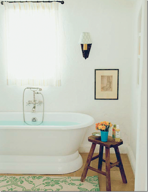
Here’s a bathroom, styled by Kathryn for her book – you can see the same bathmat that is now in Reese’s daughter’s bedroom. I love how Kathryn uses the small wood stools as tables in her bathrooms. And notice the cute shade on the sconce – it’s covered in her fabric.
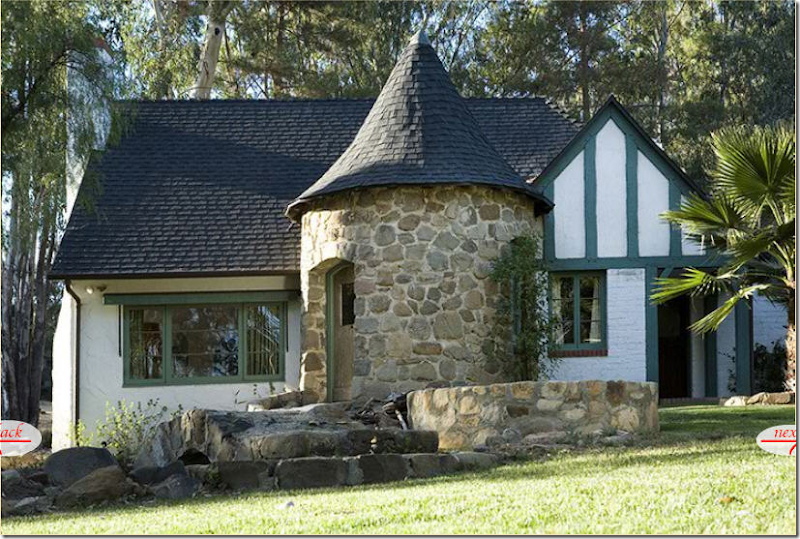
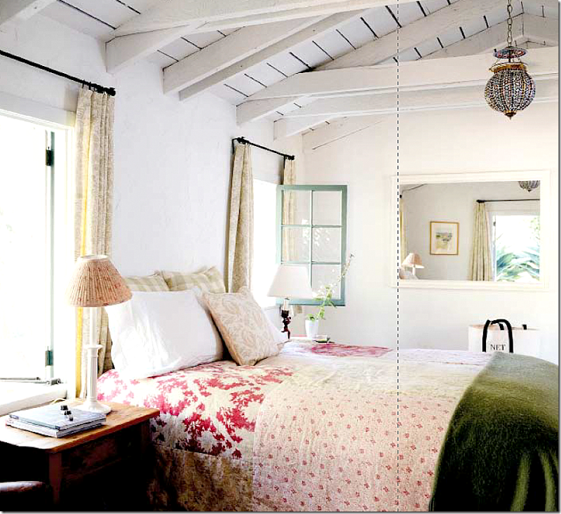
The master bedroom is in this cute house – located at the end of the bedroom wing. Kathryn expanded that window on the left and cleared out brush and trees so that she could see the distant mountains while lying in her bed! While the main house looks Spanish and French inspired, this cottage looks like it belongs in the Cotswold's in the English countryside. And you can see where she started the vine on the turret – that is now much fuller.
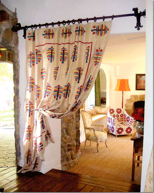
Inside the room off the entrance rock turret, Kathryn used her fabric to make portieres. Her master bedroom was styled several different ways for different photoshoots. Here is one way with that French chair (remember that chair, it shows up later.)
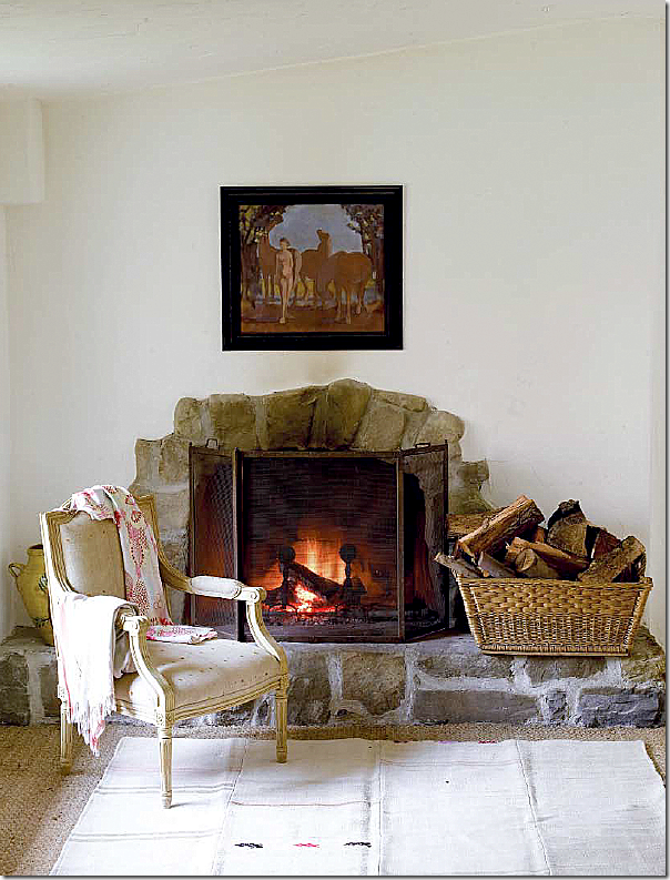
And the fireplace was styled more serenely for another photoshoot – using a different chair – that shows up later.
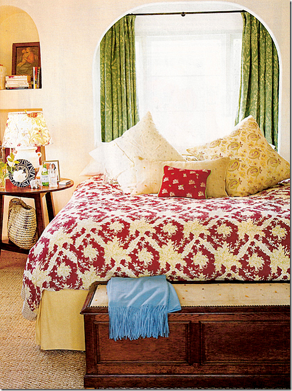
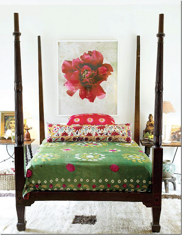
Here is the bed in the master bedroom – styled one way – all with Kathryn’s own fabrics, of course. I love the bedroom this way – so Kathryn! Of course all these photographs are wonderful - professional, and it shows.
And yet another way, with a suzani bedspread.
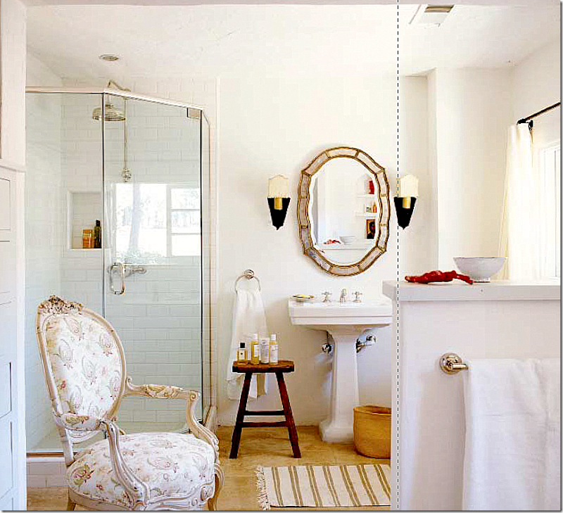
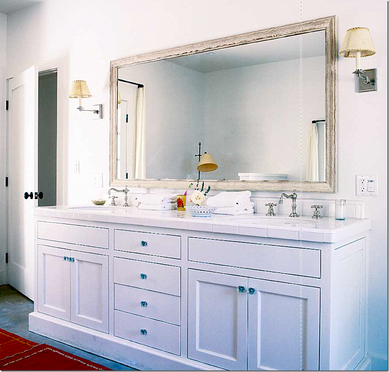
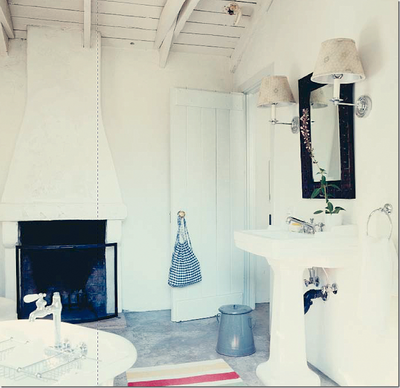
The master bathroom was completely renovated – with an old mirror and that French chair – it really gets around. Kathryn’s fabric on this chair is one of my favorites of hers. Love this bathroom.
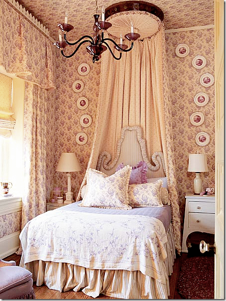
The interior design great Barry Dixon used the same Ireland paisley print in his own guest room – which he calls the Kathryn Ireland Bedroom – beautiful! I love the plates around the gorgeous canopy. And notice the headboard! So wonderful!
OK, OK – let’s get back to the ranch and see what Kathryn’s bedroom REALLY looked like:
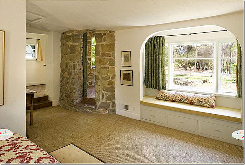
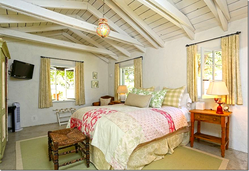
And here it is – that wonderful, full of life bedroom as it really looked like – without the styling and the fancy photographers. As you can see, all the charming chairs and rugs are gone. You can just make out the quilt in this picture. And notice that windowseat. Please – when you make a window seat – use down wrapped foam or pure down, NOT just a long piece of straight foam. It looks awful. A window seat should be inviting, it should be full and comfy looking – beckoning you to come and sit down on it. This looks like a piece of plyboard. Never, ever do this, please!!!!! Terrible, terrible photograph. Again, why would anyone be enticed to view this property as a potential home looking like this?
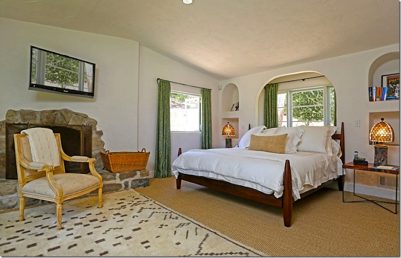
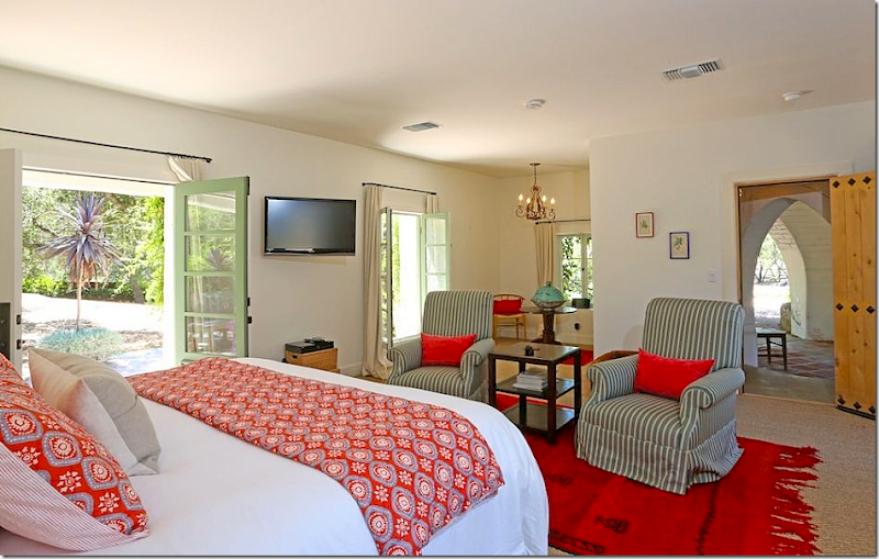
Reese’s bedroom was not shown in Elle Décor – but here it is. A new bed, with all white linens, but she did keep Kathryn’s green curtains, the French chair and even her fireplace basket. Again – notice the flatscreen. It doesn’t look like a black hole, but instead it is reflecting the outdoors. Wonder how he did that? This is the only photograph of the bedroom that shows how the bed is flanked by two archways. I hadn’t seen that before. Very pretty. And Reese added a rug from Morocco. I will assume Kristen helped her with this, it’s very nice looking – using bits of Kathryn’s décor mixed with hers. But, I could be wrong!
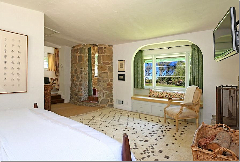
In this view, you can see that Reese kept Kathryn’s curtains and even the portieres! Well, she must be a bit blind to have kept that window seat with a pillow that doesn’t even match! On second thought, Buckingham would have NEVER approved this! And that rug? It should be placed 3/4ths or 1/2 the way under the bed. I remember worrying about where Reese would put the baby – even thinking she could put her in that room up the steps – until she or he is older, at least. Guess they don’t have to worry about that now!
And as seen in the real estate brochure – nothing was changed – not even the chairs or the wood stool. There’s a new bathmat though.
And now, to the guest suite – located on the left wing. We have even more new pictures, never seen before. This entire section of the house was redone by Kathryn – it was formerly horse stalls and then storage. This would be a great place to stay - you could walk across the courtyard for meals or through the rotunda to enter the main living room or out back to the terrace and outdoor dining area. OK, I’m ready – just invite me!
And here is the left wing, which now houses the main guest room, as Kathryn found it – an unfinished room. Here you can see all the dark brown trim that Kathryn painted what she calls “Ojai Green.” I like the green so much more than the brown. It reminds me of what is known as Messel Green – a paint that Oliver Messel used on all his houses on the island of Mustique. If interested, read my extensive study of Messel HERE.
Kathryn designed the main guest suite to function also as a master bedroom. She said this was the most preferred guest room on the estate. Her new fabric line looks great here.
And here is the bathroom as redone by Kathryn.
Here is the guest suite – now redecorated for Reese. Not shown in Elle Décor – this probably was designed by Kristen Buckingham, but I have no way of knowing for sure. It is all new though – and quite attractive. Through the front door – you can see where the room enters the rotunda for quick access to either the main living room or the back terrace. The outside eating area is also through the rotunda. Very pretty!!
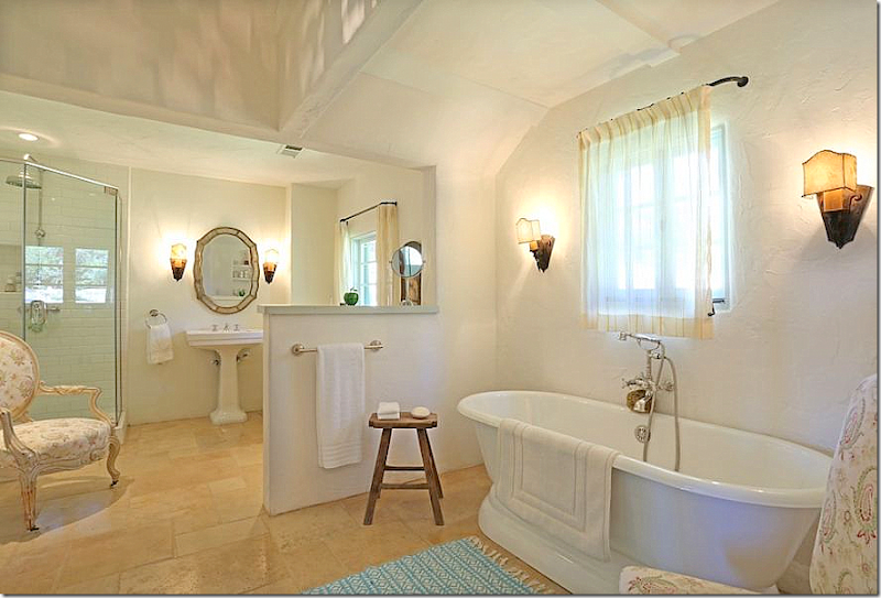
And again, the guest suite’s bathroom. Also, very nice! I love the French windows here that open up to the courtyard. And I love how Kathryn designed the open shower stall. She certainly used wonderful fixtures here in both the shower and the tub.
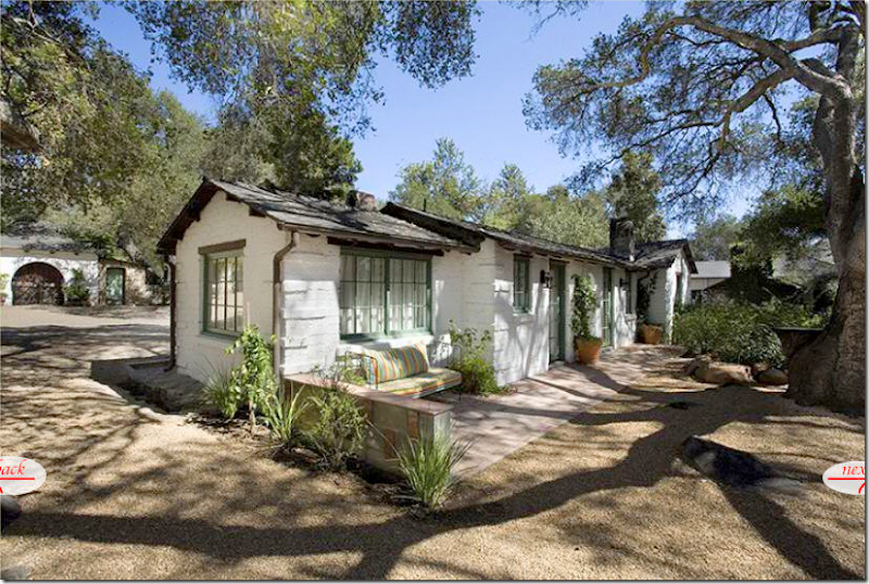
The Caretaker’s House was built to house workers while they renovated the ranch, turning it from a place for farm animals into a place for humans. On the other side of the house, you can see the huge tree that is still standing.
And the Caretaker’s House as it looked while Kathryn lived here. Here is the tree that predates the ranch. The house is past the bedroom wing and is closer to the swimming pool and stables. I believe this is also what is called the Guest Cottages. Notice all the flowering bushes in front of the house and the plants around the tree. This is all now gone for some reason. This photograph taken from the book, shows the caretaker’s house at its best.
And the reality – the same house as seen in Kathryn’s real estate brochure. At the left you can see the Forge and at the right, you can see the massive ivy covered fireplace in the kitchen. At least the photographer had a sunny day which captures the tree’s shadows.
And, the same Caretaker’s House or Guest Cottages as seen on Reese’s real estate brochure. Notice the empty beds where all the bushes were – and around the tree, where all the iris were. I wonder why they were pulled out? This photograph is not quite as appealing looking as the photograph in Kathryn’s book.
Inside the caretaker’s house is the first of the guest cottages as decorated by Kathryn Ireland. Here she again uses a mix of all her different fabrics. The windows and ceiling are both so charming. In her book Kathryn says the guest cottages are close enough to the main house to not feel like you are in Siberia, but far enough from the main house to have privacy. I would gladly stay here!
One of the bathrooms in the guest cottage – it has it own fireplace! So romantic.
And, here the same guest room, as decorated for Reese, shown in her Real estate brochure. It looks like she kept it exactly the same, even down to the pillows, although she did add one. I love the windows here – it’s nice that the real estate photographer thought to open them up for the pictures.
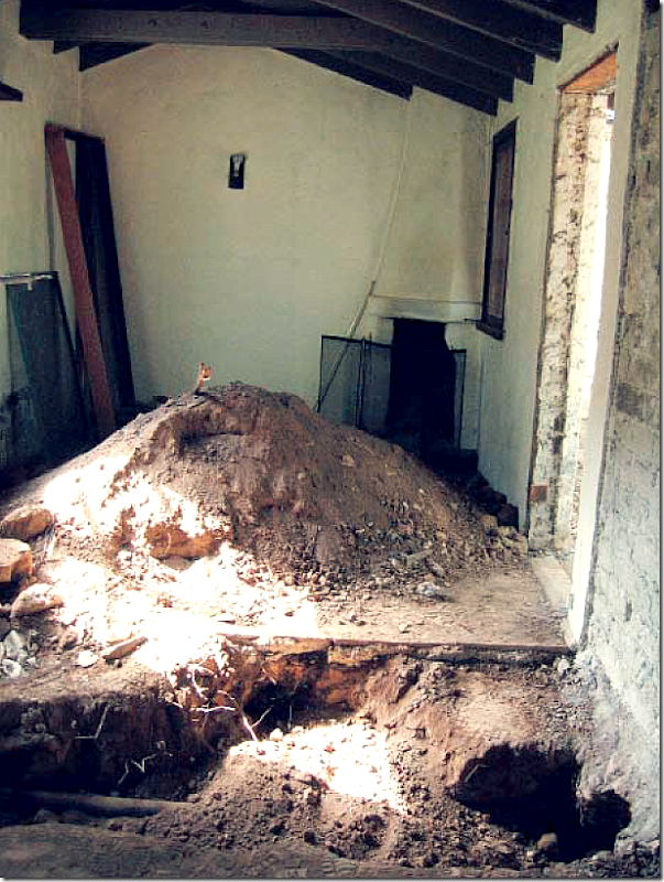
The only picture of the second guest room in Kathryn’s book – shows how it was before. She probably dug the trench to make room for plumbing pipes. Notice the Kiva fireplace in the corner. There are several of these types of fireplaces in the different estate buildings.
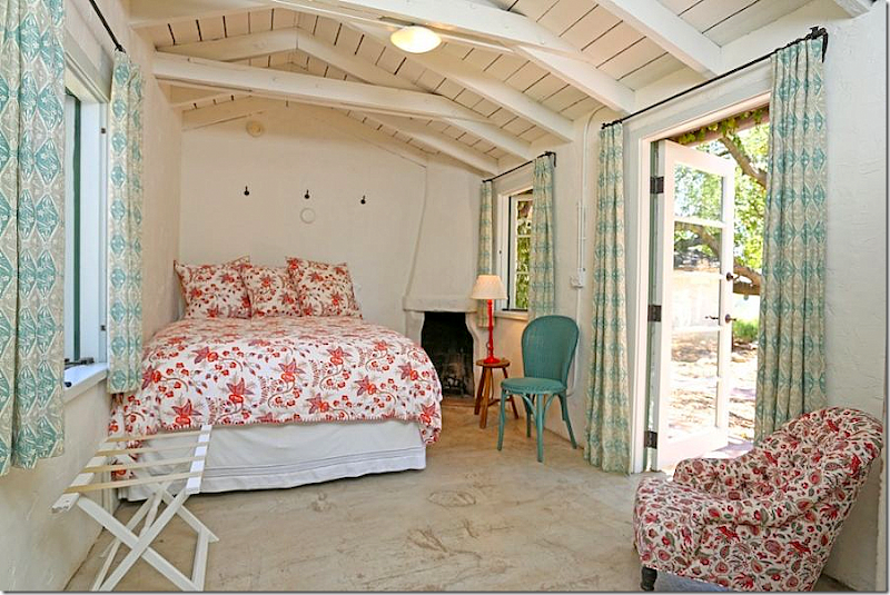
And the same guest room as it looks today – under Reese, seen in her real estate brochure. Not sure if that is the bedspread Kathryn used, but the curtains certainly are – those are from her fabric line. And remember that chair in the children’s room, it turns up here. This is another charming room with the beamed ceiling and French doors and windows.
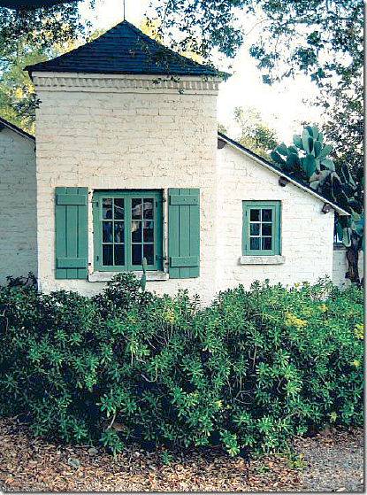
For her book, Kathryn captured the tiny Gatekeeper’s house. It looks so charming. Inside is a small guest room – complete with a sleeping loft.
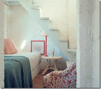
The only photo of the tiny guest room – and oops, there’s that chair again! This is how it looked under Kathryn. There is no photo from Reese’s stay.
Capturing all the buildings on the property in a good photograph is subject to the sun, the way the plants are blooming on that particular day, and the photographer’s skill. This photograph taken before Kathryn – during the Ramis’ stay – shows the huge oak tree outside the bedroom wing and the main house that Reese had cute down. You can see how the property wasn’t really landscaped.
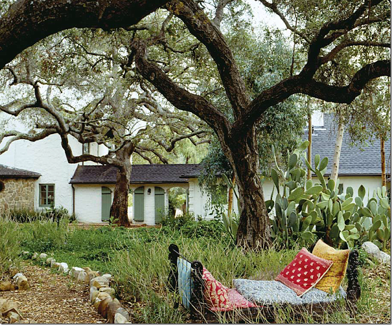
Here for the book, Kathryn shot the same area behind the main house and the bedroom wing. She used this iron bed in several settings. Notice how the photographer placed his camera to get both large trees in the picture.
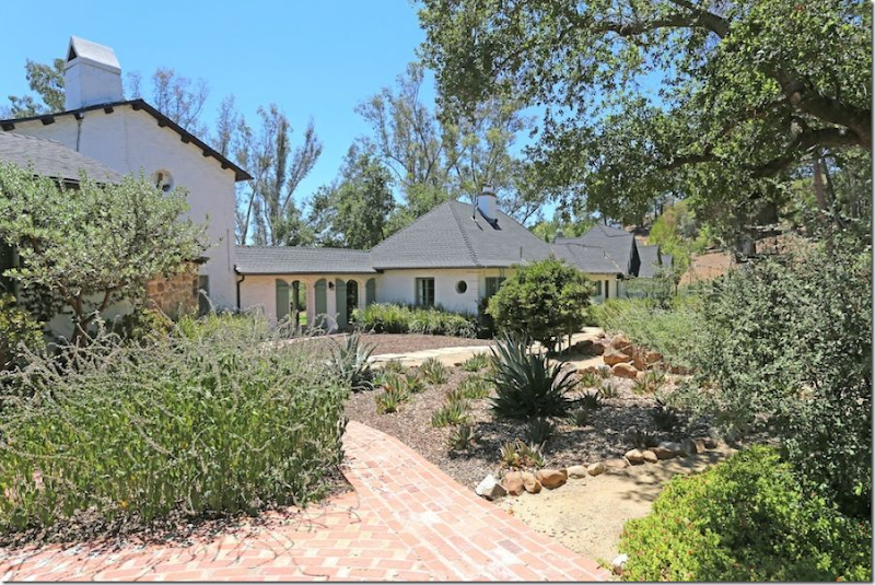
And during Reese’s time – the huge tree is now gone! What a shame!!! Instead there is a large empty flowerbed and newly laid brick walkways that lead from one outbuilding to the next.
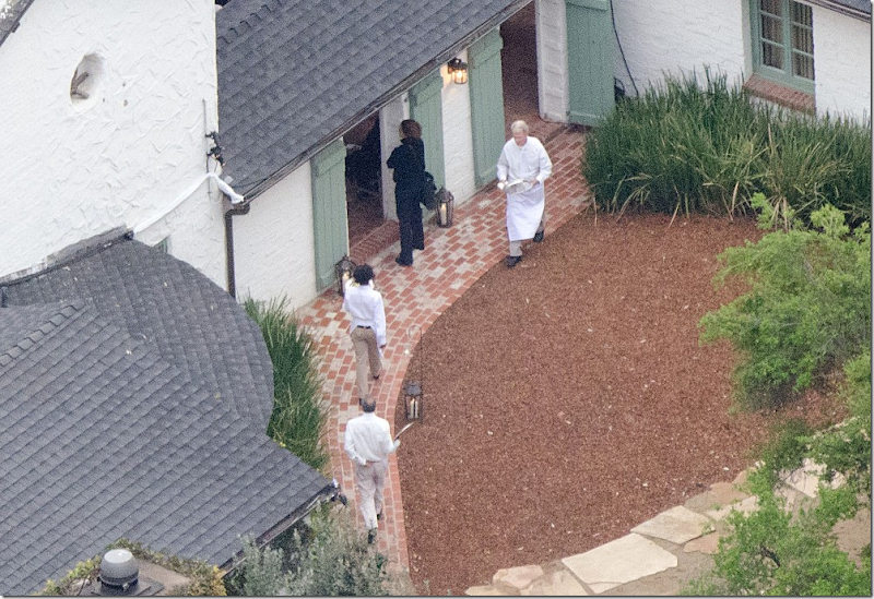
And from the paparazzi helicopter, during Reese’s wedding, you can see the tree is definitely gone and replaced by the beautiful brick sidewalk.
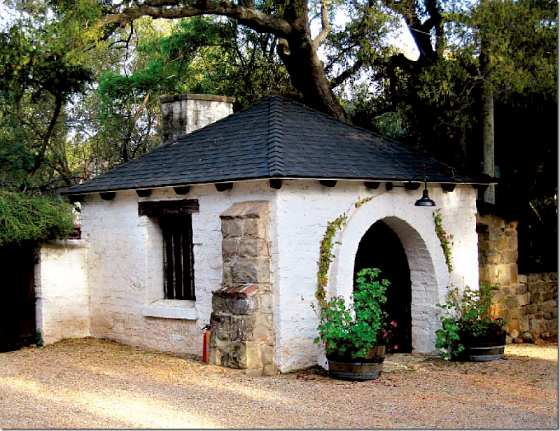
For Kathryn’s book, she took a picture of the charming original Forge where much of the hardware, the nails, the doorknobs, sconces, etc. was fabricated.
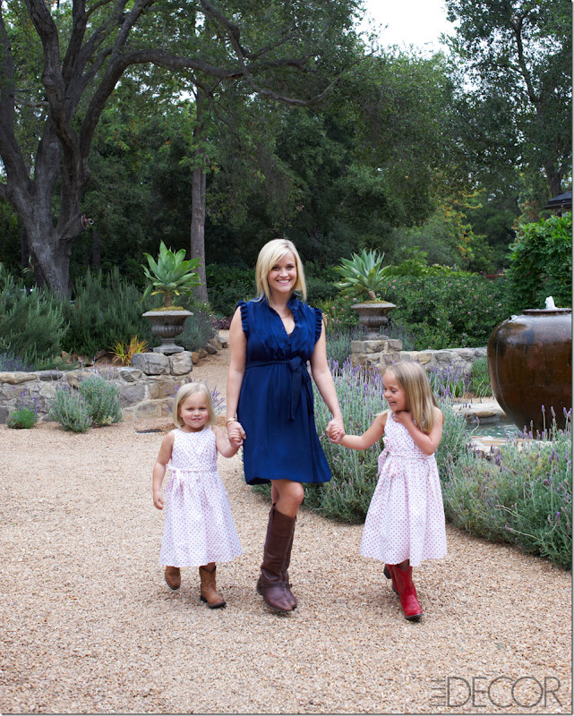
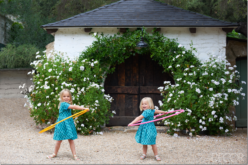
But, the Elle Décor photograph of the same Forge, is the winner. The overflowing tubs of white flowers and the softening vines – add much to the photograph. But it’s Reese’s two nieces who really steal the show. Again, there’s nothing better than a professional photographer and his trusty stylist.
A rare, original photograph of the carriage house and the gatekeeper’s house. Even way back then they tried to grow vines to soften the wood doors.
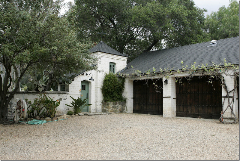
Kathryn added a iron pergola for the vines over the garage doors. And she painted the gatekeepers house Ojai green, along with putting in a charming light above the door. This is where the secluded, tiny guest room loft is located. But, this photograph – taken on an overcast day is lacking. Plus, a professional photographer would never leave that hose laying on the ground like that!
Kathryn’s real estate photographer took a better show – with the sun streaming, he captured the forge along with the carriage house and gatekeeper’s house.
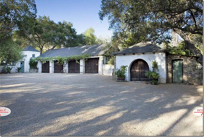
Reese’s real estate photographer took a poorer picture – he is so far back, you can barely see the gatekeeper’s house and the forge is hidden in shadow. Not sure what he was doing here, but the picture can’t compete with Kathryn’s. Notice though, how much the vines over the pergola have grown since Kathryn planted them!! I wonder if she has ever visited the ranch again and seen how her landscaping looks now that it is all grown out. I would think that she would love to see it.
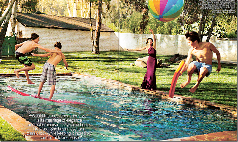
For the magazine shoot, Kathryn styled the pool, using her sons as props. Again, such a charming picture – it makes you want to jump in and join them, which is the power of the photographer who captured this particular moment in time.
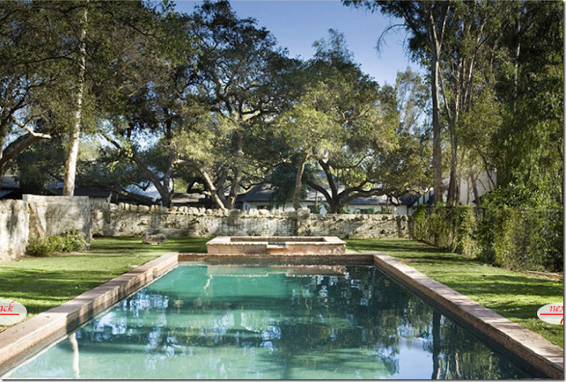
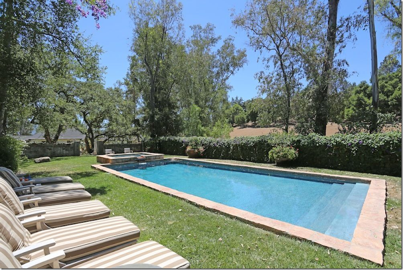
But, for her real estate photographs, the pool looks a little worn and boring and frankly unappealing. Many of you commented on the wire fence and why it wasn’t replaced. What you didn’t notice is that she had planted vines which hadn’t yet grown up over the fence.
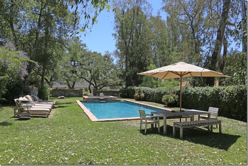
Now, in Reese’s pictures – the pool looks clean and blue, not green. The furniture and umbrella soften the hard edges of the stone fence. And notice the purple flowering vines that completely hide the wire fence now! All gone. The pool area looks very appealing now. BTW, Reese also installed a white picket fence all along the back of the property.
At first I thought these benches might be the white chaises seen on the terrace of the Elle Décor photo, but these are completely different. White arms and striped fabric – so charming. The white chaises must have been borrowed for the photoshoot. Here you can see how thick the vines truly are – and she has also added a few tubs of flowers. Nearby there is also a trampoline and a ladder that leads to a tree house, all added by Reese for her children. I wonder who will be enjoying them now?
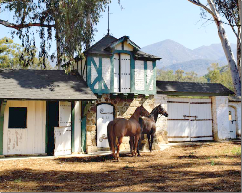
The stables are so cute, it would be hard to ruin a picture of them. This photograph, professionally taken for Kathryn’s book shows the charming stables with the two horses perfectly placed. Someone is probably standing off to the right offering them apples. Luckily the sun is shining, dappled through the beautiful eucalyptus trees. Must smell wonderful there with all the eucalyptus around. And, notice the gorgeous mountain range in the background. What a beautiful piece of property this is!
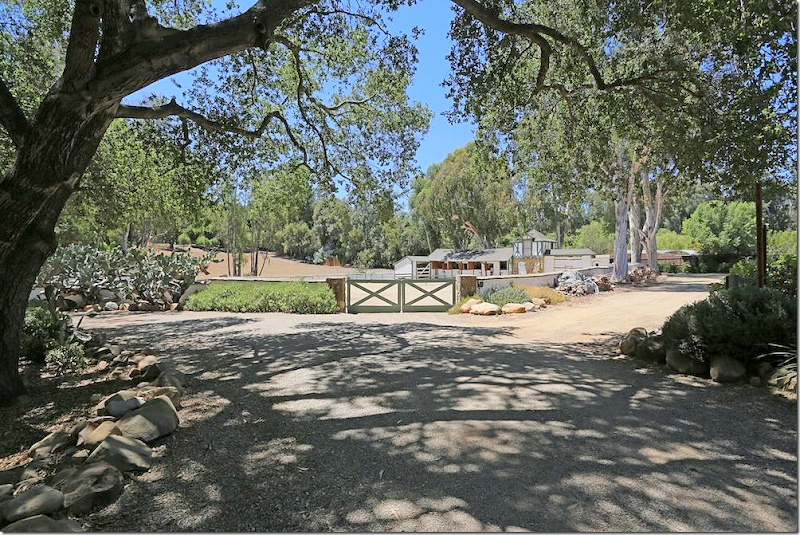
Reese’s real estate photographer closed the gates to set the scene. Another beautiful, sunny day for him.

He captured the entire stables, but didn’t think to add the horses in with it. And in another missed opportunity for him – by standing where he did, he didn’t get the mountains to their best advantage. If a prospective buyer was looking for a good view of the mountains he wouldn’t think this ranch had one – but it does! Compare this view with the photograph that Kathryn took of the stables.

Kathryn’s real estate photographer took these pictures to highlight the mountain view on the property.
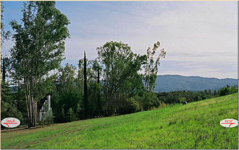
And here again, someone viewing Kathryn’s real estate brochure would know that the property came with beautiful mountain views. These photographs probably are what enticed Reese to take a look at the ranch, and to buy it – just a few short weeks after Kathryn had listed it! I wonder how long the property will stay for sale now. The price may deter a quick sale, but for a celebrity who wants to hide out, this is the perfect place – as Rob Pattinson no doubt knows! (had to get that one in!)
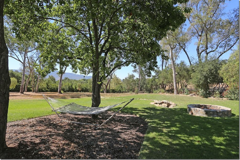
Reese’s real estate photographer did capture the view in this photograph – although if he had stepped over to the right some, you might see more of the mountain range.
And that’s it. I have to say, I really had my eyes opened with this one. The Elle Décor photoshoot seems so phony to me now. Rooms styled just for the shoot, other rooms changed so much they aren’t recognizable anymore. They shlepped so many props and furniture for the shoot – do they always do that????? On the Skirted Roundtable, we’ve been told by magazine editors over and over again that those days are over. What they owner has is what you see – but that obviously isn’t true.
I wonder, do you felt taken or used by Elle Décor? You were shown a house that really doesn’t exist as they said it did. Does that matter to you? Would you rather see a beautifully styled room than what it really looks like? Bringing flowers and accessories, maybe pillows and throws is one thing, but to totally remodel a room just for the shoot is something different altogether. Are you surprised at how the house actually looks compared to how Elle Décor portrayed it? I was. Totally shocked.













0 comments:
Post a Comment