Today’s question comes from Jennifer – who doesn’t say where she lives, but it looks like it’s somewhere up north maybe? Not sure!
Jennifer writes:
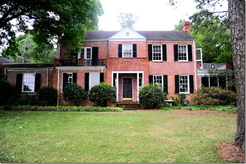
Dear Miss Cote de Texas: My husband and I recently moved. We left our "forever home" which was a "fixer-upper" when my husband got transferred out of state and we have purchased another "forever" house that is also a "fixer-upper." For now, we are tackling necessities, the pretties later. The home is brick and sat vacant for over two years. There are two exterior balconies that both need to be redone as the roofing material on the floor is not suitable – it’s leaking, and causing rot issues. In the next few weeks, we will begin redoing both balconies. We plan to replace the "rolled roofing material" with slate flooring (seen below - I hope!). Eventually we'll replace the porch flooring and the screened in porch (to the right) with the same slate for a unified composition.
But, the big question is regarding the balcony railings. The wrought iron railing on the front and all the wood railing on the right side will be coming down. Our contractor has offered to clean up the wrought iron, repaint it, and put it back just like it is, and also to rebuild the white railing (to the right), or to replace all of it. We think we are in favor of replacing all of it. However, this is one of those things that I want to do right the first time and not look back with regret - which is why I so deeply value your opinion and would be SO, SO, SO grateful for your help! Do we do both railings the same and unify the look? Should they be kept different? I'd much prefer iron to wood for maintenance sake. We just want to do it right the first time. We pay cash as we can, so the progress will be slow going, but steady. We hope to be here for the long haul. The house has great bones and is loaded with potential!
Miss Cote de Texas, PLEASE, PLEASE, PLEASE help us!!! We would be so grateful!
Dear Jennifer:
My first thoughts are wow – what a beautiful house! I love old houses, they have such a charm that is lacking from most new houses – they are so much quieter for one, because the walls are more solid, as are the doors. I love the room sizes and ceiling heights and how all the rooms don’t open up onto each other as much as they do in new construction. And I love all the romantic nooks and crannies that are found in old houses such as yours.
Now, onto your problem. I must say, as you know, I am not an architect, so take my suggestions for what they are worth (not much!) You might want to think about making an appointment with an architect to get a learned opinion. It would probably be worth it in the long run.
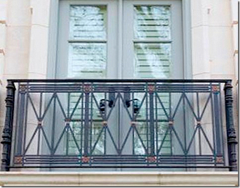
But, in the meantime, here are my ideas. My first immediate thought is that I do think the two railings should be the same. The house isn’t quite symmetrical, so if the railings were different, I think that would play up the asymmetrical look. The iron railing that is there now seems a bit ornate. I would research railings that are more simple in design. The railing you sent me looks a bit French and a bit contemporary. I don’t think I would use that exact one, search for one with more classic lines.
This is the railing you sent me – but I’m not sure I would go with this railing. It doesn’t seem to match your house’s style. This would be more suited to a French design, not a Georgian brick house.
Now, after saying that you should do both railings the same – I looked at houses where there were two different railings, and I can see that could be the correct choice here also:
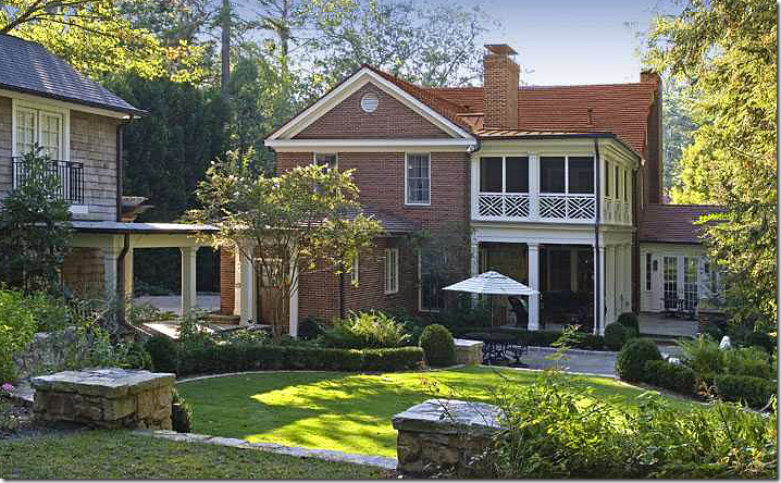
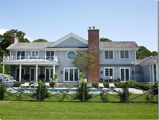
This is the back of a house – but notice how similar to your house this is with the porch and the wood columns. The wood railing above seems to make the two floors more cohesive in design. Notice how the wood column is repeated on the first and second floor – they seem to flow into each other. And notice, on the far left there is also a iron railing mixed in. The mixture of the wood and iron railings here seem attractive and interesting.
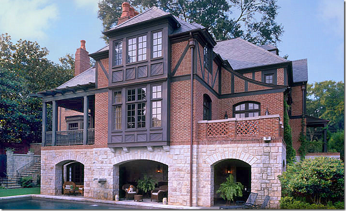
In this Tudor styled house, there is a brick balcony along with an iron one. The point is – would two different railings on your house be interesting or distracting?
Here, this house shows an upper wood balcony.
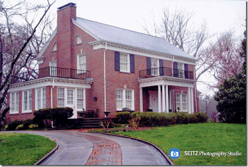
Now, here is a red bricked Georgian showing a similar design to yours. To me, the black railing seems harsh. If the rails were a softer gray color and the trim color was closer in shade to the railings, it would look so much better.
Your house: If you found a simple iron railing, and installed it in both places – but painted the columns on the right side the same color as the railing, it would blend in and be pleasing to the eye. But I think there is something else you should consider before making the final decision. The red brick!
I kept looking at your house, trying to decide if this was MY house, what would I do? In the end, I decided I would make both railings the same. As long as the iron design is kept simple, it will look good on the right – and on the left, too.
But, the main thing I’m thinking you should do, and what I would do immediately if this was my house – would be to paint your red brick and get new shutters or at least paint them! I think this will make a huge difference – and it could even make a difference in your decision between an iron railing or an iron and wood railing.
More ideas would be to build out a room over the two sides – or at least on the right side. And – add new gutters and landscaping which would be long term goals. I think I would close in those columns next to the front door and add fabulous gas lanterns on both sides of the entry. Here are some pictures to give you ideas:
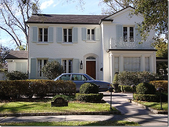
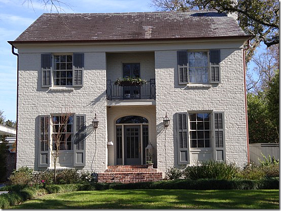
This red brick house was painted cream – and notice the iron work! Painted to blend in without sticking out. This house is beautiful – love the pale celadon colored shutters.
Note: here is the slate Jennifer wants to use on the balcony floors. If she did use this – she could pick out the paint colors from the slate – the shutters could be a darker celadon and the brick could be a soft, light gray or pure ivory – exactly as shown in the above house.
Painted brick, copper gutters, gas lanterns, and the iron work is painted to match the gray shutters. Another beauty!
Painted brick, although it’s a little too yellow/creamy. But notice the left side with the wood railing. It looks like a room was added on the top of the sunporch of this house – exactly what you could one day! These colors are not great – the green shades look dated with the yellow/cream brick. IMO!
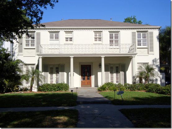
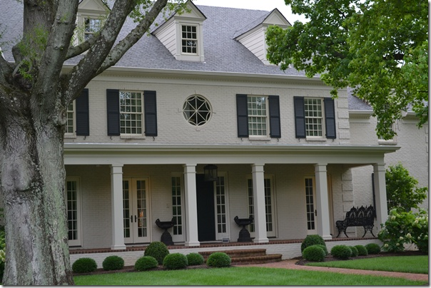
Pretty, pretty painted brick – very true cream without yellow. The shutters are just a bit darker. Notice the grill work – painted the same color as the brick. I love this look.
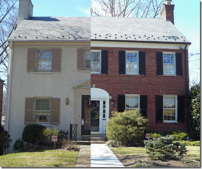
Two identical houses in the same neighborhood, except one is painted brick. Look how much fresher the house on the left looks.
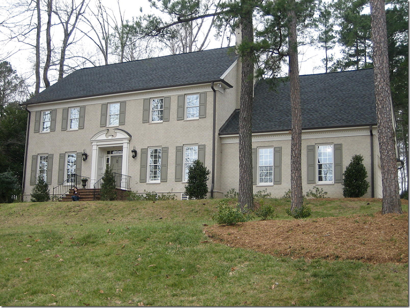
Painted taupe brick with a moss green shutter. Very pretty.
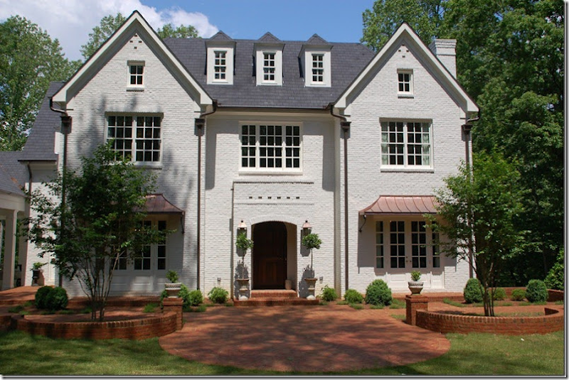
This house was updated with paint and great landscaping. The copper awnings really add so much to the house. Notice the bottom windows were traded out for French doors. Lanterns. Beautiful!
Another painted brick house with new black shutters. This wood railing above the front door looks nice in ivory. And notice they mixed the iron railings on the railing with the wood balcony.
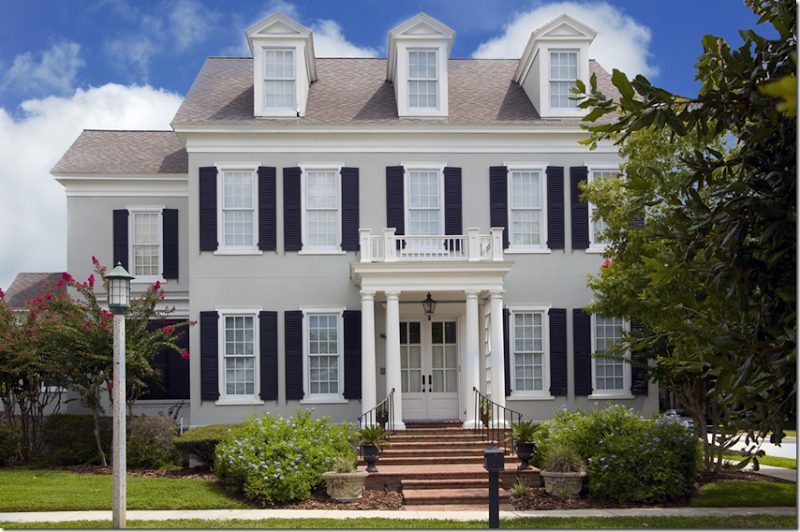
Taupe painted brick with black shutters, lantern.
Cream brick – shutters were removed and new French doors now replace the bottom windows. Pretty driveway gate on the right side.
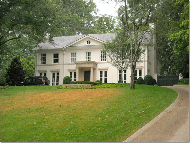
Painted a light gray. Notice the landscape here – I love the curved line of clipped box and the plain Versailles wood planters. Very simple, but elegant!
One last house – again, the landscaping is elegant – just groundcover and small box. Pretty painted brick with a great lantern. I especially love the old brick sidewalk with the steps and welcoming planter boxes!
Jennifer, thanks for sending in your question! I hope this gives you some ideas. Be sure to read the comments as the readers will have lots of great ideas too!!!
To enter a question to Dear Miss Cote de Texas – just email me at mrballbox329@aol.com
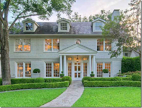
And finally, did you hear that Gwyneth Paltrow and her husband Chris Martin just bought the Veranda House that Windsor Smith designed?!! What a lucky girl to be living there!!
I wonder who will be the designer – or will she do it herself? I love the entry – pictured here, a long wide room with gray and white stone checkerboard floor.
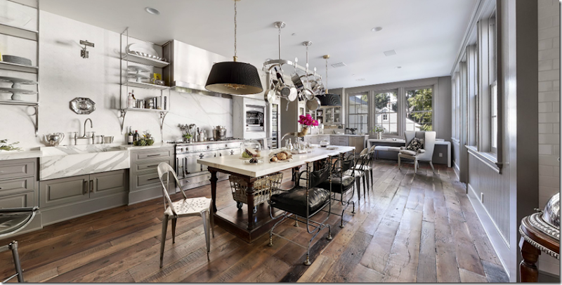
And the best room - the gorgeous kitchen. Maybe one of the prettiest ever!!
And looking the other way – the walls in the kitchen are either white marble or subway tile!
The great 360 tour of the house is still up – catch it before they take it down for good – HERE.






0 comments:
Post a Comment