1
Vermeer: Lady with her Maidservant
Dear Miss Cote de Texas: I would love your guidance on how to use color and texture effectively to create a focal point and maximize style in Great Room, Breakfast Room and Entry. I'm open to changing or adding color, introducing new fabrics & area rugs and slip covering yellow stripped chairs in GR.
This homeowner has a lot going for her already. She has nice furniture and accessories and a very pretty house. She just wants to pull it all together and get a more decorated look. In my opinion, the best way to get a “decorated” look is to have professional made window treatments and pillows. Have a proper sized rug. Accessorize the shelves and the tables. Just be doing these things, you could use an Ikea couch and chair and tables from a catalogue, and your room would still look professionally done.
Starting in the entryway, she could use an area rug here. Perhaps a flat weave with a pattern in it – like this:
Assorted antique Kilims from Pottery Barn would be a nice choice with lots of color. Or she could go a bit quieter with one of their plainer textured rugs.
The family room with sofa and love seat in a soft cream and two yellow chairs.

Looking towards the breakfast room.
And from the kitchen back towards the family room and entry.
The breakfast room leads to the deck.
What a great view!!! Wow! So pretty!!!

OK, I’m going to give you all my ideas – just as if you were my client.
The main problem I see is everything is the same tone, the same color – a light creamy yellow. Nothing really pops, except perhaps the chair fabric with the stripe. Everything just blends into each other. To solve this:
1. I would recover the sofa and slip them in white linen to pop the room with a brighter shade. The white would really lighten up the room and create some contrast.
2. Another big problem is the window – it really needs curtains. But, the issue is the arch above the bottom windows. It’s the typical problem window without one easy solution.
Now, if this was my house, I would have the window removed. It wouldn’t cost that much at all to do this and it would really make a difference. Once the window was removed, I would get a curtain rod and hang it about two feet above the windows. Then I would buy one textured shade and place it in the “dead space” between the rod and above the windows/French door. Next, I would hang four panels of 1 1/2 widths of fabric across the windows.
The reason why I recommend removing the window is that if you place a shade over the arched window, it’s just too wide. Here is how it would look with a shade hiding the arched window. See how wide the shade is? By taking out the arched window – you could lower the rod a foot or two and it would still be make the windows taller than they are now, but more in proportion. Check to see the price before you say “no” to this idea! It is probably much cheaper than you imagine it.
How the windows would look covering up the arch window with a shade. While this does heighten the window element, the shade is just too wide.
If taking out the window is not an option - would it be better to hang the curtains and just not use the shade? Probably. Here is how it might look:
Better than with the shade.
Here is how it would look to just ignore the arch and just use curtains on the bottom windows.
An another view.
Just as long as you don’t handle the arch like this!
Or like this!
So, to sum it up – you have a few options:
a. Remove the arch window. Use a rod 2 ft above the windows/French door and put a shade under the rod to hide the dead space.
b. Keep the arched window. Put a rod over the arch and hang 4 1 1/2 width panels from the rod. No shades.
c. Hang a rod right above the windows and just ignore the arch.
I put them in order of which would be the best route.
3. Next, I would use a patterned fabric for the draperies and the pillows. Make the pillows 24” and use two per sofa and one lumbar pillow for each chair. Down inserts only. Use a simple seam or a 1/4” flange.
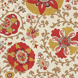
4. I picked out some fabrics from Calico Corner that could be used with what you already own or with the white slipcovers on the sofa:
The top two are new Nate Berkus fabrics which you could use for the curtains and then mix and match pillows. This would certainly brighten up the room and they are youthful looking, too. Plus I love them mixed with white linen.
I also like this Suzani fabric for the curtains:
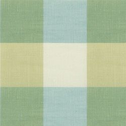
Or you could go for a lighter look with these two fabrics:
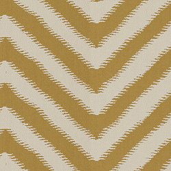
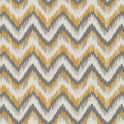
Or a brighter gold and yellow and white:
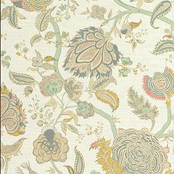
I love the gray mixed with white and gold:
I love these mixed with the white sofa and whiter walls:
5. All your tables are the same color, which blends into the floor, again not giving you any punch. Think about painting the coffee table black and staining the side tables a rich brown. Also, I would think about switching the two tables.
Get a garden stool for between the two chairs. From Wisteria.
6. I would get custom cut seagrass for both the family and dining room. If you can’t find it custom cut – try this Stark rug that is now available at Pottery Barn. These rugs will add some needed texture and the pattern adds some punch:
For even more punch, layer a white cowskin over the rug, under the coffee table.
7. Your shelves: Think about painting the shelves a darker shade and then redo them with white accessories. A reader sent me these pictures of her shelves – which would be a great look for yours:
Here are the reader’s shelves and I love the way they look! You could paint the back of yours a much darker shade than is on the walls. Then, use a set of white plates instead of a lot of books and framed pictures. Don’t have white plates? Look on EBay! And I love the sunburst mirror on the mantel, instead of the framed print you have. The sunburst really pops. See how these shelves become a focal point? Very well done!

Close up of one side of shelves. I would remove the second shelf from the top on your bookcases so that you could do something more dramatic on the next shelf – like this.

Wisteria sells a great sunburst – two sizes.

Add a chandelier to the family room – from Wisteria.
In the breakfast room – I would extend the décor from the family room here. Whatever curtains you use in there – use here and use the same rug. For the windows, raise the rod about a foot over the molding, put a textured shade in the dead space, and use 3 panels of 1 1/2 widths on this window, and 2 panels of 1 1/2 widths in the other panel. Remember – always use interlining and lining. I ALWAYS use a blackout interlining to keep the sun from shining through the fabric and to make the draperies look thicker, heavier, and more luxe.
Your table seems a bit small – maybe get a larger one at 48 or 60 inches. If you use white slipcovers on your sofa, use the white linen here too. I would also get wicker chairs to place around the table. They would be bulkier and would better fill out and anchor the space. Put the chairs you are now using on either side of the cabinet. Make slips for these seats and the bar stools – either out of the white linen, or one of the patterned fabrics. Take off the shades on the chandy– those are a little distracting and replace them with plain shades.

Ballard Designs makes these great looking wicker chairs. These would help fill out the space and add lots of texture and punch.
I hope I’ve give you enough ideas to give your rooms more texture and focal points. Thank you so much for sharing your beautiful home with us!!!
If anyone has any other ideas for the windows – or the rooms in general, please leave a comment to share them!
AND, if YOU have a decorating question – email me at mrballbox329@aol.com
FINALLY - WOW!!!!! A sale at BROWN!!!!!!!


Subscribe to:
Post Comments (Atom)
0 comments:
Post a Comment