First, let's go back to the inspiration pic I found on pinterest:
 |
| Source |
Here's the wall I needed to fill (the one next to the door):

Here's how it had looked prior to stenciling:

Those floating shelves were actually there when we purchased the house, and I just left them. It was time for a change.
Back to the martini sign. I knew just one wouldn't be enough to fill the space proportionately, so I decided to make 3. But what should they say? I'm more of a wino myself, so I brainstormed a few wine names that were around the same length, and ended up with Cabernet, Zinfandel and Pinot Noir (love me some reds!)
Then it was time to figure out how to make them.
I wanted them to be lightweight/easy to hang and relatively flat on the wall, almost more like a metal sign than a chunk of wood. After measuring the wall, I decided that 6" tall x 2 ft wide was the perfect size.
I headed to Lowe's and guess what?

Hard to read the label, but it says 1/2" thick by 6" wide by 2 ft long. For just $3.43/ea! Lowe's, you never let me down.
$10 later, I was back home with my boards figuring out how to paint them. Instead of black, I thought a rich brown would suit the look best. I opted for ORB spray paint (which I already had on hand) to make things super easy and add a bit of sheen to jazz them up.

10 minutes later...

Next it was time to apply the letters. I am sans Silhouette Cutter, so I always like to find new ways to apply words to things. I've used different methods in the past, including my tea time sign and trash bucket, but I came across yet another method from this blog, using just a pen and paint brush. I'm always up for something new so I decided to try it out.
First: design the signs.
I measured out the size I wanted the text to be:

I left around 1.5" on all sides.
I chose a basic bus roll-esque font (called BN-67 9010-03... strange, I know) and evenly spaced out the text in an editing program:

I added the boxes around the edges to know where to cut the paper so they all lined up. Since they were larger than 11", I had to split them up into several pages to fit onto my letter sized paper.
 |
| Don't mind the low on ink streaks |
Once everything was printed, I trimmed the edges, positioned them onto the boards and taped in place:

Lovely.
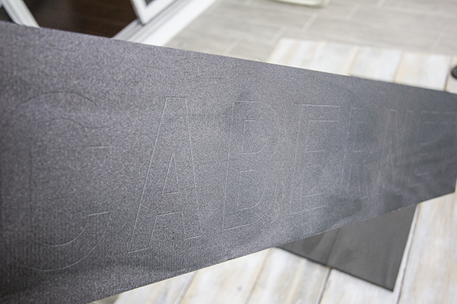
Then it was time to trace.
The instructions said to simply use a ballpoint pen and apply pressure, which will create an indent in the wood for you to fill in with a small paintbrush. This wood is especially soft so it worked quite well.
Luckily, most of my edges were straight so I used a ruler most of the time:

And voila!

Then it was time to paint.
The key is using a small, flat stiff brush for the cleanest line. It's pretty crucial to have the right tool for this job or the edges will end up sloppy.
I wanted the signs older looking, so I custom mixed an off-white using paints I already had.
On the first sign, I coated the insides of the letters with paint first:

Then came back and smoothed out the edges, following the indentations I had made. This part takes a steady had and lots of time, but I enjoyed it because I find painting therapeutic (not wall painting!).
I posted a sneak preview on Instagram midway through... (if you use instagram, follow me @jennasuedesign!)

Finally, after about an hour per sign, the lettering was complete:
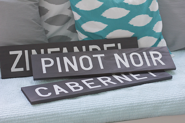
Happy dance.
I liked them the way they were, but wondered if adding a pinstripe border would make them look more finished. I debated for a while, and finally decided to go for it.
Not trusting myself to freehand something so exact, I used painters tape:


And I was digging the results.

Finally, they were all done!

And now, the grand finale reveal of the dining nook.
For fun, let's revisit the space when we bought the house two years ago:


Phase 1:

Phase 2:

And the final phase:


 |
| Print found here |
And that is that! I love seeing the transformation. We've come a long way from mirored walls, multiple wallpapers and carpet. And it was all worth it.
Next week I'll be getting into the fall spirit with a couple crafty things. Until then, I'll leave you with a couple random tidbits:
1) I spotted my font on TV for the first time today...

in a Monistat 1 commercial, hah! Too funny/awesome. If only I had a dollar for every time this font was used, sigh.
2). Tomorrow I'm debuting a new line of prints I've been working on for a while, and I'm super excited about this one. I'll be sending out a coupon code just for those who are on my mailing list, so make sure to sign up so you don't miss it!
That is all. Time to go cuddle with the family. Happy almost-end of summer :)

0 comments:
Post a Comment