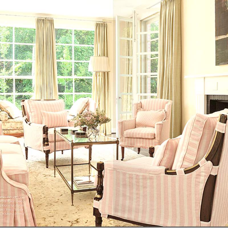
Last week, we looked at the beautiful living room by Ladye Kay Allen from Dallas. The slips actually are only for the spring and summer – they are put away in the winter months. While there are other fabrics besides the Peter Fasano stripe in the room – it is the most dominant fabric.
In addition to the living room, the dining room also has the seasonal slips. I love this look. I love one fabric/one print decorating, my own house is filled mostly with white linen slipcovers. I love the cohesive look to a room or a house when mostly one fabric is used, but is it boring?
Dan Carithers designed this room 25 years ago using the linen stripe as the only pattern. I fell so in love with this room that I copied it in my first house, using the same linen stripe on all the furniture except for a few pillows and a skirted table. Stripes are particularly attractive when used as a singular fabric in a room.
Another living room – showing one main fabric, a blue and white stripe.
Lee Radziwill likes to decorate using one fabric. Here she used a stripe in her NYC apartment.
Another room of Lee Radziwill’s in her former Paris apartment shows everything covered in the same toile pattern. Is decorating with one pattern a good design statement – or is it a lazy way to decorate? Would this room above look better if there were different patterns here – or does this one toile make a fabulous statement? I vote for the fabulous statement.
Checks are another popular fabric to use in one-fabric/pattern decorating.
This bright blue and white check looks more effective used everywhere in the room. It would have been even more effective if the fabric was put on the walls.
Using one fabric is not a new idea. The earliest rooms most often had one fabric, as shown here in Versailles.
The French aristocracy used one fabric to cover the walls, furniture, curtains and beds. Of course there wasn’t a decorative center back there with a million choices of fabrics.
Toiles are a popular fabric for one fabric decorating.
Charlotte Moss used this red toile, mixing it with a silk leopard velvet.
Another popular fabric is a Tree of Life pattern. Here, one fabric covers almost everything. Again, it is hard to imagine this room decorated with many fabrics instead.
Ginny Magher used one floral print in her former bedroom in Atlanta. The effect is beautiful and pleasing.
This room has a pretty yellow/green toile covering everything, including the walls.
Blue and white toile is a popular choice – the white bed linens help to break up expanse of toile and the break in the pattern is a good choice.
There are several toiles that have become popular for one fabric decorating – this Old World Weavers toile is quite popular.
Here the same toile in the red colorway. The mustard colorway is also very popular.
This Scalamandre toile is another very popular toile - especially in the green colorway.
Here it is mixed with a brown check. The fabric has long vines running through it that are especially feminine and pretty and simulate movement.
Another room with the Scalamandre toile.
One of the most iconic fabrics for this type of decorating is this Brunschwig & Fils pattern – Verrieres. This room in the Verrieres estate is where the fabric got its name. Louise Vilmorin is pictured in her drawing room – as it was decorated for many decades, never changed. I’m very familiar with this fabric as my parents had a bedroom decorated in it– but their rug was a needlepoint in cream, with the flowers in the blue. It popped the fabric much better than this rug, I must say!
Another view of the room – notice the tea table with the blue and white porcelains imbedded in it. Little Augury has a wonderful story about the history of this room and it’s fabric HERE.
Mario Buatta used the iconic fabric in this most celebrated Kips Bay Showhouse room. He mixed in a few other fabrics including persimmon silk on the vanity table.
The tall curtains were so pretty.
In the corner, Buatta covered a sofa in the toile.
Years later Buatta used the same fabric in another room. The scalloped edge is used on the hem.
A vintage room with Verrieres. Too much of a good thing? Perhaps a bed covered in white linens would have provided a break from all the blue?
Here it is in Peach – in another vintage room.
This fabric is often used in one pattern decorating – it is a newer design by Manuel Canovas. Here, Ginny Magher used it in the black colorway in her Provence house – mixing in blue bedding which is a nice touch.
Mario Buatta effectively used the Canovas Melon toile here.
A close up of the Buatta room.
The pink color way is very pretty. Amanda Nisbet.
Buatta again.
A vintage English room – with a creamy bedspread.
Gerrie Bremermann used the fabric in peach.
Another popular fabric used in one pattern decorating is Bennison Roses, shown here in Carol Glasser’s former bedroom. After Carol showed this bedroom in a magazine, many copycats sprung up using Roses. It is still a favorite of mine. Shannon Bowers used it in her bedroom in gray – in the new Milieu issue.
One of the most iconic fabrics used in single pattern decorating is Bowood – the Colefax and Fowler fabric. Bowood is named after a piece of fabric that the famous decorator John Fowler found on the estate Bowood, which he then had manufactured. Over the years – it has become one of the most popular fabrics used. The three roses fabric comes in two colorways – in glazed cotton or union. This month’s House Beautiful featured a delightful beach house designed entirely in Bowood.
The Hamptons house is designed by Justine Cushing, a New York blue blood interior designer. Her sister bought the former garage which is right next to the old Cushing summer house – a barn and cottage, also decorated by Justine.
The former garage was a wreck when they bought it sight unseen. They opened up two rooms to make the large living/dining room. To unite the small house, all walls were clad in beadboard and the wood floors are all painted white. Bowood was used everywhere – to great appeal, I think. You might think it’s a lazy way to decorate! Here, white sofas, floor and walls pop against the Bowood.
Looking toward the front window – Cushing believes in reusing all furniture already owned. Nothing goes to waste. I like the green coverlets she used on the white sofas.
Looking across from the living room to the dining area. Cushing says, as do other decorators who favor using one fabric – that it unites furniture which is mismatched. If you cover a room full of old furniture in one fabric – it tends to make it look decorated and special.
The dining room. The two gold consoles are pricey family antiques.
Before she decided to use Bowood everywhere – she had ordered this fabric for the kitchen blind. It’s the one fabric that is different!
The upstairs landing – with antique chairs and chest.
The master bedroom with the sofa covered in, Bowood, of course!
The master bedroom – I love the purple and white quilt used with the Bowood.
The guest room with handmade afghans.
The bathroom with the Bowood covered vanity.
Too much Bowood? I love the way the small cottage looks, all covered in the rose fabric. You would certainly have to love the fabric, but the simple, pretty Bowood is easy to love. It is so airy and simple and sweet. I love this beach house and would copy it, given a chance. Can’t imagine another fabric that could replace the Bowood though. Can you?
Here is a look at how other designers have used Bowood:
Here, it is mixed with checks.
Checks and solid fabrics and mirrors keep the Bowood from dominating.
Architect Gil Shafer used Bowood on the walls and ceiling to unify the attic room.
Bowood used sparingly in this French bedroom.
And again – the Bowood dresses down this fancy room.
Bowood in the red colorway – it is not nearly as popular as the green.
A dining room – with Bowood curtain. Love this!
Justine Cushing. Does that name sound familiar to you? A few bloggers have posted pictures of a Hamptons cottage owned by the Cushing family. The rooms had been decorated for decades and almost 10 years ago House Beautiful showed the house as it had been carefully and sparingly updated by Justine. I found the location of the house – the original barn and cottage combined – across the street from the Atlantic Ocean. You can see the house where the blue dot is above. And – right next to it – is the former garage turned cottage that Justine’s sister just bought – and which she decorated entirely in the Bowood fabric. The two houses both shown in House Beautiful – a decade apart – are wonderful Hampton houses. Instead of the huge mega mansions found there now, these are original, small cottages clad in shingles that remind you of what the Hamptons used to be like.
The original Cushing cottage – the barn living room. The walls are covered in a pansy paper. Most of the pieces are slipcovered in a Lee Jofa linen. The zebra rug here and in the garage/cottage is really a hooked rug. The slips covering the dining room chairs are in the faded companion print to the chintz.
The gorgeous crystal chandelier is a surprise in the barn cottage.
Close up of the dining room slips.
Here you can just barely see the decades old faded pansy wallpaper. The family calls this painting the Pom Pom Hat.