One of the most discussed and frustrating aspects of this blog has been the Comment Section. Judging by the numbers of people who read the blog (over 88,000 per month) by far, the great majority of you never leave a comment nor even read the Comment Section. But, there is a small group of people who do frequently comment – loyal readers all, some of whom leave a comment on every single blog story. After last week’s story – where over 150 comments were left – some of which were quite rude – I received many emails asking about what can be done to stop the rudeness and the bullying.
So, I thought I would tackle this discussion once and for all and hopefully, we can all move on from it.
There are several ways to leave a comment – some readers are registered with either a gmail account or their registered name. But for those without a gmail account, the easiest way to leave is a comment is by being “anonymous.”
Many of these anons will actually sign their name at the end of their comment so that we will know who they are. But, there are others who sign in as Anonymous, leave no name and they remain truly Anonymous by choice.
And there in lies the problem.
Most of those who are Anon are great commenters. They are respectful and kind, leaving words of encouragement, thanks, and appreciation. But, there are the very few Anons who aren’t respectful nor kind, nor thankful, nor appreciative. These few Anons can be downright mean, condescending, and ugly. They are rude to homeowners and guest designers who are nice enough to show their houses on the blog and they are rude to me – about my house, my family, and my aesthetic. The truth is, they don’t really bother ME. My skin is thick and I can take the criticism from them, but, it’s the homeowners and guest designers that are disrespected here which truly bothers me and other readers.
Understand this - there is only a handful of Anons that are the issue.
Many have asked – why do I allow it to continue? The answer is there is no simple solution. If I banned Anonymous comments, I would ban an awful lot of totally innocent people who just don’t happen to have a gmail account or who don’t wish to leave their name. To ban all of the many innocent people who post under Anonymous just because of the very few troublesome Anons is just not fair.
I could moderate the comments – in other words - not allow any comments to be posted on the blog until I have read them first. I have been reluctant to do this for this reason: If I got only a few comments – moderating would be an easy task. But, usually the comments average at least 50 a story and sometimes as many 150 and even over 200. Moderating a busy Comment Section would be a full time job, which I just don’t have the extra time to do.
Another solution would be to just delete the nasty comments after they are posted – but by the time I would catch them, many have seen the comment and responded to it, thus rendering the deletion moot. Again, if I got only a few comments a day, deleting would be a viable choice. But then, there would be accusations of censorship.
And there is this – as bad as the few nasty Anons can be – they are also smart and quite humorous at times. Many times they have good suggestions and they can be quite entertaining. Sometimes they say things or complain about something that we probably all agree with, but won’t say aloud. As much as I would love the nasty Anons to disappear altogether, they do challenge me and keep me honest and in check. They have a BS detector and when it is directed at me – it can be quite valuable. But other times – when they are rude to guest decorators and homeowners – I want to round them up and give them a spanking or wash their mouths out with soap!
I have also been asked why I don’t just block these mean Anons or why I haven’t “outed” them if I know who they are, since I have hinted at this for a while. First, I can’t block individual people. Second, I do have a way of tracking who visits the blog and who leaves comments – through their IP Address. So, if I know who they are, why not “out” them? Because while I am convinced I know their correct identity, IP addresses are not infallible and there is a chance I could be wrong. That’s why.
The nasty Anons can be like schoolyard bullies – once they get our attention, they start to show off and can misbehave, badly. Yet, most days, these same few obnoxious Anons can be quite well behaved. They usually tend to get rambunctious when I show a house by a young or unknown designer – and then all hell breaks loose. These two or three or four Anons will post comment after comment after comment – enraging everyone with their words. Sparring with them only spurs them on and makes them leave even more comments. It’s best not to engage them, not to answer them. Like the playground bully, if you don’t interact with them, they will go somewhere else to get the reaction they crave. Still, I admit, I am the most guilty of this interaction and answer them too much. Usually, I just want to set the record straight or I want to defend the guest designer and homeowner.
Why am I talking about this at all? Like I previously said, all the mean commenting by a few Anons came to a head last week. I showed a house done by a relatively new local designer. I LOVED the house. LOVED it. And most of you did too. But, the few mean Anons really outdid themselves. Over 150 comments were left – most of which was everyone arguing with these Anons. Enough is enough.
I ask ONE thing of all commenters. If there is a guest designer or a homeowner on the blog – PLEASE be respectful. Imagine that you are touring the house with the designer or homeowner – don’t leave a comment that you wouldn’t say to their face on that home tour. That’s all I ask!!
I don’t mind, and I even encourage you to ask questions about the design process. By doing so, we can all learn something. I only ask that you be respectful. There’s a nice way and a rude way to ask a question or to state an opinion.
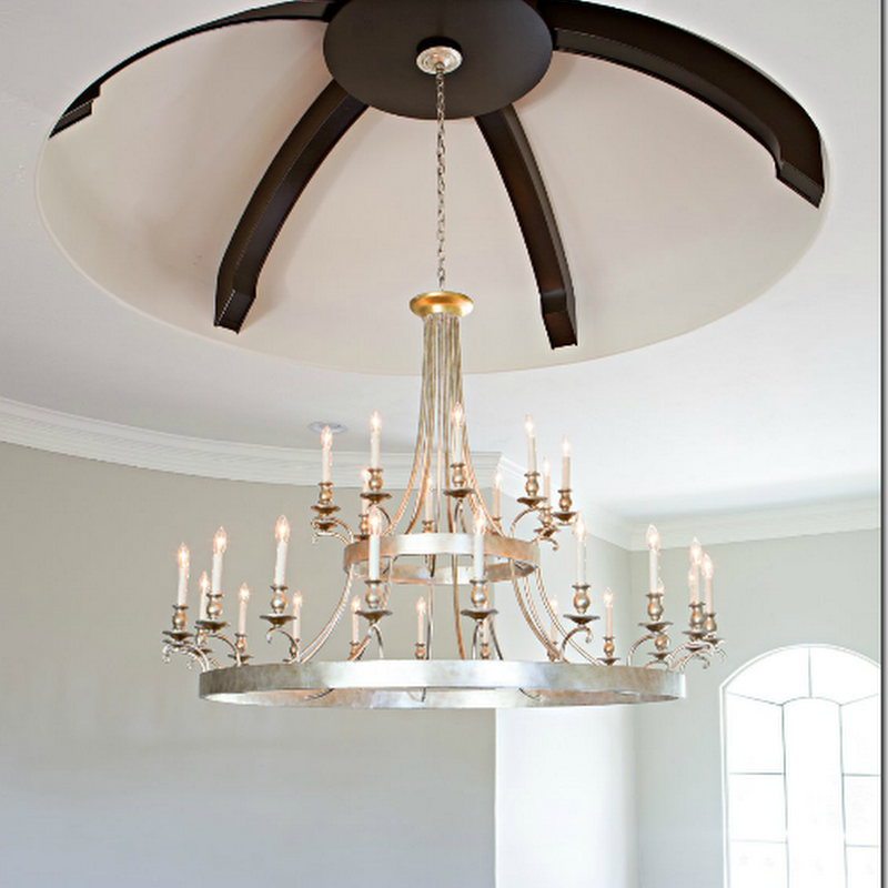
For example –last week there were questions asked about the dark beams in the entry hall ceiling dome. Some readers asked why the beams were added and why they were so dark. The homeowner was gracious enough to answer these questions.
She wrote:
“As for why the ceiling beams are dark...we actually contemplated making them a weathered lighter wood vs the dark that they are, but if you come to visit you will immediately agree and understand why we choose the darker wood...we have large double wood front doors in the same color scheme as well as other accents in the home such as the family room fireplace mantel and kitchen island that are the same.”
The questions and comments about the beams were valid. I don’t mind AT ALL when people question design decisions that we can all learn from. And this was a perfect example of that. The question was asked and answered – both respectfully.
There were also comments about the settee in the entry hall – some wondered if there was enough head room for a person to sit there. Again, the homeowner answered:
“For the settee, you will not hit your head sitting on it unless you are a giant ;) Amanda did a wonderful job making this a home, that we now love, to raise our family in.”
Again, question asked and answered, respectfully.
Things got out of hand over the discussion about the use of Restoration Hardware’s “capital” tables versus antique ones – which Ginger Barber had used in a similar way – as I showed in a picture. The Anons really hated that the designer had used Restoration Hardware furniture. Here are a few of the comments about the RH tables:
“Yes, they are expensive, shockingly so for what they are. For the same money, the homeowner could have bought a more timeless piece rather than one that in a few years will be declared passe' like all of the other junk being hawked by RH at the moment. Perhaps the owner wanted RH. That piece of information has not be established. If, however, the young decorator recommended it, then the homeowner got poor advice. Now if one wanted to put a moat in their living room so that children can run around playing on it, then the capitals might have been the right idea.”
Again the homeowner kindly answered:
“My husband and I are in our early 30's and when we traveled we were still saving money to pay for school instead of collecting antiques as I wish. We also have two young children who still love to do cartwheels, draw on furniture, and play sword fights so I'm sure if we had antiques displayed they would be in crumbles in a matter of seconds ;)”
Though the question about the tables WAS a valid one, the Anon was very rude, yet, still the homeowner politely answered. The discussion about RH didn’t stop with her answer. It went on and on with rude comments made about her children. It did get me thinking though – is it true that if “the young designer recommended ‘RH' tables, then the homeowner got poor advice?”
Really - why - I thought? Is it poor advice to recommend Restoration Hardware furniture to a client? I had a real problem with that. First, those RH tables are solid and functional, while the ones that Barber used, the true antiques, don’t seem nearly as functional as coffee tables, nor as safe for young children to be around.
I commented:
“ I buy a lot of things from RH and so do Big Named Designers. You don't like those tables, I get that. Ok I do. The owners do. That's why people's houses look different.”
Well, Anon didn’t like that answer one bit!!!
He challenged me:
“Name one "big name designer" that would put their name on anything currently in the RH catalog? Name one! You can't.”
So, I answered:
“Oh, I certainly can. I was told about this house where the source for the sofas was RH. I can't say who it was - call me a liar. I wouldn't have said it without having proof.”
So, he called me a liar because I didn’t want to the name the “Big Name Designer.” Actually - I was given pictures of a house designed by a “Big Name Designer” where the sofas were indeed from RH. I just didn’t feel right about naming the designer, since he hadn’t sent me the pictures himself. But, that wasn’t good enough for Anon.
He told me:
“Indeed you can't name one or you would. So we are to trust your say so here because you are desperate to make a point. If you truly know a "Big Name Designer" as you referred to them who uses RH, please tell us who that designer is or don't make up convenient truths..”
A few people stuck up for me (thank you!) and talked about a house that was just shown in House Beautiful where indeed a “Big Name Designer” had used Restoration Hardware. Even that wasn’t good enough for Anon. He raised the bar higher. Even though he said I couldn’t name one “Big Name Designer” who would ever put their name on something from RH – Shubel’s was an exception for a myriad of reasons that he cited below:
“The Stephen Shubel house was lovely, but what you failed to mention and what is evident from the pictures is that Shubel did not use catalog and on line sources exclusively. He has used a bare minimum of these pieces in rooms where they are sat amongst finer pieces of furniture, beautiful wall coverings, fabric and rugs. Therein lies the difference. For instance, he pairs beautifully the Crate and Barrel dining chairs, with a pair of antique chairs and the West Elm cube benches draped in simple linen are featured in front of a beautiful window treatment as well as wall treatment. This is both a clever and wonderful way to incorporate pieces that a homeowner has selected not only for style but to minimize cost. What Shubel did not do is deliver a truck load of exclusively catalog and online sources and say "job done."
But – the truth is - neither did THIS designer. She mixed in things both new and things old that the clients had, like their mirror and the dining room table. It wasn’t all bought from a catalogue, nor was it all bought from RH. And the homeowner didn’t want antiques.
Still, I thought more about this issue. I know a lot of designers DO use Restoration Hardware. I know I do, but I’m not a “Big Name Designer.” So I decided to look at House Beautiful’s recent issues and see exactly if other designers used RH or do they only use custom furniture - hand made pieces designed only for their client, along with priceless antiques. Because – let’s face it – unless it’s handmade or custom or antique – it comes from a catalogue on a truck and most companies now take orders online.
And, let me say this – I was surprised how easy it was to find Restoration Hardware pieces in House Beautiful stories, also in Elle Décor and Architectural Digest. I even found the dreaded “capital” tables!
So, Anon, here are just a few “Big Name Designers” who readily put their name on items from Restoration Hardware.
You may remember this beautiful house shown in House Beautiful last September. Designed by the “Big Name Designer” Benjamin Dhong, the house is located in San Francisco and is owned by a single Englishman who wears bespoke suits and drives an Aston Martin. Dhong says he loves contrasts and he likes houses that mix the high with the low. He finds rooms filled with only expensive and pretty things to be “vulgar.” Yet, his designs – even with a plethora of online sources – look exceeding luxe.
The dining room is a mix of high and low – as are all these rooms. Here, pricey wallpaper hangs on the walls, while carpet remnants!! stitched together cover the floor. Vintage chairs from Tara Shaw sit with a Knoll table top and Julian Chichester table base.
The table? Antique? Nah – it’s just Oly Studio – a company defined by its online accessibility.
Let’s take this room. The guest room. The bed is new, made to look like a Chippendale design – from Ceylon et Cie. The carpet? Inexpensive seagrass. The table? Inexpensive catalogue Jonathan Adler. The wallpaper – the most expensive there is – De Gournay. The chair? Yep! The dreaded Restoration Hardware.
Another picture of the glorious guest room.
The living room in the house has expensive wallcovering and a Starke rug.
And along one side of the living room, there is a Tara Shaw repro Swedish chair hidden underneath a – horrors! –Z Gallerie throw! (I actually bought that same throw for my niece’s bedroom.)
And, here, the main seating area of the dressy living room, is the slipcovered Restoration Hardware sofa with two copies of the famous Egg chair. Gosh! Restoration Hardware in the living room????? NO!!!!!!!!!!!!!!!
Antique chair is mixed with a desk from – Restoration Hardware!
Oh lord!!!!!! Oh no!!!!!!! The dreaded Restoration Hardware “Capital” table. I had to laugh when I saw this picture. This table – which the nasty Anons ridiculed to death – shown here in House Beautiful, in a house designed by the uber chic Benjamin Dhong – a highly regarded and respected “Big Name Designer” – well, well, well. And two RH chairs flank the Capital table. In the breakfast room, there are chairs from Design Within Reach. The rug? West Elm.
Hmmm. Did Dhong just order a truck load of furniture from catalogues and have it delivered? Well yes. But he did add some expensive wall treatments and art work in the mix, along with a few pricey vintage pieces – all easily affordable to the bespoked dressed Englishman. Maybe a family, not quite as liquid, could start out with the basics and add to it over the years? Is that a lazy designer – who provides a good solid base for the family to grow into as children age and bank accounts grow? For shame, Anon!!!
Another view of the family room and the Capital table and chair from RH. I think Anon owes last week’s designer and homeowner an apology. Don’t you????
Here is the living room shown last week with two of the RH Capital tables – which I love. Will the homeowners and designer add more to the room as time goes by? Maybe or maybe not. They might like the room just as it is now, or they may want to add a pricey antique chair or table in here one day. I like the room just as it is.
And another house:
This month House Beautiful showed two houses with Restoration Hardware merchandise, but one was not designed by a “Big Name Designer” – and I already showed it a few weeks ago. The second house WAS designed by the VERY “big name designer” Stephen Shubel which was discussed earlier by a commenter. The house is on a few acres in the Sonoma wine country. According the Shubel, the owner found cheaper versions of furniture he had picked out. Much was bought online and from catalogues. NO!!!!!! What a LAZY designer!!!! The chandelier here is from Curry and Company – the same company that our guest designer, Amanda Carol, used in her designs. The sofa – Restoration Hardware. The white table by Oly Studio is a homage to one by John Dickinson – which Shubel probably wanted, but this was a cheaper version of that. While the original table probably cost over $8000, the copy is so much cheaper. Do you really need the original to get the same look? Shubel obviously didn’t think so. Hmmm. Really? Use a copy instead of the original? What BAD advice Shubel gave these homeowners!!! They should ask for a refund!!
Another view of the living room – shows Restoration Hardware’s copy of a French chair – upholstered in both a print and a plain fabric. Wow! Just what Amanda Carol did with HER client’s chairs. Amazing. Pillows are both custom and Z Galleries. Mirror tables from West Elm. Actually – there is nothing antique or pricey in this room at all. It’s all new and mostly inexpensive. Much was ordered from catalogues and came delivered on a truck. And yet- here is the house, shown in prestigious House Beautiful.
Dining room chairs are a mix of vintage and Aidan Gray. Chandelier – Oly Studio.
The guest room has bedding by Z Gallerie and nightstands from Aidan Gray. The stools are 19th century – the only pricey item in the room.
The master bedroom has stools from Wisteria and the bed is from, yes, Restoration Hardware. Mixed with a Stark rug, the room looks more custom than catalogue – yet besides the rug it IS all catalogue. So lazy. Such bad advice! Why did House Beautiful even publish this house????
I hope you realize I am using sarcasm here.
In the garage turned into pool house – Serena and Lilly ottomans mix with the Restoration Hardware sofa and Shades of Light chandelier.
So, is Shubel a lazy designer for turning to catalogues and online stores? No! But our guest designer was called that for doing the same exact thing. Go figure.
And yet another:
In House Beautiful last November “Big Name Designer” Thom Filicia showed off his lake house. Most was decorated using his own very reasonably priced furniture line – for Vanguard.
But he filled in places with Restoration Hardware – like this light fixture, which I love!
And this light fixture. He also used a RH mirror over the fireplace.
And yet, another example:
In November 2011, “Big Name Decorators” and hot duo Parrish Chilcoat and Joe Lucas used Restoration Hardware’s leather chair in this living room owned by a professional hockey player.
For his outdoor living space, Restoration Hardware provided all the seating, except for the Ikea deck chair. Ikea??!!!
My favorite blogger and designer Brooke Giannetti of Velvet and Linen chose Restoration Hardware curtains in this house she decorated.
and in the living room too - Restoration Hardware curtains.
And in the fabulous dining room – Restoration Hardware chairs - hosts in leather. Gorgeous! Don’t the basket lights make the room?
And in this dining room shown last week – the host chairs remind me of the ones Brooke chose. Beautiful!
And so, I think we can put to bed the comments about ordering from catalogues and Restoration Hardware – and whether “Big Name Designers” order from RH too. They do. I can’t tell you how many times Restoration Hardware was sourced in all the major magazines. It doesn’t mean you are lazy or unimaginative to use sources like these. If you like the Capital table – then order it!
And one last point on this subject – an Anon wrote in making fun of me for calling it a Capital Table instead of Capitel. I looked up Capitel – there is no such word in the English dictionary – it is Spanish. But, under Capital, you will find:
Definition of CAPITAL
the uppermost member of a column or pilaster crowning the shaft and taking the weight of the entablature
Just saying.
And then, there was this comment from Jamie:
“Amanda is a great designer. People forget when looking at a designer’s work that the client has the ultimate say. As designers we don't get everything we want for a client's home. We compromise. Many clients don't like antiques, so we compromise. Or they decide that they want draperies but those are expensive so woven shades under the draperies aren't worth it. So we compromise. That's how it goes.”
Anonymous used this minor point about shades to put me and my aesthetic down, by responding:
“Jami, woven shades under draperies is an invention of this blog. You are not likely to see this treatment in many places in other parts of the country except Texas. I personally can't think of a better way to ruin the look of expensive fabric and beautiful windows than to put those cheap looking shades under them. Ask yourself a question and truly answer it honestly. Would you really use these hideous shades had you not first seen them here?”
The comment is of course directed against me since I like textured or bamboo shades under curtains in certain circumstances. His comment made me laugh – as IF I invented using bamboo shades under curtains – or as IF they are only used in Texas. “Hideous” shades. True, I do like to use shades – I like that look – but even more, I like to use to shades to hide imperfections in windows, such as short windows, or unbalanced ones. And I like to use shades to cover the “dead space” between the rod and the fabric.
For instance in my bedroom – I used a long shade to hide the fact that there is really only one very short and very long window here. Instead, now it looks like there are three perfectly balanced and proportionally placed windows. By placing the rod at the molding, the window appears taller and the room, in turn, appears taller. It’s a smooth, clean line.
Notice these windows – to make them appear taller, the rod was placed at the ceiling. Yet, there is the dead space between the rod and the window that tells you how tall the windows truly are – your eye is not fooled. If they had raised the shades up to the rod – you truly wouldn’t be able to tell how short the window really is. And this is just a messy look – to me. By raising the blind you would get a cleaner, less fussy, look.
Again- the dead spot. How much more graceful and pretty the window would be if the shade was raised to the rod to cover the dead spot. No one is fooled that the window is taller than it is. Still, a very pretty room!
For this client, I used the shades to bring the windows up higher than they actually are. By placing the rods and curtains higher than the window frame and then adding the shade, it fools the eye that the window is taller. Additionally, I like the contrast of the dark shade against the ivory fabric.
Sometimes, like in my family room, I use shades just because I like the look of the shade and how it adds to the color scheme and brings needed texture to the room.
Sometimes, like in my living room, I don’t use shades at all.
Still, the Anon got me thinking – am I really the only person who uses these hideous, cheap looking shades? Or are they only found in Texas?
I looked around for “Big Name” Houston designers who use shades – and had trouble finding any. Here, though, Jane Moore used very expensive and beautiful Conrad shades under silk curtains. Hideous? No.
This picture shows a beautiful living room, NOT in Texas, with shades and curtains.
In a Chicago townhouse, Alessandra Branca used bamboo shades and curtains.
And in an apartment in Rome, Italy, she used shades and curtains.
In this beautiful bedroom, Conrad shades used under curtains – again, not in Texas.
In California, shades and curtains.
More luxe Conrad shades and silk curtains.
“Big Name Designer” Suzanne Kasler used shades and curtains in this living room.
And Nate Berkus used shades and curtains.
Love this look in a Charleston house, though I would have raised the shade above the molding.
And again in California – curtains and shades. So hideous, I know!
I love the ikat curtains mixed with bamboo blinds here. I love the texture they add.
And here, paisley mixed with Conrad shades.
And in this family room – curtains and shades – not in Texas and not hideous.
Would the anon apologize for his comment? I doubt it.
Last week, when I begged that the Anons please be respectful, this is answer I got back:
“Joni, no apologies required. If one is not ready for prime time, one should not publish their designs. It's really that simple. You insult your readers by requesting that they ignore some of the obvious mistakes. You have a sophisticated readership, both homeowner and professional and to require that we dish out praise where it is not warranted is simply hypocritical and disingenuous at best. I won't do it, so sue me!!”
To this I say – not everything I show will be ready for “prime time.” Many houses, including mine and my client’s are not ready for House Beautiful or Architectural Digest, but they are pretty enough to be shown on a BLOG. This is a BLOG, not a magazine. It is FREE. If you had to pay to look at houses shown here, then you might have a point.
I am constantly asked by readers – why do you only show expensive houses? Why not show houses that we normal people live in? And – I do try to do that – as often as I can. I don’t show houses to insult the sophisticated reader. I show houses that all readers – sophisticated, wealthy, older, younger, or unsophisticated – can enjoy. Not all readers are the same and not all readers will enjoy each and every house.
Additionally, I don’t ask that you dish out praise, whether it is warranted or not. I encourage your questions about design choices. I only ask ONE thing – that you be respectful of the guest designers and homeowners. That’s all I have ever asked of you. Notice I am not included in that description.
I hope we can all move on and try to be respectful to each other from now on. I hope I have answered all your questions about this subject, but feel free to ask them if I haven’t. Like I said previously – even the Anons add to the discourse. I don’t want to silence them or ban them because everyone, even them, bring some positive aspects to the comment section. I only ask that they be respectful. Is that too much?