Monday, September 30, 2013

Florida House Tour Video

I'm taking a break from packing (5 days til we move!) to post a quick update on our progress.

First order of business: the house is rented! We got a call from a nice couple right after we listed it, they came to see it the next day and made an offer that night. Big sigh of relief. After the papers were signed a few days later, we got straight to packing and prepping the house.

When we were touching up the paint, this started to happen:


Unfortunately, none of our paint colors match anymore (maybe from sitting out in the humid garage?) so we had to repaint 90% of the house which has sucked up a lot of our time. 

I'm still working in the studio so we haven't touched that room yet, but we're still on schedule for the movers to come Friday so it's been relatively stress free.

Here's a shot I just took of the living room:


So weird to see empty walls again!

Before we moved a thing, we decided to go ahead and shoot a house tour video as a way to preserve the memories. It's also a chance to clear up any confusion on the layout if you guys ever wondered how the rooms flowed together. And it's the first time anything has ever been on video so we thought it would be a fun little time capsule.


Disclaimer: Some of the shots were out of focus and I had to reshoot them, so you'll see a few funky edits/sound changes. Don't mind my blabbing, this wasn't rehearsed at all so some commentary may be redundant.

And with that out of the way, I'm trying to soak up as much of Florida as I can before we say goodbye. I took some time off work this afternoon to enjoy one last beach trip...


I'm really gonna miss this place.


I'll be back with an update once we arrive in California!


A FABULOUS GIVEAWAY AND A FABULOUS FUNDRAISER!!


We’ve got a great new giveaway today from the nice ladies at LoveFeast Shop.  You remember them – we have had several giveaways from LoveFeast, including their fabulous velvet pumpkins:


My favorite – the white pumpkins!


Besides the velvet pumpkins, acorns and hearts -  LoveFeast sells all kinds of things, like wonderful jewelry, furniture, and…


décor items like these acrylic antlers.


Today – the giveaway will be this fabulous medium sized Provencal Platter – valued @ $370! 


Provence_Platters_0316_1024x1024

The platters are created by Australian sculptors who remake them out of French oak wine casks.   These platters are wonderful for everyday use or for when entertaining!   To read more about the platters, visit the LoveFeast Shop HERE.


2_Provence_Platter_1024x1024

Aren’t they fabulous?


Now, the rules are this:

The contest will run from now until Thursday evening at 11:59 pm.  One winner will be named.  To enter, all you have to do is go to the LoveFeast website and pick out ONE item which they sell that you love.  Come back here and leave a comment telling me what that item is and why you love it!!!

That’s it! 

NOTE:  If you are anonymous – be SURE to leave an email address in case you win!!


Custom_Logo_imprint_upon_request_1024x1024

Have fun looking around LoveFeast’s web site.  They have added a great number of new unique items!  And be sure to look at the pumpkins – they make wonderful decorations for Halloween, Thanksgiving and Christmas, and they make great gifts too! 


If you do make a purchase, Cote de Texas readers will receive a 10% discount.  Here is the promo code to use with any purchase:  PROMO CODE:  CTEXAS10    The discount lasts until:  October 15th, 2013.

Remember – to enter, visit the web site, pick out your favorite item and come back here to let me know what that item is.     To pick your favorite item – go to the LoveFeast Shop HERE.

A huge thanks to the girls at LoveFeast Shop for this wonderful giveaway. 


AND……

Lastly, I want to announce the date of the next fundraiser for Habitat for Horses!

  Habitat for Horses is the great organization dedicated to rescuing abused, starving, and abandoned horses.  After Habitat for Horses rescues these horses they adopt out those that are able to be rehabilitated.  It’s a wonderful organization and one that was introduced to me by interior designer Ginger Barber who is very active in the organization.  Ginger’s life was turned around when she discovered Habitat for Horses and every bit of time in her life is dedicated to working there and helping to raise vital funds to keep it going.

This fundraising event will be held November 7th at 6pm until 10 pm at AREA, located at 3735 Westheimer.  There will be BBQ, beer and wine, along with a concert by Shake Russell and Michael Hearne’s band!    The event will showcase the debut of the book The Horse at Home, along with photographs by the great Skeeter Hagler and Kathy Oliver.

The event promises to be a great time and lots of fun, but more importantly, it’s for an important cause.

Please go HERE for ticket and sponsorship information. 


image


Area2

NOTE:  The new location of AREA –  3735 Westheimer.


Saturday, September 28, 2013

Car Paint Designs Ideas

What Are The Best And Worst Aspects Of Modified Cars?


When it comes to modifying cars, there's some pretty decent examples of how to do it right. Sadly though, there comes a time when it doesn't look so great, but not that this would put off any prospective car modifier. In homage then to the some of the best and worst modified cars, here at Cars4Sale we have established a list of some of the things we love and hate when it comes to suped up machines.


We see and sell on a variety of different cars, some modified monsters and some beauties – we'll always find a home for them, but we've so many we had to share our thoughts on what are the best and worst modified cars. So here it goes:


Best Aspects of Modified Cars


Fine Tuning

We love cars that have been fine tuned, with turbo engines, enhancing their engine size, capacity and ultimately speed. This is what modifying your car is all about and we doff our cap in appreciation for those that start off with their engine. Evo's that can beat the Ferrari's or Impreza's making mincemeat of Lamborghini's; fundamentally this is the whole point of modifying cars.


Vehicle Wrapping

This can make any modified car look the bee's knees. There's nothing better than seeing an awesome car with eye catching and sporty looking wrapping over it. Recently it's been used in various forms, such as company promotion, protecting paint work and to give an all round flashy look. You'll also see wrapping in motor sport as manufacturers will use it to advertise sponsors on their vehicles. It's a great way of trying out news colour schemes and designs without affecting the original paintwork of the car. So when it comes to selling your vehicle on, you can either keep it on, or have it removed to have you car restored to its original self.


Swapping Engines

As mentioned, modifying cars isn't just about the aesthetics. It's about getting your car fine tuned, so it performs to its best. That said, there are still really cool aesthetical modifications you can make, but it's important to concentrate on the engine first and foremost. The idea with swapping engines is fairly old, and even though it's considered sacrilege, you can enhance the power of your pride and joy tenfold.


Worst Aspects of Modified Cars


Cambers

Originating from Japan, the name comes from the way the wheels of the car incline sideways. This makes the car look like it's been squashed, with the wheels of the car pointing outwards. Not only does this not look right, but it doesn't exactly help the performance of your vehicle. In the worst case scenario you'll see cambers that make the car look like they've folded up. Not a good look.


Big Wheels

There is a fascination when it comes to modifying cars, and that's to include big wheels. Whilst this may look good on large SUVs and even some Sedans, it looks terrible on smaller cars, especially if the arches are made bigger too. It makes the car look like it's on roller-skates, and you'll get no performance benefit out of it whatsoever; no extra speed, no more grip or better stopping. So if you're thinking of suping up your coupe, stop to think before you add 22s to it.


Interior Disasters

Okay, we've all see Pimp My Ride, and some of the things they can produce is impressive. However, it's a television show people, and the people working on the cars are professionals. There's nothing worse than seeing an old clapped out banger, which has been given the ‘star' treatment, which contains luminous, bright and generally over the top colours, designs and accessories. Somewhere along the line, modifying cars went awry.


So there you have it, these were just some of the best and worst aspects of modifying cars. There are however many more. Whilst you may disagree, or agree, with our selection, that's the beauty of modifying cars, it's down to people's tastes and opinions.


Art of Invisibility: Clever Camouflage Car Paint Job Design ...
Art of Invisibility: Clever Camouflage Car Paint Job Design
Art of Invisibility: Clever Camouflage Car Paint Job Design ...
Art of Invisibility: Clever Camouflage Car Paint Job Design
Art of Invisibility: Clever Camouflage Car Paint Job Design ...
101 Paint And Body Ideas January 2009 Custom Chevy Truck Photo 6

Small Kitchen Ideas

10 Dealing Tips For Small Kitchen Design


Kitchen hasn't lot of space and you want to manage large things. It's hard to arrange lot of things in small kitchen. If you have idea about how to use the right design ideas in creating a more space, you can arrange lot of things within little space.


If you have a small kitchen and you are going to design. You will face the problem of designing, how you can fit and where. There are many different designed cabinets and surface patterns that can help you. You can design your small kitchen with a sense of space.


To design efficient kitchen, you have to work on three major areas: storage, lighting and appliances. Small kitchens seem to be very difficult design. But you can design easily because you can find that there are many designing options in the market.


A small kitchen requires creativity design in coming up with storage solutions. Some ideas to try include:


1. Set countertops along with wall. Countertops help to arrange lot of things.

2. To design galley under the countertops and up on countertops, there make 8 columns. Each columns store lot of pots.

3. Today's appliance manufacturers have come up with more compact space-saving appliances make small kitchen design easier, such as refrigerators that are 24 inches deep instead of 30 inches deep, as well as appliances that can be hung underneath cabinets like microwaves.

4. Most design tricks to create dining area in the kitchen include using folding tables with two small chairs that can be tucked into a corner.

5. Use colored lighting under cabinets within glass doors. That lighting will look more attractive.

7. Deeper counters can more increase work space and you can put the lot of pots in counters.

8. Fix the hanger on wall, where you can hang up pots and pans.

9. Install designed sink in the kitchen. You can wash posts easily in large sink.


Mostly kitchens are small. But after complete the designing in the kitchen; you'll notice that kitchen's featured are large. You'll think, good design means being able to create more space and being able to fit all necessary things in small kitchen.


Small Kitchen : Design, Ideas and Pictures for Small Kitchens
33 Cool Small Kitchen Ideas | DigsDigs
Cape Kitchen | 10 Big Ideas for Small Kitchens | This Old House

Thursday, September 26, 2013

New Master Reveal: Before & After!

This reveal isn't quite as finished as I had anticipated it would be (I still had plans to add swing arm style library lamps and hang some wall accessories), but since we decided to move last week, this is as done as it will be!

Here's what we first started with three years ago:


And how the room looked for 2+ years as my office:


The transition to master bedroom...


And here it is today, all ready to be packed up...


I really love our cozy little bedroom and am sad to leave it so soon, but I hope to create a similar look in our new master once we're settled in. Our furniture is coming with us so we'll just have to see how everything works out in the next house.

If you missed any of the transformation posts, here's a recap:

Renovating the closet
More renovating the closet
Adding recessed lighting
New paint & plank wall
Moving in
Salt dough wall decor
Salt dough wall decor, part 2
$50 Gallery Wall
DIY linen & lace curtains
DIY blackout liner

Here's the source list breakdown:

Wall color: Valspar's Urban Sunrise
Closet color: Valspar's Mark Twain House Ombra Gray
Curtains: DIY
Artwork: Ikea/DIY
Headboard: DIY
Mirror: Craigslist/DIY
Bedding: Target sheets/pillow/bedskirt, Ikea comforter
Rug: Ikea
Dresser & End tables: Ikea/DIY
Bamboo shades: Amazon
Lamps: Ikea
Fan: Amazon
Accessories: Antique stores, Target
Nautical wall accessories: DIY
 
And as always, you can also head over to my house tour page for a source list for every room in the house.


That's it guys—the last and final "After" in this house *sniffle*. It has been a great run and I've learned so much over the past three years. I feel a lot more confident going into the next house with some DIY skills under my belt and ready for bigger and better projects. Bring it on!


Wednesday, September 25, 2013

A Designer To Love


During the last story I showed a bright family room designed by Schuyler Samperton – a well known decorator in Los Angeles.  You might already be very familiar with Samperton, but for those who aren’t, I wanted to share images from her beautiful portfolio.  For years Samperton’s web site was a stagnant place, but that all changed just a few years ago when she debuted her new internet site.  It’s been a real thrill to see her updated work, most of which had never been seen before.  Her portfolio has grown with her and her work is fabulous – it’s fresh and new, but it’s steeped in the classics.  Her rooms are warm and welcoming at the same time – everything that a house should feel like.

To review – it was Samperton’s own apartment that garnered her initial burst of popularity.  She started out working for the mega star Michael Smith, along with another designer.  Both left and started their own firm.  Today, Samperton is now solo.   Her stint with Smith clearly made a lasting impression on her work and you can see his influence in her designs – which is definitely a great thing. 


Let’s look at her own apartment first – which garnered so much attention.

schuyler-samperton-interior-design-west-hollywood-06

Located in West Hollywood, this is a 900 sq. ft. apartment – with five rooms.  It is small, but so rich in layers and colors, you don’t notice where the rooms start or end.  In the main room, she added a large bookcase which immediately creates architectural interest.   The room is amazing.  It’s the basis of her aesthetic and much of her work has these same elements:   warm colors, textiles, worn leathers, layers, and patterns.


schuyler-samperton-interior-design-west-hollywood-07

Another look at the bookcase – and a glimpse of the large window where she added Bennison curtains, a very luxurious choice.   Underneath it all is a zebra rug adding more pattern.   The room is timeless – it could have been installed this year or twenty years ago.  The coffee table is an antique Oriental lacquer piece and the two chairs are painted an unexpected red.  It’s all so warm and inviting and welcoming.  You want to put your feet up and read a book and never leave.


schuyler-samperton-interior-design-west-hollywood-08

A close up of the Bennison fabric against the green walls.  The antiques aren’t fine or out of reach, which makes it all the better.   Michael Smith’s influence is seen immediately – in the wall colors, in the choice of fabrics, in the use of textiles and antiques. 


image

This shows a recent update to the space – a daybed placed in front of the windows instead of the two red chinoiserie inspired chairs.


image

A vignette with a bright turquoise lamp in front of an oil painting.


schuyler-samperton-interior-design-west-hollywood-01

A screen is used in the dining room along with an antique gilt wood chandelier.


schuyler-samperton-interior-design-west-hollywood-04

Another more recent view of the brightly painted yellow dining room with its skirted table and the newly placed lantern.


image

In the master bedroom, a 19th century French antique settee sits next to the bed.


schuyler-samperton-interior-design-west-hollywood-02

A Suzani is used as a bedspread, while a screen is used as a headboard.  Again, the Michael Smith influence is strong here – with the suzani, the screen, the blue and white lamp and the English antique furniture.   Samperton took the best of Smith and made it her own.   


Westside Provencal

image


The next house that Schuyler designed which was published is owned by the model Carolyn Murphy.  It was shown in Vogue magazine and its publication coincided with her new web site/blog.   Here in the living room – the walls are creamy white with a gray velvet tufted sofa and antiques.   The house is wonderful – filled with architectural charm – a bit of France near the L.A. beach.


image

The house was built in the 1920s.  It’s small, but so charming, the size makes it all the more cozy.    Here Samperton added her trademark beautiful curtains in a muted pattern. 


image

The dining room is truly fabulous!  The Restoration Hardware fixture hangs over the beautiful wood table – with two chairs that are almost falling apart !!!  Love this so much!


image

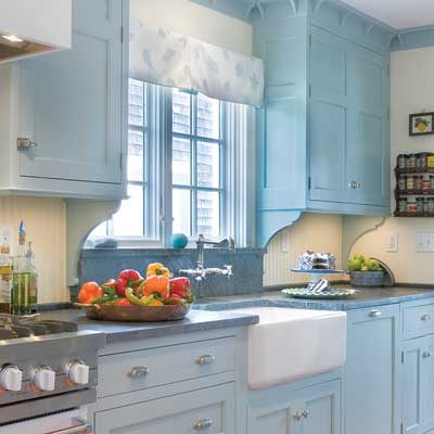
The kitchen is charming – look at the sink.  Love the tile floor and the casement windows in the adjacent pantry. 


image

Samperton said she searched the internet for all these different textiles – and together they do make a colorful statement.  Again, it’s all so casual and simple, yet it is so warm and inviting. I just love her aesthetic.   Notice the original door knob. 


image

A nook upstairs – love the rug.  Again, a pile of patterns, nothing matching, but that is the charm.  Samperton has a gift of being to assemble mismatched fabrics and make them relate to each other in an unexpected way.


image

Tiles and a marble sink – tiny casement window with stucco walls and an old shelf.  Perfection!


image

Carolyn had the headboard and the curtains – so they were reused.  Love the metal lamp.  Love the table.   The only pattern is a pillow with the found fabric.


image

WOW!!!   The master bathroom is beyond fabulous!   I would live outside in that adjacent garden!  Why don’t they still make houses like this?


image

A close up of the marble vanity.   Love the mirrors and the twin sinks.  Perfection. 


image

The garage was turned into an artist’s studio and an entertaining space.  


image

It’s Belgian Rough Luxe meets industrial chic.


schuyler-samperton-interior-design-westside-provencal-17

Notice the corner fireplace.   Love the furniture Samperton assembled for this space.


image

The back yard – when can I move in?  Love the gravel and the lavender planted around the pool.   Notice how the four trees become a natural pergola – what a great idea!


Hancock Park:

schuyler-samperton-interior-design-hancock-park-03

In this house, the décor is a little more dressy, but it still has that warm mix of antiques, Oriental vibe, and luxe fabrics and textiles.  Again, Samperton chose a patterned fabric for the curtains – and mixes it with plain upholstery. 


schuyler-samperton-interior-design-hancock-park-02

A vignette in the living room.


image

Love the dining room where there is turquoise hand painted wallpaper mixed with gold fabrics.  Notice the rug!


schuyler-samperton-interior-design-hancock-park-04

Love this use of fabrics, rug, and textiles in the family room.


image

The paneled walls are great – they add so much character to the house.


image

Love the quiet chintz at the window and on the bed. 


Beverly Hills:

image

This house is a real departure in the color palette for Samperton.  But, it still has the same warm feel – inviting and comfortable and cozy.  Dying to know who lives here!  A single female?  Or a married couple?


image

Notice here how she tones down the bright fabrics with art work and an antique wood console. 


schuyler-samperton-interior-design-beverly-hills-02

As always – a mix of textiles on the pillows.


schuyler-samperton-interior-design-beverly-hills-01 (1)

The dining room is blue and white – notice the blue and white tiled walls – a la Michael Smith.  He copied that age-old idea and other designers then copied him.


Palisades Traditional:


image

This is another new addition to the portfolio.  Again, it’s traditional with an English colonial feel to it.  Striped fabrics are mixed with patterned textiles. 


image

The kitchen and breakfast room are an interesting mix of white marble and red walls.  Notice the pendant lights over the island. 


image

Love this printed fabric and the blue denim in the family room. 


image

English styling in the powder room with its leaded glass windows.


image

The children’s room – a mix of blue and white stripes with worn leather and plaid.  The lamps and their shades are fabulous!


image

The master suite is my favorite – the English styled canopy bed dressed with embroidered fabrics, the striped settee, the old rug and the walls are wallpapered, adding another layer – wonderful!   The layers that Samperton puts in each room add much to the feel – the rooms don’t feel empty, no matter how large they are – they feel properly furnished.   So many designers don’t add enough furniture to larger rooms, making them seem cavernous.   Samperton avoids that misstep. 


image

The owner’s study – love this!!!!!!  This is a working office but – Samperton still made it feminine and pretty.   Love the chandelier and the pink fabric mixed with the ticking stripe.


image

Swedish furniture – notice the hand printed wallpaper that Samperton lined the walls with.  I love all her rug choices – they add another quiet layer of pattern to the rooms.


image

In the master bathroom, she added wood furniture – an unexpected choice.


image

The English styled chair with striped fabric works with the rugs and cabinets.  Such a pretty space.


I hope you enjoyed seeing some of Schuyler Samperton’s portfolio today – there’s lot more on her web site – so be sure to visit there and check it out.  When she debuted her new web site, she started a blog which was very interesting and promising!  But, I’m afraid she is too busy with clients to keep it up – so it’s rarely updated these days, which is a real shame.  Still, read the older entries when you visit.

I hope you got some new ideas for decorating today – ideas for adding warmth and coziness in a room, ideas on how to fill out a room so it doesn’t look either empty nor cluttered, and ideas on how to mix and match textiles and fabrics in ways that aren’t too obvious. 

Visit her web site HERE.

And if you are inspired by Samperton’s style – be sure to visit Michael Smith’s web site.  He’s got some beautiful photographs of his portfolio – some old favorites and some new designs – HERE.